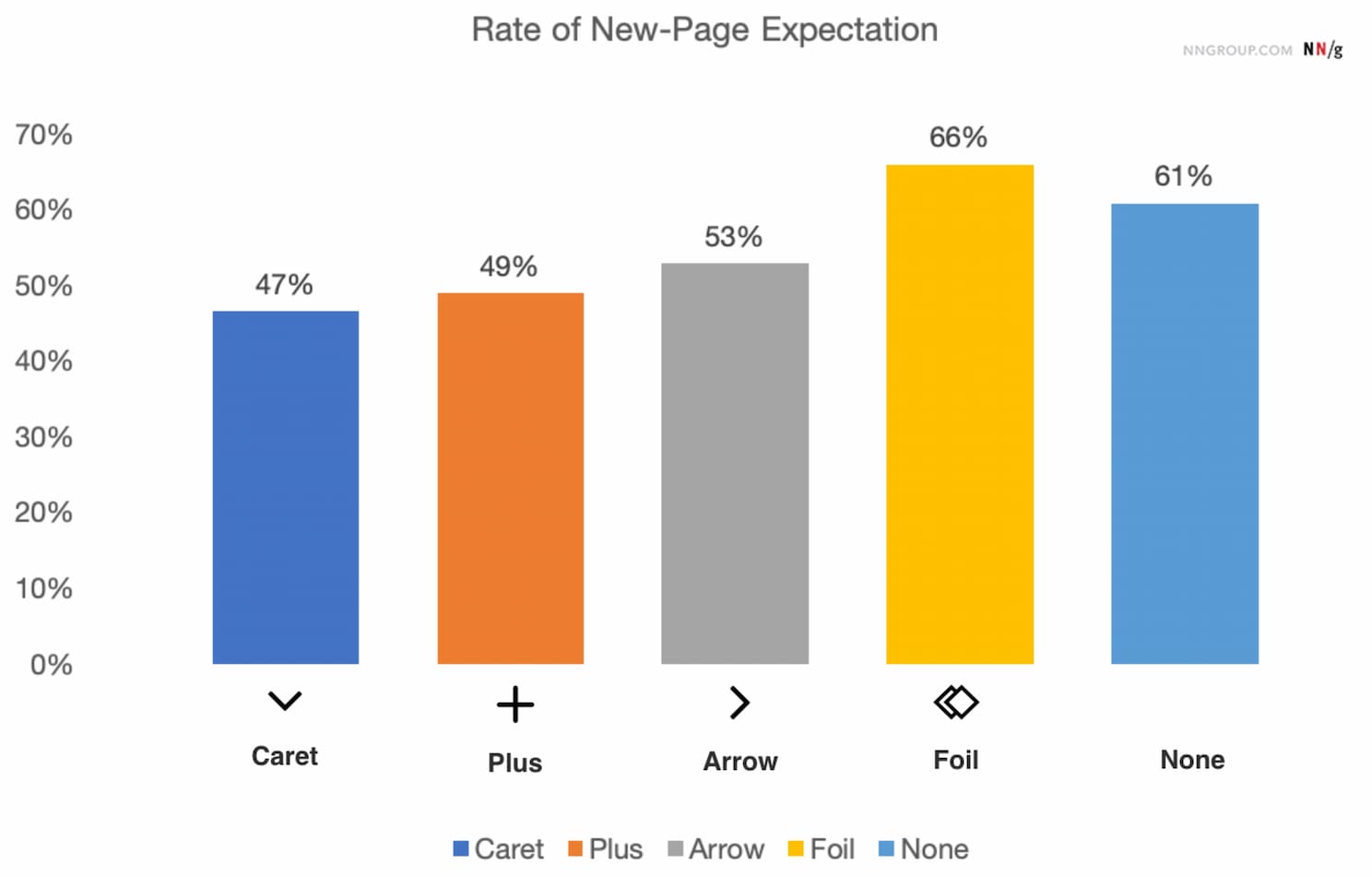
So what icon is the most reliable to show expansion and collapsing for accordions? Is there really any noticeable difference between carets, chevrons, arrows, and triangles?
Well, research shows that there is some difference indeed. But what’s more interesting is that split menus are harmful, why it's better to not have icons and text labels link to different actions, and why the caret is the safest icon choice. Let’s dive in!
No Icon = Opening The Page
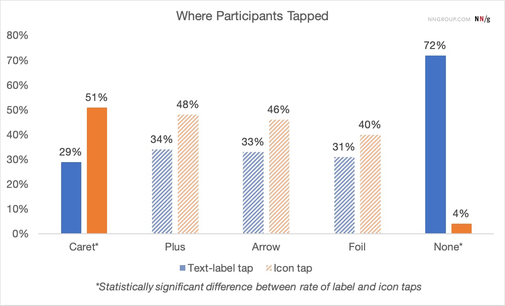
The findings aren’t very surprising: without any icon in use, users expect that tapping on the menu item would take them directly to a new page. Users often struggle with custom icons as they don't clearly signal that they'll open an accordion. And people tend to tap fairly equally on the icon and on the label for most icons.
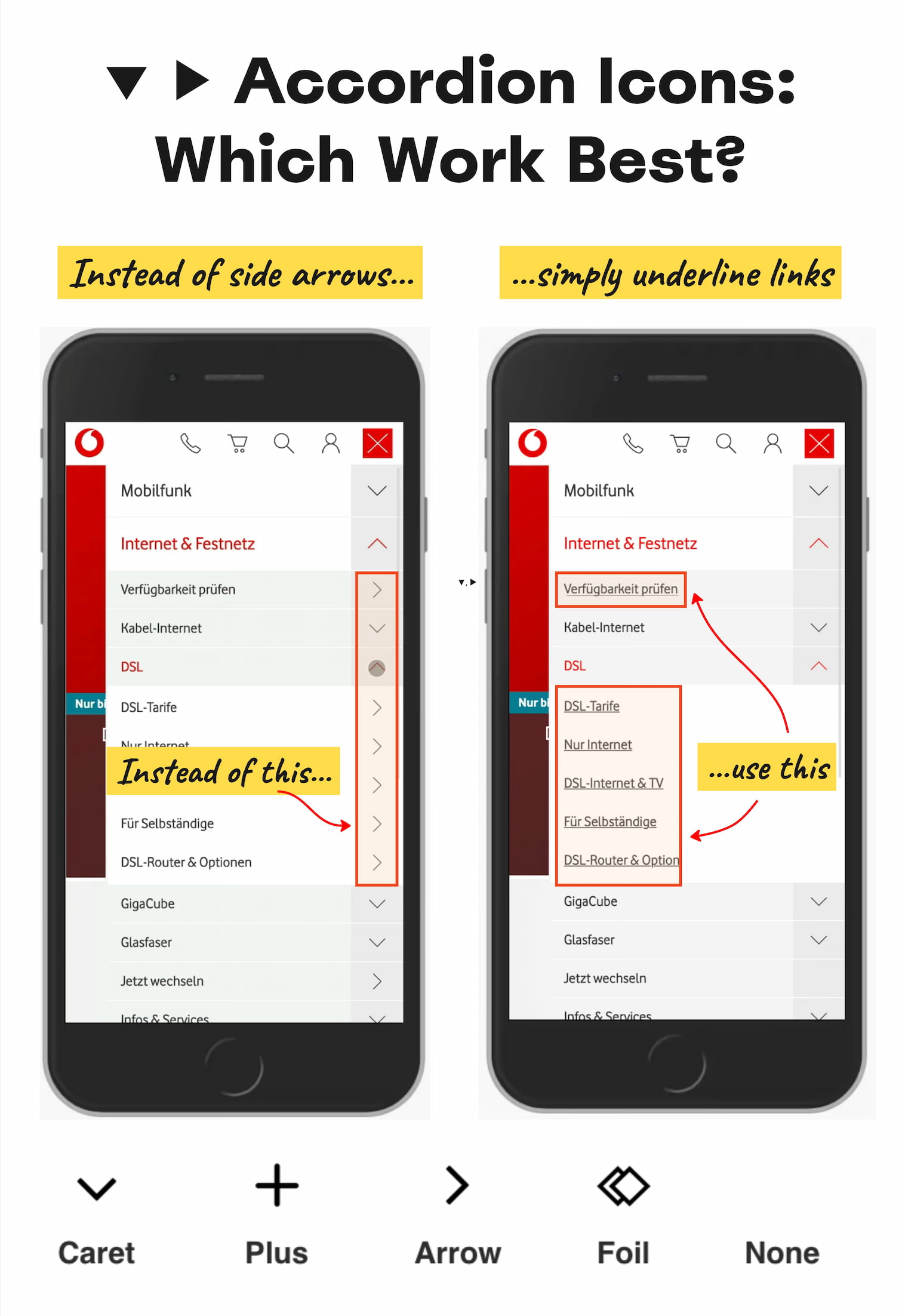
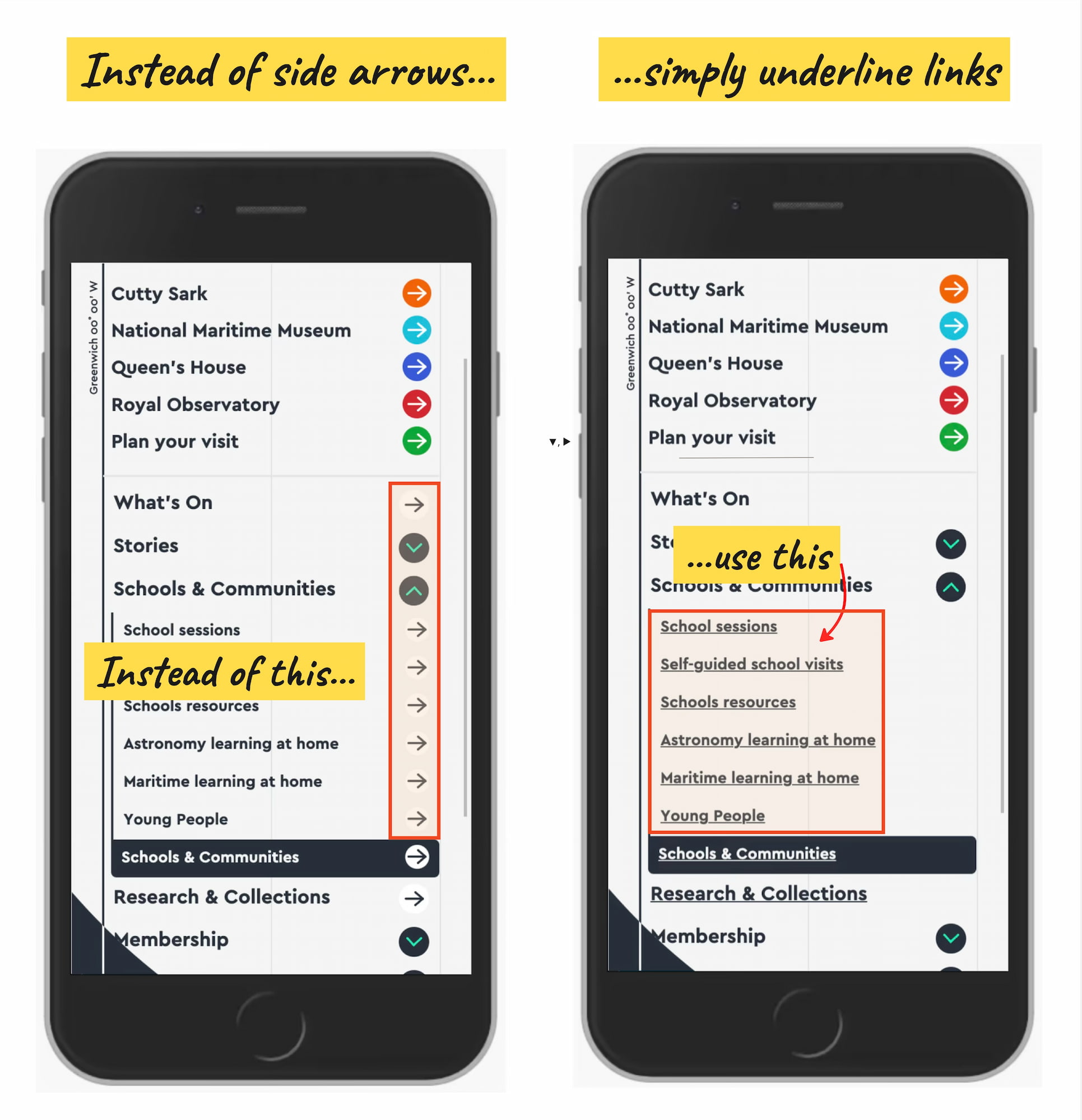
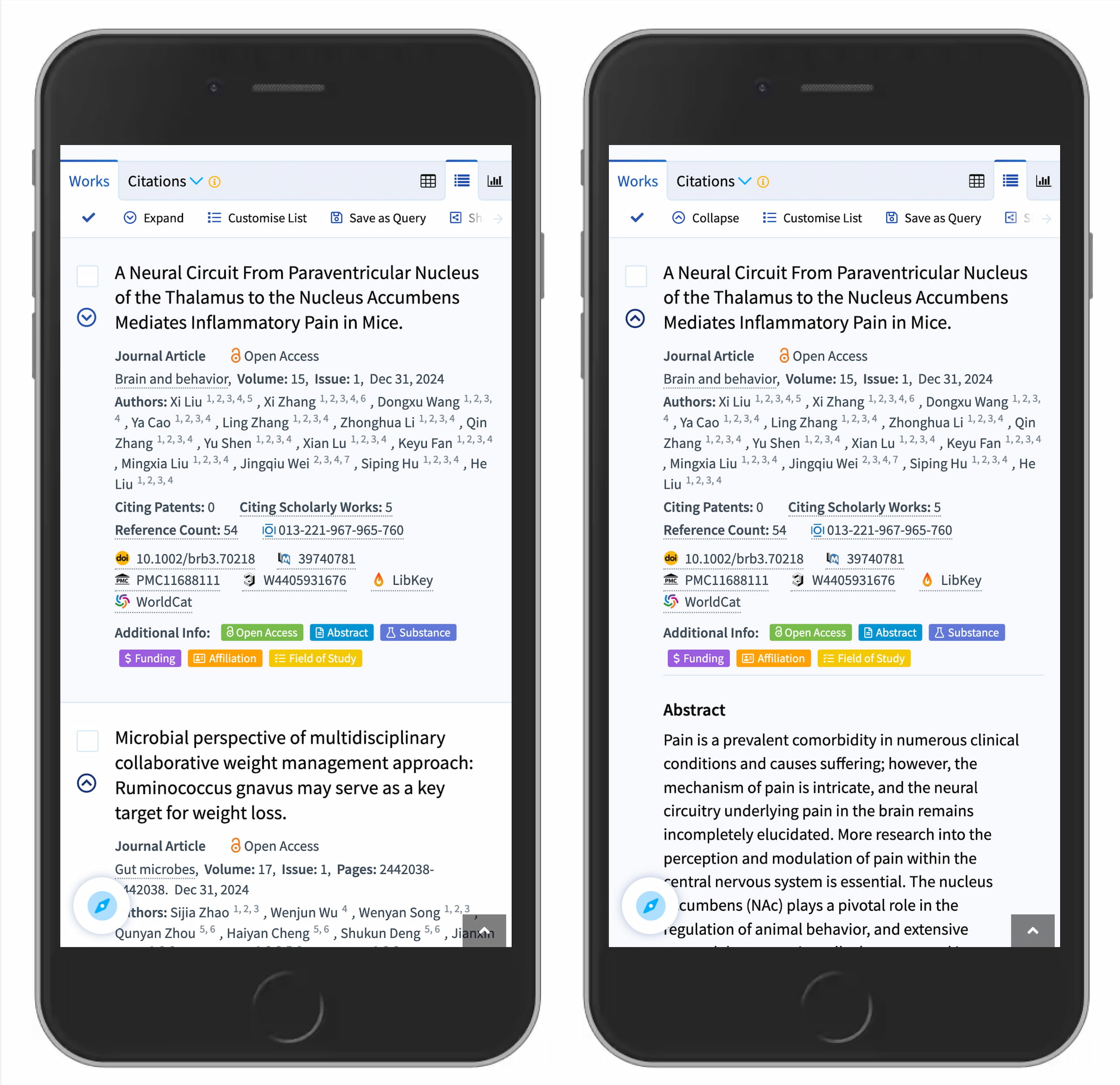
Many designs (like the one below) tend to slightly overcomplicate things by adding arrows and carets pointing everywhere, depending on the state of the accordion. But typically we don't need to use an arrow to indicate a link to the category.
The rule of thumb is very simple: if it’s a link, the easiest and most effective way is to simply underline it — without any arrow, caret, or other icon. Perhaps it’s not particularly exciting, but it works flawlessly every single time.
Confusing Behavior With Arrows ▶ and Split Buttons
Using a right-facing arrow icon ▶ isn’t associated with an expectation of going directly to a new page. And having the same icon pointing down ▼ doesn’t necessarily imply that an accordion is going to open on tap/click.
It’s a good idea to avoid split buttons for accordions — where the text label links directly to a page, but the icon opens the accordion. Instead, it’s much more reliable to allow users to tap on a main category and expose the menu; and to access the category page, we add a link to it inside the menu.
Plus +/− and Arrows ↓/↑ Are Understood, But Can Be Misunderstood
For accordions, we typically use +/− or arrows ↓/↑ to signal expanded and collapsed states, and typically it works well. However, both have many different interpretations. Plus + can mean anything from saving for later to adding to cart to zooming in, and can be particularly confusing for multi-level navigation, with many levels open at the same time.
Arrows ↓/↑ can mean scrolling or sliding or finding the next match, but also a jump to a particular portion of a page. Both plus and arrows are well-understood and work, but depending on the design, can be confusing — mostly because they are overloaded.
Wrapping Up
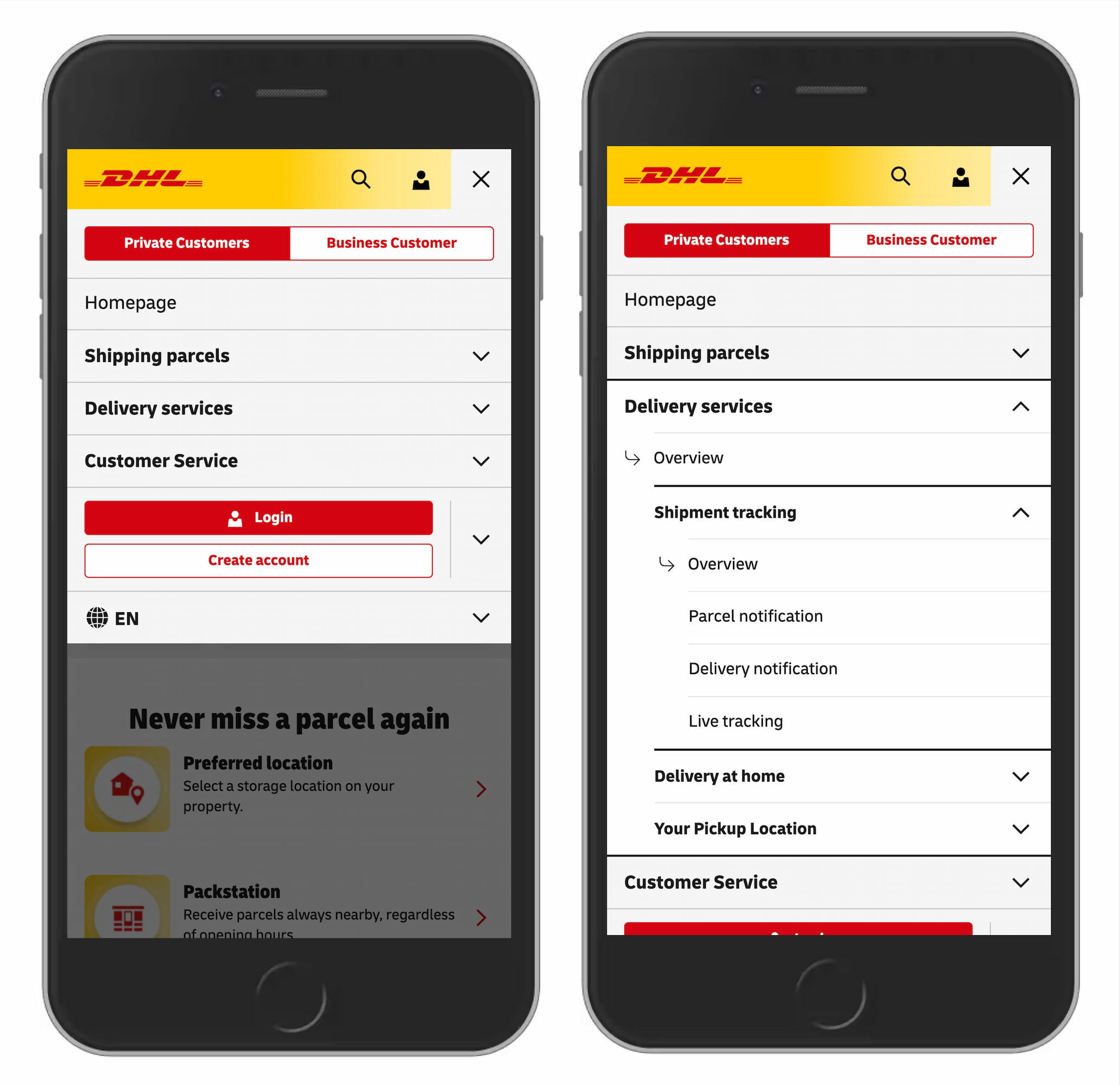
The safe choice is to use the caret/triangle pointing down ▼ by default, and change it to a caret pointing up or a caret pointing sideways ▶ on interaction. If you need an alternative, then +/- typically work well, too.
But we certainly don’t need any further icons or arrows to indicate where the links go. The same goes for split menus, which often produce more mistakes than help. Instead, we have one button or dropdown that does exactly one thing — shows all options and allows users to drill down.
And if you need a direct link, we link the title directly to the page and underline it. More often than not, simpler is better.
Editor’s Note
We hope you’ll find these wonderful projects useful — put together by wonderful creators. A friendly shout-out to everyone sharing their work with folks to use and learn from! That’s one of the reasons why we truly love the web and people building and designing it. 💚
At Smashing, we love the web. That’s why we publish articles and books, run workshops and events around everything web. We love seeing what we all can do to make the web more accessible and usable. We also love organizing and attending online events — with friendly discounts for large groups (5+ attendees) and schools and students. Interested? Just send us an email and we’ll sort it out!
Naming is hard. The language we use shapes the way we think about things, but also the conversation we have about it. That’s why we have so much confusion about colors, icons, UI components, features — and that’s why we struggle to name design tokens, HTML classes, and variables.
Sometimes, the names we choose are too generic, so it’s difficult to understand what exactly is meant. And sometimes they are too specific, leaving little room for flexibility and reuse. How do we choose the right names? And which naming conventions work best? Let’s take a closer look.
How To Name Things
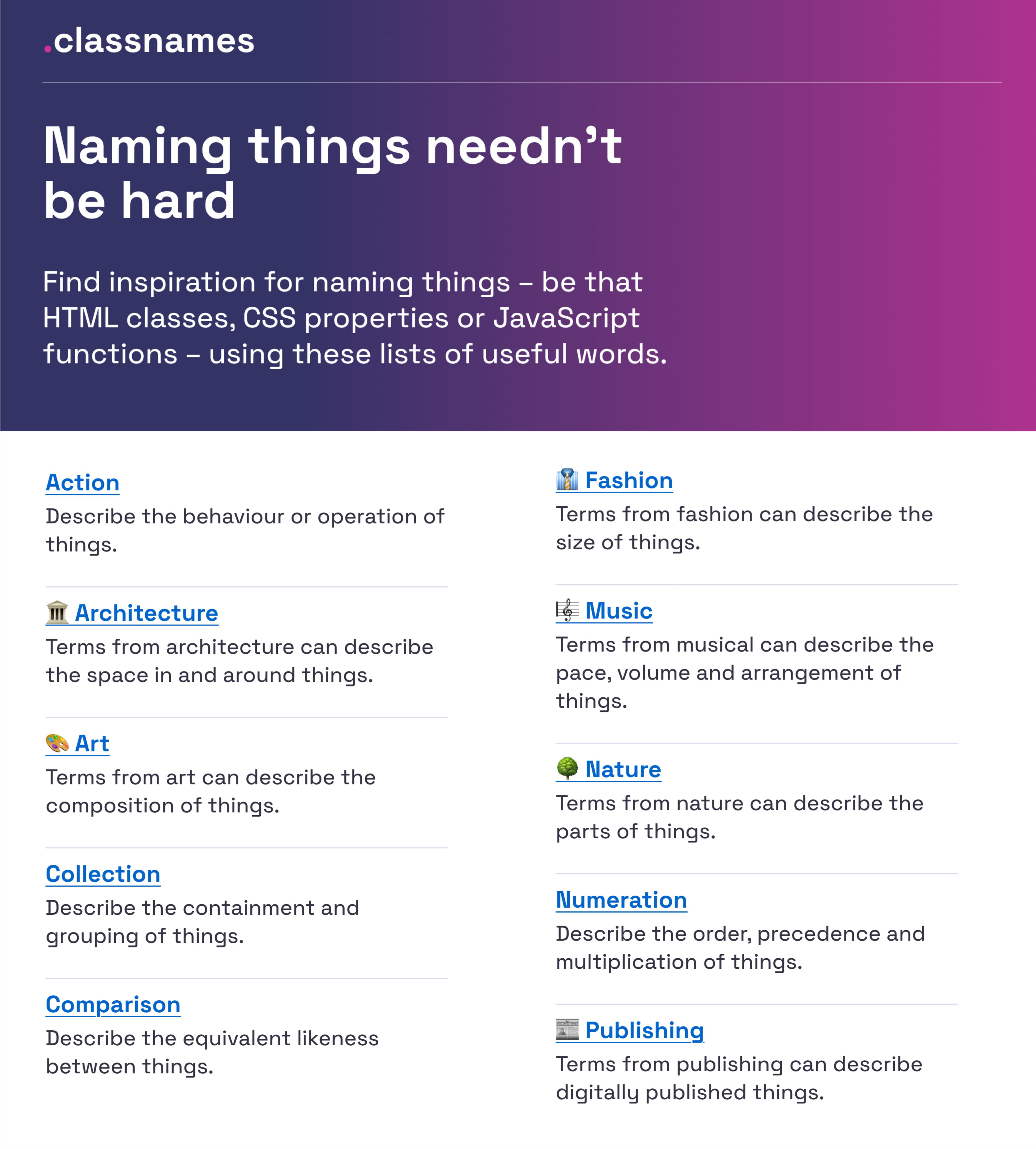
If you’re looking for some inspiration for naming HTML classes, CSS properties, or JavaScript functions, Classnames is a wonderful resource jam-packed with ideas that get you thinking outside the box.
The site provides thematically grouped lists of words perfect for naming. You’ll find terms to describe different kinds of behavior, likeness between things, order, grouping, and association, but also themed collections of words that wouldn’t instantly come to one’s mind when it comes to code, among them words from nature, art, theater, music, architecture, fashion, and publishing.
How To Name Colors
How would you choose the right name for a given color? Fortunately, David Aerne maintains a tremendous repository of color names, currently with 30355 unique color names, sourced from various references and 1000s of user contributions.
What makes a good name? Javier Cuello summarized a set of naming best practices that help you name your layers, groups, and components in a consistent and scalable way.
As Javier points out, a good name has a logical structure, is short, meaningful, known by everyone, and not related to visual properties. He shares do’s and don’ts to illustrate how to achieve that and also takes a closer look at all the fine little details you need to consider when naming sizes, colors, groups, layers, and components.
How To Name Design Tokens
How to build a flexible design token taxonomy that works across different products? That was the challenge that the team at Intuit faced. The parent company of products such as Mailchimp, QuickBooks, TurboTax, and Mint developed a flexible token system that goes beyond the brand theme to serve as the foundational system for a wide array of products.
Nate Baldwin wrote a case study in which he shares valuable insights into the making of Intuit’s design token taxonomy. It dives deeper into the pain points of the old taxonomy system, the criteria they defined for the new system, and how it was created. Lots of takeaways for building your own robust and flexible token taxonomy are guaranteed.
Frequent Names For UI Components
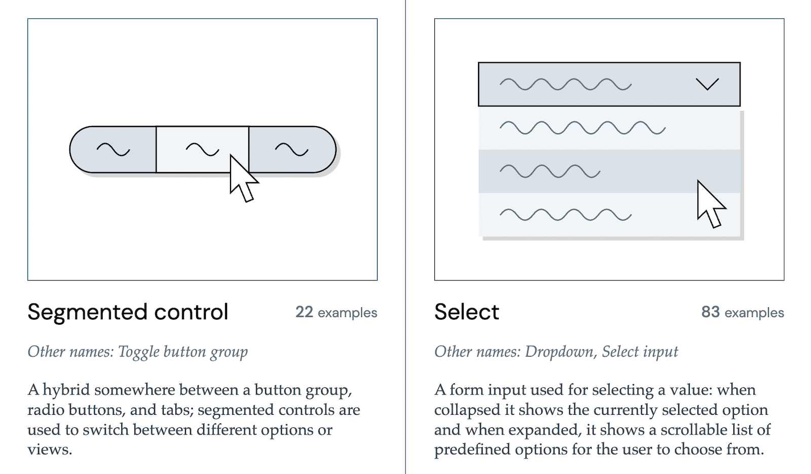
Looking at what other people call similar things is a great way to start when you’re struggling with naming. And what better source could there be than other design systems? Before you end up in the design system rabbit hole, Iain Bean did the research for you and created the Component Gallery.
It’s a collection that includes plenty of examples for more than 50 UI components — from accordion to visually hidden — and also lists other names that the UI components go by. A fantastic resource, and not only with regard to naming.
Bonus: Name That UI, a visual dictionary of common UI components.
How To Name New Features
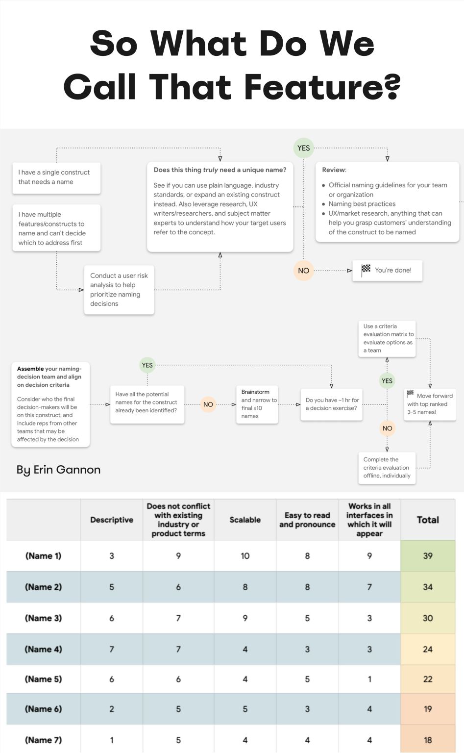
Features often have low adoption due to poor discoverability. Feature adoption needs time — first the feature must be discovered, then understood, then tried, learned, and eventually built into existing workflow. Erin Gannon has written a helpful practical guide on how to make sure all of it happens.
Good names are driven by user needs and problems. They should signal the value or outcome of a feature (the job-to-be-done), and — most importantly! — tap into the user’s own language. So ask people to explain a feature in their own words and then use the words they use.
How To Name Variables (Taxonomy Map)
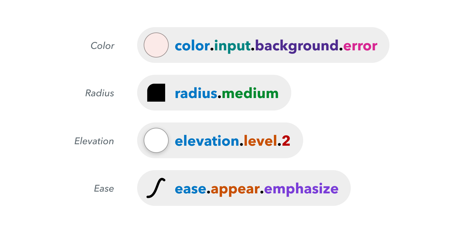
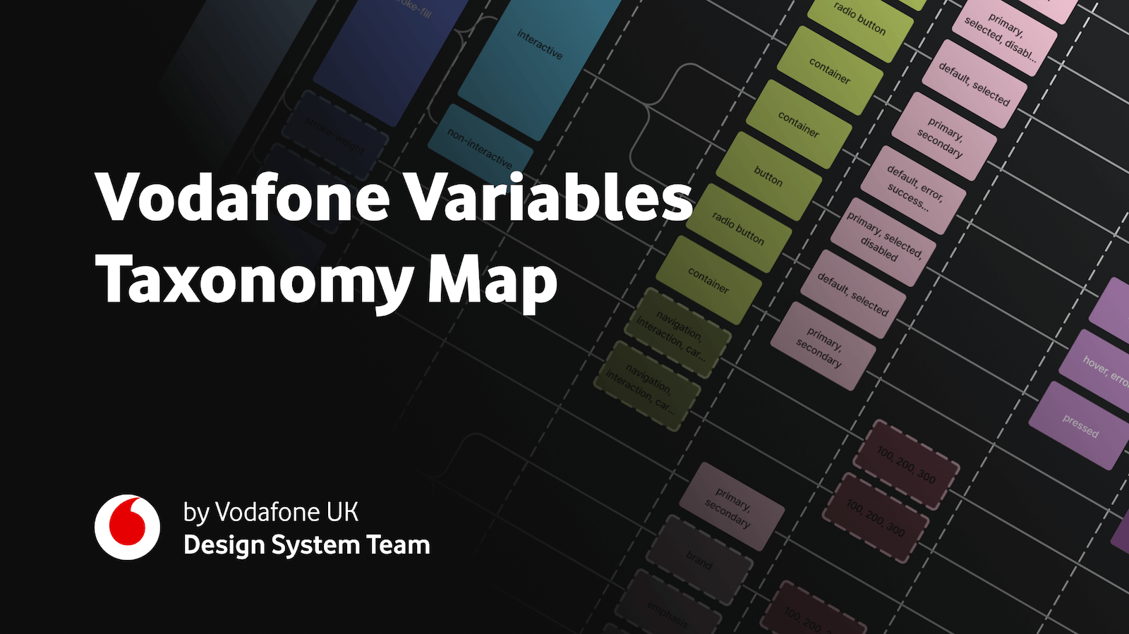
A wonderful example of naming guidelines for a complex multi-brand, multi-themed design system comes from the Vodafone UK Design System team. Their Variables Taxonomy Map breaks down the anatomy and categorization of a design token into a well-orchestrated system of collections.
The map illustrates four collections required to support the system and connections between tokens — from brand and primitives to semantics and pages. It builds on top of Nathan Curtis’ work on naming design tokens and enables everyone to gather insight about where a token is used and what it represents, just from its name.
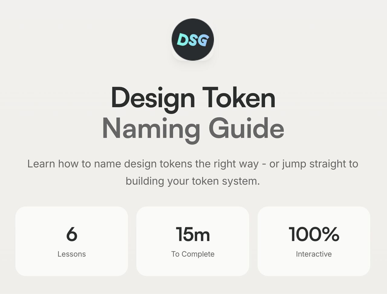
Romina Kavcic created a helpful little tool for naming design tokens — from learning how they work and how to name them well to configuring your own naming structure with components, categories, states, and roles.
Bonus: The Design Token Names Inventory spreadsheet, with a simple structure with four levels to give you a bird’s-eye view of all your design tokens. You can easily add rows, themes, and modes without losing track, and filter your tokens.
Naming Products or Services
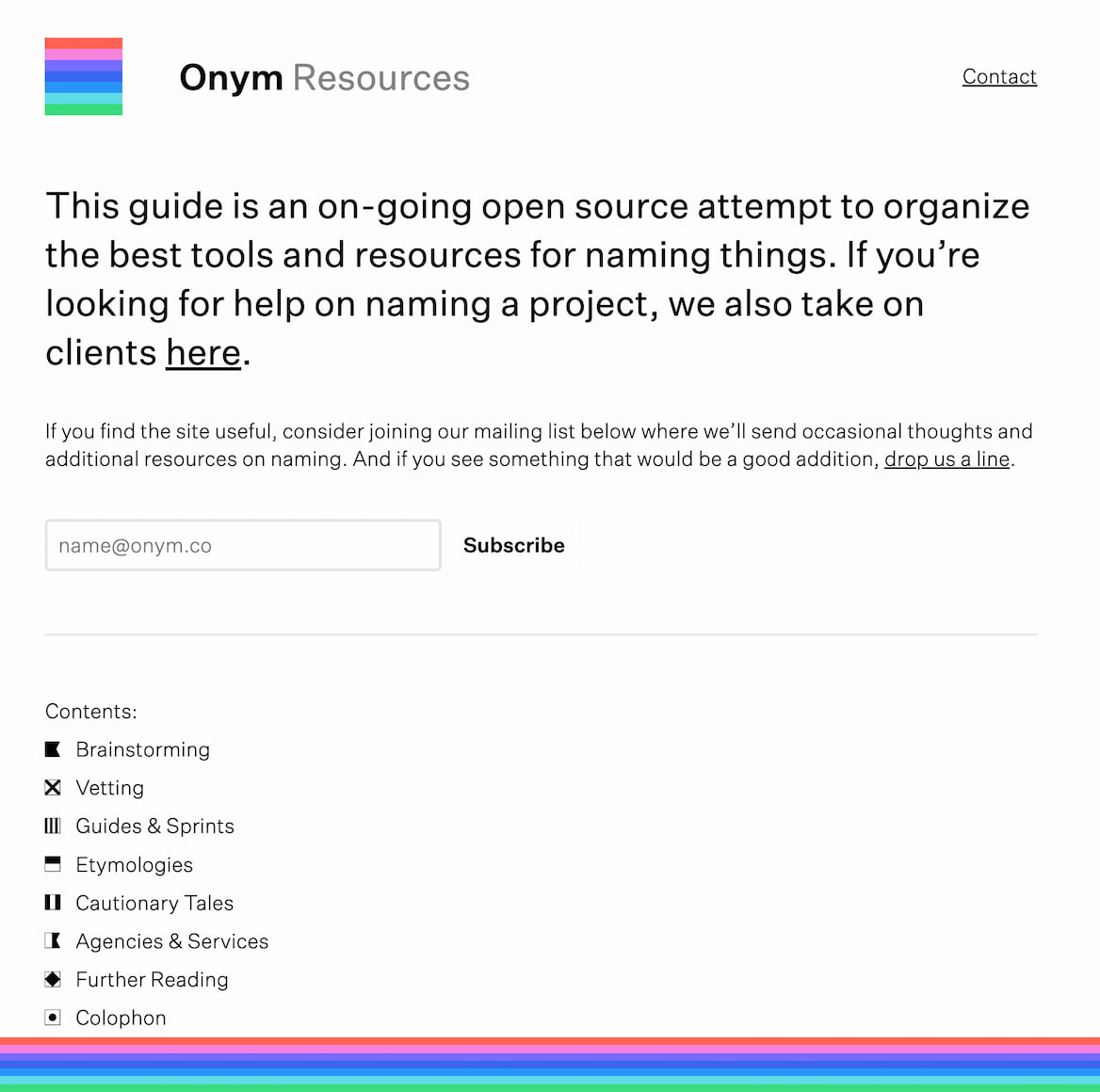
If you are looking for the right name for your product or service, Onym is a fantastic open-source repository that organizes tools and resources for finding names for brainstorming, vetting, guides, sprints, etymologies — all the way to cautionary tales and agencies that name things, as well as useful books to take a look at.
Useful Bookmarks for Naming Things
A quick-reference list of tools and guides for naming just about... well, anything, in one place:
The right name is the one that’s well-understood and used by the team and users. So much time is wasted speaking about the very same thing but in different dialects — the designer’s dialect, the developer’s dialect, the product manager’s dialect, and the user’s dialect. That’s what often causes frustration and confusion.
So if you see low adoption, it might be merely because of the name. And pay attention to potential naming conflicts and put them in a backlog of things to address later. It’s one of those fine little details that can reduce frustration and confusion and help teams work together better.
Editor’s Note
We hope you’ll find these wonderful projects useful — put together by wonderful creators. A friendly shout-out to everyone sharing their work with folks to use and learn from! That’s one of the reasons why we truly love the web and people building and designing it. 💚
At Smashing, we love the web. That’s why we publish articles and books, run workshops and events around everything web. We love seeing what we all can do to make the web more accessible and usable. We also love organizing and attending online events — with friendly discounts for large groups (5+ attendees) and schools and students. Interested? Just send us an email and we’ll sort it out!
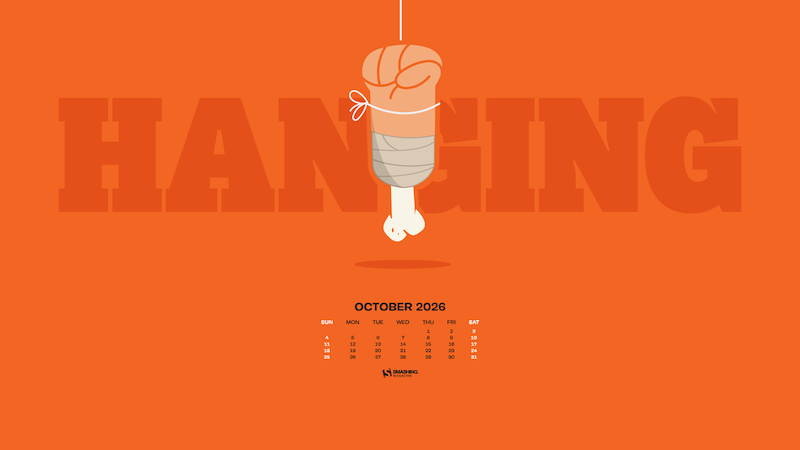
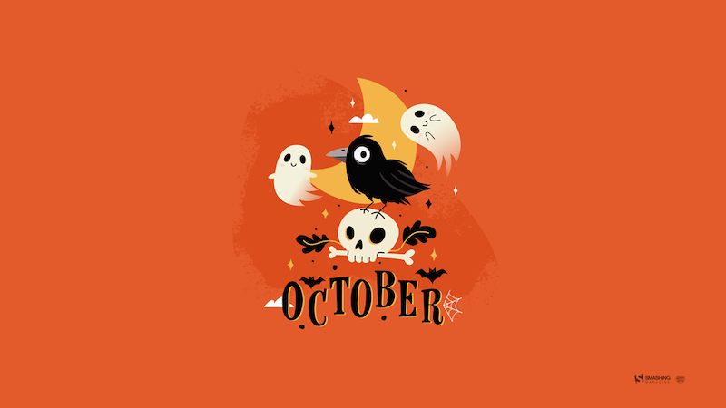
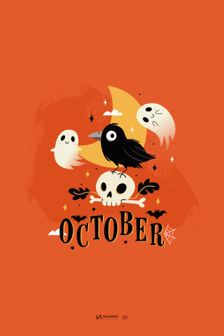
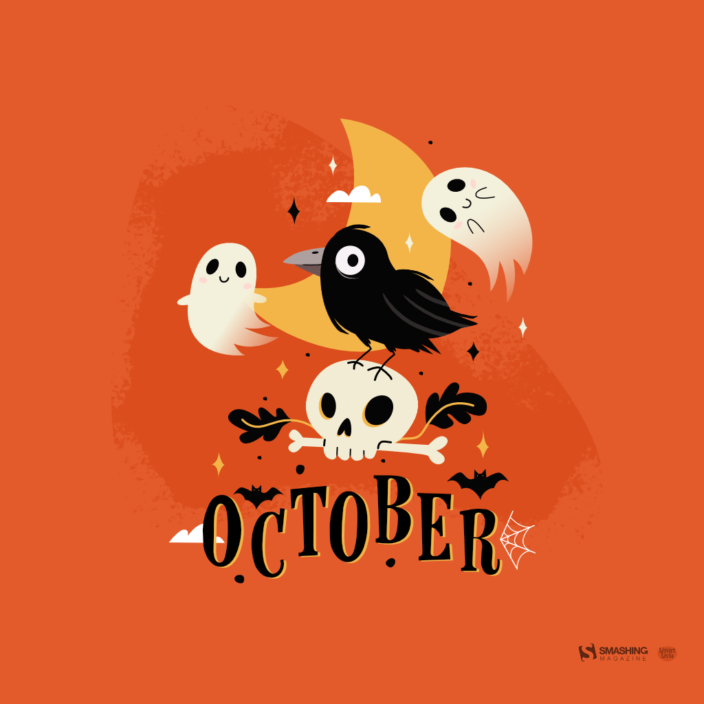
Misty mornings, leaves shining in bright red, yellow, and orange hues, and spooky creatures making an appearance — October has a very special charm. So, how about some new desktop wallpapers to celebrate October’s beauty, and the upcoming Halloween season, of course? Well, we’ve got you covered.
Just like it has been a monthly tradition here at Smashing Magazine for more than 15 years already, the wallpapers in this post were created by artists and designers from across the globe. All of them come in a variety of screen resolutions and can be downloaded for free. A huge thank-you to everyone who shared their designs with us — you are truly smashing!
Now, before you pick your favorite for the month, did you know that you can also get featured in one of our upcoming wallpapers posts? We are always looking for creative talent, so please don’t hesitate to join in. We’d love to see what you come up with!
You can click on every image to see a larger preview.
We respect and carefully consider the ideas and motivation behind each and every artist’s work. This is why we give all artists the full freedom to explore their creativity and express emotions and experience through their works. This is also why the themes of the wallpapers weren’t anyhow influenced by us but rather designed from scratch by the artists themselves.
A Night Of Universal Magic And Joy
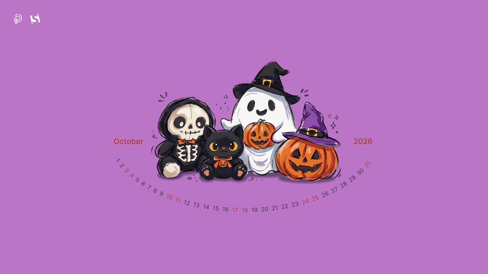
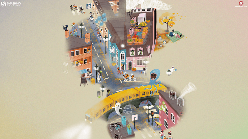
“From candlelit streets in Europe to vibrant festivals across the Americas, Halloween has become a global celebration that unites people of all ages. It is a magical night where children step into the shoes of their favorite heroes for candy-filled adventures, while adults rediscover the pure, playful excitement of childhood. Across cultures and continents, glowing pumpkins and festive costumes light up the autumn dark, bringing neighbors together, sparking laughter, and proving that joy knows no age limit.” — Designed by PopArt Studio from Novi Sad, Serbia.
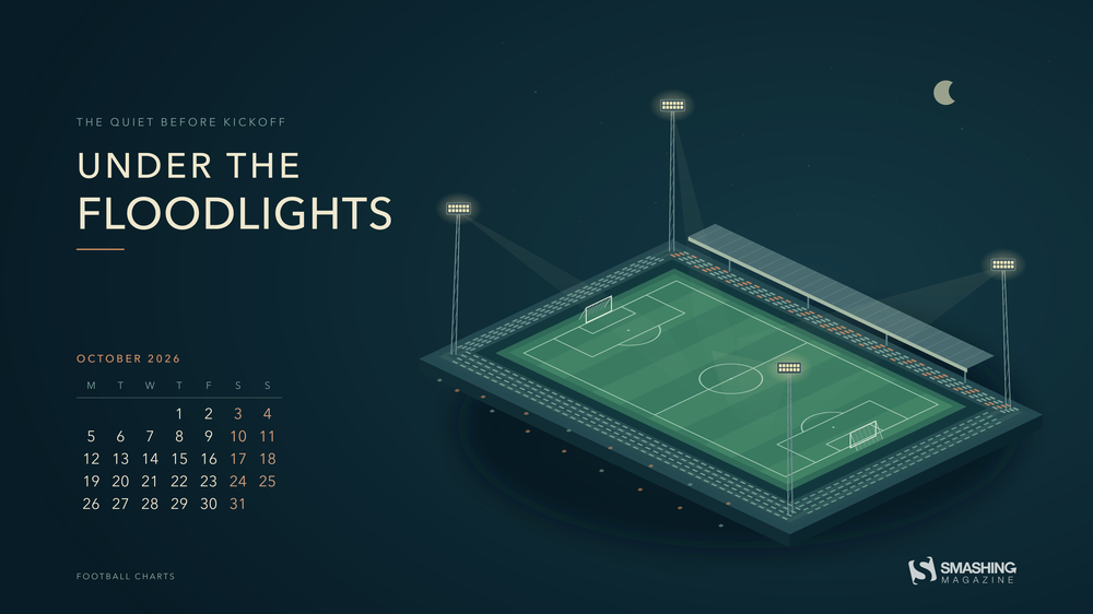
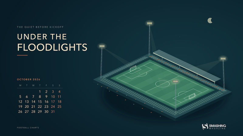
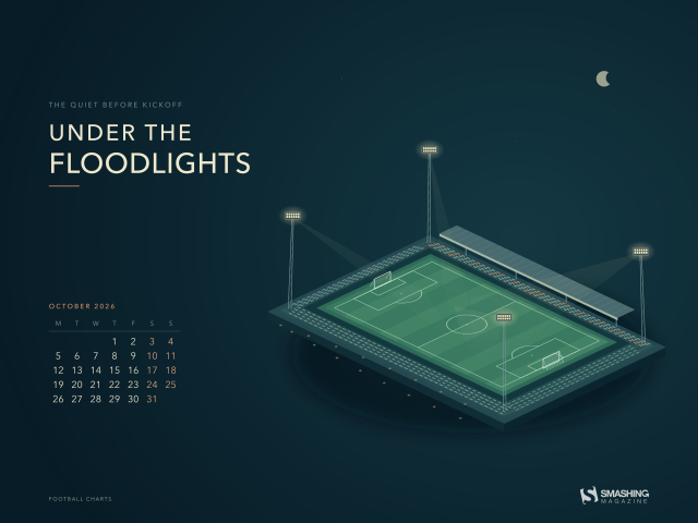
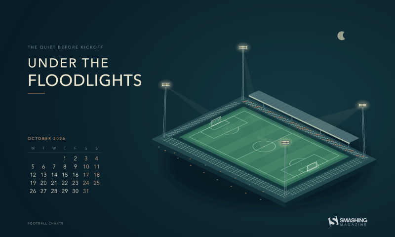
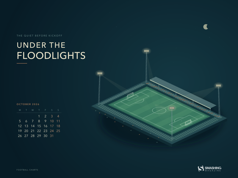
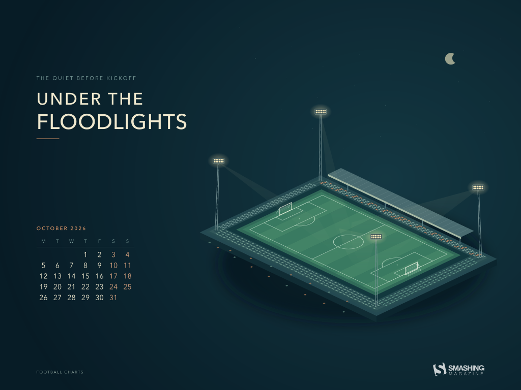
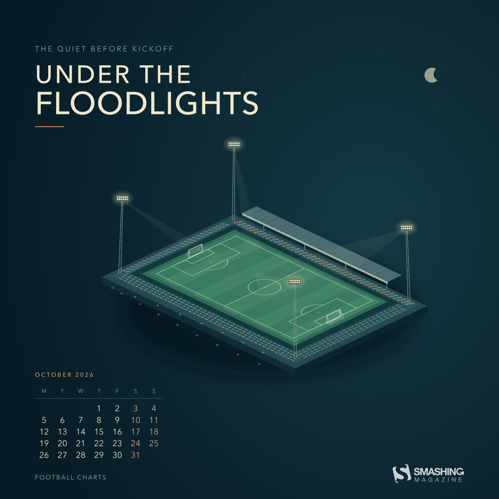
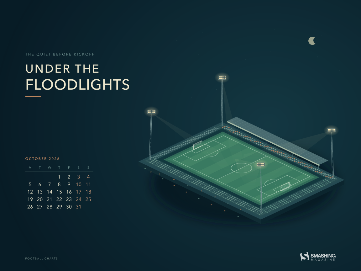
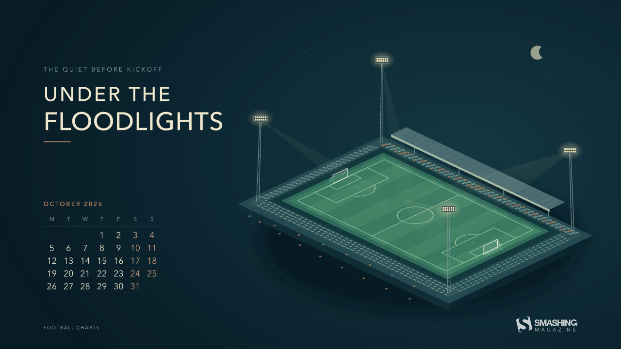
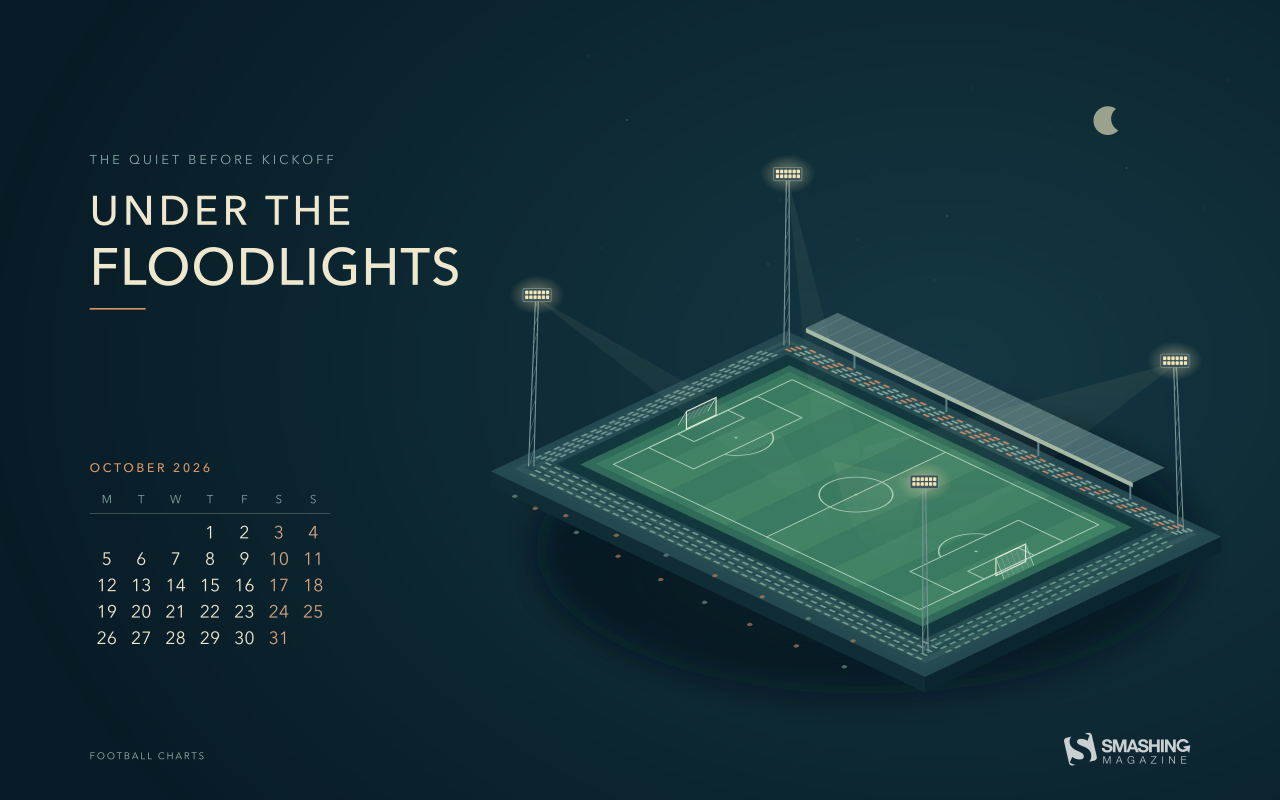
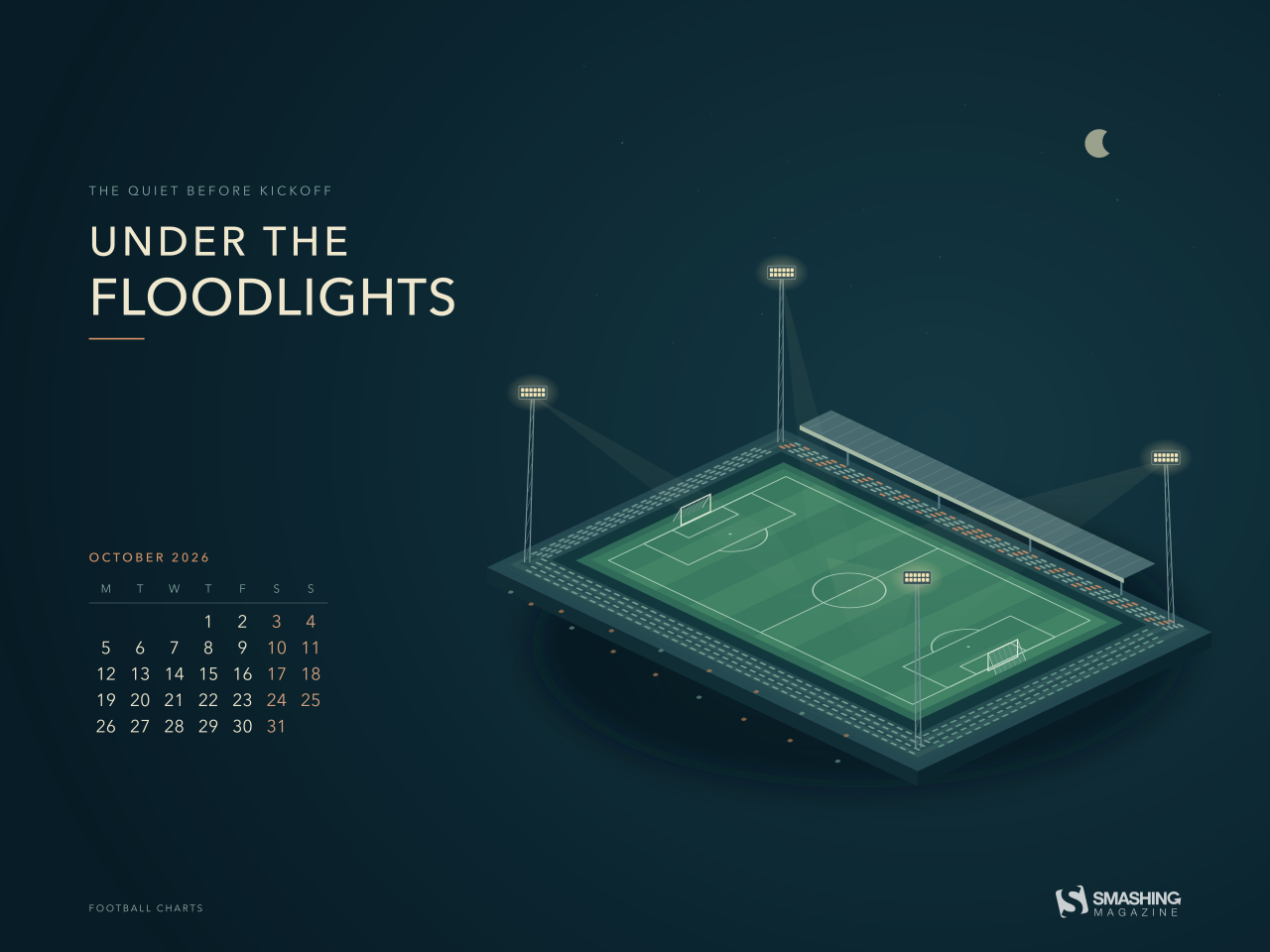
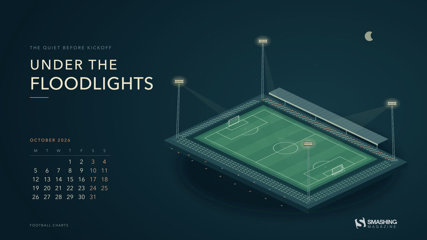
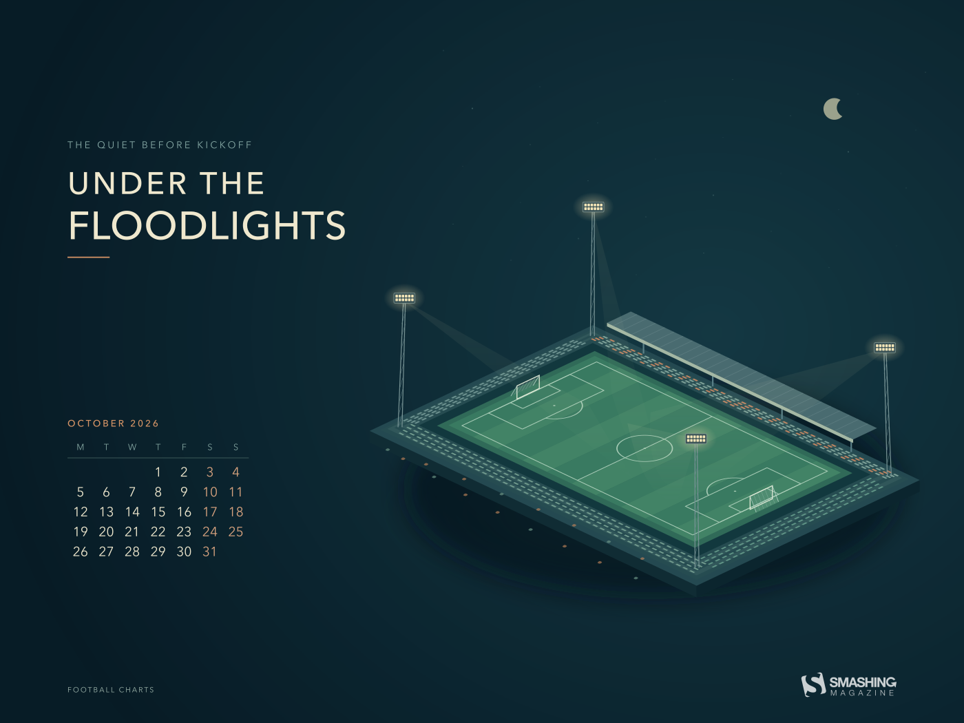
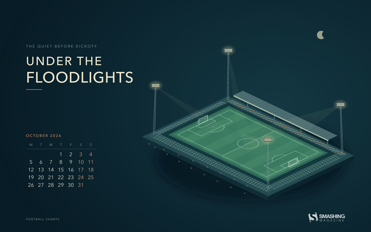
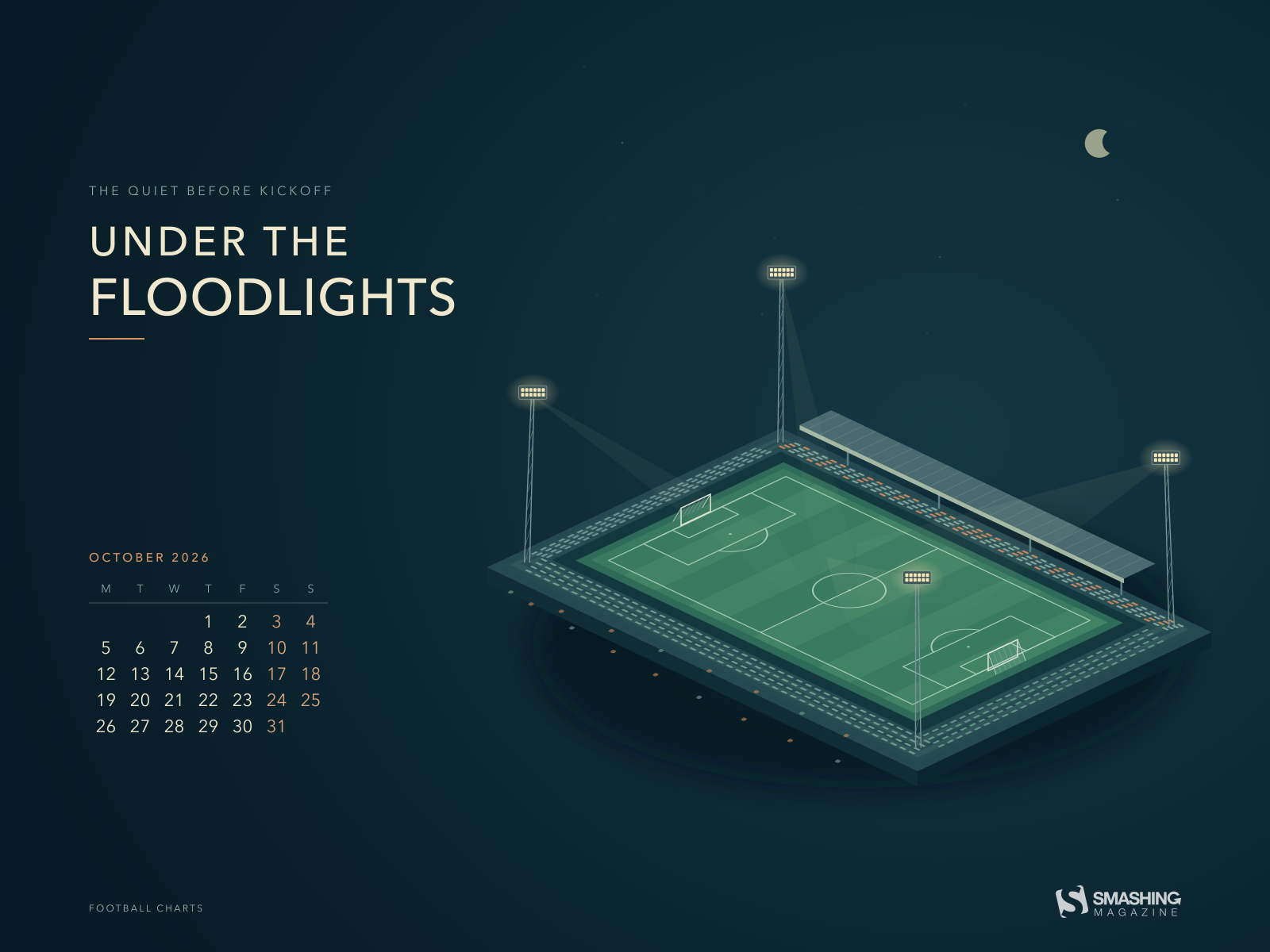
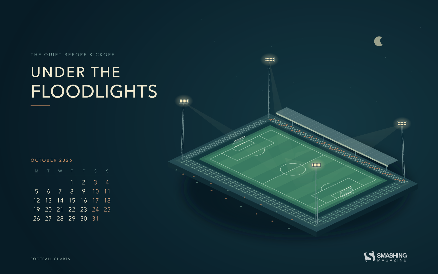
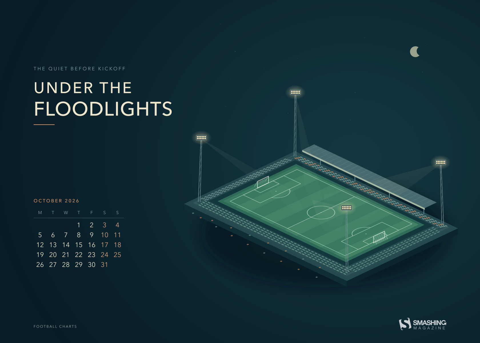
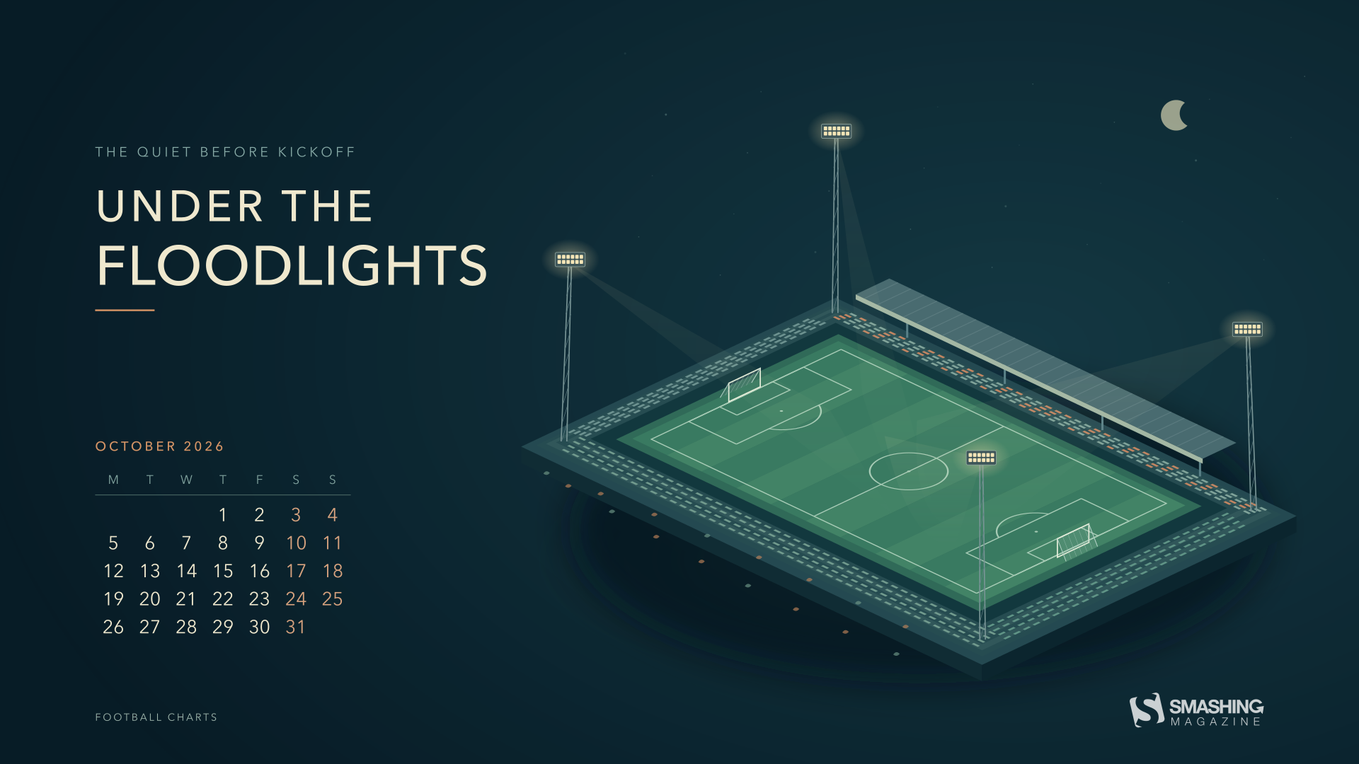
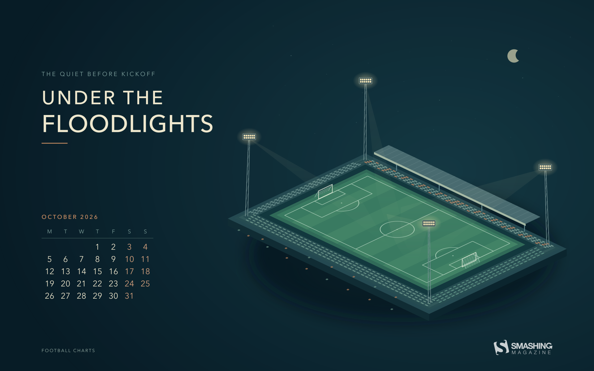
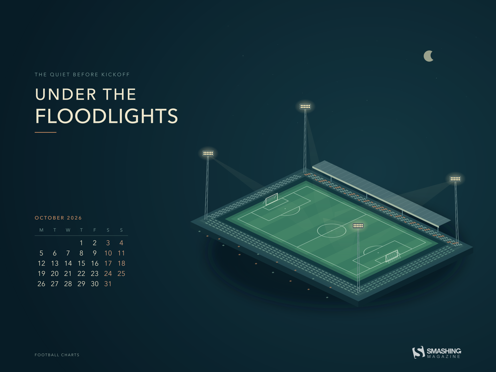
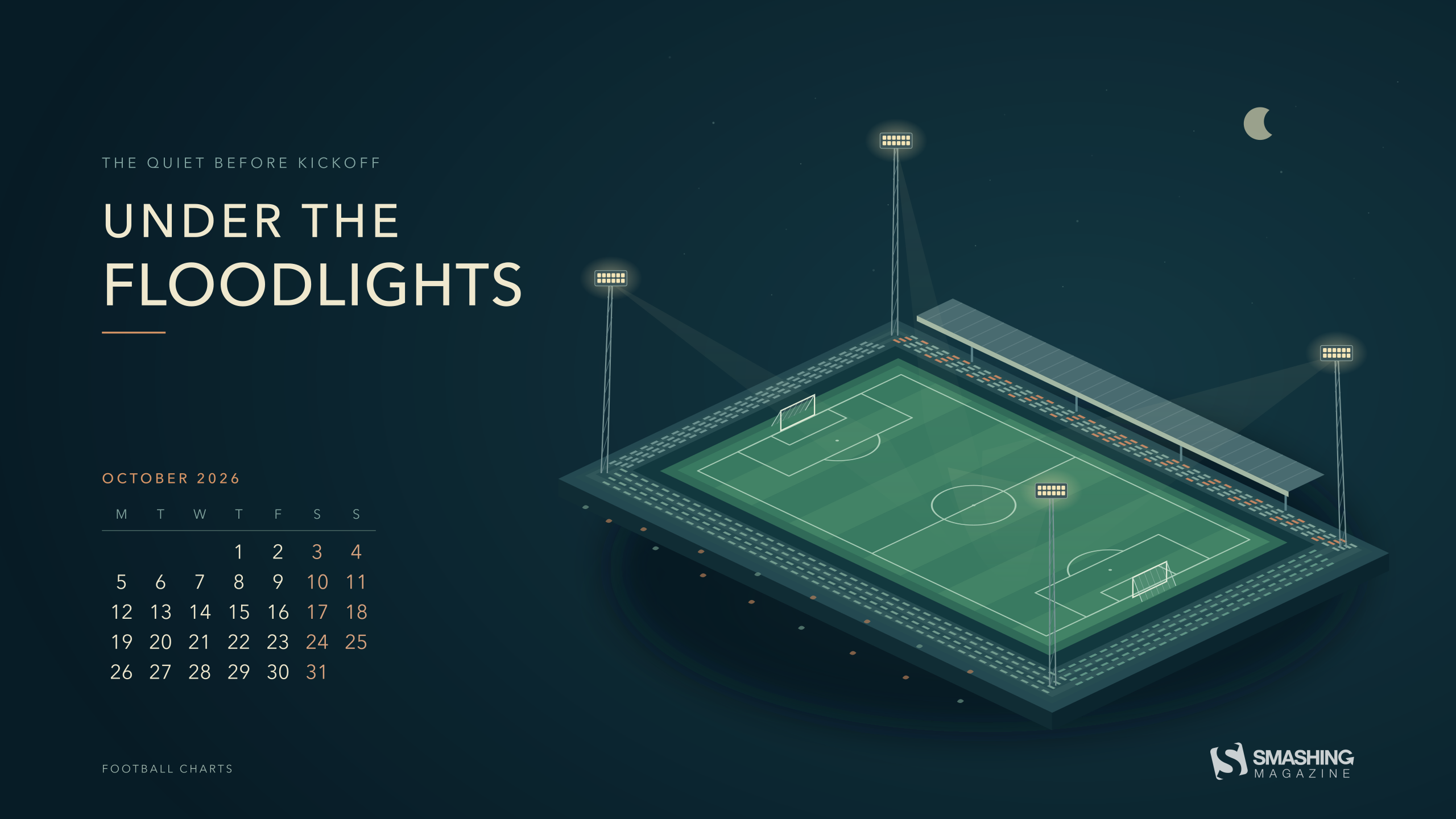
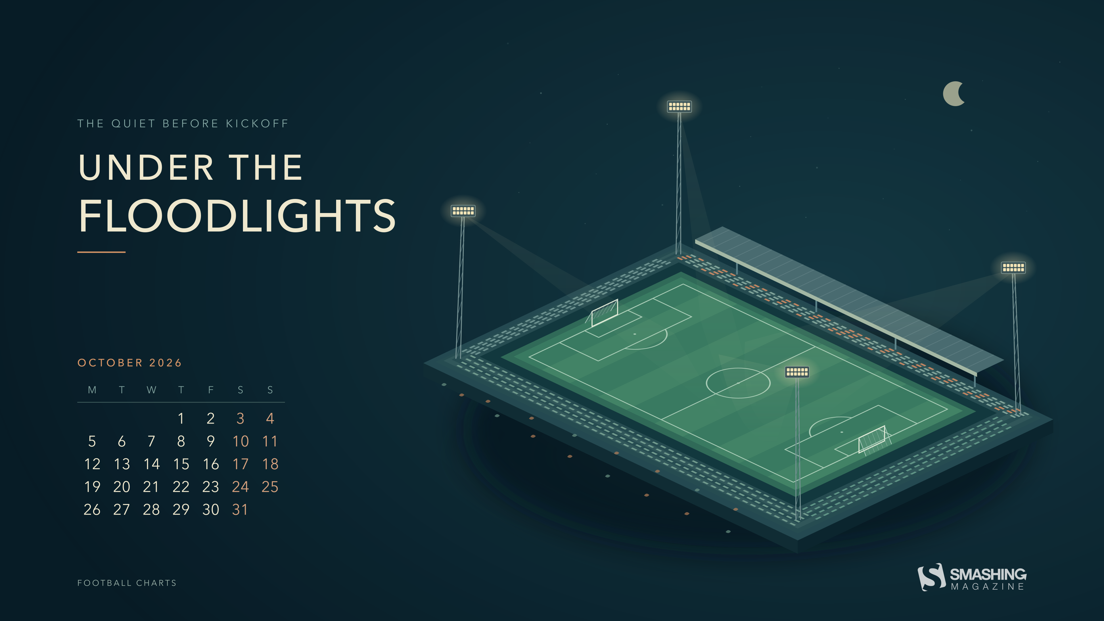
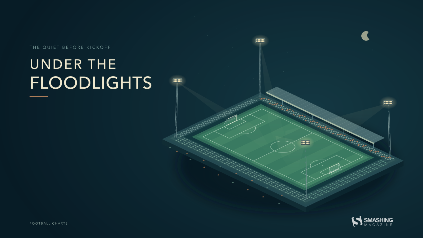
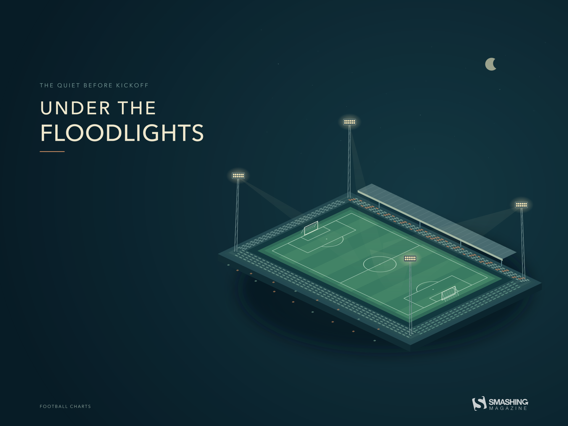
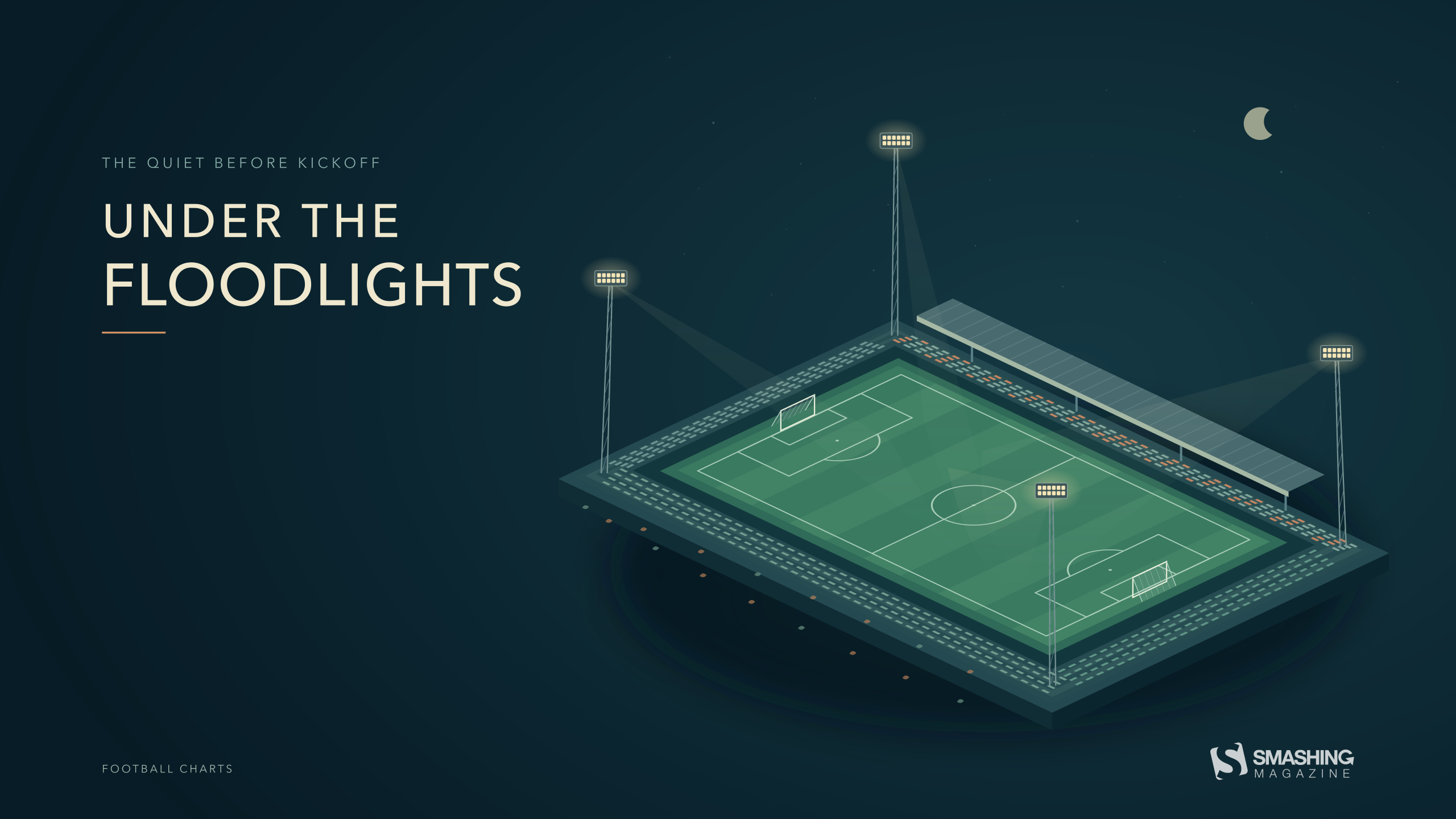
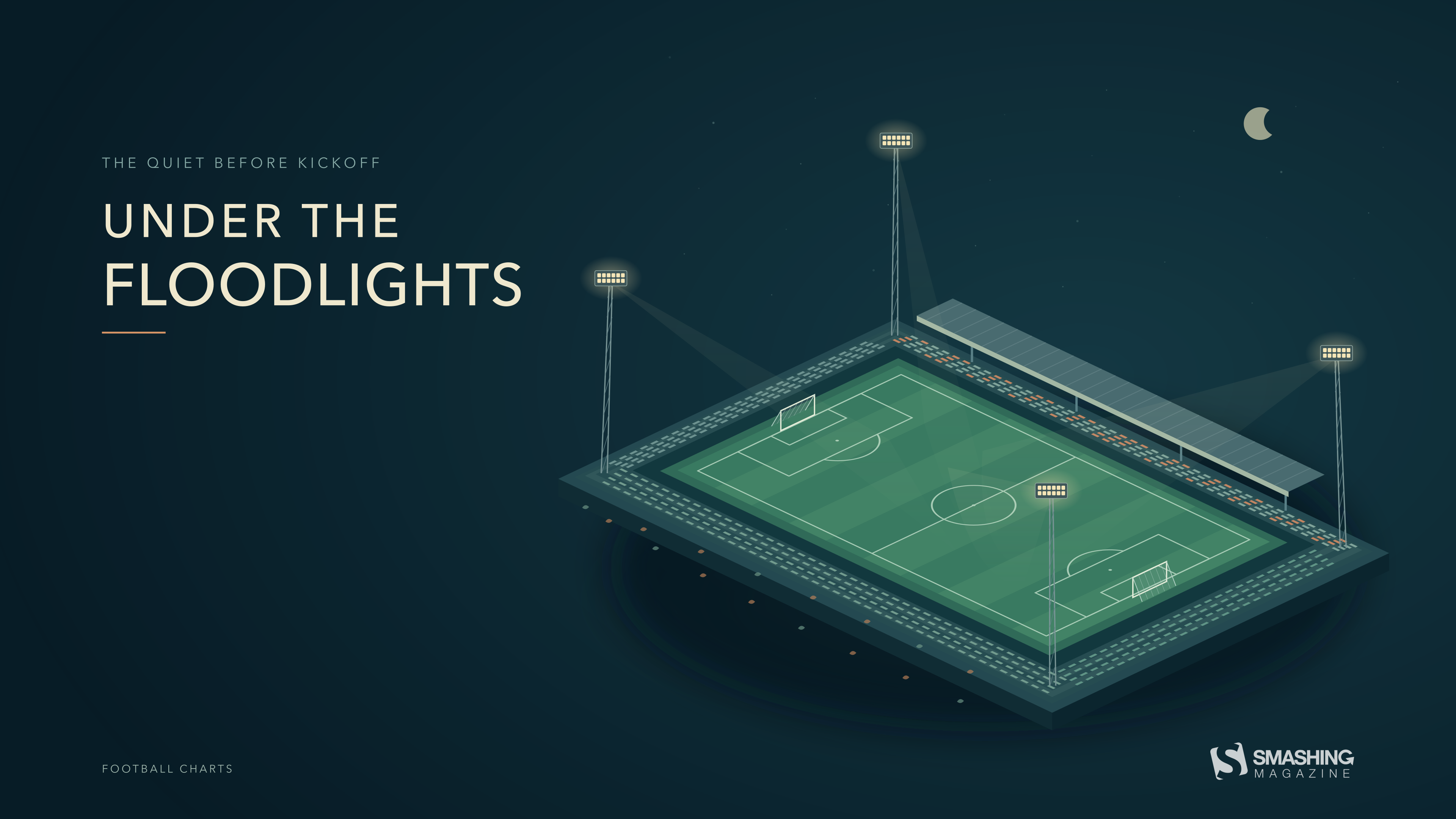
“October football begins under the lights. This geometric illustration captures the quiet moment before kickoff: an empty pitch, warm floodlights, and a dark autumn sky. A few fallen leaves hint at the season, while the open composition leaves room for the everyday things on your desktop.” — Designed by Football Charts from Serbia.
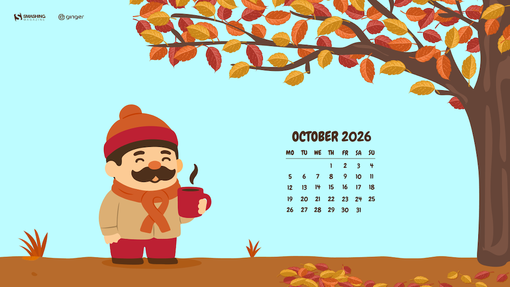
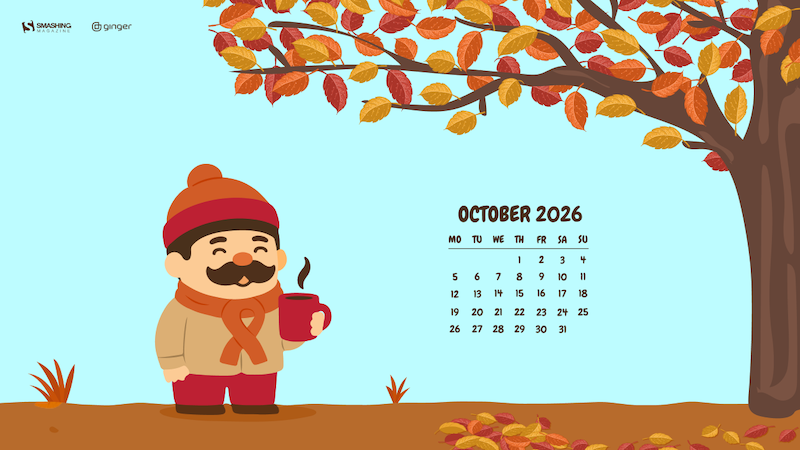
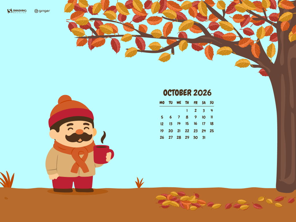
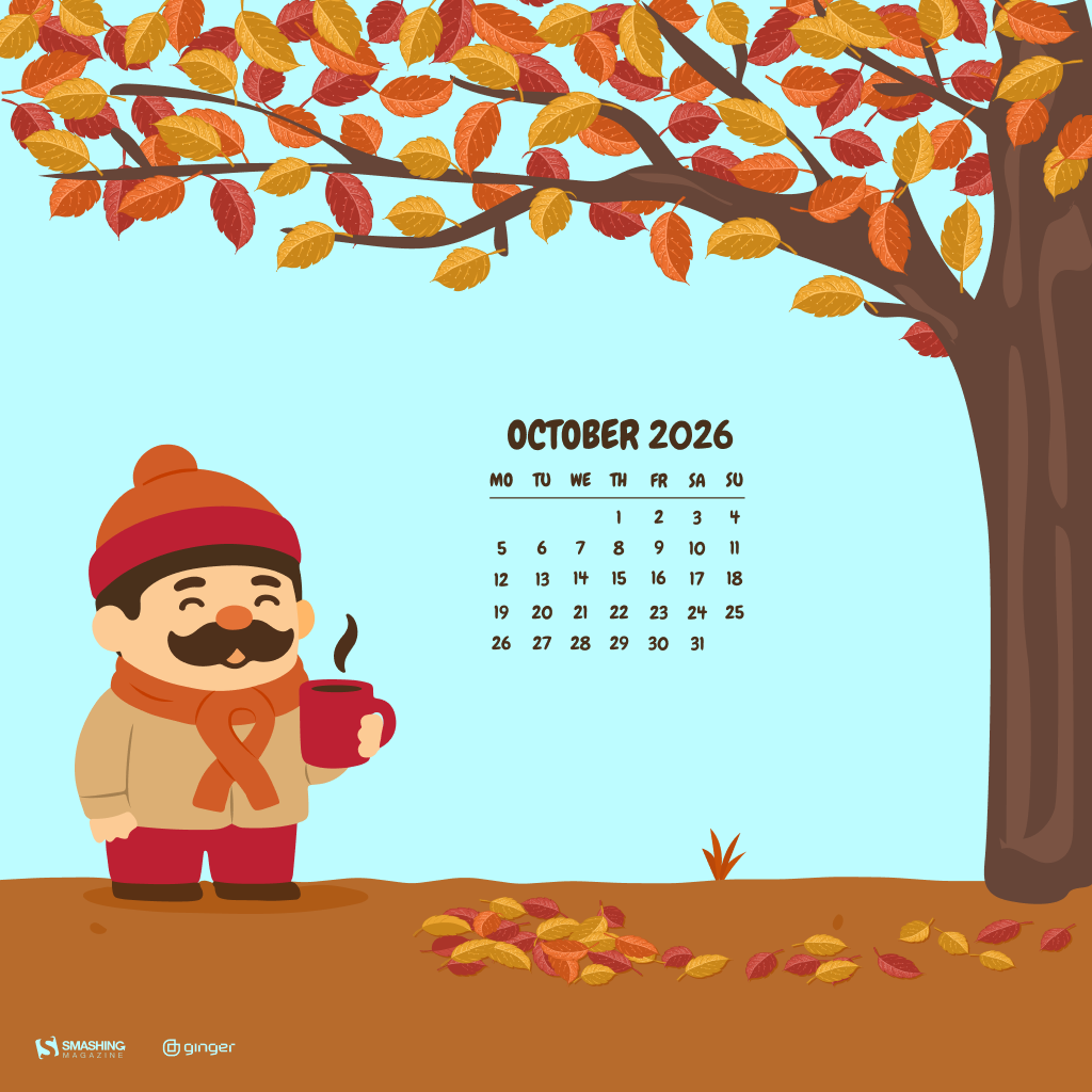
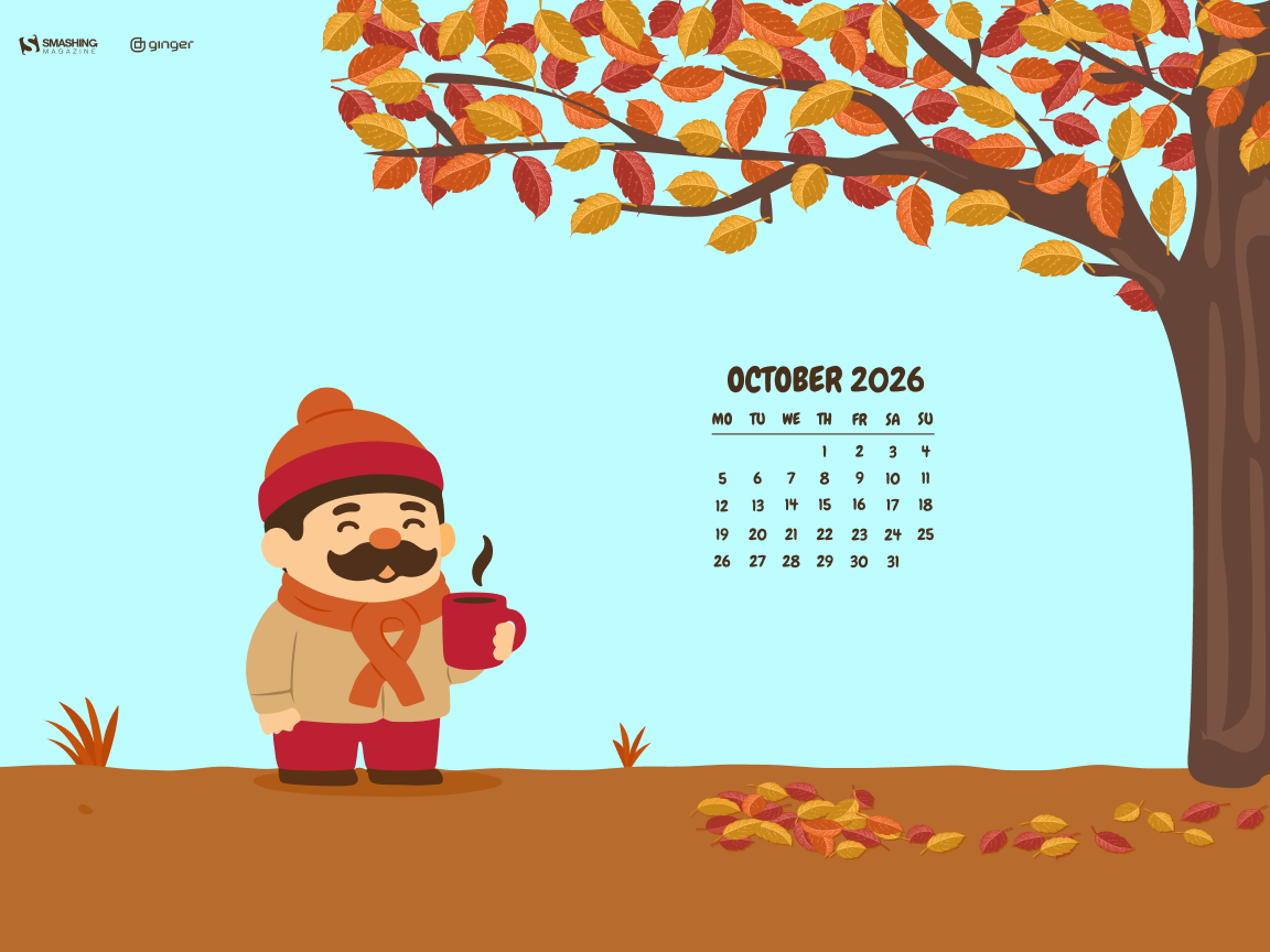
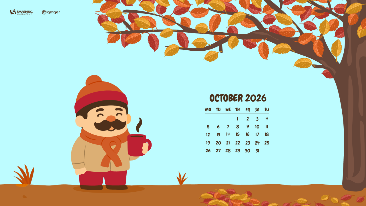
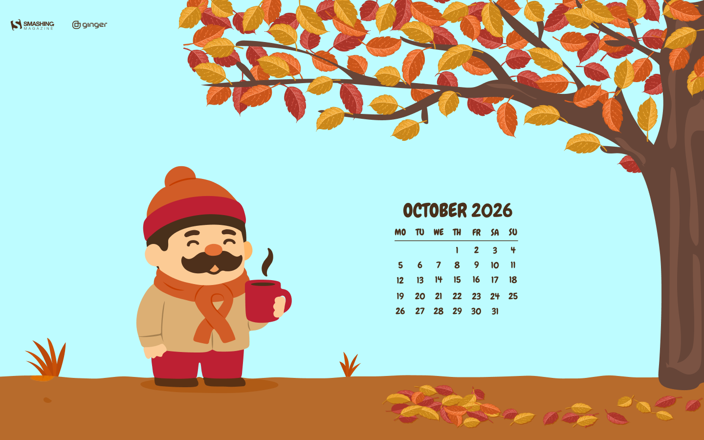
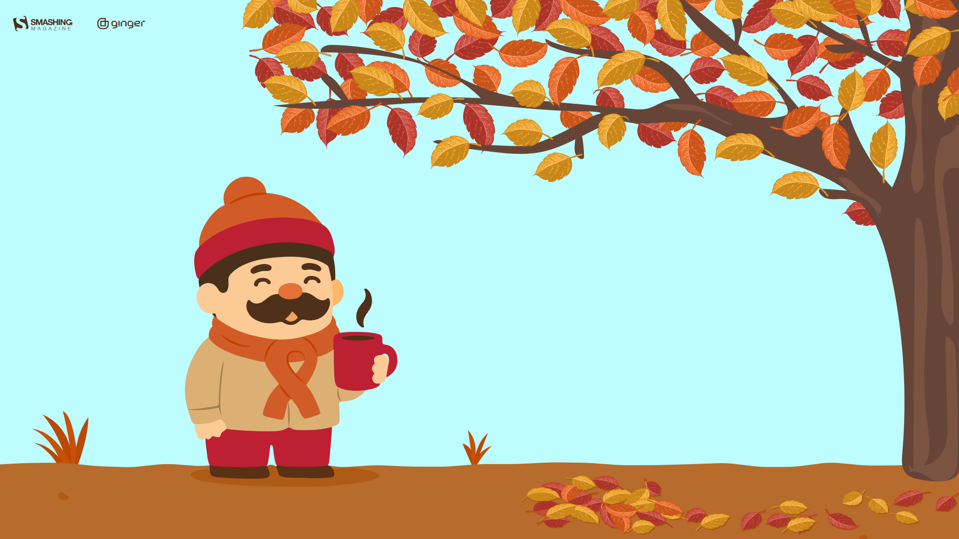
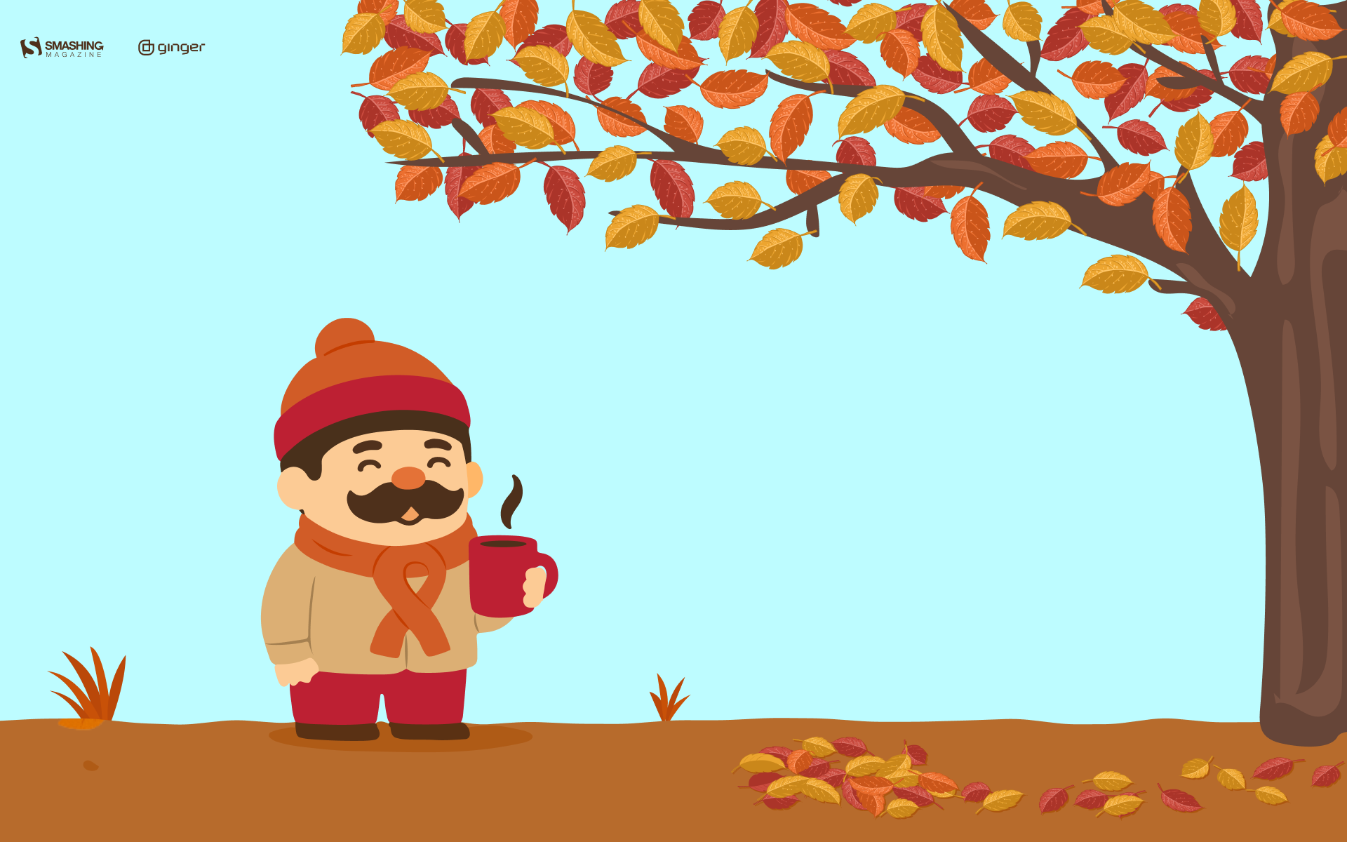
“October is here, which means colder mornings, warmer clothes, and coffee that somehow tastes better outside. A small autumn scene for one of the coziest months of the year.” — Designed by Ginger IT Solutions from Serbia.
“When I was young, I had a bird’s nest not so far from my room window. I watched the birds almost every day, because those swallows always left their nests in October. As a child, I dreamt that they all flew together to a nicer place, where they were not so cold.” — Designed by Eline Claeys from Belgium.
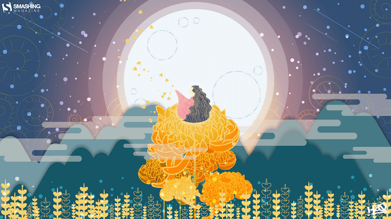
“The term ‘Hanlu’ literally translates as ‘Cold Dew.’ The cold dew brings brisk mornings and evenings. Eventually the briskness will turn cold, as winter is coming soon. And chrysanthemum is the iconic flower of Cold Dew.” — Designed by Hong, ZI-Qing from Taiwan.
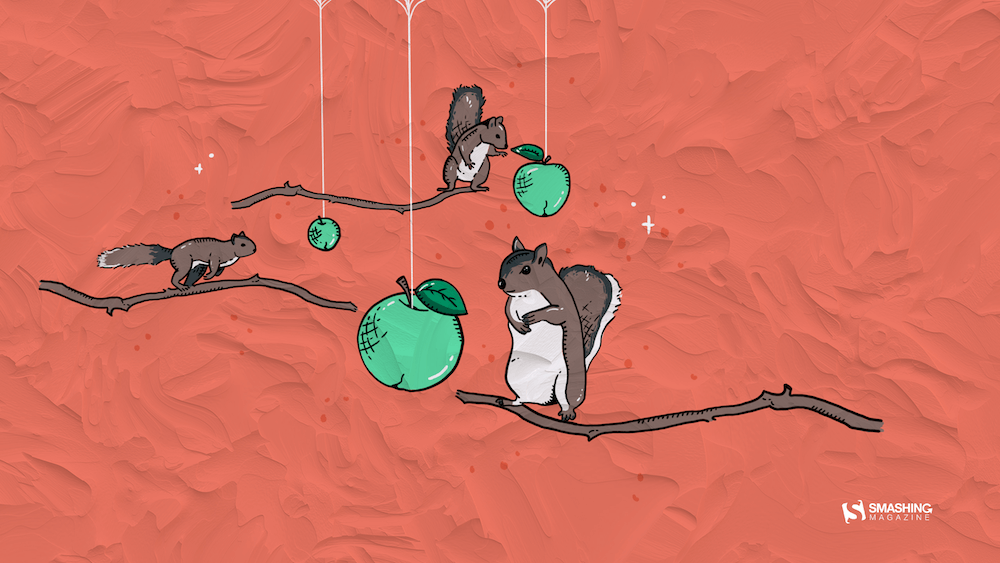
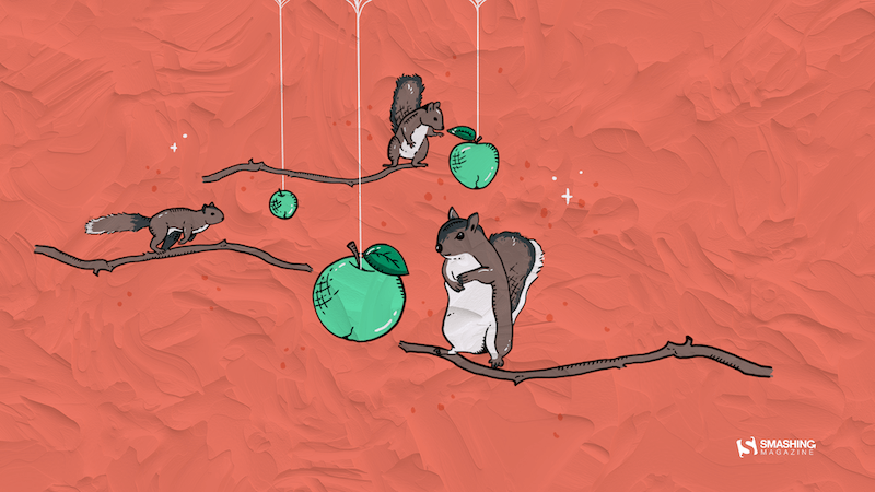
“Did you know that squirrels don’t just eat nuts? They really like to eat fruit, too. Since apples are the seasonal fruit of October, I decided to combine both things into a beautiful image.” — Designed by Erin Troch from Belgium.
“To me, October is a transitional month. We gradually slide from summer to autumn. That’s why I chose to use a lot of gradients. I also wanted to work with simple shapes, because I think of October as the ‘back to nature/back to basics month’.” — Designed by Jelle Denturck from Belgium.
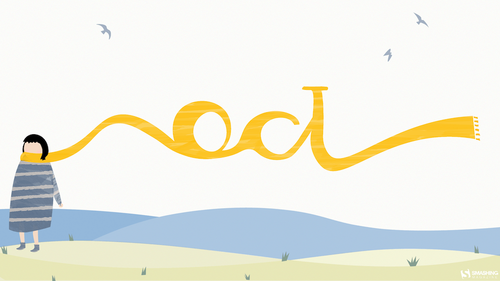
“When I was little, my parents always took me and my sister for a walk at the beach in Nieuwpoort. We didn't really do those beach walks in the summer but always when the sky started to turn gray and the days became colder. My sister and I always took out our warmest scarfs and played in the sand while my parents walked behind us. I really loved those Saturday or Sunday mornings where we were all together. I think October (when it’s not raining) is the perfect month to go to the beach for ‘uitwaaien’ (to blow out), to walk in the wind and take a break and clear your head, relieve the stress or forget one’s problems.” — Designed by Gwen Bogaert from Belgium.
“We are about to experience the magical imagery of nature, with all the yellows, ochers, oranges, and reds coming our way this fall. With all the subtle sunrises and the burning sunsets before us, we feel so joyful that we are going to shout it out to the world from the top of the mountains.” — Designed by PopArt Studio from Serbia.
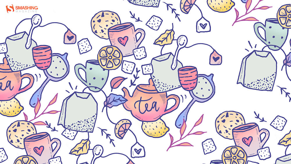
“As it gets colder outside, all I want to do is stay inside with a big pot of tea, eat cookies, and read or watch a movie, wrapped in a blanket. Is it just me?” — Designed by Miruna Sfia from Romania.
“The days are colder, but the colors are warmer, and with every step we go further, new earthly architecture reveals itself, making the best of winters’ dawn.” — Designed by Ana Masnikosa from Belgrade, Serbia.
“To me, October is all about cozy evenings with hot chocolate, freshly baked cookies, and a game night with friends or family.” — Designed by Lieselot Geirnaert from Belgium.
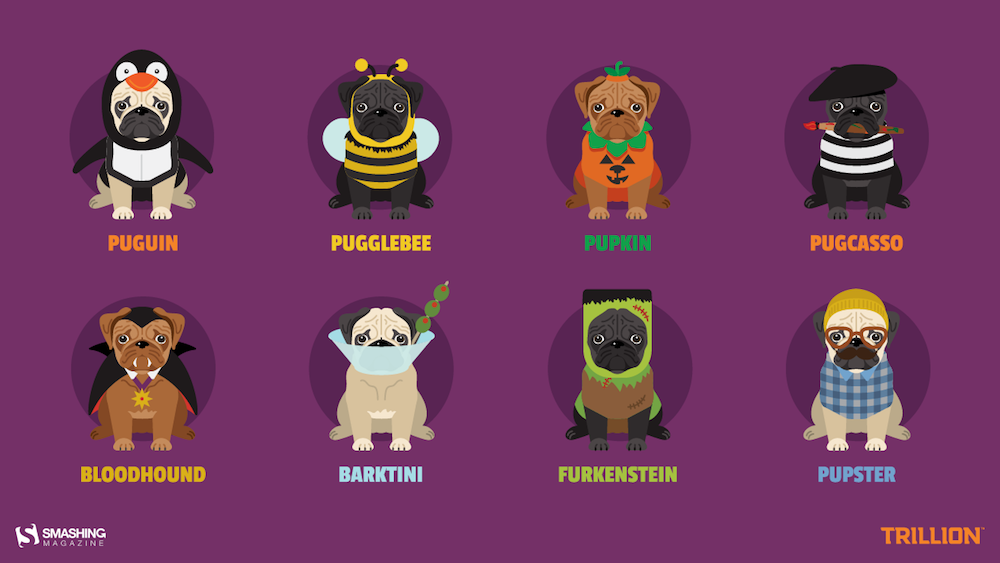
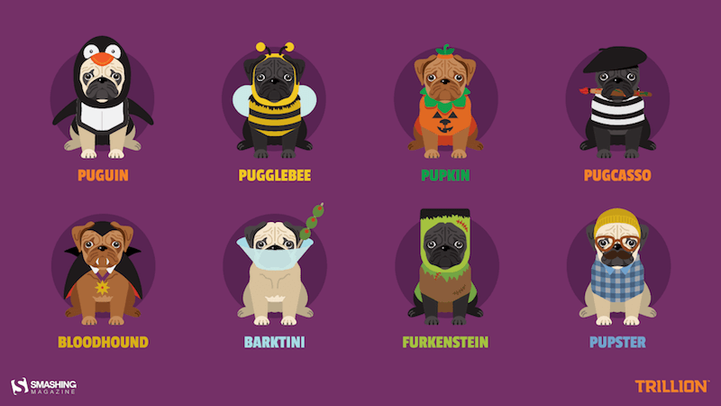
“The best part of October is undoubtedly Halloween. And the best part of Halloween is dog owners who never pass up an o-paw-tunity to dress up their pups as something a-dog-able. Why design pugs specifically in costumes? Because no matter how you look at it, pugs are cute in whatever costume you put them in for trick or treating. There’s something about their wrinkly snorting snoots that makes us giggle, and we hope our backgrounds make you smile all month.” — Designed by Trillion from Summit, NJ.
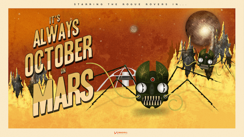
“The story is a mash-up of retro science fiction and zombie infection. What would happen if a Mars rover came into contact with an unknown Martian material and got infected with a virus? What if it reversed its intended purpose of research and exploration? Instead choosing a life of chaos and evil. What if they all ran rogue on Mars? Would humans ever dare to voyage to the red planet?” Designed by Frank Candamil from the United States.
“October is the month when the weather in Poland starts to get colder, and it gets very rainy, too. You can’t always spend your free time outside, so it’s the perfect opportunity to get some hot coffee and work on your next cool web project!” — Designed by Robert Brodziak from Poland.
Feeling inspired? We’ll publish the November wallpapers on October 31, so if you’d like to be part of the collection, please don’t hesitate to submit your design. We are already looking forward to it!
To be completely honest with you, I missed the news when CSS Container Queries first shipped. And when I finally heard about it, my very first thought was, “Why exactly do I need this when media queries already exist?”
I’m not proud of that reaction, knowing what I know now, but it was comforting to know that I wasn’t alone. In fact, there are legions of us out there.
What baffles me is that container queries aren’t a new feature, as it currently sits at around 94% browser support. And yet, very few people are actually using it. According to the State of CSS survey, 86% of developers are aware of container queries, but only 41.4% actually use them. Surveys can be biased and not completely representative of our entire field, but this one is certainly the best indicator we’ve got.
I’m not particularly interested in how many people are using container queries as much as in how they are using them. I can’t account for everyone, but from what I’ve seen — including in my own early attempts — many of us are using them wrong.
The bottom line is that incorrect use comes down to the same impression I had when learning about them: they absolutely look just like media queries at first glance. And since they look similar, it’s easy to assume they serve similar purposes and work the same way.
They don’t.
Note: I should state up front that what I’m focusing on in this article is using container size queries, i.e., a responsive design technique for responding to the size of a particular container. There are also container style queries that respond to a container’s computed styles (and are experimental at the time of this writing). You can catch up on those in Juan Diego’s piece here on Smashing Magazine where he examines their possible use cases.
Media Queries Look Outward
The viewport is a proxy. It always has been. Media queries are what gave us the illusion that screen width alone is responsible for how responsive apps adapt to their environment.
Ask yourself this: When you write @media, what are you asking the browser?
I, like most developers, am asking the browser: How wide is the screen right now? That’s it.
Media queries answer that beautifully, but what happens when this .card component is placed in a grid cell that’s 300px wide on a 1920px desktop screen?
The media query doesn’t care; it does its job. The viewport is still 1920px, so min-width: 1024px fires and the matched query styles are applied, even though the card only has 300px of space to work with. Eventually, everything in the card deforms, overflows, or cramps up.
“Media queries are dumb. Not dumb in terms of the concept, but dumb in that they don’t know very much. In fact, most people assume that they know more than they do.”
It’s common to think of responsive design purely as a system for updating complete page layouts, like going from two columns on a large screen to a single column on a small screen.
Container Queries Look Inward
Container queries are smarter than that. They make responsive layouts more reliant on what’s happening inside a component rather than on the outer context that has no insight into a component’s contents. It is more like: “How much space is available for me in this specific spot, right now?”
Here is the same card code example we looked at in the last section, but with a container query:
This changes everything. The card isn’t influenced by the viewport; its only concern is whether the .card component’s parent wrapper has at least 450px of inline (i.e., horizontal in a left-to-right writing mode) space. If that condition is true, the component goes horizontal; if not, it goes to its default block display.
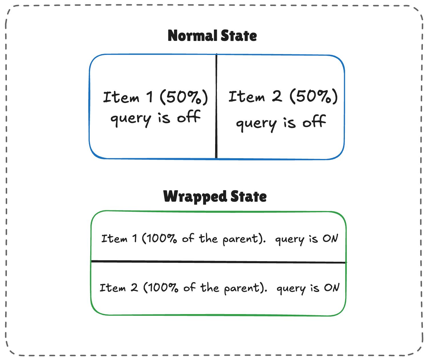
The logic works like this:
When there’s enough room, both items (.flex-item) sit side-by-side, each exactly half the parent container’s width.
When there is limited space, the second item wraps to the next line.
Because flex-grow is active on each item, the wrapped items stretch to fill most of the parent’s width.
If the item is a container itself, it detects the sudden width expansion and fires.
/* The flex parent */
.flex-layout {
  display: flex;
  flex-wrap: wrap;
}

/* Register a flex item as a container */
.flex-item {
  container-type: inline-size;
  flex: 1 1 390px; /* Grow to fill space, wrap at 390px */
}

/* Default Card Styles (narrow / side-by-side) */
.card {
  display: flex;
  flex-direction: column;
  background: #f4f4f4;
}

/* Once there's enough room for a full row */
@container (min-width: 600px) {
  .card {
    flex-direction: row;
    align-items: center;
    background: #e2f0d9;
  }
}
This works. As the parent size shrinks and the cards wrap to two lines, the card item expands, the container query fires, and applies the necessary styles.
Conclusion
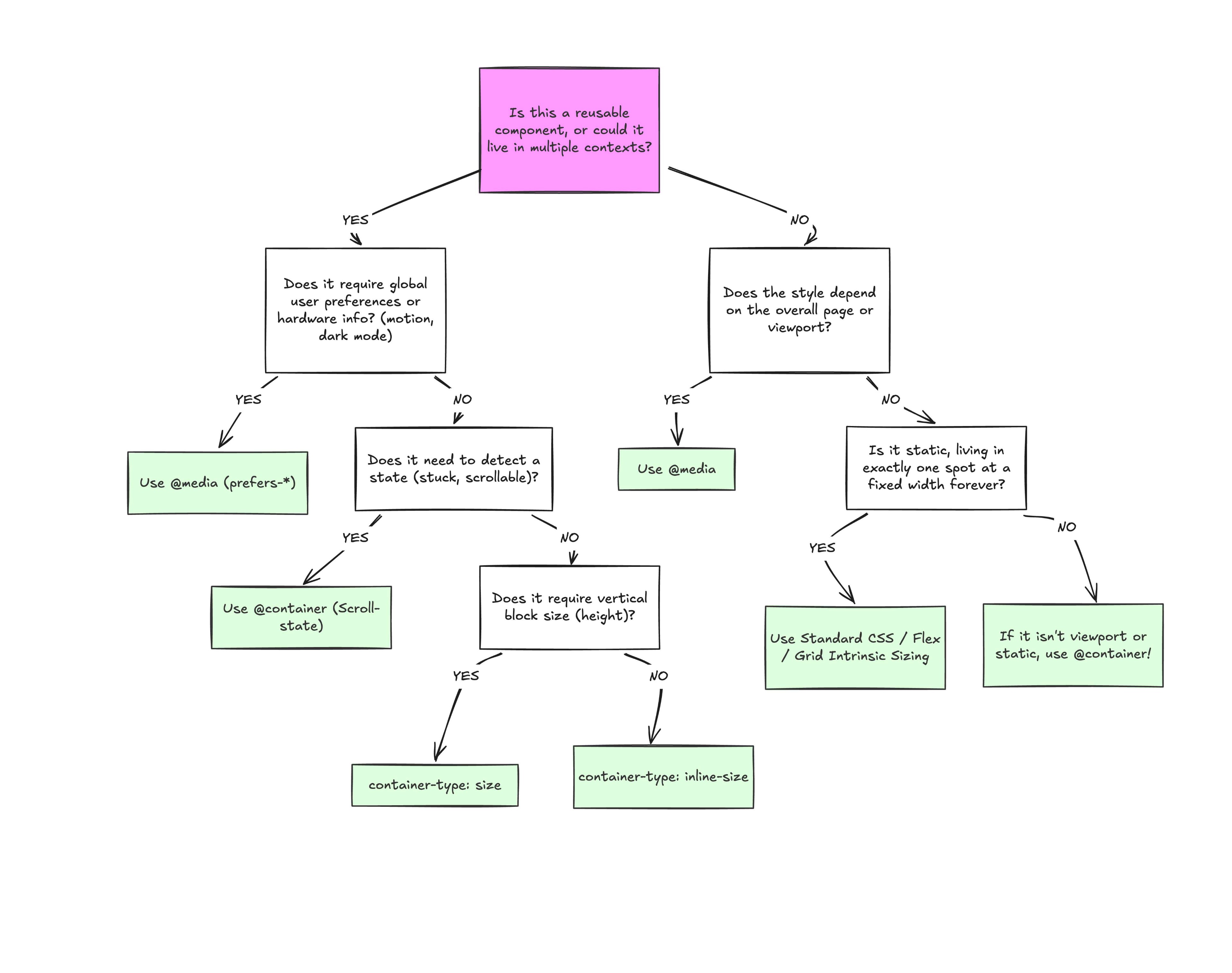
At the end of the day, the core reason why container queries look incredibly similar to media queries is simply familiarity. They’re not exactly “new”, but they are way less understood and adopted than media queries. But media queries have plenty of their own limitations; otherwise, we wouldn’t need container queries to fill those gaps.
What we have is a more effective feature for detecting when a specific component’s context changes and a means for adjusting styles based on its content, as it should be when that component can exist in multiple contexts.
We’ve all heard of the sacred rule in modern web development, the rule never to be broken. The rule of “Never block the main thread.”
You almost can’t miss it as a web developer; it’s in almost every performance guide, and to be fair, it is good advice. We all know the browser’s main thread is single-threaded, meaning it can only do one thing at a time.
Plus, as we know, the main thread isn’t ours alone; we share it with the browser’s rendering engine, input handlers, and other critical tasks. As a result, the less time we hold onto the main thread, the more responsive an app feels. That leads us to share tasks with background workers as we’ve convinced ourselves there should be a hard line between the UI and any computation, and that line shouldn’t be crossed.
And that is what a “recommended” architecture looks like.
But I dare say that sometimes**, moving the data to a worker is slower than just letting the main thread do the work.
I found this out a few months ago while building a Chrome extension with screenshotting features called Fastary. I kept finding a latency of about 2 to 3 seconds in all my testing, even after using an Offscreen Document (a background process in Chrome extensions) to handle the canvas operations. A screenshot task should feel instant without lag, after all.
It is quite ironic that by reflex, we move work away from the main thread to avoid freezing the UI, but sometimes the act of moving that work (e.g., serializing, copying, and deserializing) can also freeze the UI. And sometimes the recommended approach of letting the background do the work can be slower than just doing the work on the main thread.
Let’s talk about that.
The Architecture Of Browser Context Isolation
To put things in perspective, let’s understand why we isolate browser contexts and how they communicate with each other, with emphasis on the communication part.
A browser is more than a single environment. Different environments are running at the same time, each having its own memory space, what it can access, and rules:
The main thread is what we are most familiar with; this is where JavaScript logic runs, where the DOM lives, where styles get rendered, and where users interact.
The Web Workers are separate threads that can also execute JavaScript without DOM access. We mostly use this for heavy data tasks.
The Service Workers are network-related proxies in charge of intercepting network requests and can even run when the page is closed.
And then there are Chrome extension contexts, where we have background service workers, content scripts, and Offscreen Documents (the relevant ones for this article).
Each one of these is isolated from the others. A web worker or background script lives in a different memory space from the main thread. They cannot just reach and read each other’s variables or logic, and this is known as the “shared-nothing” architecture.
How do these isolated environments communicate? They explicitly message each other back and forth using APIs, like postMessage().
The Structured Clone Algorithm
postMessage() tells the browser to take a piece of data and deliver it to the context that requested it. But to do this, the browser relies on the Structured Clone Algorithm (SCA).
You’re probably familiar with JSON.stringify(). SCA is similar, but much stronger and smarter. In its simplest form, SCA is a deep, recursive copy operation, i.e., cloning. It walks through the entire data structure it is given, clones every single value, serializes it into a transportable format, ships those bytes to the target contexts, and then reconstructs the original object on the receiving side.
SCA is fast, or maybe fast-ish... For a small regular config object like {theme: "dark"}, it is imperceptible; you don’t even notice it. The story changes, however, when dealing with heavy data because the SCA is a synchronous blocking O(n) operation, i.e., the cost increases linearly with the size of your data.
Let’s put that into perspective. A user clicks a button, and internally, an 8MB image payload is sent to a background worker for processing. When you call postMessage(), the main thread must immediately stop what it is doing to run this serialization and copying process.
So, if the time it takes to pack, ship, unpack the data, and go back to the start is longer than the time to just process the data on the main thread, why not do that instead?
What About Transferable Objects?
I’m sure some of you are already thinking, “Why not just use Transferable objects?” And that is a valid point. Let’s talk about that.
Developers who really pursue ultra-high-performance web apps usually use Transferable objects (e.g., ArrayBuffer, ImageBitmap, or MessagePort) to bypass the Structured Clone Algorithm. This is because when you transfer an object, you’re not making a copy (like SCM). Instead, the browser switches ownership of the data from one context to another.
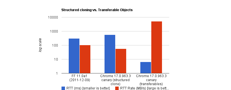
The browser performs a hand-off whereby the sending context loses access to the data instantly, and the receiving context takes full control. It is actually insanely fast. According to Chrome Developers’ benchmark, transferring a massive 32MB ArrayBuffer can take under 7ms, compared to about 300ms when cloning with SCM. That’s a 43x speed boost.
But like all good things, there are downsides. To name a few:
You lose it once you send it. If the UI still needs that data (like to show an image preview), you can’t access it anymore.
Not all data is transferable. A plain JS object is not. A Blob is not. Even a Base64 string is not.
API limitations. In the context of browser extensions, Chrome’s internal messaging (chrome.runtime.sendMessage) traditionally forces everything through JSON serialization.
So, as far as my screenshot extension went, Transferable objects were not an option.
Why We Isolate Contexts Anyway
Why do we even bother isolating contexts at all? Why not just leave it all to the main thread?
Offloading long-running CPU tasks to a background thread is absolutely the right thing to do. The browser needs to paint a new frame every 16.6ms to keep things fluid; that means any task that takes >50ms is generally considered “long”. Offloading to the background is absolutely the right thing to do.
The issue, however, is that we’ve turned this “never block the main thread” into an absolute rule, without asking is this task expensive to process or expensive to move?
I have come to realize now that the rule is less “never block the main thread” than “never block the main thread for too long.”
When The Right Architecture Is The Wrong Architecture
My goal with the Fastary extension was to make it feel like a native app, running as smoothly and instantly as you would expect a native app to.
As you already know, I took the recommended approach to use the Offscreen Document to handle DOM work in the background. But to my surprise, that took a different turn.
The Offscreen Document API is a clear winner. You create a hidden, undisplayed document that runs entirely in the background. It has a DOM and supports Canvas. For example, if I want to crop a screenshot, stitch multiple screenshots together, perform heavy image manipulation, or add a watermark, Offscreen Document was made for that.
Turns out that was not the best approach. This was my architecture:
The background Service Worker captures a screenshot with chrome.tabs.captureVisibleTab(), which returns a Base64-encoded data URL string.
The background Service Worker uses chrome.runtime.sendMessage() to ship this image payload to the Offscreen Document.
The Offscreen Document receives the image, loads it into an <img> element, then draws it onto a canvas before it applies the user’s crop coordinates, encodes the result, and sends the processed image back to the background worker.
But when I tested it, the screenshot didn’t feel instant. As I said earlier, there was a consistent 2–3 second lag.
I figured out that when captureVisibleTab() takes a screenshot, it returns a Base64 URL string, and on a standard 1080p screen, that string could be approximately 1MB or more, depending on how detailed the image is. It gets even more interesting on modern Retina displays (e.g., MacBooks) as they tend to automatically double the image’s size by default.
Keep in mind that since the image payload could be doubled and extension messaging relies on JSON serialization (as of this writing), we potentially deal with massive synchronous communication that costs an entire round trip.
The image string data is JSON-serialized at least twice: once when going into the Offscreen Document and once coming back out with the processed results to the background worker. The actual image processing (cropping) done inside the Offscreen Document was fast, no doubt, but I can’t say the same about the transfer overhead.
The Retina High-DPI Problem
As if the latency itself wasn’t enough, I noticed a rather subtle bug — which, now that I think of it, was more of my ignorance. After a screenshot was taken, the crop result was completely off in a way that either weirdly scaled the image or resulted in incorrect coordinates.
It turns out that when a user selects a region to crop, the content script gets the box coordinates using getBoundingClientRect(), which is measured in CSS pixels; this is what the DOM uses. But when the screenshot is captured natively in Chrome, the browser doesn’t crop it automatically; it instead uses the physical hardware pixels to get the full screen capture. And the browser uses devicePixelRatio (DPR) to know how many physical pixels should represent one CSS pixel. Basically, if a user on a Retinal display (DPR = 2) highlights an area of 400x300 CSS pixels, the actual captured image area is 800x600 physical pixels.
Note: One CSS pixel is equal to 1 physical pixel (DPR of 1) on a standard monitor. On a Mac Retina display or a modern 4K monitor, however, the DPR is usually 2 or 3.
For an accurate crop, I needed to apply these two different measurement systems with the right DPR, i.e., scale the crop coordinates by the DPR. But remember, Offscreen Documents have no physical display. Processing any image would have a default DPR equal to 1. To fix this, I would have to capture the exact devicePixelRatio from the active tab, serialize it, pass it alongside the image payload, and manually do the scaling math inside the Offscreen Document. The complexity starts to compound.
What if I broke the golden rule and did the work on the main thread instead?
Working On The Main Thread
Some developers will argue that UI tasks are the only things that should run on the main thread, but I don’t fully agree with that. Personally, I believe that user explicitly-invoked actions that need immediate results can sometimes get a solid pass to run on the main thread, provided the work is incredibly fast (e.g., 1s).
That’s what I did: scrap out the Offscreen Document and reengineer the logic. Instead of:
…I decided to run the whole image processing in the active tab:
The background Service Worker captures the screen and gets the Base64 string (same as before).
The background sends the payload directly to the content script in the active tab using chrome.scripting.executeScript().
The content script (running on the main thread) receives the payload, draws it to a canvas, performs the crop using the correct DPR value, and copies the result to the clipboard.
// Background Script
const screenshotUrl = await chrome.tabs.captureVisibleTab(undefined, { format: "png" });

// Inject the processing function into the active tab as a content script
await chrome.scripting.executeScript({
  target: { tabId: activeTab.id },
  func: processAndCopyImage,
  args: [{ base64Image: screenshotUrl, cropData: userSelection }]
});
This approach completely clears out multiple context hops and round trips that JSON serialization requires. The only cross-context transfer involves sending the data URL from the background to the content script.
The Retina DPI issue essentially solved itself, as the content script runs directly inside the real, active browser tab because it knows the monitor’s real devicePixelRatio.
But there’s an elephant in the room that you may have noticed.
Sure, the image is now processed on the main thread, and the background manipulates the canvas in the active tab. I could technically be blocking the main thread. That’s where I amended the “no blocking the main thread” rule to “no blocking the main thread for too long.” In this specific case, at least, blocking the main thread for a task the user requests for approximately one second is justifiable. It works conversely as well: maybe don’t isolate processes if the data transfer cost is greater than the processing cost.
Conclusion: When To Isolate And When Not To
I’ve boiled it down to a mental model that depends on whether the task is:
1. Compute-Heavy Tasks (CPU-Bound)
These are tasks where the primary cost is computation and not the size of the data itself. These are tasks where most of the time is spent on doing calculations or heavy transformations, e.g., image compression, audio profiling, physics simulation, etc.
The transfer cost for these tasks is minuscule compared to the actual work.
2. Data-Heavy Tasks (Data-Bound)
These tasks are the exact opposite. These tasks are only expensive because of the size. The processing time is almost insignificant, but the data is expensive to transport, e.g., image cropping, filtering an array, shallow copy, etc.
In my specific case, offloading the task to the background falls mostly into negative-sum efficiency. If we are talking about moving megabytes of data to perform a 50ms operation, there is no benefit to offloading it to the background.
Perhaps we can think of it like this:
Total Time = Serialization Cost
  + Transit
  + Background Processing Time
  + Deserialization Cost
Looking at this, if the “background processing time” is the most dominant task in your operation, then isolation is the clear winner. But if serialization, plus deserialization, plus transit exceeds that cost, then there’s no need to isolate things.
And if you can’t figure out if the task is CPU-heavy or data-heavy, it certainly doesn’t hurt to measure it, for example, using performance.mark() and performance.measure() around postMessage calls to profile the transfer cost.
Reçu — 4 mai 2026⏭Articles on Smashing Magazine — For Web Designers And Developers
May has a way of sneaking in with longer days, softer light, and that first real hint of summer in the air. It’s the season of fresh ideas and just enough energy to start something new, or finally pick up something you’ve been putting off. And sometimes, all it takes to spark that little bit of inspiration is a fresh view… even if it’s just on your desktop.
That’s where our monthly wallpapers series comes in. For the past 15 years, artists and designers from around the world have been contributing their designs to celebrate each new month. This May is no exception. Created with care and a unique personal touch, every wallpaper in this collection comes in a variety of screen resolutions and can be downloaded for free. A huge thank-you to everyone who got creative — this post wouldn’t be possible without your wonderful support!
If you too would like to get featured in one of our upcoming wallpapers posts, please don’t hesitate to join in. We can’t wait to see what you’ll come up with! Happy May!
You can click on every image to see a larger preview.
We respect and carefully consider the ideas and motivation behind each and every artist’s work. This is why we give all artists the full freedom to explore their creativity and express emotions and experience through their works. This is also why the themes of the wallpapers weren’t anyhow influenced by us but rather designed from scratch by the artists themselves.
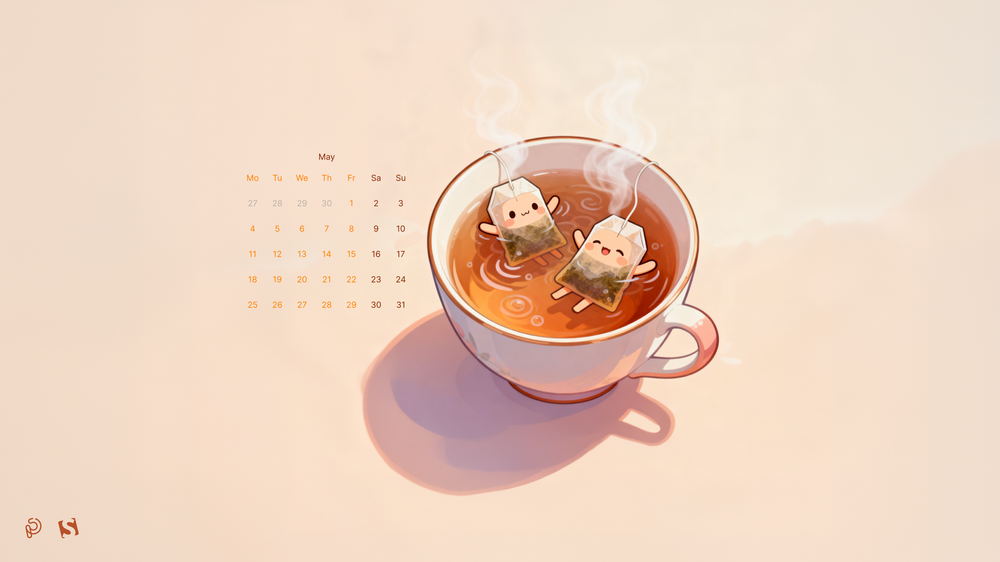
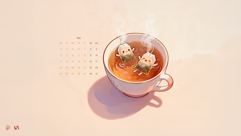
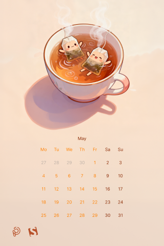
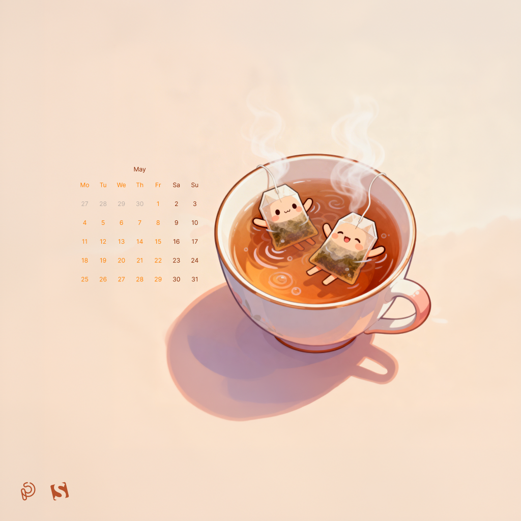
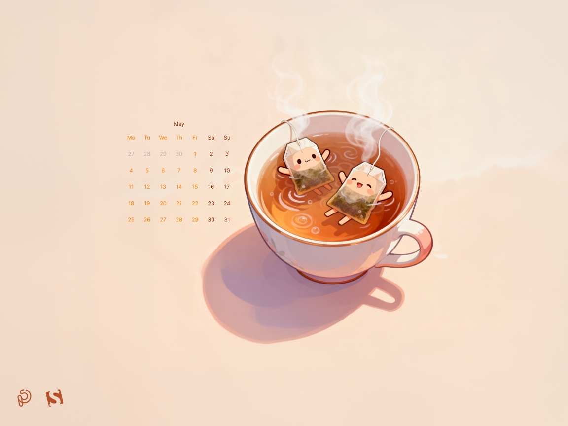
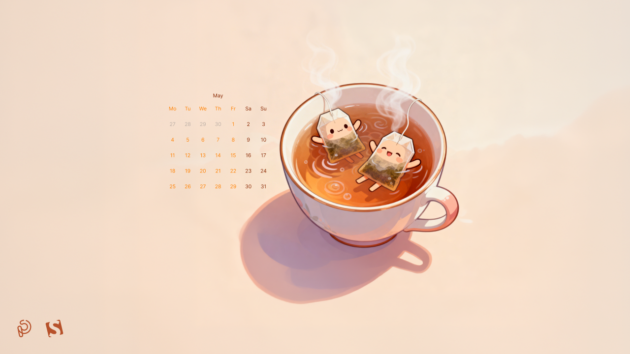
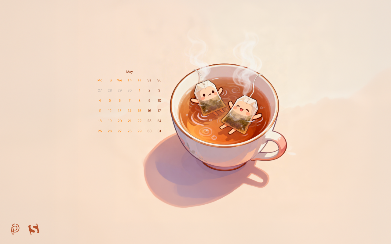
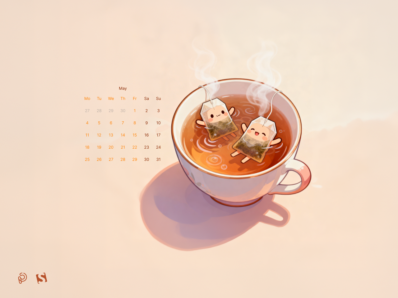
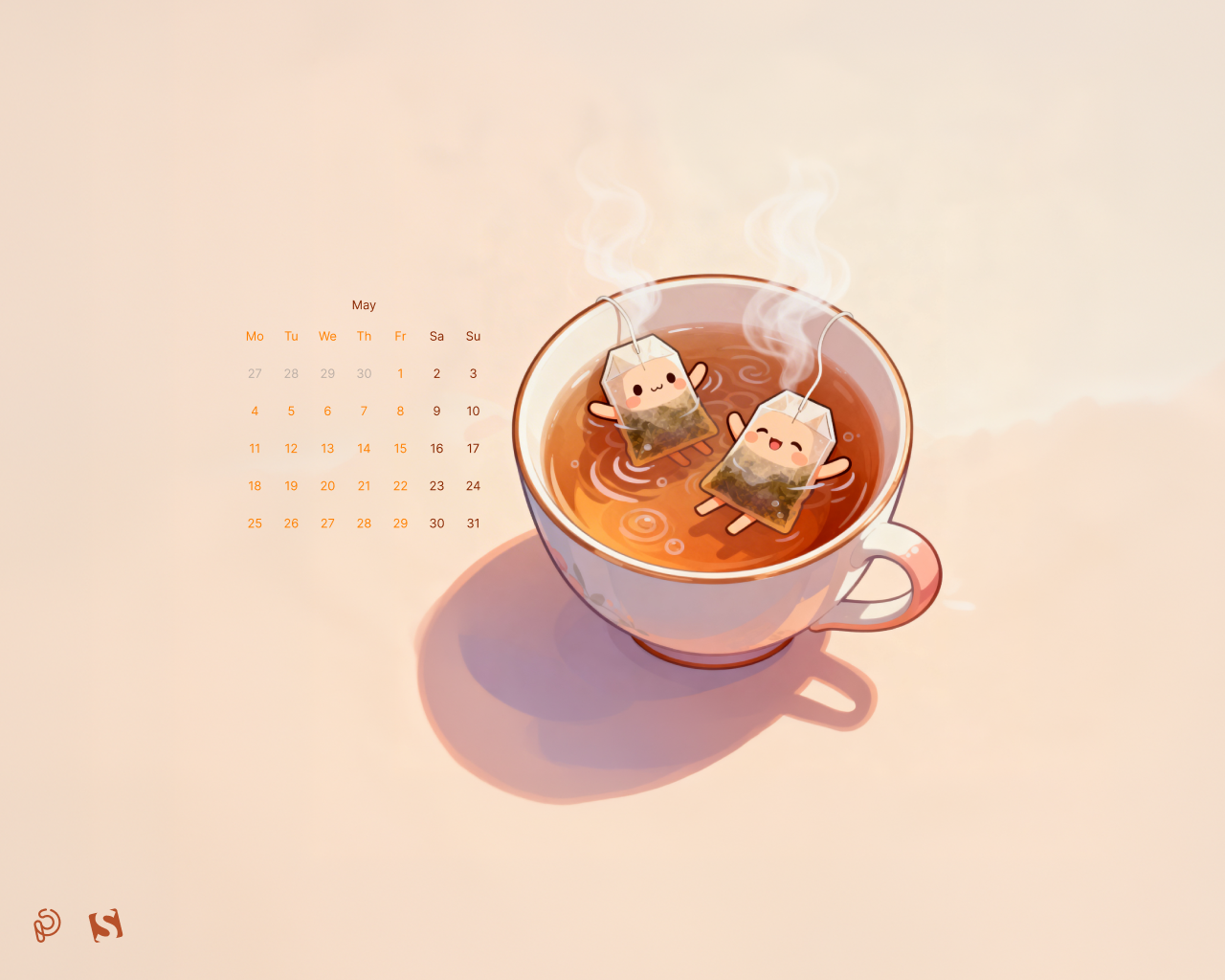
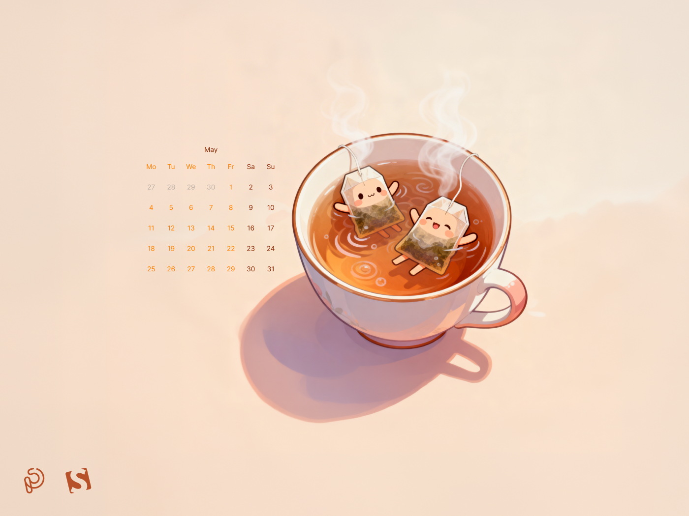
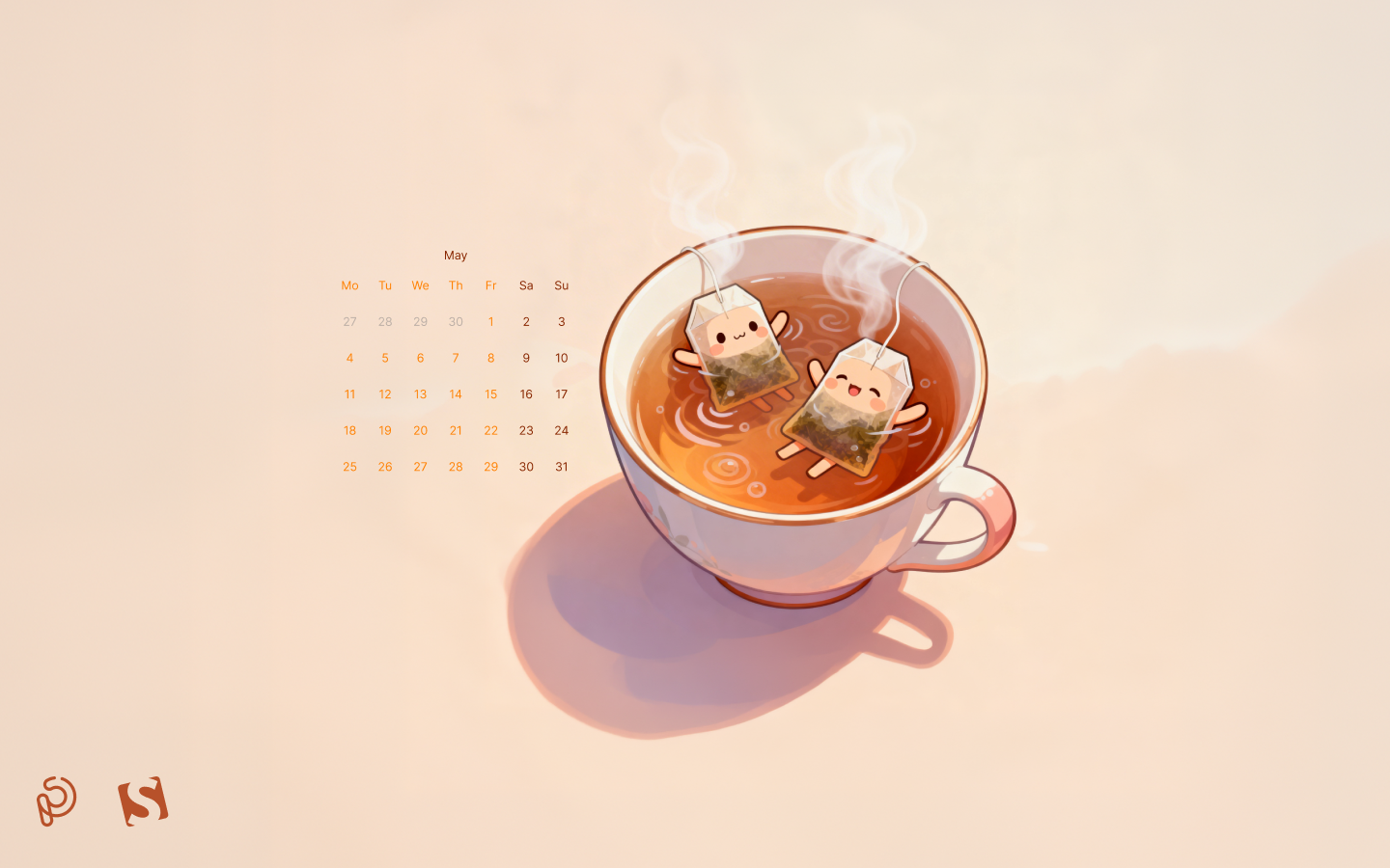
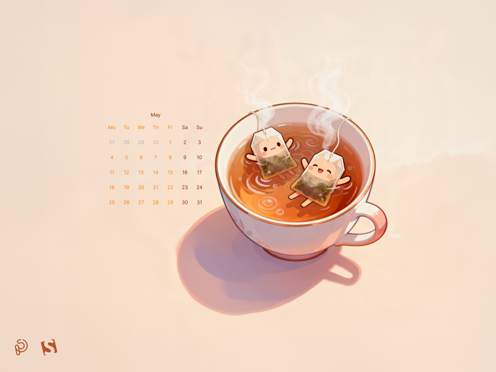
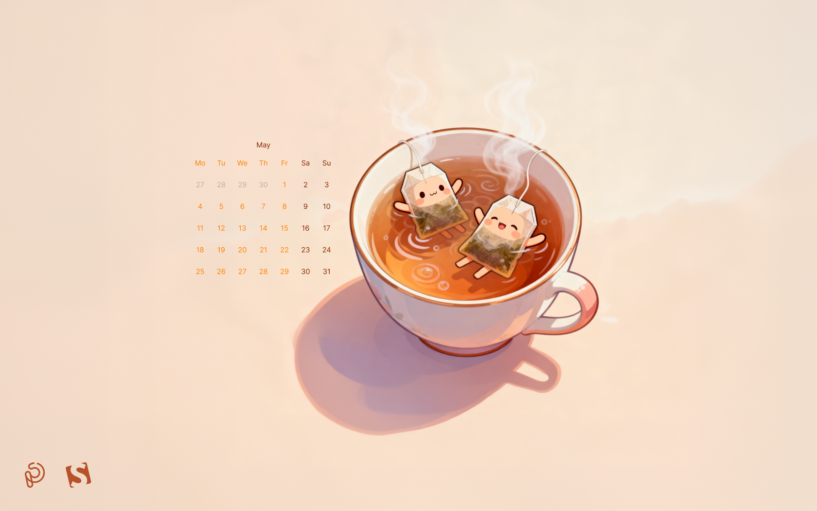
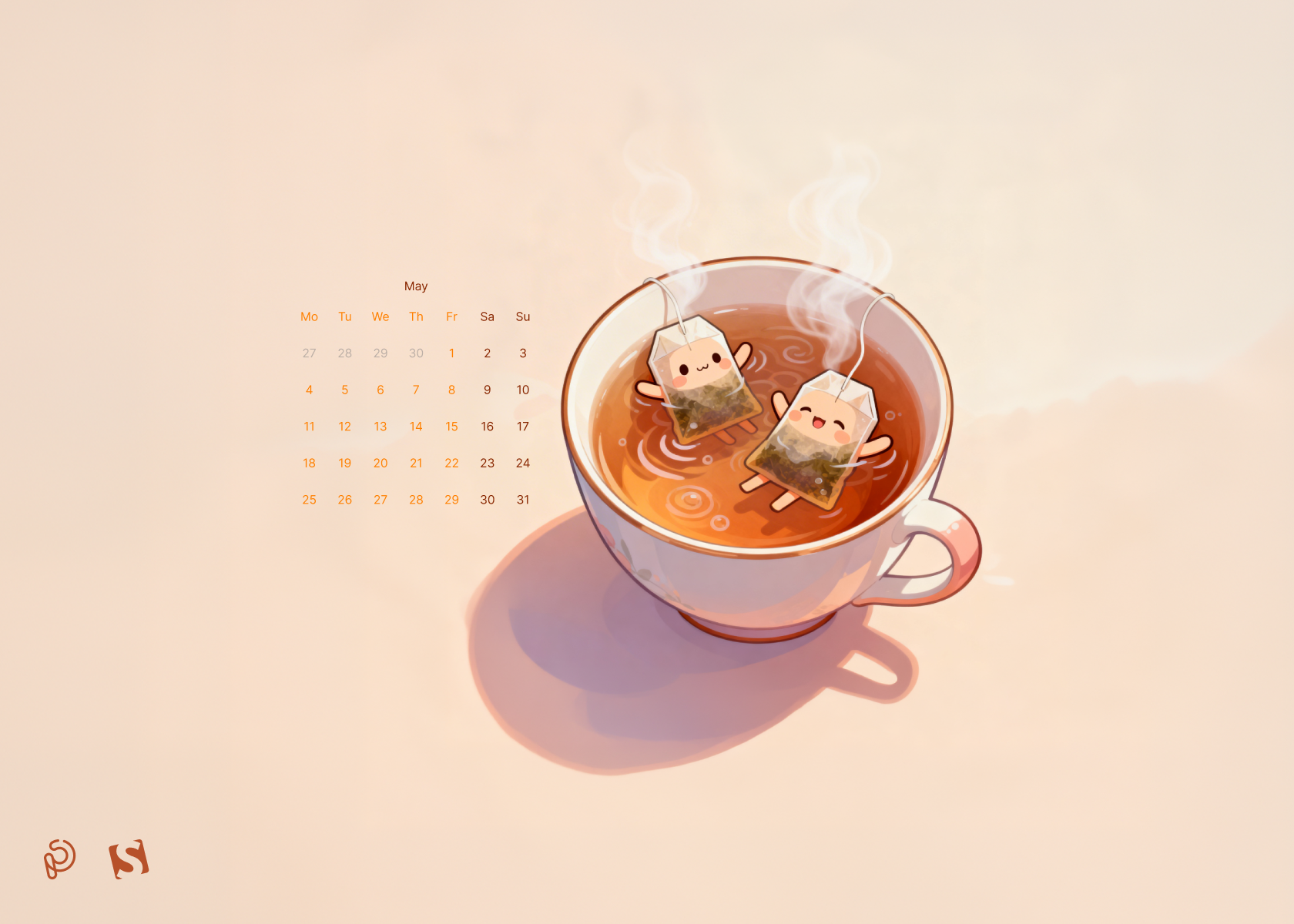
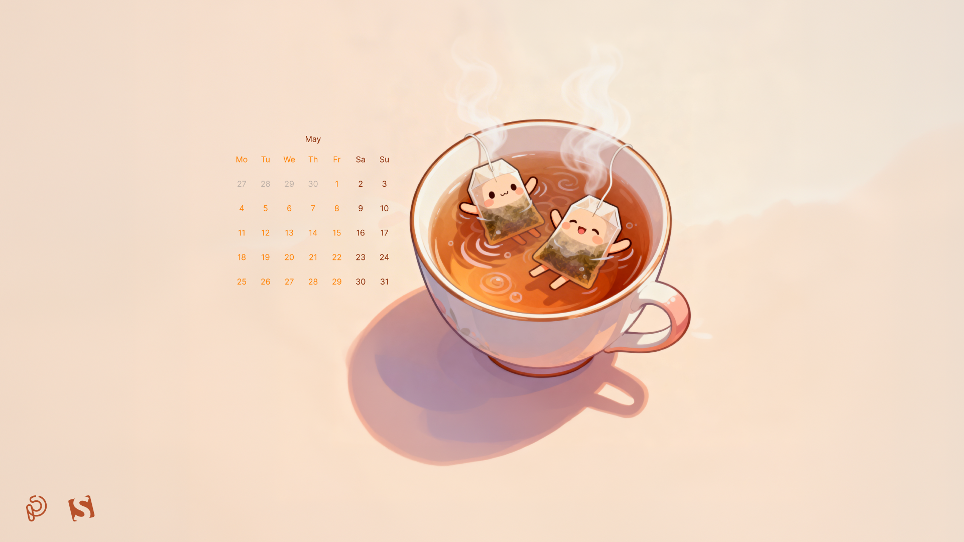
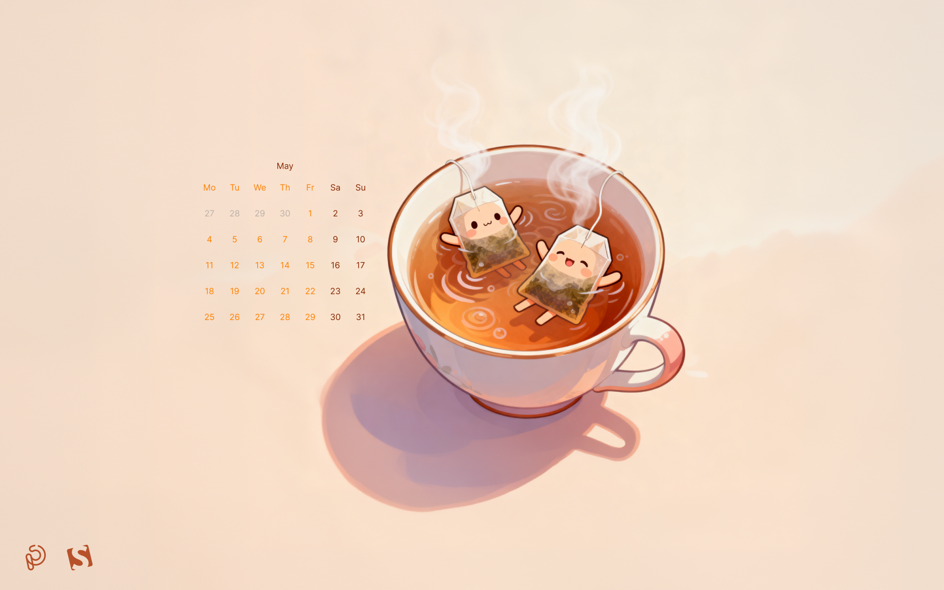
“A quiet ritual, a shared moment, a pause in the rush — tea invites you to slow down and discover warmth in the smallest details. Let each cup unfold its own little story.” — Designed by PopArt Studio from Novi Sad, Serbia.
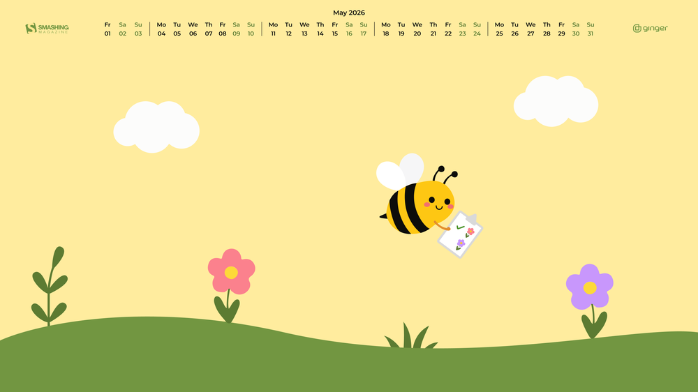
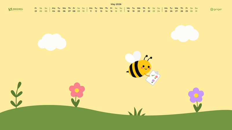
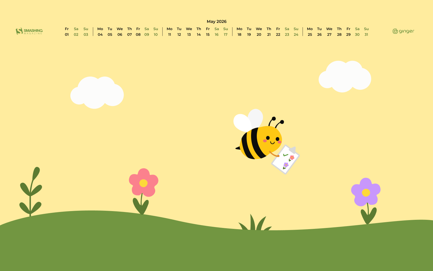
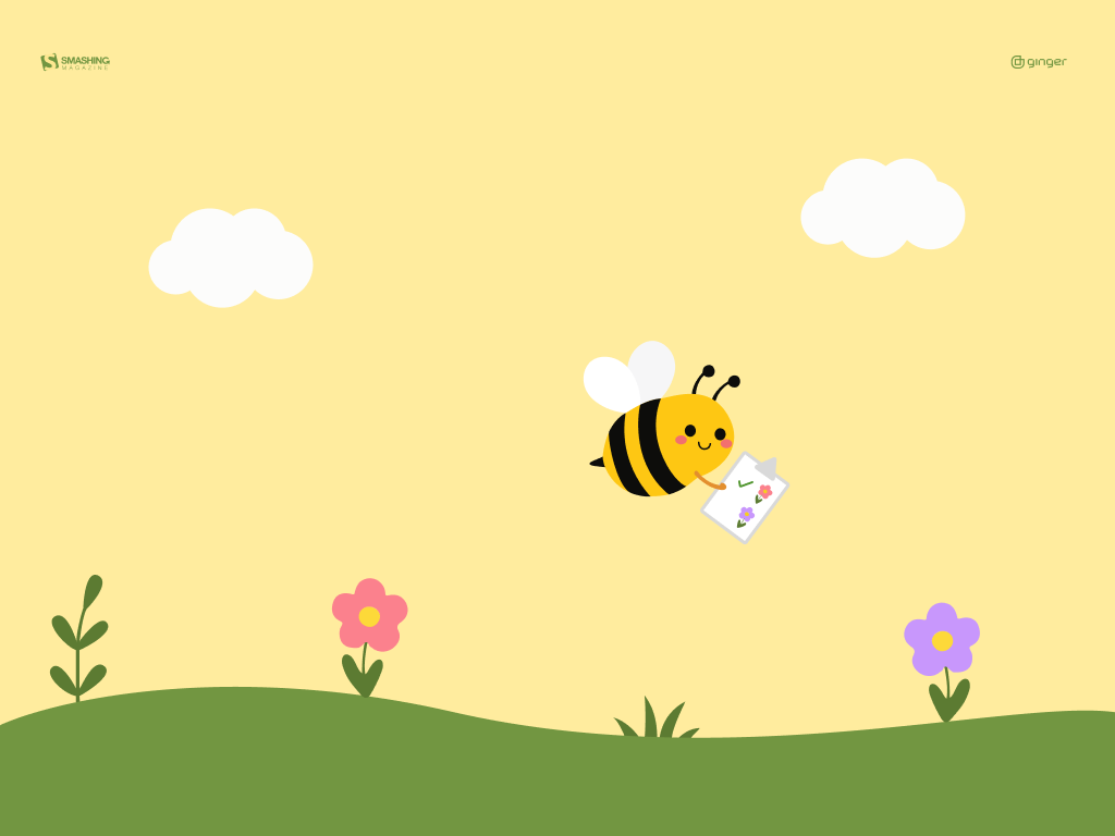
“A small bee with a big garden plan checks each flower on her list and looks for the next bloom to visit.” — Designed by Ginger IT Solutions from Serbia.
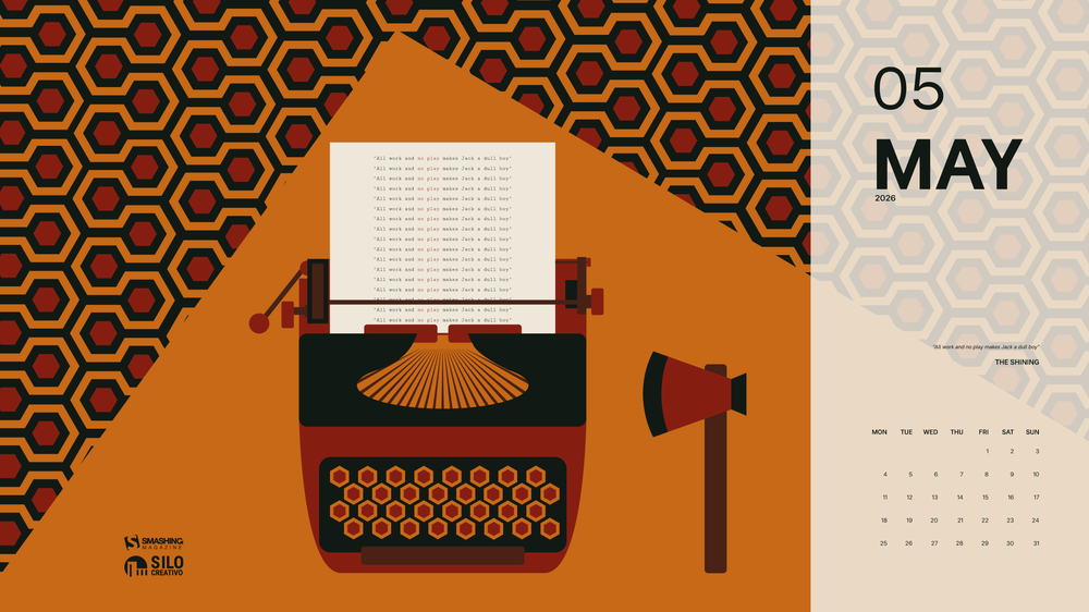
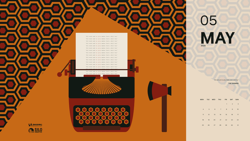
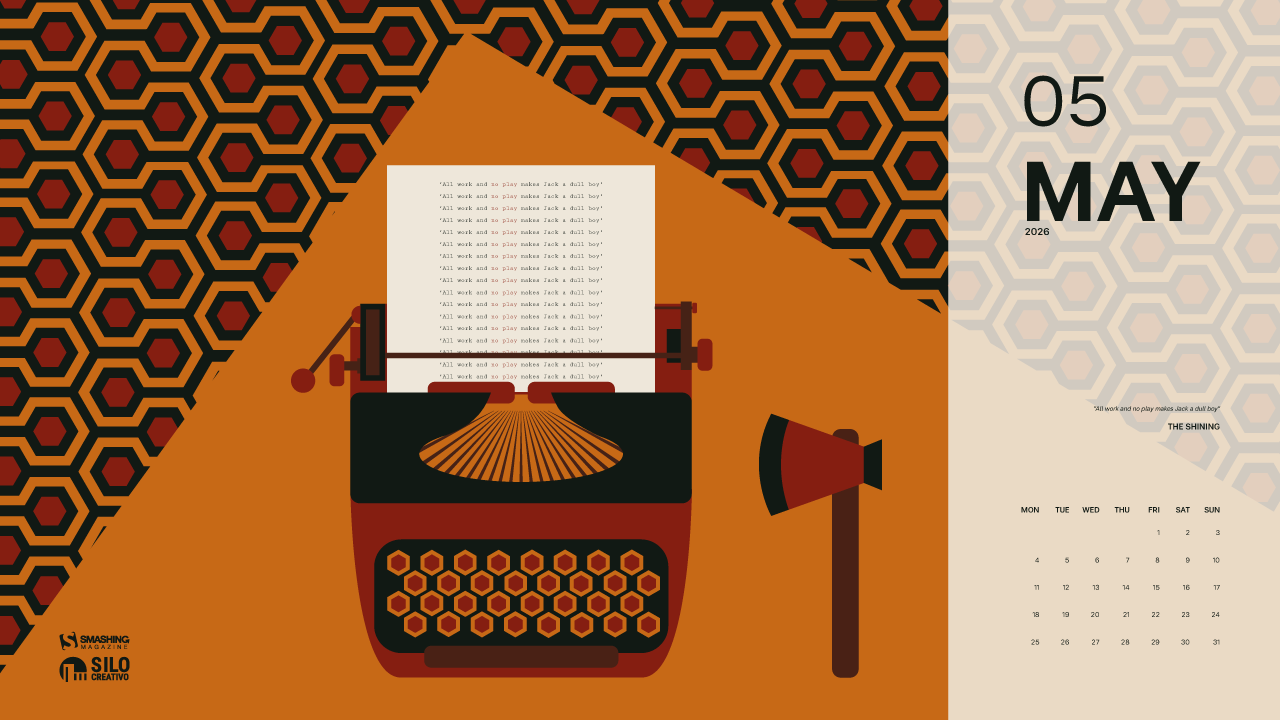
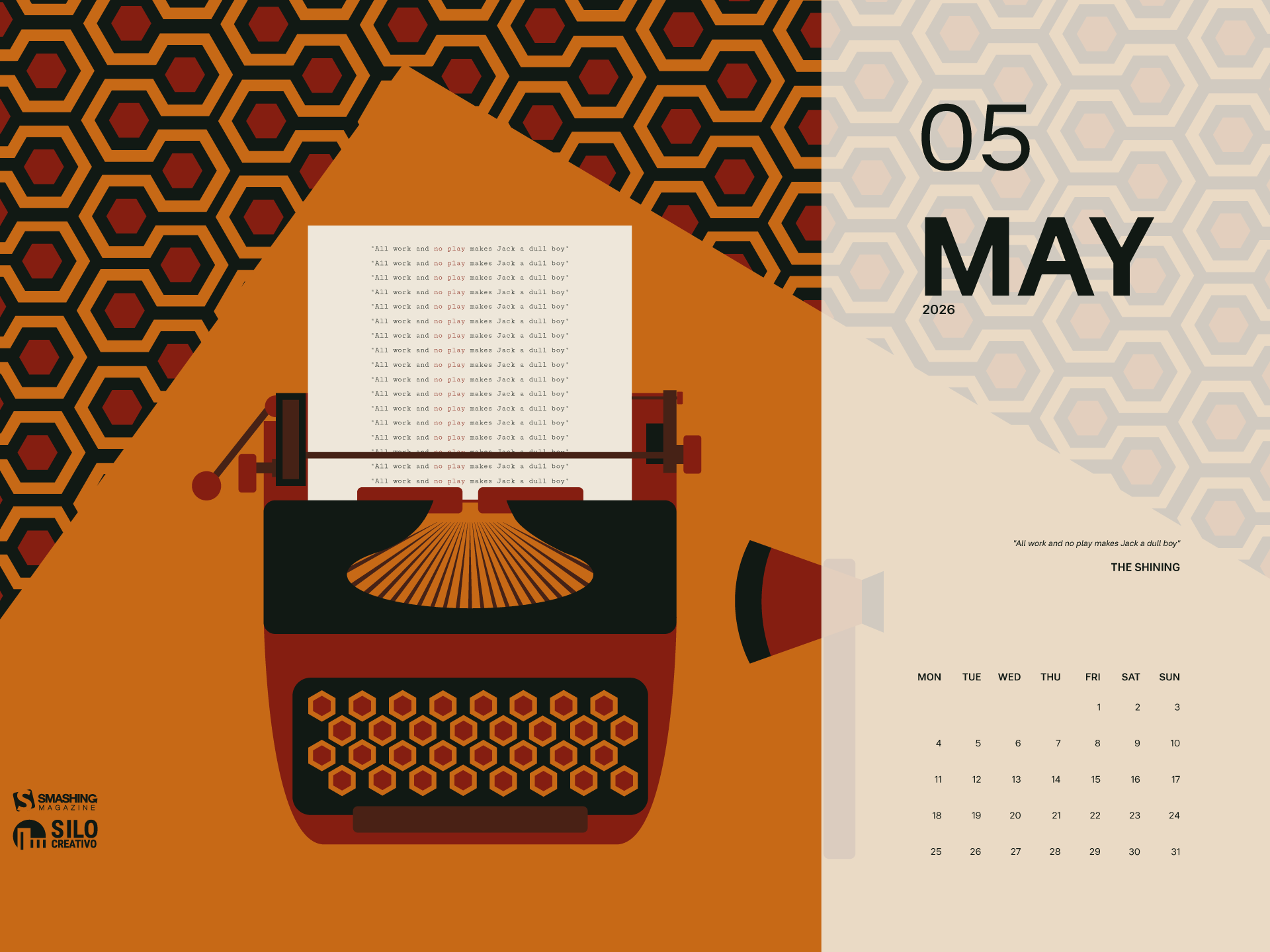
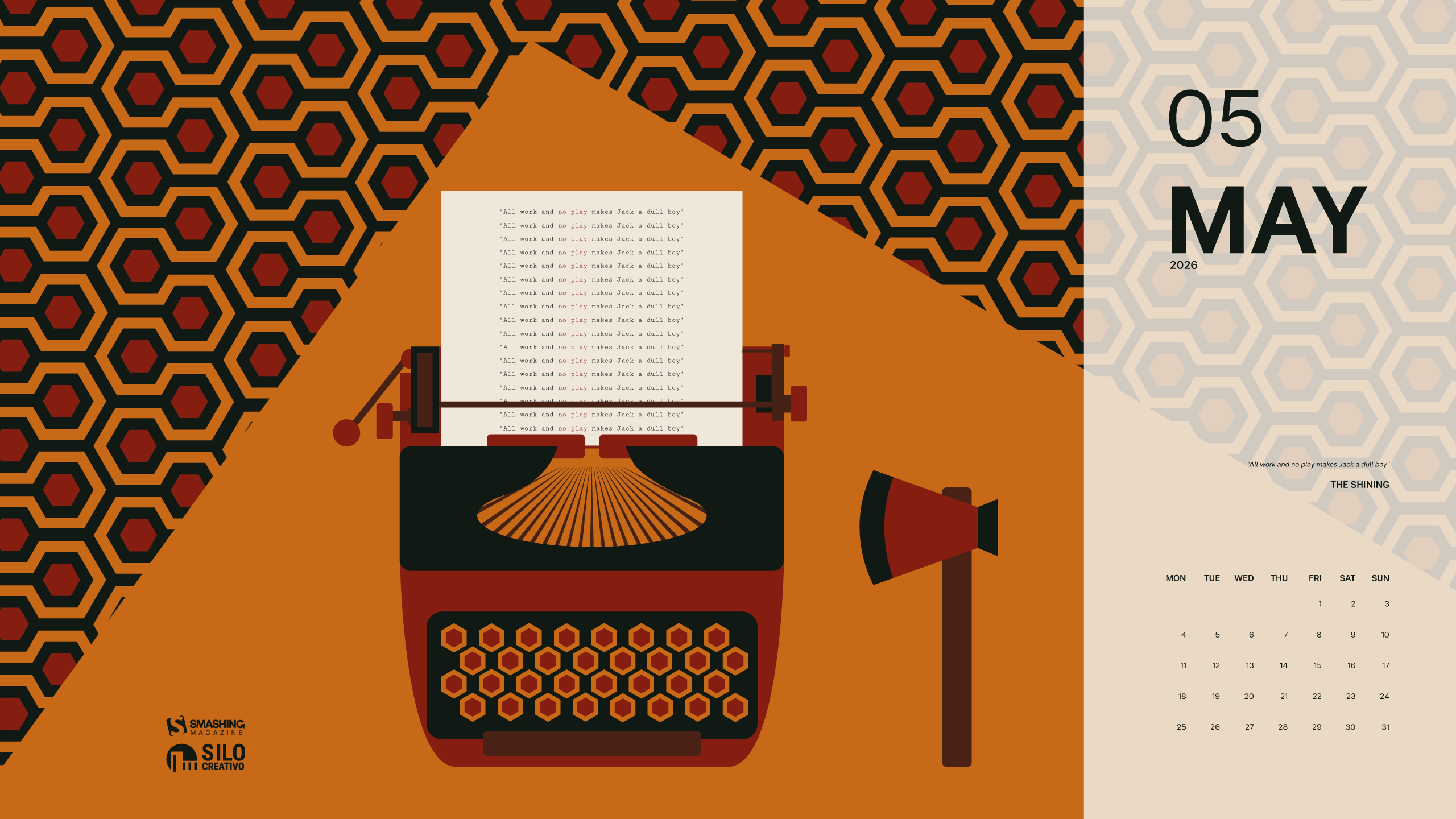
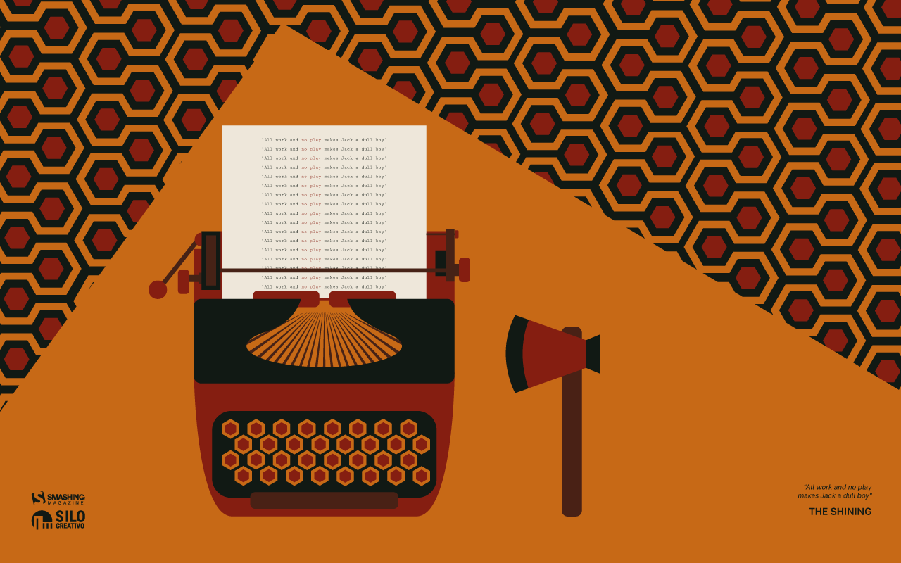
“Summer is getting closer, but we’re reminded of a more wintry and eerie landscape, like that of ‘The Shining.’ A truly great film, proving that you don’t need much, but it needs to be used well to create suspense and terror.” — Designed by Veronica Valenzuela from Spain.
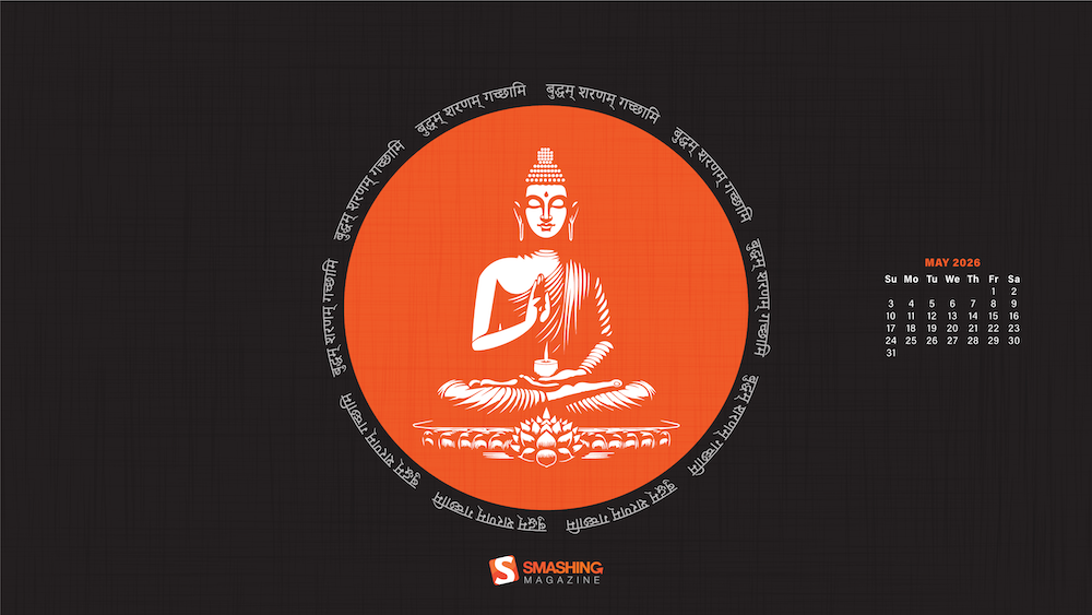
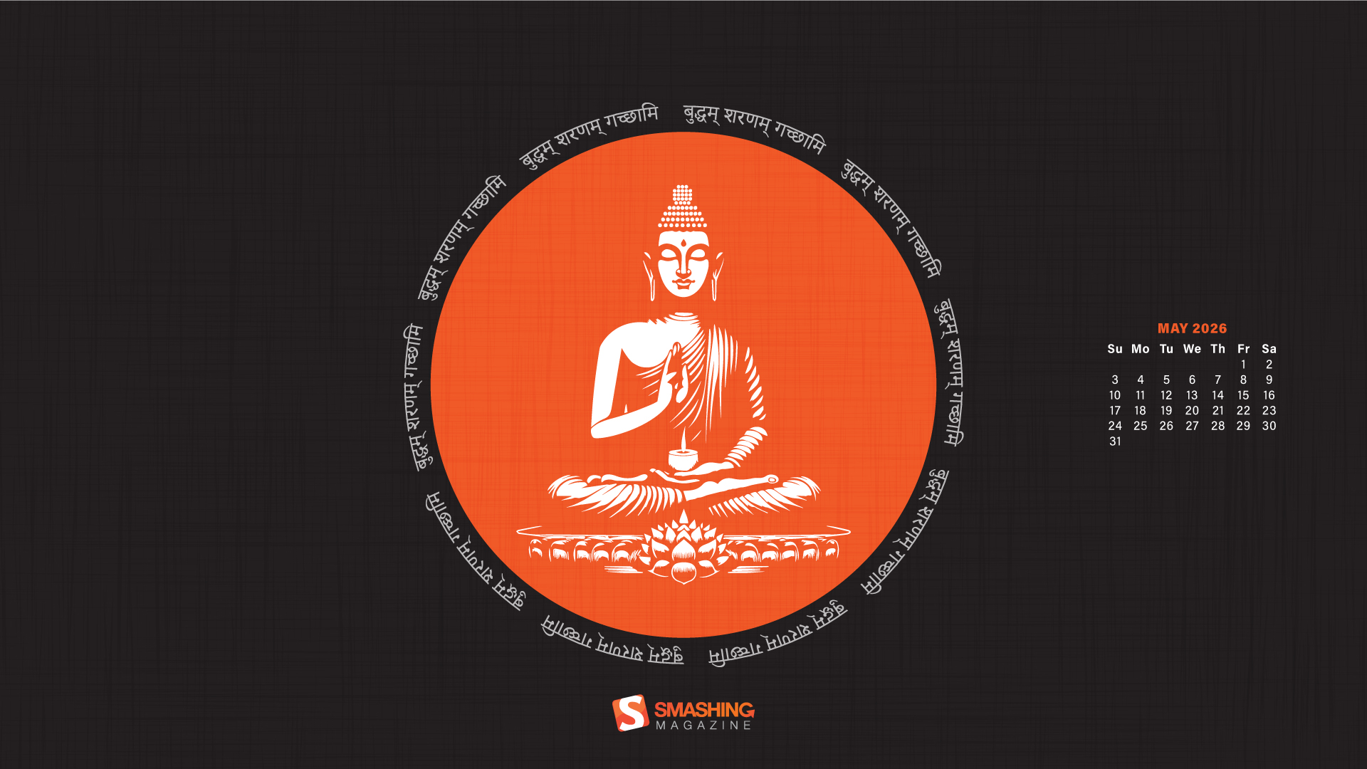
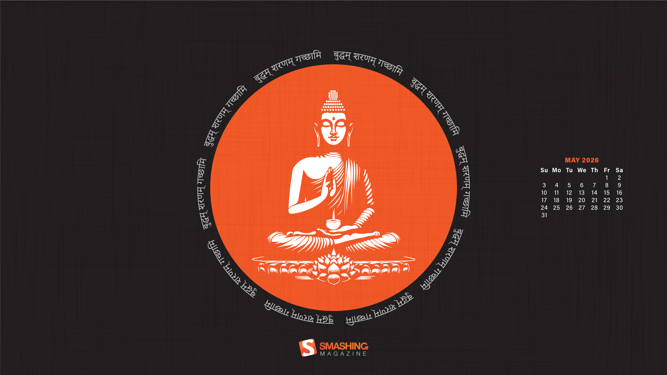
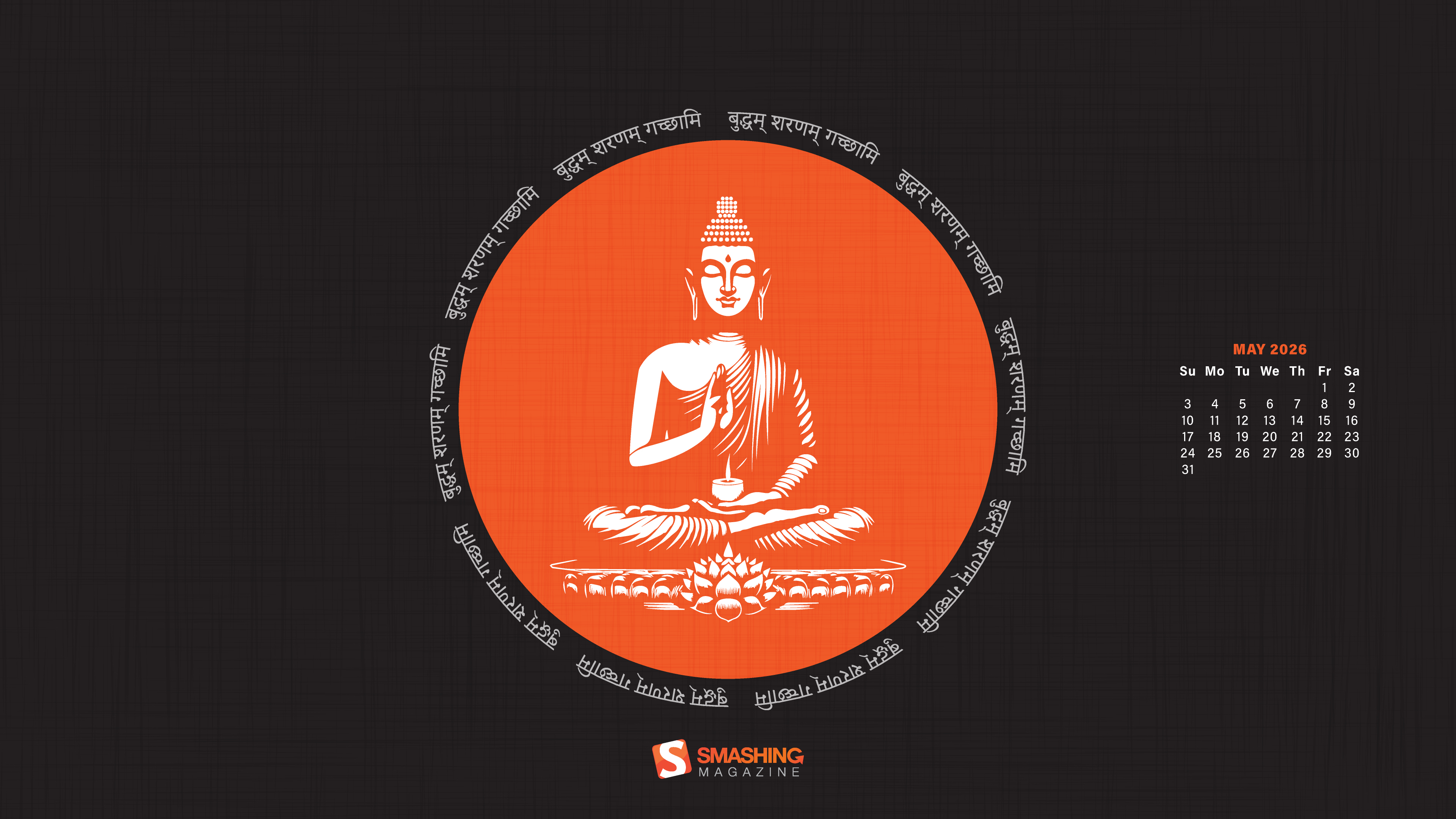
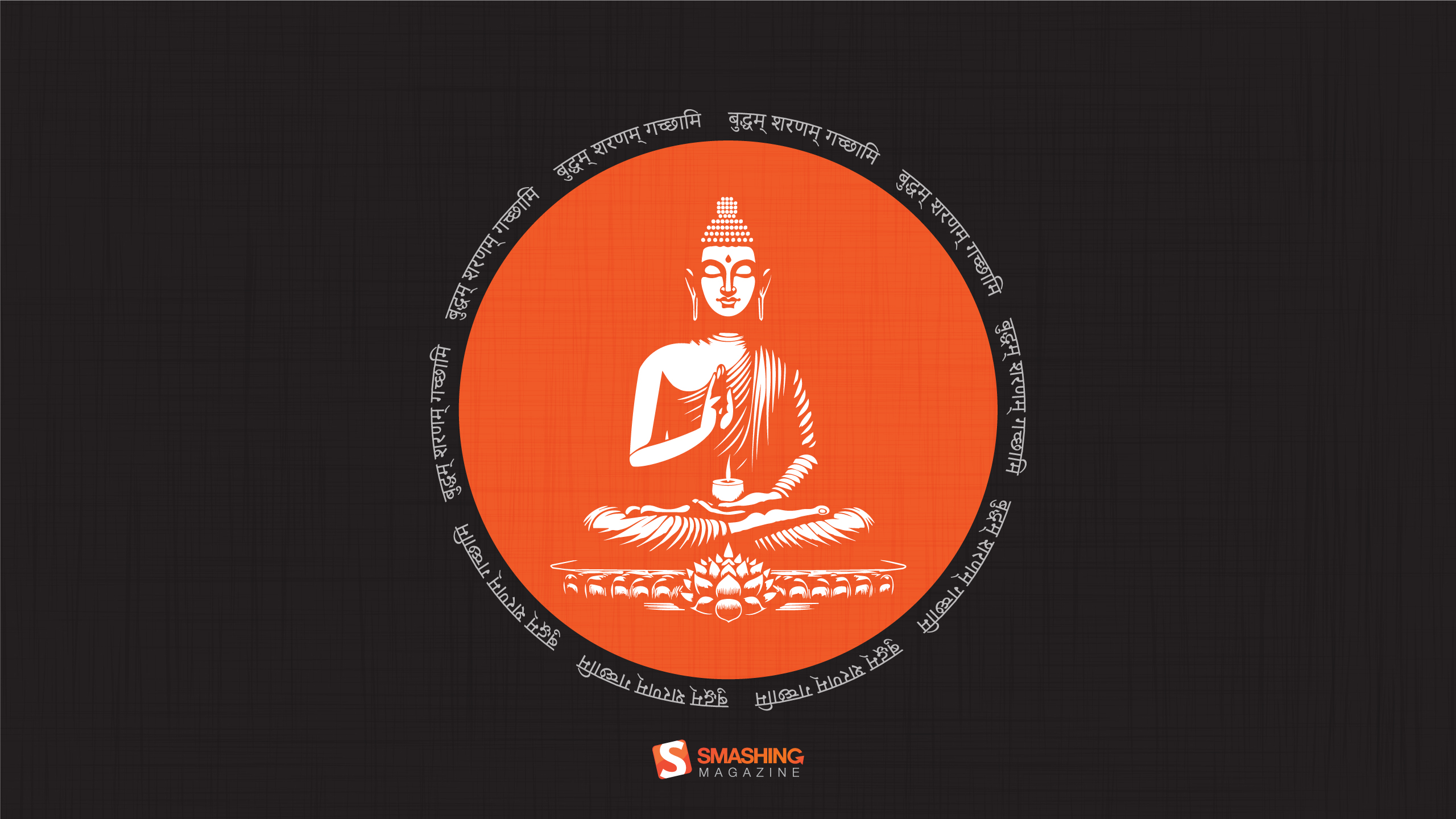
“Buddha Purnima, falling on May 1st, is the most sacred Buddhist festival commemorating the birth, enlightenment, and passing of Gautama Buddha. It is observed on the full moon day of the Vaisakha month, symbolizing spiritual liberation and the triumph of peace. The day serves as a global reminder of his core teachings: non-violence, compassion, and the path to ending suffering.” — Designed by V D Photography from Surat, Gujarat, India.
“The longing for warmth, flowers in bloom, and new beginnings is finally over as we welcome the month of May. From celebrating nature on the days of turtles and birds to marking the days of our favorite wine and macarons, the historical celebrations of the International Workers’ Day, Cinco de Mayo, and Victory Day, to the unforgettable ‘May the Fourth be with you’, May is a time of celebration — so make every May day count!” — Designed by PopArt Studio from Serbia.
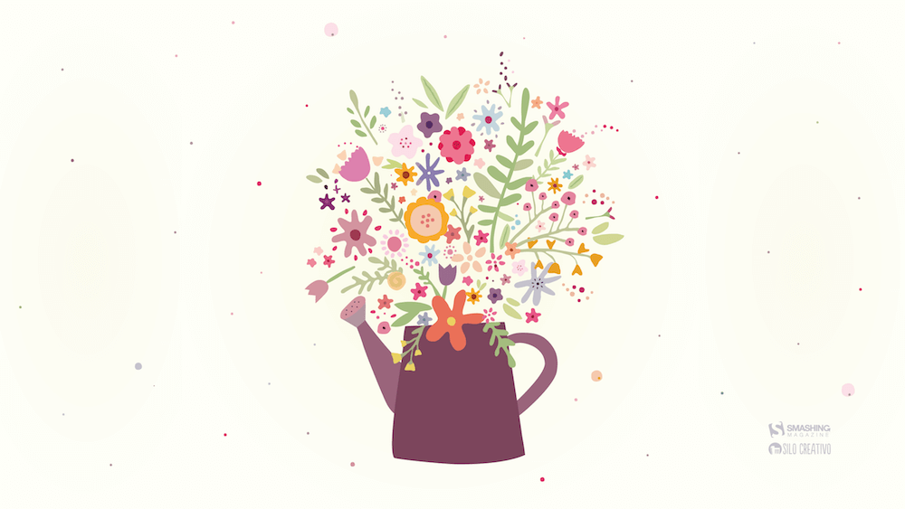
“This month is dedicated to flowers, to join us and brighten our days giving a little more color to our daily life.” — Designed by Verónica Valenzuela Jimenez from Spain.
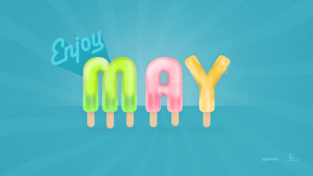
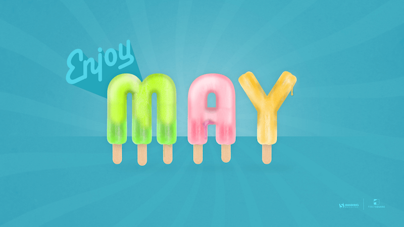
“Springtime, especially May, is my favorite time of the year. And I like popsicles — so it’s obvious isn’t it?” — Designed by Steffen Weiß from Germany.
“We don’t usually count the breaths we take, but observing nature in May, we can’t count our breaths being taken away.” — Designed by Ana Masnikosa from Belgrade, Serbia.
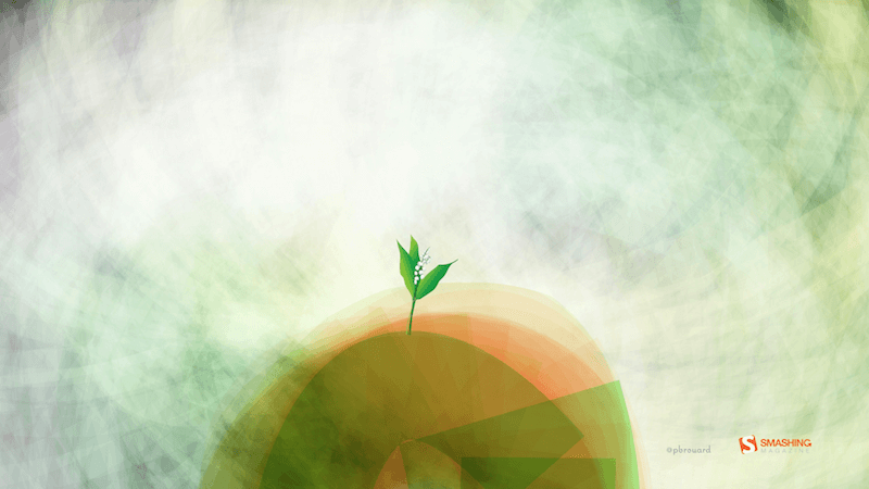
“The ‘lily of the valley’ came earlier this year. In France, we celebrate the month of May with this plant.” — Designed by Philippe Brouard from France.
“April and May are usually when everything starts to bloom, especially the magnolia trees. I live in an area where there are many and when the wind blows, the petals make it look like snow is falling.” — Designed by Sarah Masucci from the United States.
“‘As knowledge increases, wonder deepens.’ (Charles Morgan) So I tried to create an illustration based on this.” — Designed by Bisakha Datta from India.
“Lixia is the 7th solar term according to the traditional East Asian calendars, which divide a year into 24 solar terms. It signifies the beginning of summer in East Asian cultures. Usually begins around May 5 and ends around May 21.” — Designed by Hong, Zi-Cing from Taiwan.
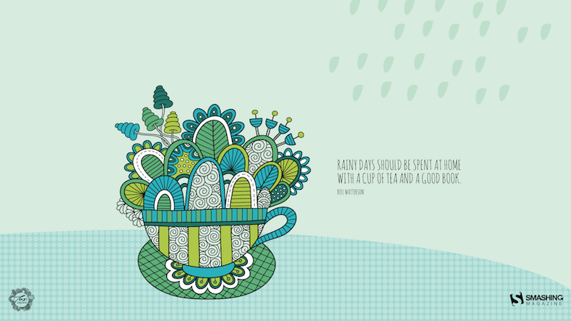
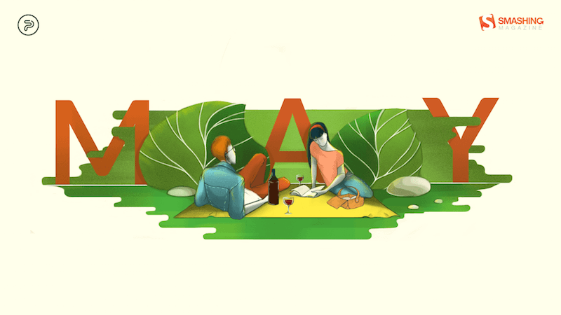
“Winter is nearly here in my part of the world and I think rainy days should be spent at home with a good book!” — Designed by Tazi Design from Australia.
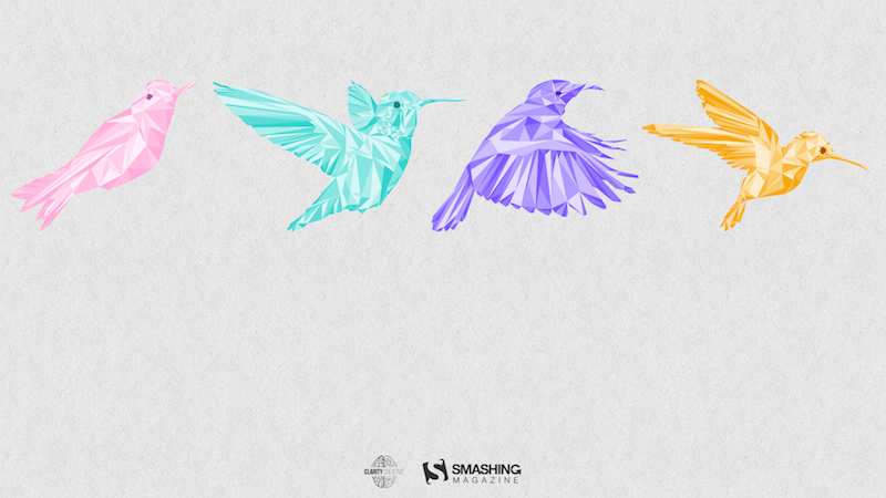
“Inspired by a little-known ‘holiday’ on May 4th known as ‘Bird Day’. It is the first holiday in the United States celebrating birds. Hurray for birds!” — Designed by Clarity Creative Group from Orlando, FL.
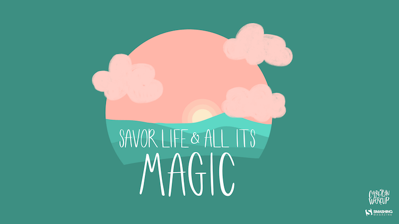
“I designed Magical Sunset as a friendly reminder to take a moment and enjoy life around you. Each sunset and sunrise brings a new day for greatness and a little magic.” — Designed by Carolyn Warcup from the United States.
“Edwin Way Teale once said that ‘[t]he world’s favorite season is the spring. All things seem possible in May.’ Now that the entire nature is clothed with grass and branches full of blossoms that will grow into fruit, we cannot help going out and enjoying every scent, every sound, every joyful movement of nature’s creatures. Make this May the best so far!” — Designed by PopArt Studio from Serbia.
Feeling inspired? We’ll publish the June wallpapers on May 31, so if you’d like to be part of the collection, please don’t hesitate to submit your design. We are already looking forward to it!

 Connexion