A cross-browser feature as of the release of Firefox 128 in July 2024 is a new at-rule - @property - which allows defining types as well as inheritance and an initial value for your custom properties.
We'll learn when and why traditional fallback values can fail, and how @property features allow us to write safer, more resilient CSS custom property definitions.
Custom properties - aka "CSS variables" - are useful because they allow creating references to values similar to variables in other programming languages.
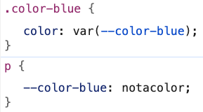
Consider the following scenario which creates and assigns the --color-blue property, which then is implemented as a class and applied to a paragraph.
Now, you and I both know that "blue" is a color. And it also may seem obvious that you would only apply the class that uses this color to text we intend to be blue.
But, the real world isn't perfect, and sometimes the downstream consumers of our CSS end-up with a reason to re-define the value. Or perhaps they accidentally introduce a typo that impacts the original value.
The outcome of either of these scenarios could be:
the text ends up a color besides blue, as that author intended
the text surprisingly renders as black
If the rendered color is surprisingly black, it's likely that we've hit the unique scenario of invalid at computed value time.
When the browser is assessing CSS rules and working out what value to apply to each property based on the cascade, inheritance, specificity and so forth, it will retain a custom property as the winning value as long as it understands the general way it's being used.
In our --color-blue example, the browser definitely understands the color property, so it assumes all will be ok with the use of the variable as well.
But, what happens if someone redefines --color-blue to an invalid color?
Ok, but our good friend the cascade exists, and back in the day we used to put things like vendor prefixed properties prior to the unprefixed ones. So, perhaps if we use a similar method and supply an extra color definition before the one that has the custom property it can fallback to that?
CSS for "Attempt resolution with extra color definition"
Bummer, we don't seem to be making progress towards preventing this issue.
This is because of the (slightly scary sounding) scenario invalid at computed value time.
Although the browser has kept our definition that expects a custom property value, it's not until later that the browser tries to actually compute that value.
In this case, it looks at both the .color-blue class and the value provided for the p element rule and attempts to apply the computed value of notacolor. At this stage, it has discarded the alternate value of blue originally provided by the class. Consequently, since notacolor is in fact not a color and therefore invalid, the best it can do is use either:
an inherited value if the property is allowed to inherit and an ancestor has provided a value; or
the initial value as defined in the CSS spec
While color is an inheritable property, we haven't defined it on any ancestors, so the rendered color of black is due to the initial value.
Refer to this earlier Modern CSS article about how custom property values are computed and learn more deeply about the condition of invalid at computed value time.
It's time to introduce @property to help solve this issue of what you may perceive as a surprising rendered value.
The critical features @property provides are:
defining acceptable types for specific custom properties
enabling or disabling inheritance
providing an initial value as a failsafe for invalid or undefined values
This at-rule is defined on a per-custom property basis, meaning a unique definition is needed for each property for which you want to leverage these benefits.
It is not a requirement, and you can certainly continue using custom properties without ever bringing in @property.
Please note that at time of writing, @property is very newly cross-browser and I would advise you to consider it a progressive enhancement to benefit users in supporting browsers.
Let's apply it to our blue dilemma and see how it fixes the issue of the otherwise invalid color supplied in the element rule.
CSS for "Apply @property to --color-blue"
@property --color-blue{syntax:"<color>";inherits: true;initial-value: blue;}/* Prior rules also apply */
I'm blue dabadee (maybe)
Success, our text is still blue despite the invalid definition!
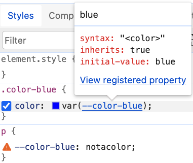
Additionally, DevTools is now helpful again:
We can observe both that the invalid value is clearly an error, and we also are provided the full definition of the custom property via the hover overlay.
Why would we need types for custom properties? Here are a few reasons:
types help verify what makes a valid vs. invalid value
without types, custom properties are very open-ended and can take nearly any value, including a blank space
lack of types prevents browser DevTools from providing the optimal level of detail about which value is in use for a custom property
In our @property definition, the syntax descriptor enables providing the allowed types for the custom property. We used "<color>", but other types include:
"<length>" - numbers with units attached, ex. 4px or 3vw
"<integer>" - decimal units 0 through 9 (aka "whole numbers")
"<number>" - numbers which may have a fraction, ex. 1.25
"<percentage>" - numbers with a percentage sign attached, ex. 24%
"<length-percentage>" - accepts valid <length> or <percentage> values
A special case is "*" which stands for "universal syntax" and enables accepting any value, similar to the default behavior. This means you skip the typing benefit, but perhaps want the inheritance and/or initial value control.
The type applies to the computed value of the custom property, so the "<color>" type would be happy with both blue as well as light-dark(blue, cyan) (although only one of those is accepted into the initial-value as we will soon learn).
Let's say we want to provide a little flexibility for our --color-blue custom property.
We can use a list to provide valid options. Anything other than these exact values would be considered invalid, and use the initial-value instead (if inheritance didn't apply). These are called "custom idents", are case sensitive, and can be any value.
The pipe character (|) used in the previous list indicates an "or" condition. While we used explicit color names, it can also be used to say "any of these syntax types are valid."
Some properties accept mixed types to develop the full value, such as box-shadow which has potential types of inset, a series of <length> values, and a <color>.
Presently, it's not possible to type this in a single @property definition, although you may attempt to try something like "<length>+ <color>". However, this effectively invalidates the @property definition itself.
One alternative is to break up the custom property definitions so that we can allow a series of lengths, and then allow a color. While slightly more cumbersome, this allows us to still get the benefit of typing which relieves the potential errors we covered earlier.
CSS for "Support multi-part mixed values for syntax"
If you're less concerned about the "type" of a property for something like box-shadow and care more about inheritance or the initial value, you can instead use the universal syntax definition to allow any value. This negates the problem we just mitigated by splitting up the parts.
A subset of CSS properties are inheritable, such as color. The inherits descriptor for your @property registration allows you to control that behavior for your custom property.
If true, the computed value can look to an ancestor for its value if the property is not explicitly set, and if a value isn't found it will use the initial value.
If false, the computed value will use the initial value if the property is not explicitly set for the element, such as via a class or element rule.
In this demonstration, the --box-bg has been set to inherits: false, and only the outer box has an explicit definition via the applied class. The inner box uses the initial value since inheritance is not allowed.
Unless your syntax is open to any value using the universal syntax definition - "*" - then it is required to set an initial-value to gain the benefits of registering a custom property.
As we've already experienced, use of initial-value was critical in preventing the condition of a completely broken render due to invalid at computed value time. Here are some other benefits of using @property with an initial-value.
When building design systems or UI libraries, it's important to ensure your custom properties are robust and reliable. Providing an initial-value can help prevent a broken experience. Plus, typing properties also meshes nicely with keeping the intent of design tokens which may be expressed as custom properties.
Dynamic computation scenarios such as the use of clamp() have the potential to include an invalid value, whether through an error or from the browser not supporting something within the function. Having a fallback via initial-value ensures that your design remains functional. This fallback behavior is a safeguard for unsupported features as well, though that can be limited by whether the @property rule is supported in the browser being used.
Review additional ways to prevent invalid at computed time that may be more appropriate for your browser support matrix, especially for critical scenarios.
Incorporating @property with initial-value not only enhances the reliability of your CSS but also opens the door to the possibility of better tooling around custom properties. We've previewed the behavior change in browser DevTools, but I'm hopeful for an expansion of tooling including IDE plugins.
The added layer of security from using @property with initial-value helps maintain the intent of your design, even if it isn't perfect for every context.
The initial-value is subject to the syntax you define for @property. Beyond that, syntax itself doesn't support every possible value combination, which we previously covered. So, sometimes a little creativity is needed to get the benefit.
Also, initial-value values must be what the spec calls computationally independent. Simplified, this means relative values like em or dynamic functions like clamp() or light-dark() are unfortunately not allowed. However, in these scenarios you can still set an acceptable initial value, and then use a relative or dynamic value when you use the custom property, such as in the :root assignment.
This limitation on relative units or dynamic functions also means other custom properties cannot be used in the initial-value assignment. The previous technique can still be used to mitigate this, where the preferred outcome is composed in the use of the property.
Finally, custom properties registered via @property are still locked into the rules of regular properties, such as that they cannot be used to enable variables in media or container query at-rules. For example, @media (min-width: var(--mq-md)) would still be invalid.
As of time of writing, using a property or function value that a browser may not support as part of the initial-value definition can cause the entire page to crash!
Fortunately, we can use @supports to test for ultra-modern properties or features before we try to use them as the initial-value.
@supports([property|feature]){/* Feature is supported, use for initial-value */}@supportsnot([property|feature]){/* Feature unsupported, use alternate for initial-value */}
There may still be some surprises where @supports reports true, but testing will reveal a crash or other error (ex. currentColor used with color-mix() in Safari). Be sure to test your solutions cross-browser!
There are a few conditions which may feel like exceptions to the requirement of "computationally independent" values when used for the initial-value.
First, currentColor is accepted. Unlike a relative value such as em which requires computing font-size of ancestors to compute itself, the value of currentColor can be computed without depending on context.
Second, use of "<length-percentage>" enables the use of calc(), which is mentioned in the spec. This allows a calculation that includes what is considered a global, computationally independent unit set even though we often use them for dynamic behavior. That is, the use of viewport units.
For a scenario such as fluid type, this provides a better fallback that keeps the spirit of the intended outcome even though it's overall less ideal for most scenarios.
CSS for "Use of calc() with vi for initial-value"
@property --heading-font-size{syntax:"<length-percentage>";inherits: true;initial-value:calc(18px + 1.5vi);}/* In practice, define your ideal sizing function
using `clamp()` via an assignment on `:root` */h2{font-size:var(--heading-font-size);}
Resize the window to see the fluid behavior
Note: While we typically recommend using rem for font-size definitions, it is considered a relative value and not accepted for use in initial-value, hence the use of px in the calculation.
In some scenarios, registering a property without the universal syntax - which means an initial-value is required - has consequences, and limits the property's use.
Some reasons for preferring optional component properties include:
to use the regular custom property fallback method for your default value, especially if the fallback should be another custom property (ex. a design token)
an initial-value may result in an unwanted default condition, particularly since it can't include another custom property
A technique I love to use for flexible component styles is including an intentionally undefined custom property so that variants can efficiently be created just by updating the custom property value. Or, purposely using entirely undefined properties to make the base class more inclusive of various scenarios by treating custom properties like a component style API.
For example, if I registered --button-background here as a color, it would never use the correct fallback when my intention was for the default variant to use the fallback.
.button{/* Use of initial-value would prevent ever using the fallback */background-color:var(--button-background,var(--color-primary));/* Intended to be undefined and therefore considered invalid until set */border-radius:var(--button-border-radius);}.button--secondary{--button-background:var(--color-secondary);}.button--rounded{--button-border-radius: 4px;}
If you also have these scenarios, you may consider using a mixed approach of typing your primitive properties - like --color-primary - but not the component-specific properties.
While some of the demos in this article intentionally were set up to have the rendered output use only the initial-value, in practice it would be best to separately define the custom property. Again, this is presently a new feature, so without an additional definition such as in :root you risk not having a value at all if you swap to only relying on initial-value.
You should also be aware that it is possible to register the same property multiple times, and that cascade rules mean the last one will win. This raises the potential for conflicts from accidental overrides. There isn't a way to "scope" the @property rule within a selector.
However, use of cascade layers can modify this behavior since unlayered styles win over layered styles, which includes at-rules. Cascade layers might be a way to manage registration of @property rules if you assign a "properties" layer early on and commit to assigning all registrations to that layer.
Custom properties can also be registered via JavaScript. In fact, this was the original way to do it since this capability was originally coupled with the Houdini APIs. If a property is registered via JS, that definition is likely to win over the one in your stylesheets. That said, if your actual intent is to change a custom property value via JS, learn the more appropriate way to access and set custom properties with JS.
Use of @property has the potential for strengthening container style queries, especially if you are registering properties to act as toggles or enums. In this example, the use of @property helps by typing our theme values, and ensures a fallback of "light".
Although it's a bit outside the scope of this article, another benefit of typing custom properties is that they become animatable. This is because the type turns the value into something CSS knows how to work with, vs. the mysterious open-ended value it would otherwise be. Here's a CodePen example of how registering a color custom property allows animating a range of colors for the background.
Use of @property enables writing safer CSS custom properties, which improves the reliability of your system design, and defends against errors that could impact user experience. A reminder that for now they are a progressive enhancement and should almost always be used in conjunction with an explicit definition of the property.
Be sure to test to ensure your intended outcome of both the allowed syntax, and the result if the initial-value is used in the final render.
Custom properties - aka “CSS variables” - seem fairly straightforward. However, there are some behaviors to be aware of regarding how the browser computes the final values. A misunderstanding of this process may lead to an unexpected or missing value and difficulty troubleshooting and resolving the issue.
To help you use custom properties confidently and troubleshoot efficiently, we’ll review:
how the browser determines values for any property
the impact of “computed value time”
pitfalls around using custom properties with cutting-edge CSS
why inheritance should inform your custom property architecture
Each of these are declared values, and due to specificity and the cascading order, the element’s final selected value may be the cascaded value. In this case, .card__title wins for the color property.
If a property does not receive a value from the cascade, then it will use either the inherited or initial value.
Inherited values come from the nearest ancestor that has assigned a value, if the property is allowed to inherit (ex. color, font properties, text-align)
Initial values are used when no inherited value exists or is allowed and are the values provided by the specification for the property
So, for <h2 class="card__title">, the full set of values populated for the element may be as follows:
.card__title{/* Cascaded value */color: #93b;/* Initial properties and values */display: block;/* Inherited properties and values */line-height: 1.2;font-family: Source Code Pro;font-weight: 500;font-size: 1.35rem;}
Some property definitions require further computation to absolutize the values. The following are a few of the value transforms that may occur.
Relative units such as vw, em, and % are converted to pixel values, and floats may be converted to integers
currentColor and named colors like rebeccapurple are converted to an sRGB value
Compositing values that affect each other
ex. padding: 1em requires computing the value for font-size that em depends on
custom properties are replaced with their computed values
These transformations result in the computed,used, and actual values - which refer to the progressive steps that may be involved to end up with an absolutized value. You can dive deeper into the specifics of how values are calculated or check out this review of value processing.
One special computation scenario with a critical impact on modern CSS is when the browser assigns values to custom properties, referred to as “computed value time” (CVT).
The .card p will be the inheritedcolor value of red as provided by the body. It is unable to use the cascaded value of blue due to the browser discarding that as a possible value candidate at “parse time” when it is only evaluating syntax. It is only when the user agent attempts to apply the final value - the stage of “computed value time” - that it realizes the value is invalid.
Said another way: once the browser determines the cascaded value, which is partially based on syntactic correctness, it will trash any other candidates. For syntactically correct custom properties, the browser essentially assumes the absolutized value will succeed in being valid.
This leads to an inability for custom properties to “fail early”. When there is a failure, the resulting value will be either an inherited value from an ancestor or the initial value for the property. (If this sounds familiar, it’s because it’s also the behavior when using unset.)
Critically, this means an invalid custom property value is unable to fall back to a previously set cascaded value, as you may expect, because those have been discarded from the decision tree.
All hope is not lost! If later a utility class on the paragraph were to update the color property, then due to rules of the cascade and specificity it would win out like normal and the invalid custom property value wouldn’t have an effect.
html{color: red;}p{color: blue;}.card{--color: #notacolor;}/* Not used */.card p{color:var(--color);}/* Wins! */.card .callout{color: purple }
Note that when referring to invalid values for custom properties that what makes it invalid is how the value is applied. For example, a space character is a valid custom property definition, but will be invalid when applied to a property.
:root{/* Valid definition */--toggle:;}.card{/* Invalid at computed time */margin:var(--toggle);}
On the other hand, a custom property with a value of 100% may be applied to width but not color.
:root{--length: 100%;}.card{/* Valid */width:var(--length);/* Invalid at computed time */color:var(--length);}
Join my newsletter for article updates, CSS tips, and front-end resources!
Another scenario where a custom property being invalid at computed value time may break your expectation is using the custom property as a partial value, or undefined with a fallback, especially paired with cutting-edge CSS features.
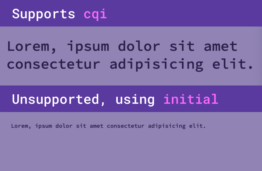
Given the following, you may expect that when the cqi unit is not supported, the browser will simply use the prior font-size definition.
Instead, the browser assumes it will understand the second clamp() definition and discards the prior font-size definitions for this h2 rule. But when the browser goes to populate the custom property value and finds it doesn’t support cqi, it’s too late to use what was intended as the fallback definition. This means it instead uses the initial value, if there is no inheritable value from an ancestor.
While you might think that the initial value would at least be a font-size befitting the h2 level, the initial value for any element’s font-size is “medium” which is generally equivalent to 1rem. This means you not only lose your intended fallback style, but also the visual hierarchy of the h2 in browsers which do not support cqi.
One way to discover the initial value for any property is to search for it on MDN, and look for the “Formal Definition” section which will list the initial value, as well as whether the value is eligible for inheritance.
A few initial values to be aware of besides font-size:
background-color: transparent
border-color: currentColor
border-width: medium which equates to 3px
color: canvastext which is a system color and likely to be black, but may change due to forced-colors modes
font-family: depends on user agent, likely to be a serif
Safely Supporting Modern CSS Values in Custom Properties
Does this mean you need to change every place you use custom properties? That all depends on your support matrix (which browsers and versions you have elected to support). For super-ultra-modern properties, especially when the initial value is undesirable, this approach may be the safest. Another example of when you may use an @supports condition is with new color spaces, like oklch().
Confusingly, given a situation like the cqi example, browser dev tools for the un-supporting browser may still show the failing rule as being the applied style. This is likely because the browser may still support the other parts, like clamp(). An incorrect appearance in dev tools can make it difficult to troubleshoot issues caused by custom properties being invalid at computed time, which is why it’s important to fundamentally understand what is happening.
Another way computed value time affects custom property value assignment is inheritance of computed values.
Calculation of a custom property value is performed once per element, which then makes the computed value available for inheritance. Let’s learn how that impacts your custom property architecture choices.
A common convention is batching custom properties into the :root selector. If one of those properties involves a calculation which includes another :root-level custom property, then updating the modifying property from a descendent will not update the calculation.
As in the following example, the --font-size-large is calculated immediately, so updating the --font-size property within a descendent rule will not be able to affect the value.
CSS for "Computed values are immutable"
:root{--font-size: 1rem;--font-size-large:calc(2 * var(--font-size));}h1{--font-size: 1.25rem;/* The new --font-size will not update the --font-size-large calculation */font-size:var(--font-size-large);}
Cake muffin toffee gingerbread ice cream
This is because the calculation happens as soon as the browser processes the definition against the :root. So the :root definition produces a static, computed value which is inheritable, but immutable.
This is not to say this behavior is unique to :root. The key concept is that once custom property values are computed, the computed value is only inheritable.
To think about it another way: within the cascade, values can be inherited by descendents, but can’t pass values back to their ancestors. Essentially this is why the computed custom property value on an ancestor element cannot be modified by a descendent element.
If we lower the custom property calculation to be applied based on classes, then the browser will be able to recalculate as part of the value processing to determine the computed value. This is because it will calculate a value for elements with the class font-resize, and a separate value for elements with both font-resize and font-large classes.
CSS for "Computed values are per element"
:root{--font-size: 1rem;}.font-resize{font-size:calc(var(--font-size-adjust, 1) * var(--font-size));}.font-large{/* Successfully modifies the value when paired with .font-resize */--font-size-adjust: 2.5;}
A few simple strategies to avoid custom property failure include:
Use a fallback value when defining a custom property, which is the second value that can be provided to the var() function, ex. var(--my-property, 1px)
A cross-browser feature as of the release of Firefox 128 in July 2024 is a new at-rule - @property - which allows defining types for your custom properties.
Helpfully, the initial-value parameter enables defining your own property-specific initial value which will be used in the event the computed value would otherwise be invalid!
Given the following definition for our --color-primary custom property, if the computed value was invalid, the provided initial-value of purple would be used instead.
The language of CSS has had an explosion of new features and improvements in the last few years. As a result, feature parity between browsers is at an all-time high, and efforts are being made to continue releasing features consistently and synchronously among evergreen browsers.
Today, we will explore modern project architecture, emphasizing theming, responsive layouts, and component design. We'll learn about features to improve code organization and dig into layout techniques such as grid and container queries. Finally, we'll review real-world examples of context-aware components that use cutting-edge CSS techniques. You're sure to be inspired to expand your CSS skills and ready to create scalable, future-friendly web projects.
Since the early days of CSS, a convention to tame cross-browser styling inconsistencies has been the CSS reset. This refers to a group of rules that do things like to remove default spacing attributes or enforce inheritance of font styles. It has also grown more flexible in definition, and some folks use it as a place to put baseline global style overrides.
Here are a few handy rules I now place in my reset to take advantage of modern CSS features. A wonderful thing about these rules is they are also progressive enhancements that don't strictly require fallbacks. If they are supported in a browser and are applied, great! And if not, there's no or minimal impact on the user experience.
I set a common baseline for default links, which are scoped to those without a class. This is an assumption that classless links are intended to keep a regular, underlined link appearance. The update is to set the underline to use a relative thickness and increase the underline offset. The visual outcome may be minor, but it can improve the legibility of links, especially when presented in a list or other close-proximity contexts.
/* Baseline for default links */a:not([class]){/* Relatively sized thickness and offset */text-decoration-thickness:max(0.08em, 1px);text-underline-offset: 0.15em;}
The max() function asks the browser to choose the larger of the presented options, which effectively ensures that in this rule, the underline cannot be thinner than 1px.
An exciting cross-browser update as of March 2022 was a switch of the default focus behavior for interactive elements to use :focus-visible by default. Whereas the :focus state applies no matter how an element receives focus, :focus-visible only produces a visible focus state based on the heuristics of the user's input modality. Practically speaking, this means that typically mouse users will not see a visible focus for elements like links or buttons, but a keyboard user who accesses those elements through tabbing will see a visible focus style.
As for our reset, this means our visible focus styles will be attached to only the :focus-visible state.
In this rule, custom properties are used to set the various outline attributes. This allows the creation of a common baseline for our application's focus styles while allowing overrides for components as needed.
You might also be less familiar with the outline-offset property, which defines the distance between the element and the outline. This property can use a negative value to inset the outline and place it inside the element. I often do this override for button component styles to ensure the outlines retain accessible contrast against the element.
The last two additions to my reset involve improving the scroll position for targeted or focused elements.
Using scroll-padding properties, you can adjust the scroll position in relation to elements. The "padding" space does not affect the layout, just the offset of the scroll position.
In this rule, the :target selector matches when an element is a target of an anchor link, also known as a "document fragment." The scroll-padding-block-start will allow for room between the target and the top of the viewport.
The use of scroll-padding-block-end in this next rule allows for room between a focused element and the bottom of the viewport, which helps with tracking visible focus position.
/* Scroll margin allowance below focused elements
to ensure they are clearly in view */:focus{scroll-padding-block-end: 8vh;}
Values for both rules can be adjusted to work best with your application layout. Consider that you might need a little bit of help from JavaScript if you need to account for sticky headers or footers.
Native CSS nesting began to be supported in Chromium 112, Safari 16.5, and very newly in Firefox Nightly so stable support should be shortly behind.
For those who have used a preprocessor like Sass or LESS, native nesting will be familiar, but it does have some unique rules.
Any selector type is valid as a nested selector. The ampersand - & - character is also available and refers to the top-level selector, so that is one way to begin a nested selector.
Selectors such as :is() or :where() are useful in nested selectors. And standard class or attribute selection is also allowed, as well as the other combinators.
A possible gotcha with nesting selectors is that the compound result creates descendent selectors. In other words, a space character is added between the top-level selector and the nested selector. When you intend to have the nested selector be appended to the top-level selector, the use of the & enables that result.
Use of & also allows nested selectors for pseudo-elements and pseudo-classes.
.my-element{&::before{}&:hover{}}
Review more examples of valid and invalid nesting rules from Jen Simmons and Adam Argyle.
You can safely begin using nesting today without Sass or LESS by incorporating a build tool such as LightningCSS, which will pre-combine the selectors for your final stylesheet based on your browser targets.
In a coordinated cross-browser rollout, the new at-rule of @layer became available as of Chromium 99, Safari 15.4, and Firefox 97 in early 2022. This at-rule is how to manage CSS cascade layers, which allows authors more control over two key features of the "C" in CSS: specificity and order of appearance. This is significant because those are the last two determining factors a browser considers when applying an element's style.
Using @layer, we can define groups of rule sets with a pre-determined order to reduce the likelihood of conflicts. Being able to assign this order largely prevents the need to use !important and enables easier overrides of inherited styles from third-party or framework stylesheets.
The critical rules to understand about cascade layers are:
the initial order of layers defines the applied priority order
priority increases in order
ex. first layer has less priority than the last layer
less-nested layered styles have priority over deeper nested layer styles
un-layered styles have the highest priority over layered styles
In this example, the initial layer order is given as global followed by typography. However, the styles added to those layers are written so that the typography layer is listed first. But, the p will be blue since that style is defined in the typography layer, and the initial layer order defines the typography layer later than the global layer.
The nested layer of color within typography also has lower-priority than the un-nested style. Finally, the paragraph will also have a margin-bottom of 2rem since the un-layered style has higher priority over the layered styles.
As with many newer features, there is much room for experimentation, and "best practices" or "standards of use" have not been established. Decisions like whether to include cascade layers, what to name them, and how to order them will be very project dependent.
Here’s a layer order I have been trying out in my own projects:
Moving to cascade layers is a bit tricky, although a polyfill is available. However, at-rules cannot be detected by @supports in CSS. Even if they could, there's still the issue that un-layered styles that you may not be ready to move to layers would continue to override layer styles.
The desire to detect @layer support and minimize the conflict between layered and un-layered styles was a motivating factor in creating my project SupportsCSS, a feature detection script. It adds classes to <html> to indicate support or lack thereof, which can then be used as part of your progressive enhancement strategy for many modern CSS features, including cascade layers.
Join my newsletter for article updates, CSS tips, and front-end resources!
There are three features I immediately begin using when starting a new project, large or small. The first is custom properties, also known as CSS variables.
The 2022 Web Almanac - which sources data from the HTTP Archive dataset and included 8.36M websites - noted that 43% of pages are using custom properties and have at least one var() function. My prediction is that number will continue to grow dramatically now that Internet Explorer 11 has reached end-of-life, as lack of IE11 support prevented many teams from picking up custom properties.
The Almanac results also showed that the ruling type used by custom property values was color, and that is in fact how we’ll begin using them as well.
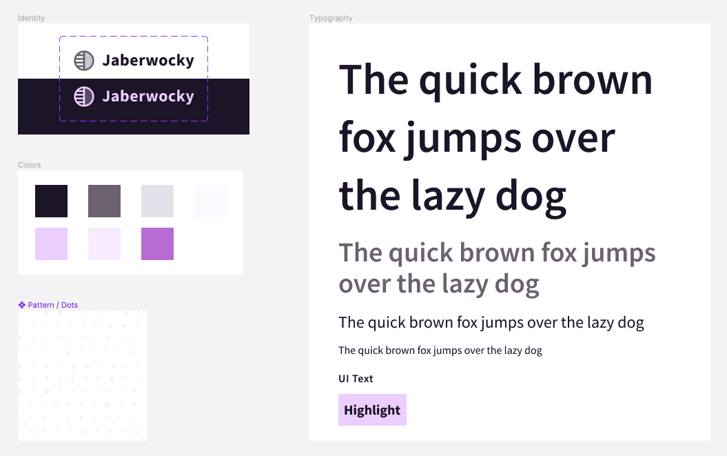
For the remainder of the examples, we’ll be building up components and branding for our imaginary product Jaberwocky.
We’ll begin by placing the brand colors as custom properties within the :root selector, within our theme layer.
You may also wish to place font sizes or other "tokens" you anticipate re-using in this theme layer. Later, we'll elevate some component properties to this global space. We'll also continue to inject custom properties throughout our layout utilities and component styles to develop an API for them.
Now that we have a brand and color palette, it's time to add the other two features.
First is color-scheme, which allows us to inform the browser whether the default site appearance is light or dark or assign a priority if both are supported. The priority comes from the order the values are listed, so light dark gives "light" priority. The use of color-scheme may affect the color of scrollbars and adjust the appearance of input fields. Unless you provide overrides, it can also adjust the background and color properties. While we are setting it on html, you may also localize it to a certain component or section of a layout. Sara Joy shares more about how color-scheme works.
The second property is accent-color which applies your selected color to the form inputs of checkboxes, radio buttons, range, and progress elements. For radio buttons and checkboxes, this means it's used to color the input in the :checked state. This is an impactful step towards theming these tricky-to-style form inputs and may be a sufficient solution instead of completely restyling. Michelle Barker shares more on how accent-color works.
There is so much we could cover regarding CSS layout, but I want to share two utilities I use in nearly every project for creating responsive grids. The first solution relies on CSS grid, and the second on flexbox.
The first parameter within repeat uses the auto-fit keyword, which tells grid to create as many columns as can fit given the sizing definition which follows. The sizing definition uses the grid-specific function of minmax(), which accepts two values that list the minimum and maximum allowed size for the column. For the maximum, we've used 1fr, which will allow the columns to stretch out and share the space equitably when more than the minimum is available.
For the minimum, we've included the extra CSS math function of min() to ask the browser to use the smaller computed size between the listed options. The reason is that there is potential for overflow once the available space is more narrow than 30ch. By listing 100% as an alternate option, the column can fill whatever space is available below that minimum.
The behavior with this minimum in place means that once the available space becomes less than the amount required for multiple elements to fit in the row, the elements will drop to create new rows. So with a minimum of 30ch, we can fit at least three elements in a 100ch space. However, if that space reduces to 70ch, then only two would fit in one row, and one would drop to a new row.
To improve customization, we'll drop in a custom property to define the minimum allowed size for a column, which will function as a "breakpoint" for each column before causing the overflow to become new rows. For the most flexibility, I also like to include a custom property to allow overriding the gap.
Since this solution uses CSS grid, the grid children are destined to stay in a grid formation. Items that drop to create new rows will remain constrained within the implicit columns formed on the prior rows.
Sometimes in a grid with an odd number of children, you may want to allow them to expand and fill any leftover space. For that behavior, we switch our strategy to use flexbox.
The flexbox grid utility shares two common features with the CSS grid utility: defining a minimum "column" size and the gap size.
With CSS grid, the parent controls the child size. But with flexbox, the children control their sizing. Therefore, it's more safe to use a non-relative value for the column size, since using a font-relative unit like ch may change the outcome depending on the child's own font-size.
Beyond the custom properties API, the base flexbox grid utility simply sets up the display and wrap properties. Wrapping is important so that elements can drop and create new rows as space decreases.
Since our utility doesn't know what the flexbox children will be, we'll use the universal selector - * - to select all direct children to apply flexbox sizing. With the flex shorthand, we define that children can grow and shrink and set the flex-basis to the minimum value.
As with the previous grid utility, this “min” value will cause elements to wrap to new rows once the available space is reduced. The difference is that the flex-grow behavior will allow children to grow into unused space within the row. Given a grid of three where only two elements can fit in a row, the third will expand to fill the entire second row. And in a grid of five where three elements can align, the remaining two will share the space of the second row.
Shortly, we will use container size queries to develop several component styles. Container size queries allow developing rules that change elements based on available space.
To correctly query against the size of flexbox or grid children, we can enhance our utilities to include container definitions.
We’ll default the container name to grid-item while also allowing an override via a custom property. This allows specific container query instances to be explicit about which container they are querying against.
Later examples will demonstrate how to use features of container size queries and make use of these layout utility containers.
Note: There is a bug as of Safari 16.4 where using containment on a grid using auto-fit collapses widths to zero, so proceed with caution if you use this strategy before the bug is resolved.
We’ve reached the first of four components we’ll develop to showcase even more modern CSS features. While you won’t have a complete framework after four components, you will have a solid foundation to continue building from and some shiny new things in your CSS toolbox!
Our styles will support the following variations of a button:
a button element
a link element
text plus an icon
icon plus text
icon-only
There are some reset properties beyond the scope of this article, but the first properties that make a difference in customizing our buttons have to do with color.
For both the color and background-color properties, we’ll begin to develop an API for our buttons by leveraging custom properties.
The API is created by first assigning an undefined custom property. Later, we can tap into that API to easily create button variants, including when adjusting for states like :hover or :disabled.
Then, we use the values that will signify the "default" variant for the second value, which is considered the property's fallback. In this case, our lavender --accent property will be the default color. Our --primary for this theme is nearly black, and will be the complimenting default for the color property.
Next, we’ll address the presence of an .icon within the button. Detecting presence is a special capability of the very modern feature :has().
With :has(), we can look inside the button and see whether it has an .icon and if it does, update the button’s properties. In this case, applying flex alignment and a gap value. Because appending the :has() pseudo class will increase the specificity of the base class selector, we’ll also wrap the :has() clause with :where() to null the specificity of the clause to zero. Meaning, the selector will retain the specificity of a class only.
In our markup for the case of the icon-only buttons is an element with the class of .inclusively-hidden, which removes the visible label but still allows an accessible label for assistive technology like screen readers. So, we can look for that class to signify the icon-only variation and produce a circle appearance.
Next, for buttons without icons, we want to set a minimum inline size, and center the text. We can achieve this by combining the :not() pseudo-class with :has() to create a selector that says “buttons that do not have icons.”
Our final essential button variation is the case of buttons that are not icon-only. This means text buttons and those that include an icon. So, our selector will again combine :not() and :has() to say “buttons that do not have the hidden class,” which we noted was the signifier for the icon-only variant.
While the initial visual appearance is complete, we need to handle for two states: :hover and :focus-visible. Here is where we get to use our custom properties API, with no additional properties required to make the desired changes.
For the :hover state, we are updating the color properties. And for :focus-visible, we're tapping into the API we exposed for that state within our reset. Notably, we're using a negative outline-offset to place it inside the button boundary which helps with ensuring proper contrast.
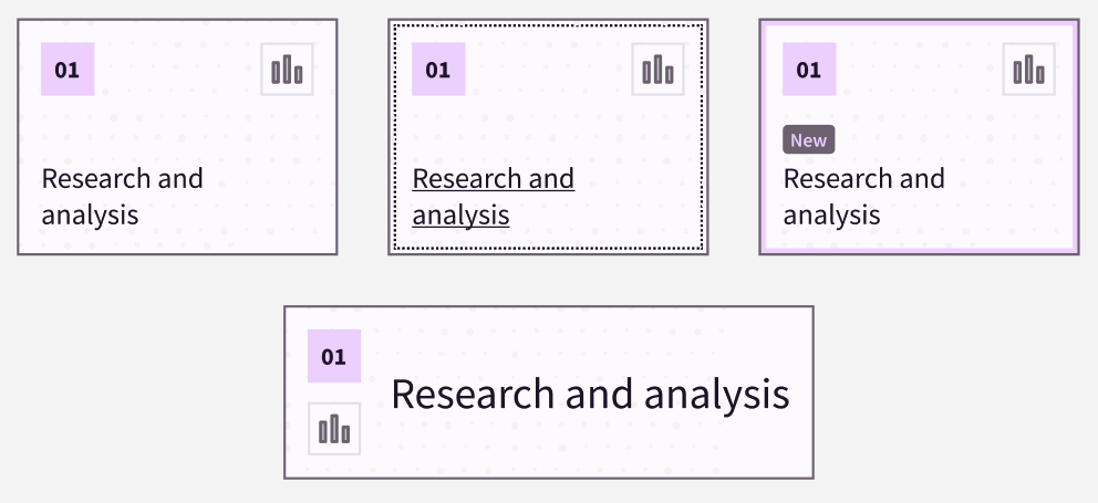
For the card component, we have three variants and one state to manage:
default, small card
“new” style
wide with larger text
focus-visible state
We’ll start from the baseline styles that provide the basic positioning and styles of the card elements. The styles don’t match our mocked-up design, but the cards are usable. And that’s pretty critical that our component generally “works” without the latest features! From this base, we can progressively enhance up to our ideal appearance.
Here are a few other details about our cards and expected usage:
we’ll place them within our flexbox-based layout grid
the layout grid will be within a wrapping container
The cards will anticipate the layout grid and it’s wrapper, which both have been defined as containers with distinct names. That means we can prepare container queries to further adjust the card layouts.
Let’s start with the “New” card variation. There are two details that change, both based on the presence of the .tag element. The hint about how to handle these styles is that we’re detecting the presence of something, which means we’ll bring in :has() for the job.
The first detail is to add an additional border to the card, which we’ll actually apply with a box-shadow because it will not add length to the card’s box model like a real border would. Also, the card already has a visible, actual border as part of it’s styling, which this variation will retain.
The other detail is to adjust the display of the headline, which the “New” tag resides in. This selector will be scoped to assume one of two header tags has been used. We’ll use :is() to efficiently create that group. And since we’ll be adding more headline styling soon, we’ll also try out nesting for this rule.
Our baseline card styles include a method for making the card surface seem clickable even though the link element only wraps the headline text. But when the card link is focused, we want an outline to correctly appear near the perimeter of the card.
We can achieve this without any positioning hackery by using the :focus-within pseudo-class. With :focus-within, we can style a parent element when a child is in a focused state. That let’s us add a regular outline to the card by providing a negative outline-offset to pull it inside the existing border.
That still leaves us the default outline on the link, which we’ll switch to use a transparent outline. The reason is that we still need to retain the outline for focus visibility for users of forced-colors mode, which removes our defined colors and swaps to a limited palette. In that mode, transparent will be replaced with a solid, visible color.
The final stateful style we’ll add is to include a text underline on the link when it is hovered or has visible focus. This helps identify the purpose as a link.
Since we’ve placed our demo cards in the flexbox layout grid, they already seem to be responsive. However, our design mockup included a “wide” card variation that is slightly different than simply stretching out the basic card.
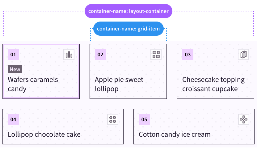
If you recall, we already defined each child of our flexbox grid to be a container. The default container name is grid-item. Additionally, there is a wrapper around the layout grid which also is defined as a container named layout-container. One level of our container queries will be in response to how wide the entire layout grid is, for which we’ll query the layout-container, and the other will respond to the inline size of a unique flex child, which is the grid-item container.
A key concept is that a container query cannot style the container itself. That’s why we haven’t made the actual .card a container, but are looking to its direct ancestor of the grid-item container to attach the container query. The grid-item container will be equivalent to the inline-size of the card itself since it directly wraps the card.
We can also use the new media range query syntax when using container size queries. This enables math operators like > (greater than) to compare values.
We’ll assign the “wide” variation styles when the grid-item container’s inline size is greater than 35ch.
The styles switch the grid orientation into columns instead of the default of rows, which places the number and icon container on the starting side. Then, we’ve added some alignment as well as gap.
The gap property slips in another excellent feature from the container queries spec which is container units. The cqi unit we’ve used stands for “container query inline”, so effectively this value will render as 5% of the calculated inline size, expanding for larger spaces and shrinking for smaller spaces.
One more adjustment for this variation is to stack the number and icon, so we'll add those styles to the container query.
There’s one last adjustment we have, and it will be based on how much room the card grid layout has available. That means we’ll switch and query the layout-container.
The adjustment is to set an aspect-ratio for the default card variations. We’ll also have to add a style to unset the ratio for the wide variation.
You may safely use aspect-ratio without worry of content overflow because the ratio is forgiving, and allows content size to take precedence. Unless dimension properties also limit the element size, the aspect-ratio will allow content to increase the element’s size.
That said, we will also place one dimension property of max-width: 100% on the card so that it stays within the confines of the grid item. Flexbox by itself will not force the element to a particular size, so the aspect-ratio could cause it to grow outside the flex item boundary. Adding max-inline-size will keep the growth in check while allowing longer content to increase the height when needed.
According to our mockup, the last adjustment we need is to increase the font size as the card becomes wider.
We’ll set up a range of allowed values using clamp(). This function accepts three values: a minimum, an ideal, and a maximum. If we provide a dynamic value for the middle ideal, then the browser can interpolate between the minimum and maximum.
We’ll use the cqi unit for the ideal value, which means the font-size will be relative to the inline size of the card. Therefore, narrower cards will render a font-size toward the minimum end of the range, and wider cards will have a font-size toward the maximum end.
A neat thing about container queries is that all elements are style containers by default. This means there is no need to wrap a rule with a container query to use container query units - they are available to all elements!
While this technique is more than sufficient for a single component, you may be interested in my article covering three fluid typography techniques applied via a “mixin” using custom properties.
One last modern CSS feature we'll use to conclude our card styles will upgrade the headings. Use of text-wrap: balance will evaluate a text block of up to six lines and "balance" it by inserting visual line breaks. This helps short passages of text, like headlines, have a more pleasing appearance. It's a great progressive enhancement because it looks great if it works and doesn't cause harm if it fails. However, balancing does not change an element's computed width, so a side-effect in some layouts may be an increase in unwanted space next to the text.
The pagination component benefits from container size queries since it is expected to modify the visibility of elements depending on the available inline space.
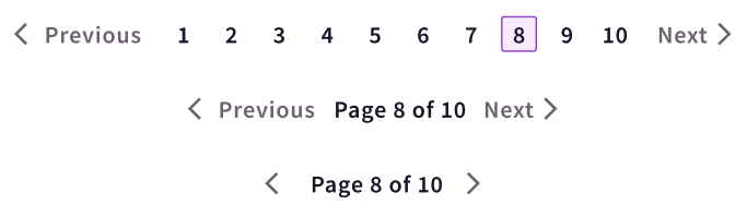
The default view which appears at the narrowest space will show only the .pagination-label and the arrow icons from the “Previous” and “Next” controls.
In slightly wider spaces, the labels for the “Previous” and “Next” controls will be visible.
Finally, once there is enough inline space, the .pagination-label will be swapped out for the full .pagination-list with numbered links to each page.
<navclass="pagination-container"aria-label="Pagination"><ahref=""class="pagination-nav pagination-nav__prev"><svg/><spanclass="pagination-nav__label">Previous</span></a><spanclass="pagination-label">Page 3 of 8</span><ulclass="pagination-list"><li><!-- pagination links --></li></ul><ahref=""class="pagination-nav pagination-nav__next"><svg/><spanclass="pagination-nav__label">Next</span></a></nav>
We'll first define containment for the .pagination-container to enable this dynamic layout behavior.
The styles for our default view have already hidden the .pagination-list and .pagination-nav labels. Important to note is that technique for hiding the .pagination-nav labels still makes the text available for users of assistive technology such as screen readers.
Time for the first level of our container size queries, which is simply unsetting the styles currently hiding the .pagination-nav labels.
While the pagination layout transition happens smoothly for the current list of items, we have a potential problem. Eventually, the pagination list could grow much larger than ten items, which may lead to overflow if the container isn’t actually wide enough to hold the larger list.
To help manage that condition, we can bring back :has() and use it to create quantity queries, which means modifying styles based on checking the number of items.
We'd like to keep the medium appearance for the pagination component if the list has more than 10 items. To check for that quantity, we can use :has() with :nth-child and check for an 11th item. This signifies that list has at least 11 items, which exceeds the list limit of 10.
We must place this rule within the "large" container query so that it overrides the other styles we planned for lists with 10 or fewer items and doesn't apply too early.
You can open your browser dev tools and delete a couple of the list items to see the layout change to reveal the full list again once there are 10 or fewer.
So far, we’ve been working with container size queries, but another type is container style queries. This means the ability to query against the computed values of CSS properties of a container.
Just like size queries, style queries cannot style the container itself, just it’s children. But the property you are querying for must exist on the container.
Use of a style query requires the style signifier prior to the query condition. Presently, support for style queries is available in Chromium within the scope of querying for custom property values.
@containerstyle(--my-property: true){/* Styles for the container's children */}
Instead of creating the quantity queries for the pagination component within the size query, we’ll switch and define a custom property for the .pagination-container to be used for a style query. This can be part of the default, non-container query rules for this element.
A feature of custom properties is they can be almost any value, so here we’re using it to create a boolean toggle. I’ve picked the name --show-label because when this is true, we will show the .pagination-label instead of the .pagination-list.
Now, while we can’t directly combine size and style container queries, we can nest the style query within the size query. This is important because just as before we also want to ensure these styles only apply for the larger container size query.
The pagination-related styles remain the same; we've just switched the application to use a style query. The style query requires a value for the custom property, so we've borrowed the familiar convention of a boolean value to treat this like a toggle.
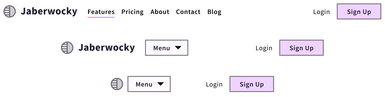
This navigation component is intended to contain a site's primary navigation links and branding. It features a fairly commonplace display of the logo followed by the top-level page links and then supplementary actions for "Login" and "Sign Up" placed on the opposite side.
Once again, this component will benefit from container size and style queries to manage the visibility of elements depending on the amount of available inline space.
As the space narrows, the horizontal link list is replaced with a button labeled “Menu” which can toggle a dropdown version of the links. At even more narrow spaces, the logo collapses to hide the brand name text and leave only the logomark visible.
To accomplish these views, we’ll leverage named containers to better target the container queries. The navigation wrapper will be named navigation and the area containing the links will be named menu. This allows us to treat the areas independently and contextually manage the behavior.
Here's our markup outline to help understand the relationships between our elements.
<navclass="navigation"><ahref="#"class="navigation__brand">Logo</a><divclass="navigation__menu"><buttontype="button"aria-expanded="false"aria-controls="#menu">
Menu
</button><ulid="menu"role="list"><!-- link list --></ul></div><divclass="navigation__actions"><!-- Login / Sign Up --></div></nav>
You'll likely find that building with container queries in mind may prompt rethinking your HTML structure and simplifying the hierarchy.
An important part of our construction that’s already in place for the baseline styles is that the .navigation wrapper is setup to use CSS grid. In order for the .navigation__menu area to have an independent and variable container size to query for, we’ve use a grid column width of 1fr. This means it is allowed to use all the remaining space leftover after the logo and actions elements reserve their share, which is accomplished by setting their column size to auto.
.navigation{display: grid;grid-template-columns: auto 1fr auto;}
The rest of our initial state is already in place, and presently assumes the most narrow context. The visible elements are the logomark, “Menu” button, and the additional actions. Now, we’ll use container queries to work out the visibility of the medium and large stages.
The first step is defining the containers. We’ll use the container shorthand property, which accepts the container name first and then the container type, with a forward slash (/) as a separator.
.navigation{container: navigation / inline-size;}.navigation__menu{container: menu / inline-size;}
First, we'll query against the navigation container and allow the brand name to be visible once space allows. This component uses the same accessibly hidden technique as was used for the pagination, so the visibility styles may look familiar. Also, note the use of the media range syntax to apply the styles when the inline-size is greater than or equal to the comparison value.
The second stage is to reveal the link list and hide the “Menu” button. This will be based on the amount of space the menu container area has, thanks to the grid flexibility noted earlier.
@container menu (inline-size >= 60ch){.navigation__menu button{display: none;}.navigation__menu ul{display: flex;}}
Depending on the length of the link list, we may be able to reveal it a bit sooner. While we would still need JavaScript to compute the total dimension of the list, we can use a quantity query to anticipate the space to provide.
Our present container size query for the menu container requires 80ch of space. We will add a quantity query to create a condition of whether or not to show the links given a list with six or more items. We'll set the --show-menu property to true if that is met.
Now we'll add one more container size query with a nested style query. The size query will take advantage of the media range syntax again, this time to create a comparison range. We'll provide both a lower and upper boundary and check if the inline-size is equal to or between those bounds, thanks to this new ability to use math operators for the query.
@container menu (40ch <= inline-size <= 60ch){/* Styles when the container size is between 50-80ch */}
Then, within that we nest a style query. The style rules are intended to keep the “Menu” button hidden and the link list visible, so we’ll also include the not operator. That means the rules should apply when the container does not meet the style query condition.
Important to note is that the container size query we already wrote for the menu container when it is sized >= 60ch should remain as is, otherwise the display will flip back to prioritizing the “Menu” button above 60ch.
Since container queries enable independent layout adjustments of component parts, they can help to meet the WCAG criterion for reflow. The term "reflow" refers to supporting desktop zoom of up to 400% given a minimum resolution of 1280px, which at 400% computes to 320px of inline space.
While we don’t have a “zoom” media query, both media queries and container queries that affect the layout approaching 320px will have an impact. The goal of the reflow criterion is to prevent horizontal scroll by “reflowing” content into a single column.
Taking our navigation as an example, here's a video demonstration of increasing zoom to 400%. Notice how the layout changes similarly to narrowing the viewport.
The advantage of container queries is that they are more likely to succeed under zoom conditions than media queries which may be tied to a presumed set of "breakpoints."
Often, the set of breakpoints frameworks use can begin to fail at the in-between conditions that aren't precisely a match for device dimensions. Those may be hit by zoom or other conditions like split-screen usage.
Thoughtful usage of container queries makes your components and layouts far more resilient across unknown conditions, whether those conditions are related to device size, user capabilities, or contexts only an AI bot could dream up.
The previous post in this series is all about testing features support for modern CSS features. However, there’s one consideration that is top of mind for me when choosing what features to begin using.
When evaluating whether a feature is "safe to use" with your users, considering the impact of the feature you're looking to integrate weighs heavily in the decision. For example, some modern CSS features are "nice to haves" that provide an updated experience that's great when they work but also don't necessarily cause an interruption in the user experience should they fail.
The features we reviewed today can absolutely have a large impact, but the context of how they are used also matters. The ways we incorporated modern CSS in the components were, by and large, progressive enhancements, meaning they would fail gracefully and have minimal impact.
It's always important to consider the real users accessing your applications or content. Therefore, you may decide to prepare fallbacks, such as a set of styles that uses viewport units when container queries are unavailable. Or, switching some of the :has() logic to require a few extra classes for applying the styles until you are more comfortable with the level of support.
As a quick measure, consider whether a user would be prevented from doing the tasks they need to do on your website if the modern feature fails.
Remember: there's no need to use everything new right away, but learning about what's available is beneficial so you can confidently craft a resilient solution.
The pace of the CSS language can be challenging to keep up with! Browsers release features and fixes monthly, and the CSS Working Group is constantly working on specifications. So, how do you know using a new feature is "safe" to use? And what are the considerations around making that choice?
Additionally, browser makers have started an annual effort to improve the interoperability of the web, which means striving to make features work consistently cross-browser. You can review the list and progress on those efforts on the Interop Dashboard.
As you absorb all that's possible in CSS now, remember: it's not about learning everything right now; it's about being aware of what's possible to help you develop a solution when needed!
Testing for CSS support - also called "feature detection" - can be done directly in your stylesheets using @supports.
This at-rule allows testing:
properties
values
selectors
Within @supports, the test condition will return positive if the browser understands the property and the value.
@supports(accent-color: red){/* styles when accent-color is supported */}
You can also test for selectors such as :is(), :where(), :focus-visible, and more. When using the selector condition with a function like :is(), a value must also be provided to the selector.
@supportsselector(:is(a)){/* styles when :is() is supported */}
Like media queries, you can combine tests with and as well as or, and negate tests with not.
@supports(leading-trim: both)or(text-box-trim: both){/* Styles when either property is supported */}@supports(transform:scale(1))and(scroll-timeline-name: a){/* Styles when both properties are supported */}@supportsnotselector(:focus-visible){/* Styles when :focus-visible is not supported */}
A significant limitation of @supports is that it currently cannot test for at-rules, meaning it cannot detect support of @container (container queries), @layer (cascade layers), and others. This lack of detection is problematic because at-rules typically greatly impact how you write and structure your CSS.
Additionally, there can be issues testing for partial implementations.
As an example of failure for partial implementations, a recent addition to CSS is the :has() selector. Unfortunately, the implementation at the time of writing in Firefox 112 may return a false positive when testing relational selectors with :has() like li:has(+ ). This is false because the partial implementation only supports more direct selectors like li:has(a).
/* This should fail in Firefox 112 */@supportsselector(li:has(+ *)){/* It may not fail, so the body becomes red */body{background: red;}/* This rule does fail to apply */li:has(+ *){background: green;}}
When using @supports, be sure to test the outcome in multiple browsers to ensure your styles apply with the result you intended.
Also be aware that testing your condition with @supports requires @supports itself to be supported! In other words, check the support of the feature you're testing for and@supports to ensure you're not creating a condition that wouldn't actually have the chance to fail due to @supports being ignored if it's unsupported.
The CSS language is growing because the web is complex, and our requirements are ever-changing. In addition, device proliferation and user needs drive a lot of change and improvements in the underlying browser engines.
For example, it was thought that container queries would never be possible, but the availability of related features enabled their release to be cross-browser complete in February 2023.
But when do you know it's the right time to start using a new feature? After all, while the browsers Chrome, Edge, and Firefox have been termed "evergreen" - meaning they can automatically update themselves - there's no guarantee that users will allow that update quickly, if at all. Safari can also update in a way decoupled from OS updates, but doing so is not actively pushed, and typically only advanced users will seek out the updates. As Eric Bailey wrote, evergreen does not mean immediately available.
A popular resource to check for feature availability is caniuse.com. It's a fantastic place to get an overview of when browser features are added and notes on partial implementations or known bugs. However, the percentage shown for support should be taken as one metric and used alongside your actual audience analytics.
Depending on your location in the world, your industry, or your product's specific marketing, you may need to delay using a particular feature. Or, you might find positive signs that the majority of your audience would be able to see the latest and greatest!
If you use VSCode, I also highly recommend the webhint extension which alerts you when you are writing a feature that may not be well supported. This saves a trip out to caniuse, as it also gives you the list of where the feature isn't supported. With that information, you can decide whether you need to create a support solution as you write your styles. This also helps in reducing bugs from appearing later in browsers you may not have tested (although you should test as much as you can!).
The impact of the feature you're looking to integrate also weighs heavily in this decision. For example, some modern CSS features are "nice to haves" that provide an updated experience that's great when they work but also don't necessarily cause an interruption in the user experience when they fail.
Some examples of low-impact features include:
accent-color - change the color of native form elements, including checkboxes and radio buttons
overscroll-behavior - prevent scroll chaining to the background page when the end of a scrollable container is reached
scroll-margin - able to add margin to the scroll position, useful for anchor targets
text-underline-offset - allows adjusting the distance between a text underline and the text
Other features that impact layout structure, or are tied to providing a more accessible experience, may not be advised to use until you are confident in a high likelihood of support. As a quick measure, consider whether a user would be prevented in doing the tasks they need to do on your website if the modern feature fails.
Another way to reasonably use newer features is to include them alongside fallback solutions. A "fallback" is a solution that works well enough to retain a positive user experience when the ideal feature isn't supported.
Fallbacks work for two reasons. First, because CSS fails silently - meaning it skips definitions it doesn't understand without breaking the whole stylesheet. Second, because of the "C" in CSS which is the cascade that uses the listed order of definitions as part of how the browser determines which definition to apply. The cascade rules say that - given equal specificity - the last-ordered definition that the browser understands will "win".
For example, aspect-ratio is an awesome feature that I enjoy using to create uniform-sized images within a grid of cards or an image gallery. A fallback may provide a height for the images so that at least they are constrained in the layout, even if the ideal aspect-ratio isn't used.
First, we assume no support and give an explicit height. Then, using @supports to check for aspect-ratio support, we remove that explicit height and then use aspect-ratio.
Often fallbacks can be a one-line alternative that uses an older syntax or method. These solutions are placed just before the ideal solution, which allows the modern solution to be used where supported. And when it's not supported, the last-ordered definition that is supported will be used, which we noted earlier was due to the cascade.
In this example, our fallback uses the well supported height property with 100vh. Then, we upgrade it to use the logical property of block-size with 100dvh, where dvb is the "dynamic viewport unit" that is better suited for environments like iOS Safari.
/* Fallback */height: 100vh;/* Ideal, modern version */block-size: 100dvb;
Sometimes, lack of support is due to one browser adopting a proprietary version of a property. When this happens, they typically use a "prefix". This is how we get properties such as -webkit-background-clip.
A tricky part of working with prefixed properties is that sometimes other browsers enable them to work, but they remain prefixed due to a lack of official spec support. For some properties, they eventually get spec support, leading to browsers deprecating the prefixed version. And sometimes, one browser uses a prefixed version, and the others don't!
Luckily, a tool exists to help manage prefixing properties. Autoprefixer is available as a PostCSS plugin (which we'll discuss later) and as a web app.
For example, one of my favorite techniques for controlling width without affecting the display property is to use width: fit-content. For the best support, it needs to include prefixed versions. Rather than remembering that, I can either include Autoprefixer in my build process or use the Autoprefixer web app to get the rule:
You'll want to check caniuse.com or the browser compatibility section on MDN docs to be sure that a prefixed property you want to use has support cross-browser.
Sometimes you may wish to detect features like at-rules which @supports is unable to do. Or, you need more precise detection for partial implementations.
CSS at-rules are exposed as a web API that is consumable by JavaScript. This means you can check for support using JavaScript and then apply classes or other modifications to indicate to your styles that a feature is available.
For example, you can check for support of cascade layers with the following:
if(window.CSSLayerBlockRule){// Cascade layers are supported}
A web API function that works just like @supports is also available, which is CSS.supports(). This function accepts a value identical to what you would pass to the corresponding @supports block, including testing for selectors and the ability to combine or negate tests.
if(CSS.supports('width: 1cqi')){// Container query units are supported}
When I was a young sprout coming up in web development, a popular solution for feature detection was Modernizr. This was JavaScript that did feature tests and then added classes to the <html> element to indicate support or lack thereof. It was tremendously popular and even included in the official HTML5 boilerplate. But now, this solution is outdated, and I wouldn't recommend using it for new projects. This is because many of the tests likely aren't necessary for your audience anymore and because it hasn't been updated to include many of the very latest modern CSS features.
However, I appreciate the ease of use of those support classes. They offload the effort of devising the right test for @supports, and can simplify creating selectors.
I've created SupportsCSS as a feature detection solution that tests support of at-rules, selectors, and other features and applies classes to <html> with the results. The tiny script is also customizable so that it only tests for the features you care to include.
Here's a summary of what SupportsCSS does:
Checks for selectors like :has(), properties like text-box-trim, features like relative color syntax, and at-rules like @layer
Allows adding custom tests
Exposes a results object to iterate over detected support, as well as individual results for quick conditional checks in JS
Since the classes rely on JavaScript loading and succeeding, you will want to treat any styles based on the support classes as progressive enhancements. This is not too different from directly including @supports in your styles.
However, if you have more critical styles and you do expect that most of your audience will have support, consider using a regular @supports block in your stylesheets. Then the styles are available as soon as your stylesheet is loaded.
That said, you may like to review the test suite, which exposes the tests used for the features. You can copy any of the tests from the SupportsCSS test suite that use CSS.supports and use those within @supports.
Using @supports and JavaScript-based detection either directly or via SupportsCSS only tells you if a feature is supported. You are responsible for providing the experience for supported and unsupported features.
Let's review polyfills and build tools that help bridge the gap while features are gaining support.
Sometimes, supporting a CSS feature is best done by including a polyfill. A polyfill is a script that enables a feature to work on an unsupported browser by creating a solution with other, better-supported features. Polyfills are used when a more simple fallback solution isn't possible or too complex to do manually.
An example of a polyfill is for container queries, which extends support clear back to Firefox 69, Chrome 79, Edge 79, and Safari 13.4. As with most polyfills, it has limitations and so doesn't provide full coverage of all the ways you may enact container query styles.
Polyfills are a wonderfully helpful way to begin using "future CSS" today! Just be aware of their limitations. Additionally, polyfills may not keep up with syntax changes, leading to breaking a previously working implementation. You are responsible for keeping the polyfill version you include up-to-date.
We briefly mentioned Autoprefixer, which is available as a web app or PostCSS plugin. But what is PostCSS? Well, it's a tool you use alongside a build tool like Gulp, Grunt, or Webpack. Through the use of PostCSS plugins, various features become available.
A popular PostCSS plugin is postcss-preset-env which "allows you to use future CSS features today." It comes coupled with Autoprefixer. When using it, polyfills are added when needed, and additional plugins related to the features you're writing are applied.
Several tools, like PostCSS, determine how to include feature support by using the browserslist entry in package.json or by including that information in the tool's configuration. Browserslist is a way of defining which browsers your application will support, which you can visualize and adjust using the Browserslist web app.
Besides polyfills, transpiling is another way build tools enable support of future CSS. Transpiling means rewriting the future version to a comparable but older and better-supported version. An example would be using the logical property margin-inline: auto would be transpiled to margin-left: auto; margin-right: auto if the browserslist targets didn't have full support. This allows writing your stylesheets with newer features, which over time your build tool will stop transpiling as support improves.
Another option besides PostCSS that I've started using as my build tool of choice is LightningCSS. It includes Autoprefixer, minification, and transpiling of new CSS. I like it because it's a single package to include and replaces the individual includes I previously had for Autoprefixer and minification. In addition, I've found that I can use it to replace Sass for my more simple projects since it enables nesting and still lets me organize my styles into separate files.
I encourage you to continue learning about this topic until you are comfortable with what it means to handle modern CSS support. It's fun to experiment and practice using modern CSS, but imperitive to consider what that means for your users.
Fluid typography is the term for designing font-size rules that responsively adapt the size based on the amount of available inline space. Before the availability of container query units, techniques usually relied on the viewport width - vw - unit. The viewport method is excellent for main page type, such as article headlines. However, viewport-based fluid typography doesn't quite work for narrower spaces that flex independently of the viewport, such as a grid of cards.
We'll explore three ways to create dynamic fluid typography rules by leveraging container query units and CSS custom properties. You'll learn more about:
creating mixins using custom properties
max(), min(), calc() and clamp()
container queries and units
:is() and :where()
Previously here on ModernCSS, I presented a method that relied on using Sass to perform some calculations and produce the rules to apply viewport-based fluid typography. You may still be interested in some of the other information including tips on preventing text-overflow and a few other considerations for web typography.
However, not only can we upgrade the solution presented previously by dropping Sass, but the final rules will be far more resilient and context-independent.
The standard viewport-based fluid typography relies on the clamp() function and the vw (viewport width) unit.
The clamp() function is one of several handy CSS math functions and accepts three values: a minimum value, an ideal value, and a maximum value. The core idea of fluid typography is that the "ideal" value uses a dynamic unit - vw - in order to interpolate between the min and max. This effectively allows the font to resize along a preferred range.
In the demo, the minimum allowed size is 1rem and the maximum allowed size is 3rem, where 4vw allows interpolating along the range.
We'll talk more about that addition of 1rem + shortly, but suffice it to say that it enables improved resizing when using display or text zoom, an important accessibility consideration.
Now although that demo has a resize handle, you won't see any resizing of the font actually occur. That's because it's reliant on the width of your viewport, so you will need to resize your entire browser width to see a change. Already, we've demonstrated the problem with this technique!
Due to this issue, a past remedy may have been to create component-specific styles that anticipate different viewport sizes and assign various font sizes within media queries. But now, with the availability of container queries, we can do better!
What you need to know to understand the examples in this tutorial is that container queries allow defining rules for elements to respond to their ancestor container's available space. This is different from media queries which can only be based on the viewport.
Technically this definition and the use in this tutorial is in consideration of container size queries. The spec also includes style queries for updating rules based on style features.
The primary benefit of container queries is in creating more contextually appropriate layout rules that adapt to the true available space. With viewport media queries, rules are effectively orchestrated at the macro page level. But container queries allow responding to layout changes of micro elements and components as their context shifts through variable placement in page layouts.
Container elements must be explicitly defined, which at the base level is done through the container-type property. For queries against available inline space, we use the value inline-size. Then, child elements of the container can query the container for its size with the @container rule and apply styles when that size condition is met.
The use of the term "inline" rather than "width" is from the precedent set by logical properties, which have their orientation adjusted based on the writing mode: right to left (RTL), left to right (LTR), or vertical. Using "inline" refers to the horizontal dimension for the writing mode.
As we build up the solutions, we'll learn more about working with containment.
Officially, these are called "container query length units," and they are a measure of the size of a containing element.
Just as 1vw equals 1% of the viewport width, so does 1cqi equal 1% of a container's inline size. We'll be using cqi for purposes of defining fluid typography since we want the size to be associated with the horizontal axis of the writing mode.
Interestingly, the CSS working group resolved that all elements would default to style containment. This means that the use of a container unit will work even without an ancestor that has containment. Keep reading to learn about a quirk of this behavior.
To begin our solutions, we'll set up some custom properties. This is because all of our rules will be designed to work with a sort of "mixin" rule that will intake the cascaded values from the custom properties.
I'm referring to it as a mixin since it will be a general rule that takes the custom properties, applies a function, and produces variable results based on the custom property values. For best results, we'll work with the cascade to more predictably inherit values. This means we'll assign our base custom property values first and the mixin rules later in the stylesheet order.
The starting structure for our rules involves choosing explicit font sizes for headline levels 1-4, which are the main focus of our base rules. We'll create custom properties for them and explicitly assign them per headline level.
Note that each rule updates the --font-size custom property to associate it with the size for that level. That's important because it enables the mixin rules we'll be creating, which will be generalized to scale for each of the input properties. Without generalizing to a mixin, we would have to repeat the function from the mixin within each separate headline rule.
So, what does this mixin actually look like? Well, the contents will be unique per each of our three solutions. However, the selector will be the same.
We'll attach it to each heading element as well as the added heading classes and a utility class as well of .fluid-type. The utility class will allow using the mixin ad-hoc for type that may not be styled as a heading.
Due to a quirk of how custom properties work, we'll need to be explicit about separating our fluid sizes that use container query units from a fallback size. Otherwise, if a browser encounters the mixin and doesn't understand the container query unit, it will throw out the custom property value.
The "quirk" is that it will then render the "initial" value of 1rem instead of using a previously defined size for the element. The outcome is that all type will appear at 1rem, removing any type size hierarchy from your application. That's why we need the explicit @supports check for whether the browser will understand the container query units before trying to apply the rule.
To counter this behavior, you may assign a static value to the base headline rules, or include a solution prior to the container queries mixin that uses viewport units. Either fallback should be placed prior to and outside of the @supports condition.
The more important reason is that it will raise the specificity of the entire rule to a class, which will make it more resilient to accidental overrides from inheritance, but it can also be matched or exceeded easily by later class-based or compound rules.
The less important reason is to simplify the selector into a single-line list vs. a traditional comma-separated selector broken into multiple lines.
If you encounter issues with :is(), such as complexity creating overrides, or if you want the ability to override through inheritance, you can switch to :where(). Use of :where() lowers specificity to zero, meaning later rules that may be component or page specific will override it easily due to the cascade without having to match or exceed the specificity.
Note that :is() computes to the highest specificity in the given selector list, which is why I mentioned this rule would have the specificity of a class. Based on your preference and whether the behavior of :is() or :where() is useful for your context, you can alternatively remove the wrapper and use a standard selector list without :is() or :where().
The cornerstone of all of our methods will be upgrading from vw to cqi as our dynamic unit of choice to enable fluid typography.
A starting rule to do this really is just a swap of those values.
CSS for "Fluid typography using cqi"
.fluid-type{font-size:clamp(1rem, 4cqi, 3rem);}
Sorry, your browser doesn't support container query units! The demos will not be fluid.
Viewport-based fluid typography.
But - wait a minute - it still isn't working on resize of the container. However, it is responding based on the viewport. What's going on?!
The container queries spec includes a provision that every element defaults to a style container, which is why the use of cqi already enables fluid resizing. But, since we didn't define a container for our demo, the measurement is still against the closest ancestor with containment applied.
This site doesn't have containment applied on any ancestor of the demo, so the fallback behavior of container query units is to use the "small viewport size for that axis." This means for our rule where we are querying the "inline" axis, the viewport width is used as the measure.
In order to produce the effect we're really after, which is to have the font size respond to the parent container, we need to assign containment.
Sorry, your browser doesn't support container query units! The demos will not be fluid.
Viewport-based fluid typography.
In this update, we put a parent div with the container class around the paragraph. Now the paragraph with the fluid-type class is responsively sizing according to the demo's inline size.
A key concept of container queries is that they respond to the nearest ancestor with containment. If you apply rules that use container query units and aren't seeing them respond as you expect, you may have to adjust the markup and add a rule to allow the elements to carry a container with them.
For the example rule explaining viewport-based fluid type, I mentioned that the inclusion of 1rem added to the vw value was important for text resizing. It's because viewport-based methods are prone to restricting the font size from growing until at least the 200% required by the Web Content Accessibility Guidelines (WCAG) Success Criterion 1.4.4: Resize Text.
As clarified by Eric Eggert, this rule means that the on-screen rendered pixel height of the text must eventually be able to resize up to 200% of its original height at normal (100%) zoom. That technically doesn't need to be reached by the time the browser or text zoom setting is set to 200%, so it's acceptable if it's reached by, say, 300% zoom.
For viewport-based fluid methods, inclusion of a rem value helps prevent issues with the text resizing. Without it, zoom-based resizing with only vw is more likely to fail to increase or stall out on increasing until a very high zoom value.
PS - if you're not sure why we're dealing in rems, check the explanation of rem vs other units in the earlier article here on fluid type.
An interesting feature of swapping to use cqi instead of vw is that by its very nature it will continue to increase as long as the container inline size increases during zoom. This holds true both for browser/display zoom and text zoom applied at the OS level. In my testing, as long as rem is still used as the anchoring unit for the font-size definition, increases to 200% or more are more consistently achievable than vw methods.
You should always test your fluid type rules in as many ways as you can to ensure zoom behavior works as expected. This means varying zoom levels with the type in multiple contexts such as a responsive grid of cards, in a medium-width article, a full width container, and a narrow sidebar.
Our goal is to make a mixin function, so we need to manage a few more considerations than the more static rule created in the last section.
Let's begin the rule by plugging in our --font-size custom property that was previously set up. We'll also enable a --font-size-fluid property with a default of 5cqi. Like the size property, this would allow updating the target size per heading level, if desired.
The missing piece in our mixin function is a definition for the minimum size allowed within the range.
One option is to assign a custom property to update per inherited rule like the other parts. But instead, let's see how we can make the value more dynamic.
Within clamp(), we can perform additional math calculations, no wrapping calc() required!
This update says that the minimum allowed size should be 30% smaller than the --font-size. Due to the mathematical order of operations, the multiplication part of the equation is computed before the subtraction.
We also slipped in one more custom property for --font-size-diff to enable customizing the percentage difference if needed. For example, very large font sizes might allow a greater reduction, such as 0.5.
This produces a very nice effect that is scalable across our heading level rules with just a few tweaks that take advantage of our additional custom properties. However, it is presently possible for the minimum size to shrink smaller than perhaps we'd like, and potentially smaller than the regular body copy.
Join my newsletter for article updates, CSS tips, and front-end resources!
Regular, unstyled text uses 1rem, which is approximately 16px, as a browser default when no zoom features are applied. We can ensure that the minimum is not less than 1rem by comparing it to the result of the equation.
The CSS max() function accepts multiple values, and the larger computed size - the "max" value - will be used. Therefore, by passing it 1rem and the equation, if the computed reduction of the --font-size would be less than 1rem, the browser will use 1rem instead.
Here's our final mixin rule with the addition of max().
To alleviate the affects of the custom properties quirk, an alternative option would be to define the mixin using vw and then override it within @supports. You will not achieve identical results since the font-size will be relative to the viewport instead of individual containers, but it also allows you to have some measure of fluid type. Be sure to test cross-browser and adjust as needed!
/* Adjust element `--font-size-fluid` overrides to use `vw` */:is(h1, .h1, h2, .h2, h3, .h3, h4, .h4, .fluid-type){font-size:clamp(var(--font-size) - var(--font-size) * var(--font-size-diff, 0.3),var(--font-size-fluid, 3vw),var(--font-size));}@supports(font-size: 1cqi){:is(h1, .h1, h2, .h2, h3, .h3, h4, .h4, .fluid-type){--font-size-fluid: 5cqi;}/* Add element `--font-size-fluid` overrides here that use `cqi` */}
In the first mixin, our use of clamp() allowed us to define a range for the font sizes. This is beneficial especially if you feel there needs to be a maximum for how large text can grow.
Alternatively, if there doesn't strictly need to be an upper bound for your font sizes, we can simply allow the size to grow from a minimum base size.
Instead of using our previously defined --font-size, we'll swap to defining base values. These are intended to be the smallest size we would allow, because our mixin will add on to the base.
Here, we have listed and associated one base size per heading level, but you may prefer using semantic names like 'title', 'subtitle', 'caption', etc. Then those are assigned to the --font-base-size shared property for each heading rule, which will be passed into the mixin.
You may want to retain the previous --font-size values to continue using as a fallback in case the fluid mixin isn't compatible with the user's browser.
This mixin is quite a bit simplified from version one. Using calc(), we have a single equation where from the starting point of --font-size-base we are adding --font-size-fluid, which defaults to 3cqi.
Using this mixin, you'll likely want to use reduced fluid values compared to the first mixin. That's because the risk of the solution so far is that font sizes can, in theory, infinitely grow based on how much inline space is available. Practically speaking, this may not cause a significant issue unless you already have a very large font base that has the potential to spread across a large inline area.
If you do feel a maximum is eventually required, we can add one by wrapping the equation with the min() function and introducing a --font-size-max property.
How does min() result in a maximum boundary? Because as the font-size grows, if the computed value tied to the cqi value would exceed the --font-size-max, that would result in --font-size-max being the "minimum" value between the options. In that way it effectively caps the growth.
Now, you could extend this solution and dynamically compute the max end of the range like we did for the minimum end of the range in the first mixin. That's the beauty of custom properties used with defaults - you can choose an initial method for the mixin, and accept an override, too!
As noted in the intro, fluid type has already been discussed here on ModernCSS. In that tutorial, the key idea was building up font sizes according to a type scale ratio, and was computed with Sass.
We can now take what we've learned in the other mixins and produce a comparable solution, but this time with only custom properties and CSS math functions, instead of relying on Sass!
The idea of the ratio is to produce a collection of font sizes that feel harmonious as a group. A ratio also abstracts away the need to define individual, static font sizes since it's used to dynamically generate the sizes.
This mixin will be very similar to the first mixin, with the difference being in how we compute the actual font size.
Once again, we need to set up the custom properties for our base rules. We'll define a --type-ratio property, and have used a "perfect fourth" ratio as a starting point.
:root{/* Perfect Fourth */--type-ratio: 1.33;}
In order for the ratio to be applied correctly, we need to compound the font sizes. This means given a base size, we'll multiply it by the ratio. Then we'll take the result and multiply it by the ratio again for the next size level, and so on.
In the former Sass solution, we took advantage of a loop to manage the compounding. But the translation to custom properties means we'll need to do this ahead of time, so we'll add the pre-computed sizes as additional global properties.
Our "base" will be the size we plan to apply to the body text so that our smallest headline is at least the first multiple of our --type-ratio larger than that. In this case with the perfect fourth ratio, that makes --font-size-4 equal 1.33rem. Each successive level takes the previous --font-size-[LEVEL] result and compounds it by applying the --type-ratio.
:root{/* Body font size */--body-font-size: 1rem;/* Compounded headlines sizes */--font-size-4:calc(var(--body-font-size) * var(--type-ratio));--font-size-3:calc(var(--font-size-4) * var(--type-ratio));--font-size-2:calc(var(--font-size-3) * var(--type-ratio));--font-size-1:calc(var(--font-size-2) * var(--type-ratio));}
Following that, we'll assign the sizes to each headline rule. Reminder that the font-size listed in these rules will be used as a fallback for browsers that do not yet support container queries and units.
The mixin is a very similar calculation as the method discussed in the first solution. However, we'll compute the minimum size ahead of time. This is so that we can create a smoother transition for the group by adding the minimum + 1cqi for the middle, ideal clamp() value. Since we're adding the container query unit onto the minimum, we're using a smaller value than the first mixin. Experiment and see how changing it to even a decimal value like 0.5cqi affects the rate of change!
Additionally, we kept our friend max() to ensure the minimum wasn't able to reduce below the --body-font-size.
Fun fact: The --_font-min property doesn't need a calc() wrapper because at the point at which we create it as a custom property it's a simple list of values. When it gets used in clamp(), then the browser uses that context to actually do the calculation with the provided operators for the equation.
Be sure to resize this as in a supporting browser, and also compare the transition to mixin #1.
CSS for "Mixin for generating font sizes from a type ratio"
Regular body copy size for a paragraph and non-headline text.
For best results, if you would like to change the --font-size-diff value, you'll likely want to change it as a global property. That's because changing it for individual levels will interfere with the ratio-based sizing.
Additionally, you can try out increasing the base for the original calculation if you feel it's too close in size to the body copy. A quick way to do that is add it into the calculation for --font-size-4, such as:
Practically speaking, when using any of the mixins presented in this tutorial you will possibly want to create containers out of elements like <article> or create a utility class to apply containment. And, where containment is applied will be something to consider when you define markup for components like cards. Otherwise, as we learned, it may seem as though the viewport is being used to compute the font size rather than your intended context.
While our mixin rules are being applied broadly to headlines, you may prefer to only apply fluid type when a utility class is used. Or, you may determine a few variations that better fit your specific contexts and components, such as scales for articles, cards, forms, and tables.
Since all the mixins use the container query unit of cqi to trigger expanding and shrinking of the font size, your context and preferences will be the deciding factors.
Perhaps you feel expanding from a base is easier to reason about, or produces the results you're after more consistently for a particular component, so you use mixin number two. Or, maybe you like defining the ranges more precisely, or have been given those ranges in design specs, so mixin number one that uses clamp() better fits your style. And maybe you just prefer to leave the sizes up to math, so providing a type scale like mixin number three works best for you.
Fluid type is far from a new topic, and the methods presented here are not the only ways to accomplish it! I've learned a lot from the following resources, and I encourage you to continue researching to find the technique that suits your preference or project best.
Most resources use viewport-based calculations since container query units are a more recent addition to the web platform. As such, they may need adapted if you prefer basing the sizing on containers.
Skip any of the manual calculations and use values provided by Utopia.fyi (currently viewport-based only)
The user's browsing environment is not predictable. Tell other developers, and for goodness sakes, tell your designers. Let's learn how to coexist with that unpredictability by using adaptive, contextual spacing techniques.
In 2018, Jen Simmons introduced the term "Intrinsic Web Design" in her talk "Everything You Know About Web Design Just Changed." She also shared the principles of intrinsic web design that we'll use as guidance:
Contracting & Expanding - the way we consider how our design will adapt to a change in available space
Flexibility - using primarily flexbox and grid in combination with newer units and functions in a way that enables our layouts to adapt at various rates to the available space
Viewport - the ability to use all four sides of the viewport as well as take advantage of viewport units
Using adaptive layout techniques is a trust exercise between designers, developers, and the browser.
Clamp accepts three values: the minimum, ideal, and maximum values. This effectively lets you provide flexible constraints.
The trick with clamp() is in that ideal value where a dynamic unit such as view width must be used to trigger the transition between the min and max.
You may have encountered clamp() under the umbrella of fluid typography, which relies on viewport units. Here's a set of example values:
font-size:clamp(1rem, 4vw, 3rem);
Based on the current computed value of 4vw, the font-size will adjust as the viewport grows and shrinks. But it will never be smaller than 1rem or larger than 3rem.
We'll review more use cases for clamp later on for our spacing techniques.
So how do we go about using clamp() for intrinsic design? My suggestion is:
designers provide the min and max values
devs determine dynamic dimensions
The min and max values can be provided by design tokens, which may be a familiar concept if you come from design systems or are using frameworks that provide sizing ramps. I'll continue to call out opportunities for design tokens as we explore more techniques since they are an excellent method to map our constraints back to designs and wireframes.
The min() and max() functions enable us to provide context-dependent options. These have essentially the same level of support as clamp().
Both min() and max() accept two or more values. For the min() function, the browser will use the smallest computed value, and the inverse will happen for max() where the browser will use the largest computed value.
Another feature of min, max, and clamp is that we can perform additional calculations without needing a nested calc() function. So for the following definition, we're asking the browser to choose the smallest value between 100vw - 3rem and 80ch.
min(100vw - 3rem, 80ch)
This results in 100vw - 3rem being selected when the viewport is < 80ch, and 80ch being selected when the viewport is > 80ch.
If we take that rule and add the logical property margin-inline set to auto, then we have a really modern container class.
We can take our container class a step further and set up an optional custom property of container-max that uses 80ch as a fallback. So now we have a modern, ultra-flexible rule.
It can be a bit tricky to understand when to use min and max.
Let's consider the following values for max.
max(2rem, 4vh)
When the computed value of 4vh becomes less than 2rem, the max function will select 2rem.
So effectively, what's happening is that the selected choice of 2rem is the minimum value you will allow for this rule.
Now let's flip to min():
min(100%, 60ch)
This rule for min() means that 60ch is effectively the maximum allowed value for this element.
If you're wondering why we'd use min and max instead of listing out separate corresponding properties, it's because we can use them anywhere a numeric value is allowed, not just for dimensions.
fit-content grows just large enough to contain its contents
min-content only grows large enough to match the width of the longest word and will apply soft-wrapping
max-content will continue growing as large as its contents require
At first look, it can be hard to tell the difference between fit-content and max-content, so let's expand the text values:
fit-content will grow but not overflow
max-content has overflow potential
To be honest, I haven't found many use cases for min-content or max-content. But fit-content is a top-shelf property.
In this demo, the "alert" has width: fit-content. Notice that it is only growing to the equivalent of its max-content, which is narrower than the available inline space.
Lorem ipsum, dolor sit amet.
The magic of fit-content is achieving content-relative width without changing the display value, meaning we can save the display property. And in this flow context, the alert element can continue to use block behavior which means margins continue to work.
I've written about it in several other Modern CSS articles, but here's the summary. Except for the ch unit, everything in that line is CSS grid-specific.
repeat() defines a recurring pattern to use for the specified grid tracks
auto-fit means to create as many tracks as will fit, according to the next part of the definition
minmax() is a CSS grid function that defines a range of values that will be used to compute each track size where the first value is the minimum and the second value is the maximum
At a larger size, three tracks are created, and as the inline space reduces, the track space also reduces. Once track size squeezes elements below the 30ch minimum, elements drop to be added to or create a new row.
In the demo, we also enhanced the rule to include a nested min() function with 100% as one of the options. This reduces the chance of overflow by allowing the element to shrink below 30ch when the space requires being more narrow. We also enabled this rule to scale by adding an optional custom property of --grid-min to control the "breakpoint."
In this next rule, we'll use the grid-only function version of fit-content(). Using the fit-content() function means we can provide our own preferred max value, as seen for the sidebar in the demo, which maxes out at 20ch.
Altogether, the behavior produced by this rule is that the article element will reduce until it hits its 50% minimum. At this point, the sidebar will finally begin to compress until it reaches the equivalent of min-content.
We can improve the flexibility of this rule by again including a custom property. I love this definition because it can accommodate other content types, like this image.
Just keep in mind that the image doesn't have such a thing as a min-content value, so it will continue to shrink based on the remaining allotment of space.
So far, what we've talked about is how to affect how elements take up space and size themselves. Now it's finally time to talk about affecting the spacing between and around elements which will help us get the most out of intrinsic web design.
Despite the long-time availability of units besides the pixel, we continue to define spacing almost exclusively in pixels, maybe sometimes in rems.
Pixels are the least flexible unit for creating intrinsic layouts. So what if we could provide the browser with a better rubric for determining sizes for spacing? And what if we could do it without being overbearing with media queries?
The first thing to acknowledge regarding spacing is that the properties involved in spacing - gap, padding, and margin - have different purposes. So let's learn how to use more appropriate units and create adaptive methods for handling spacing between and around elements.
Padding is for handling individual box spacing. Our upgraded technique will use clamp() with percents and rem.
A reminder that percents used with padding are calculated relative to the element's inline size, so for clamp(), we can use a percentage as an element-relative dynamic value.
Here's a comparison of two mobile experiences - the left uses pixels to define margin and padding, and the right uses clamp():
For the version using clamp(), notice the gains in inline space, which leads to a more comfortable reading experience.
Pixels are often designed to work for a "desktop" or widescreen environment. And updating their values would mean creating a series of media-query controlled breakpoints. So instead, here's a demo of our improvement using clamp() and min().
We use the same padding rule for both the article element and the cards. The trick on the article is to toggle between 60ch, which applies on large inline spaces, and 100%, which results in no extra outside "gutter" space on narrow inline spaces.
Another context impacted positively by these rules is the Web Content Accessibility Guidelines Success Criterion for reflow, which defines expectations for browser zoom up to 400%. At this point, the computed width of the screen is assumed to be around 320px. Unfortunately, we don't have a zoom media query, but any rules that affect a viewport approaching 320px will impact this context. So, the narrow layout will display at the high zoom and be allowed the more ideal line length for reading.
That middle percent value may seem a bit magic - and, well, it is - but I've found a decent starting point is to double the maximum value to use as the percent. And hey, there are some more design token opportunities!
Next up is margin, and for our purposes, we'll be explicitly using it for block layout spacing, by which I mean vertical spacing.
We'll use the min() function with viewport units and rem for margin. Viewport units will allow creating contextual spacing.
Here is our baseline rule for margin;
.block-flow{margin-block-start:min(4rem, 8vh);}
I'm borrowing the term "flow" from Andy Bell's flow rule and "block" because the rule is applied using the logical property of margin-block-start. If you're not yet familiar with logical properties, margin-block-start is the logical companion to margin-top.
Within min(), we've supplied the values of 4rem and 8vh. So you can think of 4rem as the static value and 8vh as the dynamic value.
Here's the rule's effect on a large vs. small context. Technically, the computed margin for these values only saves about 13px on the "mobile" version, which may not seem too impactful.
However, once again, in our zoom context, the difference made by enabling the 8vh option is quite positive.
In this context, it's desirable to reduce unnecessary space. This demo also emphasizes the difference between a zoom context and mobile: landscape orientation. In contrast, typically, we're most concerned about designing for portrait orientation in the mobile context.
So here is a starting point for our block-flow custom properties, where once again, simply doubling the static rem value to produce the vh value works out pretty well. And as we explored, both true mobile and desktop zoom are the critical contexts to test out and verify the vh value. The static rem value is another design token opportunity.
Since I need to stay on brand, here’s your ultra modern CSS rule to setup block flow.
Using :is(), we're defining that direct children of the body and direct children when the block-flow class is applied will default to having our medium top margin. If including body is too overarching for your context, you can certainly reduce this rule to just block-flow.
Here is the starter set of block-flow custom properties:
Our final spacing property is gap, which we'll consider for layout component spacing, as in providing values for the intrinsic grid we set up earlier. We'll again be using clamp(), but switch it up to use vmax as the dynamic value for this context.
As a reminder, gap is applied between elements, as the shaded area indicates.
The vmax unit request the browser to use whichever is largest: the viewport width or the height.
We're using vmax for the dynamic unit and not percent because percent, as applied to gap, is calculated based on the direction of the gap. So uniformly applying gap like this using percent may yield a smaller value for row gap than for column gap. Instead, using vmax creates dynamic, contextual space that will be evenly applied to both row and column gap.
And - you probably guessed it - our min and max values for clamp() are once again potential design tokens.
I use gap with grid and flex for atomics like form fields. So I wanted to explicitly name this set of custom properties as layout-gap since they rely on vmax and are intended for layout components like grids. Again, you can see the doubling strategy in effect to work out a starting vmax value.
We've just reviewed more appropriate techniques to ensure context-dependent, intrinsic sizing and spacing of elements. Viewport-relative media queries aren't scalable for every context and are no longer the best tool for the job.
Additionally, we'll soon have full support for container queries. Once we have access to container units, they may become the better option in some places I've still opted for viewport units in these examples.
We are also getting the "parent" selector - :has() - which will open more possibilities for creating contextual spacing based on the actual element configuration.
Design systems and frameworks' (necessary) rigidity is at odds with intrinsic web design.
In order to move, I'm asking each of you to try to make adjustments where you can and educate others about the possibilities. Take time to be a little more thoughtful, experiment, and push beyond your current comfort zone. Let me know how you use and improve this starter set of techniques!
There are currently four well-supported math functions in CSS. I've found each of them to be extremely useful in my daily work. These CSS functions can be used in perhaps unexpected ways, such as within gradients and color functions and in combination with CSS custom properties. We'll learn the syntax for each, view basic demos of their functionality, and explore practical use cases.
Practical purpose of calc(): performing basic math operations, with the ability to interpolate between unit types (ex. rem to vw).
This math function has the longest cross-browser support of the four functions we're exploring. It has a wide range of uses for any time you'd like to be able to do client-side math within your styles.
For example, you may want something to take up most of the viewport height except the height of the navigation. For this purpose, you can mix units to pass a relative vh (view height) unit with an absolute pixel unit:
.content{height:calc(100vh - 60px);}
As the viewport resizes or a user visits on larger or smaller devices, the value of 100vh will dynamically update, and therefore so will the calculation.
The benefit of calc() is in allowing you to avoid either hard-coding a range of magic numbers or adding a JavaScript solution to calculate the value needed to apply it as an inline style.
We can extend the capabilities of calc() by passing in CSS custom properties.
An example of this being very useful is creating a consistent color palette using hsl() (which stands for hue, saturation, and lightness). Given values for saturation, lightness, and a starting hue, we can calculate complementary values to build a full palette. Because of the commonality among the saturation and lightness values, the palette will feel cohesive.
CSS for "Using calc() to create an HSL color palette"
Practical purpose of clamp(): setting boundaries on a range of acceptable values.
The clamp() function takes three values, and order matters. The first is the lowest value in your range, the middle is your ideal value, and the third is the highest value in your range.
An area you may have already encountered the use of clamp() is for fluid typography. The essential concept is that the font-size value can fluidly adjust based on the viewport size. This is intended to prevent large headlines triggering overflow, or taking up too much of the viewport.
Another example can be seen in my demo from SmolCSS on responsive padding. The interesting thing about using percentages for padding is that it is relative to the element's width. This means it's a bit like a container-relative unit, which we can use similar to how you might think of vw.
The example from SmolCSS uses the following padding definition, where the padding will grow and shrink relative to the element's width. It will never be less than 1rem, and never greater than 3rem:
.element{padding: 1.5rem clamp(1rem, 5%, 3rem);}
You may have realized this again removes some scenarios where you might have previously reached for media queries. Instead of micro-managing this spacing or worrying about strictly adhering to a pixel ramp (ex 8, 12, 24, 36), you can set up sensible guidelines for a responsive transition.
The most significant benefit here versus media queries is that since this padding definition is element relative, it will be larger when the element has more space on the page and smaller if, for example, it's placed in a narrow column. This would take a lot of coordination with media-query-based utility classes!
Practical purpose of min(): setting boundaries on the maximum allowed value in a way that encompasses the responsive context of an element.
That's right - despite being the min() function, the outcome is that the provided values will act as a maximum allowed value for the property.
Given width: min(80ch, 100vw), the outcome is that on a larger viewport, the 80ch will be selected because it is the smaller value of the two options, yet it acts like a maximum based on contextually available space. Once the viewport shrinks, 100vw will be used because it is computed as smaller than80ch, yet it's actually providing a maximum boundary for the element's width.
The example just provided is my preferred way to define a .container, with one tiny tweak. The min() function allows nested basic math operations, which means we can flip to subtracting some space as a swap for defining left and right padding, as follows:
.container{width:min(80ch, 100vw - 2rem);}
On larger viewports, the element can grow to a max of 80ch, and once the viewport shrinks below that width, it will be allowed to grow to 100vw - 2rem. This definition effectively produces 1rem of "padding" on either side of the element.
In this example, you could also swap to 100% instead of vw to make the element width responsive within a parent container, as used for this demo:
Lorem ipsum dolor sit, amet consectetur adipisicing elit. Vero a quam labore inventore iste eligendi, quasi velit, qui repellendus voluptatem temporibus nisi. Pariatur nesciunt at dolorum, cumque illum maiores animi?
Quick note: The ch unit is equal to the width of the 0 character given all current font properties at the time it is applied. This makes it an excellent choice for approximating line length for a better reading experience, for example.
What's the benefit? Responsive sizing without the need for media queries! It seems to be a common theme for these functions 😉
The min() function is my most used of the math functions. Let's look at some more amazing upgrades to practical scenarios.
Any time you would like to size an element responsively, min() can be a great choice. For example, I explored using min() to control sizing an avatar within a comment thread in Modern CSS episode 26.
In the avatar example, we ended up applying three values with different units: min(64px, 15%, 10vw). Another way to read this is that the avatar size will not exceed one of those values at any given time, with the browser selecting whichever is the minimum computed value.
This definition works out to never having an avatar larger than 64px. Particularly in a zoom scenario, the 10vw helps the size feel more relative. And the 15% helps keep the size relative to the element, which may have a more visually appealing result before the 10vw applies.
Join my newsletter for article updates, CSS tips, and front-end resources!
CSS math functions can be used in most properties that allow a numeric value. One unique place to use them is within background-size.
Why? Perhaps you're supplying a layered effect of a background color and an image. And rather than using the cover size value, which would make the image fill the space, you would like to cap the growth of the image. This is a perfect place to bring in min().
Consider the following example, where min() is used to ensure the image doesn't exceed 600px while being allowed to respond down with the element by also setting 100%. In other words, it will grow up to600px and then resize itself down to match the element's width when it is less than 600px.
Given a desktop size of 1280px at 400% zoom, your content is equivalent to a device at 320px. However - versus a mobile phone - the orientation is still landscape. A viewport of this size means a much-reduced area to read and perform actions. Additionally, sizes that seemed appropriate for a phone become a lot large contextually when viewed in a zoomed-in window.
Fortunately, max() gives us one way to in particular handle margins more gracefully. I avoid pixel values for everything in my personal work and usually prefer rem for smaller spaces. But for larger spaces intended to separate content sections, I use the following, which allows relative growth for tall viewports and reduces distance for shorter viewports, which also applies to zoomed viewports.
.element + .element{margin-top:max(8vh, 2rem);}
On the taller viewports, 8vh will be used, and on smaller or zoomed-in viewports, 2rem will be used. I encourage you to try this out and spend some time testing across viewports, devices, and with and without zooming into your layout. This technique is a small upgrade that can make a significant difference for the end-user.
Review an expanded example of this scenario and learn more about reflow in the Modern CSS episode 27.
Have you ever experienced forced browser zoom once you focused a form input on iOS? This consequence will happen for any input that has a font-size less than 16px.
Where 1rem could be swapped with a Sass variable or a CSS custom property. This use of max() ensures that regardless of another value provided, the font-size will be at least16px and therefore prevent the forced browser zoom.
The latest addition to my CSS reset uses min() to apply relative sizing for focus outlines.
This is a reduced snippet, but by using max(), we ensure a minimum outline size of 2px, while allowing it to grow relative to the element by using the font-relative em value.
The term "target size" comes from WCAG Success Criterion (SC) 2.5.5, where "target" refers to the area that will receive a pointer event (ex. mouse click or touch tap). In the upcoming WCAG 2.2, SC 2.5.5 is now the "Enhanced" version, which has a minimum size of 44px.
For this guideline, consider buttons that only use icons or the avatar from our earlier example that links to a profile. Or perhaps a dual-action button where a dropdown arrow is a separate action from the primary button control.
In these instances, we can use max() similarly to when we provided a guardrail to prevent the input zooming. We'll set 44px as one of the values within max() so that at minimum, that is the element's size.
It should be noted that this criterion also considers the space around the element, which if combined with the element's actual size is at least 44px, then the criterion is passed successfully. As with all of these techniques, be sure to test with your actual product and with real users!
Another way I've used max() is to set an image height when using aspect-ratio to enable an acceptable experience for browsers that do not yet support that property.
img{/* Fallback for `aspect-ratio` of defining a height */height:max(18vh, 12rem);object-fit: cover;width: 100%;}/* When supported, use `aspect-ratio` */@supports(aspect-ratio: 1){img{aspect-ratio:var(--img-ratio);height: auto;}}
This final demo shows an example of applying multiple CSS math functions to allow responsive sizing across several properties. Note the comments alongside the demonstrated code.
How do we plan future-proof styles in a world with an infinite degree of device and user ability variance? Let's explore how things can break and how modern CSS provides solutions.
This episode will cover handling for:
variable content length and overflow
unpredictable media sizes
internationalization
accessibility-related user settings
We'll explore creating a robust comment thread component. Here's our starting point - an exact mimic of the layout you received from design, good job!
When you can't precisely plan around content, plan for flexibility. Rather than setting absolutes, we can use CSS functions to choose the best value relative to the current context.
In our .comment styles, we set a precise pixel value for the avatar. Instead, we can use the CSS function min to select the minimum computed value between a list of options.
In this case, the impact is that the avatar will never exceed 64px for larger viewports. And for smaller viewports or within narrower containers, it will be computed as 15% of the total comment width.
As this example shows, sometimes we can turn over layout choices to the browser to make contextually versus define precise values within media queries.
Whether characters or elements, always expect more than the original design has planned.
Our avatar update has already improved things. But we're still viewing the component with "happy path" content from our designer that doesn't reflect real-world data. Notably, the user names and comment lengths are relatively short.
Let's update our demo data to have a bit more variance and "real" avatars:
Podcasting operational change management inside of workflows to establish a framework. Taking seamless key performance indicators offline to maximise the long tail.
Leverage agile frameworks to provide a robust synopsis for high level overviews. Iterative approaches to corporate strategy foster collaborative thinking to further the overall value proposition. Organically grow the holistic world view of disruptive innovation via workplace diversity and empowerment.
Have you seen https://moderncss.dev/3-css-grid-techniques-to-make-you-a-grid-convert/? Bring to the table win-win survival strategies to ensure proactive domination. At the end of the day, going forward, a new normal that has evolved from generation X is on the runway heading towards a streamlined cloud solution.
Capitalize on low hanging fruit to identify a ballpark value added activity to beta test. Override the digital divide with additional clickthroughs from DevOps.
Nanotechnology immersion along the information highway will close the loop on focusing solely on the bottom line.
Not as pretty as our mockup mimic 😊
Now, if you've been following along and testing our component via resizing, you'll see we have the possibility of content overflow.
Let's resolve it first for the .comment-meta, which is the small tag containing the username and date.
We will update the layout method to allow the username and date to line up on wider viewports and stack on smaller viewports. Simple flex behavior allows this since child elements will be their max-width when there's room and flow to a new row when the containing element reduces below that max-width.
Podcasting operational change management inside of workflows to establish a framework. Taking seamless key performance indicators offline to maximise the long tail.
Leverage agile frameworks to provide a robust synopsis for high level overviews. Iterative approaches to corporate strategy foster collaborative thinking to further the overall value proposition. Organically grow the holistic world view of disruptive innovation via workplace diversity and empowerment.
Have you seen https://moderncss.dev/3-css-grid-techniques-to-make-you-a-grid-convert/? Bring to the table win-win survival strategies to ensure proactive domination. At the end of the day, going forward, a new normal that has evolved from generation X is on the runway heading towards a streamlined cloud solution.
Capitalize on low hanging fruit to identify a ballpark value added activity to beta test. Override the digital divide with additional clickthroughs from DevOps.
Nanotechnology immersion along the information highway will close the loop on focusing solely on the bottom line.
While flexbox gap support is gaining, in this case, the degraded behavior is simply very slightly closer elements, so it isn't too detrimental not to provide a fallback.
Go ahead and test this version and see how the dates bump to a new line when there isn't enough space for their full width.
In the demo data, the longer email in the second comment eventually causes overflow scroll on smaller viewports. So does the extended URL in the comment body.
The fix could be scoped to only the link elements if we'd like. However, due to the nature of a comment thread, it seems to make sense to be extra-preventative about overflow content in this context So we'll apply two properties to the top-level .comment in order to cascade to all the content within.
CSS for "Preventing Content Overflow"
.comment{/* Help prevent overflow of long words/names/URLs */overflow-wrap: break-word;/* Optional, not supported for all languages */hyphens: auto;}.comment a{/* Remove from links to prevent perceiving false hyphens */hyphens: none;}
Podcasting operational change management inside of workflows to establish a framework. Taking seamless key performance indicators offline to maximise the long tail.
Leverage agile frameworks to provide a robust synopsis for high level overviews. Iterative approaches to corporate strategy foster collaborative thinking to further the overall value proposition. Organically grow the holistic world view of disruptive innovation via workplace diversity and empowerment.
Have you seen https://moderncss.dev/3-css-grid-techniques-to-make-you-a-grid-convert/? Bring to the table win-win survival strategies to ensure proactive domination. At the end of the day, going forward, a new normal that has evolved from generation X is on the runway heading towards a streamlined cloud solution.
Capitalize on low hanging fruit to identify a ballpark value added activity to beta test. Override the digital divide with additional clickthroughs from DevOps.
Nanotechnology immersion along the information highway will close the loop on focusing solely on the bottom line.
Notice we removed the possibility of hyphens from links. In this case, the full links are visible like in our example, and someone tries to write it down or read it aloud.
CSS-inserted hyphens are not included if a user copies the text. As noted, hyphens are also not consistently available for all languages in all browsers. You can review hyphens support on MDN.
With overflow-wrap: break-word, any text string may be broken onto a new line once the containing element doesn't have room for its full-width. When hyphens are supported, the bonus effect is reducing a "ragged edge" from odd spaces caused by broken words.
Optionally, you may want to update links to use overflow-wrap: anywhere; to prevent an empty space if the browser decides to move the link to a new line before applying the break. You can see our current solution on smaller viewports currently leaves a space before the long exposed link.
Try out resizing the component now, and perhaps even pop open dev tools to inspect and toggle on and off these properties to see the difference in their effects.
Join my newsletter for article updates, CSS tips, and front-end resources!
First, we set border-radius to create a circle appearance. Then we ensure the image fills the grid column with width: 100%. Following that, we turn the image into its own container and allow the image content to fill but not exceed the img dimensions with object-fit: cover. We end the rule with a cutting-edge property of aspect-ratio to ensure a perfect square.
Podcasting operational change management inside of workflows to establish a framework. Taking seamless key performance indicators offline to maximise the long tail.
Leverage agile frameworks to provide a robust synopsis for high level overviews. Iterative approaches to corporate strategy foster collaborative thinking to further the overall value proposition. Organically grow the holistic world view of disruptive innovation via workplace diversity and empowerment.
Have you seen https://moderncss.dev/3-css-grid-techniques-to-make-you-a-grid-convert/? Bring to the table win-win survival strategies to ensure proactive domination. At the end of the day, going forward, a new normal that has evolved from generation X is on the runway heading towards a streamlined cloud solution.
Capitalize on low hanging fruit to identify a ballpark value added activity to beta test. Override the digital divide with additional clickthroughs from DevOps.
Nanotechnology immersion along the information highway will close the loop on focusing solely on the bottom line.
We follow that rule with a feature detection fallback rule - @supports not (aspect-ratio: 1) - for browsers that do not support aspect-ratio. This fallback is an older technique that relies on padding to ensure a perfect square ratio of the image's parent and then ensures the img fills that area.
We've covered the scenarios we could detect fairly easily by resizing our browser/the component container. And adding more real-world data helped us define better avatar styles.
There are a few more items we need to explicitly test for: internationalization (i18n) and a few relevant WCAG success criteria for accessibility.
Terminology check: WCAG stands for the "Web Content Accessibility Guidelines," a set of standards intended to help create more accessible and inclusive experiences. Success Criteria are guidance that is broadly applicable to current and future web technologies in order to assist in creating experiences that are accessible.
Yes, the comments are silly nonsense (courtesy of cupcake ipsum and corporate ipsum). However, for something like a comment thread component that's purpose is to intake and display user-submitted content, it's a great idea to stress-test by trialing some translations.
The first comment is German, the second is Estonian, and the third is Arabic.
Podcasting des operativen Änderungsmanagements innerhalb von Workflows, um ein Framework zu erstellen. Schalten Sie nahtlose Leistungsindikatoren offline, um den Long Tail zu maximieren.
Kasutage agaraid raamistikke, et pakkuda põhjalikku ülevaadet kõrgetasemeliste ülevaadete jaoks. Iteratiivsed lähenemised ettevõtte strateegiale soodustavad koostöömõtlemist, et edendada üldist väärtuspakkumist.
Kasvata orgaaniliselt terviklikku maailmavaadet häirivast innovatsioonist töökoha mitmekesisuse ja mõjuvõimu suurendamise kaudu.
سيؤدي الانغماس في تقنية النانو على طول طريق المعلومات السريع إلى إغلاق الحلقة حول التركيز فقط على المحصلة النهائية
Thanks to our previous work on handling overflow, our comment thread is gracefully handling the change in content languages.
On the third one that is in Arabic, the browser is handling the content direction switch firstly due to placing the attribute dir="rtl" on the .comment list element. Interestingly, the browser intelligently switches the order of the grid-template-columns without our needing to do anything extra. Flexbox will also flip according to this attribute. Older styles that use floats would not flip and would require an additional override.
We've defined just one extra property: text-align: start. This is called a logical property and in the case of RTL being defined it flips the text and becomes equivalent to text-align: right. While support is still gaining for logical properties, you may need to include a fallback. Since we're using gap for spacing throughout, no update is needed there. If we were using margins that were affected, we could again use logical properties to help do the conversion when needed.
Since I am not an RTL (right-to-left) styling expert, I will point you to this fantastic resource if you would like to learn more about RTL styling.
Reflow is the term for supporting desktop zoom up to 400%. On a 1280px wide resolution at 400%, the viewport content is equivalent to 320 CSS pixels wide.
Zooming on a desktop eventually triggers what we usually think of as "responsive design" behavior. In fact, if you are using media queries or other viewport-based layout methods, you will see those begin to take hold as you zoom in.
The trouble with handling this success criterion is usually two-fold:
there is no zoom media query to adjust for any issues
the aspect ratio of a desktop using zoom is different than the mobile portrait mode we usually plan responsive design around
The aspect ratio difference, in particular, can cause issues with overlap. It also means solutions that rely on only viewport units or percentages appear either too large or too small within a zoom context.
However, viewport units used in combination with other units can actually help solve zoomed layout issues as well and gap-fill the problem of not having a dedicated zoom media query.
If we zoom our component to 400%, the avatar column begins to grow a bit large within that context. We'd like it to take up a relatively similar size column as we perceive it at standard zoom.
Recall that we originally applied min to the avatar's grid column, which was intended to resize the avatar for smaller containers and viewports via a percentage width. Fortunately, the min function can take more than two values!
Now, this type of fix can take some trial and error, but to my eye, adding 10vw as an additional value provided the desired adjustment. It also slightly reduced the avatar for true mobile viewports but was a worthwhile trade-off.
The benefit of retaining the percentage width is that our component continues to be responsive to its parent container as well. If we removed it, we would not see a reduction until the viewport units began to take effect, which may objectively be too late.
Podcasting operational change management inside of workflows to establish a framework. Taking seamless key performance indicators offline to maximise the long tail.
Leverage agile frameworks to provide a robust synopsis for high level overviews. Iterative approaches to corporate strategy foster collaborative thinking to further the overall value proposition. Organically grow the holistic world view of disruptive innovation via workplace diversity and empowerment.
Have you seen https://moderncss.dev/3-css-grid-techniques-to-make-you-a-grid-convert/? Bring to the table win-win survival strategies to ensure proactive domination. At the end of the day, going forward, a new normal that has evolved from generation X is on the runway heading towards a streamlined cloud solution.
Capitalize on low hanging fruit to identify a ballpark value added activity to beta test. Override the digital divide with additional clickthroughs from DevOps.
Nanotechnology immersion along the information highway will close the loop on focusing solely on the bottom line.
If you are using a desktop browser, bump up your zoom to 400%. Then open dev tools (recommended not to place it as a sidebar for this test) and find this demo. Select one of the .comment list items and adjust the 10vw by using your arrow keys to see when it "wins" versus the other values. Then, swap to a mobile emulator and view whether your adjustment positively or negatively impacted the avatar in that view.
Resolving zoom layout issues takes some patience, but min is one of the best modern CSS tools I've found to assist with this challenge.
Line height (line spacing) to at least 1.5 times the font size
Spacing following paragraphs to at least 2 times the font size
Letter spacing (tracking) to at least 0.12 times the font size
Word spacing to at least 0.16 times the font size
Luckily, there is a text spacing bookmarklet you can grab that will apply styles to test this criterion.
If you're unfamiliar with a bookmarklet, you can click the link and drag it to your bookmark bar. In this case, the bookmarklet contains a tiny script that will apply the text spacing styles to all elements on the page you're viewing to allow you to test this criterion.
Applying the bookmarklet test to our comment thread component, we, fortunately, encounter no issues thanks to our previous efforts.
You may have difficulties with this criterion if you try to define content boxes with absolute dimensions, or rely on CSS truncation methods, or force inline dimension styles with JavaScript. If the content is cut-off or overflows, you need to resolve it to meet this criterion.
You may choose the "Open in CodePen" option to generate a new CodePen that includes the final styles created for this component. Use it as an opportunity to better explore the various updates we applied, including:
responsive grid column sizing with min
flexbox for variable width content reflow
overflow-wrap and hyphens to handle content overflow
combining units within min to account for various viewport sizes as well as zoom
Continuing from part one, this episode will focus on the advanced CSS selectors categorized as pseudo classes and pseudo elements and practical applications for each. We'll especially try to make sense of the syntax for nth-child.
This is the largest category, and also the most context-dependent.
Pseudo classes are keywords that are applied when they match the selected state or context of an element.
These vastly increase the capabilities of CSS and enable functionality that in the past was often erroneously relegated to JavaScript.
Some selectors are stateful:
:focus
:hover
:visited
:target
:checked
While others attach to the order of elements:
:nth-child() / :nth-of-type()
:first-child / :first-of-type
:last-child / :last-of-type
:only-child / :only-of-type
Then there's the highly useful pseudo class :not(), the newly supported :is(), as well as the :root pseudo class that has come to the forefront as CSS custom properties (variables) have risen in support.
Review the MDN docs for the full list of available pseudo classes including available options specific to form inputs, video captions, and language, as well as some currently in progress towards implementation.
The nth series of selectors has endless applications. Use them for anything you want to occur in any sort of repetitive pattern using a 1-based index.
An excellent candidate for this is zebra striping of table rows.
The nth-child selector can use an integer, be defined using functional notation, or the keywords of even or odd. We'll use the keywords to most efficiently produce our zebra striping rule:
tbody tr:nth-child(odd){background-color: #ddd;}
Which will produce the following:
Apply Alternating Background Colors
Using the functional notation for nth-child we can alternate through a series of background colors and ensure the pattern repeats in the defined order no matter how many elements exist. So a pattern of rebeccapurple, darkcyan, lightskyblue will repeat in that order.
The way this works is to define the total number of colors - 3 - alongside n, which represents all positive numbers starting from 0, and which will be multiplied by the associated number, in this case, 3. So by itself, 3n would select the 3rd item, the 6th item, the 9th item, and so on. It would not select the first in the list because 3 x 0 = 0.
For our repetitive pattern, we want the first item selected to be the first color in our palette.
So, we extend the notation to be 3n + (integer corresponding to color order), therefore our first color rule becomes:
For an extended guide to nth-child checkout the recipe reference from CSS-Tricks and the nth-child tester to explore constructing these selectors.
Enjoying this guide and finding some useful solutions? I'd appreciate a coffee to help keep me motivated to create more resources! I also offer front-end reviews and mentoring sessions, choose an option to support me.
Removing Extra Spacing From Child Elements
If you are not using a reset that starts all elements with zero margin, you may encounter typography elements creating extra unwanted margins that unbalance spacing within a visual container.
Pseudo classes do not always need to be directly attached to an element, meaning we can do the following rule which attaches to any element that happens to be the last child of any parent and ensures it has no margin-bottom:
:last-child{margin-bottom: 0;}
Excluding Elements From Selectors
Careful application of :not() is very useful for excluding elements from being selected.
We explored a few uses of :not() within the attribute selector section, notably a:not([class]) for targeting links that have no other classes applied.
:not() is excellent for use in utility frameworks or design systems to increase specificity on classes that have the potential to be applied to anything and for which there are known issues on certain combinations.
An extended example of excluding it for classes with links is when you are adjusting contrast for text, possibly in a dark mode context, and want to apply the contrast adjustment to text links as well:
/* Non dark mode application */a:not([class]){color: blue;}/* Update text color for dark mode */.dark-mode{color: #fff;}/* Extend the color update to links via `inherit` */.dark-mode a:not([class]){color: inherit;}
You can also chain :not() selectors, so perhaps you want to create a rule for form field inputs, but not of certain types:
It's also possible to include other pseudo selectors within :not() such as to exclude the :disabled state for buttons:
button:not(: disabled);
This allows you to have tidier rules by defining a reset of button styles first, then only apply coloration styles, borders, etc to non-disabled buttons instead of removing those styles for button:disabled later.
"...takes a selector list as its argument, and selects any element that can be selected by one of the selectors in that list." - MDN docs on :is()
One way this can make a big impact is more compactly selecting typography elements such as:
:is(h1, h2, h3, h4);
Or to scope layout styles more succinctly, such as:
:is(header, main, footer);
We can even combine :is() with :not() and really trim down our selectors, in this case selecting elements that are not headlines:
:not(:is(h1,h2,h3,h4))
To see this selector in context, check out the Smol Composable Card Component from the ModernCSS companion project, SmolCSS.dev.
For the immediate future, you'll want to include at least the webkit prefix version if you want to start using this selector. Due to a quirk in how browsers use selectors, you'll want to make this a unique rule separate from is() to avoid the browser throwing both rules out.
:-webkit-any(header, main, footer);
Join my newsletter for article updates, CSS tips, and front-end resources!
Style the Current Anchor Linked Element
When an element is the target of an anchor link (document fragment identifier) - https://url.com/#anchor-here - you can style it using :target.
I rely on anchor links for my project 11ty.Rocks, such as can be seen visiting this link to the CSS Houdini Worklet Generator.
The :target pseudo class should be placed on the element that contains the id attribute. However, you can chain it with descendent selectors to affect nested elements - maybe you want to give article:target h2 a larger size or something like that.
Leveraging :target I add a little extra message by combining with the pseudo element ::before to help indicate to the visitor which item they were provided a link for, which appears as follows ("It's me you're looking for...")
Bonus tip: ensure a bit of spacing prior to the top of the element on scroll by using scroll-margin-top: 2em; (or another value of your choosing). This should be considered a progressive enhancement, be sure to review browser support for scroll-margin-top.
A key gotcha is that styles applied via :visited will always use the parent's alpha channel - meaning, you cannot use rgba to go from invisible to visible, you must change the whole color value.
So, to hide the initial state, you need to be able to use a solid color, such as the page background color.
Additionally, for accessibility, it may not be desirable for the pseudo element content to be read out if it's an icon or emoji since we cannot supply an accessible name for content values. There is inconsistencies between assistive technology in whether pseudo element content is read, so we can try to ensure it's ignored with the use of aria-hidden="true".
Our first step then is to add a span within links and that is what we will ultimately apply the :visited stylings to:
<ahref="#">Article Title <spanaria-hidden="true"></span></a>
The default styling (non-visited) adds the pseudo element, and makes the color the same as the page background to hide it visually:
a span[aria-hidden]::after{content:"✔";color:var(--color-background);}
Then, when the link has been visited, we update the color to make it visible:
An up and coming pseudo class is :focus-within for which a polyfill is available, but otherwise it should be used with caution or as a progressive enhancement.
The :focus-within pseudo class as described by MDN docs:
The :focus-within CSS pseudo-class represents an element that has received focus or contains an element that has received focus. In other words, it represents an element that is itself matched by the :focus pseudo-class or has a descendant that is matched by :focus.
Pseudo elements allow you to style a specific part of the selected element. They vary quite widely in application, with the (currently) best supported ones being the following:
The ::before and ::after pseudo elements create an additional element that visually appears to be part of the DOM, but is not part of the real HTML DOM. They are as fully style-able as any real DOM element.
I have used these elements for all sorts of embellishments. Since they act like real elements, they are computed as child elements when using flexbox or CSS grid layout, which has greatly increased their functionality in my toolbox.
A few key concepts for using ::before and ::after:
Requires the content property before being made visible, but this property can be set to a blank string - content: "";
Critical text content should not be included in the content value since it's inconsistently accessed by assistive technology
Unless positioned otherwise, ::before will display prior to the main element content, and ::after will display after it.
Here's a demo of the default behavior of these with just a little bit of styling applied:
Notice they act like inline elements by default, and follow the wrapping behavior as well for longer content:
And here's with the singular adjustment to add display: flex to the paragraph:
And here's with swapping that to display: grid:
The ::before and ::after elements are quick ways to add simple, consistent typography flourishes, a few of which can be seen in this CodePen demo:
The "lede" (pronounced "lead") is a newsprint term for the first paragraph within a news article and is intended to be a summary of the key point of the article (you may have heard the phrase "Don't bury the lede!").
We can combine the pseudo class of :first-of-type with the pseudo element of :first-line to emphasize the first line of paragraph copy. Interestingly, this is dynamic and will change as the viewport size changes.
Producing the following inherently responsive result:
Ensure Accessible Contrast For Text Selection
A frequently missed style is for text selection, despite it being an interaction many of us engage in multiple times a day.
While browsers try to handle styling this event, it is possible to lose contrast. I encountered this when styling ModernCSS.dev due to the darker theme in use.
To resolve, we can use the ::selection pseudo element to supply a custom text color and background color:
::selection{background: yellow;color: black;}
Custom List Bullet Styles
An up and coming pseudo element specifically for styling list bullets is ::marker.
For the browser support link and an example of how to use it, check out the section in my tutorial on Totally Custom List Styles.
CSS Diner - a game to test your ability to create CSS selectors
Style Stage - a great place to practice your new selector knowledge is my other project, Style Stage, which is a modern CSS showcase styled by community contributions. A limitation is the inability to add new classes or IDs, so you will need to exercise your selector abilities to successfully create your stylesheet submission!
Whether you choose to completely write your own CSS, or use a framework, or be required to build within a design system - understanding selectors, the cascade, and specificity are critical to developing CSS and modifying existing style rules.
You're probably quite familiar with creating CSS selectors based on IDs, classes, and element types. And you've likely often used the humble space character to select descendants.
In this two-part mini-series, we'll explore some of the more advanced CSS selectors, and examples of when to use them.
A key concept to successfully setting up CSS selectors is understanding what is known as CSS specificity, and the "C" in CSS, which is the cascade.
Specificity is a weight that is applied to a given CSS declaration, determined by the number of each selector type in the matching selector. When multiple declarations have equal specificity, the last declaration found in the CSS is applied to the element. Specificity only applies when the same element is targeted by multiple declarations. As per CSS rules, directly targeted elements will always take precedence over rules which an element inherits from its ancestor. - MDN docs
Proper use of the cascade and selector specificity means you should be able to entirely avoid the use of !important in your stylesheets.
Increasing specificity comes with the result of overriding inheritance from the cascade.
As a small example - what color will the .item be?
The .item will be red because the specificity of including the #id in the selector wins against the cascade and over the element selector.
This doesn't mean to go adding #ids to all your elements and selectors, but rather to be aware of their impact on specificity.
Key concept: The higher the specificity, the more difficult to override the rule.
Every project will be unique in its needs in terms of reusability of rules. The desire to share rules with low specificity has lead to the rise of CSS utility-driven frameworks such as Tailwind and Bulma.
On the other hand, the desire to tightly control inheritance and specificity such as within a design system makes naming conventions like BEM popular. In those systems, a parent selector is tightly coupled with child selectors to create reusable components that create their own specificity bubble.
If you're thinking "I don't need to learn these because I use a framework/design system" then you are greatly limiting yourself in terms of using CSS to its fullest extent.
The beauty of the language can be found in constructing elegant selectors that do just enough and enable tidy small stylesheets.
The universal selector - * - is so named because it applies to all elements universally.
There used to be recommendations against using it, particularly as a descendent, because of performance concerns, but that is no longer a valid consideration. In fact, it hasn't been a concern in over a decade. Instead, worry about your JS bundle size and ensuring your images are optimized rather than finessing CSS selectors for performance reasons 😉
A better reason to only use it sparingly is that it has zero specificity when used by itself, meaning it can be overridden by a single id, class, or element selector.
My most common usage is as my very first CSS reset rule:
*,
*::before,
*::after{box-sizing: border-box;}
This means that we want all elements to include padding and borders in the box model calculation instead of adding those widths to any defined dimensions. For example, in the following rule, the .box will be 200px wide, not 200px + 20px from the padding:
.box{width: 200px;padding: 10px;}
Vertical Rhythm
Another very useful application was recommended by Andy Bell and Heydon Pickering in their Every Layout site and book and is called "The Stack" which in it's most simple form looks like this:
* + *{margin-top: 1.5rem;}
When used with a reset or parent rule that reduces all element margins to zero, this applies a top margin to all elements that follow another element. This is a quick way to gain vertical rhythm.
If you do want to be a little more - well, selective - then I enjoy using it as a descendent in specific circumstances such as the following:
article * + h2{margin-top: 4rem;}
This is similar to the stack idea, but more targeted towards the headline elements to provide a bit more breathing room between content sections.
This is an exceedingly powerful category and yet often not used to its full potential.
Did you know you can achieve matching results similar to regex by leveraging CSS attribute selectors?
This is exceptionally useful for modifying BEM styled systems or other frameworks that use related class names but perhaps not a single common class name.
Let's see an example:
[class*="component_"]
This selector will select all elements which have a class that contains the string of "component_", meaning it will match "component_title" and "component_content".
And you can ensure the match is case insensitive by including i prior to closing the attribute selector:
[class*="component_" i]
But you don't have to specify an attribute value, you can simply check if it's present, such as:
a[class]
Which would select alla (link elements) that have any class value.
These selectors can be wielded to perform some basic accessibility linting, such as the following:
img:not([alt]){outline: 2px solid red;}
This will add an outline to all images that do not include an alt attribute.
Join my newsletter for article updates, CSS tips, and front-end resources!
Attach to Aria to Enforce Accessibility
Attribute selectors can also help enforce accessibility if they are used as the only selector, making the absence of the attribute prevent the associated styling. One way to do this is by attaching to required aria attributes
One example is when implementing an accordion interaction where you need to include the following button, whether the aria boolean is toggled via JavaScript:
<buttonaria-expanded="false">Toggle</button>
The related CSS could then use the aria-expanded as an attribute selector alongside the adjacent sibling combinator to style the related content open or closed:
When dealing with navigation, you may have a mix of default links and links stylized as "buttons". In this case, it can be very useful to use the following to select non-"button" links:
nav a:not([class])
Remove Default List Styling
Another tip I've started incorporating from Andy Bell and his modern CSS reset is to remove list styling based on the presence of the role attribute:
/* Remove list styles on ul, ol elements with a list role,
which suggests default styling will be removed */ul[role="list"],
ol[role="list"]{list-style: none;}
The child combinator selector - > - is very effective at adding just a bit of specificity to reduce scope when applying styles to element descendants. It is the only selector that deals with levels of elements and can be compounded to select nested elements.
The child combinator scopes descendent styling from any descendent that matches the child selector to only direct descendants.
In other words, whereas article p selects allp within article, article > p selects only paragraphs that are directly within the article, not nested within other elements.
Consider a sidebar navigation list, such as for a documentation site, where there are nested levels of links. Semantically, this means an outer ul and also nested ul within li.
For visual hierarchy, you likely want to style the top-level links differently than the nested links. To target only the top-level links, you can use the following:
I enjoy using element selectors for the foundational things in my page layouts, such as header or footer. But you can get into trouble since those elements are valid children of certain other elements, such as footer within a blockquote or an article.
In this case, you may want to adjust from footer to body > footer.
Styling Embedded / Third-Party Content
Sometimes you truly do not have control over class names, IDs, or even markup. For example, for ads or other JavaScript-driven (non-iframe) content.
In this case, you may be faced with a sea of divs or spans, in which case the child combinator can be very useful for attaching styles to varying levels of content.
Note that many of the other selectors discussed can help in this scenario as well, but only the child combinator deals with levels and can affect nested elements.
The general sibling combinator - ~ - selects the defined elements that are located somewhere after the preceding (prior defined) element and that are within the same parent.
For example, p ~ img would style all images that are located somewhere after a paragraph provided they share the same parent.
This means all the following images would be selected:
It is likely you would want to be a bit more specific (see also: the adjacent sibling combinator), and this selector tends to be used most in creative coding exercises, such as my CommitSweeper pure CSS game.
Practical Applications For the General Sibling Combinator
If we also pull in the universal selector, we can quickly generate slight variations such as for simple card layouts.
Rather than moving content around and in and out of nested divs with classes to alter the arrangement of the headline and paragraphs, we can use the general sibling combinator instead to produce the following variations.
The rule adds some margin, reduces the font size and lightens the text color for any element that follows the image:
This rule has extremely low specificity, so you could easily override it by adding a more targeted rule.
Additionally, since it only applies when the elements are shared direct descendants of the image's parent - a li in this case - once you wrap the content in another element the rule will only apply up until inheritance is in use by child elements. To better understand this, try wrapping the content in the last card item in a div. The color and margin will be inherited on the div and type elements, but the native browser styling on the h3 prevents the font-size from the general sibling combinator from being inherited since the native browser rule has higher specificity than the universal selector which is technically targeting the div.
The adjacent sibling combinator - + - selects the element that directly follows the preceding (prior defined) element.
We've already used this within the universal selector examples - * + * - to apply a top margin to only elements that follow another element - so let's get right to more examples!
Practical Applications For the Adjacent Sibling Combinator
Polyfill For Lack fo Flexbox Gap Support in Navigation
Flexbox gap support is on the way, but at the time of writing is notably not yet available in Safari outside of their technology preview.
So, in the case of something like website navigation where flex layout is very useful, we can use the adjacent sibling combinator to assist in adding margin as a polyfill for gap.
nav ul li + li{margin-left: 2rem;}
Which enables a gap effect between list items without needing to clear out an extra margin on the first:
Applying Spacing Between Form Labels and Inputs
The theory being applied in "the stack" that we explored for universal selectors is to only apply margin in one direction.
We can use this idea scoped to form field objects to provide enough spacing to retain visual hierarchy between field types. In this case, we add a much smaller margin between a label and it's input, and a larger margin between inputs and labels:
Note: This example works in a limited context. You probably want to enclose field types with a grouping element to ensure consistency between field types, vs. list all field types besides input such as select and textarea. If forms design is of interest to you, check out the mini-series here on ModernCSS and stay tuned for my upcoming egghead course about cross-browser form field styling.
A key difference between our three border methods is where they are placed on an element and how they affect its dimensions. This behavior is controlled by the CSS box model.
the border is precisely the boundary of the element, sitting between its padding and margin, and it's width will impact the computed element dimensions
the outline is next to but outside of the border, overlapping both box-shadow and margin, but not affecting the element's dimensions
by default, box-shadow extends out from edge of the border covering the amount of space in the direction(s) defined, and it will also not affect the element's dimensions
Borders have been a standard in design since the beginning of the web.
An important difference compared to the other two methods we're going to cover is that by default borders are included in the computed dimensions of an element. Even if you set box-sizing: border-box the borders still figure into the calculation.
The most essential syntax for a border defines it's width and style:
border: 3px solid;
If not defined, the default color will be currentColor which means it will use the nearest definition for color in the cascade.
But there are more styles available for border, and using border-style you can define a different style for each side if you'd like.
Visit MDN docs to review all available border-style values and see examples.
Border is a solid choice (pun intended) for when it's acceptable for the style to be computed in the element's dimensions. And the default styles give a lot of design flexibility.
Keep reading for a bonus tip about something only border can do!
For outlines, the only required property to make it visible is to provide a style since the default is none:
outline: solid;
Like border, it will gain color via currentColor and it's default width will be medium.
The typical application of outline is by native browser styles on :focus of interactive elements like links and buttons.
This particular application should be allowed to occur for purposes of accessibility unless you are able to provide a custom :focus style that meets the WCAG Success Criterion 2.4.7 Focus Visible.
For design purposes, an often noted issue with outline is that it is unable to inherit the curve from any border-radius styles.
Use of outline may be desirable when you don't want to impact the element's dimensions, and you don't need it to follow a border-radius. It happens to use the same style values as border so you can achieve a similar look.
You may prefer box-shadow particularly when you want to animate a border without causing layout shift. The next section will demonstrate an example of this context.
And since box-shadow can be layered, it's an all-around good tool to get to know to enhance your layouts.
However, it will not be able to fully mimic some of the styles provided by border and outline.
Join my newsletter for article updates, CSS tips, and front-end resources!
A common case of the real border becoming an issue is when providing styles for both bordered and non-bordered buttons, and the scenario of them lining up next to each other.
A typical solution is usually increasing the non-bordered button dimensions equal to the border-width.
An alternate solution with our new knowledge is to use box-shadow along with the inset keyword to place the pseudo border visually inside the button:
Note that your padding will have to be larger than the border-width to prevent overlap of the text content.
Alternatively, perhaps you want to add a border on :hover or :focus. Using the real border, you will have an undesirable visual jump from layout shift since the border will briefly increase the dimensions in those states.
In this case, we can use box-shadow to create the pseudo border so that the true dimensions are not increased - plus we can animate it using transition:
A classic CSS joke is that to figure out CSS issues particularly for overflow scrolling or positioning is to add:
*{border: 1px solid red;}
Which will add a red border to every element.
But as we've learned, this will also affect their computed dimensions, thus potentially accidentally causing you additional issues.
Instead, use:
*{outline: 1px solid red;}
Pop quiz: where will the outline be placed, and why is this a better solution?
One potential consequence of using border is adding scrollbars once content is re-drawn. This side-effect will not happen when using outline.
Additionally, you're likely to be using border for elements already, so universally changing the border will cause layout shifts which is certainly likely to introduce new problems.
Side note: Browser DevTools also have evolved more sophisticated methods of helping you identify elements, with Firefox even adding both a "scroll" and "overflow" tag that is helpful in the case of debugging for overflow. I encourage you to spend some time learning more about DevTool features!
For accessibility, one scenario you may not be aware of is users of Windows High Contrast Mode (WHCM).
In this mode, your provided colors are stripped away to a reduced high contrast palette. Not all CSS properties are allowed, including box-shadow.
One practical impact is that if you have removed outline upon :focus and replaced it with box-shadow, users of WHCM will no longer be given visible focus.
To remove this negative impact, you can apply a transparent outline on :focus:
Because outline and box-shadow sit outside of the border in the box model, one consequence you may encounter is having them disappear under the edges of the viewport. So, you may need to add margin to the element or padding to the body as a countermeasure if you want it to remain visible.
Their placement also means they can be sheared off by properties such as overflow: hidden or the use of clip-path.
As promised, here's a bonus tip about something that - of the methods we've discussed - only border can do.
An often forgotten border-related property is border-image. The syntax can be a bit strange when trying to use it with actual images.
But it has a hidden power - it also allows you to create gradient borders since CSS gradients are technically images:
This requires defining a regular border width and style (although it will only display as solid regardless of style value), followed by the border-image property that can use the gradient syntax with one addition. The number after the gradient is the slice value which for our gradient we can simply use a value of 1 to essentially not alter the sizing/distortion of the gradient.
The downside is that these borders do not respect border-radius, so if you need a solution that does, you can use Inspector to peek at how the gradients are added for the cards on the ModernCSS home page 😉
Modern CSS - and modern browser support - provides us three excellent methods to create pure, basic CSS shapes. In this tutorial, we will examine how to create CSS triangles using:
This is the first trick I learned to create CSS triangles, and it's still a solid standby.
Given a zero width and zero height element, any values provided border directly intersect and are the only visible indication of an element. This intersection is what we can take advantage of to create a triangle shape.
To illustrate how this works, we'll supply a different border color to each side:
Which produces the following, in which you can see we've essentially already achieved 4 triangle shapes:
In order to create this as a single triangle instead, we first decide which direction we want the triangle pointing. So, if we want it pointing to the right, similar to a "play" icon, we want to keep the left border visible. Then, we set the colors of the other borders to transparent, like so:
In the demo image below, I've added a red outline to see the bounding box so we can discuss some improvements.
One improvement we can make is to remove width of the right border to prevent it being included in the total width of the element. We can also set unique values for top and bottom to elongate the triangle visual. Here's a compact way to achieve these results:
.triangle{border-style: solid;border-color: transparent;/* top | right | bottom | left */border-width: 7px 0 7px 10px;border-left-color: blue;}
As seen in the updated image below, we first assign a solid, transparent border. Then we define widths such that the top and bottom are a smaller value than the left to adjust the aspect ratio and render an elongated triangle.
So to point the triangle a different direction, such as up, we just shuffle the values so that the bottom border gains the color value and the top border is set to zero:
.triangle{border-style: solid;border-color: transparent;/* top | right | bottom | left */border-width: 0 7px 10px 7px;border-bottom-color: blue;}
Resulting in:
Borders are very effective for triangles, but not very extendible beyond that shape without getting more elements involved. This is where our next two methods come to the rescue.
CSS gradients are created as background-image values.
First let's set our stage, if you will, by defining box dimensions and preventing background-repeat:
.triangle{width: 8em;height: 10em;background-repeat: no-repeat;/* Optional - helping us see the bounding box */outline: 1px solid red;}
Following that, we'll add our first gradient. This will create the appearance of coloring half of our element blue because we are creating a hard-stop at 50% between blue and a transparent value.
background-image:linear-gradient(45deg, blue 50%,rgba(255, 255, 255, 0) 50%);
Now, if our element was square, this would appear to cut corner to corner, but we ultimately want a slightly different aspect ratio like we did before.
Our goal is to create a triangle with the same appearance as when using our border method. To do this, we will have to adjust the background-size and background-position values.
The first adjustment is to change the background-size. In shorthand, the first value is width and the second height. We want our triangle to be allowed 100% of the width, but only 50% of the height, so add the following:
background-size: 100% 50%;
With our previous linear-gradient unchanged, this is the result:
Due to the 45deg angle of the gradient, the shape appears a bit strange. We need to adjust the angle so that the top side of the triangle appears to cut from the top-left corner to the middle of the right side of the bounding box.
I'm not a math wizard, so this took a bit of experimentation using DevTools to find the right value 😉
Update the linear-gradient value to the following:
linear-gradient(32deg, blue 50%,rgba(255,255,255,0) 50%);
And here's our progress - which, while technically a triangle, isn't quite the full look we want:
While for the border trick we had to rely on the intersection to create the shapes, for linear-gradient we have to take advantage of the ability to add multiple backgrounds to layer the effects and achieve our full triangle.
So, we'll duplicate our linear-gradient and update it's degrees value to become a mirror-shape of the first, since it will be positioned below it. This results in the following for the full background-image definition:
background-image:linear-gradient(32deg, blue 50%,rgba(255, 255, 255, 0) 50%),linear-gradient(148deg, blue
50%,rgba(255, 255, 255, 0) 50%);
But - we still haven't quite completed the effect, as can be seen in the progress image:
The reason for the overlap is because the default position of both gradients is 0 0 - otherwise known as top left. This is fine for our original gradient, but we need to adjust the second.
To do this, we need to set multiple values on background-position. These go in the same order as background-image:
background-position: top left, bottom left;
And now we have our desired result:
The downside of this method is that it's rather inflexible to changing aspect ratio without also re-calculating the degrees.
However, CSS gradients can be used to create more shapes especially due to their ability to be layered to create effects.
For a master class in CSS gradients for shapes and full illustrations, check out A Single Div by Lynn Fisher
Join my newsletter for article updates, CSS tips, and front-end resources!
This final method is the slimmest and most scalable. It is currently slightly lagging in support so be sure to check our own analytics to determine if this is an acceptable solution.
Here's our starting point for our element, which is box dimensions and a background-color:
The concept of clip-path is that you use it to draw a polygon shape (or circle, or ellipse) and position it within the element. Any areas outside of the clip-path are effectively not drawn by the browser, thus "clipping" the appearance to just the bounds of the clip-path.
To illustrate this more, and to generate your desired clip-path definition, check out the online generator: Clippy
The syntax can be a bit more difficult to get used to, so I definitely suggest using the generator noted above to create your path.
For our purposes, here's a triangle pointing to the right:
clip-path:polygon(0 0, 0% 100%, 100% 50%);
With a clip-path, you are defining coordinates for every point you place along the path. So in this case, we have a point at the top-left (0 0), bottom-left (0% 100%), and right-center (100% 50%).
And here is our result:
While clip-path is very flexible for many shapes, and also the most scalable due to adapting to any bounding box or aspect ratio, there are some caveats.
When I mentioned the browser doesn't draw anything outside of the bounding box, this includes borders, box-shadow, and outline. Those things are not re-drawn to fit the clipped shape. This can be a gotcha, and may require additional elements or moving of effects to a parent to replace the lost effects.
This demo shows our three ways to create a CSS triangle, which is added to each element using ::after and makes use of viewport units to be responsive.
We're going to create custom form input and textarea styles that have a near-identical appearance across the top browsers. We'll specifically style the input types of text, date, and file, and style the readonly and disabled states.
Read on to learn how to:
reset input styles
use hsl for theming of input states
ensure all states meet contrast requirements
retain a perceivable :focus state for Windows High Contrast mode
Now available: my egghead video course Accessible Cross-Browser CSS Form Styling. You'll learn to take the techniques described in this tutorial to the next level by creating a themable form design system to extend across your projects.
This is the fourth installment in the Modern CSS form field mini-series. Check out episodes 18-20 to learn how to style other common form field types including radio buttons, checkboxes, and selects.
There is a bit more parity between text input styles than we saw with radios, checkboxes, and selects, but inconsistencies nonetheless.
Here's a screenshot of the unstyled inputs we're going to address today across (from left) Chrome, Safari, and Firefox.
We will be looking to unify the initial appearance across browsers and common field types.
The date field is unique in that Chrome and Firefox provide formatting and a popup calendar to select from, while Safari offers no comparable functionality. We cannot create this in CSS either, so our goal here is to get as far as we can with creating a similar initial appearance. Check out the caniuse for date/time inputs.
To allow simplifying our styles and preparing to work with the cascade, we've only added one CSS class - input - which is placed directly on the text input and textarea.
The label is not part of our styling exercise, but its included as a general requirement, notably with the for attribute having the value of the id on the input.
For the tutorial, we're going to try a bit different technique for theming by using hsl values.
We'll set a grey for the border, and then break down a blue color to be used in our :focus state into its hsl values, including: h for "hue", s for "saturation", and l for "lightness".
As per all user interface elements, the input border needs to have at least 3:1 contrast against it's surroundings.
And, the :focus state needs to have 3:1 contrast against the unfocused state if it involves something like changing the border color or, according to the WCAG 2.2 draft, a thickness greater than or equal to 2px.
The draft for WCAG 2.2 makes some slight adjustments to :focus requirements, and I encourage you to review them.
As is included in all my tutorials as a modern best practice, we add the following reset first:
*,
*::before,
*::after {box-sizing: border-box;}
As seen in the initial state of the fields across browsers, some standout differences were in border type, background color, and font properties.
Interestingly, font-size and font-family do not inherit from the document like typography elements do, so we need to explicitly set them as part of our reset.
Also of note, an input's font-size should compute to at least 16px to avoid zooming being triggered upon interaction in mobile Safari. We can typically assume 1rem equals 16px, but we'll explicitly set it as a fallback and then use the newer CSS function max to set 16px as the minimum in case it's smaller than 1em (h/t to Dan Burzo for this idea).
We set our border to use the theme variable, and also created a slightly rounded corner.
After this update, we're already looking pretty good:
It may be difficult to notice in that screenshot, but another difference is the height of each field. Here's a comparison of the text input to the file input to better see this difference:
Let's address this with the following which we are applying to our .input class as long as it is not placed on a textarea:
We included line-height: 1 since when it's not a textarea it's impossible for an input to be multiline. We also set our height in rem due to considerations of specifically the file input type. If you know you will not be using a file input type, you could use em here instead for flexibility in creating various sized inputs.
But, critically, we've lost differentiation between editable and disabled input types. We also want to define readonly with more of a hint that it's also un-editable, but still interactive. And we have a bit more work to do to smooth over the file input type. And, we want to create our themed :focus state.
Join my newsletter for article updates, CSS tips, and front-end resources!
Let's take another look at just our file input across Chrome, Safari, and Firefox:
We cannot style the button created by the browser, or change the prompt text, but the reset we provided so far did do a bit of work to allow our custom font to be used.
We'll make one more adjustment to downsize the font just a bit as when viewed with other field types the inherited button seems quite large, and font-size is our only remaining option to address it. From doing that, we need to adjust the top padding since we set our padding up to be based on em.
If you were expecting a fancier solution, there are plenty of folx who have covered those. My goal here was to provide you a baseline that you can then build from.
While not in use often, the readonly attribute prevents additional user input, although the value can be selected, and it is still discoverable by assistive tech.
Let's add some styles to enable more of a hint that this field is essentially a placeholder for a previously entered value.
To do this, we'll target any .input that also has the [readonly] attriute. Attribute selectors are a very handy method with wide application, and definitely worth adding to (or updating your awareness of) in your CSS toolbox.
Similar to readonly, we'll use an attribute selector to update the style for disabled fields. We are attaching it to the .input class so it applies on textareas as well as our other input types.
We'll make use of our CSS variable to update the border color to a muted grey, and the field background to a very light grey. We'll also again apply the not-allowed cursor as just an extra hint that the field is not interactive.
And here is the result for both a text input and a textarea:
Accessibility Note: disabled fields are not necessarily discoverable by assistive tech since they are not focusable. They also are not required to meet even the typical 3:1 contrast threshold for user interface elements, but we've kept with user expectations by setting them to shades of grey.
Our textarea is really close, but there's one property I want to mention since it's unique to the inherent behavior of textareas.
That property is resize, which allows you to specify which direction the textarea can be resized, or if it even can at all.
While you definitely should allow the textarea to retain the resize function under general circumstances, you can limit it to just vertical resizing to prevent layout breakage from a user dragging it really wide, for example.
We'll apply this property by scoping our .input class to when it's applied on a textarea:
Ok, we've completed the initial styles for our inputs and the textarea, but we need to handle for a very important state: :focus.
We're going to go for a combo effect that changes the border color to a value that meets 3:1 contrast against the unfocused state, but also adds a box-shadow for a bit of extra highlighting.
And here's why we defined our theme color of the focus state in hsl: it means we can create a variant of the border color by updating just the lightness value.
First, we define the border color by constructing the full hsl value from the individual CSS variable values:
Then, we add in the box-shadow which will only use blur to create essentially a double-border effect. calc() is acceptable to use inside hsla, so we use it to lighten the original value by 40%, and also allow just a bit of alpha transparency:
Note that we've now added a new context for our contrast, which is the :focus border vs. the :focusbox-shadow, so ensure the computed difference for your chosen colors is at least 3:1 if using this method.
Optionally, jump back up to the .input rule and add a transition to animate the box-shadow:
Finally, we don't want to forget Windows High Contrast mode which will not see the box-shadow or be able to detect the border color change. So, we include a transparent outline for those users:
.input:focus{outline: 3px solid transparent;}
We also use this technique in the episode covering button styles.
Here's a gif demo of focusing into the text input:
And here's the appearance for the readonly field, since it has a different border-style:
In the CodePen HTML, there is a comment with an example of using an inline style to define an updated visual such as for an error state. Again, keep in mind that we are lightening the provided --input-focus-l value by 40%, and the focused border color must be at least 3:1 contrast against the unfocused color, so consider that when you alter the CSS variable values.
There are two aditional attributes that can help improve the user experience, particularly on mobile, in addition to using the correct input type (ex: email).
Second is autocomplete which has far more options than on or off. For example, I always appreciate that on iPhone when Google sends me a confirmation code by text the keyboard "just knows" what that value is. Turns out, that's thanks to autocomplete="one-time-code"!
Check out the full list of autocomplete values that allow you to hint at the value expected and really boost the user experience of your forms for users that make use of auto-filling values.
First, here's a final look at our solution across (from left) Chrome, Safari, and Firefox. The file input still sticks out a bit when viewed side by side, but in the flow of a form on an individual browser it's definitely acceptable.
Here is the solution with all the field types we covered represented.
Modern CSS gives us a range of properties to achieve custom select styles that have a near-identical initial appearance for single, multiple, and disabled select elements across the top browsers.
A few properties and techniques our solution will use:
clip-path to create the custom dropdown arrow
CSS grid layout to align the native select and arrow
custom CSS variables for flexible styling
em units for relative sizing
Now available: my egghead video course Accessible Cross-Browser CSS Form Styling. You'll learn to take the techniques described in this tutorial to the next level by creating a themable form design system to extend across your projects.
As with all form field types, <select> varies across browsers in its initial appearance.
From left to right, here is the initial appearance for <select> in Firefox, Chrome, and Safari:
The differences include box size, font-size, line-height, and most standout is the difference in how the dropdown indicator is styled.
Our goal is to create the same initial appearance across these browsers, inclusive of multiple selects, and disabled states.
Note: The dropdown list is still not stylable, so once the <select> is opened, it will still pick up the individual browser's styles for the option list. This is ok - we can deal with that to retain the free accessibility of a native select!
<labelfor="standard-select">Standard Select</label><divclass="select"><selectid="standard-select"><optionvalue="Option 1">Option 1</option><optionvalue="Option 2">Option 2</option><optionvalue="Option 3">Option 3</option><optionvalue="Option 4">Option 4</option><optionvalue="Option 5">Option 5</option><optionvalue="Option length">
Option that has too long of a value to fit
</option></select></div>
The label is not part of our styling exercise, but its included as a general requirement, notably with the for attribute having the value of the id on the <select>.
To accomplish our custom styles, we've wrapped the native select in an extra div with class of select for simplicity in this tutorial.
As is included in all my tutorials as a modern best practice, we add the following reset first:
*,
*::before,
*::after {box-sizing: border-box;}
Following that, we can begin the rule for the native select and apply the following to rest its appearance:
select {// A reset of styles, including removing the default dropdown arrowappearance: none;// Additional resets for further consistencybackground-color: transparent;border: none;padding: 0 1em 0 0;margin: 0;width: 100%;font-family: inherit;font-size: inherit;cursor: inherit;line-height: inherit;}
While most of those are likely familiar, the oddball out is appearance. This is an infrequently used property and you'll note that it is not quite where we'd like it for support, but what it's primarily providing for us in this instance is the removal of the native browser dropdown arrow.
Note: The CodePen is set up to use autoprefixer which will add required pre-fixed versions of the appearance property. You may need to specifically set this up for your project, or manually add them. My HTML / Sass Jumpstart includes autoprefixer as part of the production build.
The good news is, we can add one more rule to gain removal of the arrow for lower IE versions if you need it:
First, we set up some width constraints. The min-width and max-width values are mostly for this demo, and you may choose to drop or alter it for your use case.
Then we apply some box model properties, including border, border-radius, and padding. Note the use of the em unit which will keep these properties proportional to the set font-size.
In the reset styles, we set several properties to inherit, so here we define those, including font-size, cursor, and line-height.
Finally, we supply it background properties, including a gradient for the slightest bit of dimension. If you remove the background properties, the select will be transparent and pick up the page background. This may be desirable, however, be aware and test the effects on contrast.
And here's our progress:
Join my newsletter for article updates, CSS tips, and front-end resources!
For our dropdown arrow, we are going to use one of the most exciting modern CSS properties: clip-path.
Clip paths let us make all kind of shapes by "clipping" the otherwise square and rectangle shapes we receive as defaults from most elements. I had fun using clip-path on my recent portfolio site redesign.
Prior to clip-path having better support, alternative methods included:
background-image - typically a png, slightly more modern would be an SVG
SVG may feel like the optimal solution, however when used as a background-image it loses the ability to act like an icon in the sense of not being able to alter its properties such as fill color without redefining it entirely. This means we cannot use our CSS custom variable.
Placing an SVG inline solves the fill color issue, however it means including one more element every time a <select> is defined.
With clip-path, we get a crisp, scalable arrow "graphic" that feels like an SVG but with the benefits of being able to use our custom variable and being contained in the style vs. the HTML markup.
To create the arrow, we will define it as an ::after pseudo-element.
Clippy is an online tool that allows you to select a shape and adjust the points while dynamically generating the clip-path CSS
If you're following along, you may have noticed the arrow is not appearing despite defining width and height. When inspected, its found that the ::after is not actually being allowed it's width.
We will resolve this by updating our .select to use CSS grid layout.
.select {// ...existing stylesdisplay: grid;}
This lets the arrow appear by essentially extending it a display value akin to "block".
At this stage we can verify that we have indeed created a triangle.
To fix the alignment, we'll use my favorite CSS grid hack (old hat to you if you've read a few articles around here!).
Old CSS solution: position: absolute
New CSS solution: A single grid-template-areas to contain them all
First we'll define our area, then define that the select and the ::after both use it. The name is scoped to the element its created for, and we'll keep it easy by calling it "select":
Oh yeah - remember how we removed the outline? We need to resolve the missing :focus state from dropping that.
There is an upcoming property we could use called :focus-within but it's still best to include a polyfill for it at this time.
For this tutorial, we'll use an alternate method that achieves the same result, just a bit heftier.
Unfortunately, this means we need to add one more element into the DOM.
After the native select element, as the last child within .select, add:
<spanclass="focus"></span>
Why after? Because since this is a pure CSS solution, placing it after the native select means we can alter it when the select is focused by use of the adjacent sibling selector - +.
You may be wondering why we're back to position: absolute after just learning the previous grid-area hack.
The reason is to avoid recalculating adjustments based on padding. If you try it on your own, you'll see that even setting width and height to 100% still makes it sit within the padding.
The job position: absolute does best is matching the size of an element. We're pulling it an extra pixel in each direction to make sure it overlaps the border property.
But, we need to make one more addition to .select to ensure that it's relative to our select by - well, position: relative.
.select {// ...existing stylesposition: relative;
And here's our custom select all together as seen in Chrome:
Selects come in a second flavor, which allows a user to select more than one option. From the HTML perspective, this simply means add the multiple attribute, but we'll also add a class to help create style adjustments called select--multiple:
<labelfor="multi-select">Multiple Select</label><divclass="select select--multiple"><selectid="multi-select"multiple><optionvalue="Option 1">Option 1</option><optionvalue="Option 2">Option 2</option><optionvalue="Option 3">Option 3</option><optionvalue="Option 4">Option 4</option><optionvalue="Option 5">Option 5</option><optionvalue="Option length">
Option that has too long of a value to fit
</option></select><spanclass="focus"></span></div>
And looking at it, we can see it's inherited most of our styles favorably, except we don't need the arrow in this view.
This is a quick fix to adjust our selector that defines the arrow. We use :not() to exclude our newly defined class:
.select:not(.select--multiple)::after
We have a couple of minor adjustments to make for the multiple select, the first is removing padding that was previously added to make room for the arrow:
select[multiple] {padding-right: 0;}
By default, options with a long value will overflow visible area and be clipped, but I found that the main browsers allow the wrapping to be overridden if you desire:
select[multiple] option {white-space: normal;}
Optionally, we can set a height on the select to bring a bit more reliable cross-browser behavior. Through testing this, I learned that Chrome and Firefox will show a partial option, but Safari will completely hide an option that is not able to be fully in view.
The height must be set directly on the native select. Given our other styles, the value 6rem will be able to show 3 options:
At this point, due to current browser support, we have made as much adjustments as we are able.
The :selected state of the options is fairly customizable in Chrome, somewhat in Firefox, and not at all in Safari. See the CodePen demo for a section that can be uncommented to preview this.
While I would advocate for simply not showing disabled controls, we should prepare the styles for that state just to cover our bases.
To emphasis the disabled state, we want to apply a greyed background. But since we've set background styles on .select and there isn't a :parent selector, we need to create one last class to handle for this state:
Here we've updated the cursor as an extra hint that the field cannot be interacted with, and updated the background values we previously set to be white to now be more grey for the disabled state.
We'll create custom, cross-browser, theme-able, scalable checkboxes in pure CSS with the following:
currentColor and CSS custom properties for theme-ability
em units for relative sizing
use of pseudo elements for the :checked indicator
CSS grid layout to align the input and label
Many of the concepts here overlap with our custom styled radio buttons from episode 18, with the addition of styling for the :disabled state
Now available: my egghead video course Accessible Cross-Browser CSS Form Styling. You'll learn to take the techniques described in this tutorial to the next level by creating a themable form design system to extend across your projects.
In the radio buttons article, we explored the two valid ways to markup input fields. Much like then, we will select the method where the label wraps the input.
Here's our base HTML for testing both an unchecked and checked state:
Our label uses the class of .form-control. The base styles we'll include here are font styles. Recall from earlier that the font-size will not yet have an effect on the visual size of the checkbox input.
Alright, now we'll get into restyling the checkbox to be our custom control.
The original version of this tutorial demonstrated use of extra elements to achieve the desired effect. Thanks to improved support of appearance: none and with appreciation to Scott O'Hara's post on styling radio buttons and checkboxes, we can rely on pseudo elements instead!
Join my newsletter for article updates, CSS tips, and front-end resources!
We need to reset the native checkbox input styles, but keep it interactive to enable proper keyboard interaction and also to maintain access to the :focus state.
To accomplish this, we only need to set appearance: none. This removes nearly all inherited browser styles andgives us access to styling the input's pseudo elements. Notice we have two additional properties to complete the reset.
CSS for "hiding the native checkbox input"
input[type="checkbox"]{/* Add if not using autoprefixer */-webkit-appearance: none;appearance: none;/* For iOS < 15 to remove gradient background */background-color: #fff;/* Not removed via appearance */margin: 0;}
Worried about support? This combination of using appearance: none and the ability to style the input's pseudo elements has been supported since 2017 in Chrome, Safari, and Firefox, and in Edge since their switch to Chromium in May 2020.
For our custom checkbox, we'll update box styles on the base input element. This includes inheriting the font styles to ensure the use of em produces the desired sizing outcome, as well as using currentColor to inherit any update on the label's color.
We use em for the width, height, and border-width value to maintain the relative appearance. We're also customizing the border-radius with another em relative style.
Our style updates includes a rule to give some space between our checkboxes by applying margin-top with the help of the adjacent sibling combinator.
Finally, as discussed in our radio button tutorial, we do a small adjustment on the label vs. checkbox alignment using a transform to nudge it up half the width of the border.
This is the quickest way to align the :before to the horizontal and vertical center of our custom control.
It's now time to bring in our ::before pseudo element which will be styled in order to represent the :checked state. We create the :before element, including a transition and using transform hide it with scale(0):
Use of box-shadow instead of background-color will enable the state of the radio to be visible when printed (h/t Alvaro Montoro).
Finally, when the input is :checked, we make it visible with scale(1) with a nicely animated result thanks to the transition. Be sure to change the checkbox state to see the animation!
Since box-shadow is removed, we'll ensure the :checked state is visible by providing a background-color, which is normally removed in forced-colors mode, but will be retained if we use one of the defined forced colors. In this case, we're selecting CanvasText which will match the regular body text color.
Due to the style stacking order, our box-shadow that we've themed for use in regular mode is actually visuallly placed over the background-color, meaning we can use both without any further modifications.
CSS for "supporting forced-colors"
input[type="checkbox"]::before{/* ...existing styles *//* Windows High Contrast Mode */background-color: CanvasText;}
Creating the "Checkmark" Shape
Right now, the filled-in state is OK, but it would be ideal to have it shaped as a checkmark to match the more expected pattern.
We have a few options here, such as bringing in an SVG as a background image. However, that solution means losing access to CSS custom properties which we are relying on to "theme" our inputs.
Instead, we'll re-shape the default box by using the clip-path property. This property allows us to treat the pseudo element's box similar to a vector element being reshaped with the pen tool. We define coordinates to redraw the shape between. You can use this handy clip-path generator to draw your own shapes or instantly pick up common ones. We also use clip-path to create a custom select dropdown arrow.
As a matter of preference, I also alter the transform-origin to use a value of bottom left instead of the default of center to mimic a sort of "checking in" animation.
In the earlier version of this tutorial, we used box-shadow, but now we have two improved features for the humble outline. First, we can use outline-offset to create a bit of space between the input and the outline. Second, evergreen browsers now support outline following border-radius!
Remember: :focus is a temporary state, but it's very important that it is highly visible to ensure the accessibility of your form controls and other interactive elements.
This concludes our critical styles for the checkbox. If you're interested in an additional method to style the label, check out the radio button tutorial to learn how to use :focus-within.
One step not present in the radio buttons tutorial was styling for the :disabled state.
This will follow a similar pattern as for our previous states, with the change here mostly being to update the color to a grey. We first re-assign the main --form-control-color to the new --form-control-disabled variable. Then, set the color property to use the disabled color.
We've also updated to set the cursor to not-allowed as an additional visual cue that these inputs are not presently interactive.
But we've hit a snag. Since the label is the parent element, we don't currently have a way in CSS alone to style it based on the :disabled state.
For a CSS-only solution, we need to create an add an extra class to the label when it is known that the checkbox is disabled. Since this state can't be changed by the user, this will generally be an acceptable additional step.
Here's a demo that includes the :disabled styles, and also shows how the power of CSS variables + the use of currentColor means we can re-theme an individual checkbox with a simple inline style. This is very useful for things like a quick change to an error state.
Using a combination of the following properties, we can create custom, accessible, cross-browser, theme-able, scalable radio buttons in pure CSS:
currentColor for theme-ability
em units for relative sizing
appearance: none for full restyling access
CSS grid layout to align the input and label
Head's up: A lot of these styles overlap with the episode on custom checkbox styles which you might be interested in reading next!
Now available: my egghead video course Accessible Cross-Browser CSS Form Styling. You'll learn to take the techniques described in this tutorial to the next level by creating a themable form design system to extend across your projects.
There are two appropriate ways to layout radio buttons in HTML.
The first wraps the input within the label. This implicitly associates the label with the input that its labeling, and also increases the hit area to select the radio.
<label><inputtype="radio"name="radio"/>
Radio label text
</label>
The second is to have the input and label be siblings and use the for attribute set to the value of the radio's id to create the association.
Our technique will work with either setup, although we're going to select the wrapping label method to prevent including an extra div.
The base HTML for our demo including classes and two radios - necessary to test :checked vs. un-checked states - is the following:
<labelclass="form-control"><inputtype="radio"name="radio"/>
Radio
</label><labelclass="form-control"><inputtype="radio"name="radio"/>
Radio - checked
</label>
For groups of radio buttons, it is also necessary to provide the same name attribute.
Here's how the native HTML elements in Chrome appear:
The primary issue that causes developers to seek a custom styling solution for radio buttons is the variance in their appearance between browsers which is increased when including mobile browsers as well.
As an example, here are radio buttons as shown on Mac versions of Firefox (left), Chrome (middle), and Safari (right):
Our solution will accomplish the following goals:
scale with the font-size provided to the label
gain the same color as provided to the label for ease of theme-ability
achieve a consistent, cross-browser design style, including :focus state
maintain keyboard and color contrast accessibility
If your primary goal is modifying the :checked state color, you may be interested in learning more about the upcoming accent-color property from Michelle Barker's overview.
There are two base CSS rules that must be placed first in our cascade.
First, we create a custom variable called --color which we will use as a simple way to easily theme our radio buttons.
:root{--form-control-color: rebeccapurple;}
Next, we use the universal selector to reset the box-sizing method used to border-box. This means that padding and border will be included in the calculation of any elements computed final size instead of increasing the computed size beyond any set dimensions.
Our label uses the class of .form-control. The base styles we'll include here are font styles. Recall from earlier that the font-size will not yet have an effect on the visual size of the radio input.
The original version of this tutorial demonstrated use of extra elements to achieve the desired effect. Thanks to improved support of appearance: none and with appreciation to Scott O'Hara's post on styling radio buttons and checkboxes, we can rely on pseudo elements instead!
Join my newsletter for article updates, CSS tips, and front-end resources!
We need to hide the native radio input, but keep it technically accessible to enable proper keyboard interaction and also to maintain access to the :focus state.
To accomplish this, we only need to set appearance: none. This removes nearly all inherited browser styles andgives us access to styling the input's pseudo elements. Notice we have two additional properties to complete the reset.
CSS for "hiding the native radio input"
input[type="radio"]{/* Add if not using autoprefixer */-webkit-appearance: none;appearance: none;/* For iOS < 15 to remove gradient background */background-color: #fff;/* Not removed via appearance */margin: 0;}
Worried about support? This combination of using appearance: none and the ability to style the input's pseudo elements has been supported since 2017 in Chrome, Safari, and Firefox, and in Edge since their switch to Chromium in May 2020.
For our custom radio, we'll update box styles on the base input element. This includes inheriting the font styles to ensure the use of em produces the desired sizing outcome, as well as using currentColor to inherit any update on the label's color.
We use em for the width, height, and border-width value to maintain the relative appearance. Good ole border-radius: 50% finishes the expected appearance by rendering the element as a circle.
If you've worked with grid or flexbox, your instinct right now might be to apply align-items: center to optically tune the alignment of the input in relation to the label text.
But what if the label is long enough to become broken across multiple lines? In that case, alignment along horizontal center may be undesirable.
Instead, let's make adjustments so the input stays horizontally centered in relation to the first line of the label text.
On our input, we'll use transform to nudge the element up. This is a bit of a magic number, but as a starting point this value is half the size of the applied border.
Use of box-shadow instead of background-color will enable the state of the radio to be visible when printed (h/t Alvaro Montoro).
Finally, when the input is :checked, we make it visible with scale(1) with a nicely animated result thanks to the transition. Be sure to click between the radios to see the animation!
In this mode, our box-shadow is completely removed, leaving these users without an indicator of the checked state.
Fortunately, resolving this involves adding just one extra property. We'll provide a background-color, which is normally removed in forced-colors mode, but will be retained if we use one of the defined forced colors. In this case, we're selecting CanvasText which will match the regular body text color.
Due to the style stacking order, our box-shadow that we've themed for use in regular mode is actually visuallly placed over the background-color, meaning we can use both without any further modifications.
CSS for "supporting forced-colors"
input[type="radio"]::before{/* ...existing styles *//* Windows High Contrast Mode */background-color: CanvasText;}
Depending on your browser, you may already be seeing some kind of a focus style provided as an outline. We'll add just a tiny bit of customization to make it match our input's color, and provide some space from the input by using outline-offset.
This is a simplification from the earlier version of this tutorial which used box-shadow. Now, evergreen browsers all support outline which follows border-radius, removing an excuse not to just use the outline!
Remember: :focus is a temporary state, but it's very important that it is highly visible to ensure the accessibility of your form controls and other interactive elements.
Since the label is not a sibling of the native input, we can't use the :focus state of the input to style it.
An upcoming pseudo selector is :focus-within, and one feature is that it can apply styles to elements that contain an element which has received focus.
For now, any critial usage of :focus-within requires a polyfill, so the following styles should be considered an enhancement and not relied on as the only way to provide a visual indication of focus.
We'll test for focus by adding a rule for :focus-within on the label (.form-control). This means when the native input - which is a child and therefore "within" the label - receives focus, we can style any element within the label while focus is active.
Check out the custom checkbox styling to also learn how to extend styles to the :disabled state, and see how to work with clip-path as a :checked indicator.
StyleStage.dev is not just an informational landing page about the project - it is the foundational HTML which is intended to be restyled by contributors - like you!
Style Stage started as a wild idea to reanimate the spirit of
CSS Zen Garden which was created by Dave Shea and that provided a demonstration of "what can be accomplished through CSS-based design" until submissions stopped in 2013.
Things in CSS-land have improved a lot since then, including the available properties, the tools we have available to build with, our greater understanding of addressing accessibility concerns, and increased awareness of performance impacts.
If you missed the launch live stream, here's the lightly edited full recorded Twitch broadcast, or by topic in the Twitch highlight collection. We covered a lot of the things in this article plus more about CSS, and concluded by building a new 11ty feature ✨.
There's a growing tendency to choose a framework when what would best serve a project is using CSS in its natural state and becoming one with the cascade.
Creating your Style Stage stylesheet will challenge you to explore techniques like flexbox and grid to arrange the page, and pseudo elements to add extra content and flair. Take the opportunity to design something crazy! So far, gradients and transform: skew() are popular with contributors ✨ Check out the list of other modern features for inspiration of what you may like to try.
By prohibiting access to the HTML (which is already semantic and accessible on its own), Style Stage encourages you to get creative while re-familiarizing yourself with the basics. And in this otherwise fast-paced industry, I see that as a major positive.
Play is a powerful teacher! How far can you push the boundaries while staying accessible and performant? These are skills worth practicing that will equip you to choose the right tool for the job in future projects. Even if the right tool is a framework, you will have a deeper understanding of how styles you apply are working and improve your ability to customize them.
Trust me - it feels good to say: "I can do that in CSS!"
Review StyleStage.dev for expanded details, as well as the source HTML and CSS.
By participating as a contributor, your work will be shared with your provided attribution as long as Style Stage is online, your stylesheet link and any asset links remain valid, and all contributor guidelines are adhered to.
All submissions will be minified, autoprefixed, and prepended with the CC BY-NC-SA license as well as attribution using the metadata you provide. You may use any build setup you prefer, but the final submission should be the compiled, unminified CSS. You retain the copyright to original graphics and must ensure all graphics used are appropriately licensed. All asset links, including fonts, must be absolute to external resources. Stylesheets will be saved into the Github repo, and detected changes that violate the guidelines are cause for removal.
Ensure your design is responsive, and that it passes accessible contrast (we'll be using aXe to verify). Animations should be removed via prefers-reduced-motion. Cutting-edge techniques should come with a fallback if needed to not severely impact the user experience. No content may be permanently hidden, and hidden items must come with an accessible viewing technique. Page load time should not exceed 3 seconds.
dark mode toggle - optionally opt into a toggle to improve the user experience by allowing them to choose which theme to display rather than relying on prefers-color-scheme values alone
style index preview images - to improve the experience of browsing available styles
And of course the original six contributors - thanks so much for helping bring this project to life by spending time within a short deadline to create your awesome stylesheets!
This episode explores creating website heroes - aka "headers" - with one of my favorite ways to use CSS grid layout: by turning it into a canvas.
Support notice: The essential properties used in these techniques - grid-template-areas and object-fit - are not supported below IE 16. Good news - that still means they are about 96% supported!
Inspired by my years in marketing, here are the three layouts we're going to create:
In the not-too-distant past, the way to achieve most of these layouts required the use of position: absolute.
With grid, we can upgrade from that solution and gain responsive, dynamic positioning superpowers!
Here's our starting point for HTML:
<header><divclass="hero__content"><h1>Product</h1><p>You really need this product, so hurry and buy it today!</p><ahref="#"class="button">Buy Now</a></div><imgsrc="http://placecorgi.com/600"alt=""/></header>
Then, we'll turn the header into a grid container, and create a single template area called "hero":
Use of the template area creates a single named grid cell. We then create a rule to assign all children of any type (thanks to the universal selector *) to this area:
Using CSS grid layout template areas means that we get all the goodness of grid positioning which is a big upgrade from absolute positioning!
This directs that all children share the same grid cell, effectively turning it into a canvas.
We can now define items be centered or other positions relative to each other and the container instead of doing math to calculate percentages, or encountering media query headaches to get around absolute positioning interfering with responsive growing and shrinking of content.
Read on to gain more context with our header examples!
With no other styles yet in place besides our base, here's what we have: the elements are aligned top left, with the image layered over the .hero__content:
The first thing we'll address is setting some dimension expectations on the header:
Viewport units such as vh are my go-to way to size heroes. This keeps them proportionate to the users viewing area by dynamically sizing them up or down depending on device size.
We are capping this particular one to prevent the image resolution from getting too stretched by way of max-height, but that is optional and circumstantial to the image in use.
Join my newsletter for article updates, CSS tips, and front-end resources!
Next, we need to provide some direction on the img behavior.
You may be wondering why we didn't use a background image. The first answer is so that the image retains its semantics including the alt attribute in order to be discoverable by assistive technology.
Second, keeping it as an image allows more flexibility in how we style and position it.
We will use object-fit together with object-position which actually makes its initial behavior very similar to that of a background image:
The height: min(65vh, 600px) is important, because it directs it to fill the height of the header based on the "minimum" of either of those values, which comes from the heights we set on the base header. After giving explicit dimension parameters, object-fit takes over and scales the image contents to "cover" the dimensions including the width: 60%.
Finally, we will add justify-self to the img to define that it should be placed at the end of the container - our first dip into the magic of using grid for this solution:
img {// ...existing stylesjustify-content: end;}
Here's our progress:
Now for the .hero__content, the first improvement is to give it a width definition, and also give it some space from the viewport edge:
This vertically aligns the content with the image. Since the image is set to 100% of the header height, optically this vertically centers the content, resulting in our desktop-ready hero:
In order for this to continue working on the smallest screens, we need a couple tweaks.
First, we'll default the image width to 80% and wrap the 60% reduction in a media query. We'll also add a transition just to smooth it between viewport resizes:
Then on the content, we'll use a bit of trickery to set the background to an alpha of the hero background so it's only visible once it begins to overlap the image, and include an update on the margin, some padding, and a bit of border-radius:
And again, we'll use object-fit to control our img. The difference this time is we want it to span 100% width and height so it has full coverage over the header:
It's quite apparent that the contrast of the text is not sufficient over the background image. One common way to both add an extra touch of branding and also aid in addressing contrast issues is to apply a color screen to an image.
Here's our slight hack to accomplish this - first, the header receives a background-color that includes alpha transparency:
Then, we direct the image to slip behind the header with z-index. In my testing, this still keeps the img discoverable with assistive tech, but reach out if you know of an issue!
img {// ...existing stylesz-index: -1;}
Resulting in the following:
To demonstrate a bit more about what is possible thanks to using grid, let's create a :before and :after pseudo-element on the header to hold an SVG pattern.
The important thing to include is to also assign the pseudo-elements to grid-area: hero. Otherwise, they would slot in as new "rows" according to default grid flow, which would break our canvas.
And due to the place-items: center definition, here's the result:
The first issue to resolve is the overflow, which we'll fix with:
header {// ...existing stylesoverflow: hidden;}
Next, grid offers self properties to direct that specific item can reposition itself, which breaks it from the grid parent definition. So we'll update our pseudo-elements accordingly:
created a color screen over the img by defining background-color of the header with rgba and adding z-index: -1 to the img to slide it behind the header
used pseudo-elements for additional design flair, and positioned them separately from the parent grid definition with place-self
For this third example, our base HTML changes a bit to add in the form. We also include a wrapper around the main content which we'll explain soon:
<header><divclass="hero__wrapper"><divclass="hero__content"><h1>Product</h1><p>You really need this product, so hurry and buy it today!</p></div><divclass="hero__form"><h2>Subscribe to Our Updates</h2><formaction="/"><labelfor="email">Enter your email:</label><inputid="email"name="email"type="email"/><buttonclass="button"type="submit">Subscribe</button></form></div></div></header>
And here's our starting appearance, given use of things we've already learned: the header SVG pattern pseudo-element has already used place-self: end, the form styles are already in-tact (spoiler: that is using grid too!), and overflow is also already being controlled:
Let's start to fix this by beginning our .hero__wrapper class. An important update is to set its width to 100vw so that as a containing element it spans the header entirely. We'll also go ahead and create it as a grid container:
.hero__wrapper {width: 100vw;display: grid;}
Next, it's time to define the grid columns. We'll use my favorite technique which is already featured in multiple episodes for intrinsically responsive grid columns:
We've used auto for the max-allowed width instead of 1fr since we do not want equal columns, but rather for the columns to expand proportionately to their relative size. This is for a bit better visual balance between the text content and the form, and can be adjusted to taste. If you desire equal-width columns, use 1fr instead of auto.
Let's talk a minute about that bottom gradient border - how is it being positioned?
It is the :after element on the header and is the primary reason we are using a wrapper around the main header content. It is being positioned with place-self: end, and its width is due to the natural stretch behavior. Check the demo to see how minimal its style are.
Ok, now we need some additional spacing around the content. In the other heroes, we applied a height but this doesn't quite cover our use case here because on smaller viewports the form and content will vertically stack.
Instead, this is a better job for good ole padding. We'll place it on .hero__wrapper so as not to affect the position of the SVG pattern or gradient border:
Use of the viewport unit vmin for the top and bottom padding means that the smaller of "view-width" or "view-height" will be used for that value. The benefit here is helping ensure the hero doesn't cover the entire screen of smaller viewports, which may make it seem like there isn't additional page content. This is because in that case the "veiw-width" will be used making it a smaller value versus on larger, desktop viewports where it will use "view-height" and be a greater value.
To complete the large viewport appearance, we will add two positioning values to the wrapper:
Where align-items provides vertical alignment, and justify-content provides horizontal alignment.
On smaller viewports, our only adjustment is to ensure that the content remains legible over the SVG pattern. We'll use a similar technique to hero #1:
items will take as much room as needed to contain their content up until the max width of the container, at which point text will break to new lines
there is a risk of overflow because of lack of "wrapping" behavior in grid, which means assigning this property will flow things along the X-axis into infinity
this can be solved by only applying this behavior above a certain viewport width via a media query
Note: once flexbox gap is fully supported, it will likely be the better method for this outcome due to also having wrapping behavior
For short content where variable widths are desirable, such as a navbar or list of icons, and when wrapping either isn't a concern or a media query can be used to flip this property.
The unique-to-grid functions of repeat() and minmax() along with the auto-fit keyword work together to create an outcome where immediate children become equal-width, responsive columns.
As the grid container resizes, upon hitting the supplied value for --grid-col-breakpoint, the columns begin to drop to a new virtual row.
Use of the --grid-col-breakpoint CSS variables allows altering this "breakpoint" via inline style to accommodate various content within a layout or across components with only a single class.
If you're in need of an intrinsically responsive grid with equal-width columns.
This behavior is also one of two viable "container query" methods that we currently have available since it responds to container width instead of being controlled by media queries.
This episode will explore expanded usage of box-shadow and border-radius and conclude with a landing page demo using these properties to enhance the image presentation.
You will learn:
the expanded syntax of border-radius, and when to use which type of units to set values
how to create multiple box-shadow layers
about the box-shadow value inset
how to "hack" box-shadow with inset to apply popular image filter techniques
Kids these days will never have to deal with creating a gif for each corner of a div that you want to appear rounded 😂 Truly, the release and eventual support of border-radius was one of the most significant milestones in CSS.
For a refresher, here's how it's often used:
border-radius: 50%;
Which for a square element will result in a circle appearance.
Or scale it back for just a slight roundedness to otherwise sharply square corners, such as for a button or card where you might use:
border-radius: 8px;
One way to begin to take this a bit further is to use two values, where the first value sets top-left and bottom-right, and the second value sets top-right and bottom-left:
border-radius: 20% 50%;
Whiiiich... kind of looks like a lemon?
Now, given the same values but a different size div those results will vary quite widely:
There's a super uber expanded syntax which allows you to define both the horizontal and vertical radius each corner is rounded by. Whereas the default is rounded very circularly, adding the additional radius alters the "clipping" that occurs to produce the corner, allowing the trendy "blob" shapes:
Check out this border-radius playground by Jhey with a config panel and live preview to generate expanded syntax border-radius styles.
There are a few more ways to define the syntax, you can check those out on the MDN docs.
Notice that we've used a few different units: %, px, and vw which is the "viewport width" viewport unit.
Percentage values are relative to the size of the element which means less predictability if the element is expected to be various sizes. For the 50% example, once the element is no longer square it begins to appear more elliptical.
Absolute units such as px or rem are preferred when you want consistent results not based on the element but based on perhaps design specs.
Relative units such as viewport units or em can be beneficial if you want consistency but also an element of scale:
viewport units will compute to be larger on "desktop" and smaller on "mobile" but remain consistent in rounded appearance
em will vary based on font-size, resulting in more rounded corners on elements with larger fonts and less rounded corners on elements with smaller fonts
Personally, upon it reaching decent support, the thing that made box-shadow the most exciting for me was for popping models off the page in a far more native fashion 🙏
And for awhile, they were mission critical for what we called "skeumorphic design". And they made a bit of a comeback over the past year for "neumorphic design".
Were those new terms to you? Here's a nice overview comparing each with examples by UX Collective.
But what I usually use box-shadow for these days is just a subtle hint at elevation for things like buttons or cards:
It is acceptable to omit the blur-radius and spread-radius, which leads to a sharper shadow due to loss of blur. The shadow will also not extend beyond the offset values since the spread is intended to scale beyond the element's dimensions.
In the above example, we essentially gave the shadow a "light source" that was slightly above and left of the element which "cast" the shadow slightly right and below.
Instead, you can set the offsets to 0 for a shadow that is equal around the element, although at least blur-radius is required. If spread-radius is also supplied, that will apply scale to the shadow to extend it beyond the element's dimensions:
I enjoy using box-shadow to provide a custom visual :focus state on buttons. Unlike border, box-shadow does not alter the elements computed dimensions, meaning adding or removing it does not cause either it or elements around it to shift from reflow. Check out the episode on buttons to see that method.
A unique feature of box-shadow is the ability to apply multiples:
The "stacking order" is such that the first set is "on top", or visually closest to the element, and down from there. That's why the spread-radius has to be increased, else the "lower" layers would not be visible (except where the offset doesn't overlap).
We can also flip box-shadow to the inside of the element by adding the inset value:
Two alternate ways I like to use inset shadows are for images.
The key is in the stacking order and the fact box-shadow is placed above images applied via background-image.
Vignette
The first is as a "vignette" which is a photography technique where the edges of the photo softly fade into the background. This helps highlight the subject of the photo particularly if the subject is centrally located.
However, the inset property cannot be directly used on an <img/> since it is considered an "empty" element, not a container element.
Going with a background-image instead, the following CSS is applied to the container:
Here's a comparison where the left image has the vignette applied and the right does not.
We used vmin units so that the box-shadow would scale relative to the overall image size which was also set in vmin. This is due to the inability for box-shadow to be set using percent, which makes it a little difficult to set values relative to the element. So the hack within a hack is to use viewport units to set expected size of the element to have more predictable results for the box-shadow across viewport sizes.
Join my newsletter for article updates, CSS tips, and front-end resources!
Image Color Screen
I found this technique when I was using background-image but also wanted a color "screen" - which means needing to place a translucent color fill over the image. This is a helpful technique to help defend the contrast of any text placed over background images, and also to create visual consistency among an otherwise unrelated set of images.
My previous solution - used for many years - was an extra absolutely positioned :before on the containing element with the screen color applied there as background-color.
And a comparison with the screen on the left and without on the right:
Did you catch the hack? I mentioned that percentages aren't allowed - but since viewport units are, we set the spread to 100vmax which is likely to cover any element unless your element is greater than double the max-width or max-height of the viewport.
Hold up - why double? Because the spread is created from all sides of the element so it's at least double the vmax value. You can test it out by using the above value and setting your container to at least width: 100vw; height: 100vh and see at what point the middle of the container is not covered.
If you're using it for something more than a hero image, for example, just increase as needed, such as to 200vmax.
If anyone is aware of taking performance hits for this, let me know!
The demo goes a bit further and shows how to use object-fit on images to make them behave like background-image while still retaining the semantics of an image, which is great when use of the alt property is necessary (spoiler: you should go this route most of the time for accessibility).
In addition, the h1 headline has text-shadow applied, which is animated on :hover of the header. The main difference between box-shadow and text-shadow is that text-shadow does not have a spread property.
It also combines techniques by showing border-radius in conjunction with box-shadow for the content images. And, the content images show how box-shadow can be animated by pulling back the vignette fade on :hover for a highlighting effect.
The extra trick on the box-shadow animation is re-supplying the inset values to ensure the pull-back of the fade uses our translucent black instead of white. This is because box-shadow in most browsers (except Safari) defaults to the value of the current color if not explicitly supplied, and the list items have set color: #fff.
Bonus: My favorite "position:absolute killer" using CSS grid and assigning all elements to the same grid-area - maybe a future episode and/or egghead video will cover that 😉

 Connexion