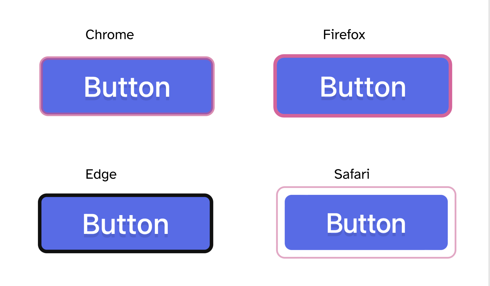
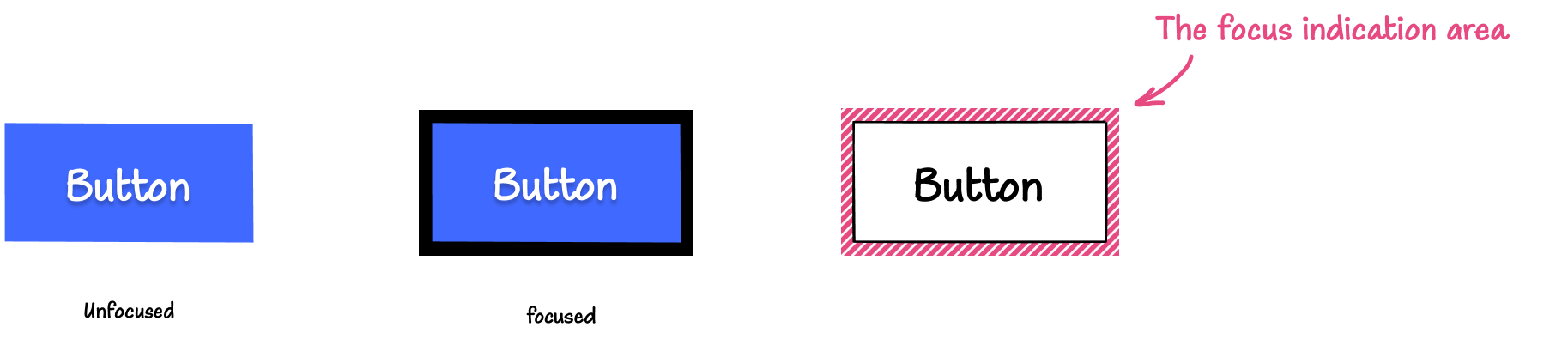
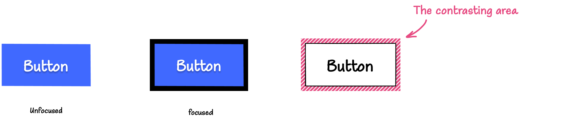
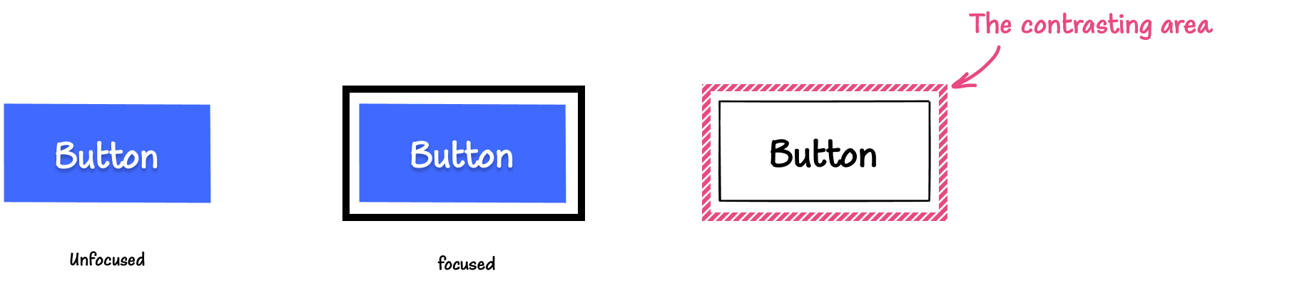
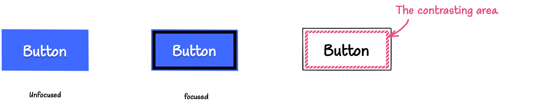
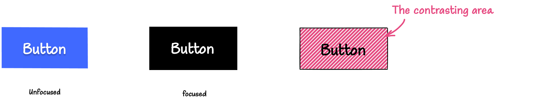
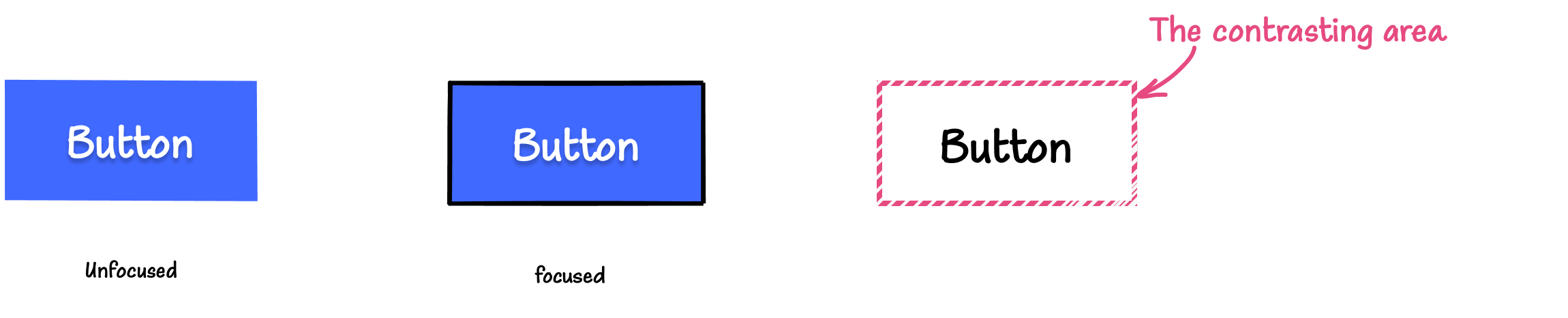
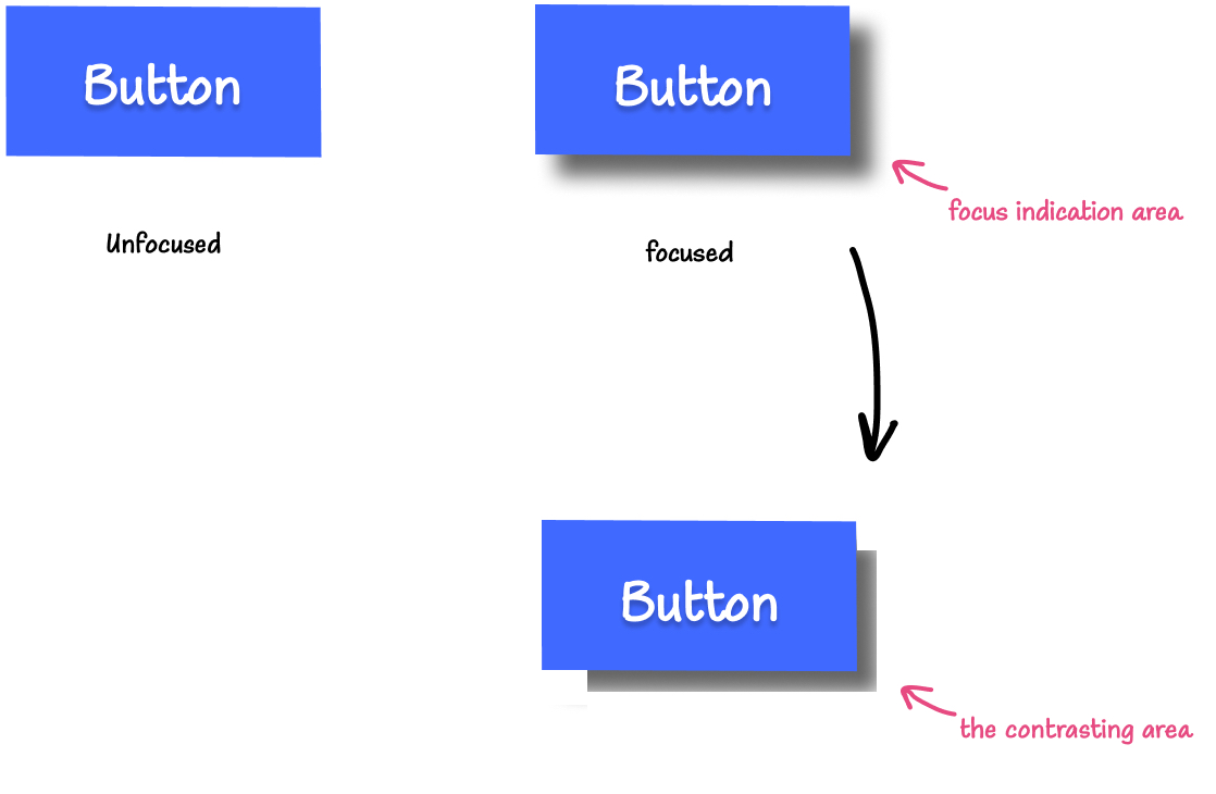
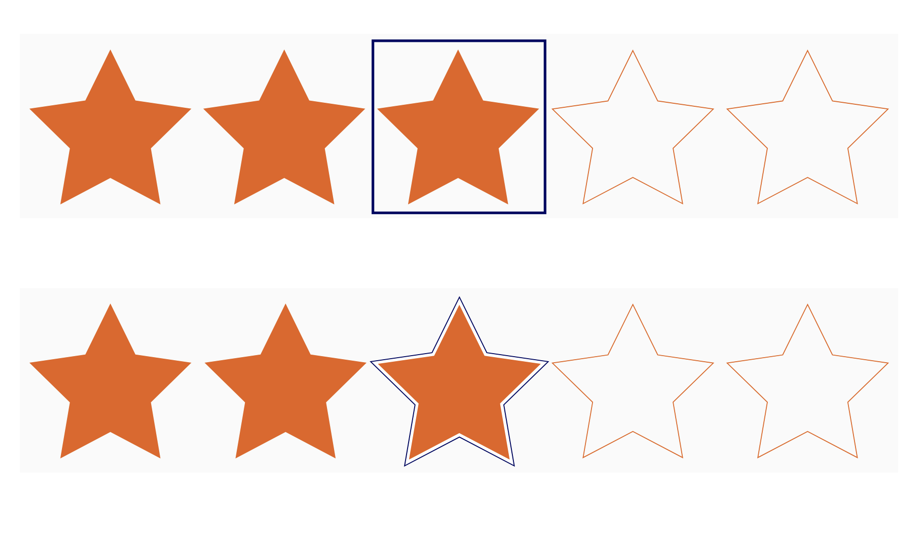
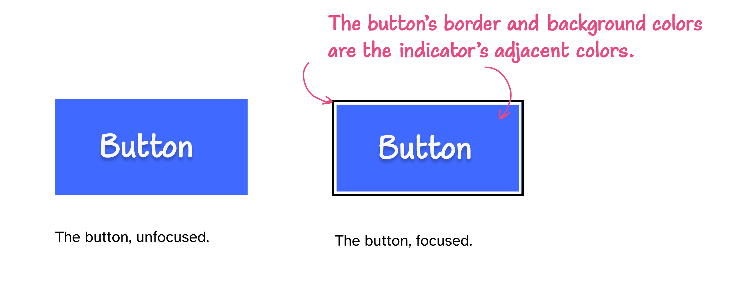
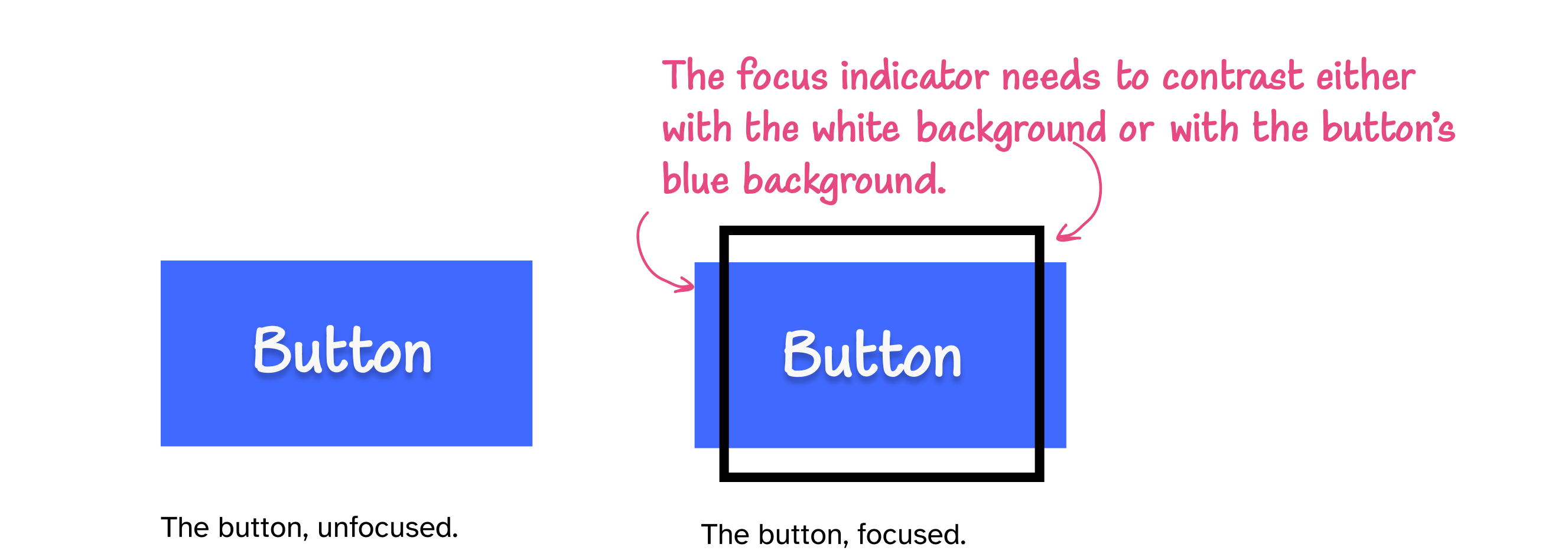
What do you usually think about when you think about focus indicators? Probably outlines? Maybe borders and background color changes, too? That’s what I would normally think about.
When we talk about focus indicators, the discussion usually revolves around outlines, borders, and maybe background color changes, because these styles for focus indicators are universal—you can modify these properties on all focusable elements in a similar manner. You may even design one universal outline that would apply to all the focusable elements on a page and call it a day.
But there’s another, more context-specific focus indicator that is not as widely included in the discussion: the caret.
When you tab your way through a page to a text input field, the browser, by default, usually shows two focus indicators:
an outline around the text field,
and a caret.
The caret is the blinking vertical line that appears at the “insertion point” of an editable element such as an input field or a contenteditable area.
This caret—the one that appears in editable text areas—is specifically referred to as the insertion caretin the CSS specification. It serves as a visual indicator that basically says: “You are here. This is your current text insertion position.”.
Like other focus indicators, the caret should meet minimum accessibility requirements to ensure that it is usable and that it serves its intended purpose.
The caret also serves another purpose: it may indicate a keyboard user’s current position within non-editable areas of text, in a mode of keyboard navigation called “caret browsing”.
In this mode of browsing, the caret is often referred to as the “navigation caret”, and it serves a similar purpose to the mouse cursor, but for keyboard users. And we all know how important the visibility of the mouse cursor is, right?
When I first heard about the new CSS caret-* properties from Manuel Rego’s article, I was a little cautious about the implications of using them, but I was also mostly intrigued and somewhat excited about the possibility of using these properties to improve the user experience for keyboard users navigating websites using a caret.
However, as I dug deeper into the CSS specification, user preferences in operating systems, browser support, and accessibility guidelines, I soon learned that there is a lot to consider before using these properties… so much that it made me question whether I would personally ever use them at all.
In this article, I’m going to share with you everything I learned about caret browsing, caret styling using CSS, and accessibility considerations to keep in mind should you ever want to apply custom styles to the caret.
So, let’d dive in.
What is caret browsing?
When you navigate pages using a keyboard, you typically press the tab key to move your focus from one interactive element on the page to the next. But navigating one interactive element at a time does not give you precise control over where your position is within the page.
What if you want to move your position to a specific piece of text on the page to copy it, for instance? You can’t do that using the tab key. You’re going to need a more precise keyboard navigation method—one that is similar to navigation within, say, a MS Word document or a text editor, for example.
This keyboard navigation method exists in most browsers today, and it is known as “caret browsing” (or “caret navigation”).
Caret browsing is an accessibility feature. And it is a hidden gem for navigating without a mouse. It is provided by browsers, and enables a kind of keyboard navigation where the caret, also commonly referred to as the text cursor, is used to navigate the page.
Imagine your web browser as a text editor, much like Microsoft Word. Here, you can use your mouse cursor to start typing or selecting text. Caret browsing essentially gives you the same capability on web pages.
A blinking cursor known as the caret appears on the webpage when you activate caret browsing. This makes it possible to move the caret around using the arrow keys on your keyboard, navigating text as you would in a document.
[…] This feature can be particularly handy when you need to research, gather information, or work on web-based projects.
So caret browsing is essentially keyboard navigation using a caret as an indicator of your current position on the page.
To enable caret browsing, press the F7 key on your keyboard.
If it’s your first time enabling caret browsing, a dialog will appear asking you if you want to enable caret browsing.
When you enable caret browsing, the caret—a blinking text cursor—will appear on the page, indicating your current position. You can then start to use your keyboard Arrow keys to navigate the text content on the page. You can also use the caret to select and follow links: when the caret is over a link, press Enter.
Enabling caret browsing in MS Edge.
To disable or turn off caret browsing, press the F7 key again.
The default caret styles applied by browsers
By default, the caret inherits the color of the text it is positioned in, whether that’s in an editable or a non-editable text area.
In the video from the previous section, the caret color changes from black to blue when the caret is on a link because the link’s text color is blue.
a closeup of the cursor when it enters a link on the page
These default styles for carets are defined in the CSS Basic User Interface Module, which states that browsers should use currentColor as the default (auto) caret color.
Operating systems (OS) offer users options to customize the caret
Like other user interface elements (e.g. mouse cursors), operating systems offer settings for adjusting caret styles to make it more accessible to the user. These settings may vary across operating systems.
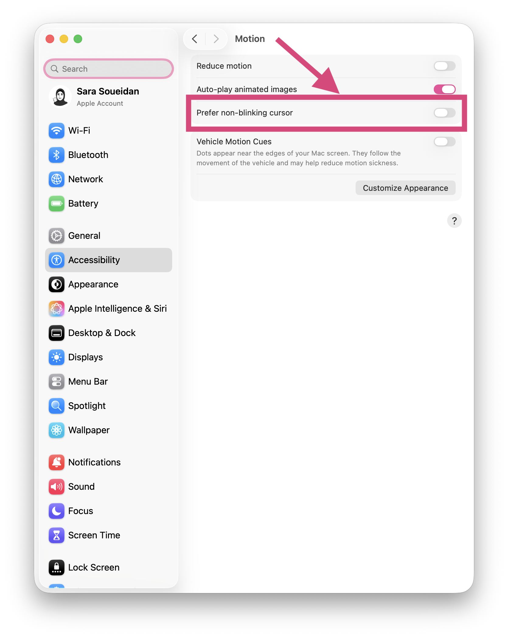
On macOS
macOS offers one setting for adjusting the text cursor: Prefer Non-Blinking Cursor. You can find that setting in macOS Settings under Accessibility > Motion.
The text cursor blinks by default. Enabling Prefer Non-Blinking Cursor stops it from blinking.
In this video, I have the demo page open in Chromium Edge browser. I then activate the "Prefer Non-Blinking Cursor" option in macOS Motion Accessibility settings. Both the insertion caret and the navigation navigation caret stop blinking.
The Prefer Non-Blinking Cursor option is honored by Safari, Chrome, Firefox, and Chromium Edge and is applied to both the insertion caret and the navigation caret. So if the user wants the caret to stop blinking, it will stop blinking everywhere, which is what you would expect from a system-level setting.
On Windows OS
Windows OS offers more advanced customization options to make the caret even more accessible.
At the time of writing, browsers do not apply these customizations to the navigation caret.
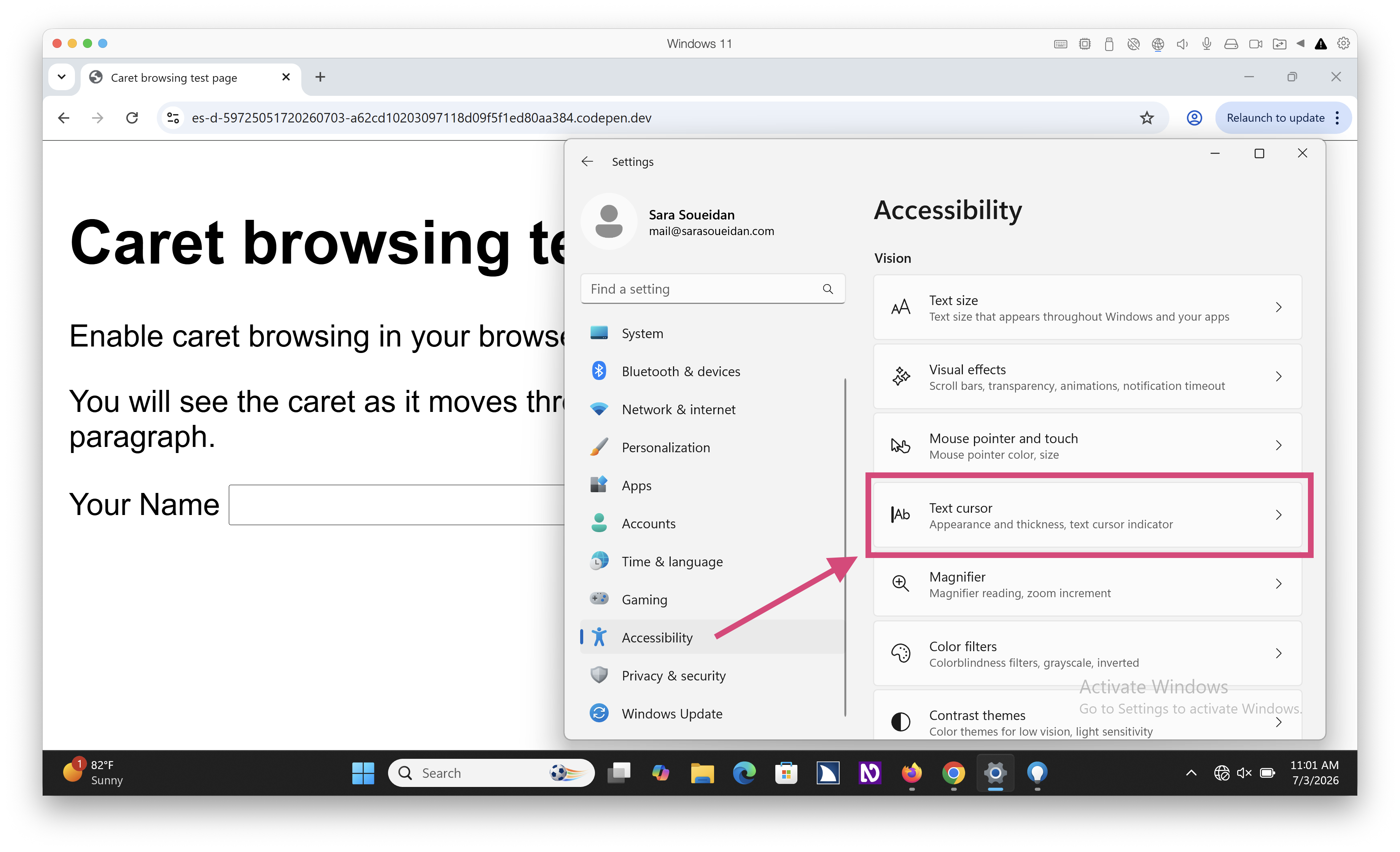
In Windows OS settings, the caret is referred to as the text cursor. So to modify its settings, go to: Windows > Settings > Accessibility > Text Cursor.
In the Text Cursor settings you will see options to:
enable and customize a “text cursor indicator”;
modify the text cursor’s thickness;
and set the blink rate of the cursor.
When you enable the text cursor indicator option, Windows adds what looks like air balloons to each end of the caret, which makes it more visible and allows it to visually stand out in a sea of text.
You can customize the color of the indicator (the balloons) and choose a color that is more visible to you.
In this video I enable the text cursor indicator option in Windows settings, and demonstrate a couple of the different color options available. The indicator is shown for all insertion carets in Windows OS and in the browser.
This option is particularly useful for when input fields receive keyboard focus and that don't have any other visible focus indicators. The text cursor indicator makes it easier to spot where your keyboard focus is at. For example, when I pressed command+R, which fires up the "Run" Windows dialog (in my virtual machine), it automatically sets focus to the field inside the dialog (at the bottom left of the screen). No other focus indicator is shown on the field.
You can also adjust the thickness of the text cursor to make it even more visible.
In this video, I increase the thickness of the text cursor in Windows settings. The insertion caret becomes thicker in the Run dialog and in other editable fields in the system.
At the time of writing, browsers do not honor the cursor thickness setting on insertion carets. If you modify the thickness of the caret in the OS settings, the caret thickness remains unchanged on your web pages.
And finally, you can modify the cursor’s blink rate. A user may lower the blink rate down to zero, which effectively stops the caret from blinking.
In this video, I decrease the caret's blink rate to zero and apply the changes. The caret stops blinking in the Windows Run dialog.
At the time of writing, browsers also do not honor the cursor blink rate setting on insertion carets.
And as we mentioned ealier, browsers do no honor any of these Windows OS settings on the navigation caret.
Modifying the default caret styles in CSS
The CSS Basic User Interface Module specification defines three properties that enable us to style carets: caret-color, caret-animation, and caret-shape, along with the shorthand caret property.
According to the specification, these properties are meant to apply to the insertion caret, but not to “other user interface mechanisms with a similar appearance”, like the navigation caret, though user agents may choose to take them into account. Whether to do so and to what extent is up to the user agent.
So browsers that support these CSS properties will decide whether or not to apply your caret styles to the navigation caret.
The caret-color property sets the color of the caret
The caret-color property has been around for years now and is used to specify the color of the caret.
As we mentioned earlier, browsers will use currentColor as the default caret color if you don’t override that with your own color.
At the time of writing, all modern supporting browsers use the color specified in the caret-color property on both the insertion caret and the navigation caret.
Here is a screen recording showing the caret color change as I change its value in the browser devtools.
Notice how the color defined in CSS overrides the default navigation caret color that it otherwise inherits from the surrounding text. The CSS color is also used when I navigate to the link, so the caret no longer inherits the link's color.
The caret-shape property specifies the shape of the caret
The caret is typically shown as a thin (typically a one-pixel-wide) vertical line (or bar). You can modify that default shape of the caret using the caret-shape property. You can choose between three shapes:
bar: a thin bar placed at the insertion point. This is the default caret shape in most browsers and operating systems.
block: a rectangle overlapping the next visible character. To make the text underneath the caret more visible, the current Chromium implementation adds transparency to the block caret.
underscore: a thin line under the next visible character following the insertion point.
Here is a screen recording showing all three caret shapes in action:
The first input field demonstrates the default auto value, which is effectively bar on most browsers and operating systems. The second field demonstrates the bar value. The third field demonstrates the block value. And the fourth field demonstrates the underscore value.
Notice how the block shape has a reduced transparency, so the caret color is a shade of grey instead of being a true black like the current text color. This is the current Chromium implementation.
Here is a live demo of the above screen recording for you to try it out:
If you are using a supporting browser, you should see the different caret shapes as you interact with the input fields.
At the time of writing, browsers apply the caret-shape property to the insertion caret, but not to the navigation caret.
Animating the caret with caret-animation
The caret-animation property enables you to animate the other caret properties.
To animate a caret, you’ll select the element or container where the caret is shown, and then:
Set caret-animation to manual. By setting the caret animation to manual you’re effectively telling the browser to stop the default blinking animation on the caret because you are going to take control of animating the caret by applying your own CSS keyframe animations.
Define the animation using a CSS @keyframe animation and apply it to the element.
Here’s an example that animates the color of the caret between pink and green, creating a custom color-transition effect:
input[type=text]{ caret-animation: manual; animation: color-transition 1s linear infinite; }
Because the caret-color property is applied to the navigation caret, so is the animation.
Note that I chose two colors that have a high contrast with the white background to make sure that the caret remains visible. You may need to zoom in to see the color animate on the caret because of its small surface area.
You can also animate the shape of the caret. Manuel Rego provides a live demonstration that you can check out.
As we’ve learned so far, caret styles can be modified by the user on the OS-level, and by us, CSS authors, on the CSS level.
Browsers decide which preferences and author styles are applied to the caret. They will apply some styles to the insertion caret only, while others are applied to the insertion caret and to the navigation caret.
The caret is an important user interface element. Without it, keyboard users wouldn’t be able to pinpoint their exact location on the page.
In both of its forms (insertion or navigation), the caret is effectively as important as the mouse cursor is for mouse users.
Technically, the insertion caret is a focus indicator. So, like other focus indicators, there are WCAG criteria that determine mininum accessibility requirements to ensure that the insertion caret is accessible.
Accessibility requirements for the insertion caret
The WCAG criteria that are relevant to styling the insertion caret are:
The insertion caret is a focus indicator but you will generally not have to worry about making it conform to SC 2.4.13 Focus Appearance (Level AAA) because it cannot meet the criterion because of its small surface area.
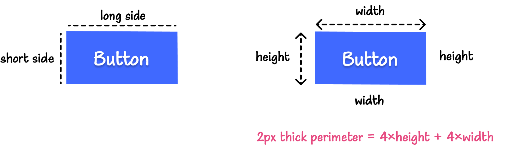
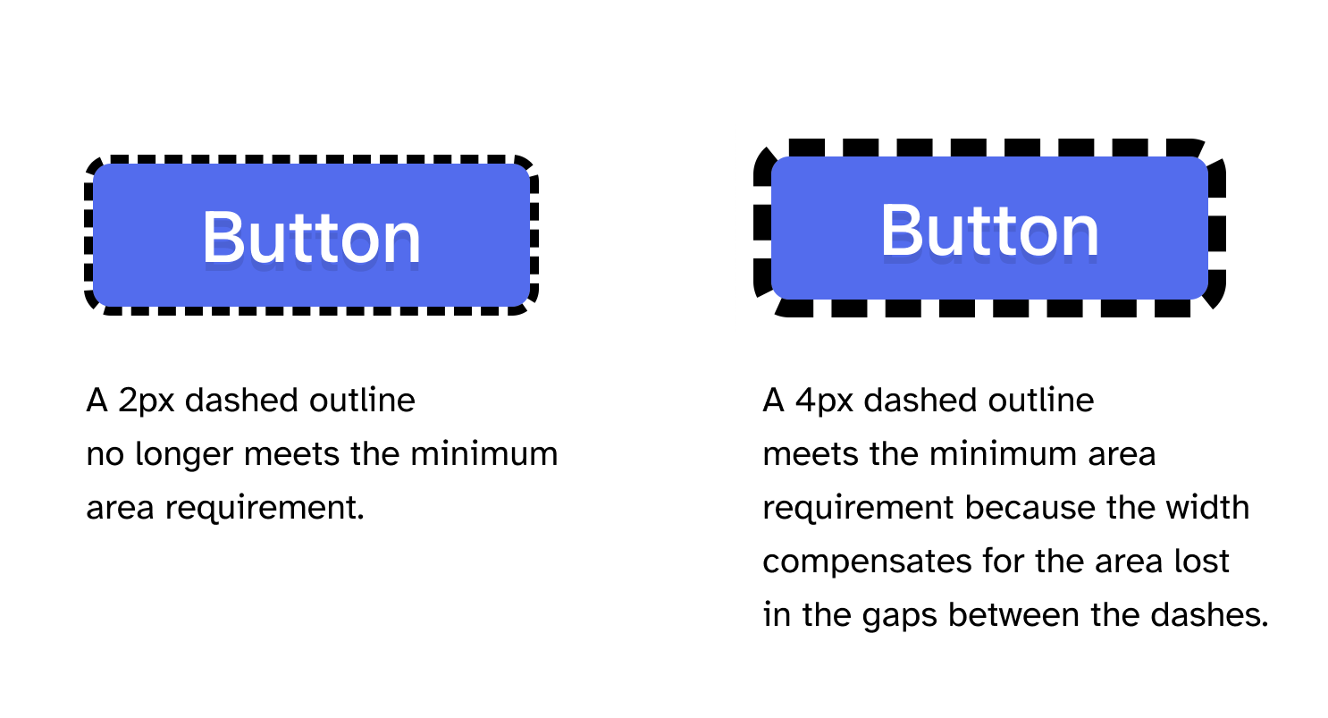
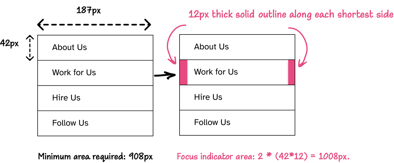
Even if you make the caret shape a block, the block is still not “at least as large as the area of a 2 CSS pixel thick perimeter of the unfocused component or sub-component”, which is the minimum required area of a focus indicator as per SC 2.4.13.
Using the insertion caret to indicate focus will not cause a failure of Focus Appearance. But if you’re aiming for Level AAA WCAG conformance, then the insertion caret alone will not meet its requirements. You will need to show another focus indicator that does. To do that, follow the guidelines for designing other forms of focus indicators that I outlined in the guide to creating WCAG-conformant focus indicators.
Any keyboard operable user interface has a mode of operation where the keyboard focus indicator is visible.
The “keyboard focus indicator” can be anyfocus indicator that lets user know where their focus is. It can be an outline, a border, a background color, or a caret.
This success criterion mandates that at least one focus indicator is shown.
If you’ve read my guide to WCAG-conformant focus indicators, you may remember that:
The default focus indicator provided by browsers automatically passes because it is exempt from this criterion (even if the default focus indicator has low contrast)
As soon as you decide to override the default focus indicator and provide your own custom styles, you must ensure that the focused element has at least one focus indicator that meets the minimum contrast ratio against adjacent colors that is defined in SC 1.4.11 Non-Text Contrast.
According to Focus Visible’s Understanding document, sufficient techniques for passing this criterion include browser-provided methods for indicating focus, and the insertion caret is listed as one of those methods. So if you don’t change the default caret styles, then strictly speaking you increase your chances of passing SC 2.4.7 Focus Visible, even when you haven’t provided another clearly visible focus indicator.
The visual presentation of the following have a contrast ratio of at least 3:1 against adjacent color(s):
User Interface Components
Visual information required to identify user interface components and states, except for inactive components or where the appearance of the component is determined by the user agent and not modified by the author;
[…]
The minute you decide to modify the color of the caret with caret-color, you must ensure that your focused element passes this criterion, either by:
Ensuring the caret-color value has a contrast of at least 3:1 against adjacent color(s).
Or ensuring that there is another focus indicator that passes the success criterion. That can be custom focus indicator, or the default browser outline for the element.
The Understanding document provides a table that contains several examples of user interface components that pass the criterion’s requirement.
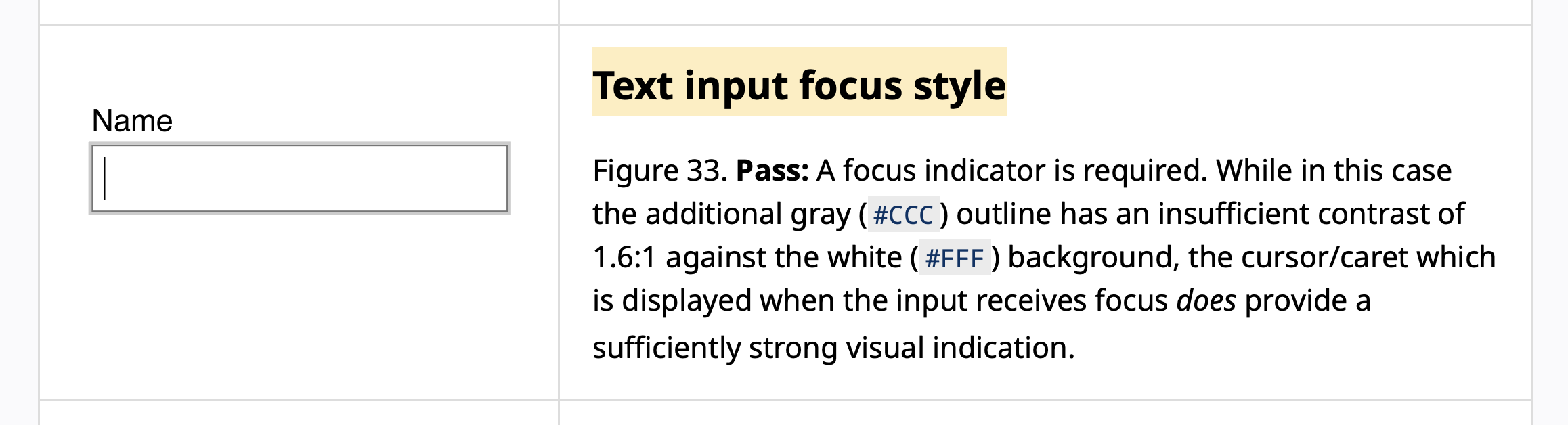
One of these examples is an input field that has a low-contrast outline in the focused state:
The input example from the Understanding document.
That input in the example passes Non-Text Contrast because it has a caret that “does provide a sufficiently strong visual indication”.
The caret in this example has a sufficiently strong contrast against the input’s background color. This is why it is considered as an indicator with sufficiently strong visual indication.
If the caret color had insufficient contrast against the background, and there is no other focus indicator with sufficient contrast, the component fails Non-Text Contrast in the focused state.
So, if you haven’t provided another passing focus indicator, your caret-color value must have at least 3:1 contrast against the background.
Web pages do not contain anything that flashes more than three times in any one second period, or the flash is below the general flash and red flash thresholds.
The terms “blinking” and “flashing” can sometimes refer to the same content.
“Blinking” refers to content that causes a distraction problem. Blinking can be allowed for a short time as long as it stops (or can be stopped)
“Flashing” refers to content that can trigger a seizure (if it is more than 3 per second and large and bright enough). This cannot be allowed even for a second or it could cause a seizure. And turning the flash off is also not an option since the seizure could occur faster than most users could turn it off.
Blinking usually does not occur at speeds of 3 per second or more, but it can. If blinking occurs faster than 3 per second, it would also be considered a flash.
Now, not all flashing or blinking content will automatically fail this criterion.
The Understanding document includes a list of sufficient techniques that you can follow to meet this criterion.
If you have something that flashes more than 3 times in a one second period (so G19 can’t be used), but the area that is flashing is less than 25% of 10 degrees of visual field (which represents the central area of vision in the eye), then it would automatically pass.
The Technique page then goes on to explain how to translate the “10 degrees of visual field” to CSS pixels so that you can apply and test it in your work. Check the technique details out for all the nitty gritty details if you have any kind of flashing content in your work.
So whether or not a blinking caret meets this criterion depends on the size of the caret and how much space it takes in a user’s visual field.
As Adrian Roselli notes in his article about custom carets, a blinking caret “can impact a zoomed user if an author creates a more rapid animation, particularly if the caret shape is a block (taking up more of their field of view).”
So probably avoid any rapid blinking animations on the caret.
And if you apply any kind of custom animation on the caret, wrap your animation in a prefers-reduced-motion: no-preference query so that the animation only occurs when the user hasn’t expressed a preference for stopping animations.
@media(prefers-reduced-motion: no-preference){ /* any possible animation goes here */ }
With that said…
Remember when we said earlier that a user can stop the caret from blinking using OS-level settings (on both macOS and Windows)?
There’s currently no way in CSS for us to check whether the user has caret-specific preferences enabled or not.
Users may have animations enabled on their system, while also expressing a preference to stop the caret from blinking. Maybe they don’t mind the UI animations here and there, but they want a non-blinking caret specifically when they are navigating with keyboard because a blinking caret is more difficult to pinpoint on a page when it is lost in large blocks of text.
If you apply an animation to your caret, users must be able to stop this animation. And prefers-reduced-motion won’t cut it in this case.
The CSS specification states that:
UAs that do not have an editable user stylesheet should provide a setting to disable blinking, flashing, and animated carets. UAs that do have an editable user stylesheet may want to provide this setting as well. See [WCAG] Guideline 2.2 and Guideline 2.3 for details.
Browsers don’t currently provide that setting.
So, if you asolutely have to, or if you feel the need to animate the caret:
Avoid a rapid flashing animation;
And maybe provide an option somewhere on your website for the user to disable your custom caret animation.
Accessibility requirements for the navigation caret
The navigation caret is closely related to focus indicators but it is not a focus indicator, so it does not fall under any of the focus-related WCAG success criteria like the insertion caret does.
However, the navigation caret does fall under general non-text color contrast requirements specified by SC 1.4.11 Non-Text Contrast.
As we mentioned in a previous section, the caret inherits the color of its surrounding text by default.
If the text has sufficient minimum contrast all over your website, then so will the caret.
If you use the caret-color property to modify the color of the caret, you must ensure that the color you choose has at least 3:1 contrast against the background.
Remember that the caret-color property affects both the insertion caret and the navigation caret. This means that the color you choose must have 3:1 contrast against the background of your text fields and contenteditable areas, as well as against any other backgrounds where the navigation caret is shown.
If you have more than one background color on the page, you may need to adjust the color of the caret for the different areas of the page, because one color may not have sufficient contrast against all background colors on the page.
Or, alternatively, you may scope your styles so the caret-color property is only applied to the insertion caret:
/* Select only the components or elements where the insertion caret is shown and apply the caret color to those elements only */ textarea, [contenteditable="true"], textarea, input[type="text"], input[type="password"], ...{ caret-color: #9C0C60; }
Here is a demo page where a custom caret color is only applied to the input field. The navigation caret color defaults to the auto value and inherits the text color:
I have caret browsing enabled in all browsrs by default. Frankly, I would appreciate a more visible navigation caret.
One way I would make the navigation caret more visible is to give it a custom color that has sufficient contrast with the background and with the text. This would make the caret stand out more on the page.
Something else that would make it more visible is increasing its surface area by making it thicker.
However, as we’ve mentioned earlier, browsers don’t apply the caret-shape property to the navigation caret. They also don’t honor OS-level user preferences on the navigation caret. And without a way for the user to adjust the caret size, our CSS styles could make the caret less usable for users who prefer their own caret width.
This brings us to the final and arguably most important part of this article…
User needs come first—by standards and by law.
The Web platform is meant to be built following a set of design principles. One of these design principles is the Priority of Constituencies, which unambigiously puts user needs first (emphasis mine):
If a trade-off needs to be made, always put user needs above all.
[…]
The internet is for end users […]
User needs come before the needs of web page authors, which come before the needs of user agent implementors, which come before the needs of specification writers, which come before theoretical purity.
So when it comes to deciding which styles should “win”, user styles should always take priority over author styles, and browsers should prioritize user preferences whenever possible.
Unfortunately, the way it stands today, browsers apply author styles to the caret, but do not honor most user preferences, and will override user preferences with author styles.
The caret thickness is an example. Your styles take precedence over CSS preferences that the browsers don’t even honor. If your caret is too thin, or even too thick, you risk making it unusable to your users. And there is currently no way to allow the user to override your caret width.
If browsers start honoring more user preferences on carets, you must test and ensure that your custom styles don’t override the preferences defined by the user. This may mean providing a custom switch of some sort that enables them to switch your custom caret styles off to allow theirs to take precendence.
Even though WCAG doesn’t specifically address or mandate this, the latest version of the European accessibility standard EN 301 549 does.
Here are the most relevant clauses from the latest version of the standard (emphasis mine):
9.7 User preferences for web pages
Where ICT is, or includes, a web page, the web page shall not block the user agent’s mode(s) of operation that present the web page according to user preference settings, or explicitly override user preference settings for documented platform accessibility features in these modes of operation, unless this is essential to the information or function of the web page.
[…]
11.7 User preferences
Where ICT is, or includes, non-web software that provides a user interface, and is not designed to be isolated from its
platform, that user interface shall follow the values of the user preference settings for documented platform accessibility features
unless it is essential to the function of the non-web software to not follow a user preference setting.
[…]
NOTE 3: For non-web software, the underlying platform is usually the operating system.
NOTE 4: When ICT is a user agent (such as a web browser or non-web document viewing software), this clause
implies that at least one mode of operation is offered that enforces a rendering of the content that follows the values of the user preferences.
NOTE 5: This does not preclude the non-web software from having additional values for a setting as long as there is one mode where the application will follow the system settings even if more restricted.
NOTE 6: Features that might be documented as accessibility features for a platform include, but are not limited to colour filters, contrast, text size, pointer size, and text cursor
Now, I don’t find the EN 301 549 standard to be the easiest standard to read and understand. (WCAG kind of reads easy in comparison.) But the clauses pertaining to User Preferences look clear to me. User preferences must be respected and should not be overridden.
The EN 301 549 standard has been adopted by countries in and outside the EU since it came out. And it’s only a matter of time before the latest version becomes the standard for legal compliance.
Correct me if I’m wrong, but we can safely conclude that honoring user preferences for the styles and visibility of the text cursor (the caret) is going to be a conformance requirement.
Final Words
If I were to end this with one piece of advice it would be to be conservative with your caret customization.
And always make sure to provide a clearly visible focus indicator. Don’t rely on the caret as the only focus indicator.
If you have to create custom carets, give the user a choice to disable the custom styles somewhere on your website. At least until we get a proper way to detect when users have enabled their own OS-level preferences. Or until browsers provide users with some sort of easy switch to disable custom caret styles.
Adrian approaches this topic from a different angle that highlights the conformance risks that arise from creating custom carets. His article may convince you to leave the caret alone for now, at least until we have a standard and reliable way to enable users to make the caret work better for them.
Many thanks to Adrian for reviewing this article and providing feedback.
He also encouraged me to finish it and publish it… last year.
And thanks to Patrick Lauke for answering some of my WCAG-specific questions. Also last year. 😃
I created the Practical Accesibility course for people who build for the Web. It is a great fit for you if you are a designer or a developer and you want to be technically competent at web accessibility so that you can build more accessible websites and web applications, test and find accessibility issues in existing projects, and critically evaluate code for accessibility—even if AI is doing much of the coding.
Ranking our favorite features gives the Firefox team data they can use when reviewing which proposals should be taken on in Interop 2027: a yearly project with the goal to increase the interoperability of key features of the web platform across browsers—a dream come true for people who build the web.
I’ve been seeing some of my web friends blog about their rankings. (I’ve shared links to the blog posts I’ve seen and read at the end of this post.) So, instead of just posting about my top choices on social media, I decided to join in with a short blog post—a chance to breathe some life into this blog again, with more blog posts scheduled to come soon.
My choices are primarily based on a feature’s intended use cases/outcome; and my favorite features are the ones that allow us to improve both our websites’ user experience (UX and accessibility) and our developer experience (DX) at the same time.
Here are the features I am looking forward to the most and that I hope make it to Interop 2027. Only the first three are ranked. I don’t necessarily have a ranking preference for the remaining ones; they all got a vote from me and would sure be great to see them supported across browsers next year:
My picks
The HTML focusgroup attribute.
The ariaNotify() API.
Both of the above features—when used correctly and responsibly—enable us to improve the accessibility of our user interfaces and reduce the amount of work we need to do manually ourselves to achieve that.
The HTML headingoffset and headingreset attributes and the CSS :heading() pseudo-class (a whole package, yay!)
Interest Invokers. Another native HTML feature that will allow us to hopefully create more accessible common UI patterns.
CSS border-shape property. I can’t wait to ditch the old hacks when creating simple borders shapes for a simpler and more standard approach.
CSS interpolate-size and calc-size(). We’ve been waiting for these for wayyyy too long.
Allow CSS transitioning/animating display and content-visibility—for all those nifty UX-improving animations on common UI patterns and components like dialogs.
Customizable/stylable <select>. This one’s long overdue.
CSS gap decorations. Please, thank you!
CSS flex-wrap: balance. More Flexbox magic that’s nice to have.
The CSS corner-shape property. Because well you know. Nice corners are nice to have and can be tricky to create.
CSS reading-flow and reading-order properties. If we get a way to break user expectations in a page layout, we must get a way to undo the effect of said ways.
CSS object-view-box property. I’ve long wanted to control HTML images the same way I can control SVG images using the SVG viewBox attribute and this is the closest we’re getting to that!
CSS @counter-style. A nice little customisation touch to our lists.
Responsive iframes. Another long-overdue feature on the web.
We don’t get to downvote features. The ranking page states that if there are features you don’t know or even feel negatively about, leave them unranked.
There are a few features I frankly don’t care for. Some that I don’t know about. And one or two that I feel negatively about.
Other people’s picks
Favorite picks are subjective and tend to stem from our experience and professional needs and wishes. I loved reading what some of my friends have chosen and why. Here are Interop 2027 rankings from:
Despite the fact that Chrome exposes the alt text of a CSS image as part of the accessible name of the element it is used on, James Scholes shared that the alt text is not announced by NVDA, which means that screen reader users using this popular browser-screen reader combination will miss out on meaningful information.
Removed the phrase that said that implied that CSS psuedo-elements are not exposed the same way that HTML elements are exposed in the accessibility tree. Chrome and Firefox now do expose pseudo-elements in the accessibility tree.
The CSS ::before and ::after pseudo-elements are used to insert presentational content before and after (respectively) existing content in an HTML element.
The content property is used to define what content is inserted in these elements.
For example, the following CSS adds the text "Error: " before the content of an error message container:
<divclass="error-message">The value you entered is invalid.</div>
.error-message::before{ content:"Error: "; }
This example adds an SVG chevron icon to a button that toggles the display of some content:
a.external::after{ content:" \2197";/* ↗ = North East Arrow */ }
The contents of CSS pseudo-elements is exposed as part of the content of the element it is inserted into. And, importantly, CSS content takes part in the accessible name computation of the element they are used on.
CSS pseudo-content in the accessible name computation algorithm
According to the specification: when an element’s name is derived from its contents, the browser must include the textual contents of CSS pseudo-elements in the accessible name. This includes the contents of the ::before and ::after pseudo-elements, as well as the ::marker when an element supports ::marker.
Check for CSS generated textual content associated with the current node and include it in the accumulated text. The CSS :before and :after pseudo elements can provide textual content for elements that have a content model.
For :before pseudo elements, User agents MUST prepend CSS textual content, without a space, to the textual content of the current node.
For :after pseudo elements, User agents MUST append CSS textual content, without a space, to the textual content of the current node.
For example, if we look at the link from the example in the previous section:
a.external::after{ content:" \2197";/* ↗ = North East Arrow */ }
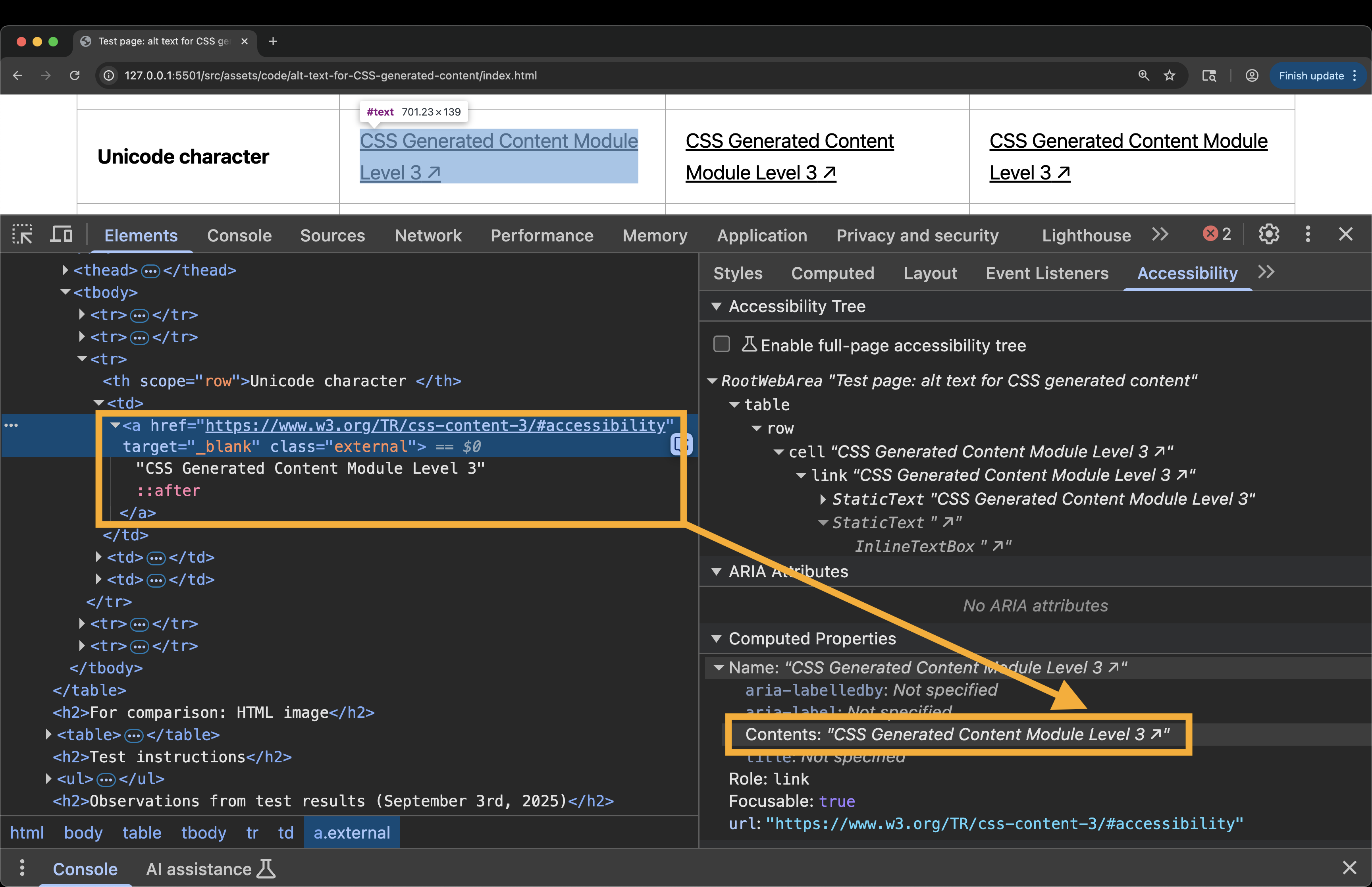
…the accessible name for the link is going to be “CSS Generated Content specification ↗”. If you open the browser DevTools and check the accessibility information of the link, you will see the unicode character included in the accessible name.
The name of the link will be read by a screenreader as “CSS Generated Content specification North East Arrow” or “CSS Generated Content specification Upright Arrow”. The screen reader announces the unicode character by its default alternative text, which does not commnunicate the intended meaning of the character.
Images and characters inserted in CSS should be treated the same way you treat HTML images: when an image (or character) is meaningful, it must be described to assistive technology (AT) users using alternative text that communicates its purpose. This ensures that AT users are getting the same information as sighted users.
Providing descriptive alternative text to meaningful images is a WCAG requirement.
In HTML, you provide the alternative text of an image in the <img>'s alt attribute:
<imgsrc="/path/to/meaningful/image.jpg"alt="[ the text describing the purpose of the image to someone who can't see the image ]">
On the other hand, when the image is purely decorative, it should be hidden from screen readers and excluded from an element’s accessible name to avoid unnecessary or confusing announcements.
In HTML, an image is marked as decorative by giving it an empty alt text. The empty alt value ensures that the image is not exposed and announced by screen readers:
<!-- When the image is decorative, leave the alt text empty. --> <imgsrc="/path/to/decorative/image.png"alt="">
But how do you provide alternative text to CSS-generated content to make sure it is announced (or not announced!) as expected?
Alternative text for CSS generated content
Historically, there hasn’t been a standard way to provide alternative text for CSS generated content and images. So, we resorted to creating placeholder <span>s in the markup for this purpose.
For decorative CSS content, we inserted the content into a <span> and then used aria-hidden="true" to hide that <span> from screen reader users.
And to provide descriptive alternative text to otherwise meaningful graphics, we created an additional, visually-hidden<span> that included the alternative text of the graphic and that is exposed to screen reader users only:
<ahref="..."target="_blank"class="external"> CSS Generated Content specification <spanaria-hidden="true"class="icon"></span> <spanclass="visually-hidden"> (Opens in a New Window)</span> </a>
But there’s a better way to handle alternative text for CSS content today.
We can now provide alternative text for CSS-generated content directly in CSS, after a slash following the content.
Content intended for visual media sometimes needs alternative text for speech output or other non-visual mediums. The content property thus accepts alternative text to be specified after a slash (/) after the last <content-list>. If such alternative text is provided, it must be used for speech output instead.
This allows, for example, purely decorative text to be elided in speech output (by providing the empty string as alternative text), and allows authors to provide more readable alternatives to images, icons, or text-encoded symbols.
This means that for meaningful icons, it looks like this:
a.external::after{ content:" \2197" / "Opens in a New Window"; }
In non-supporting browsers, the slash syntax will invalidate the entire declaration, which means that you would need to precede the new syntax with a fallback for non-supporting browsers.
That being said, support for alt text in the content property is very good today. So unless you need to support Internet Explorer or other older non-supporting browsers, you shouldn’t need to worry about the fallback.
CSS alt text in browsers today
I created a test page (embedded below) to test and demonstrate how browsers handle alt text for CSS generated content today, and how the content is exposed and announced by screen readers.
The page contains two tables:
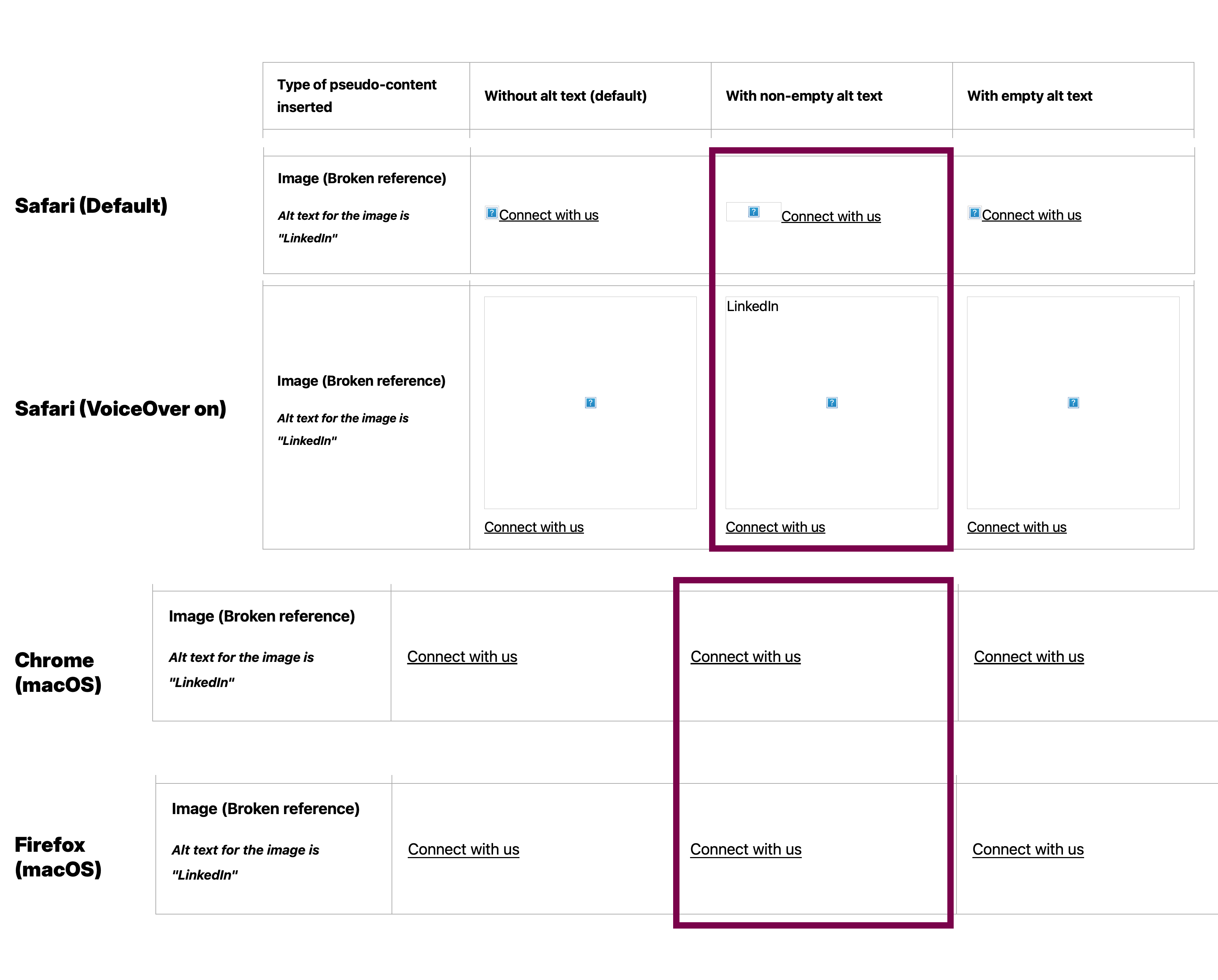
The first table contains examples of different types of CSS generated content,some of that content is intended to be decorative and some is intended to be meaningful. For each type, I created three instances: one without alt text (alt text not included in CSS declaration), one with non-empty, descriptive alt text, and one with empty alt text (alt text is empty but not omitted).
In the second table, I provided an HTML image for comparison. The HTML image table contains valid and invalid image references to demonstrate if and how the image’s alternative text is rendered in the browser. It also contains two instances of each of these images: one with non-empty alt text, and one with empty alt text.
Here is a video demonstrating how VoiceOver on macOS announces each of the examples in the table.
Navigating the buttons and links with CSS generated content using VoiceOver on macOS paired with Safari v18.4.
I got the same results with VoiceOver on iOS 26, and with VoiceOver on macOS when I paired it with both Chrome and Firefox on macOS.
Some observations from the above test:
CSS images inserted using the url() function that don’t have an alt text provided are excluded from the browser’s accessibility tree by default and are, therefore, not announced by screen readers. These are images with no alt text at all.
All images with an empty alt text value are also excluded from the accessibility tree. This is the expected behavior.
Images with non-empty alt text are announced by their alternative text. And the alt text of the image is announced as part of the accessible name of the element.
Images with broken references and non-empty alt text are also exposed and announced by their alternative text, and the alternative text of the image is announced as part of the accessible name of the element. This is the expected behavior.
Like images with valid references, images with broken references are not exposed when they don’t have any alt text provided.
Emojis and unicode characters are announced by their default alternative text, except when you override the alternative text in CSS.
And finally, the alt text of a broken CSS image is not shown in place of the image when the image is not shown. The only exception on desktop is Safari on macOS which does show the alt text of the image in a large square placeholder but only when VoiceOver is turned On, or upon turning it Off.
In other words, Safari does not display the alt text of a broken CSS image by default. But if you enable VoiceOver—say by pressing CMD + F5, the broken image is replaced with a large, full-width square that contains the alternative text of the image. You can see that in action in the video recording above.
Safari on iOS 26, on the other hand, did show the alt text in the large square placeholder in my tests whether VoiceOver was On or Off.
I got very similar results with JAWS (2025) paired with Chrome (v140) and with NVDA (2025) with Firefox (v142) on Windows. The main difference from VoiceOver macOS that stood out is that NVDA announces “graphic” after the alt text of the CSS image inserted using the url() function.
NVDA paired with Chrome, however, currently does not announce the CSS alt text, as James Scholes shares in the comments. Despite the fact that Chrome exposes the alt text of a CSS image as part of the accessible name of the element it is used on, the text is not announced with NVDA, which means that screen reader users using this popular browser-screen reader combination will miss out on meaningful information.
Support for alt text for CSS generated content has improved notably since I did the same tests last year ahead of my CSS Day talk.
Last year, Chrome exposed CSS images (inserted using url()) even when they had empty alt text.
I was pleasantly surprised to see that all browsers now behave the same way in terms of exposing alt text in CSS.
Despite that, screen readers don’t all announce this alt text consistently at the time of writing.
Don’t use CSS to insert meaningful content and images
While it’s good and certainly useful that we can now provide alt text for CSS generated content, I do not recommend using CSS to insert meaningful content into the page.
Not only will some of your screen reader users miss meaningful information when the alt text is not announced by their screen reader (looking at NVDA with Chrome 👀), but there are also other reasons why inserting meaningful content in CSS is not yet recommended…
The CSS alt text is not shown when a CSS image is not rendered
The alt text of a CSS image is not shown in place of the image when the image itself doesn’t load. If the image is meaningful and it is not shown for some readon, then its meaning will be lost on most users. And the missing alt text can make interactive elements unusable by speech control users.
As I mentioned in the previous section, the only browser that currently shows the alt text of a broken CSS image is Safari on iOS and Safari on macOS with VoiceOver enabled.
The non-empty alt text of a CSS image still contributes to the accessible name of the element it is used on even when it is not rendered visually. This creates a mismatch between the visible label of the element and its accessible name.
Furthermore, depending on the position of the CSS image’s alt text in the accessible name, this mismatch may create an immediate violation of WCAG Success Criterion 2.5.3 Label in Name.
The alt text of an HTML <img>, on the other hand, is more likely to be shown in most browsers.
CSS Generated content does not currently translate via automated tools
CSS generated content does not currently translate via automated tools.
As Adrian Roselli notes in his article on alternative text for CSS generated content, in the future, attr("data-alt") can potentially get around that unless you rely on automated translation tools. If you need your content to auto-translate, then the CSS approach is not for you.
CSS content is only accessible when your CSS is used
CSS content is only accessible when your CSS is used. But not all assistive technologies will render your stylesheets when displaying the page’s content. An example of an assistive technology that replaces your style sheets with custom ones is Reader Mode.
If you’re using CSS to insert meaningful content, this content will not be presented to users viewing the page in the browser’s Reader Mode or in a reading app.
CSS content is (currently) not searchable and selectable
At the time of writing of this post, CSS content is not searchable using the browser’s Find in Page functionality, nor is the generated text selectable.
If you try searching for CSS-generated text on a page, you’ll notice that the browser won’t “find” or highlight the text, even if it is present on the page. And if you try to select CSS-generated content to copy it, for example, you’ll find that you can’t. This makes CSS generated content less usable.
Note that the CSS Generated Content specification states in the Accessibility of Generated Content section that generated content should be searchable, selectable, and available to assistive technologies (emphasis mine). So if browsers follow the spec recommendation in the future we might get different results.
So, what should you do instead?
If the content is integral to the understanding of the page, it should be in your HTML. For text content, use HTML text. For images, use an HTML <img>, and provide a descriptive alternative text in the image’s alt attribute.
If you do insert meaningful content in CSS, make sure you give it a descriptive alt text that describes its purpose.
Does this mean that alt text in CSS isn’t useful?
No, it doesn’t. Not at all!
I’ve seen arguments that because meaningful content belongs in HTML, and since you should use CSS-generated content for decorative content only, then you’ll probably never need the alt text feature.
I find the contrary to be true!
Because you should only provide decorative content using CSS, and because CSS-generated content contributes to the accName of an element, and because you don’t want that content to cause unwanted screen reader announcements, you will want to hide that content from assistive technologies in order to improve the user experience. This is where CSS alt text provides the most utility: hiding decorative CSS images and text from screen readers.
You can get really creative with CSS-generated content. CSS pseudo-elements have long been used to create visual text effects to pages, and Mandy Michael discusses an example of such effects in a blog post she wrote. As Mandy shows, hiding the duplicate text in CSS is essential, otherwise the text will be announced multiple times, resulting in a bad screen reader user experience.
Just keep in mind not to leave the alt text out when the content is decorative, otherwise it will be announced (except in the case of an image added using url()), resulting in unnecessary and unhelpful screen reader announcements.
Summary and outro
Ideally, avoid using CSS pseudo-elements for meaningful content. Prefer using HTML.
If you do insert meaningful content in CSS, ensure it has descriptive alt text that communicates its purpose.
‘Hide’ decorative or redundant CSS-generated content by giving it an empty alt text.
And remember that support may change, bugs may be fixed, others may appear, heuristics may be introduced, and things may stop working the way they have always worked. So make sure to always perform your own testing to ensure that your content and component works as expected.
Recommended reading
I wanted to keep this post short and only discuss the current state of alternative text for CSS generated content, as well as general recommendations to get the most out of this feature.
If you’re interested in learning more about any of the topics I mentioned throughout the post, consider reading these articles:
Did you know that the alt text is only one of five different ways the browser computes the accessible name of an image? For example, did you know that if the image has no alt attribute (i.e. it is omitted) and no title attribute, and the <img> is contained in a <figure> that only contains the <img> and a <figcaption>, then the browser will use the text equivalent of the <figcaption> to give the image an accessible name?
Understanding how browsers compute the accessible name of an element, and understanding what you need to do to give your images accessible names is like having accessibility superpowers. Not only will you know what to do to make your images accessible, but you will also have a toolkit of techniques at hand that you can reach for when you need to fix existing images in your codebases.
There are least three different ways to provide an accessible name to elements that are allowed to have one. What happens when multiple naming methods collide? HTML label? ARIA attribute? CSS content? And what happens when multiple naming methods collide? Which one “wins” in the accessibility tree? ⚖️
If you’re ready to stop guessing and to really understand web accessibility, then I highly recommend enrolling in the Practical Accessibility course.
Practical Accessibility is a structured curriculum that will equip you with the foundational knowledge you need to start creating more accessible websites and web applications today.
Kevin and I been planning this podcast for months and our schedules finally aligned and we made it happen.
We originally planned to chat for a bit… but we had so much fun that almost two hours flew by without us noticing 😅
We covered:
Defining web accessibility and why it matters
How we each became more aware of it (our accessibility origin stories)
Raising awareness and addressing common pushback by debunking accessibility myths
HTML semantics and ARIA
Screen readers and the accessibility tree
New CSS features and how CSS affects accessibility
Keeping up with CSS
Course creation and the Practical Accessibility course
…and we talked a little bit about our shared interest in cooking, fermentation, nutrition, and our favorite meals 🍲
If you’ve ever been curious about web accessibility and how it relates to your work as a front-end designer or developer, and are interested in a technical deep dive into HTML semantics, ARIA, and CSS, or just want to hear two nerds geeking out and laughing along the way — give it a watch (or a listen)!
I got used to writing lengthy technical articles over the last few years that I’d been finding it increasingly harder to publish articles that are not lengthy and overly technical over the last few months. This had led me to abandon a lot of rough ideas and article drafts, eventually leading to my blog feeling abandoned for months in a row.
This isn’t just bad because, well, it is bad. What made it worse is the fact that one of my most recurring pieces of advice is telling people to just write — write down what you learned, no matter how big or small. Start a blog and publish your writings there. Don’t think about whether or not people will like or read your articles — just give them a home and put them out there.
Most popular blogs I know started out as a series of articles that were written for the authors themselves, as a way to document their process and progress for their future selves to reference when they needed to. Heck, my own firstfewarticles started out as rough drafts full of notes that I jotted down as I was learning new concepts (“CSS3” animations, anyone?), and then cleaned the notes up into an article so that it’d be easier for me to come back to those notes in the future.
With time, people got used to my writing style, and my lengthy, detailed deep dives that sort of became a distinguishing quality of my articles. So as the years went by, I started judging the quality of my articles by whether or not they match my previous style, and hence whether or not people would like them. And this is where I felt like I started losing my direction.
I completely ignored the fact that I was changing, and so were my interests. Instead of deep dives, I started enjoying writing shorter case studies that contain a lot of various useful tips and tricks, as opposed to deep dives on one very specific topic.
It took me time and practice to bring myself to start writing and publishing more again, without letting that voice in my head tell me my articles aren’t going to be good enough. I forced myself to ignore and silence that voice.
I remember publishing my first “rough” article after spending a couple of days trying to create an accessible tooltip for one of my clients. I found the process harder than I thought, and started writing notes and documenting my train of thoughts as I was learning how to do it. In the process, I was reminded of the “good old days” when I wrote for me, and it felt very nice. So, I decided to publish those thoughts in an article format that was completely new to me. But I did it anyway. I cringed when I hit that publish button and that voice inside my head tried to convince me that I was going to disappoint people. But I did it anyway. And it was absolutely liberating!
More articles started to follow. It felt like a sport: publishing more short, mini-case studies became an exercise in determination and carelessness for my brain. Today, I constantly remind myself before publishing any article that I am publishing this on my blog (which means that I can publish anything I want), and that it doesn’t matter if people read it or not. I’ll just keep doing my thing, because I enjoy doing it.
I even uninstalled Google Analytics because I didn’t care about checking any visitor numbers or bounce rates or whatever. My blog is there, and I will publish content, whether people read it or not. (Also, you know, performance.)
Once I got over my own obstacles, I stopped feeling like I was obligated to meet other people’s expectations. I started enjoying writing again. And so I recently simply started writing again.
What prompted me to write this particular article is theamazingfeedbackI got to the HSL article I published over the weekend and that I had no idea people would like. Since I want to write more often again, I’m more open to article ideas than ever. And after some people showed interest in learning more about my CSS color format workflow, I thought it would be a good topic to write about, so I did.
I didn’t spend days and weeks writing the article and polishing it like I used to do with my older articles. In fact, I was very deliberate in making it as short and succinct as possible, especially the part where I explain what HSL is and how it works in CSS. I thought most people would already be familiar with it, so I wrote a brief but concice section about it, just to cover the basics for anyone who hasn’t heard about it. And it was in this brevity and conciseness that most people found the article useful.
One particular comment to the article that stood out to me was Nicholas C. Zakas’. I was genuinely surprised to read that he thought this was the best explanation of HSL he had ever read. He pointed out that it was the brevity and conciseness that made it possible for him to not feel overwhelmed with information and therefore understand the concepts better.
In other words, my new, shorter articles have proven to be more inclusive. How great is that?! 😊
The point in saying all of this is to again encourage everyone to just write. What you write might help someone understand a concept that you may think has been covered enough before. We each have our own unique perspectives and writing styles. One writing style might be more approachable to some, and can therefore help and benefit a large (or even small) number of people in ways you might not expect.
Just write.
Even if only one person learns something from your article, you’ll feel great, and that you’ve contributed — even if just a little bit — to this amazing community that we’re all constantly learning from. And if no one reads your article, then that’s also okay. That voice telling you that people are just sitting somewhere watching our every step and judging us based on the popularity of our writing is a big fat pathetic attention-needing liar. (Saying this felt so good, haha.)
If you don’t have a blog already, make one. Write. Publish. Share. You’ll never know how many doors one small article might open up for you.
The Bootstrap Scrollspy—now commonly known as just “Scrollspy”—is a feature that automatically updates navigation links based on the user’s scroll position to indicate which link is currently active in the viewport. It is popular because it aims to enhance the user experience by providing visual cues about which part of the content is currently being viewed.
The Scrollspy effect demonstrated in the Bootstrap documentation shows the navbar links are highlighted when their respective target sections are scrolled into view.
By default, in-page navigation links (<a href="">) don’t get highlighted when their targets are scrolled into view.
Historically, the Scrollspy effect has required us to use JavaScript to ‘spy’ on sections of content in a page (such as in an article) and then programmatically update the navigation links and indicate which one is “active”. That typically involved adding a CSS class name (e.g. .active) or an HTML attribute (e.g. data-active) to style the active link.
Today, a new CSS property and pseudo-selector are available that are meant to enable us to create the Scrollspy effect with just two lines of CSS and no JavaScript.
You will also be familiar with the fact that there are CSS-generated scroll markers (::scroll-marker), as well as HTML (and SVG) scroll markers (<a href="">).
In the carousels article, I examined a CSS-only Scrollspy example from the ‘CSS Carousels’ gallery.
The Scrollspy example in the Carousels gallery is created using CSS-generated scroll markers.
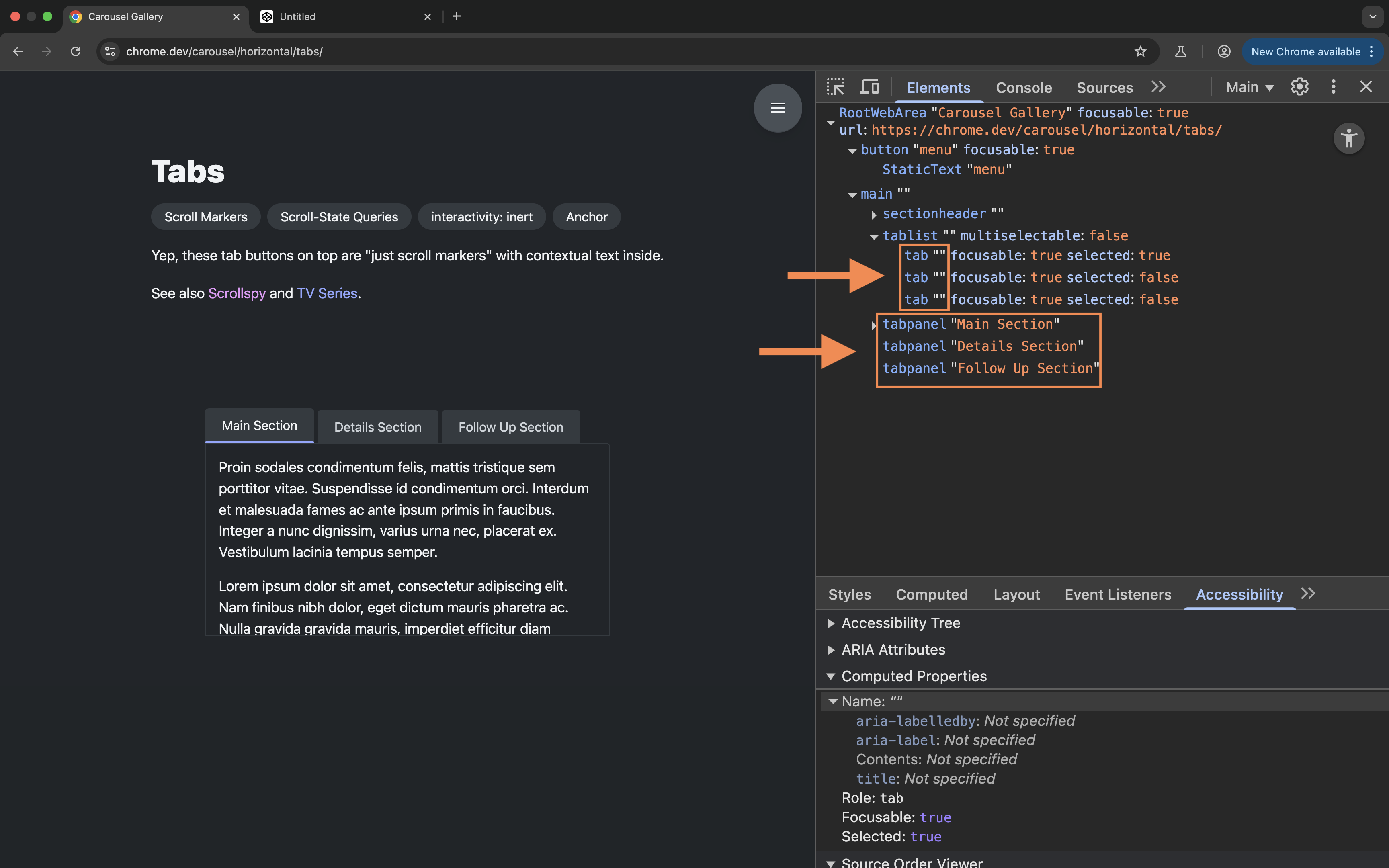
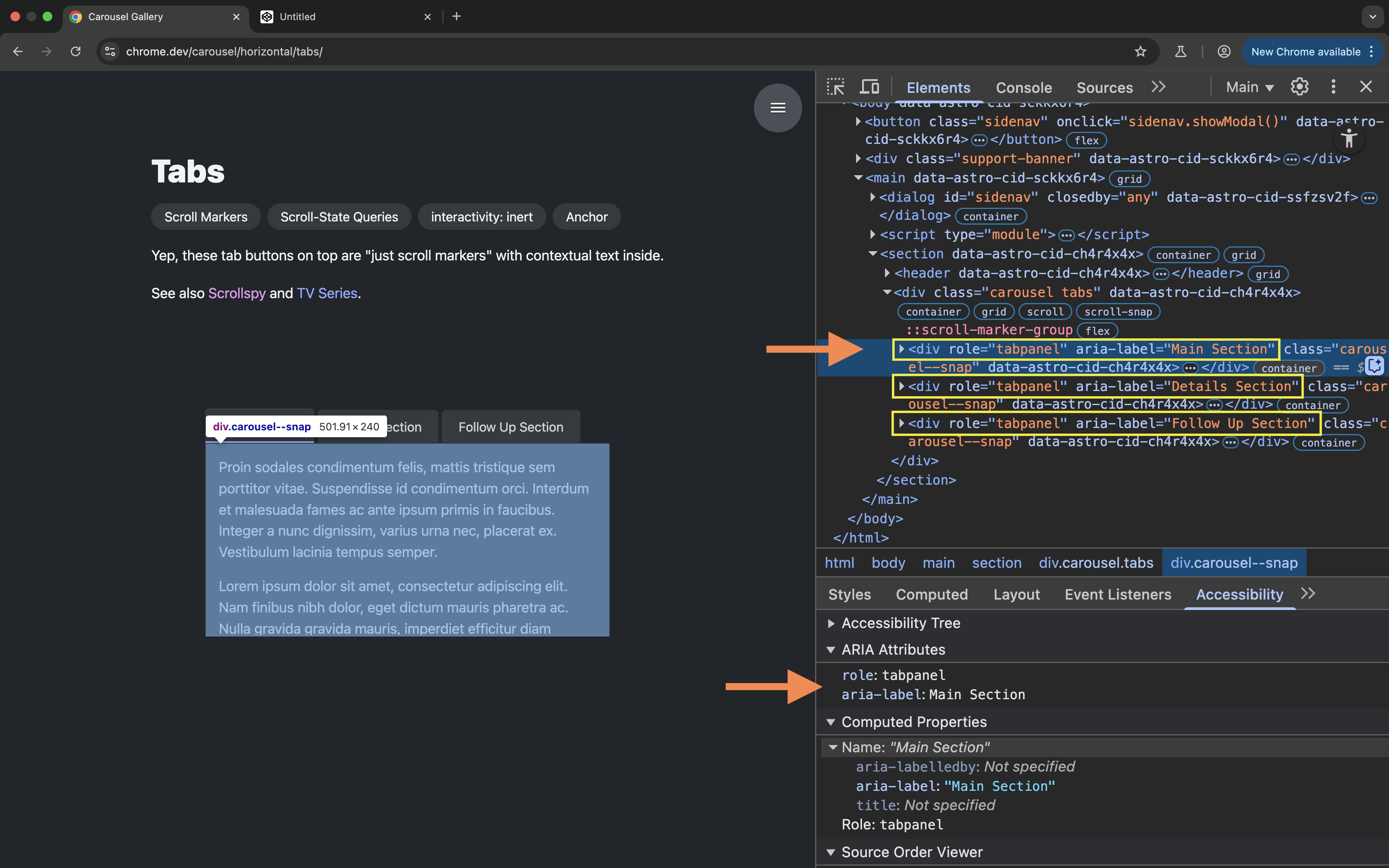
By default, CSS-generated scroll markers are semantically exposed as tabs, not links, which introduced a bunch of usability issues with that pattern that I outlined in the previous post.
As I noted in that post:
Instead of using ::scroll-markers to implement [the Scrollspy] example, I would instead expect to be able to create a semantic table of contents using an HTML list of <a href="">, and then use the :target-current pseudo-class to apply active styles to a link (the native scroll marker!) when its target is scrolled into view. […] However, that doesn’t seem to work at the moment.
Unfortunately, even though the specification states that it defines the ability to associate scroll markers with elements in a scroller, the current implementation of the :target-current pseudo-class seems to work only for CSS-generated ::scroll-markers, but not for native HTML ones.
Personally, I think :target-current is one of the most useful additions to the specification. It’s unfortunate that its current implementation is limited to the new pseudo-elements.
Since I published that post, a new property has been proposed and added to the specification. This property is named scroll-target-group and it “enriches HTML anchor elements functionality to match the pseudo elements one”, which makes it possible to use the :target-current selector to highlight links when their respective targets are in view. 🙌🏻
This post is about the scroll-target-group property and how to use it with the :target-current pseudo-selector to create the Scrollspy effect with CSS.
Enriching HTML anchors to become scroll markers
Using the scroll-target-group property (we’ll demonstrate how shortly), you can “promote” HTML anchors to become ‘scroll markers’.
When a group of HTML anchor elements becomes scroll markers, the browser will run a specific algorithm to determine which anchor in the group is the active anchor, just like it determines the active scroll marker in a group of CSS ::scroll-markers.
The active scroll marker then matches the :target-current pseudo-class, which you can use to visually highlight the active anchor.
All this requires no JavaScript on our part, which is pretty impressive.
Now, in order to use the scroll-target-group property, you will want to use it not to the anchors themselves, but to an element containing the anchors. Let’s demonstrate how.
Using scroll-target-group and :target-current
In the CSS Carousels article we talked about how the scroll-marker-group property is used to generate a grouping container for a group of ::scroll-markers. When you use the scroll-marker-group property, both the scroll marker group container and the scroll markers themselves are generated by the browser as CSS pseudo-elements.
On the other hand, the scroll-target-group property is meant to be a used on an HTML element which contains the HTML scroll markers (the links / anchors).
For example, say you have a Table of Contents (TOC) on an article page and you want to style the active link within the TOC when its target section is scrolled into view.
To use this property, you’ll want to start by setting up the semantic structure of the links:
We have a named navigation landmark that contains an ordered list of anchors pointing to sections of content on the page.
These links are, by default, keyboard-operable and they come with default link behavior and accessibility built in.
To make these links behave like scroll markers, you will then use the scroll-target-group property on their container—this can be the <ol> or the <nav> element.
The scroll-target-group property specifies whether the element it is used on is a scroll marker group container. It accepts one of two values: none and auto.
When the value of scroll-target-group is auto, the element establishes a scroll marker group container forming a scroll marker group containing all of the scroll marker elements for which this is the nearest ancestor scroll marker group container..
Now as the user scrolls through the sections of content, the browser will determine which link is currently active.
The active link will automatically match the :target-current selector, which you can use to highlight the link by giving it distinctive styles within the group:
Here’s a video recording of the example in action:
So, using just a couple of lines of CSS, you can now create a scrollspy effect without needing a single line of JavaScript.
One more thing!
Usually when you load a page that has a fragment identifier in the URL, the browser scrolls the page to the ‘target element of the document’ and you can use the :target pseudo-class to apply custom highlight styles to that element.
Until today, there hasn’t been a way to style/highlight the (in-page) link that points to that target element.
Today, if a link is a scroll marker, the :target-current styles will be automatically applied to the link when the browser scrolls to the document’s target element. This means that you can now combine :target and :target-current to style the target element identified in a URL fragment identifier and the link to that element.
The semantic accessibility of HTML scroll markers
HTML anchor elements (<a href="">) come with default link accessibility and behavior built into them: they are exposed as links to screen readers, and they come with keyboard interactions built into them by the browser.
But an <a href=""> element does not come with a built-in way to communicate that it is “active”, or that it is “the current” link within a group of links.
A scroll marker, by definition, has a meaningful purpose: it lets the user know which part of content is currently being viewed.
What this means is that when you visually highlight an active link, you’re communicating meaningful information to the user.
To ensure that you are not excluding any of your users, you want to make sure that this information is communicated to all your users, including screen reader users. This is a baseline accessibility requirement.
WCAG Success Criterion 1.3.1 Info and Relationships (Level A) states that information, structure, and relationships conveyed through presentation can be programmatically determined or are available in text.
So, how do you communicate that a link is active to screen reader users? How do you provide the same meaningful affordance that you’re creating with CSS to someone who can’t see?
Since there is no native HTML way to indicate that a link within a group is currently “active”, you can use ARIA to communicate this information.
To indicate which anchor is currently active, ARIA provides a conveniently-named attribute: aria-current.
[The aria-current state attribute] indicates the element that represents the current item within a container or set of related elements.
…
The aria-current attribute is used when an element within a set of related elements is visually styled to indicate it is the current item in the set.
Setting aria-current to true on the “active” anchor ensures that screen reader users get the same information that sighted users get about which part of the content is currently shown.
When the user scrolls through the sections of content and the active link is visually highlighted, this link must have aria-current=true set on it.
Because the purpose of the scroll-target-group property and the :target-current selector is to allow us to create JavaScript-free native HTML scroll markers, we should expect the browser to add and manage the necessary ARIA attribute(s) required for scroll markers to be inclusive. (After all, that’s the whole premise of this feature: to write a few lines of CSS and let the browser handle all the behavior for us.)
However, at the time of writing of this post, Chrome (currently the only browser that has implemented this feature) doesn’t add aria-current=true to the active anchor yet.
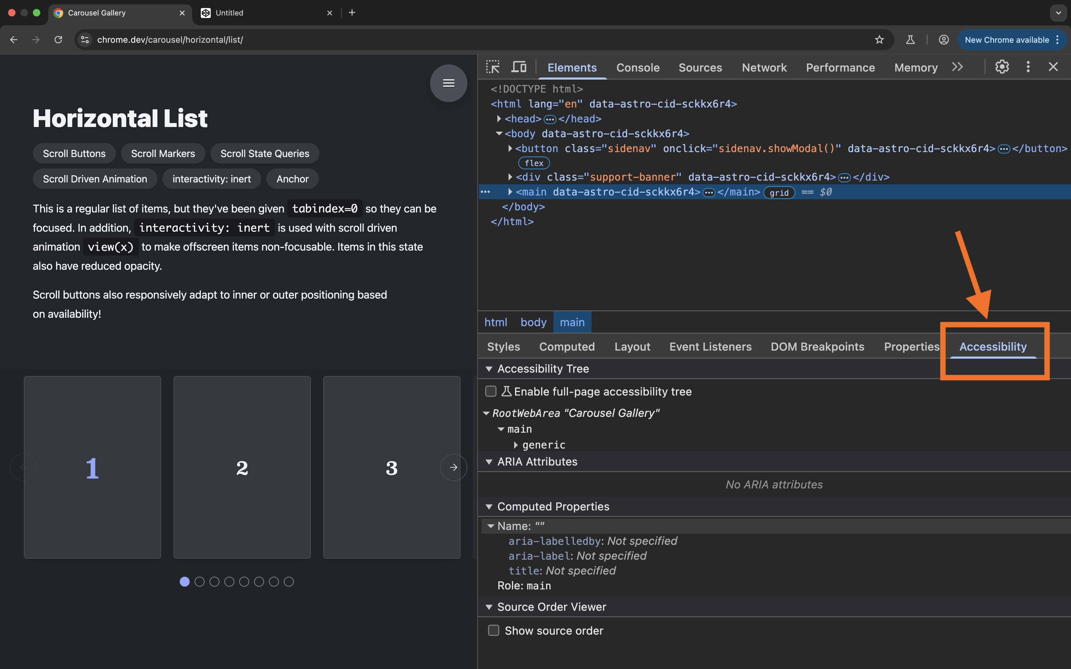
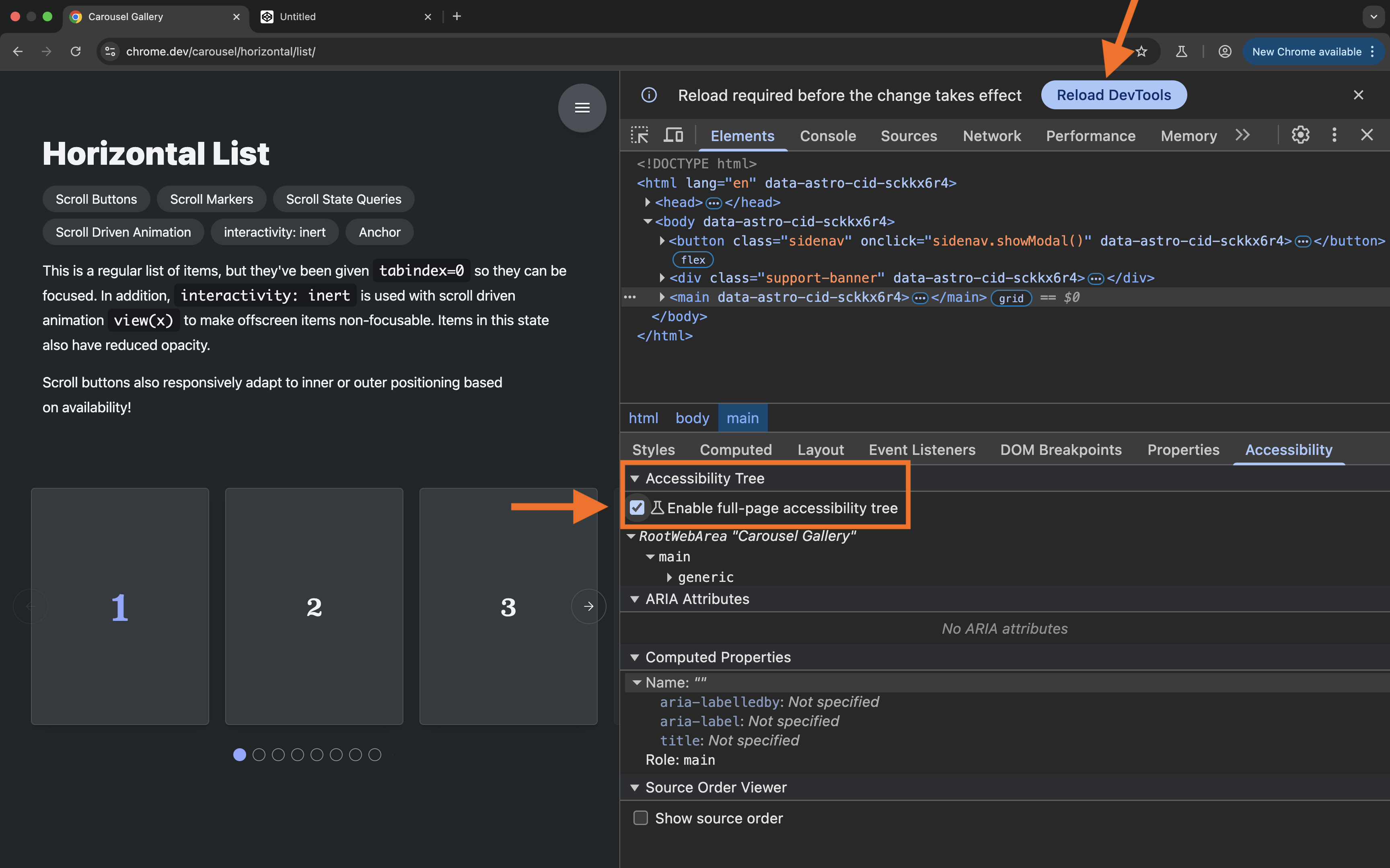
If you inspect the accessibility information of the links in the demo from the previous section you can see that the state of the active anchor is not communicated to assistive technologies when the anchor becomes active (see screenshot below). This is unfortunately akin to some of the accessibility issues with CSS Carousels that I discussed in the previous post.
I filed a Chromium issue and I’m hoping this will be resolved soon enough to make this feature usable. I will update this post when the issue is resolved.
If you want to use this feature as a progessive CSS enhancement today, keep in mind that you will, for the time being, need to use JavaScript to add aria-current to the active anchor when its corresponding target scrolls into view, otherwise you risk an instant WCAG 1.3.1 violation.
I’ll personally wait till the issue is resolved and the feature becomes ready for production. When it does, I’ll be among the first to add it as an enhancement in my CSS. ✌🏻
When I first heard of them I was very reluctant to jump on the bandwagon of excitement. I will also admit that there was even a small part inside of me that was terrified by the idea. Not only does creating interactive widgets using CSS violate the principle of Separation of Concerns (of which I am an advocate), but also because pretty much every implementation of a CSS-only widget I have seen before has had at least moderate to major accessibility issues.
But because the introductory article mentioned that carousel best practices are handled by the browser, and that it’d be very difficult to make a more accessible carousel than this, I was curious to learn more about them so that I could form a more objective and informed opinion on them. (After all, I’m also a developer and convenience sounds appealing to me too.)
So I did. I read the CSS specification and inspected the examples.
In this post, I want to share my findings from examining the accessibility and usability of “CSS Carousels”.
All the examples of CSS Carousels I’ve seen on the wild are based on the same reference—namely the CSS Carousels gallery. So we will be examining a few examples from the gallery to better understand how the new features work and how they affect the accessibility of HTML.
As I mentioned earlier, this stuff is still highly experimental. At the time of making of this post, it is only supported in Chrome Canary behind a flag. I will include video recordings of the examples that I am going to examine, so you don’t need to have Chrome Canary installed unless you want to try the examples out for yourself.
Let’s start by first defining what CSS Carousels are.
What are CSS Carousels?
“CSS Carousels” is an umbrella name for a collection of JavaScript-free, CSS-only implementations of common scrolling UI patterns—mainly patterns like sliders and carousels—that are implemented using new features defined in the CSS Overflow Module 5 specification.
You can find examples of these implementations in the “CSS Carousel gallery” that we will be examining in this post.
The CSS Overflow specification Module (Level 4) specifies CSS features for handling scrollable overflow. When an element has “too much” content for its size, the content “overflows”, and CSS provides features that allow you to handle this overflow—by making the element scroll in either or both directions, for example, or by clipping the overflow, truncating it, and so on and so forth.
The Level 5 of this specification (which is currently still a Working Draft) defines a set of pseudo-elements that are designed to provide specific visual and interactive affordances for scroll containers.
More specifically, according to the specification, this module:
“defines the ability to associate scroll markers with elements in a scroller (or generate them automatically as ::scroll-marker pseudo-elements, with automatic user behavior and accessible labels), which can be activated to scroll to the associated elements and reflect the scroller’s relative scroll progress via the :target-current` pseudo-class.”
Let’s break this down a little bit.
The specification “defines the ability to associate scroll markers with elements in a scroller”…
A scroll marker is any element or pseudo-element with a scroll target.
The HTML <a> element and SVG <a> element are scroll markers…
[…]
While these navigational links can be created today, there is little feedback to the user regarding the current content being viewed…
For example, think of a sticky Table of Content (TOC), where a link is highlighted when the link’s target section scrolls to the top of the viewport. You can see an example of such a TOC on the web.dev blog, and on MDN guides as well. The active link changes based on which section is scrolled into the viewport.
The TOC on the web.dev blog highlights the currently-active link as the link's target section scrolls to the top of the viewport.The TOC on the MDN blog also highlights the currently-active link as the link's target section scrolls to the top of the viewport.
The links in these tables of content are scroll markers. They mark the scroll position of their target sections. When a link’s target section scrolls to the top of the page, the link is styled to reflect the current scroll position of the section, and to indicate that the section is currently “active”.
We’ve always resorted to using JavaScript to style these links when their respective sections are scrolled into view.
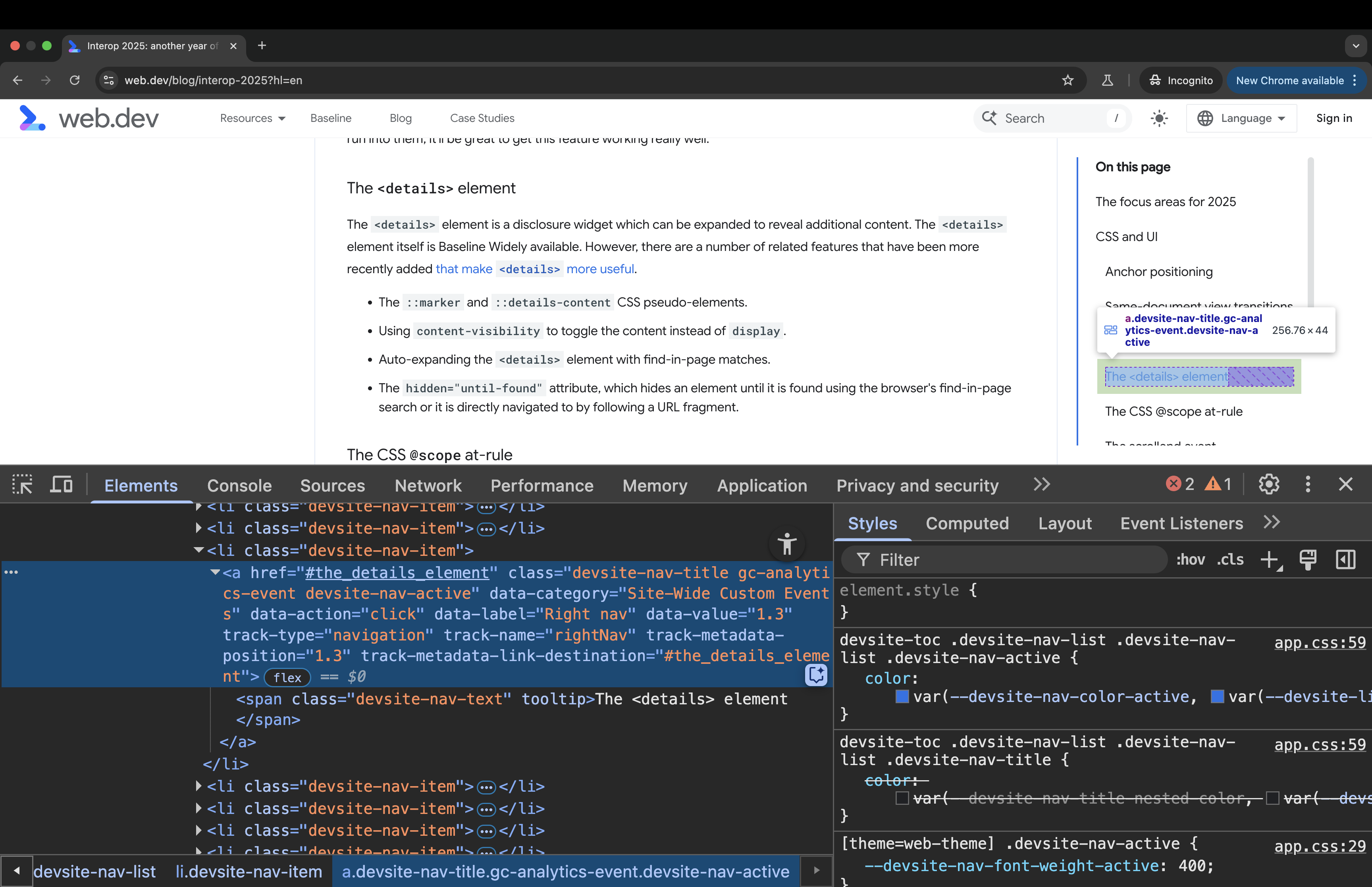
If you inspect the active links on the web.dev blog in the Chrome DevTools, you can see that a specific class name is added to a link when it becomes “active”. This class name is used to apply active styles to the link in CSS.
Active links on the web.dev blog are styled by adding the devsite-nav-active class name to the links when their corresponding target sections scroll to the top of the viewport. This class name is added via JavaScript.
So, the premise of not requiring JavaScript to style these links and instead take advantage of CSS’s new pseudo-selectors sounds really great! (The :target-current selector in particular is supposed to enable this. More on this later.)
Next, the specification specifies that it adds a mechanism for creating groups of scroll markers, and for automatically creating ::scroll-marker pseudo-elements, and that within each group, the active marker reflects the current scroll position, and can be styled to give the user an indication of which section they are in.
In other words, this specification defines a mechanism that allows you to (1) create a group of scroll markers for a scroll container, where each of the individual scroll markers in the group corresponds to an item in the scroll container, and (2) these markers can be styled to indicate the scroll position within the container.
But scroll markers, by nature, are interactive elements. So the purpose of this specification is to enable CSS to create interactive pseudo-elements (not real elements because CSS can’t do that, nor is it intended to).
This is where things start to become concerning.
Before we discuss why, let’s first get a quick overview of how the scroll markers are created.
A (very quick) overview of how to create scroll markers in CSS
This post is not a tutorial. Since the announcement of CSS Carousels, a few tutorials have been written about the topic, including an MDN guide for Creating CSS Carousels.
But for the purposes of completeness of this post, here’s a high-level, bird’s eye view of how it works:
Say you have a scroller element containing a series of items. For example, say you have a list of images in a horizontally-scrolling container. And say you want to create a list of “dots” for this container that provide a visual indicator of how many images there are in the list and that indicate which item in the list is currently “active”. These dots are also interactive and can be used to scroll their target images into view.
And say that, for some reason, you don’t want to create these indicators in HTML but rather want to create them using CSS instead. (I won’t judge. Yet.) This is the kind of thing that this level of the Overflow specification aims to enable.
You can use the new scroll-marker-group property defined in the specification to instruct the browser to create a grouping container for these dots:
ul.scroller{ scroll-marker-group: after; }
The property accepts three values: none, before, and after.
The before and after values indicate whether you want to show the scroll markers before or after the items in the scroll container. If you want the dots to appear before the list of items in the scroller, you use the before value.
The scroll marker group is created inside the list in the form of a pseudo-element: ::scroll-marker-group.
The ::scroll-marker-group pseudo-element is a fully-styleable element (i.e. you can use any CSS property to style it), and it implicitly behaves as a single focusable component, establishing a focusgroup. This means that the group takes up only one tab stop on the page. To navigate through the scroll markers inside the group, you can use the Arrow keys.
The ::scroll-marker-group pseudo-element is a container for its contained ::scroll-marker pseudo-elements (these would be the “dots” corresponding to the images in the list).
To create a scroll marker for the items in the list, you can use the ::scroll-marker pseudo-element on the list items. Like other pseudo-elements, this element will not be rendered if the content property is not declared:
Even though the scroll markers are prepended to the list items in the markup, they are (according to the specification) “collected into the ::scroll-marker-group” so that they can be exposed as a group to assistive technologies.
Now, the ::scroll-markers that the browser creates are interactive elements. Activating a scroll marker will scroll its corresponding item into view.
And the :target-current selector can be used to style the currently-active :scroll-marker when its corresponding target is shown. For example:
> li::scroll-marker:target-current{ /* style active marker */ } }
Unlike native scroll markers, though, these are not links. These are interactive pseudo-elements. More on this later.
The specification also defines the ::scroll-button() pseudo-element, which you can use on the scroll container to add (you guessed it!) scroll buttons.
These pseudo-buttons are also fully styleable elements: there is no restriction on what properties you can apply to them. And you can even use the :disabled pseudo-class to apply disabled state styles to the ::scroll-button()s when they are disabled.
/* disabled state styles */ &::scroll-button(*):disabled{ /* disabled state styles here */ } }
As we mentioned earlier, unlike the ::before and ::after pseudo-elements which are static text elements, the ::scroll-markers and ::scroll-button()s are interactive elements.
Interactive elements have specific accessibility requirements. They should have meaningful roles and descriptive names that identify their purpose, so that the user knows what to expect when they interact with them.
So, at this point there are quite a few questions we should be asking:
Do these scroll markers meet the accessibility requirements for interactive elements?
How are the scroll markers exposed to assistive technology users like screen reader users?
What roles is the browser exposing for these interactive pseudo-elements?
Do they provide meaningful semantics to the user to help them understand what they are interacting with?
Does the browser give them accessible names? The specification states that it “defines the ability to associate scroll markers… or generate them automatically as ::scroll-marker pseudo-elements, with automatic user behavior and accessible labels” (emphasis mine). So how are these markers labelled?
We can only find the answer to these questions in the HTML markup, which the browser uses to create the accessibility tree.
Scroll markers: From CSS to HTML to the accessibility tree
Semantic HTML is the foundation of accessibility on the Web.
Semantic HTML carries meaning. Assistive technologies (AT) like screen readers (SR) rely on the meaningful semantics in HTML to present Web content to their users and to create an interface for navigating that content.
But HTML is only as accessible as you write it. Even semantic HTML can be “inaccessible” if you don’t write it as it is intended.
For example, many elements are only meaningful when they are children of other elements, or when they are associated with other elements. If you don’t use these elements as intended, then they will lose their meaning and they won’t be as useful to screen reader users anymore.
So there are certain “rules” that you should follow to ensure that you get the most out of HTML’s inherent accessibility.
HTML provides many meaningful, semantic elements that represent various types of content & interactive controls. And using those elements is critical for describing the purpose of your content to assistive technology users.
But there are still some more complex components that don’t yet have meaningful elements in HTML to represent them. Until these elements exist, we can use ARIA to create them.
Think of ARIA as a polyfill for HTML semantics. It provides additional attributes—roles, states, and properties—that allow us to create complex, interactive components that do not yet have native equivalents in HTML. Using ARIA attributes we can describe these UI components to assistive technologies like screen readers.
So, together, HTML and ARIA provide important accessibility information to screen readers, without which the content of the page would not be perceivable, operable, or understandable by their users.
This is why it is always critical to understand how a CSS feature may affect the accessibility information created in HTML.
The CSS Overflow Module aims to define a set of features that provide visual affordances to scrollable containers by creating and appending new interactive elements (the scroll markers) into the HTML markup of the page. As such, we must expect these elements to affect the accessibility information exposed to assistive technologies like screen readers.
The ::before and ::after pseudo-elements already do affect the accessibility information of an element because the contents of these elements are exposed to screen readers, and they contribute to the accessible name computation of the element they are created on.
Scroll markers will affect the accessibility information differently because they are also interactive, which means that they are expected to expose roles, states, and other properties, depending on the type of element that they are exposed as.
Now, to check the accessibility information of the page, we can inspect the page’s accessibility tree.
The accessibility tree (“accTree”) is a tree of objects (similar to the DOM tree), each object containing accessibility information about an element on the page. Not all elements are represented in the accTree because not all elements are relevant for accessibility. Only a meaningful element that is not hidden (using HTML or CSS) is exposed in the accessibility tree.
The information the browser exposes about an element depends on the nature of the element (like whether it’s interactive or not).
Typically, there are four main pieces of information that the browser exposes about an element in the accTree:
The element’s role (What kind of thing is it?). The role of an element identifies its purpose. It lets a screen reader user know what something is, which is also an indication of how that thing is to be used.
The element’s name (a.k.a the accessible name, “accName”). The names identifies an element within an interface and in some cases helps indicate what an element does.
The element’s description if it has one. For example, a text input field may have a short description of what the expected input looks like.
The element’s state when it has one. For example, is the button pressed? is the checkbox checked, unchecked, or undetermined?
The accessibility tree also exposes any properties that the element may have (such as if a button is focusable or disabled), as well as any relationships with other elements (like if the element is part of a group, or if is it labelled by or described by another element).
The information exposed in the accessibility tree is very useful to us as developers because it gives us insights into how our content will be exposed to and presented by screen readers.
Knowing how the browser exposes scroll markers to the user allows you to check whether the information being exposed is hepful to the user’s understanding of the page or not, and it allows you to test whether your component meets the expectations the user has based on that information.
Importantly, how scroll markers are exposed in the context they are used in will be critical to determining how they affect the accessibility and the usability of your components.
Quick refresher: Inspecting CSS scroll markers’ accessibility information in the browser DevTools
We can inspect how the browser is exposing an element in the accTree using the browser DevTools.
When you open the Chrome DevTools, you can find the accessibility information of an element under Accessibility panel. You will find the Accessibility panel on the right side of the CSS Styles panel.
In addition to inspecting the accessibility object for each element in the Accessibility Panel, Chrome also provide a full-page accessibility tree view. To use it, in the Accessibility tab, check the “Enable full-page accessibility tree” option.
(First-time only) click the “Reload devtools to enable feature” button at the top of the DevTools.
Then, in the Elements tab, click “Switch to accessibility tree view” button in the top right corner.
Now, the full-page accessibility tree replaces the DOM tree in the panel, and element names, roles, values and states are shown in an easy-to-read, and very practical hierarchal tree view.
This view gives you an overview of how the contents of the entire page are exposed. We’re going to use this tree view to understand the CSS Carousel examples better.
So what we’re going to do next is we’re going to go over a few of the examples in the CSS Carousel gallery and we’re going to inspect the accessibility information for these examples, use a screen reader to navigate them, operate them using a keyboard, and generally examine the usability of these examples. After all, the gallery’s homepage encourages us to inspect the CSS, review the DOM, and check the accessibility tree. So, let’s do just that.
Examining the accessibility of CSS Carousels
Before going through each example separately, I want to mention a few things that all examples have in common:
The scroll-marker-group property is used on the scroll container to create a ::scroll-marker-group pseudo-element inside the container. If you disable the property, the group of scroll markers (::scroll-marker-group) is removed, and so is every scroll marker (::scroll-marker) corresponding to each of the items in the container.
The ::scroll-marker-group element is exposed as a tablist in the accessibility tree. Note that this is not mentioned anywhere in the CSS specification (at the time of making of this post). These are the semantics that Chrome is currently exposing under the hood.
Each ::scroll-marker element is exposed as a tab within the tablist.
The accessible name for the scroll marker is provided in CSS via the content property. You must provide the name for each tab. The browser will not do this for you.
When ::scroll-button()s are present, they are exposed as buttons. You are also expected to provide an accessible name to these buttons via the CSS content property.
Now, here is the most important takeaway from all of this:
Because all the scroll markers are exposed as tabs, this means that all the carousel examples in the gallery are supposed to be Tabs widgets.
Yes, you read that right. Even though most of these components don’t look or behave like Tabs, the browser is using Tabs widget semantics to describe them to assistive technologies. This is already concerning because the gallery contains different UI patterns that are clearly not Tabs.
If you’re a student of my Practical Accessibility course, then you’ll remember the statement: ARIA is a promise.
When you use ARIA to describe an element to your users, you must ask yourself: Am I delivering on the promise I have made to the user? Is this element really what I’m exposing it to be?
The browser is using ARIA Tab widget roles to expose the examples in the CSS Carousels gallery as Tabs widgets. The question is: Are they really? Do these examples meet the expectations and requirements for Tabs widgets?
We’ll start to get more technical from here on.
Tabs widget accessibility requirements
Tabs have specific accessibility requirements. We’ll start by reviewing these requirements for so we have a benchmark to test the examples against.
If these requirements are not met, then the examples are going to be confusing and unusable by screen reader users.
If you’ve taken my course, then you’ll remember from the very first ARIA chapter—ARIA 101—that ARIA is extremely powerful but also very dangerous if you don’t use it correctly. And that if you’re not aware of how roles, states and properties work together, you can end up creating a more confusing and inaccessible user experience.
We also learned that the ARIA specification documents the requirements for ARIA roles in the definition of each role, and that there are strict parent-child relationships between some ARIA roles. This means that the use of some attributes is restricted to specific contexts or parents. Some roles can only be used as a child to a specific—usually composite—ARIA role.
It is important that you learn and understand how ARIA attributes are used and nested, especially if you’re creating components that are re-used in various contexts across a website or application.
To create a Tabs widget today, you need to use the ARIA tab role, the tabpanel role, and the composite tablist role.
According to the specification (emphasis mine):
Authors MUST ensure elements with role tab are contained in, or owned by, an element with the role tablist.
[…]
Authors MUST ensure that if a tab is active, a corresponding tabpanel that represents the active tab is rendered.
[…]
For a single-selectable tablist, authors SHOULDhide other tabpanel elements from the user until the user selects the tab associated with that tabpanel.
[…]
In either case, authors SHOULD ensure that a selected tab has its aria-selected attribute set to true, that inactive tab elements have their aria-selected attribute set to false
So the specification specifies how the tab and tablist roles should be used, and states the requirements needed to ensure the Tabs widget you’re creating is accessible.
The APG’s primary purpose is to demonstrate how to use ARIA to implement widgets in accordance with the ARIA specification.
According to the guidance in the APG’s Tabs pattern page (emphasis mine):
Tabs are a set of layered sections of content, known as tab panels, that display one panel of content at a time. Each tab panel has an associated tab element, that when activated, displays the panel.
[…]
When a tabbed interface is initialized, one tab panel is displayed and its associated tab is styled to indicate that it is active. When the user activates one of the other tab elements, the previously displayed tab panel is hidden, the tab panel associated with the activated tab becomes visible, and the tab is considered “active”.
There are also two types of Tabs:
Tabs With Automatic Activation: A tabs widget where tabs are automatically activated and their panel is displayed when they receive focus.
Tabs With Manual Activation: A tabs widget where users activate a tab and display its panel by pressing Space or Enter.
Regardless of the type of activation, a Tabs component has these keyboard interaction requirements:
When you press the tab key and focus moves into the tab list, focus moves to the active tab element.
When the tab list contains the focus, pressing the tab key again moves focus to the next element in the page tab sequence outside the tablist, which is the tabpanel unless the first element containing meaningful content inside the tabpanel is focusable.
When focus is inside the tab list:
Pressing the Left Arrow key moves focus to the previous tab. If focus is on the first tab, it moves focus to the last tab.
Pressing the Right Arrow key moves focus to the next tab. If focus is on the last tab element, moves focus to the first tab.
We’re going to focus on the automatic activation tabs widget because the CSS Carousels examples are implemented so that a scroll marker’s corresponding item is shown when the marker receives focus, which means that the widget is supposed to be an automatic activation widget.
Here is a video demonstration of how the automatic activation tabs widget is expected to be operated using a keyboard, and then using a screen reader.
Some highlights:
Pressing the tab key moves keyboard focus into the tablist. The selected tab receives focus.
Pressing tab again moves keyboard focus to the active tabpanel.
Using Left and Right Arrow keys navigates between the tabs in the tablist and automatically activates the focused tab. The corresponding tabpanel is shown. The other tabpanels are hidden.
Using a screen reader (VoiceOver on macOS in this video):
If you navigate using the tab key, the experience is the same, and the screen reader announces the tab and the tabpanel when they receive focus. It announces the tab and the tabpanel's roles followed by their accessible names. For the tab, it also announces that it is selected.
If you navigate by Arrow keys using VoiceOver navigation, VoiceOver announces the tabs and tabpanels when they receive focus. It also announces the state of the tabs. Navigating to a tab using this mode of navigation does not activate the tab. The selected tab will be announced as selected. The tabs that are not selected will not be announced as selected. Navigating away from the tabs, the active tabpanel is announced. The remaining tabpanels are hidden. A tabpanel only becomes accessible when its corresponding tab is activated.
So, in an automatic activation tab widget, moving keyboard focus (not screen reader focus) from one tab to the other activates the tab’s corresponding tabpanel. The other tabpanels are hidden from all users and are therefore also not accessible by keyboard.
Now let’s go over a few of the examples in the CSS Carousel Gallery and check to see if they meet the requirements defined in the ARIA specification, and the expected semantics and behavior listed in the APG.
For each example, I’m going to focus on specific aspects of accessibility more than others. For example, I will highlight keyboard navigation in one example, screen reader navigation in another, screen reader announcements in another, and so on and so forth, depending on what issue stands out for every particular example.
Remember that, with the current implementation of scroll markers, each of these examples is supposed to be a Tabs widget.
And, finally, remember that tabs and buttons, like every other interactive element, need an accessible name.
With all of this said, let’s start going through the examples in the gallery.
I’m going to start with the horizontal list—a typical carousel example.
In this example, like all the other examples in the gallery, if you open the DevTools and inspect the accessibility tree you can see that the scroll markers are exposed as tabs contained in a tablist.
However, there are no corresponding tabpanels for these tabs.
As we mentioned earlier, the ARIA specification states that you "MUST ensure that if a tab is active, a corresponding tabpanel that represents the active tab is rendered." However, there are no tabpanels at all in this example. So this Tabs widget is already missing an integral part of what makes it a Tabs widget. What do the tabs control?
Looking at the individual tabs, you’ll find that all the tabs in the tablist share the same accessible name.
Looking in the Styles panel, you will find that the accessible name for all of the ::scroll-markers is provided using the CSS content property:
The notable thing here is that the name is provided as a fallbackalt text. This is because the dots are not supposed to have visible text labels, so the content is left empty.
Now, because this declaration is provided as alt text for all scroll markers on all the list items, the alt text is exposed as the accessible name for all the scroll markers corresponding to all the list items.
Buttons, tabs, and other interactive elements that do different things should have unique names that describe their purpose. But what we have here is 16 tabs that share the same name. So how does a user know which item each “tab” corresponds to?
Instead of providing one accessible name for all scroll markers, each marker should be given its own unique name. This means that you will want to select each list item and provide a unique accessible name for its marker. You can do that by providing a unique label in the content property, or, alternatively, you could provide the unique names in the form of HTML attributes in the markup and then reference the names in CSS using one declaration that uses the attr() function. We’ll see this declaration in action in another example.
Now, looking at the carousel itself, the first thing that comes to mind is that unlike a Tabs widget, more than one item is shown in this carousel at a time.
The APG description of a Tabs widget says that “Tabs are a set of layered sections of content, known as tab panels, that display one panel of content at a time.”
The ARIA specification also states that “for a single-selectable tablist, authors should hide other tabpanel elements from the user until the user selects the tab associated with that tabpanel.”
Now, tabs can be multi-selectable. The ARIA specification specifies a multi-selectable tabs widget as a kind of tabs where more than one tab can be selected at a time.
However, when more than one tab can be selected at a time, the specification states that you should ensure that the tab for each visible tabpanel has the aria-expanded attribute set to true, and that the tabs associated with the remaining hidden from all users tabpanel elements have their aria-expanded attributes set to false.
If you inspect the accessibility tree, you can see that the scroll marker group is not a multi-selectable tablist. The browser sets the multiselectable attribute value to false on the list indicating that only one tab can be selected at a time. And if you inspect the tabs within the tab list, you can see that only one tab has aria-selected=true on it at a time.
If this were meant to be a multi-selectable tabs widget, then it should indicate that, and the browser should set the aria-selected and aria-expanded attributes to true on all the scroll markers of the visible items.
So, by definition, scroll markers are not designed to be used to create multi-selectable components, and especially not multi-selectable Tabs components.
So, what we have here is scroll markers being exposed as single-selectable tabs in a carousel component where more than one item is “active” at a time. And even though more than one one item is active, only one scroll marker is “selected”.
And this is not something that you, as the author of the code, can change because you have no control over the semantic output of the CSS properties you use.
This indicates that the semantics exposed for the scroll markers are neither suitable nor representative of the component they are used to implement.
Now, if you navigate to the carousel using a screen reader (I am using VoiceOver on macOS), you will notice that numeration inside the list is off. This is because the browser adds the scroll marker group as well as the Previous and Next scroll buttons as direct children to the list, as siblings to the list items. So the total number of items in the list is miscommunicated to the user and no longer represents the actual number of list items.
Here is a video recording of how the carousel is announced with VoiceOver on macOS:
In this video recording, I am navigating the carousel using the tab key.
Furthermore, notice how the Scroll Left button remains focusable even though it is meant to be disabled.
A disabled <button> will typically be removed from the sequential tab order of the page, and will be exposed as a disabled button to screen reader users. However, if you inspect the accessibility information of that button when it’s in the disabled state, you’ll find that the browser does not expose it as a disabled button.
In this video recording, I am navigating the carousel with VoiceOver navigation using Arrow Left and Arrow Right keys.
You may have noticed in this recording that some tabs were announced as selected even though their corresponding items were not active/visible. On the other hand, only one of the active tabs was announced as selected even though more than one item is active/visible at a time.
So, this carousel example has several accessibility and usability issues.
A blind screen reader user navigating this carousel would encounter a broken component and would likely be confused as to what it is they are interacting with, and what will happen when each of the “tabs” is activated.
So, as a conclusion I would say that this implementation of a horizontal list carousel is not accessible, and not ready for production.
If you pull up the browser DevTools again to get an overview of the accessibility information exposed to screen readers in the accessibility tree, you can see that, like with the previous example, the browser has appends a single-selectable tablist to the scroll container.
Like with the horizontal list example, more than one Card is visible at a time, yet only one tab is selected at a time.
The tablist in this example contains five tabs corresponding to the five different cards. Yet all the tabs have the same accessible name.
The cards are implemented (and exposed) as articles. So, once again, there are no tabpanels in this widget either.
Since this example contains interactive elements inside the carousel items, let’s focus on how keyboard navigation works in the carousel. We will also be testing screen reader navigation separately.
When I start to navigate the page using the Tab key, focus moves inside the carousel to the scroll marker group (the tablist).
Pressing the tab key again moves focus outside the group into the next focusable element in the DOM, which is the Scroll Left button. Pressing the tab key again moves focus to the Scroll Right button. Normally, you would expect keyboard focus to move from the selected tab to the tab panel it controls (or a focusable element inside that panel). This is also the expected behavior stated and demonstrated in the APG.
Now, when I press the tab key again, this is where the carousel starts to behave erratically.
Here is a short video recording of me navigating the Cards example using keyboard, followed by some of the most important observations:
First, when you’re in the scroll markers group and you press the tab key, focus does not necessarily move to the currently selected card (the “tabpanel”). Instead, it moves to the first focusable element in the first card inside the scroller. Sometimes it will move to the first visible card. Sometimes it will move to the first card in the container even when it’s not visible. And sometimes it will move to the expected card.
Second, pressing Shift + Tab when you’re inside a card to navigate backwards does not return keyboard focus back to the tab that activated the card (which is the expected keyboard behavior for a Tabs widget). Instead, keyboard focus moves to the link in the previous card, and then to the link in the previous previous card, and then to the link in the previous previous previous card, and so on and so forth. This is because the invisible cards are not really hidden like they would be in a Tabs component. They are just scrolled out of view. As such, keyboard focus moves to an element that is not even supposed to be active or accessible.
Third, you will also notice that when focus moves to the link inside a card, the card’s corresponding tab is not selected. A tab is only visually marked as selected when it scrolls into a certain position within the container. Because of that, the browser will skip a tab and visually select the one that comes after it.
And lastly, if you inspect the accessibility information exposed to the user as you navigate the carousel using keyboard, you’ll also see that the state of the tabs is not correctly conveyed to the user. Even when a tab is visually marked as selected, its accessibility state is not updated. So a blind screen reader user navigating using a keyboard will not be getting the same feedback as a sighted user does.
And a sighted screen reader user will also get a mismatch between what they see on screen and what the screen reader announces to them.
Here is a video recording of navigating the Cards carousel using VoiceOver on macOS:
A couple of observations:
The scroll markers are not visually updated to indicate which card is currently selected when navigating through the cards with keyboard and VoiceOver navigation.
Numeration in the list is wrong due to the fact that the scroll buttons and scroll marker group are included inside the list. So the number of items in the list is micsommunicated to the user.
Both keyboard and screen reader navigation is broken in this example.
The entire behavior of this widget is based on how any normal scrolling container containing focusable elements would behave. This carousel does not behave like Tabs because it is not a Tabs widget. The accessibility information exposed to screen reader users is generally misleading and mostly incorrect, making it unusable.
The ScrollSpy example displays a series of content sections inside a vertically-scrolling container.
This scrolling container contains what effectively looks like an article made up of a series of sections with headings, and that has a table of contents on the left side of the article. Only instead of having a table of contents—which is semantically structured using a list of links, this example is also implemented using CSS scroll markers. This means that instead of a list of links, the “article” has a group of tabs!
If you inspect the accessibility information in the accTree, you’ll notice common issues with the previous examples:
We have a single-selectable tablist with only one tab selected at a time, when more than one section is visible at a time.
Like previous examples, there are no tabpanels in what is supposed to be a Tabs widget. Instead, the sections are implemented as regions. This means that each section is exposed as a page landmark, which is very uncommon for a series of text sections like these. We’ll talk about why they are exposed as regions shortly.
Once again, the browser is exposing semantics that are not representative of the pattern they are used to implement.
Furthermore, the tabs in this example do not have accessible names.
If you check the Styles panel, you’ll notice that the name of the markers is provided using the attr() function.
The :scroll-marker of each section pulls its content (and by extension: its accessible name) from the aria-label attribute on that section.
Even though the content of the aria-label attribute is visually rendered in the scroll markers, it is not exposed as a name for the tabs in the accessibility tree. So these markers have no accessible names.
This is probably a bug.
Now, the presence of aria-label on the <section>s provide these sections with an accessbile name. And, according to the specification, a <section> is exposed as a region landmark when it is given an accessible name. This is why the sections in this component are exposed as landmark regions.
Here is how VoiceOver on macOS announces the ScrollSpy example:
Notice how VoiceOver announces the tabs with no names.
You will also notice in the recording that the tabs are announced as selected, even when their target sections are not scrolled into view.
So the screen reader announces the presence of tabs only, but there is no other information describing the component to the user. A blind screen reader user will come across a list of controls that have no names and no indication of what they control.
In addition to highlighting the scroll marker naming bug, I wanted to use this example as an opportunity to highlight another issue with the :target-current selector introduced in the specification.
Instead of using ::scroll-markers to implement this example, I would instead expect to be able to create a semantic table of contents using an HTML list of <a href="">, and then use the :target-current pseudo-class to apply active styles to a link (the native scroll marker!) when its target is scrolled into view.
However, that doesn’t seem to work at the moment. I created a reduced test case where I have a series of sections, and a list of links to those sections. I used the :target class to apply a yellow background color to the target section, and the new :target-current class to style the link associated with that section. But the styles are not applied to the link when its target section is “active”.
Unfortunately, even though the specification states that it defines the ability to associate scroll markers with elements in a scroller, the current implementation of the :target-current pseudo-class seems to work only for CSS-generated ::scroll-markers, but not for native HTML ones.
Personally, I think :target-current is one of the most useful additions to the specification. It’s unfortunate that its current implementation is limited to the new pseudo-elements.
Moving on to one last example: the horizontal tabs example—the perfect candidate for a Tabs widget implementation.
If you inspect the accessibility tree for this example, you can see the scroll marker group exposed as a tablist, and each of the three scroll markers exposed as a tab.
The tabs don’t have an accessible name in this example either. We’ll inspect the CSS declaration for the markers shortly.
Unlike the previous examples, this example does have three tabpanels exposed in the tree.
We know by now that the browser does not add tabpanel roles to the items in a scroller. So these roles must be provided in the markup.
And sure enough, if you inspect the HTML markup for this component, you can see that the tabpanel roles are hard-coded into the HTML.
The panels are also given accessible names using aria-label, which is once again used to provide the contents and names for each of the scroll markers in CSS.
This is why the tabs don’t have an accessible name. As we mentioned in the previous example, this is probably a bug.
Let’s fire up VoiceOver and check how the Tabs are announced.
Navigating the Tabs example with VoiceOver, first using keyboard navigation, then using VoiceOver navigation.
When using VoiceOver navigation to navigate to the tabs, all the tabs are announced as selected, and the selected state of the tabs is also updated in the accessbility tree. However, their visual styles are not updated to reflect that they are selected, and their corresponding tabpanels are not shown when they are selected.
Additionally, using VoiceOver navigation (Right and Left Arrow keys) you are able to navigate between the tabpanels without needing to activate their corresponding tabs. That said, when you navigate to a tabpanel, the tabpanel is initially announced as empty. Pressing the Right Arrow key again, the screen reader announces the content inside the tabpanel just fine.
It is possible to also navigate through the tabpanels using keyboard Arrow keys, without needing to use the tabs at all.
Navigating the Tabs example with keyboard tab and Arrow keys.
As the ARIA specification notes, you should hide other tabpanels from the user until the user selects the tab associated with that tabpanel. In this case, the tab panels were accessible and were shown even when their corresponding tabs were not activated. Again, this is because what we have here is technically still a scrolling container, not a Tabs widget.
In my opinion, allowing the tab panels to be accessed by scrolling defeats the purpose of using Tabs to begin with. What is the purpose of the tabs if the content is already accessible without them? Selecting one tab does not really hide the tabpanels associated with the other tabs, it only scrolls it out of view. So this Tabs example only partially behaves like a Tabs widget, and partially like a typical scrolling container.
Now, as we mentioned earlier, the tabpanel roles are hard-coded into HTML in this particular example. It is not the browser that is adding and exposing these roles.
I don’t know why this example has the tabpanel roles hard-coded in. However, what I do know is that you, as a developer, are also expected to add these roles to your markup.
This also means that you should be aware of the fact that these roles are missing in what is otherwise being exposed as a Tabs widget. Yet, as we mentioned earlier, these exposed semantics are not specified in the CSS specification.
This is why it is very important for you to be responsible for the code you write/use and always, always check how it is exposed to screen reader users, and to test it to ensure that it is usable.
And this is why it is critical that you understand the role of the accessibility tree and the information it carries, understand how ARIA roles work, as well as understand the requirements for the widgets you are creating to ensure they are operable and that they meet the user expectations.
If you didn’t know that scroll markers are exposed as tabs and that you needed to add tabpanel roles to the widget you’re creating, then you would end up with a widget that’s broken in many ways, like the examples we examined earlier.
That being said, even hard-coding the tabpanel roles into your markup has its downsides because the tablist and tab roles are added via CSS. So what happens when CSS is not available? What happens if the user is viewing your page in Reader Mode, for example?
What I think would be a little more foolproof is if the browser added these visual affordances and behavior only when all the required ARIA roles are present in the markup.
In other words, the features defined in the specification could be made useful for some common use cases, not all—because one size almost never fits all; and then you would make sure you have the important accessibility bits taken care of in your markup.
That being said, what I personally think we really need instead is a standardized HTML markup structure.
Wouldn’t it be nice if we could just write HTML and have the browser just know what ARIA roles to expose to AT, and have it provide all the necessary keyboard interactions for free?
We can already do that for native interactive elements like a <button> and a <a> and a <details> element, to name a few.
So what we really need is native HTML elements with built-in semantics and interactive behavior for creating UI patterns that currently have no equivalents in HTML. This includes Tabs, sliders, and carousels.
This brings me to the end of this examination. So, what’s the conclusion here?
Conclusion and closing thoughts
All the issues I have covered in this post are specific to screen reader and keyboard navigation. I haven’t discussed how the tabs and scroll buttons could be cumbersome to operate for speech control users, particularly when they don’t have text labels. We haven’t talked about how the tabs could become invisible in Forced Colors Modes if they are styled using CSS background colors alone. And we haven’t tested the names of the tabs to see if they actually translate into other languages. And what happens when CSS is not available?
As developers, we are responsible for the code we write. And we are responsible for testing the components we create.
That said, I think the specification should be more explicit about how the new features it defines affects and don’t affect the accessibility of the content they are used on. That would make it easier for developers to know where there are gaps that need to be filled, and issues that need to be resolved before using these features in production.
Knowing the capabilities and limitations of a new feature is critical to understanding when to use it and what it is appropriate for.
In its current state, the specification adds a layer of abstration on top of HTML semantics that, dare I say, is quite risky, especially because these features are introduced as accessible by default.
There’s a lot the browser doesn’t currently do and that you need to take care of yourself if you want to use these new features in your projects.
If you don’t know better, you could end up creating inaccessible and unusable user interface elements with these new features, all the while assuming that the browser is “taking care of accessibility” for you.
While abstractions are often convenient for us developers, this convenience must not be delivered to us at the cost of user experience and accessibility. As responsible developers, it is on us to push back when necessary and require new features to be inclusive of the users we are creating user interfaces for.
The browser is currently creating lists of scroll markers for our convenience and it exposes them as tabs, regardless of whether the pattern they are used to create is actually a Tabs widget or not. And it does that because—surprise, surprise!—CSS is not where semantics are defined. How does the browser know what an element is? It knows that from HTML.
Semantics should be defined in HTML. And styles and visual affordances should follow from there.
As I mentioned earlier, what I believe we need is native HTML elements with built-in semantics and interactive behavior for creating other UI patterns that currently have no equivalents in HTML. This includes Tabs, sliders, and carousels. And CSS could provide an additional layer of visual affordance on top of that. That would be great!
It would be great if more resources were allocated for doing proper research and user testing for the work being done by the OpenUI group, so that these well-researched and accessibility-reviewed features are implemented sooner than later.
Outro
So, there you have it. CSS Carousels are highly experimental, not currently accessible, and therefore, not ready for production.
But this is not the only insight I want you to take away from this post. After all, this post isn’t merely about highlighting the current issues with CSS Carousels.
Rather, it’s about awareness.
If there is one thing you take away from this post let it be to learn how to think critically about new features, and to always question the accessibility and usability of a new feature before using it in production.
Put your users front and center, and measure how useful a feature is by how it affects the usability of their interfaces. This is especially true for new features that have a direct impact on the accessibility information of the page.
And how do you know if a feature affects the accessibility information of a page?
Learn more about semantic HTML, and why it is important.
Learn more about what makes semantic HTML accessible.
Learn more about how ARIA affects HTML, and how it doesn’t!
And learn about the proper use of ARIA in HTML.
Then, learn about how CSS can affect accessibility.
And most importantly, learn about your users, and all the diverse ways that they access the Web, and how the code you write affects their experience of the Web.
There’s so much to learn and to be inspired by, and that will make you a better developer.
I know this sounds overwhelming. But I promise you it’s not. Once you understand the foundations of accessibility, these things become second nature,and it becomes easier to spot accessibility issues and to fix most of them (if not all) on the spot.
Feel free to use the knowledge we covered in this post to go over the rest of the examples, inspect their accessibility information, test them using keyboard and a screen reader, and get an idea of how usable they are. Maybe even try to have some fun by imagining how you could improve them and make them more usable. (That can sometimes be by removing features!)
If you want to learn accessibility in-depth and learn how to find and fix accessibility issues by yourself, I have created a comprehensive, structured curriculum in the form of a self-paced video course that is aimed to equip you with the knowledge you need to confidently create more accessible websites and web applications today.
This post started an excellent discussion on the topic of CSS Carousels within the community, and some have blogged their thoughts on their personal websites.
Vale shared her thoughts on the topic asked the same question I asked when I first heard of them: Why?
It completely fails with regard to separation of concerns by using CSS for structure, rather than HTML. I don’t know how to address that other than asking why? I’ve noticed a lot of new CSS features, especially ones with the Chrome team’s influence, are getting a little too markup-y for my liking. David Bushell has covered this and the overreliance of pseudo-elements with touchings on the carousel kerfuffle.
In David’s first Note he mentions not being a fan of the overuse of pseudo-elements in CSS specifications, because the developer ergonomics aren’t fun and because we’re losing “separation of concerns” with content and accessibility semantics getting mixed into CSS .
These demos are a pretty sales pitch but I see problems for practical use.
Text content in CSS is code smell. A clear violation of separation of concerns. Content in CSS is a pain for content management systems. It plays havoc with translation tools too. These issues can be alleviated using attr() to move content back into HTML but not without pains.
You know what I want to see?
[…]
I just want to see HTML. We have interactive elements like <button>, <details>, and <dialog> these are immensely useful. Give us more primitives to build upon.
[…]
Where pseudo-elements shine are implementations like ::selection and ::first-letter. Where it’s impossible or impractical to add additional HTML. As primitives to build a carousel they’re too limiting. They’re a dead-end.
Please, if your team cannot explain how the thing satisfies all WCAG Success Criteria at Level AA, then don’t release the thing.
If the thing is a new feature for the web platform (HTML, CSS, ARIA, SVG, etc.), then don’t even propose the thing until you have its WCAG conformance sorted.
Then understand WCAG is the bare minimum, is only table stakes, and does not in itself guarantee the thing is accessible. Which means be prepared for the thing to still contain barriers that must be addressed before it goes any further. Which means you’ll field some questions.
The post is not specifically about CSS Carousels, but CSS Carousels are one of the examples Adrian mentions of Google-led Web platform features that are not accessible.
Adrian’s post does, however, include a series of updates—of which are specifically about CSS carousels and how the feature is progressing.
Update: August 19th, 2025
Since I published this post, a new property has been proposed and added to the specification. This property is named scroll-target-group and it “enriches HTML anchor elements functionality to match the pseudo elements one”, which makes it possible to use the :target-current selector to highlight links when their respective targets are in view.
I started blogging when I was still learning front-end development—specifically CSS—back in 2012. I was learning a lot and writing what I was learning as a way to organize my thoughts and solidify my learnings, and at some point I realized that my notes can help others learn and understand the same.
So, I created my blog a few months later in order to share my knowledge with the community.
I love writing and I love teaching, and I found blogging to be one way I can bring together two things I love, and to give a little back to the web community.
What platform are you using to manage your blog and why did you choose it? Have you blogged on other platforms before?
I don’t choose my tools based on what’s most popular at any given moment. I choose the tool or platform that works for me and stick with it until I find myself in need of something else.
I moved from Jekyll to Eleventy when I needed more flexibility with how I wanted to structure my website’s source code and with how I style the different pages on the website. Eleventy still fits my needs perfectly until this day.
How do you write your posts? For example, in a local editing tool, or in a panel/dashboard that’s part of your blog?
I collect ideas, plan blog posts, and start drafting them in Obsidian. When a draft becomes close enough to publishing, I move it into my code editor where I will refine and polish it before I finally hit Deploy.
I write in Markdown (.md) files in both Obsidian and my code editor, so moving from one tool to the other is quite effortless.
When do you feel most inspired to write?
When I want to turn the chaos in my head into order. This typically happens when I’m learning a new topic or idea, or when I’m teaching and helping others understand new topics or ideas.
I’m most inspired by helping others understand what is otherwise a complex or confusing topic, and seeing other people’s eyes light up when they finally get that “ah-ha” moment. ✨ I mostly get to see this when I speak or run workshops in person, but the same also happens through writing as well.
Do you publish immediately after writing, or do you let it simmer a bit as a draft?
I publish immediately. Once a post is out there, it’s out there; and then I can move on and start working on the next thing.
What are you generally interested in writing about?
HTML, CSS, SVG, web accessibility, progressive enhancement, and how to use Web platform features to create inclusive Web user interfaces.
This post was the result of two weeks of deep-diving into the gnarly SVG specification, which resulted in me creating the interactive demo by which I got my first SVG epiphany! 💡 SVG became my niche for years after that.
This post is also the reason hundreds (probably thousands!) of developers finally grapsed SVG coordinate systems and got their own SVG lightbulb moment. 💡 This one will always hold a special place in my heart.
Who are you writing for?
I started blogging for myself and for my future self. Now, I also write more for the community.
I start the writing process for myself; but I publish what I write for the community.
Any future plans for your blog? Maybe a redesign, a move to another platform, or adding a new feature?
I’m taking a comprehensive design course at the moment (ShiftNudge, in case you’re wondering) and am planning on redesigning my website as I go through the course. I will also be refactoring the code from the ground up this year. I’ll add new features during all of this, and will announce them in due time.
Next?
The format dictates I nominate other people to write a post like this. However, instead of nominating someone who may or may not be interested in joining the chain letter and who may instead feel pressured into doing so, I’m going to nominate you, dear reader, if you have a blog are keen to join us and share some about it.
If you don’t have a blog, I hope this series of posts by people like you will inspire you to start writing, and sharing what you write with the world. Just write, and great things may follow.
In the first part of this chapter we discussed what we might need live regions for, and how to create them using HTML and ARIA.
In this part, we’re going to discuss what live regions are not suitable for and why, and we’re going to discuss more robust ways to implement some common UI patterns that you might otherwise consider using live regions for. After that, we’re going to go over some best practices for implementing live regions for when you do need to use them to represent things like status messages in your web applications.
Live regions are easy to misuse and to overuse. Aside from inconsistent browser and screen reader support, live regions’ inherent capabilities are limited by design, which makes them unsuitable for certain types of content updates.
Live regions don’t handle rich text
Live regions don’t handle rich text. This means that the semantics of elements like headings, lists, links, buttons, and other structural or interactive elements are not conveyed when the contents of a live region are announced. If a live region contains a button, for example, the screen reader will announce the text of the button when it is injected into the live region without any mention of the button’s role:
<divaria-live="polite"> <!-- The semantics of this button are not conveyed in the live region announcement --> <button>You'll have to guess what I represent!</button> </div>
The fact that the text represents the label of a button will not be communicated by the screen reader in the live region announcement. (Example borrowed from Scott O’hara’s article)
Here is how VoiceOver with Safari announces a button when I add the button to a live region using JavaScript:
The screen reader will announce the entire contents of a live region as one long string of text, without any of the structure.
This is why you should not wrap entire sections of content in a live region. Otherwise the entire section’s content will be announced as one long string of text, which would result in a bad user experience.
When content updates happen in large sections of content, there is often a better way to communicate these updates to screen reader users.
For example, say you’re building a filtering component for an e-commerce website or any website that offers the ability to filter content within a main section of the site.
In most web applications, the content in the main section will filter dynamically as soon as the user selects one of the available filters. But just because the content within the section gets updated does not mean that the section should be a live region.
So, how do you let the user know that the content in the section is updating?
Providing simple instructional cues that set the user’s expectation of what will happen when they interact with an element is sometimes more than sufficient to let the user know of content updates even before they happen.
For the filtering component, what this means is that you can include an instructional cue at the top of the group of filters to let the user know that changing the filters will change the content in the main area. This way you’re setting the user’s expectation of what will happen when they select a filter, so you no longer need to make any announcements when the content updates. The user knows that they can just navigate to the main area and start exploring the filtered content.
The WCAG Quick Reference website provides a live implementation of this approach.
Preceding the content filters in the left sidebar of the Quick Reference, there is a note that lets the user know that “Changing filters will change the listed Success Criteria and Techniques”. No live region is necessary when this persistent cue is shown to all users, including screen reader users.
Another very common UI component that can benefit from a similar implementation approach is a dynamic search component — particularly one where you have a search field that filters and displays results as you type into the field, like the search component you can find on the Smashing Magazine website.
What many developers will do when they build a similar component (and, admittedly, it’s a mistake I also made early in my career) is they will designate the search results container as a live region (like Smashing Magazine currently does) just because the content in the container is dynamically updated while the user is typing in the field. This results in a very noisy user experience. Here’s how VoiceOver on macOS starts announcing the contents of the results container after I type a search keyword in it:
A simpler, more robust, and much more user-friendly approach to implementing this pattern is to provide an instructional cue (i.e. an accessible description for the input field) that tells the user what will happen when they start typing in the field. The description might say “Results will [ filter / display / etc. ] as you type”. For example, the search component on the a11ysupport.io website provides a live implementation of this approach. The accessible description of the search field lets you know that “Features will be filtered as you type”.
The cue must be associated with the search field using aria-describedby so that screen readers announce it to their users.
Providing instructional cues is helpful for all users. But if you don’t want the description to be visible, you can visually hide it using the visually-hidden utility class. Just make sure it is properly associated with the input field using aria-describedby.
By letting the screen reader user know that results will be shown as they type, you no longer need to announce when results are shown, and the user knows that they can navigate to the search results once they’re done typing their keyword in the field.
That being said, you do still want to use an assertive live region to inform the user when no results are found.
While we don’t want to constantly interrupt people while typing, we need to interrupt when things go afoul, says accessibility engineer Scott O’Hara in his article Considering dynamic search results and content. Specifically, let someone know immediately when they have entered a query that returns no results. Delaying such an announcement would result in wasted time, and potential uncertainty about “when” someone’s query stopped working. […] People who can see the UI are likely going to notice right away when the dynamic content dries up. They can then immediately correct for this by adjusting their query. This same affordance must be provided to people with disabilities.
In his article, Scott elaborates more on all the usability considerations you should keep in mind when you’re implementing a dynamic search component. He then proposes a solution for how you might go about implementing it in a more robust and inclusive manner. I highly recommend checking the article out and following his implementation pattern if you can.
In addition to using an accessible description for the search field, and a live region to announce when no results are found, Scott also suggests moving the user’s keyboard focus to the heading that introduces the results when the Enter key is pressed. Of course, if your search component doesn’t provide a heading, you wouldn’t need to do that. But it is a nice addition that improves the user experience for keyboard users, and screen readers will announce the number of results found when focus is moved to the heading.
Here is how Scott’s demo works with NVDA on Firefox:
In this video, NVDA announces the search field followed by the accessible description when my focus moves to the field. The accessible description indicates that results will be shown as I type. I first type a keyword "one" into the search field. Then I press Enter. Pressing Enter moves keyboard focus to the heading which introduces the results and communicates the number of results found. Then I press the Escape key. Pressing the Escape key moves my focus back to the search field. When I type a keyword that's more than five characters long, the dummy example says that No results are found. Since Scott is using a live region to communicate when no results are found, NVDA announces "No results found!".
Live regions are not suitable for notifications with interactive elements
Live regions should not be used for messages or notifications that contain interactive elements, particularly if the user may need to act on those notifications.
As we mentioned earlier, when a screen reader announces the contents of a live region, it will announce the raw text content within the region without any of the structure or semantics. This means that the semantics of any interactive elements will not be conveyed.
Furthermore, when an update happens in a live region, screen readers will only announce the contents of a live region, but the user’s focus does not move to the region. And there is no mechanism available to allow the user to easily navigate to a live region to interact with any content that might be in it.
So unless you provide a clear path for screen reader and keyboard users to get to the notification that contains interactive elements (like a well-documented keyboard shortcut, for example), then, depending on the position of the live region in the DOM, it can be difficult—if not impossible—for the user to get to the interactive content in the notification, especially if the notification dismisses itself after a short timeout.
This is why toast messages that contain interactive elements are problematic. Unfortunately, toast messages that contain interactive elements are pretty common. You can see examples of them documented in Google’s Material Design system.
But these messages come with usability and accessibility problems for screen reader users, as well as other users of assistive technologies like users browsing the web using a magnifier, and keyboard users as well.
If a notification contains an interactive element, you need to ensure that the user can easily navigate to it. And the best way to do that is to move the user’s focus to it.
The alert and status live region roles are meant to represent short messages that do not require moving the user’s focus to (i.e. that do not contain interactive children).
Authors SHOULD ensure an element with role status does not receive focus as a result of change in status.
[…]
Neither authors nor user agents are required to set or manage focus to an alert in order for it to be processed. Since alerts are not required to receive focus, authors SHOULD NOT require users to close an alert. If an author desires focus to move to a message when it is conveyed, the author SHOULD use alertdialog instead of alert.
If a notification contains an interactive element, it should not be a live region. And it should also not be a toast. You should move the user’s focus to it instead, and make it persistent.
For interactive alert notifications, instead of using a toast message, consider using an alert dialog. The ARIA alertdialog role is used to represent a type of dialog that contains an alert message.
As the name implies, alertdialog is a mashup of the dialog and alert roles. This means that it also expects similar keyboard interactions as modal dialogs do. Implementing an alert dialog is outside the scope of this chapter, but you can find the semantic and keyboard interaction requirements for implementing accessible alert dialogs documented on the APG website.
For status type notifications that contain interactive elements, you may use a modal or non-modal dialog instead, and manage focus within these dialogs when they appear, as documented on the APG modal dialog example page.
Keep in mind that moving focus should be done as an immediate response to the user’s action. If something happens async or after a delay like if a toast appears that the user hasn’t called up, then you shouldn’t move their focus to it, otherwise it would be disruptive to the user experience. Decide if you should move focus or not based on what users are expecting.
Live regions are not a substitute for ARIA state properties
Don’t use live regions to convey state changes when there’s an ARIA attribute to do that.
For example, if a button toggles the visibility of some content on a page (like a ‘dropdown’), use the aria-expanded attribute to communicate the state of the content (whether it’s expanded or collapsed) to the user. You don’t need a live region to announce that the content has been expanded or collapsed.
<!-- The aria-expanded attribute communicates the state of the disclosure widget to the user. No live region is needed to do that. --> <buttonaria-expanded="[ true | false ]">Terms of use</button>
Similarly, if you’re building a dark theme switcher using a toggle button, for example, use the aria-pressed attribute to communicate to screen readers that the dark theme is currently ‘On’ or ‘Off’.
<!-- The aria-pressed attribute communicates whether or not the [Dark Theme] is On or Off. No live region is needed to announce when the dark theme is applied. --> <buttonaria-pressed="[ true | false ]">Dark theme</button>
When aria-pressed is declared on a <button>, the button’s ARIA role mapping will change in most accessibility APIs, and it will be exposed as a toggle button (not just a regular button), indicating that this <button> toggles a certain functionality On and Off. When the value of aria-pressed is true, it communicates to screen readers that the functionality is currently ‘On’. Combined with the button’s accessible name, the state attribute lets the user know what will happen when they activate the button. You don’t need a live region to announce that the dark theme has been applied to the page.
Here’s a live demo of a simple theme switcher using two toggle buttons that you can try using a screen reader:
When a toggle button is activated, the screen reader announces the state of the button (whether it’s pressed or not) when it announces the button’s role and accessible name. The state of the button is sufficient to communicate when a theme is ‘On’ or ‘Off’. You can try it for yourself in the debug version of this theme switcher.
State property changes may not be announced to the user the same way live regions are, but not every change needs to be announced. Using appropriate semantics, providing meaningful accessible names, and using the appropriate state attributes is sometimes sufficient for screen reader users to understand what will happen when they interact with an element.
So before considering using a live region, ask yourself if there is a state attribute that does what you need. And if there is, use that attribute.
Best practices for implementing (more robust) status messages with live regions
Live regions are most suited for implementing short, non-interactive status messages that do not cause a change of context (like moving focus) and that cannot be communicated to screen reader users in another way. Live regions are currently the primary way to conform with Success Criterion 4.1.3 Status Messages (Level AA).
If you’re implementing status messages in your web application(s), there are some best practices that most accessibility professionals agree on that can help you achieve maximum compatibility across browser and screen reader pairings:
Make sure the live region container is in the DOM as early as possible
The element that is designated as a live region must exist on the page when the browser parses the contents and creates the accessibility tree of the page. This ensures that the element will be monitored for changes when they happen and that these changes are communicated to the screen reader and the user.
So when you create a live region, insert it into the DOM as soon as possible (ideally, when the page loads), before you push any updates to it. If you insert a live region into the DOM or convert a container into a live region when you need it, there’s a high chance that it won’t work.
Choose an appropriate hiding technique if the live region isn’t visible
Don’t hide the live region using using display: none; or aria-hidden="true", or any other hiding technique that removes it from the accessibility tree. Hidden live regions are not announced.
Limit the number of live regions on the page
While there is no rule as to how many live regions you can have on a page, you should limit the number of live regions you create.
As accessibility engineer Scott O’Hara says in his article “Are we live?”:
please do keep in mind that something just as bad as live regions being injected into a web page and then making no announcements, is a web page with a bunch of live regions that all start barking at assistive technology users at the same time.
A good practice is to have only two live regions on the page: one assertive region and one polite region that get inserted to the page on page load. Then you insert updates into these two regions and manage the message queue in them via JavaScript.
If you have multiple live regions on a page, they may interfere with each other, and some messages might not be announced at all.
Items which are assertive will be presented immediately, followed by polite items. User agents or assistive technologies MAY choose to clear queued changes when an assertive change occurs. (e.g., changes in an assertive region may remove all currently queued changes)
What this means is that the politeness level indicated by the aria-live attribute works as an ordering mechanism for updates. In instances when you have multiple live regions on a page, polite updates take a lower priority; and assertive updates take a higher priority and could even potentially clear or cancel other updates that are queued for announcement. This causes some messages to get lost, or just partially announced.
Carefully choreographing the sequence of events in a couple of live regions on the page will be your best approach to achieve maximum compatibility.
Compose and insert your message into the live region in one go
You should pre-compose the notification message’s content and insert it into the region in one go. Don’t make multiple DOM insertions to create one message, otherwise the screen reader may make multiple separate message announcements, which is not what you want.
Keep the content short and succinct and avoid rich content
Keep the message content concise. And keep it as short as possible. There is no character limit on the notification message, but remember that live region announcements are transient and can’t be re-played. So make sure the message is easy to understand when it is announced the first time. Keeping it short also ensures it is less disruptive to the user flow.
Avoid rich content, interactive elements, and non-text elements like images as these are also not conveyed to screen reader users.
Empty the live region and wait a bit in between updates
If the status message is not visible to everyone or it is removed after a short timeout, set a timeout (e.g. 350ms–500ms) to remove the notification text from the live region. You are not required to empty a live region after its contents have been announced because announcements are triggered on content additions by default, but emptying the live region between updates ensures that you don’t end up with weird or duplicate announcements.
/* set a timeout to empty the live region */ setTimeout(()=>{ //empty live region },350);
Emptying the live region when it’s no longer visible also ensures that screen reader users will not be able to navigate to it when they are not intended to.
So make sure the live regions are cleared up in between updates, and wait a little bit before inserting new updates to them. And when you do insert a new update, insert the new message in one go.
Debugging Live Regions
If you use live regions, you’re going to want to debug them when they don’t work as expected, like when the screen reader announces something unexpectedly. Part of debugging live regions is seeing what goes inside in them and when.
To debug live regions on a page, you can use the NerdeRegion browser extension.
NerdeRegion is a developer tools extension for debugging live regions on a Web Page. When activated, it lists all active ARIA live regions, and keeps a record of all mutations that has happened on the region.
You can use NerdeRegion to:
Check if a live region is being updated properly,
Check if accessible name computation (beta) is done correctly,
Check if live region is being re-used correctly.
To use the extension, open your browser’s Developer Tools, and navigate to the NerdeRegion tab. There, you can keep track of timestamped announcements and the source element they originate from.
In this video, I have an assertive live region on the page. When I go to the NerdeRegion panel in the Edge DevTools, it lists the number of live regions on the page in the left sidebar, as well as the type of the live region (assertive or polite) in the main area of the panel. Then when I activate the button that populates the live region with a new message, NerdeRegion shows when the live region has changed, along with a time stamp of when it did.
Since there can be bugs and inconsistencies with how ARIA live regions are announced with different screen readers, you should constantly be reviewing your live regions to ensure they are continuing to work as necessary.
As we mentioned earlier, you should try to limit the number of live regions you use ideally to two or less. But if you absolutely have to use more than that, NerdeRegion can help you figure out if an issue is potentially caused by your code or by the device combination.
Avoid live regions if you can
I know this isn’t the advice you’d expect at the end of a whole chapter about live regions. But hear me out.
Live regions are inconsistent and unpreditcable. It’s easy for their implementations to go wrong. There’s a lot of manual work involved to get them working properly.
Furthermore, the design of live regions is intended to give maximum flexibility to screen readers to implement an experience that is best for their users.
What this means is that ARIA live region properties are only strong suggestions as to how you want live region announcements to be made, but the value of these properties (and by extension: the behavior of live regions) may be overridden by browsers, assistive technologies, or by the user. This along with current bugs and implementation gaps means that you can’t guarantee that a live region will always work the way you designed it to. This is one of the reasons why you should try to rely on live regions as little as possible, and use alternative and more robust approaches whenever you can.
Remember that live region announcements are transient. If the user misses an announcement, they miss it. Depending on the importance and urgency of the announcement, this can easily degrade the usability of your web application and result in a frustrating user experience.
So if you can make your users aware of updates using other more persistent methods like moving focus or providing instructional cues, then you should consider doing so.
Not everything that updates in the background needs to be a live region. For example, chat interfaces are typically a great candidate for live regions and would be implemented using the log ARIA role, but they don’t always need to be implemented as live regions. Unless the chat is the main interface on the page, then it probably shouldn’t even be a live region.
For your day-to-day work, you’ll need live regions less often than you think, even if you’re building dynamic web applications like SPAs.
For example, let’s say you’re building the navigation for a SPA. In most SPA navigations, activating a link will load a new page without causing a page refresh.
Normally when the user activates a link and the link takes them to a new page, screen readers will announce the title of the new page first, which lets the user know where they have landed. But this doesn’t happen in SPAs. So what many developers will do is they will use live regions to announce when new content has been loaded. But this is not only unnecessary, but you can even let the user know that new content has loaded in a more efficient way.
Instead of relying on a live region to announce the page change, you could send keyboard focus to the main <h1> of the page which, as we mentioned in the heading structure chapter, should describe the primary topic of the contents of the page and ideally be identical to the page’s <title>.
By moving the user’s focus to the heading, the screen reader announces the heading’s content to the user, which gives them the same context that the page’s <title> would have given them if it had been announced after a page refresh. (But don’t forget to change the page’s <title> when a new page is loaded, too.)
Moving focus to the primary heading of the page is also helpful for keyboard users. Usually when the page refreshes and the user starts tabbing through the page, a skip link should be the first element they focus on, and they can use that link to skip directly to the main content of the page. But if the page doesn’t refresh, they may have to tab their way through many elements before they reach the new content. So moving their focus to the main heading makes their navigating through the page more efficient.
Live regions have their (limited) use cases — particularly for status messages as described in WCAG. But as accessibility engineer Scott O’Hara says:
if you can create an interface that can limit the number of live regions necessary - none being the ideal - then that’d be for the better.
Your main purpose as a designer or developer is to make users aware of new content updates when they happen. But for most UI patterns, there are other ways you can achieve that, and those ways are often more robust and more reliable than live regions, and result in an overall better experience for your users.
Another example that could use live regions but that can also be implemented in a more robust manner is a shopping cart on an e-commerce website. A common pattern on many websites today is to show an overlay of the full cart when a new item is added to the cart.
Instead of using live regions to announce that a new item has been added to cart, you can use this pattern and move the user’s keyboard focus to the cart when it is shown. This approach has a couple of benefits, one of them is that it makes it easier for keyboard users to get to the cart, see and/or edit what’s in it, and continue to checkout if this is what they want to do.
As a general rule of thumb: if you can achieve the same result without using live regions, then probably do so. The less ARIA you use, the better. Remember: No ARIA is better than bad ARIA.
If you do use live regions in your web applications, make sure you thoroughly test across all browsers and screen reader pairings. And don’t forget to test with Braille displays, too. And perform usability tests with screen reader users. Not only will usability testing give you insights into what your users are expecting from the application and what they aren’t, but it will also help you understand the different ways screen reader users are using your application and how that will affect the announcements you’re trying to make with live regions.
In this chapter, we’re going to learn about ARIA live regions — the accessible notifications system that enables us to make dynamic web content more accessible to screen reader users.
Without live regions, some rich web applications would be more challenging to use for screen reader users. So if you’re building web applications such as Single Page Applications (SPAs), you need to understand live regions so that you can utilize them where appropriate.
This chapter is split into two parts. In this first part, we’re going to learn about why ARIA live regions are important, and the different ARIA attributes and roles that you can use to create them. We’re going to get an overview of these attributes, as well as learn about their current support landscape and limitations.
In the second part, we’re going to get more practical and discuss why you should not use live regions as much as you might think that you do, and we’ll talk about alternative approaches you should use instead when you create some common UI patterns. And then we’ll discuss best practices for implementing more robust live regions when you need them today.
But first, in order to understand why live regions are important, we must first understand how a screen reader parses web content and presents it to the user. We won’t get into much detail (not at all, really!), just enough to get a good understanding of what problem live regions solve.
How screen readers parse web content
The way screen readers parse and present web content to their users is very different to how sighted users see that content.
Screen readers work by linearizing web content. Linearizing a page’s content means converting the page’s two-dimensional content into a one-dimensional string (that is then either spoken to the user using text-to-speech, or delivered to them via a refreshable braille display).
When content is linearized, it is presented to the user one item at a time.You can think of it like listening to a cassette tape, says Web accessibility specialist Ugi Kutluoglu, which you can rewind, fast forward, pause and play. This means that a screen reader user can skip to items or sections they want, and they can tab through interactive elements and Shift-tab their way back. But at the end of the day, they can only move forwards or backwards, one item at a time, because what they are presented with is a one-dimensional version of the page.
Why we need an accessible notification system for screen reader users
Reading content linearly works well for static webpages, but it doesn’t work so well for pages where content is altered and updated dynamically or asynchronously using JavaScript. If the user can only move in one dimension, and focus on one item at a time, how would they know when content is added, removed, or modified somewhere else on the page?
For example, when a user sends an email in most email web apps, a status message is shown at the top of the screen, or a “toast” message pops up (typically at the bottom of the screen) to notify them of the status of their interaction — for example that the email is sending, has been sent, or maybe that the email could not be sent. Some of these messages are urgent (like an error message), and some of them are not (like a success message, or a Draft Saved notification).
When these status messages appear, they are intended to be communicated to all users. But while these messages may be perceivable by a sighted user, they’re not preceivable by a blind screen reader user. When the status message is shown, it is not communicated to screen reader users by default because the screen reader focus is on another element at that moment (on the ‘Send Email’ button in this case).
Here is what happens when I use NVDA and activate the Send Email button and show a status message in a dummy email app demo I created. NVDA does not announce the status message when it is shown.
Here is a dummy email app demo you can try for yourself.
A screen reader can only focus on one element or part of the page at a time. This means that if the user presses a button and that button triggers an update somewhere else on the page, there’s a good chance they will be oblivious to it. So they need a way to be notified of these updates when they happen.
There are two primary ways you make a screen reader announce an update when it happens:
By notifying the screen reader of these updates when they happen.
When you move the user’s focus to an element, screen readers typically announce the element to the user. But when an update happens and you don’t move the user’s focus to it, you must notify screen readers in some other way.
In content implemented using markup languages, status messages can be programmatically determined through role or properties such that they can be presented to the user by assistive technologies without receiving focus.
A status message is defined in the specification as change in content that is not a change of context, and that provides information to the user on the success or results of an action, on the waiting state of an application, on the progress of a process, or on the existence of errors.
This Success Criterion specifically addresses scenarios where new content is added to the page without changing the user’s context. Changes of context, by their nature, interrupt the user by taking focus. They are already surfaced by assistive technologies, and so have already met the goal to alert the user to new content. As such, messages that involve changes of context do not need to be considered and are not within the scope of this Success Criterion.
In other words, this success criterion aims to ensure that, unless you move the user’s focus or cause another change of context like a page refresh, you must ensure that status messages are communicated to screen reader users using the appropriate roles and properties. To do that, you currently need ARIA live regions.
What are ARIA live regions?
ARIA live regions are a specific type of notification system primarily surfaced for screen reader users. Using live regions, you can communicate content updates down to the accessibility layer so that screen readers are made aware of these updates when they happen.
On an implementation level, a live region (not to be confused with the region landmark) is an element on the page that has been designated as being “live”. When an element is designated as a live region, a screen reader is notified when any updates take place within the element (and its children), wherever its focus is at the time.
Think of live regions as something like a livestream says Web accessibility specialist Ugi Kutluoglu, everything happening inside will be announced live like a news channel you’re listening to in the background.
Using live regions, you can mark up status messages and other similar updates so that they are communicated to screen reader users.
Here is our email notification example again with ARIA live regions working. Notice how when the ‘Send Email’ button is activated, NVDA announces the contents of the status message that is shown:
The screen reader announces the contents of the message because I’ve designated the message container as a live region (we’re going to learn how to do that shortly). So now the element is monitored for updates and the screen reader is notified of these updates when they happen. Then, when the button is activated, I inserted the contents of the message into the message container. And when I did, the screen reader was notified and it announced the update to the user.
When an update happens in a live region, the screen reader announces that update, and it only announces it once.
Toast messages and other similar status messages are the closest visual equivalent of a live region announcement. (Though not all toast messages are a good candidate for live regions. We’ll talk more about this later.)
A toast message is used to present timely information — including confirmation of actions, statuses, and alerts. By nature, toast messages are auto-expiring — they disappear on their own after a few seconds. And once they disappear, they’re gone. The user cannot review the message again.
Like toasts, live region notifications are transient.Once an announcement is made, it disappears forever. They cannot be reviewed, replayed, or revealed later. If the user misses an announcement, they miss it. It’s gone. That is, unless you provide them with a way to review it (like collecting all notifications in a notifications center, for example).
Because of their transient nature, live regions have specific and limited use cases and should not be used as an alternative to other more persistent approaches. In fact, if you can use another more persistent approach, you almost definitely should. We’ll talk more about how to use live regions and when not to use live regions later in the chapter.
Creating a live region
Using ARIA, almost any element can be designated as a live region. It doesn’t need to be a structural element; and it doesn’t need to have any implicit semantics by default.
You can designate an element as a live region using:
The aria-live attribute.
ARIA live region roles.
HTML also provides one native element that has implicit live region semantics: the <output> element. We’re going to talk more about it in another section.
1. Using the aria-live attribute
aria-live is the primary attribute used to designate an element as a live region. When used on an element, it indicates that this element may be updated, and those updates should be communicated to screen readers.
The value of aria-livedescribes the types of updates that can be expected from the region. It accepts three values: assertive, polite, and off (which is equivalent to removing the property altogether).
<!-- this div is now a live region! It's as simple as that. --> <divaria-live="[ polite | assertive ]"> ... </div>
The value of aria-live you choose will depend on the type, urgency and priority of the update.
If the update is important enough that it requires the user’s immediate attention, assertive will tell the screen reader to immediately notify the user, interrupting whatever the user’s currently doing. Assertive notifications are good for when users need to immediately know something and act on it, like when there’s an error in submitting information in a form, or something more serious like a session timeout or a security alert.
Assertive notifications are very disruptive and should be limited to a few use cases where the messages are critical to the user and require their immediate attention. Otherwise, they may disorient users or cause them not to complete their current task.
polite on the other hand, is more… polite. It indicates that the screen reader should wait until the user is idle (such as when the screen reader has finished reading the current sentence, or when the user pauses typing) before presenting updates to them. Polite regions do not interrupt the user’s current task. They are more suitable for things like success messages, feeds, chat logs, and loading indicators, for example.
aria-live="off" is the assumed default value for all elements. It indicates that updates to the element should not be presented to the user unless the user is currently focused on that region.
So creating a live region is literally as simple as declaring the aria-live on an element.
Here is an example where I have a <div> with no aria-live set on it. When you activate the button, the <div> will get populated with a message via JavaScript; but the screen reader will not announce the update. So the user will not be aware that any content has been added to the <div> at this point.
Try adding aria-live="polite" or aria-live="assertive" to it and then activate the button again. The screen reader will announce the contents of the message even though focus is not moved to the message:
The live region works even if it is visually-hidden, as long as it is not hidden in a way that removes it from the accessibility tree. (We’ve learned all about choosing an appropriate hiding technique for your content in the hiding techniques chapter.)
There are some valid use cases for visually-hidden live regions, but the general rule of thumb is that if the update or message is visible to all users and the conveyed text is equivalent to the visible text (as is the case for most status messages), then you might as well use the same element for screen reader users that you are using for everyone else, and designate it as a live region so that all users get the same update.
For example, consider the dummy email example from the previous section again. To convey the same status message to screen reader users, all you would need to do is designate the message container as a live region using the aria-live property. Error notifications are urgent and require the user’s immediate attention, and you want the user to know that an error has occured as soon as possible. As such, the value of aria-live should be assertive.
<divaria-live="assertive"></div>
By default, any padding, margin, and border on an element will take up space in the page’s layout even if the element is empty. Since the message container is placed in the DOM before the notification is shown, you will probably want to prevent it from taking up any visual space on the page when it is empty. To do that, you can use the :not(:empty) CSS selector to only apply the visual styles to it when it is not empty (i.e. when the notification is shown).
Try removing the :not(:empty) selector from the live region’s ruleset in the to see how it affects the visibility of notification container when it is empty.
A live region does not need to be initially empty.
Here’s another example where I have a list and I’m adding items to the list. I’ve designated the list as a assertive live region using aria-live. So now every time an item is added, the screen reader makes an announcement.
This means that you can use live regions to communicate different types of updates to an element, such as when content is added to the element or existing content is modified.
Live region configuration
ARIA provides three attributes that enable you to ‘configure’ when the screen reader should make an announcement, and what that announcement should contain:
aria-relevant,
aria-atomic, and
aria-busy.
These attributes are very useful and would enable you to use live regions to communicate different kinds of content updates when they are needed, but unfortunately current browser and screen reader support is inconsistent, so you can’t rely on them in your projects just yet. But we’re still going to get a quick overview of what they do because it will help you better understand the current limitations with ARIA live regions.
aria-relevant: when should an announcement be made?
The aria-relevant attribute is used to specify what type of changes in the live region should trigger an announcement.
For example, should the screen reader make an announcement when a node is added to the region? or when a node is removed? or when the text within an element changes? or maybe when any of these updates happen?
aria-relevant accepts a space-separated list of the following values: additions, removals, text, and a single catch-all value: all.
additions will trigger a notification when a DOM node is added to the region.
removals will trigger a notification when a DOM node is removed from the region.
text will trigger when text changes happen inside the region, such as changing a text node inside the region or changing a text alternative for an image inside the region.
all is a shorthand for all three options.
The default value is additions text, which means that a live region will trigger an announcement when content is added or text is changed within the region.
The removals and all values should be used sparingly. Screen reader users only need to be informed of content removal when its removal represents an important change, such as when a user is removed from the list of active users in a chat room, for example.
aria-atomic: what is contained in an announcement?
The aria-atomic attribute determines what is contained in the announcement. It indicates whether the screen reader should present all or only parts of the changed element based on the change notifications defined by the aria-relevant attribute.
For example, if a piece of text changes inside an element, should the screen reader announce only the changed text? or the entire contents of the live region? If text is added to a live region, should only the newly added text be announced? or should the entire region’s content be announced every time?
aria-atomic accepts two values: true, and false.
When aria-atomic is false, a screen reader should only announce the parts of the element that have changed. This is the default value.
When aria-atomic is true, the screen reader should announce the entire contents of the live region when a change happens inside of it. It doesn’t matter what has changed. It’s going to read everything — the entire content of the live region, plus the region’s accessible name, if it has one.
aria-atomic="true" is useful for when a part of the region changes but you want the entire content to be read because otherwise the updated content may not make much sense on its own. A practical example is a “Now Playing” indicator.
<p>
    <span>Now Playing:</span>
    <span>[ movie/soundtrack title ]</span>
</p>
If a playlist of movies or soundtracks is playing while the user performs other tasks on the page, and the name of the soundtrack that is currently playing changes, you can utilize live regions to announce that a new soundtrack is playing.
When the soundtrack changes, the only part of the indicator that gets updated is the soundtrack’s name. But you want the entire sentence to be announced so that the user gets the context they need. You can do that by designating the indicator as an atomic live region (using aria-atomic="true"):
<paria-live="polite"aria-atomic="true"><span>Now Playing:</span><span>[ movie/soundtrack title ]</span></p>
Now every time the title of the soundtrack or movie changes, the screen reader should announce “Now playing” followed by the name of the soundtrack.
aria-busy: please wait until the changes are complete
The aria-busy attribute is used to indicate that an element (typically an entire section on the page) is undergoing changes (such as a section loading new content), and that screen readers should therefore wait until the changes are complete before exposing the content to the user.
By default, all elements have an aria-busy value of false. Meaning that they are not undergoing changes and screen readers can, therefore, expose their content when the user navigates to them.
To use aria-busy, you would set it to true on an element while the element is undergoing changes, and then flip its value to false when the changes are complete and ready to be exposed or announced to the user.
aria-busy can be used on any element that is undergoing changes, even if that element is not a live region.
If you use aria-busy on a live region, the contents of the live region will be announced after aria-busy is set to false. If multiple changes have been made to the element while it was busy, they are announced as a single unit of speech when aria-busy is turned off.
‘Skeleton screens’ in Single Page Applications (SPA) are a practical use case for the aria-busy attribute.
A skeleton screen is a specific type of loading indicator that is shown in lieu of the content of a section being loaded until the content of that section loads. They often provide a wireframe-like visual that mimics the layout of the page and helps users build a mental model of what will be on the page when the content loads.
aria-busy can be used to tell screen readers to ignore the section that is currently loading content until the content finishes loading. In that sense, it has a similar effect to aria-hidden — it ‘hides’ the contents of a busy region while it is undergoing changes.
<!-- This section is updating... --> <sectionaria-busy="true"> <h2>..</h2> <p>..</p> <article>..</article> .. <!-- more content is loading --> </section>
Since the busy section is effectively hidden from screen reader users, you will want to communicate the state of the loading content to screen reader users.
You can do that by using a separate, visually-hidden live region. Using this region, you can communicate to the user that a screen has started loading, and then let them know when the loading is complete. So, when the content is loading, your markup would at a certain moment look like this:
<divaria-live="polite"class="visually-hidden">Loading content...</div> <sectionaria-busy="true"> <h2>..</h2> <p>..</p> <article>..</article> .. <!-- more content is loading --> </section>
and then when the content is loaded, flip the value of aria-busy to false, and update the content of the live region:
<divaria-live="polite"class="visually-hidden">Content loaded.</div> <sectionaria-busy="false"> <h2>..</h2> <p>..</p> <article>..</article> .. <!-- more content is loading --> </section>
Unfortunately, because aria-busy is currently not well-supported across screen reader and browser pairings, most screen readers (except JAWS) will read the contents of the busy region even before it’s done loading, which would result in a sub-optimal experience.
You currently need to work your way around that by hiding the busy region using aria-hidden, and un-hiding it when its contents are done loading.
For a detailed writeup about implementing accessible skeleton screens, check out Adrian Roselli’s article “More Accessible Skeletons”. Adrian provides a solution that doesn’t even require you to use live regions at all, and his article includes a live demo that you can tinker with and try for yourself.
Summary and support landscape
Properties for configuring live region announcements
Value
Description
aria-atomic
What is announced? When you update a live region, should it read all the content again or just the added content?
If true: Announce the entire content of the live region, including its label, if present.
If false: announce only the changed content.
aria-relevant
When is an announcement made? What types of changes to a live region should trigger the announcement? additions? removals? or all?
If additions: Trigger an announcement when new elements are added to the accessibility tree of the live region.
If text: Trigger an announcement when text content or a text alternative is added to any descendant in the accessibility tree of the live region.
If removals: Trigger an announcement when an element, text, or text alternative is removed from the accessibility tree of the live region.
If additions text (default): Equivalent to the combination of additions and text.
If all: Equivalent to the combination of additions removals text.
aria-busy
Indicates that an entire section on the page is undergoing changes (such as a section loading new content), and you're telling screen readers to wait until the changes are complete before notifying the user
If true: The element is being updated.
If false: There are no expected updates for the element.
As we mentioned earlier, support for the aria-relevant, aria-atomic, and aria-busy attributes is currently inconsistent across browsers and screen reader pairings.
So, unfortunately, you can’t rely on these properties in your projects just yet. If you do, many of your content updates may be announced in ways that you did not intend them to be announced, which could result in a sub-optimal user experience.
2. Using live region roles
When you use aria-live to create a live region, the element’s implicit semantics (if it has any) are retained. This means that you can use the appropriate element to represent the component you’re creating, and if the component is getting updated you can then designate it as a live region with the aria-live attribute.
<!-- this list will be treated like any list on the page would be; since it is also designated as being live, any changes that happen to it should be communicated to screen readers and announced to the user --> <ularia-live="polite"> <li>My list semantics are important.</li> <li>But I want you to know when new list items are added.</li> </ul>
But what if you’re creating a notification or status message that has no semantic HTML element to represent it? For example, there are no semantic elements to represent (and distinguish between) different types of notifications (such as an alert notification or a status message, for example).
While it is fine to use a <div aria-live=""> for these notifications, it would be ideal if we exposed the nature or type of a notification to the user using appropriate semantics.
ARIA provides five live regions roles that semantically represent five different types of updates:
The alert role: represents a live region with important, and usually time-sensitive information, such as error notifications.
The status role: represents a live region whose content is advisory information for the user but is not important enough to justify an alert, often but not necessarily presented as a status bar (such as a status or success message).
The log role: represents a live region where new information is added in meaningful order, and old information may disappear. Examples of logs are chat logs, messaging history, a game log, or an error log. In contrast to other live regions, in this role there is a relationship between the arrival of new items in the log and the reading order. The log contains a meaningful sequence and new information is added only to the end of the log, not at arbitrary points.
The marquee role: represents a live region where non-essential information changes frequently, such as stock tickers. The primary difference between a marquee and a log is that logs usually have a meaningful order or sequence of important content changes.
The timer role: represents a live region containing a numerical counter which indicates an amount of elapsed time from a start point, or the time remaining until an end point.
Live region roles are pre-configured. They come with implicitaria-live and aria-atomic values.
ARIA live region roles and their implicit aria-live and aria-atomic mappings
Difference between using aria-live and live region roles
The primary difference between using live region roles and using aria-live on its own is that live region roles have semantic meaning. They add explicit semantics to an element (This is an alert, This is a status message, etc.), so some screen readers may announce “alert” before announcing the content of the message.
For example, here is the dummy email app example again. Instead of using aria-live="assertive" on the notification container, I’m using role="alert. Here’s a video comparing how NVDA announces the notification, first when it is designated as a live region using aria-live="assertive", and the when it is designated as a live region using role="alert".
Another advantage to using a live region role over aria-live is that live region roles accept an accessible name.
If you use aria-live to create a live region, the implicit semantics of the element you’re using it on will determine whether or not it can have an accessible name. As we learned in the accessible names and descriptions chapter, some elements are name-prohibited. For instance, a <div> will not consistently expose an accessible name unless you give it a meaningful role. ARIA live region roles provide meaningful roles to the elements they are used on and can therefore accept an accessible name.
When a live region has an accessible name, screen readers include the name of the region in the announcement.
In this example I have a polite live region that contains the number of items in the user’s shopping cart. When the ‘Add to cart’ button is activated, the number of items is updated and the screen reader announces that number. But anouncing the number of items alone doesn’t provide the user with the same context that sighted users get when the shopping cart is visually updated. Ideally, you’d want the screen reader to announce “Shopping cart, 5 items”.
Using aria-labelledby, you can provide an accessible name to the live region (namely: “Shopping Cart”). So now when the number of items is announced, the screen reader announces ‘Shopping cart’ before announcing the number of items it contains.
Providing an accessible name to a live region is useful for when you may have multiple updating regions on the page and you want to communicate which region the updates are coming from. A region’s name thus provides the necessary context for each announcement.
3. Using the HTML output element
HTML provides one native live region element: <output>.
By definition, <output> represents an element into which you can inject the results of a calculation or the outcome of a user action. The second part of the definition can be interpreted to mean that the <output> element can be used to display a feedback message as a result of user interaction (like a toast or status message!).
The <output> element has implicit live region semantics. It maps to the ARIA status role, which means that it represents a polite live region.
<output> is also a labelable element, which means that you can give it an accessible name using the <label> element.
A practical use case for the <output> element is using it to represent the total price of products in a cart on an e-commerce website.
<labelfor="result">Your total is:</label> <outputid="result"></output>
<!-- or -->
<labelfor="result"> Your total is: <outputid="result"></output> </label>
When the user updates the number of items in their cart, the total price is updated to reflect the new total price. Wrapping the price in an <output> element allows it to be announced by the screen reader when it is updated.
Here is a dummy example where the total price is updated based on how many items are chosen in the select dropdown:
You have probably also noticed that VO with Safari announces the initial total value before it announces the updated total value every time it makes an announcement.
The <output> element is currently not consistently announced across browser and screen reader pairings. And not all screen readers announce the accessible name of the <output> when its content is updated. For example, VoiceOver with Safari announces the content of the <output> element in the example above but it does not announce its accessible name. NVDA with Firefox does not announce the accessible name either. Whereas paired with Chrome, VoiceOver announces the contents of <output> with its accessible name as it is intended.
There are also other quirks and some inconsistencies in the way <output> is currently announced across browser and screen reader pairings. Accessibility engineer Scott O’Hara has written a great article about the <output> element that I recommend reading if you want to learn more details about <output> and its quirks. Scott shares the current state of support, as well as suggestions for working around some of the support gaps.
Summary and outro
So, to quickly sum up:
ARIA live regions are a specific type of notification system primarily surfaced for screen reader users.
You can create a live region using the aria-live attribute. The value of the attribute depends on the type and urgency of the updates you’re communicating.
The aria-relevant, aria-atomic, and aria-busy attributes allow you to configure when an announcement should be made and what the announcement should contain. But support for these attributes is currently poor.
ARIA provides five roles that represent five different types of updates. Of these five roles, alert and status have the best support and can be used to represent status messages in web applications.
The <output> element is currently the only native HTML live region. The <output> element has a few quirks and some support gaps that, depending on your use case, you may be able to work around today.
As you might imagine, the current state of support for live region features and properties limits your uses of live regions quite a bit. Furthermore, the inherent behavior of live regions also makes them unsuitable for certain types of updates. We’re going to elaborate more on this in the second part of this chapter.
Fortunately, for many (if not most!) common UI patterns, there’s often a more robust way to make users aware of content updates when they happen. And for the few instances when you do need to use live regions, you can make them work by following a few implementation best practices. We will discuss all of that in more detail in the second part of this chapter.
When you’re designing and developing for accessibility, performing manual testing using a screen reader is important to catch and fix accessibility and usability issues that cannot be caught by automated accessibility checkers. You can catch the majority of issues by performing testing using the screen readers that your users rely on the most.
If you haven’t already, you want to set up a screen reader testing environment on your computer, and invest a little learning time to get acquainted with the most relevant screen reader commands and shortcuts that you will need to perfom basic manual testing with a screen reader on a day-to-day basis.
In this chapter, we will walk through setting up a screen reader testing environment on your computer. We will discuss software options you have to do that (both free and premium), and what screen reader and browser combinations to test with. We will also go through enabling accessibility testing on a Mac (which requires a little manual work to do). And finally, we will learn about a few useful features and cheasheets that make testing a little friendlier when you’re just getting started.
macOS vs Windows screen readers
Both Windows and macOS come with screen readers built into them that are available for free. The built-in Windows screen reader is called Narrator. The macOS built-in screen reader is VoiceOver.
If you’re already on Windows or if you own a Windows machine, you’re already halfway through setting up your screen reader-testing environment.
If you’re on a macOS computer, you shouldn’t test solely with VoiceOver. It is more opinionated and does not always reflect what the majority of screen reader users experiences.
If you’re on macOS and you have no access to a Windows machine (whether an actual machine or a virtual one), you can test your work with Windows screen readers using any modern browser instead. We’ll get back to this in another section.
Setting up Windows screen readers
JAWS is the most popular and feature-rich screen reader. a JAWS license isn’t free and is faily expensive. But you can still use it to perform testing for your work. JAWS will run in full in demo mode for 40 minutes at a time, until it is activated on your computer. While this is a limitation for longer testing sessions, the 40 minutes are usually more than enough to perform basic testing.
NVDA is a feature-rich, free alternative to JAWS. We will install and set up NVDA in the following sections.
NVDA is available for free, but a donation is strongly encouraged.
Click the Download button. Wait for NVDA to download. And go through the installation wizard when it’s done.
Visualize NVDA’s current focus target with Visual Highlight
To make testing with NVDA more convenient (especially if you’re new to screen reader testing), I recommend enabling NVDA’s Visual Highlight feature.
To enable it, go to Preferences > Settings > Vision > Visual Highlight, and check the Enable Highlighting option.
What this does is it shows a focus highlight around the element that NVDA is currently focused on — whether it’s in a webpage or anywhere on your system. This feature is useful for partially-sighted screen reader users who want to track the location of the NVDA navigator object and the currently-focused element. Seeing where the screen reader’s current focus is at is also helpful for you when you’re performing testing, especially if you’re recording your screen for an educational video, for example. ^^
Enable NVDA speech viewer
Another helpful feature you can enable is the NVDA Speech Viewer log window.
Click the NVDA icon in your taskbar (on the bottom right of your screen by default), and go to NVDA > Tools and enable Speech Viewer. You also have the option to open the speech viewer log window by default on NVDA startup.
The speech viewer log window contains the text that NVDA speaks, which can be helpful when you’re just getting started with screen reader testing. Just keep in mind that its usefulness of sometimes limited because the log often does not fully represent what is announced.
Setup keyboard layout for testing with NVDA on a Mac
If you’re on a Mac, go to NVDA > Preferences > Settings > Keyboard and Choose “Laptop” Keyboard layout instead of the default Desktop option. The desktop layout relies on many keys which do not exist on some Mac keyboards. You can also set this preference in NVDA’s start popup menu.
Map the Insert key to another key on Mac
The insert key is the default modifier key used by most screen readers on Windows. If you don’t own an external keyboard that has an insert key, you might need to use a software work-around to make up for the lack of the insert key on your keyboard.
NVDA settings include an option to set the caps lock key as the NVDA modifier key. You can do that if you prefer. I personally prefer to not do that because it interferes with typing when the caps lock is On.
Alternatively, you can use a software program to map one of your less-used keyboard keys to the missing insert key. I use Karabiner Elements.
Run through the setup, and make sure to enable access in your System Preferences settings if it is blocked by macOS (which it probably will be by default).
Once it is installed and your keyboard is recognized, go to Simple Modifications.
Choose the device(s) you want to create a mapping for, and then click Add Item to map an unused key to the insert key.
In my Karabiner, I mapped the right option key to the Windows insert key. And I also mapped the right cmd key to the print screen key, which can be used in combination with other keys to quickly turn Windows High Contrast mode On and Off (which is a shortcut that will come in handy in another chapter).
That’s it. Now if you open your VM and fire up a screen reader, you can use the right option key (or the key of your choice) as a modifier key in place of the insert key.
Virtual accessibility testing in your browser
If you’re on macOS and you have no access to a Windows machine, you can test your work with Windows screen readers using any modern browser instead. You can do that using a service called AssistivLabs.
AssistivLabs is to screen reader testing what BrowserStack is to cross-browser testing. It remotely connects you to real assistive technologies (like NVDA, JAWS, and Windows High Contrast Mode) using any modern web browser.
AssitivLabs currently only offers testing with Windows screen readers and assistive technologies (like Windows High Contrast Mode and Windows Magnifier) for most accounts; testing using macOS assistive technologies will be available in the future.
AssitivLabs is a paid service — it’s not available for free by default. But it is very helpful for when and if getting access to a Windows machine is otherwise not possible.
Enable keyboard accessibility on a Mac
To complement your screen reader, you should enable keyboard accessibility on your Mac.
Keyboard accessibility is not enabled by default on macOS. If you’ve ever tried to tab your way through interactive and focusable elements on webpages and couldn’t, that’s why. (Frustrating, I know.)
You need to manually enable keyboard accessibility on macOS by going to System Preferences > Keyboard, and enabling the “Use keyboard navigation to move focus between controls” option in the Shortcuts tab.
On macOS 13+, you’ll go to System Preferences > Keyboard, and then enable the Keyboard Navigation (Use keyboard navigation to move focus between controls. Press the Tab key to move focus forwards and Shift Tab to move focus backwards) option.
Once you’ve enabled system-wide keyboard accessibility, you want to also enable keyboard tabbing in Safari.
In Safari, go to Preferences > Advanced. And enable the “Press tab to highlight each item on a webpage” option.
Now you can tab your way through webpages as you should.
Which browser and screen reader pairings should you test on?
Screen readers work best when they are paired with the browsers they are the most compatible with. When performing testing, you can catch most accessibility issues (sometimes even all of them) by pairing each screen reader with the browser it is most commonly used with.
On macOS
VoiceOver works best with (and should, therefore, be paired with) Safari. If you use VoiceOver with Chrome or Firefox, for example, you might get unexpected results because VoiceOver is optimized to work with Safari not with other browsers.
On Windows
Narrator works best with Edge, and has difficulty interfacing with other browsers. But Narrator isn’t most users’ first choice.
JAWS — the most popular of all screen readers on Windows — works best with Chrome and Firefox. When perfoming testing, pair it with Chrome.
NVDA works best and is commonly paired with Firefox.
Mobile screen readers
Throughout this course, we will focus mainly on desktop screen reader testing. But you should test your work using mobile screen readers as well.
In WebAIM’s ninth screen reader user survey, 90% of respondents reported using a screen reader on a mobile device. According to WebAIM, this number has increased over the last 12 years. WebAIM also notes that participants with disabilities (91.6%) are more likely to use a mobile screen reader compared to individuals surveyed without disabilities (71.4%). So it is very important that you test your work on mobile to ensure that it works for a large group of screen reader users.
VoiceOver on iOS/iPadOS is the most popular mobile screen reader. VoiceOver comes bundled with iOS/iPadOS. Like its desktop version, you want to use it in conjunction with mobile Safari.
On Android, Talkback (the built-in screen reader) is best paired with Chrome.
Guides to browsing and navigating content with a screen reader
Make some time to learn how to navigate and browse web content with each screen reader. It might take some time and feel like a steep learning curve at first, but by doing that you will gain an invaluable skill for your accessibility work.
Here is a list of official user guides that are helpful for getting started:
And to get a high-level (yet practical) overview of how someone using a screen reader browses the Web, I recommend watching the Browsing with assistive technologies video series by Tetralogical:
When you’re just getting started with screen reader testing, and you want to test with at least three screen readers across different platforms and devices, it can be difficult to remember all the keyboard shortcuts for each screen reader right away.
Deque University provides useful screen reader keyboard shortcuts and gestures cheatsheets, that you can either reference on your computer, or print out and have them handy during your testing.
I spent some time in Reeder app this morning, catching up with RSS and the latest articles published by my favorite blogs.
I was reading Scott O’Hara’s article about using JavaScript to detect high contrast and dark modes, which includes a small, very useful script to do exactly what the title says. The output of that script at first looked like it was a “false positive”. But some further investigation led me to learn something new about the prefers-color-scheme CSS user query.
Scott’s article includes a Codepen to demonstrate the output of the script. The script will check and detect if you currently have high contrast mode or dark mode enabled, and will output the result of the check.
Since JavaScript doesn’t run in Reeder app, I clicked to open the original article on Scott’s Web site. That’s when I saw that the script was reporting that I had dark mode ON, even though I don’t have dark mode enabled on my phone.
Having just recently updated to iOS 15, my first thought that this might be a browser/OS bug or something.
But then it hit me: I do have dark mode enabled… in Reeder app. (Reeder has a nice dark mode which I enjoy reading in.) This instantly led me to question whether the media query was picking up that dark mode, instead of the OS-level preference.
When I opened the article on Scott’s Web site, I opened it in Reeder’s in-app browser. Which means that the script was running in that context when it reported that dark mode was ON.
So to test my assumption further, I opened the article in iOS Safari, which is running in the Light scheme mode (set on the OS-level). The script does not report that dark mode is ON in that context.
In order to confirm this behavior, I checked the results of the test in Reeder app on my Mac, which is running dark mode on OS-level. I toggled the theme in Reeder app between Light and Dark to verify the results. Sure enough, the script detected dark mode ON when the app theme was set to Dark, but not when the app theme was set to Light.
The prefers-color-scheme media query picks up the dark mode set in the app. Note that dark mode is also enabled on the OS level, but the media query is picking up the color theme from the app context.App color theme taking precedence over OS-level theme. Even though dark mode is enabled on the OS level, the prefers-color-scheme media query picks up the light mode set in the app when the app’s theme is the classic light.
In an attempt to verify whether this was a bug or a feature, I checked the specification. The spec includes these two paragraphs:
The method by which the user expresses their preference can vary. It might be a system-wide setting exposed by the Operating System, or a setting controlled by the user agent.
[…]
User preferences can also vary by medium. […] UAs are expected to take such variances into consideration so that prefers-color-scheme reflects preferences appropriate to the medium rather than preferences taken out of context.
That explains it. UA preference > OS-level preference. Something to keep in mind for when an “unexpected behavior” happens. A good reminder to always test and check the specifications. Had this not been in the spec, then further investigation might have led to an existing bug report or to the creation of one. Who knows.
And that was my first #TIL moment of the day.
Stay curious.
(Oh and also: RSS is awesome. Thank you to everyone providing an RSS feed for their content. You are awesome.)
There’s been a recent discussion on Twitter about the idea of adding a new element in HTML that represents a search interface. A search form, basically.
The idea is to create a semantic HTML element for the ARIA search role, which represents a landmark region “that contains a collection of items and objects that, as a whole, combine to create a search facility.”
Opinions have been shared in the Twitter thread about whether adding a new HTML element is necessary. Many have argued that it was unnecessary because we can use the ARIA search role and repurpose a form element to create the same semantics. I disagree. And this article is the longer version of my personal opinion on the subject.
tl;dr
I do strongly encourage the addition of a new HTML element that represents—and can consequently obviate the use of—the ARIA search landmark role. A search element would provide HTML parity with the ARIA role, and encourage less use of ARIA in favor of native HTML elements.
The suggested element would be syntactic sugar for <div role="search"> like <main> is syntactic sugar for <div role="main">. This means that it would an HTML sectioning element, not a replacement for another element.
I would choose <search> as a name for that element. In my mind, <search> would be to role="search" what <nav> is to role="navigation". But any other appropriate name would, of course, also work.
The rest of this article is my reasoning for encouraging the idea of adding a semantic HTML element for search.
HTML and ARIA landmark roles
The ARIA specification includes a list of ARIA roles that are used to define regions of a page as landmarks:
banner
complementary
contentinfo
form
main
navigation
region
search
HTML currently contains 112 elements. Eight of those elements are sectioning elements: main, nav, aside, header, footer, article, section, form.
Seven of these HTML sectioning elements are mapped to ARIA landmarks, which are used by assistive technologies (ATs).
header is the HTML native equivalent for ARIA’s role="banner" (when it is scoped to the body element. See HTML Accessibility API Mappings for more information.)
footer is the HTML native equivalent for ARIA’s role="complementary" (also in the context of the body element)
nav is the HTML native equivalent for ARIA’s role="navigation"
main is the HTML equivalent for ARIA’s role="main"
form is the HTML equivalent for ARIA’s role="form"
aside is the HTML equivalent of ARIA’s role="complementary"
section is the HTML native equivalent for ARIA’s role="region" (when it has an accessible name)
It is because these elements exist that we often don’t need to use ARIA’s equivalent roles (unless we absolutely have to repurpose another element using those roles, or expose an element to ATs when it is outside of its expected context).
If <nav> exists, why should a <search> (or whatever other name it gets) not? If <search> is to be deemed unnecessary because role="search" exists, wouldn’t this also mean that <nav> (and other landmark elements) would be considered redundant because role="nav" (and other ARIA roles) exists?
HTML and ARIA landmarks, beyond semantics
ARIA landmark roles are roles assigned to regions of a page that are intended as navigational landmarks. Using ARIA landmarks (or their equivalent native HTML elements when they exist) is meant to also facilitate user navigation.
Assistive technologies SHOULD enable users to quickly navigate to elements with role search. User agents SHOULD treat elements with role search as navigational landmarks. User agents MAY enable users to quickly navigate to elements with role search.
When HTML sectioning elements (and/or ARIA landmark roles) are appropriately used on a page, assistive technology users such as screen readers users could use those landmarks to navigate the page more efficiently, allowing them to jump to the area of the page that they want.
For example, if the <nav> element (or, equivalently, the role="navigation" ARIA role on a qualifying element) is used to wrap a page’s navigation, the navigation shows up in the VoiceOver Rotor on macOS. Similarly, using the main element will make the main section of the page show up in the landmarks menu. The user can then quickly jump straight to the navigation section or to the main content area of the page if they want to, bypassing other regions of the page. This increases the user’s efficiency and improves their navigation experience.
Similarly, when you use role="search" on a form element, that form will show up as a search region in the landmarks menu. The user can then jump to the search form if they need to quickly search for something.
The search form on WebAIM's Web site shows up in the Landmarks menu by VoiceOver on macOS because role="search" ARIA role is present on the form element.The search form on Smashing Magazine's Web site is not recognized as a search landmark by VoiceOver on macOS because role="search" ARIA role is absent on the form element.
If HTML sectioning elements are used without understanding the associated landmark structure, assistive technology users will most likely be confused and less efficient in accessing content and interacting with web pages.
But is a native search landmark worth it?
Yes, it is. Search is one of the most common and most used sections of many Web sites. Of course, a “It Depends” is warranted here, too.
Depending on the Web site, search might be the first thing a user looks for and uses on a given site. E-commerce Web sites are a great example of where search forms are essential and heavily used. Educational and documentation sites are another example.
Take MDN, for example. Search is so important and on MDN that the site even includes a Skip Link that enables keyboard users to skip straight to the search
field.
Now I don’t have any user research data or anything, but I would assume that the skip link was added because of how frequently users reach for the search field to look up documentation about specific topics they’re searching for.
Just because an ARIA role exists, it doesn’t eliminate the usefulness of a native HTML equivalent
I’ll just say it again: ust because an ARIA role exists, it doesn’t eliminate the usefulness of a native HTML equivalent.
The purpose of ARIA
…is to provide parity with HTML semantics. It is meant to be used to fill in the gaps and provide semantic meaning where HTML falls short.
ARIA is not meant to replace HTML. If anything, the need to use ARIA as ‘polyfill’ for HTML semantics could be considered as a sign and a constant reminder of the fact that HTML falls short on some semantics that benefit users of assistive technologies. This is due to the lack of native HTML elements that provide the meaning (and sometimes, by extension, the behavior) that these ATs need to convey to their users.
If we can get an HTML element that fills a part of the gap, it’s only going to be a win—no matter how small of a win it might seem.
> ARIA is not meant to replace HTML
this! In fact, I think we might want it to go the other way around, with HTML replacing ARIA bit by bit until its services are no longer required
The first rule of ARIA use in HTML states that you should avoid using ARIA if there is a native HTML element with the semantics of behavior that you require already built in. If such an element exists, you should reach for that element instead.
This means that ARIA should be a second resort, not a first approach.
By providing HTML elements that are implicitly mapped to ARIA roles, we can encourage the use of proper HTML markup to convey semantic meaning, and spread more awareness to help avoid both overuse and misuse of ARIA in general.
If we can get an HTML element that enables us to use ARIA less, then that element should, in my opinion, be a welcomed addition.
Outro
A native search element might feel like a small technical win to many, but the consistency it provides, the HTML semantics gap it fills, and the awareness it could potentially help spread would all make it a useful and welcomed addition.
Imagine you visit a website and you want to browse it for some content. You want to buy something; or maybe book a flight somewhere. And as you move your cursor onto the page, it suddenly disappears. Your hand may be still on the mouse, and you’re moving the mouse across the screen and across the page; but you can’t see where it is. You may or may not be hovering over a link or a button or any other form control at any moment. But if you are hovering over one, you don’t know which one it is. You could try clicking and then finding out, but you can probably already imagine what a nightmare of an experience you’re about to get into.
Unfortunately, keyboard users experience the Web in a similarly frustrating manner too often. Their equivalent of a mouse cursor is usually hidden on too many websites, making it almost impossible for them to navigate those sites. A keyboard user’s cursor equivalent is the focus indicator. By designing and implementing accessible focus indicators, we can make our products accessible to keyboard users, as well as users of assistive technology that works through a keyboard or emulates keyboard functionality, such as Speech control, switch controls, mouth sticks, and head wands, to mention a few.
What exactly is a focus indicator?
Keyboard users typically navigate their way through websites by pressing the tab key. This allows them to jump from one focusable element on the page to another.
Just like mouse users, they need to be able to see where they are on a page as they Tab their way through it, otherwise they won’t be able to identify the elements they are interacting with. That’s what focus indicators are for.
A focus indicator is a visual indicator that “highlights” the currently focused element. This visual indicator is commonly presented as an outline around the element. An outline takes the shape of its element, and since every element in CSS is a rectangle, a focus indicator is, therefore, typically a rectangle drawn around an element.
Navigating the Mozilla Developer Network (MDN) website using a keyboard. As you tab through the homepage, you can see a rectangular outline highlighting the currently focused element.
So a focus indicator allows a keyboard user to see exactly where they are at any given moment. Without it, they wouldn’t know where they are on a page and they wouldn’t be able to navigate the page and operate its controls.
The focus indicator is to keyboard users what the mouse cursor is to mouse users. And just like you would never want to hide the mouse cursor, you never want to hide the focus indicator.
Laura Carvajal on stage at Fronteers conference 2018.
In fact, a visible focus indicator is a requirement for a site to be considered accessible under the Web Content Accessibility Guidelines (WCAG). Removing or hiding focus indicators is a violation of (and will therefore fail) Success Criterion (SC) 2.4.7: Focus Visible (Level A), which states that:
any keyboard operable user interface has a mode of operation where the keyboard focus indicator is visible.
Browser default focus indicators
Browsers provide focus indicators to native interactive elements out of the box, for free. And most of us—if not all—have at some point in time included this CSS snippet in our stylesheets:
:focus{ outline: none; }
to remove those focus indicators applied by the browser.
To meet Focus Visible, you should avoid removing the focus indicator provided by the browser unless you are replacing it with your own accessible focus indicator. And I do recommend that you do that. (We’ll elaborate why in this article.)
By not removing the default browser focus indicators, you may meet the requirement of showing a visible focus indicator. But that may not always be enough because a focus indicator needs to be clearly visible to be considered accessible. And browser focus indicators may not always be.
(What’s the benefit of showing a focus indicator that many users can’t see?)
In order for a focus indicator to be clearly visible it needs to have a color contrast that is high enough for users with moderately low vision to be able to discern it.
The default focus indicator’s color contrast is not consistent across browsers.
How Chrome, Firefox, MS Edge, and Safari style their respective focus indicators (at the time of writing) when applied to a blue button on a white background.
Depending on your website’s color palette, the colors of the default browser focus indicators may clash with the colors used on your website, making them difficult (if not impossible) to see. When that happens, you’ll need to override the default focus styles with better, more accessible ones.
In this article, we’re going to learn about the accessibility requirements that your focus indicators need to meet to be considered accessible. Using these requirements, you’ll be able to determine when and why default browser focus indicators don’t meet these requirements, and how you can ensure that your custom indicators will.
WCAG 2.1 and WCAG 2.2 focus indicator accessibility requirements
The visual presentation of the following have a contrast ratio of at least 3:1 against adjacent color(s):
User Interface Components: Visual information required to identify user interface components and states…
Focus indicators are used to identify a component state (focus). So, according to this criterion, focus indicators must have a color contrast ratio of at least 3:1 against adjacent colors.
For user interface components, ‘adjacent colors’ means the colors adjacent to the component. For a component’s focus indicator, ‘adjacent colors’ depends on the position of the focus indicator within the component. We will learn about this in more detail in another section.
In WCAG 2.2, three success criteria are added that define the accessibility of focus indicators depending on their color, surface area, and visibility:
These new criteria aim to ensure that a keyboard focus indicator is clearly visible and discernible, and they define the conditions to ensure that.
SC 2.4.13 Focus Appearance states that:
When the keyboard focus indicator is visible, an area of the focus indicator meets all the following:
is at least as large as the area of a 2 CSS pixel thick perimeter of the unfocused component or sub-component, and
has a contrast ratio of at least 3:1 between the same pixels in the focused and unfocused states.
Focus Appearance is closely related to Focus Visible and Non-Text Contrast.
Focus Visible requires that a visible focus indicator exists while a component has keyboard focus; Focus Appearance defines a minimum level of visibility (which we’ll learn about in this article).
Where Non-Text Contrast mandates that focus indicators have a color contrast ratio of at least 3:1 against adjacent colors, Focus Appearance requires a sufficient change of contrast for the focus indicator area. (We’ll elaborate more on what this means shortly.)
Even though these criteria are at varying conformance levels, they complement each other, and together they ensure that focus indicators are clearly visible and accessible to more people. Since we’re always aiming for usability beyond conformance, we’re going to treat them all equal and learn how to design focus indicators that pass all of them.
The purpose of Focus Appearance is to specify a minimum area for the focus indicator, as well as a minimum contrast ratio for that area.
The “2px thick perimeter” part of the SC is the minimum area of the focus indicator that has a 3:1 contrast ratio between the same pixels in the focused and unfocused states. This does not mean that the focus indicator needs to be a 2px-thick solid outline around the element, only that the indicator needs to be at least that large.
A keyboard focus indicator can take different forms. This Success Criterion encourages the use of a solid outline around the focused user interface component, but allows other types of indicators that are at least as large.
.
— Understanding Focus Appearance
Obviously, providing a 2px thick outline around the element would be the simplest way to meet the size requirement. But the focus indicator can take other forms.
In this article, we’re going to understand what it means to be “at least as large as a 2px thick perimeter”, and we’re going to see examples of how you can meet the minimum area requirement without necessarily providing a 2px thick outline as a focus indicator.
We’re going to start by defining two terms that will help you design custom focus indicators while still ensuring they pass the requirements specified in Focus Appearance: the focus indication area, and the contrasting area. These terms were introduced in previous versions of the success criterion and have been edited out in the final wording. But I think they are helpful in understanding and meeting the requirements.
For most of the examples, we’ll be demonstrating and examining the focus indicator requirements when applied to a blue button set on a white background.
In what follows, we’re going to get a little nerdy!
1. The focus indication area and the contrasting area
When a component changes on focus to include a focus indicator, that change can always be measured as a change of color contrast.
If you add a black outline around the blue button, the change of color between the unfocused and focused states is from white to black. That’s because the area — the pixels on the screen — that has changed color in the focused state is the area around the button. That area was initially white, and it changed to black when the button received focus. This area is called the focus indication area.
The focus indication area is the area in square CSS pixels where the change in color between the focused and unfocused states of the component happens.
Focus Appearance states that “an area of the focus indicator” must have a 3:1 contrast ratio between the unfocused and focused states. That is, an area of the focus indication area (a subset of the focus indication area) must have a 3:1 contrast ratio between the unfocused and focused states.
The area that meets this contrast requirement is called the the contrasting area. And the contrasting area may or may not be equal to the entire focus indication area.
In the previous example, the color change happens from a solid white to a solid black, and the color contrast ratio between the unfocused and focused state (white and black) is 21:1. So the entire focus indication area meets the minimum contrast requirement. This means that the contrasting area is equal to the entire focus indication area.
Similarly, if you add a black outline that is separated from the button, once again, the area that exhibits the change in color is the contrasting area.
I like this pattern because it adds some breathing room and helps the focus indicator stand out, making it easier to see.
If you add an outline inside the button itself, the contrasting area then lies inside the button. The change of color is from blue (the button’s background color) to black. The color contrast ratio between the focused and unfocused state is 4.86:1.
If the button changes its background color from blue to black on focus, then the entire button’s background area is the contrasting area, and the color contrast ratio between the focused and unfocused state is once again 4.86:1.
If the button’s border color changes when it receives focus, then the contrasting area lies along the button’s border:
When the button’s border color or background color change on focus, the contrasting area must have a minimum contrast ratio of 3:1 between the focused and unfocused state to meet Focus Appearance contrast requirements. If the contrast change is less than 3:1, the focus indicator not only fails Focus Appearance, but it will also fail SC 1.4.1 Use of Color (Level A).
When the focus indicator is a solid color, measuring the color contrast ratio in the contrasting area is straightforward. But color changes may not always be solid. You may want to indicate focus on the button by applying a gradient drop shadow to it. In this case, only the portion of the gradient with sufficient contrast (larger than 3:1) will be our contrasting area; the remaining portion that fails will not be a part of it. This is an example of when the contrasting area is smaller than the focus indication area.
You may need to take some spot-checks on the gradient area and establish what area meets the contrast requirement.
The greater the change of contrast between the unfocused and focused states, the easier it is for users to see it.
2. Minimum contrasting area
The bigger the visible change when the component receives focus, the easier it is to see. And to ensure that focus indicators have good visibility, Focus Appearance requires a minimum surface area for the contrasting area: the contrasting area needs at least as large as a 2px thick perimeter around the element.
The simplest way to meet this requirement is to provide a 2px thick outline that encloses the element or component.
To enclose a component means to solidlybound or surround the component.
The Understanding Focus Appearance page provides two images that demonstrate the difference between an outline that bounds a component, and an outline that surrounds it:
In the first image, the focus indicator solidly bounds the star. In the second image, the focus indicator (also a solid outline) surrounds the star.
A solid outline around an element is an example of a focus indicator that solidly bounds an element.
.element{ outline: 1px solid #000;/* this outline *bounds* the element */ }
And a solid 2px outline has an area of at least 2px thick perimeter of the component. (Of course, any outline thicker than 2px will also meet the area requirement.)
.element{ outline: 2px solid #000;/* this outline meets the minimum area requirement */ }
If the focus indicator is dashed or dotted (not solid), it no longer “solidly” bounds or surrounds the component (because it is no longer “solid”). And it will also no longer be equal to a 2px thick perimeter of the component.
.element{ outline: 2px dashed #000;/* this outline does not the minimum area requirement */ }
The perimeter is a continuous line forming the boundary of a shape not including shared pixels, or the minimum bounding box, whichever is shortest.
The perimeter calculation for a 2px thick perimeter around an element is: 2×(2×h+2×w) = (4×w + 4×h), where h is the height of the element, and w is the width. (The calculation is simplified in that it does not include shared pixels.)
The perimeter of a circle is 2𝜋r, where r is the radius of that circle. A 2px thick perimeter around a circle is equal to 4𝜋r.
When the focus indicator is a 2px dashed outline, its area is equal to 2 times the length of the perimeter of the button (or component) minus all the gap spaces introduced between the dashes of the outline. The resulting length is approximately half of the required minimum area.
To meet the minimum area requirement, you can double the thickness of the outline to compensate for the area that is lost in the gaps.
.element{ outline: 4px dashed #000;/* this outline meets the minimum area requirement */ }
Here’s what a dashed outline looks like with 4px thickness. The thicker the outline, the larger its surface area, and the easier it is to see.
Now let’s assume, for demonstration purposes, that you’re designing focus styles for a 150px by 75px button. A 2px thick perimeter around this button is equal to 4×150px+4×75px = 900px.
So the focus indicator of this button needs to have a contrasting area of at least 900px.
If you apply an inner outline to the button, this outline is going to be smaller than the perimeter of the button (because the outline’s width and height are shorter than the button’s width and height). And an inner 2px solid outline has an area less than the 2px thick perimeter of the button.
Once again, increasing the thickness of the outline will make up for the area lost by placing the outline inside the button.
A 130px by 55px 1px-thick solid outline inside the button will have a surface area of 370px. A 2px-thick solid outline's area will be 2×370px = 740px, which is smaller than the required minimum area (900px). A 3px-thick solid outline passes the minimum area requirement with an area of 1110px.
Inner outlines are useful for many elements where providing an outer outline may not be always suitable, like if you have a list of items in a drop-down menu or a drop-down navigation, for example. Other elements with hidden overflow will also benefit from inner outlines.
As we mentioned before, the focus indicator can take other forms, too.
For example, you may provide a focus indicator only on either side of the component. You only need to ensure that the line is thick enough so that its area is at least as large as the perimeter of the item.
In this example, each item in the list is 187px wide and 42px high. A 2px thick perimeter around an item is equal to 4×187+4×42 = 916px.
The focus indicator provided is a 12px thick line along each of the shortest side of an item. The area of each line is 12×42 = 504px. The total area of the focus indicator is 2×504 = 1008px, which is larger than the minimum 916px area. So, this indicator passes minimum area requirements.
The thicker the lines, the larger the contrasting area, the more visible the focus indicator is.
The main goal of the minimum area requirement is to ensure that the focus indicator is easier to see. Whetever the style you choose to indicate focus, the important thing is to ensure that the contrasting area meets the minimum area requirement(s), so that it can be easily seen.
If you provide a gradient focus indicator to an element, you’ll want to calculate the component’s perimeter and ensure the contrasting area within the gradient is at least twice as large as the perimeter.
For our button, the adjacent color is the color of the white background around the button.
The adjacent colors for the focus indicator depend on the position of the focus indicator within the component.
The focus indicator can be:
outside the component, in which case it needs to contrast with the background around the component (that’s the indicator’s adjacent color).
In this example, the button's focus indicator is a 2px thick black outline that lies outside the button. The adjacent color is the color of the white background around the button. The indicator's black color must have a minimum 3:1 contrast ratio with the white background (which it does).
inside the component, in which case it needs to contrast with the adjacent color(s) within the component.
In this example, the button's focus indicator is a 4px thick black outline that lies inside the button. The adjacent color is the background color of the button. The indicator's black color must have a minimum 3:1 contrast ratio with the button's blue background (which in this example it does).
along the component’s border, in which case it needs to contrast with both the component’s background as well as the background around the component.
In this example, the button's focus indicator is a 4px thick black border. The adjacent colors are both the background color of the button, as well as the background color around the button. The indicator's black color must have a minimum 3:1 contrast ratio with the button's blue background as well as with the white background around the button (which in this example it does).
In this example, the button's background color is black. So the black focus indicator does not meet Non-Text Contrast requirements because it has no contrast with the button's black background color, even if it has sufficient contrast against the white background outside the button.
If the focus indicator is an inner border, it needs to contrast with the component’s background color, as well as with the component’s border color. Those two are its adjacent colors.
For example, if the button has a blue background, a black border, and the focus indicator is a white inner border, then the white indicator must have a 3:1 contrast ratio against both the blue background and the black border.
partly inside and partly outside the component, where either part of the focus indicator can contrast with the adjacent colors.
I haven’t seen a focus indicator in the wild that’s partially inside and partially outside an element. But if the indicator is partially inside and partially outside, then it needs to have a 3:1 contrast ratio either with the component’s background color, or the color outside the component.
The focus indicator in this example is an outline that lies partially inside and partially outside the button. So it needs to contrast either with the white background or with the button's blue background.
4. The focused element cannot be obscured
The purpose of a focus indicator is to allow the user to see where they are on a page, by making the currently-focused element more prominent.
But what good is a focus indicator if the focused element itself is not visible because it’s hidden off-screen or obscured by other elements on the page?
SC 2.4.11 Focus Not Obscured (Minimum) states that:
When a user interface component receives keyboard focus, the component is not entirely hidden due to author-created content.
In other words, you want to make sure the user can actually see the element or component that they’re focusing on, by making sure it’s not hidden behind other content on the page.
That being said, this criterion requires that the component be not entirely hidden. This does imply that it could be partially hidden, as long as it’s still partially visible.
SC 2.4.12 Focus Not Obscured (Enhanced) (which is the level-AAA version of this requirement) states that:
When a user interface component receives keyboard focus, no part of the component is hidden by author-created content.
When aiming for level-AA conformance, you may get away with partially hiding the focused component, though I can’t imagine where or how that would not be problematic. Try to always make sure focused component is entirely visible and not obscured by other content. It’s just better for usability. Focus Not Obscured (Enhanced) is one of the level-AAA criteria that are fairly easy to meet, even if you’re not aiming for level-AAA conformance.
When you’re testing your web pages for keyboard accessibility, check that the elements are visible when they receive focus. Make sure they’re not obscured by other elements, like modal dialogs, fly-outs, or fixed components like fixed headers. Conversely, you want to ensure that elements that are intentionally hidden cannot receive focus when they shouldn’t.
Examining (current) browser focus indicators against WCAG requirements
Now that we know the accessibility requirements for focus indicators, we can examine the focus indicators provided by the most popular browsers and measure how well they meet these requirements.
Non-Text Contrast states that Visual information required to identify user interface components and states [must have a contrast ratio of at least 3:1 against adjacent color(s)], except for inactive components or where the appearance of the component is determined by the user agent and not modified by the author (emphasis mine).
What this means is that browser focus indicators are exempt from these requirements, even if they don’t meet them. That is, the default focus indicators are considered conforming to this criterion, even if they don’t have a 3:1 contrast ratio against adjacent colors — i.e. if they’re not clearly visible.
The default focus indicators are also exempt from Focus Appearance requirements as long as the focus indicator and the indicator’s background color are not modified by the author.
So, you could get away with showing the default indicator(s) and pass conformance tests, but this does not mean that the focus indicators will be usable by the people who need them. (And they’re often not going to be, as you’re going to see in this section.)
Furthermore, the default focus indicators can be modified and customized by users, and there is no way for you to know what color the indicator is, and whether or not it has sufficient contrast with the colors on your website.
This is yet another instance of “WCAG does not guarantee usability” that we’ve seen quite a few examples of over the course of the previous chapters.
In this section, we’re going to measure just how well the default focus indicators meet or don’t meet the requirements for focus indicators to be clearly visible (and usable).
The purpose of this section is to demonstrate how you might check whether a focus indicator meets the requirements specified in the WCAG criteria we discussed earlier, and to show how and when the default focus indicators would not meet these criteria and, therefore, why you should consider providing more accessible indicators instead.
To determine if the default indicator passes the requirements, you need to check that:
it has sufficient contrast with adjacent colors
it has a contrasting area that is at least as large as a 2px thick perimeter of the button
it has sufficient contrast in the contrasting area between the focused and unfocused state
If it does not meet either of these, then there’s a good chance the indicator is not easily discernible by people with low vision, and you may want to consider overriding the default focus indicators with more visible ones.
We’re going to test the default focus indicators as they are applied to an unstyled, native button, as well as to three styled buttons: a black one with a grey border, a blue one, and a pink one.
We’re going to determine the position of the indicator relative to the button (inside, outside, or along the border) first, which we will use to determine the indicator’s adjacent color(s), and to calculate whether or not it has sufficient contrast with those colors.
When the focus indicator is provided outside the button, its adjacent color is the color of the background around the button. The background color is also going to be the color of the focus indicator’s contrasting area in the unfocused state. This means that if the focus indicator has sufficient contrast with the background color, then it will pass both color contrast requirements specified in Non-Text Contrast and Focus Appearance.
If the focus indicator is provided along the border of the button, then to meet Non-Text Contrast requirements, it needs to have sufficient contrast against the button’s background color, as well as the background color of the page. To meet Focus VisibleandUse of Color requirements, it needs to have sufficient contrast between the colors in the unfocused and focused states (i.e. the initial color of the border and the color of the border in the focused state).
Safari:
Safari’s default focus indicator color is the accent color defined on the OS-level in Settings > Appearance > Accent Color. The default accent color is blue, and so is the default focus indicator color. This color is customizable, so the focus indicator may take any color chosen by the user. On my OS, that color is pink. So the focus indicator is a light pink outline that surrounds the button. The indicator’s adjacent color is the background color surrounding the button.
Depending on the color theme of your website, it may not meet the minimum contrast defined in Non-Text Contrast and Focus Appearance.
The pink color has a low contrast ratio against most background colors. It has a 2.1:1 contrast ratio against the white background. And a 2.1:1 contrast ratio against a black background.
Safari's default focus indicator as it appears on our four buttons and a white page background.Safari's default focus indicator as it appears on our four buttons and a black page background.
Note that the indicator also changes when the button is styled: it is offset from the edges of the button, and it becomes thinner, which makes it even more difficult to discern.
Chrome:
Chrome’s focus indicator is a pink outline applied along the button’s border. This means that it needs to have sufficient contrast against both the background color outside the button, as well as with the button’s background color.
Depending on the colors used in your components, it may not meet the minimum contrast defined in Non-Text Contrast.
For example, the pink outline has a low contrast against the background color of the black button (2.8:1), the blue button (1.7:1), and the pink button (1.4:1), which means that it does not meet Non-Text Contrast requirements.
Chrome's default focus indicator as it appears on our four buttons and a white page background.
Edge:
Edge’s focus indicator is a black outline applied along the button’s border, which means that it needs to have sufficient contrast against both the background color outside the button, as well as with the button’s background color.
Depending on the colors used in your components, it may not meet the minimum contrast defined in Non-Text Contrast.
Being black, the indicator provides good contrast against light background colors. But it doesn’t meet the minimum contrast ratio against dark colors.
For example, in our test here, the focus indicator has no contrast against the adjacent black background inside the black button, so it does neet meet the minimum contrast defined in Non-Text Contrast.
Edge's default focus indicator as it appears on our four buttons and a white page background.
Firefox:
Firefox’s current focus indicator is a pink outline that surrounds the button. The indicator’s adjacent color is the background color of the page.
Depending on the background color you use, the pink outline may not meet the minimum contrast defined in Non-Text Contrast and Focus Appearance.
For example, on a light grey background, the contrast ratio between the pink and the grey is 2:1 (which is less than 3:1). This means that the contrasting area’s contrast ratio does not meet the minimum contrast requirement, and neither does the contrast ratio against adjacent colors.
Firefox's default focus indicator as it appears on our four buttons and a light grey page background.
Chrome, Edge, and Firefox apply what looks like a second outline — a white outline — around the indicator. You can see it more clearly on darker background colors. For example, here is what it looks like on a dark purple background in Chrome and Edge, respectively:
Chrome's default focus indicator as it appears on our four buttons and a dark purple page background.Edge's default focus indicator as it appears on our four buttons and a dark purple page background.
The fact that the focus indicator in these browsers consists of two outlines, and that both outlines meet the minimum area requirement (they’re both at least as large as a 2px thick perimeter), then either of these outlines may be sufficient to pass the minimum color contrast requirements.
This white outline lies outside the button, which means that it only needs to contrast with the background color outside the button. It does not need to contrast against the color(s) of the button.
The white color provides sufficient contrast against dark backgrounds, making the indicator clearly visible. This means that if the pink outline in Chrome’s focus indicator does not meet the minimum contrast ratio, for example, the white outline might, thus passing the criteria.
White and pink are still likely going to fail minimum contrast requirements against light background colors, though.
If the white outline were black instead, it would provide sufficient contrast against light background colors.
Now imagine if there were two outlines surrounding a component: a black one and a white one. The black would ensure sufficient contrast against light background colors, and the white would ensure sufficient contrast against dark background colors. This means that the outline would always meet minimum contrast requirements regardless of the colors used on the page.
Edge’s current focus indicator is the closest out of all default indicators that gets close to providing this level of contrast. But the fact that Edge’s indicator is provided as a border means that it should contrast against two adjacent colors, and if these colors are opposite colors (like if one of them is light and the other is dark), it is probably not going to meet the minimum contrast ratio defined in Non-Text Contrast against one of them.
But if the black and white outlines both surrounded the button, then they would only need to have a 3:1 contrast ratio against the background color around the button.
Measuring the contrast ratio against only one color means that either the black or the white outline will pass adjacent color contrast requirements. If white doesn’t pass, black will; and vice versa. This makes the combination of black and white the ideal recipe for a more ‘universal’ focus indicator.
A ‘universal’ focus indicator
Inspired by Edge’s indicator, you can provide an improved, universal, black-and-white focus indicator for your website that works for most (if not all) focusable elements and provides sufficient contrast against all background colors.
This focus indicator consists of two (or more!) outlines: a white outline and a black outline.
Since we can’t use the outline property to provide two outlines of different colors, we currently need to use a combination of outline and box-shadow to create our desired effect:
The box-shadow declaration creates a ‘solid’ box shadow (with a zero blur radius) around the element. Outlines overlap box-shadows, which means that the 3px solid (black) outline created with the outline property will overlap the box shadow created ‘behind’ the element. So we extend the box-shadow by 3px (so the total width is 6px). This ensures that the visible portion of the (white) shadow is also 3px wide and that it looks like a solid outline.
If most of the buttons or components on your website have dark colors, you may want to flip the order of the black and white outlines so that the white outline creates an even higher contrast with the components:
In addition to providing sufficient contrast against adjacent colors, this outline has other advantages:
Because it is provided outside the component, it increases the visual size of the component when it is shown, making it easier to spot.
The outline provided using the outline property is retained in forced colors modes (like Windows High Contrast Mode) where other visual styles like box-shadows and background colors are overridden by system colors.
Here is a live demonstration of this focus indicator. Press the tab key on your keyboard to navigate to the focusable elements and show the indicator.
If you want to take your focus indicators to the next level and make them even more visible, you can use what designer Erik Kroes calls the “Oreo-focus" indicator. The concept is the same: you use black and white to create a focus indicator, but instead of a white and a black outline, you create two black outlines with a white outline in between (like an Oreo!) This makes the focus indicator even more visible, regardless of what colors you use in your component(s).
You may want to use relative units to size your outlines like Erik does. For demonstration purposes, I’m going to use pixels and increase the outline width to 9px to ensure each black line is 3px thick:
Depending on the color theme of your website, you may also flip the order of the black and white outlines to make them even more visible against your components.
Here is a live demonstration of this focus indicator. Press the tab key on your keyboard to navigate to the focusable elements and show the indicator.
You can use either of the outlines we just demonstrated in almost all of your projects. I’ve personally started including them in all my starter CSS files that I reuse across my projects.
Showing the focus indicator only for keyboard users
The main argument I usually hear against focus indicators is that they appear even when you don’t want them to—such as when you click on the component with a mouse or tap on it. Designers and stakeholders are usually not very fond of that.
Today, all modern browsers only show the default focus indicators when they are needed: when navigating the page with a keyboard. The focus outline doesn’t show up when you click or tap an element; it only shows up when you tab to it with a keyboard.
When you provide your own custom focus indicators, you probably want to do the same and only show them for users who need them. You can do that using the :focus-visible selector.
:focus-visible does exactly the same thing :focus does, except that it only applies the focus indicator styles to an element when that element receives keyboard focus.
/* shows the universal focus indicator only when elements receive keyboard focus */ :focus-visible{ outline: 9px double black; box-shadow: 0 0 0 6px white; }
Now the focus indicator will only be visible to users navigating with a keyboard (or keyboard-like assistive technology), and those who aren’t using a keyboard won’t even know it’s there!
If you (still) need to support Internet Explorer, you can use either use the focus-visible JavaScript polyfill, or, if you’re like me and you prefer a progressive enhancement approach that doesn’t rely on JavaScript, you can use :focus-visible as an enhancement in combination with:focus.
In his article about :focus-visible and backwards compatibility, Patrick Lauke demonstrates how you can use the :not() negation pseudo-class, and (paradoxically) define styles not for :focus-visible, but to undo :focus styles when it is absent, and then to use :focus-visible if you wanted to provide additional stronger styles for browsers that support it.
button:focus{ /* some exciting button focus styles */ }
button:focus:not(:focus-visible){ /* undo all the above focused button styles
if the button has focus but the browser wouldn't normally
show default focus styles */ }
button:focus-visible{ /* some even *more* exciting button focus styles */ }
The button:focus:not(:focus-visible) part is CSS for “when the button receives focus that is not focus-visible”. That is, “when the button receives focus that is not keyboard focus”… then undo all the :focus styles. Then apply keyboard-only focus styles using button:focus-visible.
As Patrick notes, this works even in browsers that don’t support :focus-visible because although :not() supports pseudo-classes as part of its selector list, browsers will ignore the whole thing when using a pseudo-class they don’t understand/support, meaning the entire button:focus:not(:focus-visible) { ... } block is never applied.
I’ll end this section with this paragraph from Patrick’s article (emphasis mine):
If you care about backwards compatibility (and you should, until you can absolutely guarantee without any doubt that all your users will have a browser that supports:focus-visible), you will always have to either polyfill or use the combination of :focus and :not(:focus-visible) (plus optional even stronger :focus-visible).
Outro
Focus indicators are one small yet critical addition to your websites that has the ability to improve the usability of your website or application for millions of people who will use it.
If you’re a designer, make a habit to design and include focus indicator styles in your design specs if you don’t already do so. And when you’re designing them, aim for maximum visibility and prioritize usability over aesthetics.
If you don’t want to design custom focus indicators that match your design theme, you may provide the universal focus indicator we showed earlier.
If you’re a developer, include focus styles in your CSS defaults. If you’re working with designers, strike up a discussion about focus styles with them if they don’t already prioritize them in design specs. And use :focus-visible to ensure the focus indicators are only shown for the people that need them.
Many thanks to James Edwards for his review and feedback on this version of the article, and to Alastair Campbell for his review and feedback on the previous version.
Apple Keynote doesn’t come with code syntax highlighting built in. I really wish it did, and hope that Apple would at some point add this feature, especially considering how many developers and engineers use Keynote to create talk slides.
Seven years ago, I used to take screenshots of code snippets to include them in my presentations. That was very impractical. If I wanted to make changes to the code, I’d have to rewrite it, take a screenshot again, and copy-paste it into Keynote once again. That soon became tiring and highly ineffective.
Today, I know of two quick and easy ways to include “real” syntax highlighted code in Keynote. This post is me dumping my thoughts into my own “Pensieve”—this blog!—for my future self to reference, and for anyone else who might find these tips useful.
Copy-pasting formatted code from VS Code
A few years ago I learned that copying code from VS Code to Keynote would preserve the formatting of the pasted code, i.e. I could include real code (text) snippets in my slides with syntax highlighting applied to them. That was a game changer! Shortly after learning that, I installed VS Code on my machine and used it solely for that purpose for quite a while (before I eventually made the complete switch from Sublime Text).
To ensure code snippets in my slides have proper and accessible contrast, I typically enable VS Code’s High Contrast theme when I’m writing code for my presentations. (I’ve used the High Contrast theme for daily coding sessions as well for years.)
Today, I learned that this VS Code feature is actually a setting (editor.copyWithSyntaxHighlighting) that can be enabled and disabled in VS Code editor settings. I learned this after asking for suggestions for alternative ways to highlight code in Keynote after noticing that the code I was copying from VS Code was no longer preserving its formatting. (Thanks to Aaron Bassett for the tip). Turns out the setting wasn’t enabled after the last fresh install I did.
If you search for copyWithSyntaxHighlighting in VS Code settings, you can find the option that enables/disables it and turn it on/off:
Alternatively, you can manually set the value to true or false in your user Settings file.
There are otherapproaches to go around this, and probably more that I may not be aware of, but the above two approaches are simple and fast enough to work for me for now.
Of course, none of these approaches are as convenient as having built-in syntax highlighting in Keynote. Maybe, someday, Apple will add this feature. Until then, we can only make do with what we got.
Our content will not always look the way we expect it or want it to. Many apps, tools, and environments that people use to browse the Web strip our content of our CSS and apply their own styles to it. And unless we always keep that in mind, we risk creating incomplete or even broken experiences for users of those technologies or tools.
You might be reading this very blog post in a reading app right now, or maybe even listening to it being read out loud to you. In either case, the visual style enhancements I have applied to the content don’t really matter much anymore. My CSS isn’t enhancing your experience. My content—the HTML markup—though, defines your experience and can either make it or break it.
Reader modes and Forced Color modes are two common environments where content is typically stripped of our CSS. So a question I think we should constantly be asking ourselves is: Is our content still understandable without CSS? Or are we relying too much on visual styles to put ideas across? Does the HTML layer alone provide a decent and sufficient experience to our users? Is our CSS truly the enhancement it is meant to be, or are we relying too much on our own preferences rather than our users’ to communicate our ideas?
The more I consume content in reading apps, the more I am reminded of the importance and the power of progressive enhancement as a strategy to create resilient and malleable experiences that work for everyone, regardless of how they choose to consume our content. The more we think about the Web in layers, the more robust experiences we can design.
Designing for reading, there are a few things we can learn and do to improve our users’ reading experience (and other users’ experiences as well!):
1. If your idea requires CSS to visualize, provide a markup-only alternative.
After the article’s introduction was a horizontal rule, and a paragraph that read:
If you’re a frequent reader of this blog, then you’ve most likely already seen what a horizontal rule looks like on here. In fact, if you haven’t seen it before, then you might have just done that. The birds-on-a-wire illustration above this very paragraph is a styled <hr> element.
The horizontal rule above that specific paragraph was sort of as a “live demo” for the ideas and code discussed in the article. That horizontal rule is styled in my style sheet to look like a bunch of cute birds on a wire.
Knowing that some readers will be reading the article in an RSS app or even their favorite browser’s Reader mode, I provided an alternative or “fallback” piece of content that would only show up for said users when my own CSS is stripped away.
In Reeder app, horizontal rules are displayed as plain horizontal lines, so my “live demo” would not be accessible to them. As such, I’ve provided alternative text that reads: "If you're reading this article in a reading app or a Web browser's reader mode, then the above horizontal rule will not appear with my custom styles applied, and you'll just see a horizontal line. Here is a picture of what the horizontal rule looks like". The paragraph is followed by an image of the birds-on-a-wire horizontal rule style.
Notice how in the screenshot the reader-only piece of text appears in an Italic font style. Using the emphasis HTML element I am able to visually distinguish that part of the article from the surrounding text in the reading app.
Yes, my readers could easily just click through the article’s title and check the horizontal rule styles on my Web site, but they shouldn’t have to. They shouldn’t have to switch contexts just to check out a visual style that I can easily provide them with inside their preferred reading environment.
Today, inside my global utilities style sheet, I have a reader-mode-only utility class (that I will probably rename later to something more generic). I use that class to provide alternative content to my readers that would otherwise require my CSS to be understood. That content would always be present by default when my visual styles are not. And when the content is accessed or viewed in an environment where my CSS is used, the reader-mode-only content is hidden with a simple display: none;.
The idea here is to improve the user experience. This technique should never be used to shove unwanted content (such as ads, ugh!) down our reader’s throats. I know we’d ideally want people to come visit our sites, but we should respect their choices, especially since our design choices might be questionable—are we presenting too many distractions on the page? are the fonts we’re using unreadable? is the text contrast sufficient? There might be many reasons why our readers might prefer reading our content in Reader modes. Instead of questioning our user’s preferences, we should reconsider our design decisions.
Or not! Many people—myself included!—use RSS because it’s a very convenient way to stay up to date with content. The fact that our readers are subscribed to our blogs is but a greater incentive to make sure we provide them with the quality content and experience that they are expecting from us. And if you do have unwanted elements showing up for them when they shouldn’t, make sure you “clean them up”. More on that in the third section.
2. HTML is for content. CSS is for visual styles. Keep content where it belongs: in the markup.
I was reading through a Smashing Magazine article in Reeder app when I reached what seemed like a sudden change of topic in the middle of the article. What read as part of the article was actually not. What I’m referring to is Smashing Magazine’s custom “ads” (or content callouts) that appear in the middle of each of their articles.
These custom ads/callouts that highlight Smashing products typically appear in the middle of an article. With Smashing’s CSS applied, this section stands out from the rest of the article, and is preceded with heads-up text that says More after jump! Continue reading below! ↓. These styles make the callout section distinguishable from the rest of the article, so you can easily skip over that section and continue reading the article without your focus being affected much.
In Safari Reader Mode, however, the experience is not as subtle.
The heads-up text that precedes the callout section is not real text. It’s pseudo-content—literally fake content—created and added to the callout section via CSS using a ::before pseudo-element.
And since Reader Mode strips the content of CSS, that piece of text is not rendered, and the callout section no longer looks like a callout section. Instead, it just appears in the middle of the content as part of the content and interrupts the reading flow.
It's worth noting that I noticed this issue while browsing and reading Smashing articles in Reeder app more than a year ago. But the callout section no longer shows up in Reeder app. I'm not sure why that is. That's why I am using Safari Reader mode to demonstrate the issue.
Similarly, the Summary section at the beginning of the article has a “Quick Summary” label that is also generated in CSS. Below the summary is what looks like a horizontal rule separating it from the rest of the content, but that rule is actually just a bottom border style applied to it in CSS. Both the label and the summary disappear in Reader Mode and reading apps.
The Smashing article summary as it appears in the browser with CSS on.
The Smashing article summary as it appears in Safari Reader mode with basic reader mode styles applied to the semantic HTML elements. (I find it intriguing that Safari Reader Mode styles the Summary so that it's italicized, even though there is no semantic markup (such as an em element) to suggest that it should be.)
In order to ensure readers always get a proper reading experience, provide real content in HTML, and leave CSS pseudo-elements for decorational content that is not required for the core reading experience.
You may have noticed something else happening in the last screenshot: instead of starting with the core content of it, the article starts with the (truncated) author bio. The bio clearly does not belong there, and yet there it is.
Furthermore, the callout section—which is essentially an ad section—also does not belong in a distraction-free reading environment. The main reason people use reading apps and Reader modes is to “declutter” the UI so they can have a “quieter” and more focused reading experience. We can do better to improve their experiences even further with just a tiny bit of HTML sparkle. ✨
3. Keep the core experience clutter- and distraction-free: Hide non-core content by default and show it with CSS when it’s OK to do so.
The reason the author bio and callout sections are displayed even in Reader Mode is because they are markup up as part of the main <article>.
Reader Mode is meant to strip away all parts of a document and only present an article’s text and basic images in a clean and uncluttered format, to improve the user’s reading experience. In order to do that, Reader looks for content within an <article> tag, and displays it.
(Note that if Safari does’t find content represented within the proper HTML elements, the Reader Mode button doesn’t even show up at all.)
“It’s important to ensure that Reader draws out the key parts of your web page by using semantic markup to reinforce the meaning and purpose of elements in the document […] we indicate which parts of the page are the most important by wrapping it in an article tag.
Specifically, enclosing these header elements inside the article ensure that they all appear in Reader” – https://developer.apple.com/videos/play/wwdc2018/239/
If you View-Source on Smashing Magazine articles, you’ll find that the author bio and the callout section are both included in the main <article> wrapper. And that’s why they show up in Reader Mode.
I've noticed some inconsistencies in the way Reader Mode displays article content, even within the context of the same Web site. For example, not all content inside an article is displayed in Reader Mode. For example, the article meta information doesn't show up even though it's part of the article. Moreover, The drop caps illustration would sometimes show up and other time it wouldn't. I'm not sure what the reason behind that is, and why some elements show up and others don't.
If you can move content such as author biographies, ads, and other pieces that are not part of the article’s core content out of the article, then do so. This will ensure that they don’t show up and clutter the user’s reading experience in Reader Mode and some reading apps.
If you can’t move the clutter out of the article, you can hide it from Reader Mode using the HTML hidden attribute.
The hidden attribute is the HTML equivalent of CSS’s display: none. You can use it to hide content when CSS is not available. It comes in handy in a lot of scenarios which I will detail in another article. But for now, suffice it to say that by hiding the non-core pieces of content with the hidden attribute, you are making sure that they are hidden even in environments where your CSS doesn’t work and they shouldn’t be present.
Since the hidden attribute has a very low specificity, you can override it in your CSS using a simple display: block/flex/grid/etc.. So, when your reader is accessing and reading your content on, say, your Web site, you can display those elements and style them in a way that does not negatively affect their reading experience.
Flexbox is used to lay out the contents of the Smashing callout section. So the hidden attribute can be applied to the section in the HTML, and it can be overridden in the CSS with a display: flex.
Here is a video recording of me first applying the hidden attribute to the callout section in Safari’s Reader Mode. You can see that the section is removed as soon as the attribute is applied. When the CSS is enabled, I re-apply the hidden attribute, thus hiding the section once again. Then, I apply a display: flex to the section in the CSS panel, which overrides the hidden attribute and shows the section again with the necessary styling applied to it.
By leveraging the nature and weakness of the hidden attribute—by using it the way it was meant to be used—we can drastically improve our user’s reading experience in their preferred reading environments.
Outro
We have a tendency to always make an assumption about how
our readers are reading our content—probably in the browser, with our fancy styles applied to it.
But if we make a habit out of thinking about the Web in layers and CSS as an enhancement on top of the content
layer, then we can start optimizing and enhancing our users’ reading experiences regardless of their context.
Thinking about the different ways in which users access the Web only shines light on the importance of a progressively enhanced approach to building for the Web. The more we think about the Web in layers and try to improve the experience of one layer before moving to the next, the more resilient experiences we can create. That’s what the essence of progressive enhancement is about.
HTML is powerful as it is. And if marked up right, it forms a solid foundation for a more inclusive and resilient Web. CSS is a fantastic tool that enables us to further enhance an experience on top of HTML, so long as our design decisions don’t break HTML’s inherent semantics and accessibility.
The hidden atribute is one of HTML’s underrated features. I’ll dive more into it and demonstrate more practical use cases for it in an upcoming article. Stay tuned. And thank you for reading.
Container Queries (CQ) allow us to change the styles of a component so it responds to the size of its nearest container. With CQ, we can change how an element looks based on where on a page it is placed and how much horizontal space it occupies.
A lot about a design pattern could change based on how much space it’s got. So Container Queries can be used to do more than just shift elements around in a layout. (Have you seenJhey’s demo yet?!) But we can only take full advantage of the potential Container Queries offer us if we can use them everywhere a typical viewport media query can be used.
Now that we got Container Queries in CSS, I want them in HTML, too. More specifically, I can see them coming in more handy if they were available in HTML to change an image’s source inside <picture>, just like viewport-based media queries currently are. This would enable us to art-direct images instead of cropping them to fit in a layout.
Images are typically designed to adapt to layout changes much like other UI elements are. It’s possibly even more relevant for images to change with a layout than other UI elements because of their nature as replaced elements.
Take the typical card component for example. Assuming the card’s layout doesn’t change, and assuming the image will always be stacked on top of the content, then it’s usually a good idea to change the aspect ratio and orientation of the image between narrow and wide layouts. A landscape photo might look good in a wide layout, but a portrait photo would suit a narrower layout better.
Using a combination of object-fit and aspect-ratio today, we can fit any image inside a container with an aspect ratio that we specify in our CSS. And with container queries at hand, we can create a more flexible implementation, where the image adapts to the size of the card itself, independent of the size of the viewport. This is already a big improvement to the viewport-based implementation.
Using the aspect-ratio property in the following demo I have changed the aspect ratio of the image based on the width of the card component. And object-fit is used to crop and scale the image to fit within the bounds of its container in all three cases (because the default aspect ratio of the image doesn’t match any of the aspect ratios I’ve specified in the CSS).
Since the demo is using Container Queries which are currently only supported in Chrome Canary behind a flag, you may only see one aspect ratio on all three card variations. Here is a screenshot of what the image looks like for 3 different card widths:
This is a pretty flexible approach for adapting images in card (or other) components. It is particularly useful when we’re dealing with images that a user might upload via a CMS and whose aspect ratios we don’t know. Specifying an aspect ratio in CSS and cropping and scaling an image to fit within it is a solid approach to handle such images.
But cropping and scaling an image is not always the best approach, though, because not all images can or should be cropped. Sometimes cropping an image straight-up ruins it.
Take a portrait of a person, for example. Cropping it to any aspect ratio other than the one it was taken in would ruin it. And yet on the other hand, keeping the default aspect ratio might not be possible because of design and layout requirements (e.g. the image needs to be one in landscape mode in wider layouts otherwise it would be too tall).
So if we have control over what image(s) to use, the better alternative is to use is to change the image entirely in this case. If I were using a portrait of a person on the site, I might want to use two different shots of that person—one for landscape and another for portrait layouts.
To switch between different images we can use the HTML <picture> element. There are many ways<picture> can be used to serve responsive images. For art direction, the syntax might look like this:
You can see the above code in action on my Desk page. And here is a screenshot of the Desk page showing two different photos of my desk setup on narrower and wider screens:
Accessibility considerations: We currently don't have a way to change the content of the alt attribute when the image source changes. Or, if we look at it differently, we don't have a separate alt attribute for every image source we define in our . So if you're changing the content of the image, you need to keep that in mind. If your art-directed image is pure decoration, or if your image layout changes (landscape to portrait) but the core of the content is the same, then this shouldn't be an issue. But keep in mind that you may want to avoid art-direction if the content of the image changes and it doesn't match the description provided in the alt atribute anymore.
But here’s the thing: the images you specify in <picture> respond to the size of the viewport, not the component they are embedded in. The image on my Desk page changes when the size of the viewport hits 1024px. And that’s fine for this particular use case. But if we’re art-directing images inside components, we’ll want them to respond to the component’s size, not the viewport. After all, this is the kind of responsive behavior that we’ve needed for so long and that Container Queries now provides us with. The next step is, hopefully, Container Queries in HTML.
Update: It has been brought to my attention shortly after publishing this article that this features request has been made and discussed back in January. For more information about the discussion involved in making something like this work (or not!), refer to the open issue on Github.
There is a way we can currently use Container Queries to art direct images in a component, but those images would need to be embedded in the CSS, as background images.
In other words, the images need to be non-semantic, decoration images. If your image is part of your semantic content, it can’t respond to the container query just yet. And of course, since the image is a background image, we’ll need to use the aspet-ratio on the element that image is applied to, otherwise it would collapse. Here’s a live demo again using Container Queries, so it will only currently work in Canary:
We’re only scratching the surface of what Container Queries make possible. I can imagine Container Queries coming handy even in quick prototyping-in-the-browser work, as well as more specific use cases. And I’m sure more smart people will come up with even more use cases as they push the limits of what’s currently possible.
The HTML <hr> element adds a horizontal rule (or line) wherever you place it. A horizontal rule is used to provide a visual break and divide content. Like other HTML elements, horizontal rules can be styled using CSS (and SVG). This means that they don’t have to look like boring, plain horizontal lines. You can get a little creative with them, adding a nice little personal touch to your content and designs.
If you’re a frequent reader of this blog, then you’ve most likely already seen what a horizontal rule looks like on here. In fact, if you haven’t seen it before, then you might have just done that. The birds-on-a-wire illustration above this very paragraph is a styled <hr> element.
If you're reading this article in a reading app or a Web browser's reader mode, then the above horizontal rule will not appear with my custom styles, and you'll just see a horizontal line. Here is a picture of what the horizontal rule looks like:
Prior to creating this horizontal rule style, my horizontal rules looked as boring as you could possibly imagine. Until one day, I looked at that boring line and imagined a bunch of birds sitting on it (because, well, BIRDS!). And then it clicked! I got an SVG image of a bunch of birds (silhouettes) on a wire, modified it to look like I wanted it to, and used it to style my <hr> elements to look like what you can see above.
In this post, I’ll go over how I did it, and how my horizontal rules can possibly be improved further, so that they adapt to various contexts, while remaining semantic and accessible.
Semantics and accessibility
An HTML horizontal rule is, by definition, not just a visual divider. It has semantics and plays a meaningful role in the context of its surrounding content:
The HTML <hr> element represents a paragraph-level thematic break, e.g. a scene change in a story, or a transition to another topic within a section of a reference book.
The hr element has an implicit role of separator. As such, <hr> is understood and announced by screen readers. A hr is announced as “Horizontal Splitter” by VoiceOver on macOS. The hr is also displayed as a horizontal line by reading apps and reader modes, where your CSS is typically stripped out and HTML semantics are used to determine how an element is styled by the reading app.
What’s interesting is that a horizontal rule has an implicit orientation which is horizontal by default. This means that if you’re using vertical rules to split content, you can inform screen readers that the rule is vertical by setting the aria-orientation attribute value to vertical:
<hraria-orientation="vertical"> <!-- Note that you needn’t & shouldn’t explicitly set `role="separator"` on the `hr` element because its semantics are implicit -->
VoiceOver on macOS announces horizontal rules with a vertical orientation as “Vertical Splitter”.
In addition to separating paragraphs in an article, horizontal rules can be used for separating groups of menu items in a menu, for example. They can also be interactive.
Since horizontal rules are semantic elements announced by screen readers, then unless you’re using a horizontal rule to semantically divide content, you should hide it from screen readers using aria-hidden="true". In other words: use aria-hidden="true" to hide decorational horizontal lines. Do not hide them if they are providing semantic, thematic content breaks.
Styling with CSS
Like other empty HTML elements, the <hr> element can be limitedly styled using CSS. For example, you can change its width and height, border, and background color, as well as use gradients or apply a background image, etc. And even though it’s a content-less element, it seems that you can even create simple hr styles using ::before and ::after pseudo-elements, too.
To create the birds-on-a-wire horizontal rules used on this site, all I did was set the dimensions of the hr, and apply the SVG image as a background image in CSS:
There’s nothing too fancy going on in the CSS. But the above styles have irked me ever since I wrote them. Generally, I try to avoid using background images for anything that’s not purely decoration. And the horizontal rules, as mentioned earlier, are not pure decoration. I also prefer to avoid using SVGs as background images and tend to inline them whenever I can so that I can take full advantage of their stylability with CSS.
An SVG implemented as a background image cannot be styled from its containing (or referencing) stylesheet. I want the hr to be adaptive. I want to be able to customize it for different themes, and have the ability to modify and control its color(s) via CSS whenever I want. I also want to style it so that it remains accessible in user-controlled environments (such as Windows High Contrast Mode, for example). And while I don’t plan on animating the horizontal rules on this blog, I’d still like to have the option to add a subtle animation should I ever want to. After all, SVGs are handy because they are so powerful and flexible—they’re about more than crisp lines and illustrations.
To style the horizontal rule to match various themes, I could possibly change the background image on the hr for each theme. This would work. But if the images are inlined in the CSS, then I’ll end with a larger CSS file. And if they’re not inlined, I’ll end up with multiple requests to multiple images, which isn’t great for performance. Not to mention having to create and maintain multiple images, which is not the best workflow for something that could be simpler.
Additionally, in Windows High Contrast Mode, we have no control over the active theme colors. So if I want to make sure the horizontal rule always has enough contrast with the background, then I’ll need to be able to change and control its colors in my CSS, which I can’t do if if the SVG is a background image. This means that I might end with a black horizontal rule on a black background, for example.
(On the other hand, if you don’t really care about the horizontal rule’s styles in WHCM and you just want it to remain properly accessible, you could just strip away the background image and let WHCM style the hr the way it would do by default.)
I could just use a background image on the <hr> and stop at that point. But if if I want the horizontal rule to be truly adaptive, then I need a little more flexibility that the <hr> element itself doesn’t provide…
A more flexible and adaptive implementation with inline SVG and ARIA
The best way to get the full flexibility of an SVG is by inlining it. But the <hr> element is content-less — it has no opening and closing tags within which you can place other elements.
The only way to work around the limitations of <hr> while preserving semantics for screen reader users is to use a div and provide the semantics of an hr using ARIA. Yes, I am cringing at the idea as I type this. But hear me out. I think it’s worth exploring and going down this road if you want to get creative with your horizontal rules while also making sure they remain visually accessible and customizable in various contexts and environments.
The alternative approach to creating flexible horizontal rules would essentially look like this:
<divrole="separator"> <!-- hide the SVG from screen readers to avoid them announcing it --> <svgaria-hidden="true"focusable="false"width="..."height="..."viewBox="..."> <!-- svg content --> </svg> </div>
Or, as my friend Scott pointed out, the separator role could be directly applied to the svg, in which case there’s no need to hide the SVG with aria-hidden anymore:
we create a semantic horizontal rule that is understood and properly announced by screen readers, and
the illustration, being an inline SVG now, becomes easier to style and control with CSS.
For convenience, the above horizontal rule markup could be wrapped in a custom component, or separated into a template partial or a shortcode, so that it can be more efficiently inserted where a <hr> would otherwise go.
With the SVG inlined, I can use CSS custom properties to control what the SVG looks like in different contexts. For example, with CSS custom properties sprinkled inside the SVG, I could then control that content using CSS, modifying and changing its colors. For example, in Windows High Contrast Mode, I could set the color of the SVG to whatever is the current text color:
/* IE and Legacy Edge */ @media screen and(-ms-high-contrast: active){ div[role="separator"] svg{ --hr-color: windowText; } } /* Using the new standards for forced colors, currently supported in Chromium Edge */ @media screen and(forced-colors: active){ div[role="separator"] svg{ --hr-color: CanvasText; } }
That way, the horizontal rule will always have enough contrast with the background behind it.
If the content of the SVG is multi-colored, you can define and set values for multiple variables in the same manner, thus creating different versions—or themes—of the horizontal rule for different contexts or environments.
The horizontal rule is styleable and customizable using CSS.
It can be animated with CSS and/or JavaScript.
It will display like it is intended to (birds on a wire) even in environments where my CSS is stripped off, such as reading apps. Because the it is now an image, it will be displayed just the way it is, as opposed to an <hr> that would be displayed and styled by the reading app.
Using the high contrast media query, it can be adapted to always remain accessible with whatever user theme is currently active.
Here is a video of me changing the color of my birds-on-a-wire horizontal rule in realtime using Chrome devtools. This is made possible by using inline SVG and CSS custom properties to apply the color to the SVG content:
Closing Thoughts
Just like using inline SVG for icons is the best practice to ensure the icons remain adaptive and accessible, SVG can similarly provide better resilience for horizontal rules when you want to get more creative with them. Whether or not you use this technique, it’s good to have in your knowledge base, just in case you ever need it.
My talk Applied Accessibility: Practical Tips for Creating more Accessible Front-Ends is now available to watch online. This blog post is an extended transcript for a section of the talk, in which I discuss how to create more descriptive button (and/or link) text labels that improve the e-commerce experience for screen reader users, whilst making sure those buttons don’t fail WCAG success criteria. This, in turn, ensures that the buttons remain usable by another category of users: those using voice commands to navigate the Web. The concepts covered are applicable to all kinds of text labels, including form control labels.
Quick overview of the VoiceOver Rotor on macOS and how it can be used to display contents on a page
VoiceOver (VO) is the built-in screen reader on macOS. VoiceOver users can navigate the Web using what is known as the Web Rotor.
The VoiceOver Web Rotor is a quick way to explore and navigate a web page. It is like power commands but for screen reader users. It increases their efficiency and facilitates their browsing the web.
With VoiceOver open, the rotor can be activated with the keyboard shortcut ctrl + option + U. Once open, the rotor will be visible as a heads up display in the middle of the screen. It then presents all items of a particular type in a list.
Inside the rotor, there are several lists—or menus— that the user can use to explore and navigate the content on the page. Using the rotor is an easy way to hear, for example, all the links on a page. The user can then jump to any link they want. There is also a headings menu that allows the user to jump to a particular heading on the page.
In this video, I am demoing the VoiceOver Web Rotor to navigate and explore sections on an A List Apart page. Pressing the right and left arrow inside the rotor shows the different menus available, and gives a quick overview of the different types of content on the page.
Using the rotor, and if the document is using semantic markup and proper sectioning elements (such as nav, header, main, footer, aside, and so on), the user can move from one area of the page to another without having to go through the content in each section. And it is very important for them to be able to do so.
Note that the document structure in the rotor is defined by the document structure in your HTML. So, if you don’t provide a heading, it won’t show up in the rotor and so the document hierarchy for screen reader users will be affected. If you don’t use a landmark, it won’t show up in the rotor and the user won’t be able to jump to it to use it.
We mentioned earlier that the rotor contains different menus, including Headings menu, Landmarks menu, a Links menu, and a Form Controls menu. Knowing how a screen reader user might navigate a page opens up the possibility to optimize our interfaces and improve their user experience even more.
Exploring e-commerce product listings using the VoiceOver Web rotor
A common design in e-commerce Web sites is displaying a list of products on a page, each with its own Add to Cart button, allowing the user to quickly add items to their cart.
To demonstrate, here is the Yeti Web site, showcasing a list of reusable bottles. Each bottle comes with its own Add to Cart button. Some also have a Customization option. The following video is a demo of me exploring the page using the VoiceOver Web Rotor:
When you navigate this page using VoiceOver, and use the Form Controls menu, you’ll get a list of all form controls on the page, including the Add to Cart buttons.
Quickly scanning these buttons you can tell that they provide very little value, as there is no way to tell which product each button corresponds to. How does a user know which button they want to go to and press if they don’t know which product it corresponds to?
You may have already guessed that one way we could improve the navigation is by adding screen visually-hidden, reader-only text that would add the name of the product to its corresponding button.
So, technically, the solution could look something like this:
<button type=".." class=“.."> Add <spanclass="visually-hidden">PRODUCT_NAME</span> to Cart </button> <!-- P.S. Don’t do this -->
You include the product name in the button’s text label string, so then when the Form Controls menu displays the list of buttons, each button would be clearly labelled to indicate which bottle it is referring to.
This is a good solution for a screen reader user navigating using Form Controls, but you do not want to do this because even though it improves the experience of some screen reader users, it excludes users of other assistive technologies and makes these buttons inaccessible to them, and a pain to use…
Talking your way through Web browsing with voice commands
Inserting visually hidden text in the middle of a visible string of text on a button like that prevents users browsing and navigating using voice commands from interacting with the button.
A popular example of Voice recognition software used to browse the Web is Dragon Naturally Speaking. It is software that allows you to use your computer and browse the web using voice commands. It comes with a full usage manual that details how to use it to perform different tasks on your computer and on the Web. Such software is useful for a lot of people, including but not limited to people with disabilities who can’t use their hands, for example, or power users who want to get things done faster (because voice dictation is faster than typing).
Note: Note that when he says “go to sleep” or “wake up” he’s basically pausing Dragon and reactivating it by telling it to sleep and wake up.
When the dragon user (in the video) wants to select a form control, he speaks out the visual text label of that control. This is one of many reasons why visual labels are important in user interfaces.
So when we have a series of Add to Cart buttons, a dragon user will speak the label of the button in order to interact with it. This is why adding text in the middle of the string makes it inaccessible. The content in the middle of the string would break the visible label. The user would be telling dragon to interact with a button whose label is not what it visually appears to be. This is why this would fail the WCAG Success Criterion 2.5.3: Label in Name: For user interface components with labels that include text or images of text, the name contains the text that is presented visually. A best practice is to have the text of the label at the start of the name.
The following two paragraphs are from the Success Criterion’s page (emphasis mine):
The intent of this Success Criterion is to ensure that the words which visually label a component are also the words associated with the component programmatically. This helps ensure that people with disabilities can rely on visible labels as a means to interact with the components.
Most controls are accompanied by a visible text label. Those same controls have a programmatic name, also known as the Accessible Name. Users typically have a much better experience if the words and characters in the visible label of a control match or are contained within the accessible name. When these match, speech-input users (i.e., users of speech recognition applications) can navigate by speaking the visible text labels of components, such as menus, links, and buttons, that appear on the screen. Sighted users who use text-to-speech (e.g., screen readers) will also have a better experience if the text they hear matches the text they see on the screen.
Improving the experience for screen reader users whilst keeping it accessible to speech-input users
We still want to improve the experience for screen reader users, but we can’t insert the product name into the button’s visible label. We can’t fix the experience for a group of people and end up breaking it for another group. Challenges like these make you scratch your head and think of alternative solutions.
It turns out, there is a middle ground here. We can still add the product name to the button, improving the user experience for screen reader users, without breaking the visible name of the button, by appending it to the end of the button’s name, instead of inserting it in the middle.
<button type=".." class=“.."> Add to Cart <spanclass="visually-hidden">, PRODUCT_NAME</span> </button>
By appending the text to the end of the visible name, the visible name is left intact, and the Web Rotor Form Controls menu will show a list of Add to cart buttons with the names of the products they are referring to appended to them.
As for the voice control user, when they say “click Add to Cart”, Dragon is going to label the Add to Cart buttons with numbers, like we saw with the checkbox and radio button examples in the video, and then the user can speak out the number of the button they want to click. This works because Voice commands work by saying the name of the input you want to interact with, as long as the name is not “broken” or interrupted by content in the markup.
So whenever you need to add additional text to a visible label, it best come after what’s visually shown.
Similarly, always ensure the accessible name (announced by screen readers) matches the visual label as much as possible. This means that you’ll also want to avoid adding a label using aria-label that does not match the text label that is shown on a control.
Closing thoughts: Provide visual labels whenever possible
Knowing how voice control users navigate the Web can also inspire more visual improvements to our components.
If the user needs to see a visible label to interact with a control, then what about controls that don’t have any visible labels? What about components that have label-less controls, such as dot navigations (typically used in sliders and carousels)? If a user wants to interact with the dots in a dot navigation, they can’t speak their accessible name because they don’t have a visible one they can see. So they are left with two other ways to navigate: using voice commands to tab through the control, or using the mouse grid, which is the most tedious and least favorable option.
It should be obvious by now that the best practice is to always have a visible label for UI controls. But if that’s not possible at all, then the next possible option is to show a label on focus (and hover, too, maybe). Showing labels on focus is particularly important because a Dragon user can tell Dragon to Tab to the next control, but they can’t tell it to hover over it (what’s it going to hover if it has no label to indicate what it is?)
Other visual elements that would be more accessible when associated with a visible label are icon buttons. Similar to the dot navigation buttons, if you can’t add a visible label, try showing one when the user interacts with the button.
I can't count the number of times I've tried installing a command line tool on my machine, only to find myself going down a black hole of node modules & dependencies, and a seemingly non-ending list of error messages in the terminal. This would go on for a while before I finally give up and call it quits, only to revert back to find myself googling the name of an online app and using that to do what I need instead.
Yesterday, the same thing almost happened again. I got into another black hole in iTerm as I tried to install a couple of Web font conversion and optimization tools. I almost gave up before I finally managed to kind of get everything working the way I wanted it to. A lot of googling and “stack-overflowing” was involved in this process. I’m sharing my struggles in this post in the hopes that it might help someone out should they get stuck where I did. I also want to have a reference to come back in the future should I ever find myself installing the same tools again.
Yesterday was just another typical work day. I was setting up the foundation for a new client project. The Web site we’re building uses the Inter font family for the typography. So, I head over to Google Fonts, found the Inter family page, and clicked that “Download family” button.
As you probably already know, Google Fonts doesn’t supply the fonts in WOFF or WOFF2 formats. When you download a font, you only get TTF font files. Why that is, I don’t know. Jeremy has wondered the same before. And if you’re a front-end developer you should also know that TTF is not the best choice for serving Web fonts, and that WOFF and WOFF2 are far leaner and more performant.
So, as usual, I set out to convert the TTF files to WOFF and WOFF2 to serve them up in my project.
My previous font conversion workflow
Normally, I’d head over to one of the online tools available — whatever comes up first in Google search, because I’ve never bookmarked one tool to use at all times, even though I tend to use Font Squirrel generator quite often. But that has always felt like too much of a hassle. Ideally, I’d be able make this conversion within the folder in which they are located.
So the workflow would look like this:
download font,
unzip & open folder,
convert to WOFF & WOFF2,
copy to project folder and embed on page.
…instead of: download font, unzip & open folder, find an online tool, upload font files, wait for conversion, download fonts, unzip & open folder, and then move to project folder and embed on the page. This has always felt like an clunky workflow. It always bothered me that I had to click and switch contexts as much as I did.
So, yesterday I saught the help of the amazing Twitter #lazyWeb and asked my friends there what they use to convert their font files on macOS. Many responded with links to online tools, which is what I’m wanting to avoid. And some responded with recommendations for a few command line tools.
I imagined I’d want a nice drag and drop tool for this. But command line tools are also pretty handy, and usually very flexible, too. Once you’ve got one set up, it could help streamline your font conversion process. And since I’m much more comfortable in the command line today than I was a few years ago, I thought it was about time I switched to one of those tools.
I was instantly sold on Filament Group’s glyphhanger. “glyphhanger is a useful tool when working with web fonts—it can help optimize your font files very quickly”.
Not only does glyphhanger convert font files, but it also subsets them (i.e. it removes unnecessary characters from a font file), which is another optimization step you want to make to serve more performant fonts. (That, and the fact that I love the work of the folks at Filament Group, who have always been big proponents of performance.)
The Github repository’s README file includes installation instructions. And that’s where I started yesterday…
Installing Glyphhanger
I’m going to start with the process I went through and the issues and errors I got. If you’re not interested in that, you can skip straight to the solution.
Down the rabbit hole
glyphhanger is available on npm. According to the reposiroty’s README, installation is as simple as running:
npminstall-g glyphhanger
I ran that command. glyphhanger was installed. Yay. So far so good.
Following that line in the README is a note that says that pyftsubset is a prerequisite. I wasn’t familiar with what pyftsubset is, so I kept on reading. (Honestly, does everyone know what everything is?)
There was a link to another Github repository: fontTools. I chose glyphhanger for its subsetting feature, and the subsetting functionality requires you to install fonttools. So, I had a dependency to install. Reading the README of the fontTools repo only complicated things for me. So, I kept on reading the glyphhanger instructions.
(At this point: I couldn’t make the direct connection between pyftsubset and fontTools at first. Later on, I googled “pyftsubset fonttools” and learned that pyftsubset is an OpenType font subsetter and optimizer, based on fontTools. And that’s why you need to install fontTools.)
The next instruction is:
pip install fonttools
I had no idea what pip is. I decided to run the command before googling anything. Unsurprisingly, that’s when I got my first error.
zsh: command not found: pip
Oups. OK so apparently I need to have Pip installed on my machine. Not knowing what it is, I started googling. I learned that Pip is a package manager for Python. And that to install Pip, I needed to have Python installed.
Many articles mentioned that macOS already comes with a version of Python installed. So I looked for what I needed to install Pip using the Python that’s already installed. For some reason, none of the commands I found worked. So I thought: “maybe Python isn’t installed on my machine?”. So I opened a new browser tab and started googling for how to install Python.
¯_(ツ)_/¯
While I was at it, I was following the rest of the instructions in the README. I didn’t know what depended on what, so I thought I’d try continuing async.
The following instructions are about cloning the Brotli and Zopfli git repositories and installing them because they are required to get WOFF and WOFF2 support:
# Additional installation for --flavor=woff2 git clone https://github.com/google/brotli cd brotli python setup.py install
# Additional installation for --flavor=woff --with-zopfli git clone https://github.com/anthrotype/py-zopfli cd py-zopfli git submodule update --init--recursive python setup.py install
As you might have noticed already, these steps require Python to work, and since I didn’t have Python working for me at this point yet, I got quite a bunch of errors in the terminal. Trying to install Brotli and Zopfli like that confirmed to me that Python maybe is, indeed, not installed by default.
fontTools is also a Python project, which, naturally, requires Python to work. (Duh.)
So it was very obvious at this point that what I needed to focus on was getting Python and Pip set up if I wanted any of this to work.
After googling quite a bit and jumping between articles and Stack Overflow Q&As, I learned that there are multiple versions of Python (obviously), the latest (I think) is Python 3. Now this is where the weirdness started. After installing Python 3, if I wanted to run a Python command, I needed to use python3 followed by the command. Not python. According to a nice article I found later, “in order to send commands to Python 3, you will need to enter python3 in the terminal. If you enter python, the command will be sent to Python 2.”
So anyway, I installed Python using brew:
brew install python3
Yep. That worked. I don’t remember if I had any issues here. But then again, I had so many issues that I don’t remember when and where I got each.
¯_(ツ)_/¯
Here’s a quick tip: If you, like me, want to avoid brew updating every time you use the brew command, you can use HOMEBREW_NO_AUTO_UPDATE=1.
I have a snippet setup so that every time I type brew and press TAB, it autocompletes to HOMEBREW_NO_AUTO_UPDATE=1 brew, so that I can run whatever brew command I want without allowing it to update. I learned this a few months ago when I got sick of brew updating every time I wanted to run a quick command. I googled, and found this tip on Stack Overflow and have been using it since.
Next, I needed to install Pip. Once again, I found several articles, each mentioning a different way to do it. To be quite honest, I don’t remember which one of those I ended up following. I did learn though that with Python 3 comes Pip 3.
I installed Pip 3.
At this point, I realized I should have everything I needed to continue going through the README instructions. So, again, I tried installing fonttools using pip install fonttools. After getting yet more errors, I learned that, just like python3 I need to use pip3 instead of pip.
pip3 install fonttools
That worked. So I got Python, Pip, and fontTools out of the way.
To generate optimized WOFF and WOFF2 font files, I needed Brotli and Zopfli. I have no idea why I still got some errors by following the installation instructions in the README (cloning the git repos for each). So, more googling ensued. Turns out, installing Brotli and Zopfli was much easier now that I had Pip installed. I didn’t even need to clone the git repositories like the README instructed. All I needed is these two commands:
pip3 install brotli
pip3 install zopfli
And Boom! all dependencies were installed. Now when I used glyphhanger to convert my font files, it finally generated the optimized TTF, WOFF, and WOFF2 files.
So, to sum up:
tl;dr: installing all dependencies and running glyphhanger
Install glyphhanger:
npminstall-g glyphhanger
Install Python 3:
brew install python3
Install pip. Python 3 comes with pip 3. Follow the instructions in this article to install pip.
Install fontTools using pip:
pip3 install fonttools
Install Brotli and Zopfli using pip:
pip3 install brotli
pip3 install zopfli
And then use glyphhanger to subset and create optimized formats of your TTF font files:
glyphhanger --subset=*.ttf
Zach Leatherman has a post that introduces glyphhanger with examples of how to use it. You’ll want to read his article and the repository’s README for further customizations and usage options because there are quite a few.
Optimizing Variable Fonts
glyphhanger also generates WOFF2 files for Variable fonts. The file size of the subsetted Variable Inter WOFF2 file generated by glyphhanger is slightly smaller than the file size generated by Google’s woff2 library (302KB compared to 308KB). It does not break the Variable axes of the font like other online tools might, so it is safe to use it in your projects.
How To Convert Variable TTF Font Files to WOFF2 — this post explains how to set up the woff2 library and use it to generate WOFF2 from a Variable TTF font file. I’ve found it to be more helpful than the library’s README file. Make sure to follow the steps and commands to the letter.
While I finally managed to get glyphhanger set up and can now use it generate optimized Web font files, it still bugs me that I am still getting an error when using it. My terminal looks like this every time I run the command:
I googled a lot trying to find what that error means and where it’s coming from. I would love to get a clean output every time I run glyphhanger. I mean, it’s such a great tool. I want the output to be just as great. But after spending quite some time on getting it to work, I wasn’t left with enough patience to figure the solution out. If you have an idea what might be causing it, please do let me know — I’d appreciate it a lot.
✨ UPDATE: ✨ Twitter came to the rescue once again. @GentlyLurk figured out that the issue is coming from the version of shelljs used in glyphhanger, and kindly shared the fix:
Run which glyphhanger in the command line. This should give you the path to the folder inside which glyphhanger resides. (My result was /usr/local/bin/glyphhanger; it’s a hidden folder so I had to cmd+shift+. to view it.)
Find the package.json file in the folder and change the version of shelljs to 0.8.4, then
run npm install (inside the folder)
Now the errors are finally gone. 🥳 If I run glyphhanger --subset=Inter-Light.ttf for example, the result I get in the command line looks like this:
(Look at those WOFF2 savings!)
🎉🎉🎉
✨ UPDATE #2 (March 11, 2021): ✨ Zach announced the release of glyphhanger v4, which includes dependency updates that fix the console warning issue that I had and that required the manually changing the shelljs version in the package.json file. So if you follow the installation steps above, you should have a clean console output without the extra hassle. 🎉

 Connexion