❌

Vue normale

Weekly Reading List January 26 2026

26 janvier 2026 à 22:12

The post Weekly Reading List January 26 2026 appeared first on TPGi — a Vispero company.

Weekly Reading List January 19 2026

19 janvier 2026 à 13:30

The post Weekly Reading List January 19 2026 appeared first on TPGi — a Vispero company.

Weekly Reading List December 22 2025

22 décembre 2025 à 13:36

This is the last Weekly Reading List for 2025. We will recommence publication from January 19 2026.

The post Weekly Reading List December 22 2025 appeared first on TPGi — a Vispero company.

JAWS Inspect Update: October 2024

16 décembre 2025 à 01:18

JAWS Inspect has recently introduced several key updates designed to enhance your testing workflow, making it more efficient and effective than ever. Let’s dive into what’s new and how these improvements can benefit you and your team.

JAWS 2025 Alignment

One of the most significant updates this month is the alignment of JAWS Inspect with the latest version of JAWS screen reader technology available in JAWS 2025. The offline setup package will now install the latest version of JAWS screen reader technology, which means you can now utilize the latest features and improvements directly in your testing environment.

In addition to JAWS 2025, the connected setup package now allows you to choose between installing JAWS 2025, JAWS 2024, or JAWS 2023. This flexibility ensures you can select the version that best meets your needs while accessing the most current capabilities.

Notable Improvements in JAWS 2025

JAWS 2025 comes with several enhancements that are particularly beneficial for accessibility testing:

  • EPUB Support: As a popular format for textbooks and other digital publications, EPUB support is a welcome addition. This allows users to test accessibility across a wider range of digital publications, ensuring compliance and usability in various contexts. The Thorium EPUB book reader software works seamlessly with JAWS, making it easier to provide an accessible reading experience.
  • ARIA and Web Improvements: JAWS 2025 includes critical updates to how it announces graphical objects, separator elements, tables, and headings that use aria-labelledby. These enhancements provide more accurate feedback during testing, helping testers understand how JAWS interacts with web content.

To explore these improvements further, you can check out the release notes on the Freedom Scientific website.

Important note: JAWS Inspect, and JAWS 2025 remain two separate products.

What Else Is New with JAWS Inspect?

Faster Full-Page Report Generation. One important update is the enhancement to the Full-Page Report feature in JAWS Inspect. Traditionally, gathering screenshots of each element in your web content could slow down the report generation process, especially on pages with numerous elements.

Now, JAWS Inspect offers a setting to exclude screenshots from the Full-Page Report. By disabling the “Image on Reports” option in the settings menu, you can significantly reduce report generation time. This means you can get the information you need faster without compromising the quality of your accessibility checks.

Compatibility with .NET 8. In addition, both JAWS Inspect and JAWS 2025 are now compatible with .NET 8. This integration provides enhanced security features and performance improvements, ensuring a smoother experience while using JAWS Inspect.

For those who wish to include older JAWS versions, such as 2024 and 2023, during the installation, .NET 6 will be installed to ensure compatibility. By default, JAWS Inspect installs only the latest version, JAWS 2025, but you can select older versions as needed.

The October updates to JAWS Inspect streamline your accessibility testing process and expand the range of content you can effectively evaluate. Your team can ensure a more efficient and thorough testing experience by leveraging the updated features and improvements to JAWS Inspect and JAWS 2025.

Learn More About JAWS Inspect

Want to see it in action? Schedule a demo of JAWS Inspect.

The post JAWS Inspect Update: October 2024 appeared first on TPGi — a Vispero company.

JAWS Inspect Update: December 2024

16 décembre 2025 à 01:18

JAWS meets AI in the latest update to JAWS Inspect. The December 2024 update brings a variety of enhancements that improve usability, accuracy, and compatibility. This update introduces a new AI assistant, resolves browser-specific issues, and ensures seamless integration with the latest JAWS 2024 and JAWS 2025 updates.

What’s New in JAWS Inspect?

FSCompanion: Your AI Accessibility Assistant

The JAWS Inspect menu now includes access to FSCompanion, a new AI-powered tool designed to assist JAWS, ZoomText, and Fusion users. Whether a beginner or a seasoned professional, FSCompanion helps you quickly and easily understand screen reader and magnifier technology.

FSCompanion simplifies learning and ensures you get the most out of JAWS Inspect. Example questions to try:

  • How is the JAWS presentation of a website different than the sighted presentation?
  • Why are heading levels important?
  • Why does JAWS Inspect separate buttons, links, and headings into distinct lists?
  • What happens if an element provides no JAWS speech output?

Enhanced Browser Support: Chrome, Edge, and Firefox

  • Chrome and Edge (Version 130+): Resolved issues caused by Chrome 131 for the Full-Page Report. Ensure you install the latest Chrome extension for full support, including the Locate functionality.
  • Firefox: We’ve updated the Full-Page Report to provide improved HTML support, enhancing compliance checks and accessibility analysis.

JAWS 2024 and 2025 Integration

As mentioned in the last update, JAWS Inspect now integrates with JAWS 2025. The offline setup package lets you install the latest version of JAWS screen reader technology, which means you can utilize the latest features and improvements directly in your testing environment.

  • JAWS 2025: JAWS Inspect stays synchronized with the latest JAWS 2025 updates. For detailed information, visit What’s New in JAWS 2025.
  • JAWS 2024: The online installer now includes the option to install the December 2024 update of JAWS 2024. For full details, check out What’s New in JAWS 2024.

Why This Update Matters

The December 2024 update ensures that JAWS Inspect remains an essential tool for screen reader testing and user experience improvements. With the addition of FSCompanion and restored browser functionality, users can expect streamlined workflows, reliable reports, and better user experience.

Learn More About JAWS Inspect

Ready to improve the screen reader user experience for your customers? Schedule a demo of JAWS Inspect.

The post JAWS Inspect Update: December 2024 appeared first on TPGi — a Vispero company.

JAWS Inspect Update: March 2025

16 décembre 2025 à 01:18

JAWS Inspect continues to evolve, making accessibility testing more efficient and user-friendly. The first release of 2025 introduces a key change: the removal of the internal proxy requirement for web communication.

This update simplifies setup, enhances compatibility, and ensures a smoother experience for all users. Let’s dive into what’s new and how it benefits your workflow.

Proxy No Longer Required – What This Means for You

To streamline connectivity, JAWS Inspect now operates exclusively through the JAWS Inspect Chrome Extension, eliminating the need for the internal proxy. This change improves reliability while reducing potential software conflicts.

What Does This Change Mean for You?

  • New Installations: The internal proxy is now disabled by default. If you’re installing JAWS Inspect for the first time, ensure you add the browser extension, which supports Edge and Chrome.
  • Existing Users: If you previously used the proxy, your settings will remain unchanged. However, we recommend switching to the extension for a more seamless experience.
  • Manual Switch: Users can manually enable or disable the proxy under JAWS Inspect Menu > Settings > Network > Proxy Server. If the proxy is reactivated, a warning will appear regarding potential compatibility issues.

Why Is This Important?

Feedback from users indicated that the legacy proxy setting could interfere with software applications requiring internet connectivity, such as Microsoft Teams and Outlook. Moving to the extension provides:

  • Fewer software conflicts like preventing connectivity issues with other applications.
  • A more stable and secure experience, with reduced technical issues related to web communication.
  • Simplified setup for new users who can now get started faster without additional configurations.

Will I Notice Any Differences?

No, JAWS Inspect will continue to function as expected whether using the legacy proxy or the extension. However, switching to the extension ensures future compatibility, as the proxy will be phased out in upcoming updates.

Other Improvements to JAWS Inspect

Alignment with JAWS 2025

As with every update, JAWS Inspect remains fully in sync with the latest JAWS 2025 enhancements. For complete details, visit the What’s New in JAWS 2025 section on the Freedom Scientific website.

Resolved Speech Viewer Tutor Message

An issue where the Speech Viewer displayed the message “To activate, press Enter” for certain elements has been resolved. If you are using JAWS Inspect without the full JAWS screen reader, these unnecessary instructions will no longer appear.

Refresh Websites for Accurate Reporting

To ensure JAWS Inspect gathers the most accurate data, we recommend refreshing any website that was open before launching Inspect. This simple step guarantees that the most up-to-date content is included in reports.

Learn More About JAWS Inspect

Ready to take your accessibility testing to the next level with these updates? Schedule a demo of JAWS Inspect today!

The post JAWS Inspect Update: March 2025 appeared first on TPGi — a Vispero company.

JAWS Inspect Update: May 2025

16 décembre 2025 à 01:18

JAWS Inspect just got faster, leaner, and even more aligned with the latest assistive technology. The May 2025 update introduces key performance improvements through the JAWS Inspect Browser Extension and maintains full compatibility with JAWS 2025.

These behind-the-scenes enhancements are all about one thing: giving accessibility testers a smoother, more reliable experience — especially when time and accuracy matter most.

Let’s break down what’s new.

Improved Performance with the JAWS Inspect Browser Extension

Speed and stability are essential for accessibility testing. This release improves how JAWS Inspect communicates with web content by optimizing its integration with the Inspect Browser Extension (Available in the Chrome Web Store).

Why this matters:

  • Faster interaction immediately after launch — no more delays in capturing accessibility data.
  • Increased reliability when analyzing dynamic or content-heavy websites.
  • Seamless experience that feels faster and more responsive overall.

If you’re already using the browser extension, you’ll benefit automatically from these backend improvements. And if you haven’t made the switch from the internal proxy yet, now’s the time — this updated architecture is built around the extension for improved long-term performance.

Aligned with the Latest JAWS 2025 Enhancements

JAWS Inspect stays in sync with every major JAWS screen reader release — and this update ensures full compatibility with the most recent JAWS 2025 improvements.

Whether you’re testing new accessibility features or troubleshooting complex interactions, this alignment means:

  • Accurate results for current screen reader behavior.
  • Confidence in your testing outcomes, no matter what updates users are running.
  • Future-proof functionality that grows with evolving standards.

To explore what’s new in JAWS 2025, visit the official What’s New in JAWS 2025 page from Freedom Scientific.

Quick Reminder: Refresh Websites for Most Accurate Results

As always, for best results when using JAWS Inspect:

Refresh any website tabs that were open prior to launching the tool. This ensures the most current content is evaluated, avoiding outdated or incomplete results in your reports.

Ready to Experience the Upgrades?

Schedule a demo and discover how JAWS Inspect’s latest updates can streamline your accessibility workflow and help you deliver more inclusive digital experiences.

The post JAWS Inspect Update: May 2025 appeared first on TPGi — a Vispero company.

JAWS Inspect Update: Create an Inclusive and Usable Experience for All Customers

Par : Sarah
16 décembre 2025 à 01:18

With JAWS Inspect, developers and quality assurance teams can get a more comprehensive understanding of the screen reader experience. This fundamentally important accessibility tool makes it easy to quickly gather information on your users’ experience, empowering accessible and usable digital products.

The latest JAWS Inspect update takes your accessibility journey to a whole new level.

What’s New

JAWS 2024 Integration

The JAWS Inspect Setup Package now includes the latest release of JAWS 2024. With this integration, you can explore an enhanced web accessibility testing experience, harnessing the latest features and improvements in the world’s most popular screen reader, JAWS.

Powerful Configuration Options

We understand that control is essential for accessibility testing. The latest update of JAWS Inspect adds several configuration options so you can tailor your testing environment for your needs, with criteria including:

  • Browser Proxy Server: Decide whether to utilize JAWS Inspect’s internal proxy server to provide unique IDs needed for highlighting elements on a page.
  • Proxy Server Notifications: Choose if JAWS Inspect’s proxy server should report parsing errors found in the HTML document.
  • Show Chrome Plugin Message: Opt to receive recommendations for installing the Chrome or Edge extension when they are not yet installed.
  • Show Firefox Plugin Message: Choose whether JAWS Inspect recommends installing the Firefox extension when it’s missing.
  • Show Proxy Instruction: Determine whether JAWS Inspect should prompt users with a Proxy Information form when the Proxy Certificate is absent.

This update is about more than enhanced features: More than ever, JAWS Inspect gives your team greater control, making your accessibility initiatives even more efficient and personalized.

Schedule a demo of JAWS Inspect today.

Learn more about JAWS Inspect.

The post JAWS Inspect Update: Create an Inclusive and Usable Experience for All Customers appeared first on TPGi — a Vispero company.

Weekly Reading List December 15 2025

15 décembre 2025 à 13:53

The post Weekly Reading List December 15 2025 appeared first on TPGi — a Vispero company.

Weekly Reading List December 8 2025

8 décembre 2025 à 13:33

The post Weekly Reading List December 8 2025 appeared first on TPGi — a Vispero company.

Weekly Reading List December 1 2025

1 décembre 2025 à 13:49

The post Weekly Reading List December 1 2025 appeared first on TPGi — a Vispero company.

Weekly Reading List November 24 2025

24 novembre 2025 à 13:06

The post Weekly Reading List November 24 2025 appeared first on TPGi — a Vispero company.

Weekly Reading List November 17 2025

17 novembre 2025 à 13:59

The post Weekly Reading List November 17 2025 appeared first on TPGi — a Vispero company.

Accessible Names and Labels: Understanding What Works and What Doesn’t

14 novembre 2025 à 14:01

Defining labels for user interface (UI) components may seem straightforward, but in practice, it’s an area where accessibility issues frequently arise. Developers may assume that if a label is visible on the screen, assistive technologies like screen readers will automatically associate it with the corresponding control, but that’s not the case.

This article explores how to correctly define and associate labels and accessible names for UI elements to ensure that all users, including those relying on assistive technologies, can understand the purpose of each control.

We’ll also walk through several real-world scenarios that might look perfectly fine, yet fail to convey their purpose. By understanding these subtle pitfalls, you’ll be better equipped to create forms and interactive components that are both visually and semantically accessible.

Label

A label is text or an element (such as an icon or image with a text alternative) presented to all users to identify a component within web content.

Visible labels help users understand the purpose of form fields and interactive components. When labels are missing, unclear, or not persistent, users may be left guessing what information is required.

Text as a label:

Field with a visible label to the left

Icon as a label:

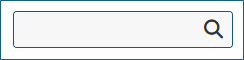
field with a search icon to the right

In most cases, visible text placed next to or within a control serves as a label that communicates the control’s purpose. However, in some cases, users may need to rely on the surrounding context to understand the control’s meaning.

The visual proximity of a label to its associated control is also important. If the label is placed too far from the control, sighted keyboard users and users of screen magnification may find it difficult to determine which label belongs to which field. Maintaining clear visual association—typically by positioning the label immediately before or above the control—supports both sighted and non-sighted users.


For more insights on designing effective visible labels, refer to the article, More Than Just Text – The Real Power of Labels.

Name

A name is a programmatic text (also known as an accessible name) by which assistive technologies can identify a component within web content to the user.

Every form input and interactive control must have a programmatic name so that screen readers and other assistive technologies can accurately announce its purpose to users.

The process by which an element’s accessible name is determined follows the Accessible Name and Description Computation 1.2. This algorithm establishes a hierarchy and precedence among potential naming sources. When multiple name sources are defined, assistive technologies use the one that appears first in the hierarchy and ignore the rest.

In simplified terms, the naming precedence is:

  1. aria-labelledby
  2. aria-label
  3. Native <label> element (for form controls)
  4. title attribute
  5. Other fallback methods such as placeholder text, implicit labeling, or inner content

Let’s explore each of these methods in this order.

aria-labelledby

If an aria-labelledby attribute is used, assistive technologies will use the text referenced by the specified ID(s) as the accessible name of the element.

<button aria-labelledby="addFav">❤</button>
<span id="addFav">Add to favorites</span>

Note: Although the text referenced by aria-labelledby is typically visible on the screen, it does not behave like a native <label> element, clicking on it will not move focus to the associated form input.

<span id="first_name">First Name:</span>
<input type="text" name="first_name" aria-labelledby="first_name">

aria-label

If no aria-labelledby reference is provided, the value of the aria-label attribute will be used as the accessible name.

<a href="help.html" aria-label="Help documentation">Help</a>

Note: The aria-label text is not visible on the screen; it is only exposed to assistive technologies like screen readers.

When a visible label is available, the content of the aria-label must include the visible text to conform to WCAG SC 2.5.3 Label in Name.

Explicit Label

In most cases, the best way to define an accessible name for a form <input> field is to associate it with a visible label using the HTML <label> element. This method has the broadest support across browsers and assistive technologies. It also offers the added benefit that users can click either the label or the input field to focus on the input, effectively increasing the clickable area. A larger click target is especially helpful for users with tremors or limited fine motor control, as well as for mobile users, particularly when the target is small, such as a single radio button.

<label for="first_name">First Name:</label>
<input type="text" name="first_name" id="first_name">

Title

The title attribute can be used to provide a name for form controls, but this approach is generally unreliable and not recommended. Many screen readers and assistive technologies do not consistently treat the title attribute as a replacement for a proper label, likely because it is often used to convey supplementary or non-essential information. For sighted users, the content of the title attribute is typically displayed as a tooltip when hovering the mouse over the form field.

<a title="microsoft home" href="https://www.microsoft.com/en-in/">
<img alt="" src="https://uhf.microsoft.com/images/microsoft/RE1Mu3b.png"></a>

However, there is one important exception: For <iframe> elements, the title attribute is required and must be used to provide an accessible name that describes the purpose or content of the embedded frame. Without it, screen reader users will hear a generic or empty frame announcement, offering no context.

<iframe src="promo.html" title="Promotional video about accessibility features"></iframe>

Note: In the Microsoft Edge browser, keyboard users can access the information provided by the title attribute by moving focus to the element. However, as of Chrome version 142.0.7444.135, the title attribute is not displayed on focus, meaning keyboard-only users cannot access this information.

Placeholder

While placeholder text can technically be used to provide an accessible name, it should not be relied upon as the only visible label for a form field. This is because:

  1. Placeholder text disappears when users begin typing, leaving no visible label to guide them during data entry.
  2. Placeholder text is not displayed when a field is pre-filled, making it difficult for users to review or edit their input.
  3. Placeholder text often has poor color contrast, and even when the contrast is improved, users may mistake it for actual input and skip the field.
  4. Long placeholder text may be truncated if it exceeds the width of the input field, reducing clarity.
  5. Placeholder text can become partially obscured or illegible when text is resized, such as on small screens or when using browser zoom.
<input type="search" placeholder="Search...">
<button type="submit">Search</button>

Implicit Label

In some situations, form controls cannot be labeled explicitly. For example, a content author might not know the ID of a form field generated dynamically by a script, or the script may not assign an ID at all. In such cases, the <label> element can be used as a wrapper that contains both the form control and the label text. This creates an implicit association between the label and the form control.

While this approach works, explicit labeling is generally better supported and more reliable across assistive technologies.

<label>
First name:
<input type="text" name="firstname">
</label>

Inner Content

For controls like buttons that have inner content, that content can serve as an accessible name. This might be plain text inside the button, or it could be the alt attribute of an <img> element contained within the button.

<button>
<span>Add to</span>
<img src="heart.png" alt="favorites">
</button>

Scenarios

The following are common situations where users with disabilities may have difficulty perceiving or understanding the purpose of a control due to missing, unclear, or improperly associated labels and names:

Scenario #1: title attribute is Overridden by an Empty <label> Element

A surprisingly common issue occurs when developers rely on the title attribute to label an input field but also include an empty <label> element, either wrapping the input or referencing it with the for attribute. When this happens, the title value gets ignored as a naming source because the <label> element takes precedence in the accessibility tree. The result? The input field ends up without a valid accessible name.

Example 1:

<span> First Name: </span>
<label>
<input title="First name" type="text" name="firstname">
</label>

Example 2:

<span> First Name: </span>
<label for="fname"> </label>
<input title="First name" id="fname" type="text" name="firstname">

It would look like this:

Field with a visible label to the left

Although screen readers such as NVDA and JAWS might still announce the title value (“First name edit blank”), inspecting the element’s Accessibility Tree or Computed Properties will reveal that it actually has no accessible name.

  • In Chrome or Edge, right-click on the page and select Inspect, or press F12 to open Developer Tools. You may need to switch to the the Accessibility tab.
  • In Firefox, open the Developer Tools by right-clicking the page and selecting “Inspect Element” or by pressing F12.
  • In Safari, right-click (or Control-click) anywhere on the page and select Inspect Element. In the Developer Tools, go to the Elements tab, select the element in the DOM tree you want to examine, select the Node tab, and expand the Accessibility section.
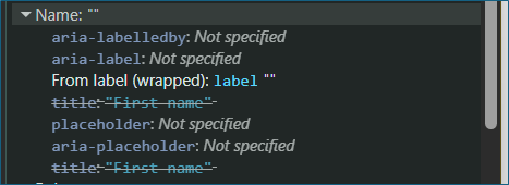
Screenshot of an element's computed properties showing no accessible name

Under Computed Properties, you’ll see the Computed Name field, which follows the Accessible Name and Description Computation hierarchy. In this hierarchy, a <label>, even an empty one, takes priority over a title attribute, which is why the title value is ignored in these cases.

Note: Users who depend on voice input tools like Windows Voice Access rely on the control’s visible or programmatic name to issue voice commands (e.g., saying “Click First Name”). Because the accessible name is missing in this case, the field becomes unreachable through voice interactions, even though it may appear to work visually and audibly for screen reader users.

Scenario #2: An empty <option> element

It’s quite common to see combo boxes (<select> elements) where the first <option> is intentionally left blank. Developers often do this to display an empty default state, but an empty option can create confusion, especially for users of assistive technologies.

Example:

<label for="cars">Choose a car:</label>
<select name="cars" id="cars">
<option></option>
<option value="volvo">Volvo</option>
<option value="saab">Saab</option>
<option value="mercedes">Mercedes</option>
<option value="audi">Audi</option>
</select>

It would look like this:
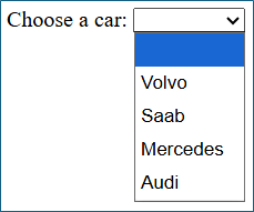
Dropdown allowing users to select a car

At first glance, this might seem harmless; it simply shows an empty selection at the top of the list. However, since <option> elements are form controls, each should have a visible and accessible name. In this example, the first option has neither.

For instance, when a screen reader user lands on this option, they may hear something like:

“list item 1 of 5” or nothing

Instead of leaving the first option empty, provide a meaningful label such as:

<option value="">Select a car</option>

This way, the control communicates its purpose clearly to everyone.

Scenario #3: Image of text with no alternative text defined inside <button> or <a>

Another common accessibility issue arises when an image of text (for example, a company), that is meant to contribute to the accessible name, is placed inside an interactive element like a <button> or <a> tag but lacks an alternative text (alt) description, users of assistive technologies will not be able to understand the control’s purpose.

Without an alt attribute or an equivalent accessible label, screen readers will simply announce it as “link” or “button,” providing no context about its destination or function.


Example:

<a href="https://www.microsoft.com/en-in/">
<img alt="" src="https://uhf.microsoft.com/images/microsoft/RE1Mu3b.png">
</a>

Visually, this looks fine, it displays the Microsoft logo and functions as a link to the homepage. However, for a screen reader user, it would be announced merely as “link,” which doesn’t communicate what the link does or where it leads.

To make this accessible, you can use either of the following approaches:

Approach 1: Define an Alternative Text for the Image

<a href="https://www.microsoft.com/en-in/">
<img alt="Microsoft home page" src="https://uhf.microsoft.com/images/microsoft/RE1Mu3b.png">
</a>

Approach 2: Use aria-label (or aria-labelledby) for the <a> Element

<a href=https://www.microsoft.com/en-in/ aria-label="Microsoft home page">
<img alt="" src="https://uhf.microsoft.com/images/microsoft/RE1Mu3b.png">
</a>

Note #1: If both an aria-label is defined on a <button> or <a> and an <alt> is defined on the nested <img>, the aria-label takes precedence and becomes the accessible name.

Note #2: If an image of text is used within a <button> or <a>, the accessible name must include the same text that appears visually in the image (for example, if the image displays “Submit,” the alt or aria-label should also say “Submit”).

Scenario #4: When the Label Alone Is Sufficient for Radio Buttons

When form controls such as radio buttons or checkboxes are presented in a group, a group label (typically using a <legend> within a <fieldset>) is usually required to provide additional context about what the group represents. However, there are cases where the individual labels alone fully describe the purpose of each control—making a grouped label optional.

Consider the following example:

<fieldset>
<input type="radio" id="A11Yin" name="A11Ytest">
<label for="A11Yin">I live in India</label>
<input type="radio" id="A11Yde" name="A11Ytest">
<label for="A11Yde">I live in Germany</label>
<input type="radio" id="A11Ysp" name="A11Ytest">
<label for="A11Ysp">I live in Spain</label>
</fieldset>

This would look like:
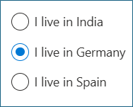
Radio buttons for country of residence

In this scenario, each label clearly communicates the purpose of the control (“I live in India,” “I live in Germany,” “I live in Spain”). Even without a grouped label like “Where do you live?”, the user can easily understand what the options represent.

However, while this works visually and semantically, it can result in repetitive or verbose announcements for screen reader users. For example, the screen reader might read “I live in India, radio button not checked,” which can become cumbersome across multiple options.

To improve clarity and conciseness, it’s better to use a grouped label with a <legend> and simplify the individual option labels.


<fieldset>
<legend>Where do you live?</legend>
<input type="radio" id="A11Yin" name="A11Ytest">
<label for="A11Yin">India</label>
<input type="radio" id="A11Yde" name="A11Ytest">
<label for="A11Yde">Germany </label>
<input type="radio" id="A11Ysp" name="A11Ytest">
<label for="A11Ysp">Spain </label>
</fieldset>

This would look like:
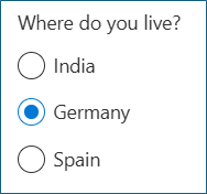
Radio buttons for country of residence

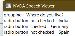
Screen readers will announce the context once (“Where do you live?”) and then read each option succinctly (“India, radio button not checked”), providing both clarity and brevity.

JAWS announcement:
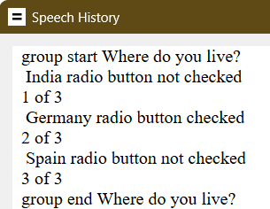
JAWS speech history: group start, where do you live, India radio button not checked, 1 of 3, Germany radio button checked, 2 of 3, Spain radio button not checked, 3 of 3, group end where do you live

NVDA announcement:

NVDA speech viewer:grouping, where do you live, radio button not checked India, radio button checked Germany, radio button not checked Spain"

Scenario #5: <button> Element with role="combobox" and Inner Text

A combo box is an input widget that allows users to choose a value from an associated popup, typically defined using the <select> and <option> elements. However, when the popup is a custom dialog—such as a date picker or color selector—developers sometimes create it using a <button> element with role="combobox".

This approach can be acceptable, but it fundamentally changes the element’s semantic role. Once a native <button> is assigned role="combobox", assistive technologies no longer treat it as a button but as a combo box. Therefore, developers must ensure that the custom widget fully supports combo box behavior, including:

  • Proper keyboard interaction patterns
  • Correct use of attributes such as aria-expanded and aria-controls

If these behaviors are not correctly implemented, the control may fail Success Criterion 4.1.2 (Name, Role, Value) because the widget does not expose its role, state, and value properly to assistive technologies.


Example: A <button> element with role="combobox" that opens a date picker dialog.

<button role="combobox" aria-haspopup="dialog">Date of birth</button>

It would look like this:
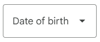
Dialog with text "Date of Birth" and dropdown arrow

Visually, this looks fine. It appears as a button labeled “Date of birth,” which opens a date picker dialog when activated. You might assume that the visible text “Date of birth” will act as the accessible name, just as it does for a regular <button>.

But that’s not what happens.

When a <button> has role="combobox", the inner text is no longer treated as the accessible name. Instead, it is treated as the current value of the combo box. This is because role="combobox" switches the element into a widget role where inner text represents user-selected content, not a label. As a result, the element lacks an accessible name altogether, even though screen readers may still appear to announce “Date of birth.”
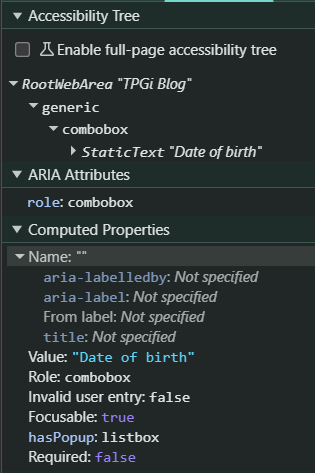
Screenshot of computed properties for Date of Birth dialog showing no accessible name

In this situation, screen readers typically announce:

“Combobox Date of birth opens dialog.”

Here, “Date of birth” sounds like the accessible name, but technically, it’s being interpreted as the combo box’s value, not its programmatic label.


To ensure that the combobox has a valid accessible name, explicitly define one using either aria-label or aria-labelledby.

<span id="dob"> Date of birth </span>
<button role="combobox" aria-haspopup="dialog" aria-labelledby="dob">06-June-2000</button>
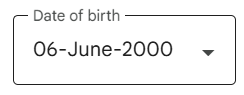
Date of birth dialog box showing 6 June 2000 selected

Now, assistive technologies will correctly announce:

“Date of birth, combobox, 06-June-2000, opens dialog.”

In this corrected example:

  • The accessible name (“Date of birth”) comes from the <span> referenced by aria-labelledby.
  • The current value (“06-June-2000”) is represented by the inner text of the <button>.

The Accessibility Tree now shows the computed accessible name.
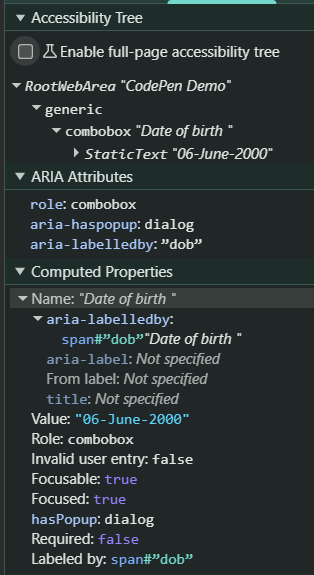
Screenshot of computed properties for Date of Birth dialog showing accessible name

Note: It’s important to note that behaviors such as how the title or placeholder attributes are announced can vary significantly across screen readers and browsers. To ensure consistent accessibility, developers should test with multiple combinations, including:

  • NVDA + Firefox
  • JAWS + Chrome or Edge
  • VoiceOver + Safari

Testing across these environments helps verify that accessible names, roles, and values are exposed as expected for all users.

Conclusion

Creating accessible names and labels is more than just adding text next to a control — it’s about ensuring that every user, including those relying on assistive technologies, can understand and interact with your interface effortlessly. A well-structured naming strategy not only improves accessibility but also enhances usability for everyone.

Here are a few key takeaways to keep in mind:

  • ✅ Use <label> elements for visible and programmatic names whenever possible.
  • ✅ Use aria-labelledby to associate a visible label that exists elsewhere in the DOM.
  • ✅ Use aria-label only when no visible label is available.
  • ❌ Don’t rely solely on placeholder or title for labeling form controls.
  • ❌ Don’t use empty <label> elements or empty <option> elements, as they result in missing or unclear accessible names.

By following these practices, you’ll help ensure that your web interfaces communicate effectively with all users, regardless of how they access them.

Resources


Like to be notified about more articles like this? Subscribe to the Knowledge Center Newsletter. It not only gives you summaries and links to our technical blog posts but also TPGi webinars, podcasts, and business blog posts – as well as accessibility and web tech conferences and other events, and a reading list of other relevant articles. You get one email a month, it’s free, requires just your email address, and we promise we won’t share that with anyone. Check the archive.

The post Accessible Names and Labels: Understanding What Works and What Doesn’t appeared first on TPGi — a Vispero company.
Weekly Reading List November 10 2025

10 novembre 2025 à 13:59

The post Weekly Reading List November 10 2025 appeared first on TPGi — a Vispero company.

Link vs Button: Choosing the Right Element for the Right Job

10 novembre 2025 à 11:49

When it comes to building accessible and user-friendly interfaces, one of the most overlooked distinctions in web development is between links and buttons. They may look similar visually and even behave similarly when styled with CSS or enhanced with JavaScript, but their semantics and purposes are fundamentally different, and these differences matter greatly for accessibility.

Understanding the Difference

While the Web Content Accessibility Guidelines (WCAG) do not explicitly prohibit misusing link or button semantics if functionality and accessibility outcomes are preserved, best practice — supported by W3C and Authoring Practices — is to use the correct semantic element for each purpose. Semantics convey meaning — not just to developers, but also to assistive technologies like screen readers.

Here are the main distinguishing factors between the two:

  • Links (<a> elements) take users to different locations — either to another page or a different section of the same page.

    Example: Navigating to a “Contact Us” page or jumping to a specific heading on the current page.

  • Buttons (<button> elements) activate an action or functionality, typically on the same page.

    Example: Expanding a hidden menu, submitting a form, toggling a theme, or opening a modal dialog.

While there are gray areas, such as a control that loads new content dynamically without a full page reload, the distinction usually comes down to navigation vs. action.

Why the Difference Matters for Screen Reader Users

Screen readers inform users whether something is a link or a button. When a screen reader encounters these elements, it announces their role — saying “link” or “button” before the accessible name.

For example:

  • A screen reader might announce “Link, Home.”
  • Or “Button, Submit Form.”

This helps users understand what to expect when they interact with the element. However, when developers blur the lines — such as making a link act like a button with JavaScript — it can lead to serious confusion.

Imagine a user looking for a specific link in the “List of Links” feature available in most screen readers. If that “link” was coded as a <button> instead, it won’t appear in the list at all, leaving the user unable to find it. Likewise, if a button is incorrectly coded as a link, it may appear in the wrong context.

This kind of semantic mismatch can frustrate screen reader users and create unnecessary accessibility barriers.

Designing Accessible Links

A well-designed link is both descriptive and distinctive. Let’s look at what that means in practice.

How to Define a Link

Use the <a> element (or role="link" with other elements) for navigation between different pages or sections. It must include an href attribute. Without the href attribute, an <a> element is not keyboard-focusable or recognized as a link by assistive technologies.”

Example:

<a href="/about">About Us</a>

Make Links Descriptive and Contextually Clear

Clear and descriptive link text is one of the most important aspects of creating an accessible and user-friendly experience. A link should give users enough information to understand where it leads or what action it performs.

Where possible, provide a more descriptive visible link phrase for all users. Alternatively, you can use the following techniques to make them descriptive for screen reader users.

Wrapping the link with the surrounding text

Wrap the link and surrounding contextual information within a same sentence, paragraph, list item, table cell, or associated table headers that gives meaning to the link in context.

Example: Adding Context Using a Paragraph

<p>Our new accessibility testing tool integrates seamlessly with CI/CD pipelines. <a href="/blog/new-accessibility-tool">Read more</a> about the new tool.</p>

In this approach, if a screen reader user navigates by links alone, they will still understand what the “Read more” link refers to.

Using Visually Hidden Text

When the visual design limits space, you can add hidden text to make link text more specific without affecting the visible layout.

Example: “Learn More” Link with Hidden Context

<a href="/services/web-accessibility"> Learn more<span class="visually-hidden"> about our web accessibility services</span></a>.
<----- CSS Starts ------>
.visually-hidden {
clip-path: inset (50%);
height: 1px;
overflow: hidden;
position: absolute;
white-space: nowrap;
width: 1px;
}
<----- CSS Ends ------>

In this example, sighted users see “Learn more,” while screen reader users hear “Learn more about our web accessibility services.”

Using aria-label to override native link text

If adding visually hidden text isn’t possible, the aria-label attribute can also be used to add context.

Example:

<a href="/services/web-accessibility" aria-label="Learn more about our web accessibility services">Learn more</a>.

Note: The visible link phrase (in the example above “Learn more”) must be present in the aria-label, otherwise this would fail SC 2.5.3 Label in Name. For more information, please refer to How to meet SC 2.5.3 Label in Name.

Accessible Image Links

When an image is the only content inside a link, the alternative text (such as an alt attribute for an <img> element) becomes the accessible name of that link. It should clearly communicate the link’s purpose or destination.

Example:

<a href="https://www.tpgi.com/"><img src="tpgi-logo.png" alt="TPGi home page"></a>

Here, the alt text “TPGi home page” describes the target of the link.

Note: If the logo itself contains text, such as “TPGi,” the alt text should include it to satisfy SC 2.5.3 Label in Name.

Using aria-describedby for supplementary descriptions

In some cases, you may want to provide additional descriptive context for a link, for example, to clarify the destination or potential actions when multiple links are present with the same accessible name. You can use aria-describedby to associate the link with descriptive text elsewhere on the page.

Example:

<p id="policy-desc">This document explains our approach to protecting your personal data.</p>
<p><a href="/privacy-policy" aria-describedby="policy-desc">View Privacy Policy</a><p>

In this example, screen reader users will hear:

“View Privacy Policy — This document explains our approach to protecting your personal data.”

Using the title attribute (as a last resort)

The title attribute can be used to provide extra information about a link. However, it should be treated as a last resort because:

Example:

<a href="/team" title="Meet the TPGi accessibility team">Our Team</a>

Note: Some screen readers may not consistently announce the title attribute. In addition, many users, especially those using touch devices or voice access tools, cannot access title tooltips, making this method unreliable for conveying essential information.

Indicating New Windows or Tabs

If a link opens in a new tab or window, this must be indicated, both visually and programmatically.

Example:

<a href="https://example.com" target="_blank" rel="noopener">Visit Example.com (opens in a new tab)</a>

Users of assistive technologies must not be surprised by a change in context. Announcing it clearly avoids confusion and maintains a sense of control.

Visual Distinction

Links should be visually distinguishable from surrounding text — typically by color and/or underline. Relying only on color differences can pose challenges for users with color vision deficiencies, so consider underlines or other visual cues.

Designing Accessible Buttons

Buttons are about actions, not destinations. They trigger behavior on the same page, such as submitting data, opening menus, or changing states.

How to Define a Button

Use the <button> element (or role="button" with all the other elements) for any control that performs an action.

Note: ARIA should not be used to repurpose native elements when native semantics suffice. For example, role="button" on a <div> is acceptable only if no suitable HTML element can serve the purpose.

<button type="submit">Submit Form</button>

Note: Avoid using <div> or <span> with click handlers to mimic button behavior, doing so removes the inherent keyboard accessibility and role information that come built into <button>, unless absolutely necessary and fully ARIA-enabled.

Descriptive Button Labels

The button’s accessible name should clearly describe its action. Avoid generic terms like “Go” or “OK” when the context isn’t obvious.

Similar to links, buttons can also use aria-label, aria-describedby, title, or an inner image element with proper alt text to convey descriptive meaning.

Example: Button with aria-label

<button type="button" aria-label="Search the website">
  <svg aria-hidden="true" viewBox="0 0 24 24">
  <path d="..." />
  </svg>
</button>

Here, the icon alone wouldn’t communicate meaning to screen reader users, so the aria-label provides an accessible name (“Search the website”).

Example: Button with aria-describedby

<p id="save-desc">Saves your draft progress without submitting.</p>
  <button type="button" aria-describedby="save-desc">Save Draft</button>

This technique is helpful when additional context is needed, for example, to clarify what the button does.

Example: Button with title (use sparingly)

<button type="button" title="Download report as PDF">Download</button>

Note: The title attribute should be used only as supplementary information. It is not consistently announced by all screen readers and may not be accessible on touch devices.

Example: Button with an inner image element

<button type="button">
  <img src="download-icon.png" alt="Download report">
</button>

If an image represents the button’s purpose, its alt text must clearly describe the action (e.g., “Download report”).

Why It’s a Best Practice, Not a WCAG Failure

Misusing a link or a button is not directly a WCAG failure, but it’s considered a best practice issue that significantly affects usability and consistency.

Here’s why:

  • WCAG focuses on accessibility outcomes, such as ensuring that elements are operable, perceivable, understandable and robustness.
    A link coded as a button might still be technically accessible if it can be operated by keyboard and announced properly by assistive technologies.
  • However, using incorrect semantics can confuse users and break expected navigation patterns. For instance:
    • Screen reader users expect links to appear in the “links list” and buttons to appear in the “buttons list.”
    • Keyboard users expect links to be activated with the Enter key and buttons with the Spacebar or Enter keys.

When these expectations are broken, even if the control remains technically functional, it reduces the predictability and usability of the interface.

Thus, it’s considered an accessibility best practice, not a violation.

Correct semantics improve the user experience, enhance clarity for assistive technologies, and align with the principles of SC 3.2.4 (Consistent Identification) and SC 4.1.2 (Name, Role, Value), which emphasize predictable and consistent interactions.

The built-in keyboard operability of semantic <button> and <a> elements also ensures conformance with SC 2.1.1 Keyboard. By distinguishing links from buttons correctly, you help users navigate confidently and build more inclusive experiences.

Following this best practice makes your content more robust, consistent, and user-centered, which are all foundational pillars of accessibility.

Resources

Like to be notified about more articles like this? Subscribe to the Knowledge Center Newsletter. It not only gives you summaries and links to our technical blog posts but also TPGi webinars, podcasts, and business blog posts – as well as accessibility and web tech conferences and other events, and a reading list of other relevant articles. You get one email a month, it’s free, requires just your email address, and we promise we won’t share that with anyone. Check the archive.

The post Link vs Button: Choosing the Right Element for the Right Job appeared first on TPGi — a Vispero company.

The State of Accessibility – Episode 14

5 novembre 2025 à 20:35

November 2025 — Mobile Accessibility

Video not playing? Watch it on YouTube.

Read the transcript.

Listen to the podcast on Spotify or Podbean.

Have you ever wondered about mobile app accessibility? In our next episode, host David Sloan, Chief Accessibility Officer, and guest John Lilly, Principal Accessibility Engineer, will discuss how you can create more accessible mobile app user experiences and start creating more inclusive digital experiences for all.

Join us live on our LinkedIn on November 12 at 10:30 AM EST.

The post The State of Accessibility – Episode 14 appeared first on TPGi — a Vispero company.

Weekly Reading List November 3 2025

3 novembre 2025 à 13:24

The post Weekly Reading List November 3 2025 appeared first on TPGi — a Vispero company.

Weekly Reading List October 27 2025

27 octobre 2025 à 13:26
Weekly Reading List

The post Weekly Reading List October 27 2025 appeared first on TPGi — a Vispero company.

❌