Connexion
Lotobingo accessibilité : retours et partages
28 juin 2026 à 02:00
Article présentant les résultats des participants aux ateliers lotobingo animés en 2025 et 2026

Au quotidien, nous avons toutes et tous recours à de nombreux objets, services et technologies dont l’existence semble évidente et l’usage parfaitement ordinaire.
Ce que beaucoup ne soupçonnent pas, c’est qu’une partie de ces inventions trouve son origine dans le handicap.
Les sous-titres, les livres audio, les SMS, et même la brosse à dents électrique ne sont que quelques exemples, parmi tant d’autres, de solutions qui n’ont pas été pensées, à l’origine, pour le grand public.
Derrière ces innovations se trouvent des personnes ayant été confrontées à des obstacles très concrets, mais aussi des démarches de recherche, de conception et parfois des inventions réalisées par les personnes concernées elles-mêmes.
Ces solutions sont nées d’un besoin simple : permettre aux personnes handicapées de contourner certaines difficultés, de gagner en autonomie ou d’accéder à des usages jusque-là compliqués, voire impossibles, à cause d’un manque d’universalité dans la conception des produits, infrastructures, communications, environnements, etc.

Paradoxalement, des solutions, initialement pensées pour répondre à des situations particulières, sont donc devenues des évidences de la vie de tous les jours pour tout le monde.
Ce phénomène a d’ailleurs un nom : l’effet « bordure de trottoir » ou, en anglais, « curb-cut effect ».
Dans cet article, nous vous proposons un retour sur plusieurs inventions et usages largement démocratisés dans notre société, mais dont les racines sont étroitement liées à l’accessibilité.
La réception d’appels et de notifications par vibrations, maintenant présent sur n’importe quel téléphone mobile, a été implanté pour la première fois en 1996 par Motorola avec le Motorola StarTAC.
Outre le fait de pouvoir sentir son téléphone dans un environnement bruyant, cette fonctionnalité permettait surtout de rendre les appels et notifications désormais perceptibles pour les personnes sourdes et malentendantes.
Grâce aux vibrations, il devenait alors possible d’être averti d’un appel sans dépendre uniquement du son.
Dans les années 30, en observant sa fille de deux ans avoir du mal à boire son milkshake à la paille, son père, un inventeur du nom de Joseph Friedman, s’est adonné à repenser le design des pailles, qui n’étaient alors que de simples tubes rigides en papier, en s’aidant de vis et de fil dentaire.

Après avoir breveté son invention, les hôpitaux furent les tous premiers à adopter ces nouvelles pailles pliables car elles permettaient entre autres aux patients alités ayant des difficultés de motricité ou de déglutition de boire dans de meilleures conditions.
Avec l’essor du plastique, son usage s’est ensuite très largement popularisé à partir des années 60, pour devenir cet objet de la vie quotidienne que l’on connait aujourd’hui, apportant évidemment son lot d’impacts environnementaux.
Heureusement, des alternatives existent, telles que les pailles réutilisables en silicone ou en inox avec embout flexible.
Vous souvenez-vous des handspinners ?
Ces toupies à main, qui avaient envahi les cours de récréation en 2017, ne sont qu’une énième itération d’un concept d’objet nommé « fidget toy » (« s’agiter, gigoter » en anglais) ayant vu le jour dans les années 1990 par le biais de recherche médicale dans l’ergothérapie sensorielle.

En effet, ces « jouets » sont à l’origine conçus pour aider les enfants avec TDAH à améliorer leur concentration et réguler leur stress.
Apparus comme un phénomène viral aussi vite qu’ils ont disparu du quotidien du grand public, les fidget toys, tout en continuant à accompagner les personnes initialement concernées, demeurent un moyen discret et thérapeutique envisageable pour qui souhaitant calmer son anxiété, travailler sa motricité fine, ou canaliser son énergie.
Aujourd’hui largement recommandée par les professionnels de la santé bucco-dentaire, la première brosse à dent électrique, de son nom la BROXODENT, vit le jour en 1954 en Suisse.

Invention du Dr Philippe-Guy Woog, ce dernier étudia et prouva la corrélation entre la santé des gencives et l’alimentation moderne : cette dernière ayant eu tendance à se ramollir avec l’évolution de notre société et de nos habitudes de consommation, les problèmes gingivaux ont fortement augmenté, notamment chez les personnes ayant une motricité fine insuffisante pour exercer les mouvements de brossage et la pression requise pour obtenir un brossage efficace en profondeur.
Pour pallier à cette diminution progressive de la nourriture dure et crue qui permettait d’entretenir naturellement les gencives, il mit alors au point cette fameuse BROXODENT, mais ce n’est qu’à partir des années 90, que les brosses à dents électriques se sont progressivement popularisées, portées par les avancées technologiques et surtout la baisse de leurs prix.
Nous avons cité en introduction les SMS, les livres audio et les sous-titres.
Dans le même registre, la dactylographie, l’épluche-légumes ergonomique (via la marque OXO), la manette XBOX adaptative, le text-to-speech sont autant d’exemples d’inventions nées de l’accessibilité puis devenues largement répandues.
En 2025, nous écrivions :
Est-ce qu’améliorer l’accessibilité, c’est rendre service à tout le monde ?
Potentiellement, mais ce n’est pas l’objectif premier.
L’accessibilité vise avant tout à répondre au droit fondamental des personnes handicapées : celui de pouvoir vivre, se déplacer, apprendre, travailler, accéder à la culture comme toute personne.
Les bénéfices pour les autres publics (personnes âgées, parents, voyageurs) sont potentiellement réels, mais secondaires. Les mettre en avant en priorité, c’est dépolitiser la question, la réduire à du confort, et oublier que sans ces aménagements, certaines personnes restent exclues.
Autrement dit, l’histoire de ces inventions est très intéressante, mais le fait qu’elles aient été pensées pour les personnes handicapées puis bénéfiques pour tout le monde n’est pas (et ne doit pas constituer) un argument en faveur de l’accessibilité.
Les bénéfices induits pour le large public ne sont qu’une conséquence bienheureuse, l’objectif recherché étant le respect, l’application et la garantie des droits des personnes handicapées dans la société sous tout aspect (citoyen, culturel, professionnel, éducatif, sanitaire, etc.).

Accessible web design opens up a universe of possibilities where every user, regardless of their abilities, can easily navigate, interact, and appreciate your website.
But why stop here?
Achieving web accessibility isn’t merely a requirement by law; it’s a critical step towards improving user experience and amplifying your site’s engagement.
Creating an accessible website involves several aspects – optimal colour contrast, appropriate text size, and the use of semantic HTML, among other things. Although it may seem overwhelming at first, knowing where to begin is a challenge that we can tackle together.
In this post, we’ll go over the main areas to concentrate on when constructing an accessible website and discuss six exceptional examples of accessible websites, each illustrating best practices and serving as a source of inspiration.
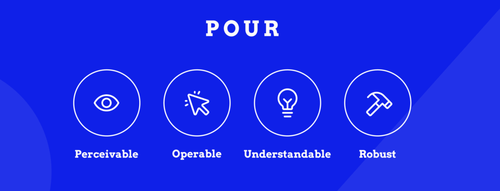
Every accessible website is built on four core principles defined by WCAG. These form the foundation of web accessibility:
These four principles – Perceivable, Operable, Understandable, Robust (POUR) – guide every WCAG success criterion. When websites meet these principles, they work for everyone.
Since accessibility is centred around people, your first job would be to consider the wide range of potential impairments – from vision and hearing impairments to cognitive and physical disabilities. The goal is to create an inclusive experience for every user, regardless of their abilities.
When you test your website for accessibility, we recommend starting with the Web Content Accessibility Guidelines, or WCAG. Published by the World Wide Web Consortium (W3C), the WCAG provides a comprehensive set of recommendations for enhancing web content accessibility.
The guideline identifies three conformance levels:
Usually, legal accessibility requirements stipulate at least AA compliance; however, striving for AAA accessibility where possible can elevate the user experience considerably.
The WCAG guidelines cover a wide array of accessibility aspects, from visual design to navigability and coding semantics to input modalities. If you want to read more about them, go to the W3C website.
For the site owners, web designers, and developers who are already interested in learning more about any of these specific topics or just web accessibility in general, our team at The A11y Collective has created a range of online courses for that very purpose.
Here’s a quick reference guide to the main features that make websites accessible:
| Feature | What it does | Who it helps |
|---|---|---|
| Alt text for images | Provides descriptive text for images | People using screen readers, those with slow connections |
| Readable text | Uses clear fonts, appropriate size, and spacing | People with dyslexia, low vision, or reading difficulties |
| Keyboard navigation | Allows full site use without a mouse | People with motor disabilities, screen reader users, and power users |
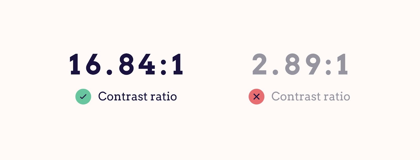
| Colour contrast | Ensures text stands out from backgrounds (4.5:1 minimum) | People with low vision, colour blindness, or viewing in bright light |
| Captions/subtitles | Provides text versions of audio/video content | People who are deaf or hard of hearing, non-native speakers |
| Consistent design | Keeps layouts and navigation predictable | People with cognitive disabilities, all users learning the site |
| Semantic HTML & ARIA | Uses meaningful code for assistive technologies | Screen reader users, keyboard navigators |
Below, we’ll explore each of these features in detail with practical examples and implementation tips.
This descriptive text helps relay the content of the images to users who may depend on screen readers to browse the internet. When crafting alternative text, focus on conveying the essential details contained in the image.
Keep in mind that the aim isn’t to provide an artistic critique of the image but rather to communicate necessary information to visitors who might not be able to visually perceive it.
Let’s do this together.

Photo by: Matheus Bertelli
Which alt description do you think is better?
If you said the second one, you’re on the right track. This simple, informative description allows visually impaired users an equivalent content experience to their sighted peers.
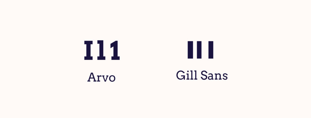
Websites, particularly ones dense with content, are more accessible and user-friendly when the text is concise. Fonts, text size, and line spacing are pivotal to the legibility of your content. Avoid fonts that may be challenging for some users to read, for example, ones with “imposter letter shapes”.
In the pursuit of outstanding web accessibility, it’s essential that a website be fully functional via a keyboard. This allows users who are unable to use a mouse due to physical disabilities to browse your website without hindrance.
Key navigation controls such as “Tab” to move forward and “Shift” + “Tab” to move backwards should be fully functional, enabling users to access all actionable elements like links, buttons, and forms.
Adequate colour contrast between text and the backdrop aids visually impaired users, particularly those who are colourblind. High contrast levels between the background and text can greatly augment the visibility and overall accessibility of your website.
And to no one’s surprise, the Web Content Accessibility Guidelines (WCAG) provide recommendations on optimal contrast levels, so you can check them out.
To ensure compliance with these, there are several tools, such as the WebAIM Contrast Checker and the Stark plugin for Figma, Sketch, and Adobe. These tools calculate the contrast ratio and indicate whether your chosen colour combination meets the required standards.
For instance, a colour combination such as black text on a white background gives a high contrast ratio, while light grey text on a white background would not meet accessibility standards.
Besides being beneficial for those with impaired hearing, they also assist non-native speakers in understanding video content and cater to those eager to learn a new language. Similarly, users in a noisy environment or who prefer silenced videos can significantly benefit from this feature.
Predictable and intuitive navigation accompanied by a consistent layout provides an exceptional user experience. This involves maintaining a familiar design across the site, using easily recognisable web design patterns such as commonly located search bars, and ensuring a proper hierarchical structure of headings is in place.
Using semantic HTML – meaningful HTML elements that describe their function – enables viewers and screen reader users to better interpret different areas of your web pages. The use of heading tags, such as <h1>, <h2>, <h3>, etc., assists visitors and assistive technologies in skimming through different sections of a webpage.
Integrating Accessible Rich Internet Applications (ARIA) landmarks can markedly advance your website’s accessibility. These landmarks, through specially designed code, assist screen readers in providing additional context to users, thereby fostering better understanding and navigation.
A prime example is using ARIA landmarks to label a search section on a website. By doing so, assistive technologies can quickly recognize this feature and guide users to it.For readers eager to delve deeper into ARIA’s details and practical implementation, consider signing up for The A11y Collective’s insightful course, “ARIA explained”.
Just as ramps and elevators facilitate physical mobility, web accessibility practices ensure digital inclusivity, making online content usable by all. Accessible web design benefits everyone – it encompasses a wide variety of needs and improves the user experience by considering the diverse range of site visitors.
Web accessibility is particularly essential for users with disabilities who are part of one of the three main types of disability groups: permanent, temporary, and conditional/situational.
Our goal is to make the digital space as welcoming as possible, no matter the circumstances of any individual.
Take, for example, a site incorporating simple, clear navigation menus: this small design choice eases the experience of all users, particularly those with cognitive impairments who may find complex navigation structures overwhelming.
It’s worth noting that good design is far more than just aesthetic appeal and fancy graphics. It’s about creating a platform that’s intuitive, enjoyable, and inclusive for everyone.
Search Engine Optimisation, more commonly known as SEO, relates to practices aimed at enhancing a website’s visibility on search engine result pages. Although accessibility is not a direct ranking factor for search engines, such as Google, it can significantly impact user experience signals that are central to SEO.
An inaccessible website may lead to higher bounce rates as users may quickly leave if they find it difficult to navigate or interact with the site. So logically, accessible websites tend to encourage more user engagement, signalling to search engines the value of the site to visitors.
This sentiment is echoed by Google Search Advocate John Mueller, who stated:
Accessibility is something that is important for a website because, if you drive your users away with a website that they can’t use, then they’re not going to recommend it to other people.
There are certain legal frameworks, such as the Americans with Disabilities Act (ADA), the European Accessibility Act (EAA), and the Accessibility to products and services directive, which require certain websites to comply with accessibility standards. This is to avoid legal complications and to ensure individuals with disabilities can access online information and services.
Despite these legal frameworks, the case for accessibility extends beyond mere compliance. Of course, the risk of legal repercussions may push certain organisations to prioritise accessibility, but the real prize is the ethical duty of providing equal access to all users. It’s about businesses recognising and validating the diversity of their audience and ensuring their digital platforms mirror these beliefs.
Theory is good, but it’s even better to see all of these tips in action. That’s why we’ve collected some of the best examples of websites that follow accessibility guidelines:

BBC main website accessibility page
Emerging as a leader in the field of the digital inclusivity matrix, the British Broadcasting Corporation (BBC) exhibits a passionate dedication to making its digital services accessible to one and all.
Their specific accessibility page provides a plethora of links to resources and documents to help users access the BBC’s content. This page is indeed a testament to accessibility in action.
The BBC also makes sure that all of their websites work well with assistive technologies to guarantee the best possible browsing journey for their audience.
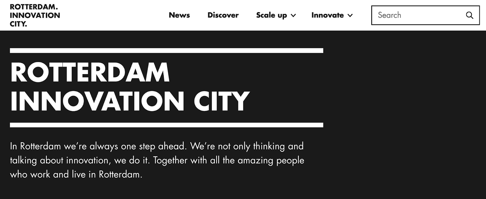
Rotterdam Innovation City website
Rotterdam Innovation City‘s seamlessly designed and keyboard-navigable website is a testament to its commitment to accessibility.
Indeed, their masterful use of semantic HTML provides meaning to the web page content, ensuring users and screen readers alike can nimbly navigate through different website elements.
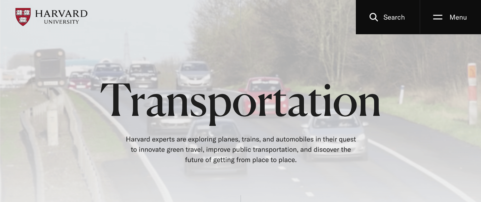
As a reflector of its academic excellence, Harvard University ensures a hurdle-free digital experience. The University provides an array of reading tools, incorporates multilingual video subtitles, and has carefully botched its colour scheming to accommodate the needs of colourblind individuals.
Their menu also reflects the simplistic but effective design of their website with a large and easy-to-read font and clear interface.


GOV.UK expertly demonstrates its commitment to digital inclusivity and accessibility. The array of accessibility features on its webpage, from clear content displayed with high contrast, consistent navigation, and support for assistive technologies through ARIA landmark roles to full keyboard navigation functionality, is impressive.
In their Accessibility statement, they also directly list all the features included in the website.
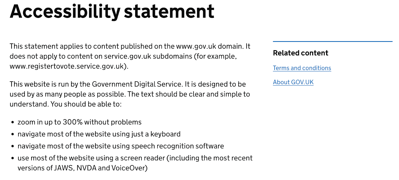
Additionally, they offer people the option to request any content in a different format best suited for them, such as plain text, braille, BSL, large print, or audio CD.

The digital version of Barclays mirrors its corporate commitment to advocating for accessible banking. With provisions for intuitive navigation, sensitive colour schemes, compatibility with screen readers, and a host of other features, the Barclays website makes banking accessible to all.

Apple has long been recognised as a leader in accessibility, and their website reflects this commitment. Apple.com demonstrates that accessible design doesn’t mean compromising on visual appeal – their clean, high-contrast design works beautifully with screen readers, keyboard navigation, and voice control.
Their product pages provide comprehensive keyboard navigation throughout complex product configurators, detailed alt text for product images, and video content with captions and audio descriptions. The shopping experience works just as smoothly whether you’re using a mouse, keyboard, screen reader, or voice commands
With these examples serving as a benchmark, start making strides to enrich your own website’s accessibility and usability today! Embed these best practices into your web projects to create a streamlined user experience that truly caters to everyone.
You might have noticed that many accessible websites include an accessibility statement. This is a public commitment that shows users you care about accessibility and provides a way for them to report issues. Here’s what a good accessibility statement typically includes:
EXAMPLE ACCESSIBILITY STATEMENT TEMPLATE
Our Commitment to Accessibility
[Organisation Name] is committed to ensuring digital accessibility for people with disabilities. We are continually improving the user experience for everyone and applying the relevant accessibility standards.
Conformance Status
The Web Content Accessibility Guidelines (WCAG) define requirements for designers and developers to improve accessibility for people with disabilities. We aim to conform to WCAG 2.1 Level AA standards.
**[Website Name] is [fully/partially/not] conformant with WCAG 2.1 Level AA. [Fully conformant means: the content fully conforms to the accessibility standard without any exceptions. Partially conformant means: some parts of the content do not fully conform.] **
Measures to Support Accessibility
[Organisation Name] takes the following measures to ensure accessibility:
• Include accessibility as part of our mission statement • Integrate accessibility into our procurement practices
• Provide ongoing accessibility training for our staff • Test with people who use assistive technologies
Feedback and Contact Information
We welcome your feedback on the accessibility of [Website Name]. Please let us know if you encounter accessibility barriers:
• Email: [accessibility@organisation.com] • Phone: [contact number]
We aim to respond to accessibility feedback within [X business days].
Technical Specifications
Accessibility of [Website Name] relies on the following technologies:
Date: [Last reviewed: DD/MM/YYYY]
Creating an accessible website involves more than just ticking compliance boxes. It’s about welcoming your users into the heart of your online presence and enhancing their experience.
While there are various automated tools that check your website’s accessibility, keep in mind that they provide some insights, but their scope and depth can be somewhat limited. They simply cannot comprehend user experience as humans do.
In particular, be cautious of quick-fix solutions such as accessibility overlays. Despite their tempting promise of making your website accessible with a single click, these overlays often fail to resolve numerous website accessibility issues and have been widely criticised by users with disabilities.
Instead of relying on these patchy solutions, it’s wiser to build a comprehensive understanding of what an accessible website looks like and how to create one. Don’t worry. Building that understanding is not as daunting as it sounds. Remember, The A11y Collective is here for your support. Our bespoke online courses are here to guide you on this journey towards accessibility. “Web accessibility, the basics” is a particularly beneficial course that provides you with the best foundation in this area.
The journey to web accessibility is an ongoing process, not a one-off task. As standards evolve, so should your understanding, and continuous learning is an integral part of the journey toward better accessibility and inclusion.
So, don’t wait – take the next step in enhancing your website’s accessibility and enroll in one of The A11y Collective’s courses today!

Understand how design decisions impact real-world users and teach you to create websites that are inclusive for everyone.
The post 6 Accessible Website Examples to Inspire Your Design appeared first on The A11Y Collective.
The earth is heating up and AI isn't helping. It drives major increases in electricity use, water use and CO2 emissions. Yet, industry and governments alike seem keen to leverage the latest tech. Can we make greener choices?
Yesterday, I spoke at a conference on AI in government about sustainable choices. The presentation and slides were in Dutch, this post is a high level summary of what I covered.
As the presentation took place during a record-breaking heatwave, which meteorologists attribute to climate change, and there were some airconditioning-related issues, very little irony was lost on us.
I started out talking about if AI is good or bad for sustainability and called it the wrong question. It's the wrong question, because both AI and sustainability are concepts that have many meanings.
AI can be understood in different ways:
Sustainability is multi-faceted too. In the Web Sustainability Guidelines, we center our definition around three pillars that ultimately need balance between them: Planet, People, and Profit:
So, there's some nuance about what the words mean, but despite that, it's worthwhile to try and reduce climate impact of our services. The pope said so, and in government, it's an increasingly a priority (like in the UK, where the Digital Service expanded their design guidance last year with principle 11: Minimise environmental impact) .
I shared five tips to make greener choices around AI, but couldn't help myself to add a bonus tip as tip zero: in many cases, not using AI for your project makes the most sense. Which is fine.
Many of us will have sat in meetings around a new idea or project, where someone put up their finger and said ”oh, maybe we can use AI for this”. The AI vendors primed us for this with hype.
Often, using AI, and especially generative AI, is like going to your local corner shop using a helicopter. What if you could solve the same problem with a couple of lines of Python, and Excel-sheet, people, or manually summarising?
I wanted to mention this specifically, because nobody wants to be the downer in the group and suggest not doing the thing that everyone is hyped about. But to be sustainable, we need to pick out just the cases where AI is absolutely necessary, and go without it for anything else.
When using a specific type of AI actually solves your problem best, here's five tips to make greener choices.
When using generative AI, model size differs wildly. An example of a large model is DeepSeek v4 Pro, which has 1.6 trillion parameters (12 zeroes), while there are small models like Hugging Face's SmollLM that has 135 million parameters (6 zeroes).
A smaller model could save 30⨉ emissions of CO2 (and equivalent greenhouse gases), explain Luccioni, Jernite, & Strubell in their paper “Power Hungry Processing: Watts Driving the Cost of AI Deployment?”.
A lot of generative AI uses so-called general purpose models, which are systems that know pretty much everything about the world. When hiring humans, we usually list a specific area of expertise. That's partially because there are no humans that know it all (just ones that think they do).
We should try to do the same with language models. If we're building a system that answers questions about taxes, we don't need to tell it what the capital of France is.
In “Power Hungry Processing”, Luccioni, Jernite, & Strubell explains this: “multi-purpose generative architectures are orders of magnitude more expensive than task-specific systems for a variety of tasks, even when controlling for the number of model parameters” (emphasis mine).
In many applications of AI, the relevant software needs lots of computing: GPUs, CPUs, memory, and storage. This computing is often done in the “cloud”, or: data centres. The climate impact of data centres is widely seen as three components: electricity, CO2 emissions (and equivalent greenhouse gases), and water usage.
The International Energy Agency predicts the amount of data centres to double or triple over the next few years. The electricity used for this will be green, partially. But it won't all be green : gas and coal will continue to be a share of what powers data centres.
On an operational level, we could reduce the load on data centres by reducing how many tokens we use, via smarter prompting (shorter, more specific, more explicit, less repetition through variables). The paper Smarter, smaller, stronger by Perez Ortiz and Drobnjak details tests that show reducing a response from 400 to 200 words reduced energy consumption by 54%.
On a policy level, one tip I learned at the AI reporting event I attended, is to question how many 9's you really need. Data centres are convenient because they offer compute for rent and make it easy to scale. And they offer uptime, guaranteeing sometimes up to 99,99999 availability: five nines. More nines could mean less sustainability: some data centres will use diesel power or other unsustainable sources when they have a power cut. So to get to a higher uptime guarantee, they need to make such choices. What if we required less nines? What if we decided it's ok to have the AI thing not work for a couple of days a year?
Greenwashing is everywhere, and to make sustainable choices, we'll need to develop our skills to recognise it from afar. Sometimes it's easy to recognise, like an airline that said with them, you can “fly responsibly” (a Dutch court said this is misleading). EU Directive 2024/825 effectively forbids greenwashing, but companies still tend to do it.
Examples from The AI Climate Hoax include:
My last tip is around data collection. It's tricky to know how much energy data centres use, not the least because Big Tech successfully lobbied the EU to treat energy usage data as company secrets.
When you do get data, it often does not include Scope 3 emissions, which are estimated to be a very large part (I've seen percentages from 30 to 89%, and I am not sure what's right, other than that it is large).
There can also be a major difference in reporting: some companies do location-based reporting, others market-based reporting. Location-based means that you get information about how much a specific data centre is actually using, whereas with market-based, factors outside are taken into account, including certificates for carbon.
Location-based data is the most helpful if your team is trying to make optimisations, because it allows them to see the numbers go down (or up),where they would appear constant with market-based reports.
Lastly, I mentioned grid intensity: because there are many different power sources, and they deliver different amounts of energy depending on the time and location, grid intensity vary. For instance, if it's sunny and windy today at noon, the grid intensity will be low because there is lots of green energy available. At other times there's less.
Your application can use this difference, that constantly changes, by moving your computing to the right place at the right time. This is also called “carbon aware computing” and companies like Google already do it, to save emissions and costs at the same time.
AI-related electricity usage, water use, and carbon emissions can be huge. That's a problem, but it's also an opportunity (cheesy but it's true). There is lots of low-hanging fruit that we can start addressing. As there's still so much to reduce, our efforts really can make a dent.
I really enjoyed giving this talk and hearing the audience comments afterwards. The main worry seems to be: how do I sell this within my organisation, and an answer emerged in the group: cost-savings and carbon-savings often go hand in hand.
Originally posted as AI and greener choices on Hidde's blog.
Separating a horizontal list of items with a divider is a common design pattern. The tricky part is making sure we have separators only between adjacent items, never at the beginning or the end of the row/line.
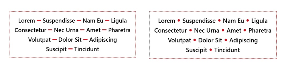
There are many hacky ways to solve this, but the new Gap Decoration feature offers a simple, modern solution. No more hacks and only a few lines of code to get the shape of the divider you want.
GDPR Policy
For years, users and many companies have been complaining about cookie banners. Even though this understandable frustration is mostly caused by misleading dark patterns used by the industry, these banners have become the symbol of what is perceived as excessive EU regulation. As part of the ‘Digital Omnibus’, the European Commission now finally wanted to get rid of cookie banners and replace them with an automated signal. However, Google and some of the very EU Member States that are actually calling on the EU to “simplify” and “cut red tape” – including Germany and France, for example – are now standing in the way. In the Council’s latest position paper of 18 June, the plan to abolish the cookie banner has been scrapped. This baffling outcome is likely to continue to cost European users a great deal of hassle, frustration and billions of clicks per year.

“Dark patterns” and annoyance until the right result. In Europe, users cannot simply be tracked. Both online and offline, there is a fundamental right to data protection – including on Meta’s or Google’s platforms, as well as on websites full of tracking adverts. Companies must therefore ask each individual for their consent – or simply leave them in peace. This is done via so-called cookie banners, whereby consent is not only sought for cookies, but usually also for the sharing of data with often thousands of third-party companies. Users should actually have the option here to consent only if they wish to be tracked online of their own free will. Depending on the study, only around 3–10% of people want this. However, through so-called dark patterns (e.g. hidden ‘No’ buttons or pre-ticked consent boxes), the tracking industry achieves consent rates of up to 90%.
With more than 450 million people in the EU, this farce generates several billion (!) clicks a year, causes frustration and is a complete waste of time for consumers – whilst tech giants and the tracking industry rake in billions in profits through “voluntary” tracking. At the same time, it is becoming increasingly clear that the massive harvesting of personal data also poses risks to security and democracy.
Max Schrems: “Cookie banners are not an invention of data protection, but of the tracking industry. Without consent, there is no snooping online. Now there are fears that a simpler way of saying ‘yes’ or ‘no’ will result in a loss of revenue for Google and the like. That is why the tracking industry is currently lobbying as hard as it can to keep the cookie banner. Clearly, it wants to retain the ability to directly manipulate users’ choices.”
The EU's proposal: an automatic signal. In autumn 2025, the European Commission proposed replacing cookie banners with an automated signal that would communicate cookie consent preferences between the device, the user and websites. Even in California – the home state of most tech companies – a similar solution is already in place. Various proposals adapted to EU law have also been around for some time. The EU proposal is actually significantly less radical than the laws in the US because it still allows for consent to be given on a per-website basis. Specifically, the newly proposed Article 88b GDPR would have provided the solution and was a simple example of how reducing red tape can succeed whilst simultaneously benefiting consumers and fair businesses.
Max Schrems: “Browsers already automatically communicate which language I prefer. It’s just as easy to indicate digitally whether you want to be tracked. Technically, this is straightforward and is even enshrined in law in some US states. There are actually a number of technical solutions that could be introduced tomorrow. Europe is lagging completely behind with these antiquated banners. Absurdly, however, Google and the tracking industry want to make it as difficult as possible for people.”
The “Google Paper” and an avalanche of misinformation. However, a secret lobbying paper from Google has thrown a spanner in the works for the European Commission. Using completely far-fetched figures, it argues that without cookie banners, all online advertising would come to a standstill. Google is exaggerating wildly here and assumes there is a central ‘kill switch’ for all advertising. Yet the European Commission has explicitly made it clear that consent should still be possible on a per-website and per-purpose basis. It would therefore be possible to grant consent to quality media outlets in particular – and to withhold it from Google, Meta and the like. Google conveniently ‘overlooks’ this. Particularly absurd is Google’s argument that quality media outlets would suffer from the abolition of cookie banners. Media outlets are exempt from the provision and would therefore not be affected at all.
Germany, France and others are now in favour of (!) the cookie banner. However absurd and transparent the arguments of the tracking lobby may be, they seem to have had the intended effect. In the proposal for a final vote in the Council, Article 88b was removed entirely from the Digital Omnibus – and with it, the only measure that would actually have simplified things for consumers. Countries such as Germany, France and Poland had demanded this in advance – presumably following massive pressure from the tracking lobby.
Max Schrems: “You really have to let that sink in: the European Commission finally wants to get rid of cookie banners, but Google and some EU Member States are now determined to keep them. For decades, people have been complaining about EU bureaucracy. But in reality, the tracking industry is so terrified of consumers being able to simply say ‘no’ that, after a bit of lobbying, everyone gives in. It really does raise the question of whether some Member States are primarily representing their voters or the lobbyists.”
The European Parliament has not yet taken a position. The ‘Digital Omnibus’ is currently still the subject of parallel negotiations in the Council and the European Parliament, although the latter has not yet made its position on Article 88b known. At the end of the negotiations, the two institutions will then have to reach a compromise. It is therefore essential that the European Parliament now advocates for the retention of Article 88b. However, here too, the conservative EPP is likely to tip the balance, as it is also under pressure from the tracking lobby.
Max Schrems: “In a democracy, what the majority of people want should actually happen – in this case, getting rid of cookie banners. If decision-makers prefer to follow the will of the tech lobby rather than that of their voters, then something is very, very wrong here."
Un énième signal.
Le 13 juin dernier, la société Anthropic, connue pour sa domination du marché de l’intelligence artificielle générative avec les grands modèles de langage (LLM) de la série « Claude », s’est vue contrainte, sur ordre du gouvernement américain dont elle dépend, de couper l’accès à certains de ses services aux ressortissants étrangers.
Le pourquoi importe moins que le geste. Il est ici question de décider arbitrairement de qui a le droit d’utiliser quoi, et selon quels critères. De faire fi de la justice et de la morale.
Super El Niño, que ça vous serve de leçon, l’amour ne se négocie pas, et la guerre des émeus.
Il semblerait que j’ai passé cette semaine à profiter du temps extérieur avant qu’il ne devienne empiriquement infernal : je me suis occupé du jardin avec amour, j’ai chanté (beaucoup), j’ai déambulé et marché, j’ai vu des copain·es. Bref, du temps loin des claviers, c’est pas plus mal non plus 😊️

Tout le monde connaît Wikipédia. Mais connaissez-vous Wikidata ?
Wikidata fait partie de la longue liste de projets gérés par la Fondation Wikimedia, au même titre que Wikipédia, Wikimedia Commons ou Wiktionnaire. Là où Wikipédia stocke de la connaissance sous forme de texte, donc de donnée non structurée, Wikidata fait exactement l'inverse : il stocke et expose des entités liées entre elles. Cela revient à construire un immense graphe de connaissance, dans lequel chaque personne, organisation, lieu ou concept est relié aux autres par des attributs lisibles par une machine.
Wikidata est une base de connaissance libre, collaborative et multilingue. Chaque entité y porte un identifiant unique : un Q pour les éléments (Q42 pour Douglas Adams, par exemple) et un P pour les propriétés (P50 pour l'auteur, P19 pour le lieu de naissance). En assemblant ces briques, on obtient des affirmations du type sujet, prédicat, objet : ce que le monde de la donnée appelle un triplet RDF.

Le volume donne le vertige. Wikidata dépassait déjà 1,5 milliard de triplets sémantiques à la mi-2024 [1]. Et toute cette donnée n'est pas seulement consultable à la main : elle est interrogeable par requête, via un point d'accès SPARQL public [2]. On peut ainsi demander « tous les écrivains français nés à Nantes » et obtenir une réponse exploitable, là où une recherche classique ne renverrait qu'une liste de pages à lire.
#!/usr/bin/env bash
# Liste les écrivains nés à Nantes via le point d'accès SPARQL de Wikidata.
# Dépendances : curl et jq.

ENDPOINT="https://query.wikidata.org/sparql"

# Q5 = être humain, P106 = occupation, Q36180 = écrivain,
# P19 = lieu de naissance, Q12191 = Nantes.
QUERY='SELECT ?ecrivain ?ecrivainLabel WHERE {
  ?ecrivain wdt:P31 wd:Q5 ;
            wdt:P106 wd:Q36180 ;
            wdt:P19 wd:Q12191 .
  SERVICE wikibase:label { bd:serviceParam wikibase:language "fr,en". }
}
ORDER BY ?ecrivainLabel'

# Wikimedia impose un User-Agent descriptif, sous peine de blocage (HTTP 429).
curl -s -G "$ENDPOINT" \
  --data-urlencode "query=$QUERY" \
  -H "Accept: application/sparql-results+json" \
  -H "User-Agent: Geeek-demo/1.0 (https://www.geeek.org)" \
  | jq -r '.results.bindings[].ecrivainLabel.value'
Sur le fond, Wikidata est une base de données orientée graphe, alimentée par des contributeurs et des imports automatisés. Sa logique n'est pas isolée : elle appartient à la même famille que les données structurées que l'on retrouve aujourd'hui sur une majorité de pages Web, ces blocs JSON-LD qui décrivent un article, une FAQ ou une organisation au format Schema.org.
C'est le même esprit, celui du Linked Open Data : décrire le monde de façon explicite pour que les machines le comprennent sans deviner. Quand vous injectez un JSON-LD sur l'une de vos pages, comme je l'ai détaillé dans mon article sur les microdonnées FAQ en JSON-LD, vous appliquez cette logique à l'échelle d'une page. Wikidata l'applique à l'échelle de la connaissance mondiale.
Pour construire un modèle de langage, il faut de la connaissance, et surtout de la connaissance de haute qualité si l'on veut limiter les hallucinations au moment des requêtes. Or la donnée disponible sur Internet est partout : sites de presse, blogs, forums, dépôts de code comme GitHub pour le monde informatique, et bases ouvertes comme Wikipédia pour la connaissance du monde.
Chaque source possède un niveau de fiabilité différent. Un modèle considérera spontanément une fiche Wikipédia comme plus solide qu'un message de forum. Wikidata pousse ce raisonnement un cran plus loin : la donnée y est non seulement fiable, mais déjà structurée et reliée. Pour un LLM, c'est la différence entre lire un paragraphe et consulter une fiche prête à l'emploi.
Trois usages expliquent cet engouement :
Vous comprenez pourquoi cette base pèse lourd dans une stratégie de Generative Engine Optimization (GEO). Être présent et bien décrit dans Wikidata, c'est exister proprement dans l'écosystème qui nourrit l'IA, et cela d'un seul coup pour de nombreux systèmes à la fois.
C'est là que je m'étais trompé. Je pensais au départ que Wikidata était au moins aussi sélectif que Wikipédia, et qu'une « notoriété publique » était indispensable. En réalité, c'est l'inverse : les critères d'admissibilité de Wikidata sont volontairement plus souples [5].
Un élément est accepté dès lors qu'il remplit au moins un de ces trois critères :
La barre est donc plus proche de « existence vérifiable » que de « célébrité ». Deux nuances méritent toutefois d'être posées clairement. D'abord, le critère 2 reste volontairement flou, au point de faire l'objet de discussions de réforme au sein de la communauté [6]. Ensuite, et c'est le point important, l'auto-promotion est explicitement découragée. Créer soi-même son propre élément relève du conflit d'intérêts [7], et un élément sans la moindre source finit supprimé. L'admissibilité large ne signifie pas absence de garde-fous.
Je ne vais pas vous faire la leçon, car je me suis pris ce mur en pleine figure. J'ai tenté de créer ma propre entité Wikidata, ainsi que celle du blog. Quelques jours plus tard, un administrateur (Madamebiblio) a supprimé les deux fiches indiquant que celles-ci ne répondent pas aux exigences de notabilité [5:1].
Avec le recul, le verdict était écrit d'avance, et il illustre exactement les garde-fous décrits plus haut. En créant moi-même ces éléments, je me plaçais d'emblée en situation de conflit d'intérêts, ce que la communauté décourage explicitement. Et mes fiches manquaient de ce qui fait tenir un élément : non pas mes propres profils ou mon propre site, mais des sources indépendantes et des identifiants d'autorité délivrés par des tiers. Un ORCID que l'on remplit soi-même ne prouve rien aux yeux d'un administrateur. Une notice BnF ou VIAF, générée parce qu'une bibliothèque a catalogué un ouvrage publié, pèse infiniment plus lourd. La leçon est claire : sur Wikidata, on ne décrète pas sa propre notoriété, on la laisse se constater par des traces externes que l'on ne contrôle pas.
Wikidata est sans doute l'un des projets les plus sous-estimés de la galaxie Wikimedia. Invisible pour le grand public, il est pourtant devenu une couche d'infrastructure essentielle : il structure la connaissance, alimente les moteurs de recherche et nourrit les modèles de langage. Pour quiconque travaille la visibilité de ses contenus à l'ère de l'IA, comprendre Wikidata n'est plus une curiosité d'érudit, c'est un sujet de fond.
Ce sujet vous intéresse ? N'hésitez pas à passer sur le serveur Discord Geeek.
Estimation de mi-2024, en croissance constante depuis. Les compteurs à jour (nombre d'éléments et de triplets) figurent sur la page Wikidata:Statistics. ↩︎
Point d'accès SPARQL public de Wikidata : https://query.wikidata.org ↩︎
Google a fermé Freebase, qui alimentait historiquement son Knowledge Graph, et en a migré les données vers Wikidata à partir de 2015. Voir Thomas Pellissier Tanon et al., « From Freebase to Wikidata: The Great Migration », WWW 2016, ainsi que la fiche Freebase : https://en.wikipedia.org/wiki/Freebase_(database) ↩︎
Wikidata est régulièrement citée parmi les bases ouvertes réutilisées pour entraîner ou ancrer les modèles. La composition précise des corpus d'entraînement reste cependant rarement documentée publiquement par les laboratoires. ↩︎
Politique de notoriété de Wikidata : https://www.wikidata.org/wiki/Wikidata:Notability ↩︎ ↩︎
L'interprétation du critère 2 fait l'objet de discussions au sein de la communauté. Voir Wikidata:Requests for comment/Notability policy reform (https://www.wikidata.org/wiki/Wikidata:Requests_for_comment/Notability_policy_reform) et la refonte de 2015, Notability overhaul (https://www.wikidata.org/wiki/Wikidata:Requests_for_comment/Wikidata:Notability_overhaul). ↩︎
La politique précise que créer un élément sur soi-même, ses proches ou son entreprise n'est pas autorisé, afin d'éviter tout conflit d'intérêts. Voir Wikidata:Requests for comment/Conflict of Interest : https://www.wikidata.org/wiki/Wikidata:Requests_for_comment/Conflict_of_Interest ↩︎
After the investigation of nostalgia, I felt that I was close to identifying the concept that I was looking for. It had to be a concept that embraced an em-placed, chronic, and painful emotion in the face of negatively experienced environmental change, and I did not want to simply add “eco” in front of some existing form of distress. With the help of Jill Albrecht, I explored the pairings of words with the algia, pain or distress, that was at the heart of this issue. Two concepts seemed to me to be very close to what I was searching for: solace and desolation.
Earth Emotions (New Words for a New World), Glenn A. Albrecht
Je pense qu’il faut inventer de nouveaux mots décrivant de nouvelles émotions. Je suis allé lire Glenn A. Albrecht à la source pour découvrir le processus de définition de solastalgia
et ceci est ma contribution, une tentative de description d’un monde qui évolue. Une partie de mon monde qui m’a fait évoluer et rencontrer des personnes ces dernières décennies.
Digitalgia donc, comme la souffrance ressentie lorsqu’on passe d’un univers numérique de la création à celui de l’oppression. Et des sentiments de peur et d’incapacité à inverser la tendance associés à cette évolution. Le trainSUV du progrès est en marche et le vélo de la raison est à la traîne. Le capitalisme est venu grignoter un espace d’expressions et d’échanges, morceau par morceau, pour ne laisser qu’un panoptique optimisant la consommation, la croissance et incitant à brûler la dernière goutte d’hydrocarbure disponible. Pour les personnes qui ont été les témoins de la création de ces espaces numériques, la peine peut s’apparenter à une forme de deuil et se traduire par un comportement dépressif.
Il y a aussi la tristesse de savoir que les nouvelles générations sont dans l’incapacité de penser qu’un tel environnement ait pu être possible à un moment donné compte-tenu de ce qui leur est proposé aujourd’hui. Au même titre que je ne peux penser une forêt plus vivante que celle dans laquelle j’évolue aujourd’hui, ou des mers moins dévastées que celles de mon enfance. Le mythe est puissant mais n’incite pas à la même frustration, au même passage à l’action, car le sentiment de perte est alors différent.
Note : je ne pense pas qu’il soit pertinent de traduire ce terme en « digitalgie » comme cela a pu être le cas avec « solastalgie » car la terminaison en IA me semble être d’autant plus pertinente dans ce contexte…
I define “solastalgia” as the pain or distress caused by the ongoing loss of solace and the sense of desolation connected to the present state of one’s home and territory. It is the existential and lived experience of negative environmental change, manifest as an attack on one’s sense of place. It is characteristically a chronic condition, tied to the gradual erosion of identity created by the sense of belonging to a particular loved place and a feeling of distress, or psychological desolation, about its unwanted transformation. In direct contrast to the dislocated spatial dimensions of traditionally defined nostalgia, solastalgia is the homesickness you have when you are still located within your home environment.
Ibid.
Arilin Thorferra
https://giants-club.net/articles/just-use-mastodon/
Who could have predicted Bluesky could ever have run that risk? I mean, apart from everyone warning us that it was launched by weirdo alt-right blockchain-shilling AI-loving shitbird Jack Dorsey, and that their current CEO came from a weirdo alt-right blockchain-shilling AI-loving shitbird background. You know. Besides them.
Voici les raisons qui font que je n’utilise et probablement n’utiliserai pas à l’avenir les IA Génératives.
Je fais une distinction avec le terme général IA car toutes les IA n’ont pas l’impact catastrophique des IA Génératives.
Using SEO (search engine optimization) to justify accessibility was only ever a technique for bosses or clients or stakeholders who see accessibility as a cost center and are typically driven more by dashboards or money. Ideally, you want to get past that ASAP to drive better outcomes for humans, not SERPs (search engine results pages). I get it as a foot-in-the-door tactic — hopefully it goes no further.
But SEO also drove bad accessibility practices, such as alt text keyword stuffing, low-contrast text, verbose headings, link text built around keywords, gratuitous landing pages, and more. Karl does a good job of demonstrating how little SEO and accessibility are connected. As such, I’ve always been wary of companies pitching accessibility and SEO in their marketing.
Now I see companies pitching accessible & “AI-ready” or “agent friendly” work, often still including SEO. I’m calling foul.

We’ve already seen anti-user guidance from LLM companies asking for their notion of accessible sites. Never mind that these PhD-level genius LLM tools can’t handle a general site most kids navigate with ease. Let’s ignore the failure of that technology and instead start slapping misunderstood ARIA attributes on all our pages instead.
Sure, there’s overlap between SEO and LLM-thieving. SEO and accessibility even have slight overlap. But accessibility is about people. Twisting a human affordance to feed these corporate efforts to make humans redundant (among all the other harms) is a signal. Different people will read that signal in different ways. If it sells work and you still focus on humans first, cool.
But to me that signal says you aren’t serious about the work. That your TESCREAL patch is just waiting to get sewn on. I’m trying to be less absolutist, less black-and-white. But boy is it hard given what I see every time I peel back the veneer.
I made a thing (based on an old experiment) to better illustrate where I see the overlaps.
See the Pen Accessibility + SEO + AEO by Adrian Roselli (@aardrian) on CodePen.
Comme chaque lundi, un coup d’œil dans le rétroviseur pour découvrir les informations que vous avez peut-être ratées la semaine dernière.
Tous les liens listés ci-dessous sont a priori accessibles librement. Si ce n’est pas le cas, pensez à activer votre bloqueur de javascript favori ou à passer en “mode lecture” (Firefox) ;-)
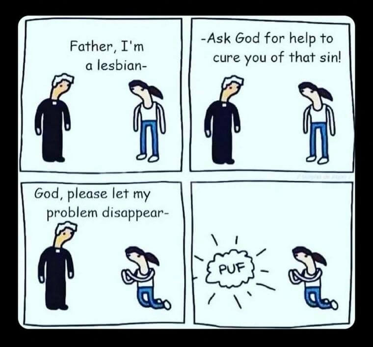
Au Ghana, aux États-Unis ou en Turquie, les droits des personnes LGBTQI+ sont attaqués. Ces offensives sont d’autant plus visibles en ce mois où les marches des fiertés, ou prides, ont lieu aux quatre coins du monde.
Le continent européen se réchauffe bien plus vite que n’importe quel autre, alerte l’OMS. Un phénomène dont les répercussions sont d’ores et déjà visibles, alors que les décès prématurés dus à des vagues de canicules se multiplient en Italie, Espagne ou encore en Grèce.
Cela fait 1 566 jours aujourd’hui depuis que l’armée russe à lancée une guerre à grande échelle contre l’Ukraine, en février 2022. Lorsqu’on prend en compte l’annexion de la Crimée en 2014, cela fait 4 492 jours que l’Ukraine subit l’agression russe – deux fois plus que la Seconde Guerre mondiale.
Depuis une vingtaine d’années, de nombreux pays africains ont adopté des technologies biométriques pour enregistrer ou identifier les électeurices, avec la promesse récurrente de réduire certaines fraudes et d’améliorer la qualité des scrutins.
l’est de la RDC constitue un terrain propice à ce type de contagion : la déforestation causée par l’exploitation minière pousse les animaux contaminés vers les villes, tandis que les nombreux conflits armés parquent les réfugiés dans des camps propices à la propagation des virus.
The EU’s biometric-based Entry-Exit System (EES) may continue to cause long queues at borders for another two years, a Frontex official has said. At the same time, the travel industry warns that queues could divert holidaymakers to other destinations, causing EU countries to potentially lose billions in visitor spending.
Les élections du 17 mai dernier au Parlement d’Andalousie, qui décident de la composition du gouvernement régional, ont constitué une surprise pour certain·es et un choc pour le système des partis andalous, qui pourrait avoir des répercussions possibles à l’échelle de l’État espagnol. Le catalyseur de ce basculement est le résultat obtenu par Adelante Andalucía (AA), une coalition de la gauche radicale
il nous semble essentiel d’affirmer que l’immigration est un fait positif, que nous sommes en capacité d’accueillir plus de monde et que nous devons le faire. Ce qu’il se passe en Espagne actuellement montre que ce projet est possible et qu’il est porté par toute une partie de la société civile.
« Nous ne pouvons pas croire en Jésus et promouvoir la guerre », a déclaré le Pape depuis la Sagrada Familia de Barcelone.
In recent days you will have read various articles announcing the arrival of Euro-Office, which is being “marketed” as the first open-source office suite developed in Europe. We feel compelled — reluctantly, since open source should rest on transparency, not deception — to correct this claim. The first open-source office suite developed in Europe was OpenOffice.org in 2001, based on StarOffice’s source code, followed by LibreOffice from 2010.
The EU has told Meta that it must allow AI chatbots operated by rival firms to use WhatsApp for free.
Ce bond financier en avant est dû à l’introduction en Bourse de SpaceX ce vendredi, qui réalise un départ fracassant.

As Congress advances anti-LGBTQ+ legislation and states expand restrictions on queer and trans visibility, PEN America experts warn the tactics increasingly resemble those used by modern authoritarian governments.
Plusieurs collectifs et assemblées comptent bien perturber l’inauguration de ce “Mondial de la dépossession et de la guerre” et dont 13 matchs se joueront au Mexique. Autour de l’Assemblée “antimundialista”, des collectifs de proches de disparus et de la grève des enseignants, les mots d’ordre convergent comme les cortèges ont prévu de le faire en direction du stade Azteca.
À Los Angeles, capitale états-unienne du “soccer”, les tarifs ont découragé jusqu’aux plus passionnés, tandis qu’une possible intervention de la police de l’immigration effraie les quartiers latinos.
Le peintre anglais était l’un des derniers survivants du pop art. Des toiles les plus intimes aux tableaux les plus militants, retour en images sur les chefs-d’œuvre d’un travailleur acharné.
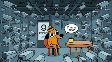
Depuis que Peter Thiel, le fondateur de Palantir, a déménagé à Buenos Aires, le président paléolibertarien travaille à faire du pays la capitale mondiale du techno-libertarianisme.
“On les lance et on sait que tout sera mort. Tout ce qui sera trouvé dans cette zone sera mort”, confie le fabricant qui a fourni la technologie.
It isn’t the only startup tackling physical AI, but it’s one of the best-funded.
The move comes after Anthropic’s receipt of a US Commerce Department directive Friday evening, subjecting the new models to export controls restricting their use anywhere outside the United States.
OpenAI is preparing the biggest overhaul of ChatGPT since its launch kicked off the AI boom, as the $850 billion group hunts for new engines of growth ahead of a planned listing this year.The company intends to transform the chatbot into a “superapp” that combines coding tools and AI agents, adding products that executives believe will generate more revenue.
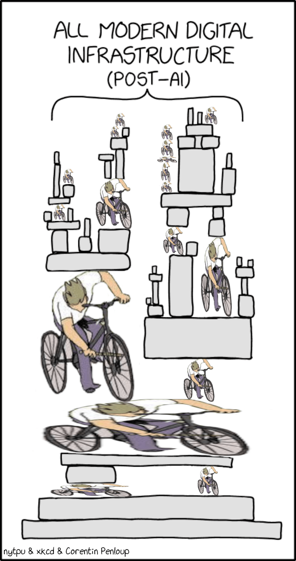
“A facial recognition algorithm flagged Robert Dillon as the man who tried to lure or entice a child under twelve years old at a Jacksonville Beach McDonald’s. It was wrong. Mr. Dillon […] had never set foot in Jacksonville Beach. But rather than test the machine’s answer against the evidence that would have cleared him, the officers built a case to confirm it.”
An AI agent tried to join the DN42 hobbyist network to perform a network scan, and bankrupted its operator with a $6531.30 AWS bill, to the extent that they are begging for donations from the DN42 community.
Google AI Overview court loss in Germany could spell doom for AI search industry.
Voir aussi Un tribunal allemand déclare Google responsable des réponses fausses de son AI Overview (next.ink)
Forecasts of run-of-the-mill weather conditions have a lot of practical value, but there is life-or-death value in an accurate forecast of extreme weather conditions. The more extreme, the more true that is. But just as a bird-identifying algorithm can’t identify a bird it wasn’t shown during training, AI-based weather models can fail at predicting extreme weather that wasn’t in their training dataset.
As ‘tokenmaxxing’ dies out, Silicon Valley is having second thoughts.

The US military struck Iran again after an Iranian drone’s lucky midair strike.
On the evening of June 7, multiple missiles were fired from various parts of Iran toward Israel. Following tensions that had emerged among Tehran, Washington, and Tel Aviv in the days following the April 8 ceasefire, Tehran finally struck parts of northern Israel, including Haifa, in response to the Israeli military’s actions in the Lebanese city of Beirut.
Pushing to seize 70 percent of Gaza’s territory, the Israeli army is opening fire at Palestinian civilians caught off guard by the ever-expanding ‘Yellow Line.’
The seven-month-old, Sam Fahd Abu Haikal, was in his mother’s arms when soldiers fired on family in Hebron

Elle disposait pourtant de tous les documents requis : visa en règle, accréditation presse et contrat officiel avec RFI. Elle couvre le conflit israélo-palestinien depuis six ans, depuis Jérusalem et Ramallah.
Une approche qui pourrait expliquer les limites des traitements actuels et aider à améliorer la manière dont cette pathologie est diagnostiquée, prise en charge et perçue dans la société.
Le 5 juillet 2023, le conseil régional Île-de-France présidé par Valérie Pécresse avait rebaptisé le lycée de Saint-Denis du nom de Rosa-Parks, jugeant la figure de la militante américaine « trop conflictuelle ». Ce 9 juin, le tribunal administratif de Montreuil a annulé cette décision pour vice de procédure.
Après la revendication d’un cybercriminel sur le piratage de Tchap, la messagerie instantanée de l’Etat, la Dinum et l’Anssi confirment la compromission de l’outil via l’usurpation d’un compte. Une enquête est en cours pour connaître le périmètre de l’incident.
Pour la première fois, tous les élèves de première planchent sur les maths ce vendredi. Pour les syndicats, cette épreuve anticipée a été conçue avant tout pour Parcoursup.
Sur la presqu’île de Crozon, dans le Finistère, le collectif Skoazell vient en aide aux femmes victimes de violences sexuelles. L’initiative est née du courage d’habitantes qui ont osé parlé. Le réseau apporte une aide logistique et morale.
Entretien avec Johanna-Soraya Benamrouche et Laure Salmona, cofondatrices de l’association Féministes contre le cyberharcèlement.
Pendant des années, le docteur nantais Traverson a abusé de son autorité de médecin. Poursuivi pour des palpations des seins non justifiées sur une soixantaine de victimes, dont des mineures, il a été reconnu coupable en décembre 2025. […] L’enquête judiciaire aurait pu commencer plus tôt. En 2021, une première plainte est déjà déposée, pour une jeune fille de 11 ans à l’époque. Dans le cadre d’une hospitalisation psychiatrique, elle révèle que le docteur Traverson lui a touché le pubis. La plainte est toutefois classée sans suite.
Après le meurtre, fin mai, d’une enfant de 11 ans dans le Gers, le casier vierge du principal suspect, malgré des plaintes pour violences sexuelles sur mineure depuis 2017, provoque un débat sur les causes des dysfonctionnements de la justice et de la police dans ce type d’affaires.
un organisme de référence dans la lutte contre la pédocriminalité internationale avait fait remonter en France plusieurs signalements sur Jérôme Barella.
L’affaire Lyhanna met en lumière les limites d’une conception viriliste du pouvoir incarnée par le ministre de la Justice. Quand les violences sexuelles s’imposent au débat public, la posture de l’« homme fort » apparaît moins comme une solution que comme une partie du problème.
Voir aussi Affaire Lyhanna : le pire de la politique (politis.fr)
Face à la tragédie, Gérald Darmanin et Emmanuel Macron se sont empressés d’accabler les magistrats pour mieux échapper à la remise en cause de leur politique.
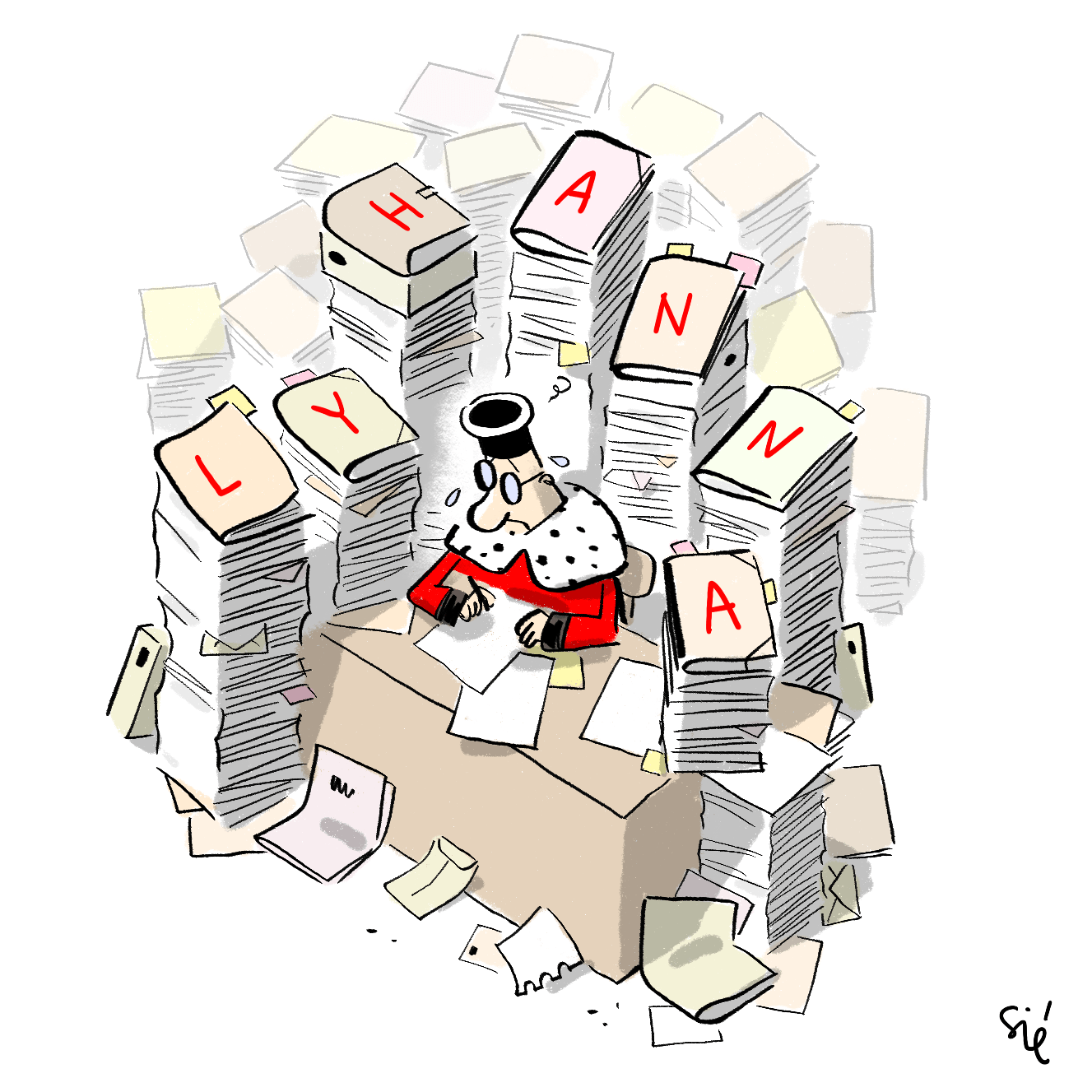
Et Lyhanna : une justice empêchée par les choix de Gérald Darmanin (blast-info.fr)
Le procureur de la République a requis l’ouverture d’une information judiciaire à son encontre et sa mise en examen pour des faits de viols, de tentatives de viols, d’agressions sexuelles et de harcèlement sexuel concernant neuf victimes commis entre 2010 et 2019.
Ces accusations révélées par « Mediapart » s’ajoutent aux nombreuses autres qui visent le chanteur de 67 ans, déjà mis en examen dans quatre affaires de violences sexuelles.
Notre média et maison d’édition sont attaqués en justice par une multinationale via une procédure bâillon. Cette multinationale se nomme Pierre Fabre, l’entreprise derrière la polémique A69.
Il y a une constante dans la politique pénale française depuis le milieu des années 1990 : chaque décennie produit sa figure de l’ennemi absolu, et chaque loi d’exception laisse des dispositifs qui, une fois installés, ne disparaissent jamais. Prendre la protection des enfants au sérieux, c’est exiger que les budgets publics aillent vers ce qui crée une réduction effective des violences, pas vers ce qui rassure à court terme et laisse les structures intactes.

Après un rejet en commission des Lois à l’Assemblée, le ministre de la Justice a annoncé retirer de son texte le dispositif de « plaider-coupable » très décrié.
Voir aussi PJL SURE : volte-face de Darmanin sur le plaider-coupable criminel (projetarcadie.com)
À un an de l’élection présidentielle, le rapport du Conseil d’orientation des retraites est plus scruté que jamais. Au risque de faire l’objet d’une récupération pour pousser à un nouveau décalage de l’âge de départ à la retraite à plus de 67 ans.
« Pensées émues pour tous les pédocriminels qui n’ont jamais passé une nuit en garde à vue », a ironisé Andréa Bescond sur Instagram [qui] avait appelé à se rassembler place Vendôme pour dénoncer les dysfonctionnements de la justice dans les affaires d’agressions sexuelles sur mineur·e après le meurtre de la petite Lyhanna
Le retentissement médiatique d’un crime, quand son auteur est perçu comme issu de l’immigration, suscite chez les Français d’origine étrangère un réflexe silencieux : la crainte que la faute d’un seul rejaillisse sur tous.
« Carcassonne est un laboratoire pour l’extrême droite, pour savoir jusqu’où elle peut détruire les libertés syndicales et d’expression »
La Cour de cassation a reconnu l’intention d’homicide du policier qui a tué Nahel Merzouk. Le 27 juin 2023, le jeune de 17 ans, était tué d’une balle tirée à bout portant lors d’un contrôle de son véhicule à Nanterre.
Face aux restructurations permanentes liées à l’ouverture à la concurrence, et au mal-être au travail qui s’installe, avec treize suicides depuis le début de l’année, la grève à la SNCF du 10 juin a été très suivie.
Cette prise de parole est intervenue après l’interruption de la cérémonie par quelques étudiants portant des masques du patron de TotalEnergies, Patrick Pouyanné, et de celui de LVMH, Bernard Arnault, diplômés de l’X, pour dénoncer les partenariats avec les entreprises privées.
René Mayrhofer […] vient de démissionner de Google pour une raison qui vous concerne directement : l’entreprise a signé un accord autorisant le Pentagone à utiliser son IA pour des opérations classifiées, et l’homme qui sécurisait votre smartphone estime que ces outils seront “probablement utilisés contre” les citoyen·nes européen·nes.
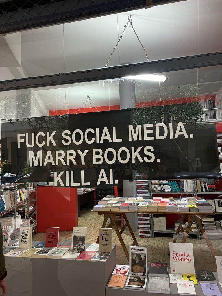
Alors qu’Amazon a préféré quitter le Québec plutôt que de signer une convention collective, sur les sites français du géant du Web, les syndicalistes dénoncent des sanctions prises à leur encontre et une culture d’entreprise qui entrave leur activité.
One day after WIRED revealed that Meta had quietly embedded an unreleased face-recognition system into an app installed on more than 50 million phones, the company removed it
Voir aussi Lunettes Meta : l’intégration de la reconnaissance faciale est discrètement en cours (next.ink)
Après une attaque au couteau à Belfast, le propriétaire de X avait appelé ses abonnés à protester et reposté des messages de leaders d’extrême droite, amplifiant selon des chercheurs des récits anti-migrants auprès de millions d’utilisateurs.
Les véhicules d’aujourd’hui savent où nous habitons, combien nous pesons et ce que nous avons mangé au dîner. Voici ce qu’il advient de toutes ces informations, et comment vous pouvez réduire le flux de données.
De 1960 à 1966, avant et après l’indépendance de l’Algérie, l’État français a expérimenté au Sahara dit algérien dix-sept bombes atomiques et autres essais chimiques. Ce sujet a longtemps été tabou en France, dans la presse, dans les discours politiques aussi bien que dans le cadre académique où enquêtes, témoignages, littérature et recherches sur ce thème ont été invisibilisés.
En agitant le spectre de la faillite de la répartition, les cercles libéraux et le Rassemblement national préparent le terrain pour les fonds de pension privés, au détriment des salariés les plus modestes. Pourtant, des propositions alternatives et réellement sociales existent.
In a 1990 interview, Steve Jobs famously stated that personal computers were “a bicycle for the mind” […] I sit in front of a Mac all day and that’s not how it feels […] That’s not a bicycle. It’s an SUV for the mind.[…] just about any “obsolete” or “underpowered” laptop can be enough once freed from the burden of always-on connectivity. It’s cheap. It’s available. You probably already have one.
Tests reveal that when people are ambling about, they have a natural tendency to turn to the left and walk in an anticlockwise direction.
We tend to view ourselves and the complex cells that build us as a distinct branch of the tree of life from the compact, seemingly featureless cells of bacteria and archaea. But we’ve found that our genome is actually a hybrid, a mish-mash of genes from bacteria and archaea, along with some that have evolved in our own lineage.
Hidden underground around the world lie 110 quadrillion kilometers of arbuscular mycorrhizal fungal networks—webs of ultra-thin threads that, if connected in a single line, would stretch almost a billion times the distance between the Earth and the sun

Retrouvez les revues de web précédentes dans la catégorie Libre Veille du Framablog.
Les articles, commentaires et autres images qui composent ces « Khrys’presso » n’engagent que moi (Khrys).
Pour rappel <dialog> permet de créer des boîtes de dialogue (modales, popups, popins, elles ont tant de noms) en HTML sans plus avoir à tout gérer en CSS+JavaScript pour positionner un élément <div> en absolu.
Et on a aussi connu cela : une popin qui se ferme quand on appuie sur echap alors qu'on voulait forcer l'utilisateur à valider un formulaire, ou à l'inverse une modale qu'on ne peut fermer qu'avec un bouton alors qu'un clic en dehors serait tellement plus naturel. Jusqu'ici, la solution consistait à empiler du JavaScript pour gérer ça à la main.
Désormais, un simple attribut HTML suffit.
Mentionné par Una Kravets et Bramus Van Damme à la Google I/O 2026.
L'attribut closedby s'ajoute directement sur l'élément <dialog> et accepte trois valeurs :
any — le dialogue se ferme via la touche Échap, un geste natif (retour arrière sur mobile), ou un clic en dehors (correspond à ce qu'on appelle un light dismiss).closerequest — fermeture via la touche Echap ou geste natif uniquement, pas de clic en dehors. C'est le comportement par défaut d'une modale ouverte avec showModal().none — fermeture uniquement via code (bouton, soumission de formulaire…), aucune alternative native.Exemples rapides :
<!-- On peut cliquer à côté pour fermer -->
<dialog closedby="any">
  <p>Aperçu rapide, fermable au moindre clic extérieur.</p>
  <button onclick="this.closest('dialog').close()">Fermer</button>
</dialog>
<!-- Aucune fermeture "accidentelle" possible -->
<dialog closedby="none">
  <p>Formulaire critique. On ne vous laisse pas esquiver comme ça.</p>
  <button onclick="this.closest('dialog').close()">Valider et fermer</button>
</dialog>
closedby ?Si l'attribut est absent ou invalide, le navigateur applique un comportement automatique :
- showModal() → se comporte comme closedby="closerequest" (Echap fonctionne).
- show() ou attribut open → se comporte comme closedby="none" (rien ne ferme sans code).
Autrement dit, rien ne change pour vos éléments existants. Ouf la rétrocompatibilité.
À ce jour, le support atteint environ 70 % de couverture globale d'après Caniuse ce qui est encourageant mais insuffisant pour un usage en production sans y réfléchir.
| Navigateur | Support |
|---|---|
| Chrome / Edge | ✅ depuis la version 134 |
| Firefox | ✅ depuis la version 141 |
| Opera | ✅ depuis la version 119 |
| Safari (macOS & iOS) | ❌ pas encore supporté |
🐌 Safari reste en retrait... et tant que ce n'est pas supporté un fallback JavaScript pour le light dismiss peut faire l'affaire :
// Fallback pour les navigateurs sans closedby="any"
document.querySelectorAll('dialog[closedby="any"]').forEach((dialog) => {
  document.addEventListener('click', (e) => {
    if (dialog.open && !e.composedPath().includes(dialog)) {
      dialog.close();
    }
  });
});
L'attribut closedby agit uniquement sur la fermeture, il ne modifie pas la sémantique de l'élément. Les bonnes pratiques habituelles restent donc :
closedby="any" : le clic en dehors ferme la boîte de dialogue, vérifiez que ce comportement est prévisible pour les utilisateurs de lecteurs d'écran. Un clic accidentel à côté d'un formulaire partiellement rempli peut surprendre. Réservez cette valeur aux interactions légères et non critiques (petites popups d'information ou de prévisualiation).closedby="none" : si l'utilisateur ne peut pas fermer via la touche Échap ni en cliquant en dehors, il doit impérativement y avoir un bouton de fermeture, accessible au clavier et aux technologies d'assistance.aria-labelledby (pointant vers le titre) et éventuellement aria-describedby pour les descriptions. L'élément <dialog> expose déjà le bon rôle ARIA, mais sans nom accessible les lecteurs d'écran annoncent une boîte de dialogue anonyme.Hi, just me heading off some bad advice I’m starting to see in developer venues.

The proposed Document Outline Algorithm, where headings would automatically reset themselves to the appropriate level based on their position in the DOM structure, was never part of a final HTML specification. It was quickly proven to be unworkable; brief support in JAWS demonstrated that. You can read the tortured history (and a JAWS support demo) in my 2016 post There Is No Document Outline Algorithm.
In 2019 WHATWG worked to resurrect <hgroup>, partly in a novel effort to try to resurrect the Document Outline Algorithm. In the end, even that effort was futile. <hgroup> came back, but it came back as a grouping element only. The only impact it has on heading structures is that browser could, if they really wanted, ignore other headings in the same <hgroup>.
In 2020, Steve Faulkner wrote about the doc-subtitle role, from the Digital Publishing WAI-ARIA Module 1.0, as a way to handle subtitles until <hgroup> found its new footing. Sadly, a cadre of authors thought that role could be the basis for the Document Outline Algorithm.
Authors very much want to make the browser decide heading levels for them. Authors also very much continue to write content and HTML structures that make that impossible.
So I wasn’t surprised when Firefox’s recent announcement of headingoffset support coming to Firefox behind a flag resulted in many cheering the “return” (irony quotes) of the Document Outline Algorithm.
But it isn’t.
headingoffset
The headingoffset attribute lets authors offset heading levels for descendants of a given node.
So if you have, say a dialog that starts at <h2>, you could add headingoffset="2" and then let it pull in (server-side or via your preferred user-slowing front-end tooling) another page that uses <h1> as its first heading, you can be comfortable knowing that <h1> will be treated as <h3> in the accessibility tree.
This can be handy for content re-use without authors needing to make every heading a variable or burning down the DOM each time to forcibly re-write them.
But it’s still the author’s job to make an intentional and good decision. The browser will know nothing more about your content or structure than it did before. And it certainly doesn’t reduce WCAG risk.
Other useful nuggets:
headingoffset values must be valid non-negative integers.headingoffset values must be between 0 and 8.headingoffset values greater than 8 are specified to max at level 9, but existing bugs may impact that.headingoffset values should fall back to level 2, but again, bugs and implementation decisions wil impact that.headingreset is a boolean attribute that tells browsers to ignore headingoffset for that node and its descendants.headingoffset until you can confirm support for the computed heading level in your target audience browser.headingoffset is not the (nor any) Document Outline Algorithm, nor does it replicate it.headingoffset requires the author to make decisions based on content.headingoffset will resolve your heading level problems in a hands-off way with imported or user-generated content, you may end up creating confusion and WCAG risk.headingoffset to try to recreate the Document Outline Algorithm.Not a ton of detail in this post, but at 500 words if you want more then here are some resources beyond what I linked:
Suite au lancement de l’association a11y France en avril 2025, nous avons désormais un site web dédié : https://a11yfrance.org.
A11Y France, association de loi 1901, fédère les personnes professionnelles de l’accessibilité numérique et les personnes concernées pour un numérique véritablement accessible à toutes et tous.
L’association a été cofondée par Ideance, Temesis, Tanaguru, l’Association Valentin Haüy et la Fédération des Aveugles et Amblyopes de France. Elle compte actuellement plus de 40 membres actifs (liste à venir prochainement).