Trois commandes « Ajouter au panier ». Même apparence, même texte, même script. Playwright MCP peut cliquer chacune d’elles, et les trois clics ajoutent bien un article. Au clavier, Tab en ignore deux.
Le cas trompeur est celui du div auquel on a ajouté role="button" : il apparaît comme le bouton HTML natif dans l’instantané transmis par MCP, sans en avoir le comportement. Après une seule retouche de couleur sur le décor, le score Lighthouse d’accessibilité atteint même 100/100 sur les trois pages. La barrière clavier reste intacte.
Trois versions, deux Tab
La démonstration isole trois variantes sur trois pages. Seule la commande « Ajouter au panier » change ; le reste est commun.
<!-- A : div cliquable -->
<div class="command" id="command">Ajouter au panier</div>

<!-- B : div cliquable avec un rôle -->
<div class="command" id="command" role="button">Ajouter au panier</div>

<!-- C : bouton HTML natif -->
<button class="command" id="command" type="button">Ajouter au panier</button>
Les identifiants appartiennent à des documents séparés. Le même gestionnaire click incrémente le compteur dans les trois variantes. Les deux div sont volontairement incomplets : aucun gestionnaire clavier ne les complète.
Ouvrez une variante dans un nouvel onglet, puis utilisez Tab depuis le début du document. Le premier arrêt est le lien « Voir le produit ». Le deuxième donne le résultat de l’expérience :
| Variante |
Focus après deux Tab |
Ajout au clavier |
A — div |
Vider le panier |
Ignorée |
B — div avec rôle de bouton |
Vider le panier |
Ignorée |
C — button |
Ajouter au panier |
+1 avec Entrée, +1 avec Espace¹ |
Chaque touche est essayée dans une page neuve, avec un compteur à zéro.
Sur A et B, on passe directement du lien au bouton de remise à zéro. L’action d’ajout existe au clic, mais le parcours de tabulation ne la dessert pas.
Sur Mac : vérifiez les réglages avant de comparer. La navigation au clavier de macOS et l’option de Safari permettant de parcourir chaque élément avec Tab influencent les arrêts. Apple détaille ces réglages et Option + Tab dans son guide Safari. Si le bouton natif est lui aussi ignoré, commencez par ces réglages. Nos mesures utilisent Chrome.
Ce que Playwright MCP transmet
Playwright MCP expose des outils de navigateur à un agent. browser_snapshot décrit la page ; browser_click agit sur un élément désigné par une référence de cette description.
Dans des sessions isolées, nous avons appelé ces outils sur chaque variante. Les deux versions MCP testées donnent les mêmes lignes pour l’ajout au panier :
# A — div
- generic [ref=e14] [cursor=pointer]: Ajouter au panier

# B — div role="button"
- button "Ajouter au panier" [ref=e14] [cursor=pointer]

# C — button
- button "Ajouter au panier" [ref=e14] [cursor=pointer]
La référence e14 est locale à chaque instantané. Transmise à browser_click, elle permet de faire passer le compteur de 0 à 1 dans les trois cas.
Pour B et C, le bloc YAML complet avant interaction est identique, ligne pour ligne, dans les deux versions testées. Rien n’y distingue leur accès par Tab. A dispose aussi d’une référence utilisable, malgré l’absence de rôle de bouton.
Un agent équipé de MCP dispose donc ici d’un moyen de cliquer une commande absente du parcours clavier. Notre script a sélectionné la cible ; nous n’avons pas mesuré la décision d’un agent autonome.
Le petit indice CSS
L’annotation [cursor=pointer] vient du style commun :
.command {
  cursor: pointer;
}
Dans une copie, on surcharge uniquement cette propriété par cursor: default. Les trois annotations disparaissent. A conserve sa référence :
- generic [ref=e14]: Ajouter au panier
Les trois clics MCP fonctionnent encore. Le pointeur enrichit cette représentation sans conditionner, dans ces essais, la présence d’une référence ou le succès du clic. Il n’ajoute aucun arrêt de tabulation.
Le YAML mêle sémantique et indices de présentation. Aucun de ces indices n’établit, à lui seul, que la commande est atteignable par Tab.
Pourquoi cette distinction compte pour les agents
La FAQ d’OpenAI pour Atlas recommande des rôles, libellés et états descriptifs sur les éléments interactifs, en renvoyant aux bonnes pratiques WAI-ARIA. Adrian Roselli a critiqué cette recommandation, notamment le risque d’ajouts redondants ou erronés et de détournement des attributs à des fins de référencement.
Notre comparaison illustre un risque précis : enrichir la description d’un contrôle peut laisser son défaut d’accès intact. L’ajout du rôle n’a pas créé la barrière clavier ; il ne l’a pas corrigée. Ces essais ne permettent pas de déduire la représentation qu’utilise Atlas.
Lighthouse : trois bons scores, la même barrière
Nous avons ensuite lancé Lighthouse sur les mêmes pages. Sa catégorie expérimentale « Agentic Browsing » comprend notamment un audit intitulé Accessibility tree is well-formed. Il réussit pour les trois variantes.
Le score Lighthouse d’accessibilité demande une précision : dans les fichiers d’origine, Lighthouse signale le contraste du mot « NOTES » dessiné sur le carnet. On conserve ces résultats, puis on crée une seconde copie où seule la couleur de fond du carnet change, de #687b40 à #647640. Le balisage des boutons et leur script restent identiques.
Scores Lighthouse d’accessibilité :
| Variante |
Score initial |
Après correction du contraste |
A — div cliquable |
95/100 |
100/100 |
B — div avec rôle |
96/100 |
100/100 |
C — button natif |
95/100 |
100/100 |
Les tests clavier échouent toujours sur A et B après ce changement de couleur. On peut donc obtenir ici un score Lighthouse d’accessibilité de 100/100 tout en laissant l’action principale hors du parcours de tabulation.
Pourquoi B dépasse-t-il même C ? Le rôle explicite rend quatre audits ARIA supplémentaires applicables et réussis. Leur poids réduit la part du même échec de contraste dans la moyenne : après arrondi, 96 au lieu de 95. Les rapports et le calcul détaillé permettent de vérifier cet effet, sans amélioration du parcours clavier.
Google documente cette limite : le score Lighthouse d’accessibilité agrège des audits automatisés, tandis que la vérification de la prise de focus des contrôles interactifs fait partie des contrôles manuels.
L’audit destiné aux agents filtre lui aussi une sélection de règles, visibles dans le code de Lighthouse 13.5.0. Dans nos six rapports, les deux audits applicables d’Agentic Browsing réussissent : arbre d’accessibilité et stabilité de mise en page. Les cinq autres sont non applicables. Ce périmètre ne couvre pas notre parcours par Tab.
À chaque observation sa question
Le navigateur expose l’interface aux technologies d’assistance selon les correspondances HTML Accessibility API Mappings. Playwright construit ses propres instantanés : le YAML MCP n’est ni l’arbre natif complet ni une transcription vocale.
Le mot « NOTES », placé sous aria-hidden="true", illustre cette différence. Il figure dans le YAML MCP, mais pas dans page.locator('body').ariaSnapshot() par défaut avec Playwright 1.64.0. Les nœuds non ignorés de l’arbre Chromium recueilli par le protocole DevTools ne l’exposent pas non plus.
| Observation |
Question couverte |
ariaSnapshot() |
Quelle représentation ARIA Playwright produit-il avec ces options ? |
| Instantané MCP |
Quelles descriptions et références sont transmises ? |
| Clic MCP et compteur |
L’ajout fonctionne-t-il par cette référence ? |
| Tab puis activation |
La commande est-elle atteinte et activable par ce parcours ? |
| Lecteur d’écran — non testé ici |
Comment le contrôle et le résultat sont-ils restitués ? |
Un lecteur d’écran peut rencontrer autrement un élément ignoré par Tab. La restitution de B avec VoiceOver ou NVDA reste à tester.
Le test qui doit passer au rouge
Cette distinction change aussi la façon d’écrire un test. Sur B, getByRole(...).click() fait passer le compteur à 1 sans imposer le trajet par Tab.
locator.press() a un autre angle mort : il tente d’abord de placer le focus sur sa cible. Pour l’observer, on ajoute tabindex="-1" au bouton natif C, dans un essai séparé. press('Enter') déclenche toujours l’ajout ; Tab ignore ce bouton. Sur B, en revanche, press('Enter') laisse le compteur à zéro. Tester une activation ne suffit donc pas à tester l’accès au contrôle.
Pour couvrir notre parcours, on envoie les touches à la page, puis on exige le focus sur le bouton. Voici le test exécuté avec @playwright/test, configuré pour Google Chrome ; baseURL désigne le dossier des variantes, avec une barre oblique finale.
const {test, expect} = require('@playwright/test');

const variant = process.env.VARIANT || 'c';

for (const key of ['Enter', 'Space']) {
  test(`Tab atteint le bouton ; ${key} ajoute un article`, async ({page}) => {
    await page.goto(`${variant}.html`);
    await expect(page.locator('#count')).toHaveText('0');
    await page.keyboard.press('Tab'); // Lien « Voir le produit ».
    await page.keyboard.press('Tab'); // Le bouton doit venir ensuite.
    await expect(page.getByRole('button', {
      name: 'Ajouter au panier', exact: true,
    })).toBeFocused();
    await page.keyboard.press(key);
    await expect(page.locator('#count')).toHaveText('1');
  });
}
Le contexte de chaque test est neuf. Sur C, les deux tests réussissent. Avec VARIANT=b, ils échouent sur l’assertion de focus ; avec VARIANT=a, le bouton recherché par rôle est absent. Dans les deux cas, le processus termine avec un code d’erreur. Une simple journalisation « non atteint » laisserait la suite verte.
Ces deux Tab correspondent à l’ordre attendu de cette page. Dans une application, on décrit le parcours attendu avec la même précision et on vérifie aussi le retour avec Maj + Tab, l’indicateur de focus et le retour d’information. Un compteur qui change ne suffit pas à établir que la personne a perçu le résultat.
Ce que le bouton HTML apporte
La différence observée est celle annoncée par l’ARIA Authoring Practices Guide : un rôle décrit une fonction, mais ne fournit pas les interactions clavier correspondantes.
Ajouter tabindex="0" au div l’intègre à la tabulation ; il reste à programmer l’activation attendue d’un bouton. Pour notre action, le navigateur fournit déjà ce comportement avec :
<button type="button">Ajouter au panier</button>
Le gestionnaire click suffit à recevoir aussi l’activation clavier native. type="button" évite une soumission involontaire si l’élément se retrouve dans un formulaire. Le texte fournit le nom accessible ; répéter ce nom dans aria-label ou ajouter role="button" n’est pas nécessaire ici.
La bonne place d’ARIA : décrire un état réel
Choisir un bouton natif ne dispense pas de décrire ses états. S’il déplie des informations de livraison, aria-expanded indique si le panneau est ouvert ou fermé. Le script doit synchroniser cet attribut avec la visibilité du contenu ; le bouton fournit déjà les interactions clavier.
Le modèle Disclosure décrit cette association. aria-controls, facultatif, relie le bouton au panneau. L’article d’Alsacréations « Le modèle de conception ARIA Disclosure » en détaille l’implémentation.
Voici une version qui garde le contenu disponible sans JavaScript :
<button type="button" id="delivery-toggle"
        aria-controls="delivery"
        aria-expanded="false" hidden>
  Informations de livraison
</button>
<div id="delivery">
  <p>Livraison en trois à cinq jours ouvrés.</p>
</div>
<script>
  const toggle = document.querySelector('#delivery-toggle');
  const panel = document.querySelector('#delivery');
  function setExpanded(expanded) {
    panel.hidden = !expanded;
    toggle.setAttribute('aria-expanded', String(expanded));
  }
  toggle.addEventListener('click', () => setExpanded(panel.hidden));
  setExpanded(false);
  toggle.hidden = false;
</script>
Pour un contenu simplement dépliable sous son intitulé, details et summary fournissent le mécanisme sans script :
<details>
  <summary>Informations de livraison</summary>
  <p>Livraison en trois à cinq jours ouvrés.</p>
</details>
Dans la version scriptée ci-dessus, le bouton n’apparaît qu’après l’initialisation du script ; sans JavaScript, le panneau reste lisible. Vérifiez que les styles respectent hidden. Plus largement, certains styles CSS peuvent altérer la sémantique exposée : un rôle explicite peut alors servir de correctif ciblé.
Revenir au parcours
Un clic automatisé réussi ne valide pas le parcours clavier. Dans notre démonstration, le test doit vérifier que Tab atteint la commande et qu’Entrée comme Espace déclenchent l’action. Le bouton HTML fournit les comportements natifs attendus ; le test vérifie leur fonctionnement dans ce parcours.
Méthode et limites
Mesures du 8 octobre 2026, sur macOS arm64 avec Chrome 155.0.8059.39 sans interface graphique, profil bureau 1 280 × 900. Première campagne : Playwright 1.63.0, MCP 0.0.68, Lighthouse 13.5.0. Complément : Playwright 1.64.0 et MCP 0.0.83, avec le même Chrome. Il confirme les six clics MCP et le parcours clavier des variantes d’origine, puis compare les représentations et les activations click() / press(). Lighthouse n’est pas relancé.
Les sources sont figées à la révision ae88025. Les contre-essais modifient séparément le fond du carnet, cursor ou tabindex. Le dossier de reproduction et son complément MCP 0.0.83 conservent sources, scripts, empreintes et résultats, avec les versions de Playwright embarquées par MCP, distinctes de celles des tests.
Un passage par condition et par version, sur trois pages volontairement simples : il ne s’agit pas d’une étude statistique. Les clics MCP sont pilotés par un script déterministe. Aucun essai autonome d’Atlas ou d’un autre agent, ni essai VoiceOver ou NVDA, n’est inclus. Les résultats ne constituent pas un audit de conformité complet.
Publié par Alsacreations.com

 Connexion

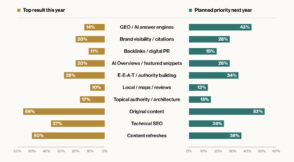 Seuls 14 % des professionnels interrogés par SEJ citent le GEO parmi leurs leviers les plus efficaces cette année, mais 43 % en font une priorité pour les 12 prochains mois. Pourtant, la mesure de la visibilité dans les IA reste à construire.
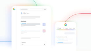 Google déploie plusieurs mises à jour pour rendre les sources plus cliquables dans ses réponses IA. Des ajustements qui interviennent alors que les éditeurs voient ces fonctionnalités capter leur trafic.
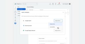 Google Ads déploie deux réglages optionnels pour hiérarchiser les canaux de diffusion et limiter la part du budget quotidien consacrée aux moins prioritaires.
 À la découverte de MVP, podcast de référence sur le SEO et le GEO qui présente depuis déjà 3 ans les nouveautés qui agitent le domaine.
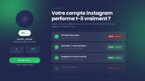 Score sur 100, benchmark sectoriel et conseils actionnables : l'audit Instagram gratuit d'Auguste permet de repartir sur des bases solides avant de relancer sa stratégie social media.
 Anthropic aborde Google Workspace par les deux bouts, avec une extension qui travaille dans le fichier ouvert et des connecteurs qui pilotent Docs, Sheets et Slides depuis le chat.
 Mémoire absente, chemin figé, validation floue : Raphaël Khalifa, fondateur de Syniaps, détaille les trois causes qui font échouer les projets d’agents IA en entreprise.
 Depuis le 2 août 2026, l'AI Act impose de signaler certains contenus produits par IA. Nous avons sélectionné 12 outils gratuits pour déclarer un contenu généré par IA et analyser un texte, une image ou une vidéo dont la provenance n'est pas établie.

 Mistral AI présente Mistral Large 4 comme le meilleur modèle à poids ouverts d'Europe et des États-Unis. Un lancement très attendu pour une entreprise soupçonnée d'avoir décroché face aux laboratoires chinois et américains.
 Anthropic veut que chaque développeur puisse adapter Claude Code à sa manière de travailler.
 L'avocat Alexandre Bigot-Joly est l'invité du podcast Follow Back, produit par Swello en partenariat avec BDM. Dans cet épisode, il revient sur le cadre juridique de la creator economy, entre transparence obligatoire et risques liés à l'IA.
 Depuis plusieurs jours, les bots envahissent les posts Instagram des comptes d'influenceurs et de médias français. Mais qui se cache derrière ces profils ?