 Connexion

Accessible Names and Labels: Understanding What Works and What Doesn’t
Defining labels for user interface (UI) components may seem straightforward, but in practice, it’s an area where accessibility issues frequently arise. Developers may assume that if a label is visible on the screen, assistive technologies like screen readers will automatically associate it with the corresponding control, but that’s not the case.
This article explores how to correctly define and associate labels and accessible names for UI elements to ensure that all users, including those relying on assistive technologies, can understand the purpose of each control.
We’ll also walk through several real-world scenarios that might look perfectly fine, yet fail to convey their purpose. By understanding these subtle pitfalls, you’ll be better equipped to create forms and interactive components that are both visually and semantically accessible.
Label
A label is text or an element (such as an icon or image with a text alternative) presented to all users to identify a component within web content.
Visible labels help users understand the purpose of form fields and interactive components. When labels are missing, unclear, or not persistent, users may be left guessing what information is required.
Text as a label:

Icon as a label:
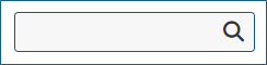
In most cases, visible text placed next to or within a control serves as a label that communicates the control’s purpose. However, in some cases, users may need to rely on the surrounding context to understand the control’s meaning.
The visual proximity of a label to its associated control is also important. If the label is placed too far from the control, sighted keyboard users and users of screen magnification may find it difficult to determine which label belongs to which field. Maintaining clear visual association—typically by positioning the label immediately before or above the control—supports both sighted and non-sighted users.
For more insights on designing effective visible labels, refer to the article, More Than Just Text – The Real Power of Labels.
Name
A name is a programmatic text (also known as an accessible name) by which assistive technologies can identify a component within web content to the user.
Every form input and interactive control must have a programmatic name so that screen readers and other assistive technologies can accurately announce its purpose to users.
The process by which an element’s accessible name is determined follows the Accessible Name and Description Computation 1.2. This algorithm establishes a hierarchy and precedence among potential naming sources. When multiple name sources are defined, assistive technologies use the one that appears first in the hierarchy and ignore the rest.
In simplified terms, the naming precedence is:
aria-labelledbyaria-label- Native
<label>element (for form controls) titleattribute- Other fallback methods such as placeholder text, implicit labeling, or inner content
Let’s explore each of these methods in this order.
aria-labelledby
If an aria-labelledby attribute is used, assistive technologies will use the text referenced by the specified ID(s) as the accessible name of the element.
<button❤aria-labelledby="addFav"></button><span id="addFav">Add to favorites</span>
Note: Although the text referenced by aria-labelledby is typically visible on the screen, it does not behave like a native <label> element, clicking on it will not move focus to the associated form input.
<span id="first_name">First Name:</span><input type="text" name="first_name"aria-labelledby="first_name">
aria-label
If no aria-labelledby reference is provided, the value of the aria-label attribute will be used as the accessible name.
<a href="help.html"Helparia-label="Help documentation"></a>
Note: The aria-label text is not visible on the screen; it is only exposed to assistive technologies like screen readers.
When a visible label is available, the content of the aria-label must include the visible text to conform to WCAG SC 2.5.3 Label in Name.
Explicit Label
In most cases, the best way to define an accessible name for a form <input> field is to associate it with a visible label using the HTML <label> element. This method has the broadest support across browsers and assistive technologies. It also offers the added benefit that users can click either the label or the input field to focus on the input, effectively increasing the clickable area. A larger click target is especially helpful for users with tremors or limited fine motor control, as well as for mobile users, particularly when the target is small, such as a single radio button.
<label for="first_name">First Name:</label><input type="text" name="first_name" id="first_name">
Title
The title attribute can be used to provide a name for form controls, but this approach is generally unreliable and not recommended. Many screen readers and assistive technologies do not consistently treat the title attribute as a replacement for a proper label, likely because it is often used to convey supplementary or non-essential information. For sighted users, the content of the title attribute is typically displayed as a tooltip when hovering the mouse over the form field.
<a title="microsoft home" href="https://www.microsoft.com/en-in/"><img alt="" src="https://uhf.microsoft.com/images/microsoft/RE1Mu3b.png"></a>
However, there is one important exception: For <iframe> elements, the title attribute is required and must be used to provide an accessible name that describes the purpose or content of the embedded frame. Without it, screen reader users will hear a generic or empty frame announcement, offering no context.
<iframe src="promo.html" title="Promotional video about accessibility features"></iframe>
Note: In the Microsoft Edge browser, keyboard users can access the information provided by the title attribute by moving focus to the element. However, as of Chrome version 142.0.7444.135, the title attribute is not displayed on focus, meaning keyboard-only users cannot access this information.
Placeholder
While placeholder text can technically be used to provide an accessible name, it should not be relied upon as the only visible label for a form field. This is because:
- Placeholder text disappears when users begin typing, leaving no visible label to guide them during data entry.
- Placeholder text is not displayed when a field is pre-filled, making it difficult for users to review or edit their input.
- Placeholder text often has poor color contrast, and even when the contrast is improved, users may mistake it for actual input and skip the field.
- Long placeholder text may be truncated if it exceeds the width of the input field, reducing clarity.
- Placeholder text can become partially obscured or illegible when text is resized, such as on small screens or when using browser zoom.
<input type="search" placeholder="Search..."><button type="submit">Search</button>
Implicit Label
In some situations, form controls cannot be labeled explicitly. For example, a content author might not know the ID of a form field generated dynamically by a script, or the script may not assign an ID at all. In such cases, the <label> element can be used as a wrapper that contains both the form control and the label text. This creates an implicit association between the label and the form control.
While this approach works, explicit labeling is generally better supported and more reliable across assistive technologies.
<label>First name:<input type="text" name="firstname"></label>
Inner Content
For controls like buttons that have inner content, that content can serve as an accessible name. This might be plain text inside the button, or it could be the alt attribute of an <img> element contained within the button.
<button><span>Add to</span><img src="heart.png" alt="favorites"></button>
Scenarios
The following are common situations where users with disabilities may have difficulty perceiving or understanding the purpose of a control due to missing, unclear, or improperly associated labels and names:
Scenario #1: title attribute is Overridden by an Empty <label> Element
A surprisingly common issue occurs when developers rely on the title attribute to label an input field but also include an empty <label> element, either wrapping the input or referencing it with the for attribute. When this happens, the title value gets ignored as a naming source because the <label> element takes precedence in the accessibility tree. The result? The input field ends up without a valid accessible name.
Example 1:
<span>First Name:</span><label><input title="First name" type="text" name="firstname"></label>
Example 2:
<span>First Name:</span><label for="fname"></label><input title="First name" id="fname" type="text" name="firstname">
It would look like this:

Although screen readers such as NVDA and JAWS might still announce the title value (“First name edit blank”), inspecting the element’s Accessibility Tree or Computed Properties will reveal that it actually has no accessible name.
- In Chrome or Edge, right-click on the page and select Inspect, or press F12 to open Developer Tools. You may need to switch to the the Accessibility tab.
- In Firefox, open the Developer Tools by right-clicking the page and selecting “Inspect Element” or by pressing F12.
- In Safari, right-click (or Control-click) anywhere on the page and select Inspect Element. In the Developer Tools, go to the Elements tab, select the element in the DOM tree you want to examine, select the Node tab, and expand the Accessibility section.
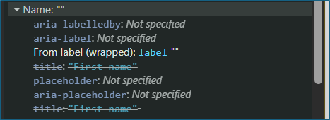
Under Computed Properties, you’ll see the Computed Name field, which follows the Accessible Name and Description Computation hierarchy. In this hierarchy, a <label>, even an empty one, takes priority over a title attribute, which is why the title value is ignored in these cases.
Note: Users who depend on voice input tools like Windows Voice Access rely on the control’s visible or programmatic name to issue voice commands (e.g., saying “Click First Name”). Because the accessible name is missing in this case, the field becomes unreachable through voice interactions, even though it may appear to work visually and audibly for screen reader users.
Scenario #2: An empty <option> element
It’s quite common to see combo boxes (<select> elements) where the first <option> is intentionally left blank. Developers often do this to display an empty default state, but an empty option can create confusion, especially for users of assistive technologies.
Example:
<label for="cars">Choose a car:</label><select name="cars" id="cars"><option></option><option value="volvo">Volvo</option><option value="saab">Saab</option><option value="mercedes">Mercedes</option><option value="audi">Audi</option></select>
It would look like this:
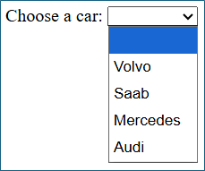
At first glance, this might seem harmless; it simply shows an empty selection at the top of the list. However, since <option> elements are form controls, each should have a visible and accessible name. In this example, the first option has neither.
For instance, when a screen reader user lands on this option, they may hear something like:
“list item 1 of 5” or nothing
Instead of leaving the first option empty, provide a meaningful label such as:
<option value="">Select a car</option>
This way, the control communicates its purpose clearly to everyone.
Scenario #3: Image of text with no alternative text defined inside <button> or <a>
Another common accessibility issue arises when an image of text (for example, a company), that is meant to contribute to the accessible name, is placed inside an interactive element like a <button> or <a> tag but lacks an alternative text (alt) description, users of assistive technologies will not be able to understand the control’s purpose.
Without an alt attribute or an equivalent accessible label, screen readers will simply announce it as “link” or “button,” providing no context about its destination or function.
Example:
<a href="https://www.microsoft.com/en-in/"><img alt="" src="https://uhf.microsoft.com/images/microsoft/RE1Mu3b.png"></a>
Visually, this looks fine, it displays the Microsoft logo and functions as a link to the homepage. However, for a screen reader user, it would be announced merely as “link,” which doesn’t communicate what the link does or where it leads.
To make this accessible, you can use either of the following approaches:
Approach 1: Define an Alternative Text for the Image
<a href="https://www.microsoft.com/en-in/"><img alt="Microsoft home page" src="https://uhf.microsoft.com/images/microsoft/RE1Mu3b.png"></a>
Approach 2: Use aria-label (or aria-labelledby) for the <a> Element
<a href=https://www.microsoft.com/en-in/aria-label="Microsoft home page"><img alt="" src="https://uhf.microsoft.com/images/microsoft/RE1Mu3b.png"></a>
Note #1: If both an aria-label is defined on a <button> or <a> and an <alt> is defined on the nested <img>, the aria-label takes precedence and becomes the accessible name.
Note #2: If an image of text is used within a <button> or <a>, the accessible name must include the same text that appears visually in the image (for example, if the image displays “Submit,” the alt or aria-label should also say “Submit”).
Scenario #4: When the Label Alone Is Sufficient for Radio Buttons
When form controls such as radio buttons or checkboxes are presented in a group, a group label (typically using a <legend> within a <fieldset>) is usually required to provide additional context about what the group represents. However, there are cases where the individual labels alone fully describe the purpose of each control—making a grouped label optional.
Consider the following example:
<fieldset><input type="radio" id="A11Yin" name="A11Ytest"><label for="A11Yin">I live in India</label><input type="radio" id="A11Yde" name="A11Ytest"><label for="A11Yde">I live in Germany</label><input type="radio" id="A11Ysp" name="A11Ytest"><label for="A11Ysp">I live in Spain</label></fieldset>
This would look like:
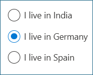
In this scenario, each label clearly communicates the purpose of the control (“I live in India,” “I live in Germany,” “I live in Spain”). Even without a grouped label like “Where do you live?”, the user can easily understand what the options represent.
However, while this works visually and semantically, it can result in repetitive or verbose announcements for screen reader users. For example, the screen reader might read “I live in India, radio button not checked,” which can become cumbersome across multiple options.
To improve clarity and conciseness, it’s better to use a grouped label with a <legend> and simplify the individual option labels.
<fieldset><legend>Where do you live?</legend><input type="radio" id="A11Yin" name="A11Ytest"><label for="A11Yin">India</label><input type="radio" id="A11Yde" name="A11Ytest"><label for="A11Yde">Germany</label><input type="radio" id="A11Ysp" name="A11Ytest"><label for="A11Ysp">Spain</label></fieldset>
This would look like:
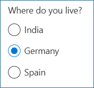
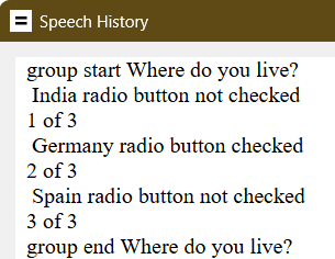
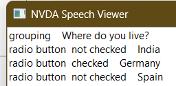
Screen readers will announce the context once (“Where do you live?”) and then read each option succinctly (“India, radio button not checked”), providing both clarity and brevity.
JAWS announcement:
NVDA announcement:
Scenario #5: <button> Element with role="combobox" and Inner Text
A combo box is an input widget that allows users to choose a value from an associated popup, typically defined using the <select> and <option> elements. However, when the popup is a custom dialog—such as a date picker or color selector—developers sometimes create it using a <button> element with role="combobox".
This approach can be acceptable, but it fundamentally changes the element’s semantic role. Once a native <button> is assigned role="combobox", assistive technologies no longer treat it as a button but as a combo box. Therefore, developers must ensure that the custom widget fully supports combo box behavior, including:
- Proper keyboard interaction patterns
- Correct use of attributes such as aria-expanded and aria-controls
If these behaviors are not correctly implemented, the control may fail Success Criterion 4.1.2 (Name, Role, Value) because the widget does not expose its role, state, and value properly to assistive technologies.
Example: A <button> element with role="combobox" that opens a date picker dialog.
<button role="combobox" aria-haspopup="dialog">Date of birth</button>
It would look like this:
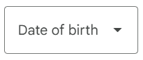
Visually, this looks fine. It appears as a button labeled “Date of birth,” which opens a date picker dialog when activated. You might assume that the visible text “Date of birth” will act as the accessible name, just as it does for a regular <button>.
But that’s not what happens.
When a <button> has role="combobox", the inner text is no longer treated as the accessible name. Instead, it is treated as the current value of the combo box. This is because role="combobox" switches the element into a widget role where inner text represents user-selected content, not a label. As a result, the element lacks an accessible name altogether, even though screen readers may still appear to announce “Date of birth.”
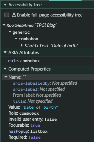
In this situation, screen readers typically announce:
“Combobox Date of birth opens dialog.”
Here, “Date of birth” sounds like the accessible name, but technically, it’s being interpreted as the combo box’s value, not its programmatic label.
To ensure that the combobox has a valid accessible name, explicitly define one using either aria-label or aria-labelledby.
<span id="dob">Date of birth</span><button role="combobox" aria-haspopup="dialog"06-June-2000aria-labelledby="dob"></button>
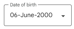
Now, assistive technologies will correctly announce:
“Date of birth, combobox, 06-June-2000, opens dialog.”
In this corrected example:
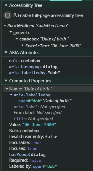
- The accessible name (“Date of birth”) comes from the
<span>referenced byaria-labelledby. - The current value (“06-June-2000”) is represented by the inner text of the
<button>.
The Accessibility Tree now shows the computed accessible name.
Note: It’s important to note that behaviors such as how the title or placeholder attributes are announced can vary significantly across screen readers and browsers. To ensure consistent accessibility, developers should test with multiple combinations, including:
- NVDA + Firefox
- JAWS + Chrome or Edge
- VoiceOver + Safari
Testing across these environments helps verify that accessible names, roles, and values are exposed as expected for all users.
Conclusion
Creating accessible names and labels is more than just adding text next to a control — it’s about ensuring that every user, including those relying on assistive technologies, can understand and interact with your interface effortlessly. A well-structured naming strategy not only improves accessibility but also enhances usability for everyone.
Here are a few key takeaways to keep in mind:
 Use
<label>elements for visible and programmatic names whenever possible.- Use
aria-labelledbyto associate a visible label that exists elsewhere in the DOM. - Use
aria-labelonly when no visible label is available.  Don’t rely solely on placeholder or title for labeling form controls.
- Don’t use empty
<label>elements or empty<option>elements, as they result in missing or unclear accessible names.
By following these practices, you’ll help ensure that your web interfaces communicate effectively with all users, regardless of how they access them.
Resources
- Understanding Success Criterion 1.3.1: Info and Relationships | WAI | W3C
- Understanding Success Criterion 2.5.3 Label in Name | WAI | W3C
- Understanding Success Criterion 3.3.2: Labels or Instructions | WAI | W3C
- Understanding Success Criterion 4.1.2: Name, Role, Value | WAI | W3C
- Labeling Controls | Web Accessibility Initiative (WAI) | W3C
- More Than Just Text: The Real Power of Labels – TPGi
- How to meet SC 2.5.3 Label in Name – TPGi
The post Accessible Names and Labels: Understanding What Works and What Doesn’t appeared first on TPGi — a Vispero company.