❌

Vue lecture

AI can operate a screen reader. What does that actually test?

In the space of a couple of weeks, four people from different contexts have reached out to me to talk about using AI for accessibility testing.

The conversations were different, but each came back to the same thing: what an AI agent can tell us when it uses a screen reader.
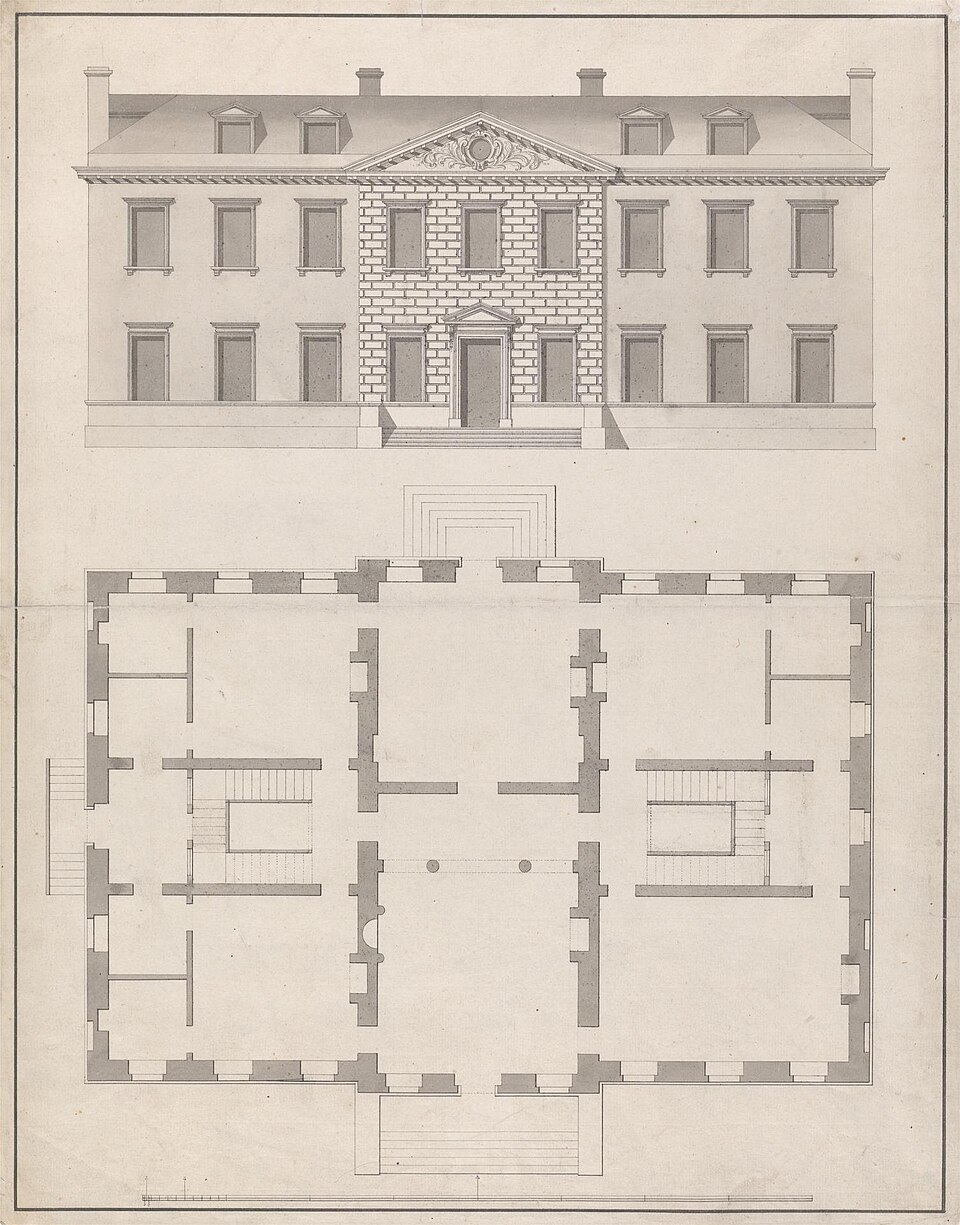
Architectural drawing showing the front elevation and floor plan of a townhouse.
James Gibbs, CC0, via Wikimedia Commons.

An AI test can show that one agent completed one route, using one setup and the information it was given. Anything broader is an informed guess.

That’s useful. Accessibility testing takes time and expertise, and conventional automated tools only find certain kinds of problems. AI agents appear to go further. They can navigate an interface, collect screen reader output, and report whether they completed a task. For a team without an accessibility specialist, that’s appealing.

If an AI agent completes a checkout using captured output from the NVDA screen reader in Chrome, the report should say exactly that. “The checkout passed screen reader testing” says far more than the test showed.

Even the narrower claim covers only one kind of access. People who use magnification, voice control, switch access, or other forms of input need separate testing.

If AI belongs in accessibility testing at all, it belongs as a limited tool inside an expert-led process. It should not replace the expert, perform the final evaluation, or determine the result.

Inspecting the house

Using AI to test a website with a screen reader is like inspecting a house from its floor plan and photographs. You can spot missing doors, narrow corridors, and obvious hazards. But you can’t tell what it’s actually like to find your way around, recover when you take a wrong turn, or live there day to day.

The analogy matches how many tools work. An AI agent can use the accessibility tree, which is the structure a browser builds for assistive technology. It can also receive an estimate of what a screen reader would say, or text captured from a real screen reader.

Tools vary. Speakable estimates announcements without running a screen reader. BrowserStack can operate screen reader interactions and capture the speech as plain text.

These outputs can expose missing names, unexpected output, broken focus movement, and routes that can’t be completed. But they don’t convey the speech’s pace, the effect of interruptions, or the effort of remembering your location while new information continues to arrive.

What a person has to do

An AI agent starts with advantages a person doesn’t have. Take booking a flight from Los Angeles to New York City.

The agent knows the goal before it begins. Depending on its setup, it can look directly at the page’s structure and find the origin and destination fields, date picker, flight options, and purchase button.

A person has to find their own route. They need to understand what the controls do and recognize whether each interaction worked. Did the dates register? Did the fare change? They have to find their way back if they miss an announcement or choose the wrong flight. Keeping track of all this while listening for the next announcement creates cognitive load.

A pass tells us the agent found a route, not what finding it was like. AI performs; people experience.

Why a pass or fail needs checking

An agent can complete a task because its setup gives it information that might not be available through the screen reader experience. It can also get stuck for unexpected reasons. It might choose an unusual way to navigate, misunderstand an announcement, or overlook a familiar screen reader command.

Run the same test twice, and an AI agent can take a different path each time, so one run can’t stand in for every run.

Until someone with accessibility expertise has interpreted a result, we don’t know what it means.

Why human testing is required

AI output needs expert human testing before it can support an accessibility conclusion. Different human activities provide different evidence.

A skilled tester using assistive technology can notice when an announcement comes too late, when the wording is confusing, or when an interaction takes too much effort.

Expert accessibility evaluation adds knowledge of standards, browsers, assistive technologies, and interaction patterns. An expert can investigate whether a problem comes from the product, the browser, the screen reader, or the agent’s setup.

Usability testing with disabled users adds something else: What is it actually like to use the product? Disabled users bring their own technology, settings, habits, expectations, and ways of solving problems.

These roles can overlap. A disabled person may also be a skilled tester or accessibility expert. The distinction is what we’re trying to learn from the activity.

One route is still one route

To paraphrase Stephen Shore’s observation about autism, if you’ve met one disabled person, you’ve met one disabled person. We can’t assume one person’s screen reader experience represents everyone.

One accessibility expert can’t speak for every disabled person either. That isn’t their role. An expert evaluates systematically, while usability testing with disabled users provides evidence about specific lived experiences. We need both, and we need to be honest about the limits of each.

People navigate in different ways. In WebAIM’s 2026 Screen Reader User Survey, 67.8% of respondents said they would first use headings to find information on a long page. That rose to 72.1% among advanced users and fell to 41.4% among beginners.

An AI agent is neither an accountable accessibility expert nor a disabled user with lived experience. Its route can’t stand in for either.

What if you don’t have a specialist?

Start with what you already have. Run conventional automated checks, and use AI agents to explore important tasks, including errors and recovery.

Without expert human testing, AI results can identify things to investigate, but they can’t support a pass, an accessibility conclusion, or a conformance claim. Treat every result as something to check.

When an agent uncovers a real problem, add a fixed test that will catch it if it comes back.

If you have a limited budget for human help, focus it on tasks where failure has serious consequences. That could include signing in, recovering an account, completing an important form, making a payment, or responding to an error.

You can hire an accessibility specialist for a focused review. For usability testing with disabled users, work with a disability-led consultancy, a local disability organization, or a paid panel. Easy Surf is one example of a disability-led company offering this work.

Pay disabled users for their time and expertise. Fix the obvious problems tools can detect first, so people can spend their time finding what the tools missed.

What AI results can support

We can’t rely on AI alone to show that a product conforms to WCAG.

Conformance means meeting every applicable requirement. W3C says this takes automated checks and human evaluation by people who understand how disabled people use the web. It also warns that evaluation tools can produce false or misleading results.

This matters most in an Accessibility Conformance Report (ACR), a buying decision, or a public accessibility claim, where readers assume the testing was complete.

Say what you tested and how. Give the product version, test setup, method, and scope. Heck, share the prompt you used.

Use AI to widen the inspection if it helps, but keep it as a tool. Expert evaluation and usability testing with disabled users must remain central to the process.

UPDATE

I wasn’t planning on giving specific examples, but when Weston Thayer from AssistivLabs offered to share a few concrete examples, I thought it might help folks get a better grasp.

So thank you Weston!

AI specific pitfalls examples

When an AI agent is completing a task using only keyboard commands and screen reader output, it’s results and recommendations may steer you towards fixes that seem like improvements to the screen reader UX, but come with hidden downsides. A few examples:

  1. Accessibility information in the wrong place. A text input that announces as “edit, blank” could be “fixed” by wrapping it in a region with an aria-label, so that the screen reader announces “Email address region. Edit, blank”. While that gives valuable information to screen readers, voice control users will not be able to say “click email address, type user@example.com”, since most voice control assistive tech works off of an element’s accessible name (which an <div role="region" aria-label="Email address"> won’t update). The region fix also fails WCAG 2.5.3 Label in Name.
  2. Silently working around keyboarding issues. Screen reader virtual cursors can navigate over UIs that don’t work with keyboard alone. Tabbing could be broken, focus could be invisible, yet an agent driving a screen reader could be blissfully unaware as it navigates forward with the virtual cursor.
  3. Overreliance on live regions. Live regions sound like a fantastic tool to improve things for screen readers — they can make the screen reader say anything you want, at any time. Google Docs took this to an extreme to deal with their lack of a DOM for documents. But there are hidden downsides: most screen readers don’t send live regions to users with refreshable braille displays connected; and it completely disregards the user’s screen reader preferences around verbosity and pronunciation.
  4. Adding visually hidden instructions that should be visible. When filling out a form, the agent may realize that instructions would’ve helped it avoid mistakes and suggest adding them with a visually hidden technique. However, often sighted users will benefit from the same instructions, which is why WCAG 3.3.2 Labels or Instructions exists.
  5. Relying on web platform features that aren’t supported well everywhere yet. If an agent is only using one particular screen reader and browser, it may suggest using HTML, CSS, or JavaScript features that work well for that screen reader and browser, but are not fully implemented in other browsers, screen readers, or other assistive technologies.
  6. Fixing pronunciation and other screen reader quirks. Screen readers can mis-pronounce words or brand names, read ALL CAPS as acronyms, and more. Attempting to override this comes with significant downsides. Some screen readers have small quirks (like VoiceOver and list-style-type: none) that should not be fixed.
  7. Trusting the speech viewer. How is the agent driving the screen reader? Commonly, the speech viewer or internal logs are used, but these often don’t match what’s actually announced. The agent could be receiving crucial information real users miss.
  •  

It’s time to retire the concept of decorative images.

I don’t mean getting rid of alt=””. We still need a way to tell screen readers to ignore images when there’s nothing to convey. I’m talking about the category label itself and how it shapes the decisions we make about images.

A large, fluffy black dog lies sprawled on a cream carpet, resting its chin between its outstretched paws. Eyes closed and sound asleep.

The concept made sense when it was introduced. Think spacer GIFs and visual flourishes that genuinely added nothing. Telling screen readers to ignore them avoided unnecessary noise.

We use images differently today. They are often chosen to set a mood or shape how someone experiences a page.

Consider a hero image on an article about burnout: Someone sitting alone at a kitchen table late at night. You don’t need the photo to understand the article. It may give you no essential information, but it adds a feeling of loneliness and exhaustion.

An image can be non-informative without being meaningless.

In accessibility audits, I routinely see recommendations to treat images like this as decorative and use empty alt text. Sometimes that recommendation is made without really asking what a sighted person gets from the image. Sometimes “decorative” becomes shorthand for “I don’t want to write alt text for this.”

The current WCAG 3 draft continues to use the concept, with an outcome called “Decorative images hidden.” It defines a decorative image as one that serves only an aesthetic purpose, provides no information, has no functionality, and can be ignored without losing meaning or context.

By that definition, the burnout photo isn’t decorative nor purely aesthetic. It adds meaning.

Some images really do add nothing that needs an alternative. A divider, background texture, or an icon that repeats a text label next to it doesn’t need a description. Describing everything would create noise and waste screen reader users’ time.

Maybe “non-contributing” is a better category label. The question we should ask before hiding an image is what it adds to the experience. That might be information, but it might also be meaning, mood, or context.

If we’re deliberately giving sighted users some of those things, why are we comfortable deciding they don’t matter for blind users?

WCAG 3 is still a draft. There is still time to retire “decorative images.”

(Cross-posted from LinkedIn)

  •  

Healthcare happens when we aren’t at our best

In 2020, I watched virtual healthcare go from something that was growing gradually to something that was suddenly necessary.

COVID changed the timeline. Across the healthcare industry, organizations needed ways for patients to see doctors without sitting in waiting rooms or sometimes leaving their homes at all. Things that might have taken years to plan and implement had to happen much faster.

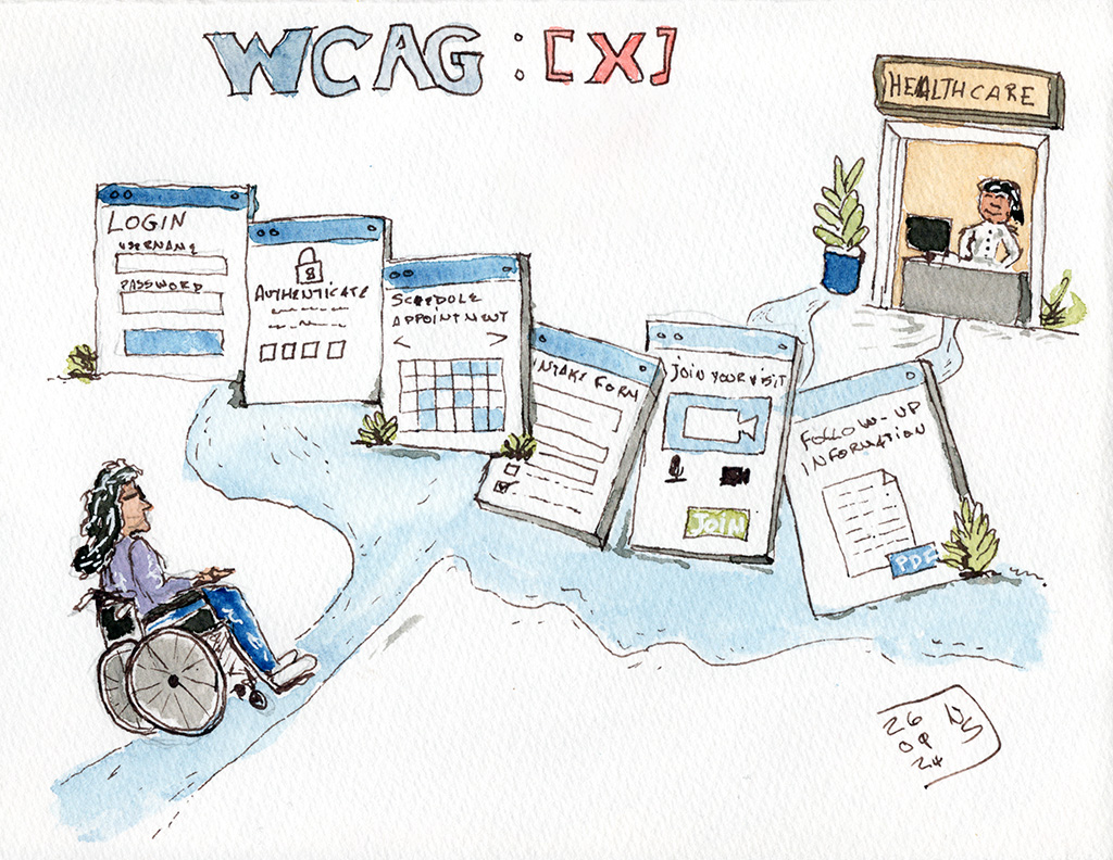
Line-and-wash illustration of a wheelchair user following a winding path through oversized virtual healthcare screens for login, authentication, scheduling, intake, video visit, and follow-up information, toward a doctor at the end. Above the screens: WCAG: [X]

I was working in digital accessibility while that shift was happening. There was a lot of urgency, for good reason. People needed healthcare, clinicians needed ways to reach them, and nobody knew how long the situation would last.

Moving healthcare online quickly didn’t mean that everyone could use it.

That wasn’t a new problem. Disabled people had already been dealing with inaccessible healthcare websites, forms, patient portals, documents, and other digital systems. COVID changed the scale of virtual healthcare and made the consequences of those barriers much harder to ignore.

An inaccessible form is a problem anywhere. When that form stands between you and an appointment with a doctor, the stakes are different.

The same applies to authentication you can’t complete, a scheduling interface you can’t operate, a video platform that doesn’t work properly with your assistive technology, or follow-up information you can’t read. All of these affect whether a disabled person can get healthcare independently.

Disabled people don’t arrive at healthcare with only one barrier

Accessibility is for disabled people. I don’t think we need to make a case for accessible virtual healthcare by first demonstrating that nondisabled people will benefit from it too.

Disabled people need healthcare. We need to book appointments, explain symptoms, understand what clinicians tell us, manage prescriptions, read test results, make decisions, and get follow-up care.

Whatever brought us to the doctor may also make the accessibility barriers we already encounter harder to deal with.

A blind person using a screen reader may also have pneumonia and be exhausted. A Deaf person may be trying to understand unfamiliar information about a new diagnosis. A cognitively disabled person may be trying to follow complicated instructions while frightened about what those instructions mean.

I’ve spent decades thinking about barriers disabled people encounter with technology. Healthcare is different because we often interact with these systems when we have less energy available to work around bad design.

Disabled people become remarkably good at working around barriers. We shouldn’t have to, but we do. We learn which browser works better with a particular website. We find another route to something. We try again. We develop strategies for dealing with technology that wasn’t designed with us in mind. None of this is a particularly good use of our time, but we get a lot of practice.

Working around those barriers becomes a lot harder when you’re sick, exhausted, in pain, or worried about what a doctor is going to tell you.

Virtual healthcare can remove barriers

One thing I don’t want us to lose from the experience of the last several years is just how useful virtual healthcare can be for disabled people.

Getting to a doctor’s appointment isn’t always simple. You may have to arrange accessible transportation. The trip itself may take considerable time and energy. The building may have barriers. The examination room may have barriers. Waiting rooms aren’t necessarily easy places to spend time. For some disabled people, going into a healthcare setting also brings increased exposure to respiratory illness and other infections.

A virtual appointment can remove some of that. Someone can speak with a clinician from home, using their own computer, their own setup, and the assistive technology they use every day. They don’t necessarily have to spend limited energy getting to and from an appointment just to have a conversation that could have happened remotely.

For that to work, the virtual part has to be accessible.

Think about what might be involved in a single appointment. You may have to log into an account, authenticate yourself, find the right service, book an appointment, complete an intake form, answer questions about your health, join a video call, communicate with the clinician, and then retrieve information afterward.

Inside a healthcare organization, those things may belong to completely different systems.

Authentication might be owned by one team. Scheduling by another. The video platform might come from a third-party vendor. Someone else may be responsible for the patient portal. Follow-up instructions might be generated as a document. Organizations are very good at drawing boxes around systems. Patients have the inconvenient habit of experiencing all the boxes in a row.

If they encounter accessibility barriers at 3 or 4 points along the way, it doesn’t particularly matter that each barrier belongs to a different product team or vendor. Their experience of the appointment includes all of it.

Testing individual screens and components matters, but so does understanding the route a disabled person has to travel through the system. An accessible video call doesn’t help much if the patient can’t get through the process required to join it.

We have had time to do better

I have some sympathy for the decisions healthcare organizations made in 2020.

It was an emergency. People were trying to solve difficult problems quickly, often without knowing what the next month would look like. Clinicians who had spent their careers seeing patients face to face suddenly had to work differently. Patients had to learn new systems. Technology had to be deployed quickly.

Accessibility should have been part of that work, but I can understand how some things went wrong in that environment.

More than 6 years later, that explanation doesn’t work nearly as well.

Virtual healthcare is now part of how healthcare is delivered. The industry has had time to learn which approaches work, where barriers exist, and how virtual care can remove some significant barriers for disabled people.

It has also had time to make accessibility part of the way these systems are designed, bought, built, tested, and maintained.

Digital accessibility is often evaluated one piece at a time. Does the website conform? Does the app work with a screen reader? Can someone use the interface with a keyboard? Those are necessary questions, and I’ve spent a large part of my career asking them.

Healthcare organizations also need to look beyond each individual piece. A patient logs in, fills out an intake form, launches a video app, talks to a clinician, and accesses follow-up information for one reason. They’re trying to get healthcare.

That means accessibility testing has to follow the patient journey too.

Test the authentication. Test the scheduling. Test the forms. Test the virtual visit. Test what happens afterward. Include the third-party products along the way, even when another company owns the code and fixing it is considerably less convenient than finding the problem.

COVID showed the healthcare industry how quickly virtual care could change when circumstances demanded it.

The next step is making sure disabled people can actually use the healthcare systems that are now here to stay.

  •  

WCAG 3.0 Will Create a Governance Problem Most Organizations Aren’t Ready For

When WCAG 3.0 eventually becomes a W3C Recommendation, many executives will assume their accessibility program has to change right away. The more likely truth is that it can keep running as it is, while something subtler shifts underneath it.

An old analog compass pointing North North East leaning on the edge of an open book.

What changes is the bookkeeping. For the first time, many organizations will have to manage two accessibility standards at once, because the newest standard will not be the one they are legally required to follow. The gap between those two realities is where the confusion starts.

When WCAG 3.0 is published, almost every regulation, contract, procurement rule, and legal obligation around the world will still point at WCAG 2.x. That leaves the people who run accessibility programs with a question that has nothing to do with testing: how do you manage accessibility when the direction of the field and the required standard stop being the same thing? Very few organizations are ready to answer it.

Why this version is different

The last few WCAG updates were easy to absorb. Going from 2.0 to 2.1, and again from 2.1 to 2.2, added new success criteria to a familiar structure. The conformance model stayed the same. Teams could update their testing without rethinking how they evaluated anything.

WCAG 3.0 is a bigger change. The March 2026 working draft replaces the pass/fail success criteria with roughly 174 requirements written as outcome statements, scored on a graded model that rolls up into Bronze, Silver, and Gold instead of A, AA, and AAA. Bronze is meant to land close to today’s 2.2 AA. The scope widens too, reaching past web pages to apps, components, and immersive environments, which is why the acronym now stands for W3C Accessibility Guidelines rather than Web Content Accessibility Guidelines.

The structural change is not the hard part, though. Accessibility programs are built out of policies, contracts, procurement language, reporting, risk practices, and legal obligations, and all of that has spent more than twenty years inside the 2.x model. Learning the new standard is straightforward. The real job is operational: carrying an organization through the years when both standards are in play at once.

The two-timeline problem

Many people assume standards and regulations move together. They don’t. A W3C Recommendation becomes official when the W3C finishes its process. Regulations change when governments and regulators finish theirs. Those clocks are almost never in sync.

You can already see the divergence today. In the United States, Section 508 still references WCAG 2.0 A and AA. The Department of Justice’s Title II rule requires WCAG 2.1 AA for state and local government. In Europe, the Accessibility Act relies on EN 301 549, which is also built on WCAG 2.1, while newer standards are beginning to reference WCAG 2.2. Different regulations already point at different versions, and none of them will move to WCAG 3.0 on their own when it becomes a Recommendation.

The likely path is a transition measured in years. Candidate Recommendation for 3.0 is currently projected for late 2027, a final Recommendation is not expected before 2028. Plenty of knowledgeable people in the field expect it much later than that. Regulatory adoption trails by years more. WCAG 2 will stay in force for a long stretch after 3.0 is done. Through that whole period, anyone running a program has to hold two answers at once: what represents the current direction of the field, and what the organization is actually required to meet. For most of the last twenty years those answers matched. They are about to come apart, and the teams that miss the distinction will set the wrong expectations and spend against the wrong priorities.

The real risk is internal confusion

Picture a familiar conversation. A senior leader reads that WCAG 3.0 has been published and asks whether the organization complies with it. The accessibility team says it complies with whatever the applicable regulations reference. Then why aren’t we on the newest standard? Because regulators haven’t adopted it yet. So are we behind?

None of those are bad questions. They are just hard to answer cleanly if the organization has never drawn the line between meeting a legal requirement and tracking where the field is heading. The teams that come through this well will have settled their position before the conversation happens. They’ll be able to say plainly which standards they are required to meet, which ones they are watching or adopting voluntarily, how they evaluate a new standard, and what would trigger a change to their internal requirements. Without that, every vendor pitch, conference talk, and industry article becomes one more thing to argue about.

Vendor claims get harder to read

Some vendors are already getting ready for 3.0. Before long you’ll hear that a platform is “WCAG 3.0 ready,” “supports Bronze,” or “assesses against 3.0.” Some of those claims will be meaningful. Plenty others will be pure marketing. Almost none of them speak to the thing you need answered: does this help us meet the obligations we have right now?

Buying a product because it advertises “WCAG 3.0 readiness” can increase your risk if your legal obligations are still tied to WCAG 2.x.

A product can line up with parts of 3.0 and still miss requirements tied to 2.x, and the reverse happens too. Accessibility maturity and regulatory compliance are related, but they are not the same thing, and treating them as interchangeable is how teams talk themselves into risk.

Procurement teams face the same challenge. Once 3.0 exists alongside regulations still built on 2.x, different buyers will start asking vendors for inconsistent evidence and evaluating products against different targets unless the organization has clear guidance. That consistency has to come from policy, not from whoever happens to be reviewing the contract that week.

Why assertions are worth watching

One part of 3.0 deserves attention from anyone who owns this work. Alongside technical requirements, the draft includes assertions: claims about how an organization works rather than how a given page tests. They look at whether staff are trained, whether accessibility is built into development from the start, and whether issues get tracked with any consistency. Mostly they ask whether anyone owns the work at all.

Those are governance questions. Most organizations still treat accessibility as an audit: test now and then, fix what breaks, file a report. Assertions point somewhere else, toward showing that accessibility is part of how the work gets done rather than something measured after the fact. The exact shape of this in the final standard may shift, but the direction is clear, and teams that build those habits now benefit no matter when regulators catch up.

What to do now

There is no need to rebuild anything around 3.0 today. It is still a draft, the details will move, and adoption is years out. What is worth doing now is quieter, and it lives in your own policies rather than in the standard.

Make sure leadership knows a transition period is coming and understands the difference between meeting a legal requirement and following where the field is going. Look at how your policies, contracts, procurement processes, and governance documents define accessibility, and whether they pin it to a version in a way that will age badly. Check whether accessibility is written down anywhere as an organizational practice or only ever measured as a technical result. And get your program ready to explain its decisions, not just hand over test results.

The organizations that handle this well will be the ones that can say, without hesitating, which standards they are required to meet, which ones they are only watching, and what would make them change their mind. That clarity is the whole advantage.

  •  

Announcing my new newsletter

I’ve never had a newsletter. And I’ve been writing and blogging for a long time! It was high time to fix that. It is fixed! I now have a newsletter. And I hope you’ll subscribe!

Line and wash sketch. A parent with a kid in a stroller and a wheelchair user are in front of an elevator. There are several signs on the elevator. Closed. Exercise week. Use the stairs. There is an arrow pointing towards the stairs. A handwritten note says: Who will you choose to exclude to benefit the majority? Signed and dated January 29, 2026.

Illustrations

I’m hoping to have one illustration per newsletter. Not always an editorial image about a specific topic. Might be a bird sketch, or an urban sketch. But I’m planning to stay on point with most of the sketches. Like the one on this page. I used it to illustrate my sengment “who are you choosing to exclude?”.

It is an ink and watercolor sketch of two people who can’t use stairs, in front of an elevator closed for “exercise week”

In this edition:

  • Who are you choosing to exclude?
  • From the podcast: Sticky elements
  • alt tag? Or alt attribute?
  • In case you missed it: Digital accessibility and the curb cut effect
  • Captions, or automated craptions?
  • Wrapping up

View and subscribe

The first edition of my newsletter is available on the web.

Powered by Buttondown.

I’d love you to subscribe! And pass the word.

  •  

HelloFresh? No. ByebyeFresh

I had a trial of HelloFresh. I was hopeful it was going to work for me. But they’ve switched to AI for everything. And that’s not for me, so bye bye.

A cardboard box with food showing above the top of the box. The branding says ByeByeFresh.

What is HelloFresh?

HelloFresh is a service where you can select meals and you receive a delivery with the exact amount of ingredients you need for that recipe, along with instructions.

HelloFresh advantages

This is a great service. It’s not a cheap way to eat. But it’s also not super expensive. For me, there were many advantages:

  • Don’t have to think about what I’m doing. It’s all there and easy to put together.
  • Generally quick. Under half hour for most of what I tried.
  • Not having to buy more than I need.
  • Easy try of new dishes with new flavor profiles.

You might think it’s ironic coming from someone who is classically trained as a chef and worked in some private clubs and Michelin-starred restaurants. But when I’m struggling with lack of energy or brain fog or stress or a combination of those, this service looked to be a life saver.

HelloFresh disappointing

We had to throw out our first delivery because the ingredients had expired before arrival.

The second delivery was hit and miss.

The third delivery was great.

But there’s no way to notify food allergies. And they no longer list all ingredients in sachets. So for me with a severe crustacean allergy, I’m playing Russian roulette if there’s shrimp paste in one of their mix but it’s not written anywhere.

Introducing AI

But more than that. They’ve emailed to boast about it using to take three months from starting a new recipe to being able to offer it, but now it’s 3 hours for the process.

Turns out they are now leveraging AI. They generate recipes using AI. They generate dish photos using AI. They generate packing lists using AI.

For me, it’s more like “Degenerate AI”…

I have no interest in AI conceived dishes that will never even possibly look like a photo (keep in mind I’m a chef by training and I’ve done food photography for years).

ByeByeFresh

Soooo.

We’re cancelling our 4th and 5th orders, and our subscription.

ByebyeFresh

  •  

Accessibility Part Of The Tripod

I’ve often mentioned that accessibility is as important as security and performance. But I realized I never blogged about it! So, here it is.

It is as important, but is rarely perceived that way.

A short modern looking stool with three legs.

You don’t make clients pay extra for security - why would you make them pay extra for accessibility?

Security, or performance, are critical features of a website or application.

When you build what you build, you automatically account for security and performance. You wouldn’t sell a platform that could be hacked by anyone who has access to a computer. You wouldn’t do that, and then say “by the way, if you want this to be secure, you need to pay us more. If you did that, you’d be laughed out of Dodge.

You don’t build something that will take minutes to load. Not on purpose anyway. In fact, entire teams have been dedicated to shaving a few milliseconds of load time. Because it matters.

But accessibility, that’s another matter. I’ve lost count of the number of times accessibility was presented as “more work”, and therefore a “premium feature”. And if it’s a premium feature, you’re going to charge for it.

“Clients don’t ask for accessibility”, you say. Maybe, but they need it, whether they know it or not. It’s the right thing to do. It makes commercial sense. It’s also, in most cases, the legal thing to do. Legal, commercial, and human aspects of accessibility have been discussed so much, I won’t rehash that argument here. Besides, if you “do” accessibility just because of a commercial or legal incentive, you’re doing it for the wrong reasons, but that’s a whole other blog post.

Ignoring accessibility is a silly short term strategy that will hurt in the long run. It will hurt you when one of your major clients feels the pinch of a lawsuit and demands your platform be accessible, like YESTERDAY.

Deprioritizing accessibility like it’s going out of fashion

But companies are deprioritizing accessibility. Or not giving it as much importance as security or performance. Companies have entire teams working on securing their product. And we’re lucky if a company even has one person doing accessibility in an organization with hundreds, if not thousands, of employees.

Accessibility is part of a quality product

The reality is, an accessible website or app is a reflection of a quality product. Just like security and peformance.

You include security and performance in your MVP (Minimum Viable Product). And you ignore accessibility. Because it’s faster. Because your team doesn’t understand. Because… Whatever reason you think is good. But that reason is not, actually, good. You don’t have an MVP when you ignore accessibility - you have an MP - A Minimum Product.

Stop building a wobbly, imbalanced, two-legged stool!

Imbalance

There’s an imbalance. The stable three legged stool is wobbly, because you aren’t putting time, effort, energy, and resources into accessibility. You leave it as an after thought. And it will cost you to fix it when you realize you should have done something about it.

Just do it!

Shift your thinking. Start looking at accessibility as a ticket item that is as important as security. As important as performance.

  •  

Usability testing with disabled users is a good investment

I was speaking about “alt text” all the way back in the early 90’s. I’m still raising awareness about that. Like many other accessibility professionals, I love to get beyond the basics. I’m regularly asked by designers to review a design or a concept. They ask me “can we make this WCAG conformant?”. That is the wrong question to ask.

A young blind Asian woman viewed from profile, listening to her phone. She is wearing over the head headphones, and sitting in front of a computer with a refreshible display.
This blind woman could be doing usability testing, using her phone or her computer with a refreshible braille display.

The right question

The right question to ask is: “Can we make this accessible?”.

The work we do is much more than about merely meeting one accessibility standard or the other. The Web Content Accessibilitiy Guidelines (WCAG) are the starting point of accessibility, not the target. This is true with any other accessibility standard. We need to stop just thinking about standards conformance. We need to think accessibility, especially when we reach more complex patterns. It becomes particulalry important when we want to use really unusual patterns.

It’s all about the implementation

I must drive some designers up the wall. My answer typically is “it depends on how we implement it”, when they ask if their design is going to work.

There are things we can tell outright are not going to work. We can probably find a way to massage the implementation of other things into standards conformance. But having all the right ingredients doesn’t mean the recipe will taste good. Using the right elements in the right way as to make it conform to the standards will not ensure an accessible experience.

Usability testing with disabled users

This point is driven home nearly every time I conduct a usability test with disabled users. They experience barriers, even when we fixed all accessibility barriers found during auditing.

Almost every time I end up saying to the designer: “I wish we could do functional prototypes and have disabled users test them”. That would give us the real answer as to whether or not something is accessible.

European Accessibility Act

As it happens, the European Accessibility Act requires things to work for disabled people. It does not require things to conform to a specific accessibility standard. So we should use the standards, such as WCAG, to guide our work. But we must make sure what we design and build actually works for disabled folks.

Usability testing - Just do it!

You can “roll your own” usability test with disabled users, call on small outfits like Canadian Easy Surf, hire a nonprofit like Access Works by Knowbility, or go for an enterprise-grade outfit like Fable.

What’s important is to ensure you test your products with disabled users. I guarantee you that you will gain insights about your product’s accessibility.

I’ve been doing accessibility work for a Very Long Time, and conducting usability studies with disabled users for about 15 years. I learn something new almost every time!

  •  

How to do alt text on social media for artists and photographers

We often post images on social media. But not many of us think of adding alt text to describe these images for blind people who rely on screen reading application. This means they can’t access your content. Here’s a short guide to help you get started with alt text.

Screenshot of a photo from this website with VoiceOver Caption panel showing the text Nic Steenhout, a white man with short hair and glasses.

Intended audience for this post

This article is written primarily for artists and photographers sharing their work on BlueSky. But the advice given applies to anyone sharing images on any social media.

What is alt text?

alt text stands for “alternate text”. It is a textual description of images posted on the web. Alt text is used by blind screen reader users to access your visual content. Imagine if you could not see an image - alt text would be your way of consuming the content and understand what the image is about.

What alt text is not

  • alt text is not intended for SEO keyword stuffing
  • alt text is not intended for side jokes that don’t describe the image
  • alt text should not just be a repeat of what’s on the social media post

alt text matters, but why?

alt text is important. As stated earlier, alt text allows non-sighted people to consume and understand your visual content. Without alt text, they are left with knowing an image is present, but cannot tell what the image is about. Not easily at any rate.

No alt text means that folks with vision disabilities can’t participate in the meme or the joke. No alt text means that non-sighted people can’t participate like sighted people do. Heck, in some cases, missing alt text means blind people can’t do their job!

As an artist and/or photographer, I want as many people as possible to access my content. Adding alt text is a good way to help with that.

Differences between social media and the web

This article focuses on alt text on social media - because the context is slightly different than on the web in general. On the web, we often say that if the image is purely decorative, you would use an empty alt attribute. But if the image is informative, you would write alt text.

The problem is that on social media, adding images is never just for decoration. The image on social media is an integral part of the post. As such, it is critical to describe it.

Some social media also provide a “badge”, a visual way to tell whether or not there is alt text for an image. BlueSky and Twitter (I mean X) do that. LinkedIn does not.

What to write for alt text

Alt text should be clear, concise, and descriptive. It should be long enough to give the information, while not being too long. The problem of course is that “too long” is a hard unit to measure.

Do

  • Front load content. Add the important information first. Like that someone can get the idea just with the first sentence of the alt text. If they decide to skip the rest, they still got the information that matters.
  • Describe colors. Blind people have a mental image of what a color is - even if they were born blind and the mental image of “blue” doesn’t correspond to what sighted people perceive as “blue”.
  • Name the animal in the photo (if you are posting bird or wildlife photos).
  • Describe the animal or bird if it is unusual.
  • Describe the animal’s pose.
  • Write about unique features of the animal or image.
  • Describe the foreground, midground, and background of the image.
  • If there is text in the image, write the text in the alt text.
  • Add a period at the end of the alt text. It may help some screen readers not to run in to the following content without pausing.

Do not

  • Start with “photo of” or “image of”. Screen reading applications will already announce that there’s an image there.Exception If the type of image is important to understanding the image. For example if it’s a pencil drawing, or a watercolor painting, or a screenshot.
  • Use alt text to stuff keywords.
  • Use alt text to make jokes.
  • Use alt text to extend how much text you can put in your post.

alt text examples

Here are just a few examples of alt text I’ve written for my photos on BlueSky. This is to give you an idea of what you could do.

A large tree with orange leaves is illuminated by the warm light of the sun getting lower. The same light is shining on old farm buildings. In the background, dark grey and angry storm clouds.

Female Mallard duck 3/4 out of the water, wings starting to spread out. She is mostly speckled brown except for her underwings which are white. And a rich deep turquoise rectangular patch on the upper wing.

A Golden-crowned kinglet, a small bird on a dead and dry blackberry bush branch. The top of his head has a yellow stripe.

A great blue heron on a small branch. He's viewed from the side, but he's higher up than the photographer. The background is grey and featureless sky.

An adult and juvenile bald eagle standing on an old dead tree laying on its side. The tree is in shallow water surrounded by a sandbar with low grasses.

Tricky ones

Sunsets and nightsky are often difficult to write alt text for. But it’s worth trying! NASA came to the forefront a couple years ago with the high quality of the alt text they wrote for the James Webb Telescope images. I won’t reprint the image, since it’s copyrighted. But here’s the description:

A starfield is speckled across the image. They range from small, faint points of light to larger, closer, brighter and more fully resolved stars with eight-point diffraction spikes. The upper-right portion of the image has wispy, translucent, cloud-like streaks rising from the nebula.

How’s that? Can you “see” the image in your mind’s eye, even if you haven’t seen the photo itself?

Night sky showing lots of stars. The mid ground of the image shows leafless trees in silhouette against a lighter colored sky. The foreground is a still lake with the trees and the stars reflected in it.

Blue sky filled with pink and grey clouds. A pond surrounded by trees in the midground and tall grasses in the foreground. The sky and trees and grasses are reflected in the pond’s still as glass water.

How to add alt text on BlueSky

The way to add alt text on BlueSky varies slightly depending on how you access the platform: Things are slightly different if you use the web interface, the iOS app, or the Android app. But they are close enough that this description for the web should guide you.

Screenshot of the BlueSky post interface with an image and the button to add alt text highlighted.

When you add an image to a post, you’ll notice that at the top left of the image is a small button that says “+alt”. That is the button you need to click or activate to bring up an input box to enter the alt text.

Screenshot of the BlueSky alt text input box.

You can use up to 2,000 characters on BlueSky, but it’s unlikely you’ll need that much.

Screenshot of BlueSky accessibility setting showing the option to require alt text before posting.

You can also turn on a setting under “accessibility” to remind you to add alt text before posting. This is a powerful tool if you want to add alt text, but you forget about it because you haven’t formed the routine to do so yet.

Additional resource about accessibility for social media

There’s more to accessibility on social media than just writing good alt text. Some topics to consider include:

  • Captions and transcript for audio and video content
  • Content formatting, ASCII art, fancy fonts, and (over)use of Emojis
  • Use and formatting of hashtags.

I highly recommend checking out the Accessible Social website by Alexa Heirich (or buy the book by the same author)

More ways to access visual content when alt text is not present

Some blind screen reader users know how to leverage tools to be able to get the image described. Maybe their screen reader uses AI to describe images that don’t have alt text. Or maybe they use a service like Be My Eyes. Or maybe they ask a friend to tell them what the image is. But these ways to approach being able to perceive an image are extra work. It slows down the ability to just scroll social media and enjoy what’s there.

Conclusion

Adding alt text is important. It’s a bit daunting at first but the more you do it, the easier it gets!

  •  

Alt text for avatars or user photos

People relying on screen readers should have access to the same kind of information sighted folks have when looking at an image. This is not a new concept. alt text for images was introduced in HTML back in 1993. It’s not new. And yet we’re still talking about it. Having to teach about it.

“How to best caption user avatars or user photos?” is a question that’s coming up more and more.

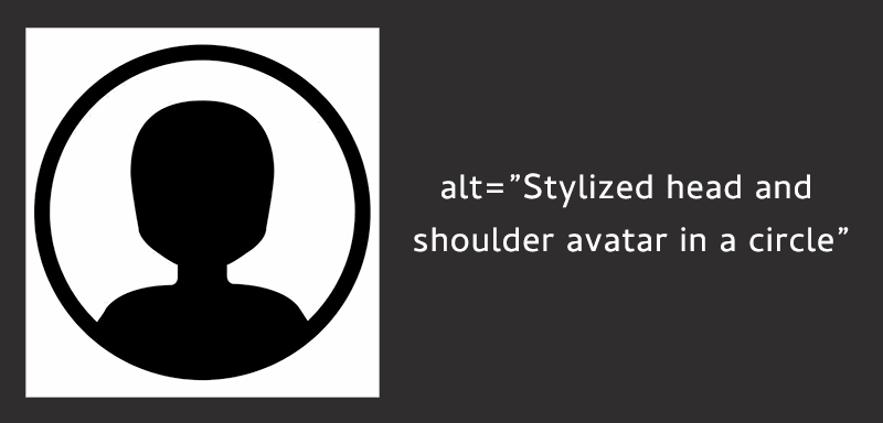
Blank avatar with text that reads alt=Stylized head and shoulder avatar in a circle.

How has it been handled historically?

I’ve seen a couple trends over the years. They kind of make sense to some level, but they aren’t enough to really provide the same level of information for people with vision impairments as for sighted people.

  1. Use empty or null alt text. This would be using something like alt=””. This basically tells screen readers that the image is decorative and not worth worrying about. This is the lazy way out.
  2. Use the person’s name as alt text. This would be using something like alt=”Nicolas Steenhout”. It’s somewhat useful if a screen reader user is trying to find an image of the person. But it doesn’t tell them anything about what the person looks like.

It’s not something that has been picked up by accessibility auditors much. At least, I’ve not seen it raised in audits from different accessibility companies, or discussed between accessibility experts much. But it is something that I’m hearing more and more blind folks asking for.

Informative image

A user avatar or photo is an informative image. The image was selected specifically to say something about the person. You probably have spent a bit of time pondering what image or photo of yourself to use on social media. You’ve probably changed that image several times over the time you’ve been on social media. Each time you change, there’s a reason for it. Maybe you don’t look like you did back when you last uploaded an image. Maybe you want to suggest a different mood. But these images are not just decoration. They are there to provide some kind of information.

What information do you get from these images?

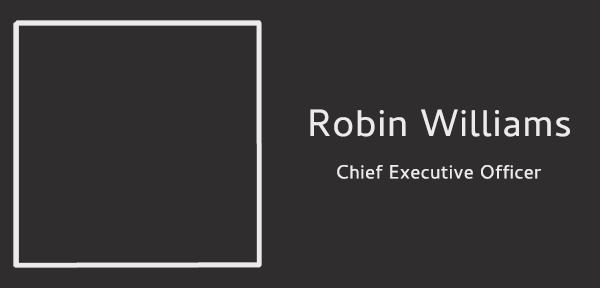
Imagine you’re blind. Your screen reader is able to announce alt text. But the image on these screenshots have been marked with alt=””

Screenshot with the outline of a photo but the photo is left blank. Text on the screenshot reads: Robin Williams. CEO.

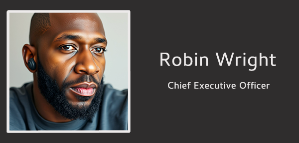
Screenshot with the outline of a photo but the photo is left blank. Text on the screenshot reads: Robin Wright. CEO.

What can you tell me about either Robin Williams or Robin Wright, apart from their name and the fact they are CEOs?

Now let’s look at the same screenshots. But we’re sighted. So we have access to the information available visually in the photos.

What can you now tell me about Robin Williams and Robin Wright?

Did you assume that Robin Williams was a man and Robin Wright was a woman? It would be easy to do so considering they are famous actors.

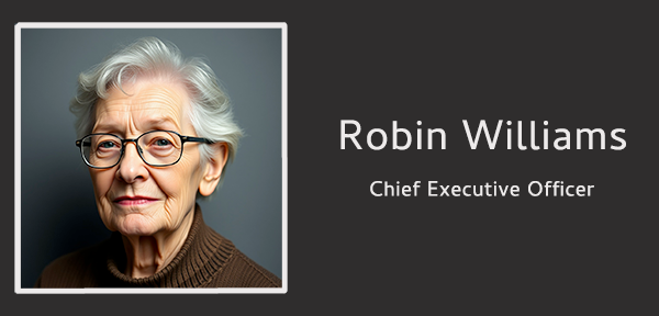
You probably can tell their gender. You can tell their approximate age. You can tell what their race is. You can tell if they use assistive devices such as glasses or hearing aids. There’s a lot of information about someone that comes through photos.

Screenshot with an outlined head and shoulder portrait of an elderly white woman with short grey hair. She is wearing black glasses. Text on the screenshot reads: Robin Williams. CEO.

Screenshot with an outlined head and shoulder portrait of an younger black man. He has very short hair and a dignified black beard. He is wearing hearing aids. Text on the screenshot reads: Robin Wright. CEO.

This is why avatars or photos of people are considered informational. They require clear and concise alt text that describes the individual. This is in order to at least give part of the same information to blind screen reader users as we get as sighted users.

Note: These photos were AI generated and are not anyone real.

What information is important?

Sighted users can typically tell the following information just by looking at a photo:

  • Age range
  • Gender
  • Race
  • Clothing style
  • Hair style
  • Facial hair
  • Does the person use glasses or hearing aids or other assistive tech?
  • Anything else that is striking about this person that says something!

This information helps us form a mental image of the person we’re interacting with.

Brief and concise, but accurate

It’s easier to determine what alt text to write if you’re describing your own photo. For situations where HR might be writing alt text for all the employee photos on the corporate website, this might be trickier.

Keep in mind that alt text should be brief, concise, and accurate. There’s no actual limit to the length of alt text you can write. Unless a specific platform limits the number of characters. For example, LinkedIn limits you to 1,000 characters. But while there’s no character limit, we do want to keep it concise. A super long text alternative becomes cumbersome and maybe less useful.

  •  
❌