Earlier this month, we announced platform properties for Search Console,
allowing you to track how your social and video posts on Instagram, TikTok, X, and YouTube perform on Google Search,
Discover, and Google News. Today, platform properties are globally available to everyone.
We’ve all heard of the sacred rule in modern web development, the rule never to be broken. The rule of “Never block the main thread.”
You almost can’t miss it as a web developer; it’s in almost every performance guide, and to be fair, it is good advice. We all know the browser’s main thread is single-threaded, meaning it can only do one thing at a time.
Plus, as we know, the main thread isn’t ours alone; we share it with the browser’s rendering engine, input handlers, and other critical tasks. As a result, the less time we hold onto the main thread, the more responsive an app feels. That leads us to share tasks with background workers as we’ve convinced ourselves there should be a hard line between the UI and any computation, and that line shouldn’t be crossed.
And that is what a “recommended” architecture looks like.
But I dare say that sometimes**, moving the data to a worker is slower than just letting the main thread do the work.
I found this out a few months ago while building a Chrome extension with screenshotting features called Fastary. I kept finding a latency of about 2 to 3 seconds in all my testing, even after using an Offscreen Document (a background process in Chrome extensions) to handle the canvas operations. A screenshot task should feel instant without lag, after all.
It is quite ironic that by reflex, we move work away from the main thread to avoid freezing the UI, but sometimes the act of moving that work (e.g., serializing, copying, and deserializing) can also freeze the UI. And sometimes the recommended approach of letting the background do the work can be slower than just doing the work on the main thread.
Let’s talk about that.
The Architecture Of Browser Context Isolation
To put things in perspective, let’s understand why we isolate browser contexts and how they communicate with each other, with emphasis on the communication part.
A browser is more than a single environment. Different environments are running at the same time, each having its own memory space, what it can access, and rules:
The main thread is what we are most familiar with; this is where JavaScript logic runs, where the DOM lives, where styles get rendered, and where users interact.
The Web Workers are separate threads that can also execute JavaScript without DOM access. We mostly use this for heavy data tasks.
The Service Workers are network-related proxies in charge of intercepting network requests and can even run when the page is closed.
And then there are Chrome extension contexts, where we have background service workers, content scripts, and Offscreen Documents (the relevant ones for this article).
Each one of these is isolated from the others. A web worker or background script lives in a different memory space from the main thread. They cannot just reach and read each other’s variables or logic, and this is known as the “shared-nothing” architecture.
How do these isolated environments communicate? They explicitly message each other back and forth using APIs, like postMessage().
The Structured Clone Algorithm
postMessage() tells the browser to take a piece of data and deliver it to the context that requested it. But to do this, the browser relies on the Structured Clone Algorithm (SCA).
You’re probably familiar with JSON.stringify(). SCA is similar, but much stronger and smarter. In its simplest form, SCA is a deep, recursive copy operation, i.e., cloning. It walks through the entire data structure it is given, clones every single value, serializes it into a transportable format, ships those bytes to the target contexts, and then reconstructs the original object on the receiving side.
SCA is fast, or maybe fast-ish... For a small regular config object like {theme: "dark"}, it is imperceptible; you don’t even notice it. The story changes, however, when dealing with heavy data because the SCA is a synchronous blocking O(n) operation, i.e., the cost increases linearly with the size of your data.
Let’s put that into perspective. A user clicks a button, and internally, an 8MB image payload is sent to a background worker for processing. When you call postMessage(), the main thread must immediately stop what it is doing to run this serialization and copying process.
So, if the time it takes to pack, ship, unpack the data, and go back to the start is longer than the time to just process the data on the main thread, why not do that instead?
What About Transferable Objects?
I’m sure some of you are already thinking, “Why not just use Transferable objects?” And that is a valid point. Let’s talk about that.
Developers who really pursue ultra-high-performance web apps usually use Transferable objects (e.g., ArrayBuffer, ImageBitmap, or MessagePort) to bypass the Structured Clone Algorithm. This is because when you transfer an object, you’re not making a copy (like SCM). Instead, the browser switches ownership of the data from one context to another.
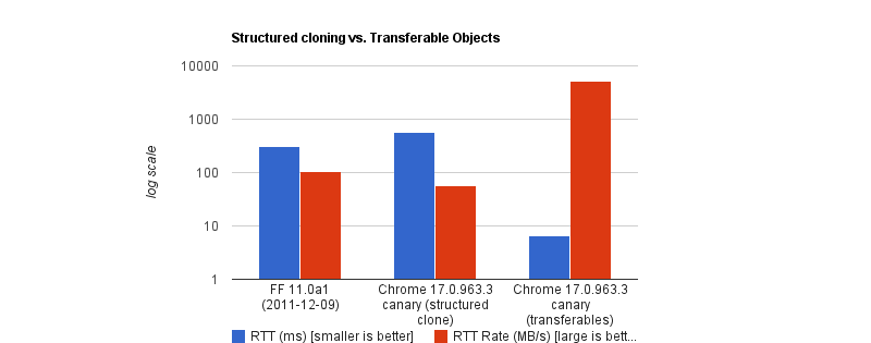
The browser performs a hand-off whereby the sending context loses access to the data instantly, and the receiving context takes full control. It is actually insanely fast. According to Chrome Developers’ benchmark, transferring a massive 32MB ArrayBuffer can take under 7ms, compared to about 300ms when cloning with SCM. That’s a 43x speed boost.
But like all good things, there are downsides. To name a few:
You lose it once you send it. If the UI still needs that data (like to show an image preview), you can’t access it anymore.
Not all data is transferable. A plain JS object is not. A Blob is not. Even a Base64 string is not.
API limitations. In the context of browser extensions, Chrome’s internal messaging (chrome.runtime.sendMessage) traditionally forces everything through JSON serialization.
So, as far as my screenshot extension went, Transferable objects were not an option.
Why We Isolate Contexts Anyway
Why do we even bother isolating contexts at all? Why not just leave it all to the main thread?
Offloading long-running CPU tasks to a background thread is absolutely the right thing to do. The browser needs to paint a new frame every 16.6ms to keep things fluid; that means any task that takes >50ms is generally considered “long”. Offloading to the background is absolutely the right thing to do.
The issue, however, is that we’ve turned this “never block the main thread” into an absolute rule, without asking is this task expensive to process or expensive to move?
I have come to realize now that the rule is less “never block the main thread” than “never block the main thread for too long.”
When The Right Architecture Is The Wrong Architecture
My goal with the Fastary extension was to make it feel like a native app, running as smoothly and instantly as you would expect a native app to.
As you already know, I took the recommended approach to use the Offscreen Document to handle DOM work in the background. But to my surprise, that took a different turn.
The Offscreen Document API is a clear winner. You create a hidden, undisplayed document that runs entirely in the background. It has a DOM and supports Canvas. For example, if I want to crop a screenshot, stitch multiple screenshots together, perform heavy image manipulation, or add a watermark, Offscreen Document was made for that.
Turns out that was not the best approach. This was my architecture:
The background Service Worker captures a screenshot with chrome.tabs.captureVisibleTab(), which returns a Base64-encoded data URL string.
The background Service Worker uses chrome.runtime.sendMessage() to ship this image payload to the Offscreen Document.
The Offscreen Document receives the image, loads it into an <img> element, then draws it onto a canvas before it applies the user’s crop coordinates, encodes the result, and sends the processed image back to the background worker.
But when I tested it, the screenshot didn’t feel instant. As I said earlier, there was a consistent 2–3 second lag.
I figured out that when captureVisibleTab() takes a screenshot, it returns a Base64 URL string, and on a standard 1080p screen, that string could be approximately 1MB or more, depending on how detailed the image is. It gets even more interesting on modern Retina displays (e.g., MacBooks) as they tend to automatically double the image’s size by default.
Keep in mind that since the image payload could be doubled and extension messaging relies on JSON serialization (as of this writing), we potentially deal with massive synchronous communication that costs an entire round trip.
The image string data is JSON-serialized at least twice: once when going into the Offscreen Document and once coming back out with the processed results to the background worker. The actual image processing (cropping) done inside the Offscreen Document was fast, no doubt, but I can’t say the same about the transfer overhead.
The Retina High-DPI Problem
As if the latency itself wasn’t enough, I noticed a rather subtle bug — which, now that I think of it, was more of my ignorance. After a screenshot was taken, the crop result was completely off in a way that either weirdly scaled the image or resulted in incorrect coordinates.
It turns out that when a user selects a region to crop, the content script gets the box coordinates using getBoundingClientRect(), which is measured in CSS pixels; this is what the DOM uses. But when the screenshot is captured natively in Chrome, the browser doesn’t crop it automatically; it instead uses the physical hardware pixels to get the full screen capture. And the browser uses devicePixelRatio (DPR) to know how many physical pixels should represent one CSS pixel. Basically, if a user on a Retinal display (DPR = 2) highlights an area of 400x300 CSS pixels, the actual captured image area is 800x600 physical pixels.
Note: One CSS pixel is equal to 1 physical pixel (DPR of 1) on a standard monitor. On a Mac Retina display or a modern 4K monitor, however, the DPR is usually 2 or 3.
For an accurate crop, I needed to apply these two different measurement systems with the right DPR, i.e., scale the crop coordinates by the DPR. But remember, Offscreen Documents have no physical display. Processing any image would have a default DPR equal to 1. To fix this, I would have to capture the exact devicePixelRatio from the active tab, serialize it, pass it alongside the image payload, and manually do the scaling math inside the Offscreen Document. The complexity starts to compound.
What if I broke the golden rule and did the work on the main thread instead?
Working On The Main Thread
Some developers will argue that UI tasks are the only things that should run on the main thread, but I don’t fully agree with that. Personally, I believe that user explicitly-invoked actions that need immediate results can sometimes get a solid pass to run on the main thread, provided the work is incredibly fast (e.g., 1s).
That’s what I did: scrap out the Offscreen Document and reengineer the logic. Instead of:
…I decided to run the whole image processing in the active tab:
The background Service Worker captures the screen and gets the Base64 string (same as before).
The background sends the payload directly to the content script in the active tab using chrome.scripting.executeScript().
The content script (running on the main thread) receives the payload, draws it to a canvas, performs the crop using the correct DPR value, and copies the result to the clipboard.
// Background Script
const screenshotUrl = await chrome.tabs.captureVisibleTab(undefined, { format: "png" });

// Inject the processing function into the active tab as a content script
await chrome.scripting.executeScript({
  target: { tabId: activeTab.id },
  func: processAndCopyImage,
  args: [{ base64Image: screenshotUrl, cropData: userSelection }]
});
This approach completely clears out multiple context hops and round trips that JSON serialization requires. The only cross-context transfer involves sending the data URL from the background to the content script.
The Retina DPI issue essentially solved itself, as the content script runs directly inside the real, active browser tab because it knows the monitor’s real devicePixelRatio.
But there’s an elephant in the room that you may have noticed.
Sure, the image is now processed on the main thread, and the background manipulates the canvas in the active tab. I could technically be blocking the main thread. That’s where I amended the “no blocking the main thread” rule to “no blocking the main thread for too long.” In this specific case, at least, blocking the main thread for a task the user requests for approximately one second is justifiable. It works conversely as well: maybe don’t isolate processes if the data transfer cost is greater than the processing cost.
Conclusion: When To Isolate And When Not To
I’ve boiled it down to a mental model that depends on whether the task is:
1. Compute-Heavy Tasks (CPU-Bound)
These are tasks where the primary cost is computation and not the size of the data itself. These are tasks where most of the time is spent on doing calculations or heavy transformations, e.g., image compression, audio profiling, physics simulation, etc.
The transfer cost for these tasks is minuscule compared to the actual work.
2. Data-Heavy Tasks (Data-Bound)
These tasks are the exact opposite. These tasks are only expensive because of the size. The processing time is almost insignificant, but the data is expensive to transport, e.g., image cropping, filtering an array, shallow copy, etc.
In my specific case, offloading the task to the background falls mostly into negative-sum efficiency. If we are talking about moving megabytes of data to perform a 50ms operation, there is no benefit to offloading it to the background.
Perhaps we can think of it like this:
Total Time = Serialization Cost
  + Transit
  + Background Processing Time
  + Deserialization Cost
Looking at this, if the “background processing time” is the most dominant task in your operation, then isolation is the clear winner. But if serialization, plus deserialization, plus transit exceeds that cost, then there’s no need to isolate things.
And if you can’t figure out if the task is CPU-heavy or data-heavy, it certainly doesn’t hurt to measure it, for example, using performance.mark() and performance.measure() around postMessage calls to profile the transfer cost.
The earth is heating up and AI isn't helping. It drives major increases in electricity use, water use and CO2 emissions. Yet, industry and governments alike seem keen to leverage the latest tech. Can we make greener choices?
Yesterday, I spoke at a conference on AI in government about sustainable choices. The presentation and slides were in Dutch, this post is a high level summary of what I covered.
As the presentation took place during a record-breaking heatwave, which meteorologists attribute to climate change, and there were some airconditioning-related issues, very little irony was lost on us.
Words matter
I started out talking about if AI is good or bad for sustainability and called it the wrong question. It's the wrong question, because both AI and sustainability are concepts that have many meanings.
AI can be understood in different ways:
as a technology, there are many kinds; Microsoft alone has 78 products named Copilot, but also, there are many types of AI, like computer vision, natural language processing, generative AI and agentic architectures. Traditional vs generative can be a useful distinction in sustainability, because of the difference in energy impact.
as an economic phenomenon (it isn't profitable yet, so it may get more expensive or introduce ads, and there are lots of financial stakes that explain why it's sometimes forced on consumers)
as an infrastructure (behind the cloud metaphore, there are very real data centres that warrant closer inspection)
Sustainability is multi-faceted too. In the Web Sustainability Guidelines, we center our definition around three pillars that ultimately need balance between them: Planet, People, and Profit:
Planet: its surface temperature rises due to emission of greenhouse gases that trap heat, and it has a finite amount of water of which only a small portion is suitable to drink.
Profit: within our capitalist system, the needs of planet and people need to be balanced with profit, in order for anyone to successfully make the case for change.
So, there's some nuance about what the words mean, but despite that, it's worthwhile to try and reduce climate impact of our services. The pope said so, and in government, it's an increasingly a priority (like in the UK, where the Digital Service expanded their design guidance last year with principle 11: Minimise environmental impact) .
It's ok not to use AI
I shared five tips to make greener choices around AI, but couldn't help myself to add a bonus tip as tip zero: in many cases, not using AI for your project makes the most sense. Which is fine.
Many of us will have sat in meetings around a new idea or project, where someone put up their finger and said ”oh, maybe we can use AI for this”. The AI vendors primed us for this with hype.
Often, using AI, and especially generative AI, is like going to your local corner shop using a helicopter. What if you could solve the same problem with a couple of lines of Python, and Excel-sheet, people, or manually summarising?
I wanted to mention this specifically, because nobody wants to be the downer in the group and suggest not doing the thing that everyone is hyped about. But to be sustainable, we need to pick out just the cases where AI is absolutely necessary, and go without it for anything else.
Five tips to make greener choices
When using a specific type of AI actually solves your problem best, here's five tips to make greener choices.
Smaller models
When using generative AI, model size differs wildly. An example of a large model is DeepSeek v4 Pro, which has 1.6 trillion parameters (12 zeroes), while there are small models like Hugging Face's SmollLM that has 135 million parameters (6 zeroes).
A lot of generative AI uses so-called general purpose models, which are systems that know pretty much everything about the world. When hiring humans, we usually list a specific area of expertise. That's partially because there are no humans that know it all (just ones that think they do).
We should try to do the same with language models. If we're building a system that answers questions about taxes, we don't need to tell it what the capital of France is.
In “Power Hungry Processing”, Luccioni, Jernite, & Strubell explains this: “multi-purpose generative architectures are orders of magnitude more expensive than task-specific systems for a variety of tasks, even when controlling for the number of model parameters” (emphasis mine).
Be smart about data centre usage
In many applications of AI, the relevant software needs lots of computing: GPUs, CPUs, memory, and storage. This computing is often done in the “cloud”, or: data centres. The climate impact of data centres is widely seen as three components: electricity, CO2 emissions (and equivalent greenhouse gases), and water usage.
The International Energy Agency predicts the amount of data centres to double or triple over the next few years. The electricity used for this will be green, partially. But it won't all be green : gas and coal will continue to be a share of what powers data centres.
On an operational level, we could reduce the load on data centres by reducing how many tokens we use, via smarter prompting (shorter, more specific, more explicit, less repetition through variables). The paper Smarter, smaller, stronger by Perez Ortiz and Drobnjak details tests that show reducing a response from 400 to 200 words reduced energy consumption by 54%.
On a policy level, one tip I learned at the AI reporting event I attended, is to question how many 9's you really need. Data centres are convenient because they offer compute for rent and make it easy to scale. And they offer uptime, guaranteeing sometimes up to 99,99999 availability: five nines. More nines could mean less sustainability: some data centres will use diesel power or other unsustainable sources when they have a power cut. So to get to a higher uptime guarantee, they need to make such choices. What if we required less nines? What if we decided it's ok to have the AI thing not work for a couple of days a year?
Recognise greenwashing
Greenwashing is everywhere, and to make sustainable choices, we'll need to develop our skills to recognise it from afar. Sometimes it's easy to recognise, like an airline that said with them, you can “fly responsibly” (a Dutch court said this is misleading). EU Directive 2024/825 effectively forbids greenwashing, but companies still tend to do it.
“bait and switch”: often “traditional” AI has a much smaller footprint than generative AI; when companies point at how clean their traditional AI is while ignoring the effect of their generative AI, this is misleading
use of (own) research with little evidence
hidden emissions through clever bookkeeping (often leaving out Scope 3 or ‘embodied’ emissions)
empty promises, like pointing at technologies that don't exist yet
downplaying via selective shopping in data or data without context
fatalism: “we'll reach those sustainability goals anyway, why bother trying”
When you do get data, it often does not include Scope 3 emissions, which are estimated to be a very large part (I've seen percentages from 30 to 89%, and I am not sure what's right, other than that it is large).
There can also be a major difference in reporting: some companies do location-based reporting, others market-based reporting. Location-based means that you get information about how much a specific data centre is actually using, whereas with market-based, factors outside are taken into account, including certificates for carbon.
Location-based data is the most helpful if your team is trying to make optimisations, because it allows them to see the numbers go down (or up),where they would appear constant with market-based reports.
Lastly, I mentioned grid intensity: because there are many different power sources, and they deliver different amounts of energy depending on the time and location, grid intensity vary. For instance, if it's sunny and windy today at noon, the grid intensity will be low because there is lots of green energy available. At other times there's less.
Your application can use this difference, that constantly changes, by moving your computing to the right place at the right time. This is also called “carbon aware computing” and companies like Google already do it, to save emissions and costs at the same time.
Summing up
AI-related electricity usage, water use, and carbon emissions can be huge. That's a problem, but it's also an opportunity (cheesy but it's true). There is lots of low-hanging fruit that we can start addressing. As there's still so much to reduce, our efforts really can make a dent.
I really enjoyed giving this talk and hearing the audience comments afterwards. The main worry seems to be: how do I sell this within my organisation, and an answer emerged in the group: cost-savings and carbon-savings often go hand in hand.
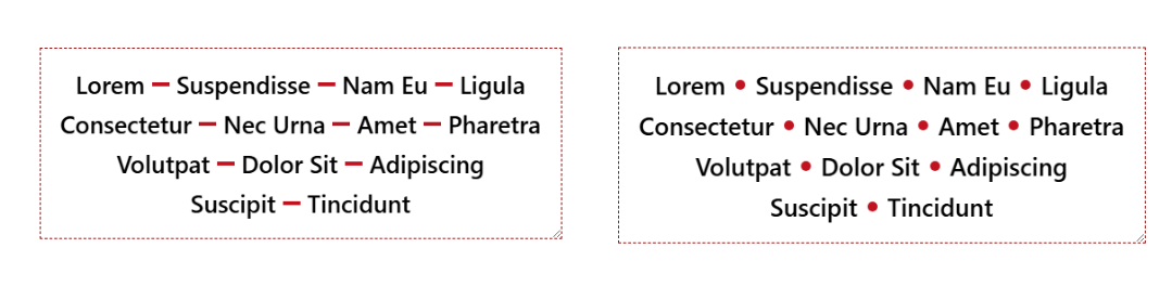
Separating a horizontal list of items with a divider is a common design pattern. The tricky part is making sure we have separators only between adjacent items, never at the beginning or the end of the row/line.
There are many hacky ways to solve this, but the new Gap Decoration feature offers a simple, modern solution. No more hacks and only a few lines of code to get the shape of the divider you want.
Le 13 juin dernier, la société Anthropic, connue pour sa domination du marché de l’intelligence artificielle générative avec les grands modèles de langage (LLM) de la série « Claude », s’est vue contrainte, sur ordre du gouvernement américain dont elle dépend, de couper l’accès à certains de ses services aux ressortissants étrangers.
Le pourquoi importe moins que le geste. Il est ici question de décider arbitrairement de qui a le droit d’utiliser quoi, et selon quels critères. De faire fi de la justice et de la morale.
Using SEO (search engine optimization) to justify accessibility was only ever a technique for bosses or clients or stakeholders who see accessibility as a cost center and are typically driven more by dashboards or money. Ideally, you want to get past that ASAP to drive better outcomes for humans, not SERPs (search engine results pages). I get it as a foot-in-the-door tactic — hopefully it goes no further.
But SEO also drove bad accessibility practices, such as alt text keyword stuffing, low-contrast text, verbose headings, link text built around keywords, gratuitous landing pages, and more. Karl does a good job of demonstrating how little SEO and accessibility are connected. As such, I’ve always been wary of companies pitching accessibility and SEO in their marketing.
Now I see companies pitching accessible & “AI-ready” or “agent friendly” work, often still including SEO. I’m calling foul.
We’ve already seen anti-user guidance from LLM companies asking for their notion of accessible sites. Never mind that these PhD-level genius LLM tools can’t handle a general site most kids navigate with ease. Let’s ignore the failure of that technology and instead start slapping misunderstood ARIA attributes on all our pages instead.
Sure, there’s overlap between SEO and LLM-thieving. SEO and accessibility even have slight overlap. But accessibility is about people. Twisting a human affordance to feed these corporate efforts to make humans redundant (among all the other harms) is a signal. Different people will read that signal in different ways. If it sells work and you still focus on humans first, cool.
But to me that signal says you aren’t serious about the work. That your TESCREAL patch is just waiting to get sewn on. I’m trying to be less absolutist, less black-and-white. But boy is it hard given what I see every time I peel back the veneer.
Pour rappel <dialog> permet de créer des boîtes de dialogue (modales, popups, popins, elles ont tant de noms) en HTML sans plus avoir à tout gérer en CSS+JavaScript pour positionner un élément <div> en absolu.
Et on a aussi connu cela : une popin qui se ferme quand on appuie sur echap alors qu'on voulait forcer l'utilisateur à valider un formulaire, ou à l'inverse une modale qu'on ne peut fermer qu'avec un bouton alors qu'un clic en dehors serait tellement plus naturel. Jusqu'ici, la solution consistait à empiler du JavaScript pour gérer ça à la main.
L'attribut closedby s'ajoute directement sur l'élément <dialog> et accepte trois valeurs :
any — le dialogue se ferme via la touche Échap, un geste natif (retour arrière sur mobile), ou un clic en dehors (correspond à ce qu'on appelle un light dismiss).
closerequest — fermeture via la touche Echap ou geste natif uniquement, pas de clic en dehors. C'est le comportement par défaut d'une modale ouverte avec showModal().
none — fermeture uniquement via code (bouton, soumission de formulaire…), aucune alternative native.
Exemples rapides :
<!-- On peut cliquer à côté pour fermer -->
<dialog closedby="any">
  <p>Aperçu rapide, fermable au moindre clic extérieur.</p>
  <button onclick="this.closest('dialog').close()">Fermer</button>
</dialog>
<!-- Aucune fermeture "accidentelle" possible -->
<dialog closedby="none">
  <p>Formulaire critique. On ne vous laisse pas esquiver comme ça.</p>
  <button onclick="this.closest('dialog').close()">Valider et fermer</button>
</dialog>
Et sans closedby ?
Si l'attribut est absent ou invalide, le navigateur applique un comportement automatique :
- showModal() → se comporte comme closedby="closerequest" (Echap fonctionne).
- show() ou attribut open → se comporte comme closedby="none" (rien ne ferme sans code).
Autrement dit, rien ne change pour vos éléments existants. Ouf la rétrocompatibilité.
Compatibilité navigateurs
À ce jour, le support atteint environ 70 % de couverture globale d'après Caniuse ce qui est encourageant mais insuffisant pour un usage en production sans y réfléchir.
Navigateur
Support
Chrome / Edge
✅ depuis la version 134
Firefox
✅ depuis la version 141
Opera
✅ depuis la version 119
Safari (macOS & iOS)
❌ pas encore supporté
🐌 Safari reste en retrait... et tant que ce n'est pas supporté un fallback JavaScript pour le light dismiss peut faire l'affaire :
// Fallback pour les navigateurs sans closedby="any"
document.querySelectorAll('dialog[closedby="any"]').forEach((dialog) => {
  document.addEventListener('click', (e) => {
    if (dialog.open && !e.composedPath().includes(dialog)) {
      dialog.close();
    }
  });
});
Accessibilité
L'attribut closedby agit uniquement sur la fermeture, il ne modifie pas la sémantique de l'élément. Les bonnes pratiques habituelles restent donc :
closedby="any" : le clic en dehors ferme la boîte de dialogue, vérifiez que ce comportement est prévisible pour les utilisateurs de lecteurs d'écran. Un clic accidentel à côté d'un formulaire partiellement rempli peut surprendre. Réservez cette valeur aux interactions légères et non critiques (petites popups d'information ou de prévisualiation).
closedby="none" : si l'utilisateur ne peut pas fermer via la touche Échap ni en cliquant en dehors, il doit impérativement y avoir un bouton de fermeture, accessible au clavier et aux technologies d'assistance.
Gestion du focus : à l'ouverture, le focus doit aller dans la modale ; à la fermeture, il doit revenir sur l'élément déclencheur (qui a ouvert la modale, par exemple un bouton).
Libellé/titre : pensez à aria-labelledby (pointant vers le titre) et éventuellement aria-describedby pour les descriptions. L'élément <dialog> expose déjà le bon rôle ARIA, mais sans nom accessible les lecteurs d'écran annoncent une boîte de dialogue anonyme.
Hi, just me heading off some bad advice I’m starting to see in developer venues.
Background
The proposed Document Outline Algorithm, where headings would automatically reset themselves to the appropriate level based on their position in the DOM structure, was never part of a final HTML specification. It was quickly proven to be unworkable; brief support in JAWS demonstrated that. You can read the tortured history (and a JAWS support demo) in my 2016 post There Is No Document Outline Algorithm.
In 2019 WHATWG worked to resurrect <hgroup>, partly in a novel effort to try to resurrect the Document Outline Algorithm. In the end, even that effort was futile. <hgroup> came back, but it came back as a grouping element only. The only impact it has on heading structures is that browser could, if they really wanted, ignore other headings in the same <hgroup>.
Authors very much want to make the browser decide heading levels for them. Authors also very much continue to write content and HTML structures that make that impossible.
So I wasn’t surprised when Firefox’s recent announcement of headingoffset support coming to Firefox behind a flag resulted in many cheering the “return” (irony quotes) of the Document Outline Algorithm.
But it isn’t.
headingoffset
The headingoffset attribute lets authors offset heading levels for descendants of a given node.
So if you have, say a dialog that starts at <h2>, you could add headingoffset="2" and then let it pull in (server-side or via your preferred user-slowing front-end tooling) another page that uses <h1> as its first heading, you can be comfortable knowing that <h1> will be treated as <h3> in the accessibility tree.
This can be handy for content re-use without authors needing to make every heading a variable or burning down the DOM each time to forcibly re-write them.
But it’s still the author’s job to make an intentional and good decision. The browser will know nothing more about your content or structure than it did before. And it certainly doesn’t reduce WCAG risk.
Other useful nuggets:
headingoffset values must be valid non-negative integers.
headingoffset values must be between 0 and 8.
headingoffset values greater than 8 are specified to max at level 9, but existing bugs may impact that.
Other invalid headingoffset values should fall back to level 2, but again, bugs and implementation decisions wil impact that.
headingreset is a boolean attribute that tells browsers to ignore headingoffset for that node and its descendants.
Do not use headingoffset until you can confirm support for the computed heading level in your target audience browser.
Recap
headingoffset is not the (nor any) Document Outline Algorithm, nor does it replicate it.
headingoffset requires the author to make decisions based on content.
Until JAWS and TalkBack fix existing bugs, probably don’t do / allow any heading levels higher than 6.
Don’t do / allow any heading levels higher than 9.
If you are hoping headingoffset will resolve your heading level problems in a hands-off way with imported or user-generated content, you may end up creating confusion and WCAG risk.
Do not try to use headingoffset to try to recreate the Document Outline Algorithm.
Related
Not a ton of detail in this post, but at 500 words if you want more then here are some resources beyond what I linked:
A11Y France, association de loi 1901, fédère les personnes professionnelles de l’accessibilité numérique et les personnes concernées pour un numérique véritablement accessible à toutes et tous.
Vous défendez l'accessibilité et vous vous heurtez à des objections ? Ce guide couvre 9 objections classiques, avec données, arguments et stratégies concrètes pour convaincre vos équipes d'investir dans l'accessibilité.
Today, we're excited to announce the launch of new Search Generative AI performance reports
in Search Console, including dedicated reports for Search and Discover, to help you understand your
site's visibility within generative AI features on Search.
Le centrage vertical en CSS… C’est historiquement l’une des difficultés les plus célèbres du développement web, un sujet de plaisanterie classique qui fait sourire les développeurs back-end et désespérer les intégrateurs depuis l’époque de CSS2.
Pendant près de quinze ans, nous avons multiplié les détours techniques. Nous avons buté sur des vertical-align: middle capricieux réservés aux tableaux, ou des position: absolute combinés à des top: 50% et des transform: translateY(-50%) aussi magiques que fragiles.
Cette époque de savants calculs et de lignes de code superflues est désormais révolue depuis l'arrivée des modèles de positionnement Flexbox et Grid Layout.
Ceci dit, une petite révolution est passée quasi inaperçue, et pourtant elle simplifie tout : la propriété align-content fonctionne désormais dans le flux normal (Block layout). Plus besoin de déclarer un display: flex ou display: grid simplement pour aligner du contenu verticalement.
Le grand déblocage : align-content partout, pour tous
Jusqu’à récemment, align-content était une propriété exclusivement réservée aux modules Flexbox et Grid Layout. Elle permettait de distribuer l’espace entre les lignes ou d’aligner le contenu sur l’axe secondaire. Si vous tentiez de l’appliquer sur un simple bloc de texte (display: block), le navigateur l’ignorait superbement.
Grâce à une mise à jour majeure des spécifications CSS (CSS Box Alignment Module Level 3), align-content est désormais fonctionnel dans tous les modes d’affichage.
Un support universel et moderne
C’est une excellente nouvelle : ce comportement n’est pas une simple piste de réflexion, il est déjà pleinement supporté par tous les navigateurs modernes (Chrome, Firefox, Safari et Edge). Vous pouvez dès aujourd’hui l’utiliser en production pour simplifier considérablement vos intégrations.
Alors comment ça marche ?
Le principal avantage de cette évolution est l’économie de code et de structure HTML. Voyons cela à travers deux cas d’usage concrets.
1. Le centrage vertical parfait
Pour centrer un contenu verticalement dans un conteneur de hauteur fixe ou minimale, il suffit désormais de deux lignes de CSS sur le parent. Pas de Flexbox, pas de Grid, juste du bloc natif.
.hero-banner {
  display: block; /* Optionnel, c'est le comportement par défaut d'un div */
  min-height: 400px;

  /* La magie opère ici */
  align-content: center;
}
Ce qui change par rapport à Flexbox
Avec Flexbox, écrire align-items: center (ou align-content) nécessite impérativement un display: flex. Le problème, c’est que le passage en mode Flexbox modifie le comportement de tous les enfants directs (ils deviennent des flex items, se mettent en ligne par défaut, etc.). Avec align-content sur un bloc, les enfants restent des blocs normaux, conservent leurs marges et leur comportement natif dans le flux.
2. Aligner en bas de page
Vous souhaitez positionner un pied de carte ou un texte tout en bas d’un bloc sans avoir recours au positionnement absolu ? L’opération est tout aussi directe :
.card {
  min-height: 300px;
  align-content: end;
}
Vous pouvez bien sûr utiliser toutes les valeurs classiques de la propriété : start, end, center, space-between, space-around, space-evenly.
Tableau récapitulatif des valeurs courantes
Valeur
Effet sur un bloc (display: block)
start / flex-start
Aligne le contenu au début (haut) du conteneur.
center
Centre le contenu verticalement.
end / flex-end
Aligne le contenu à la fin (bas) du conteneur.
space-between
Distribue l’espace résiduel entre les blocs enfants.
Et pour l'axe horizontal ? Le cas de justify-self
Si align-content règle magistralement la question de l'alignement vertical sur le parent, une autre propriété complémentaire pointe le bout de son nez pour l'axe horizontal : justify-self.
Appliquée cette fois directement sur un élément enfant au sein d'un bloc, elle a pour but de lui permettre de se positionner de manière autonome à gauche, à droite ou au centre de son parent (par exemple avec justify-self: center ou justify-self: end).
Pour le moment, le support actuel par les navigateurs reste encore trop partiel pour envisager une utilisation en production. Pour l'alignement horizontal d'un bloc individuel dans le flux normal, les bonnes vieilles marges automatiques (margin-inline: auto, etc.) ont donc encore de beaux jours devant elles.
Pourquoi ça change la vie ?
Au-delà du gain de temps, cette évolution CSS apporte une vraie rigueur sémantique et technique :
Lisibilité du code : Moins de conteneurs (div) superflus créés uniquement pour corriger des défauts d’alignement.
Performance cognitive : Le code est plus lisible. Quand on lit align-content: center, on comprend immédiatement l’intention, sans avoir à analyser si le display: flex associé ne risque pas de perturber le reste de la mise en page.
Respect du flux : On conserve la puissance et la prévisibilité du modèle de bloc traditionnel là où Flexbox ou Grid n’étaient finalement que des détours techniques pour un besoin simple.
Dix-quinze ans après les premiers débats enflammés sur les forums d’Alsacreations pour savoir s’il fallait utiliser les display: table-cell ou des hacks à base de lignes fantômes, le CSS moderne nous offre enfin l’outil ultime. Une seule propriété pour les gouverner toutes. Elle n’est pas belle, la vie d’intégrateur en 2026 ?
Just in time for Google I/O, the Chrome for Developers site announced Modern Web Guidance (MWG):
Modern Web Guidance is a set of evergreen and expert-vetted skills that guide your AI coding agents across many common use cases to build modern web experiences that are accessible, performant, and secure.
I appreciate this set of LLM skills lists accessibility first, something I feel strongly every MVP (or early preview as Google calls this) must:
Simply, if your MVP does not have accessibility factored in, it is not viable. If you claim accessibility is a core principle but your version 0 does not include it, then it is not a core principle.
Last year I made a straightforward and simple request to Google (that also respects the law in most jurisdictions where Google does business):
Please, if your team cannot explain how the thing satisfies all WCAG Success Criteria at Level AA, then don’t release the thing.
Unfortunately, MWG accessibility doesn’t satisfy. Partly because not every pattern has tailored guidance. For example, you may remember when Google ran at a toast pattern before abandoning it:
Again, the people designing the feature neither understood accessibility nor had consulted anyone who did while they designed it, instead relegating accessibility to the later stages of their design and assuming it could simply be remediated with a modest effort and without any serious redesign or rethink.
I hoped Google also remembered and applied that experience here, making a skill tailored to toasts to avoid another debacle. Nope.
Reopening because this guide needs accessibility guidance in some form as there’s no general toast guidance.
But this is an early preview of what developers can do with MWG. It’s not going to cover every pattern. That would be absurd. So let’s look to a pattern Google decided to showcase at launch via this first example prompt on the page:
Create an accordion-style stats component that smoothly animates on open and close.
I expected a pile of <details name> elements, maybe CSS block-size with a JavaScript fallback, probably a couple placeholder images for generic stats, possibly a well-formed table to accompany them, and of course all of it passing WCAG. This is what Antigravity produced with MWG:
Antigravity with MWG went well beyond the prompt, providing a theme switcher, configuration settings, and plenty of calls to Google fonts. But it failed to do what I asked. The animation doesn’t work in Firefox. This despite the promise of baseline / Baseline support and fallbacks:
Progressive Enhancement & Nuanced Fallbacks: We distinguish between purely additive enhancements (like speculative preloading) which are safe to let older browsers silently ignore, and critical behaviors (like dialog controls or network beacons) where we write highly considered, low-overhead fallbacks.
[…]
Baseline-Aware Integration: We leverage real-time compatibility data from the Baseline project so agents can dynamically adapt to current browser support and any browser support preferences.
This is already worrisome given we know that three years on, Baseline still doesn’t really address baseline support:
The relatively new Web Platform Baseline offering does not track browser support for accessibility features built into the web platform. If you need to understand whether browsers support accessibility features as your own base level set of requirements, for legal or other compliance reasons, then Web Platform Baseline does not represent a baseline.
Let’s ignore the non-DRY code, like duplicated HTML text in the script and stringing out the transition instead of using transition-property. Antigravity with MWG didn’t even create a WCAG-conformant example from its own prompt. I found errors within moments. MWG failed its core promises of creating accessible and performant code. Despite its own explicit guidance.
For the first two of these MWG already had guidance, and the a11y skill just wasn’t picked up. Overall activation aside, this highlights the importance of including contextual a11y information.
[…] [W]e should try to have one guide for each common interactive element summarizing and linking/embedding relevant bits of guidance (e.g. tabs, accordions, drawers, etc). The more scattered the use case guidance is, the less likely it is that agents will actually pick up all the pieces.
And there’s the rub. There’s no way to guarantee you’ll get what you ask for, that you won’t get something else, and that these guides — the entire promise of MWG — will be honored. MWG asks authors to trust MWG when using an LLM to code interfaces. But MWG knows its guidance may be ignored:
LLMs are non-deterministic. Even if we do everything right, there is no guarantee any guideline will be used for any given prompt. Even if the relevant guide is picked up, it may not be read fully. Case in point: As you say, MWG already had guidelines for many of these things!
The underlying code generation technology can’t be trusted to follow the rules and the rules aren’t robust enough to blunt that reality.
If your job requires you to burn tokens to satisfy some manager’s dashboard, then yes, grab the MWD skills files and integrate them into your LLM work. You’ll almost definitely get better output than if you do nothing at all. There are smart people working on this and many of the accessibility rules I saw were on-point.
But that output will be wrong in subtler and more nuanced ways across potentially fatter piles of code with more unrelated output and unwanted dependencies. It will require a more specialized set of skills to identify errors. And those errors will be different every time the code is generated.
So on the side, keep supporting any existing pattern library. If it’s built well, it’s copy-ready code that you can stuff into a project just as quickly as a chatbot could generate it. It’s deterministic, so you get the same code every time. Ideally it’s been vetted, so you don’t need to look for errors. It’s tailored to your context, meaning you don’t need to yank out random style switchers and typefaces (hoping you got all the dependencies).
If your job doesn’t require you to burn tokens, then probably ignore MWG and, by extensions, LLM for code. In case the environmental damage, intellectual property theft, wealth redistribution to the rich, encoded biases, and built-in support of fascism weren’t enough.
Update: 24 June 2026
The Silktide blog has this banger of a quote:
Across the board, [Google Antigravity using Modern Web Guidance] was a deprioritization of accessibility requirements in favor of visual presentation.
I don’t agree Antigravity nor MWG should use APG, which a regular visitor here may know, but the author is correct the APG disclosure pattern is mostly harmless.
But Silktide is right that the, once again, Google built the wrong thing for the wrong people and then proudly shoved it out into the world with no hint of self-awareness.
Google a mis en ligne un guide officiel, assez compact, que beaucoup attendaient pour expliquer comment "optimiser son site" pour ses fonctionnalités d'IA (obtention de résumés automatiques, mode "IA" dans les résultats, etc.).
Bonne nouvelle pour le web : il n'y a rien de révolutionnaire, et cela ne devrait - pour le moment - aboutir à aucune technique fourbe qui impacterait les humains ou l'accessibilité numérique.
Le message principal est que les bonnes pratiques classiques restent valables.
Le but de cette actualité n'est pas de faire la promotion de l'usage de IA par Google mais bien de souligner l'espérance d'une absence d'impact supplémentaire sur la qualité du web actuel.
Les réponses générées par l'IA de Google s'appuient sur le même index de recherche qu'avant : si vous n'êtes pas indexé, vous n'existez pas pour l'IA non plus.
On attend toujours un contenu de qualité, une structure technique propre, une bonne expérience utilisateur. À ce sujet Google a également confirmé il y a quelques jours qu'il pénaliserait les sites modifiant le comportement du bouton retour du navigateur, notamment pour "faire rester" les humains sur un site dans un piège infini grâce aux méthodes history.pushState et history.replaceState.
Ce qui est intéressant, c'est la section mythbusting où Google démonte quelques idées qui circulent en ce moment... Les rumeurs et fausses astuces circulent encore plus vite qu'avant.
Les fichiers llms.txt : inutiles pour Google. Le fichier n'a aucun effet particulier sur le traitement de votre site.
Découper le contenu en petits morceaux : pas nécessaire, les systèmes comprennent des pages avec plusieurs sujets.
Réécrire ses textes pour l'IA : inutile également. Les systèmes comprennent le sens général, pas besoin de cibler chaque variante de requête imaginable.
Les données structurées : toujours utiles pour les résultats enrichis classiques, mais pas requises pour apparaître dans les réponses IA.
La seule vraie nuance apportée concerne le contenu "non générique" : avoir un vrai point de vue, une expérience personnelle, une analyse qui va au-delà du consensus. Dans un monde où produire du contenu banal est à la portée de n'importe quel outil ou LLM quelconque, ce qui a de la valeur c'est ce que vous seul pouvez apporter.
The designer/developer handoff has been with us for years. And even though today's AI tools are dramatically increasing everyone's output, the walls between disciplines haven't changed. So now we're throwing more stuff over the wall, faster. We've been iterating on a different workflow, which Amelia Wattenberger and I demoed at Design Futures Assembly.
Most companies have years of cemented process. Changing how designers and developers work together means unwinding habits, tools, and politics that have been building for a long time. We're in a different situation because we're spinning up new companies regularly. Which means we can recreate the design/dev process each time. And as the technology evolves and we learn what works, we adapt and carry those lessons into the next one. Today we'll share our current approach.
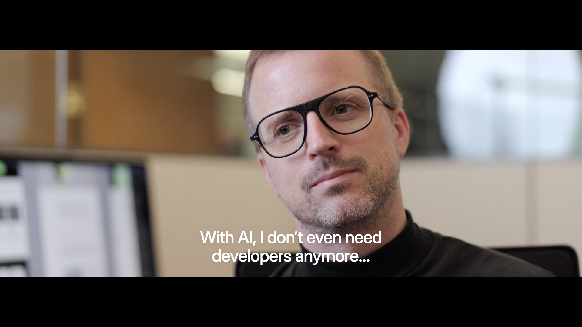
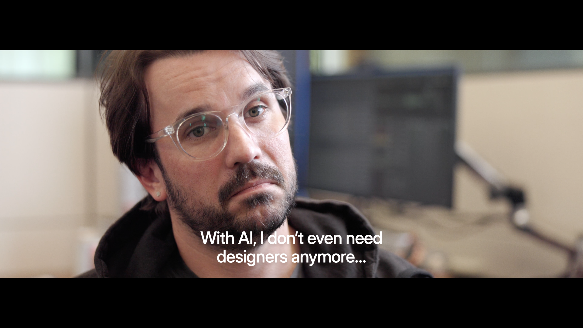
Where a lot of the discourse on AI is these days, and where a lot of AI tools are at, is individual empowerment. Designers saying: "I can finally ship code, I don't even need developers anymore." Developers saying the reverse.
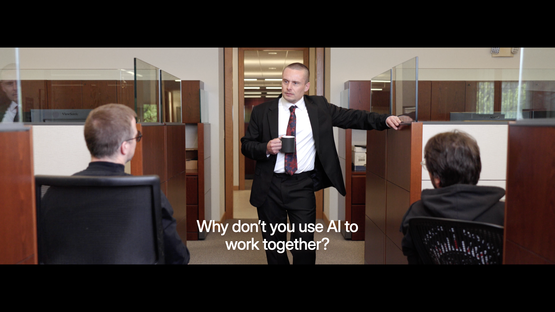
But very few people are actually asking the question: how do we use AI to work better together?
Because pretty much everybody, in this room and beyond, is working with other people. And that's where the magic lies. Being able to pull multiple folks, their skills, and their experience together to create something better than you could do yourself.
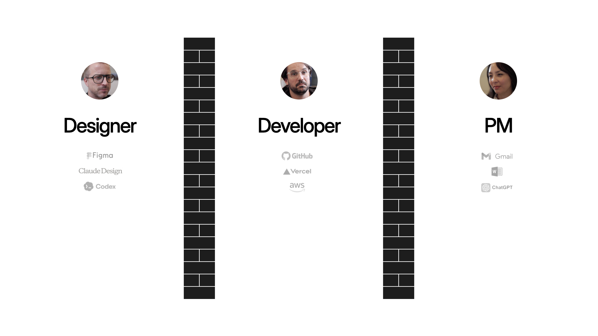
Why doesn't this kind of collaboration happen already? As user experience, front-end development, and product management have matured as disciplines, we've fallen into a throw-it-over-the-wall modality. Partially because as these roles have matured, specific tools have been made for designers, like Figma. Likewise specific tools for developers, tools for PMs, et.c
And now we're adding a lot more tools, thanks to AI. So we're all able to produce more at a higher rate. Which means we're more throwing stuff over the wall faster. That's why you hear stories of developers just being overwhelmed with PRs as everyone starts "shipping" their ideas.
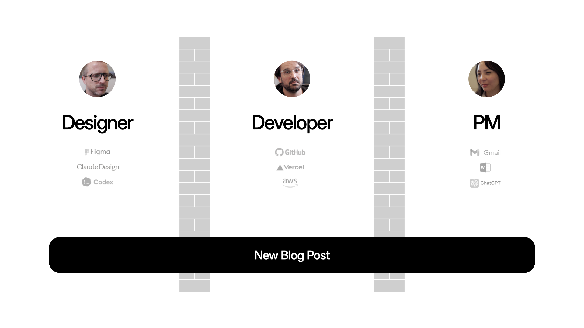
That applies to big complex projects but also nearly everything we do. Like publishing a blog post on your Web site. Maybe these days, the PM writes the content in ChatGPT, the designer makes the assets in Nano Banana, the developer writes the code in Codex. Everyone's productive, but are they aligned?
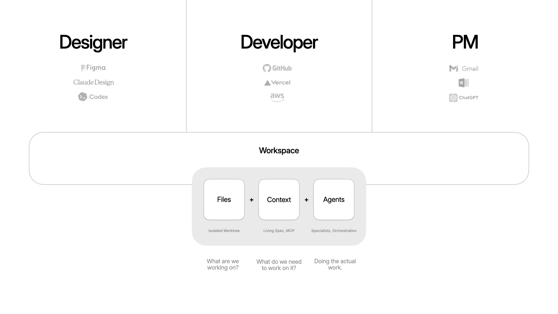
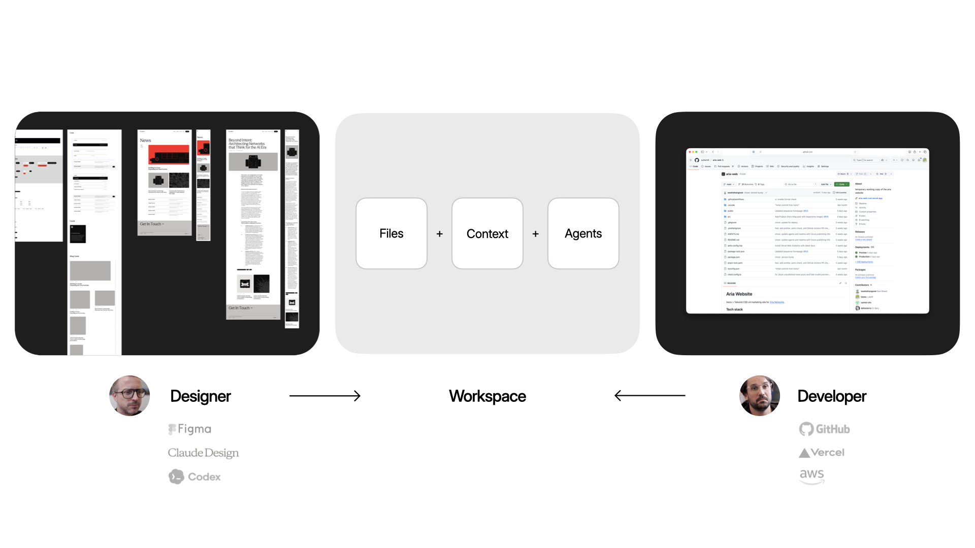
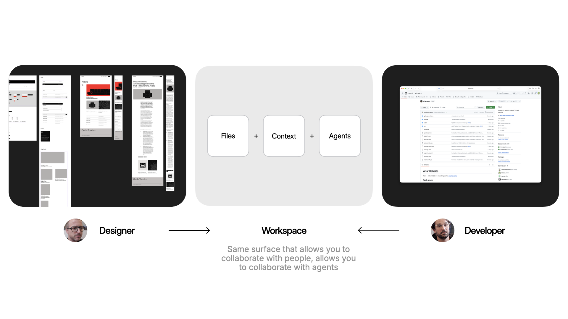
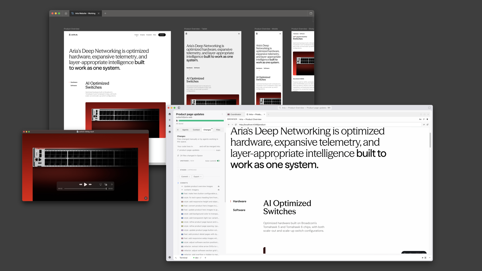
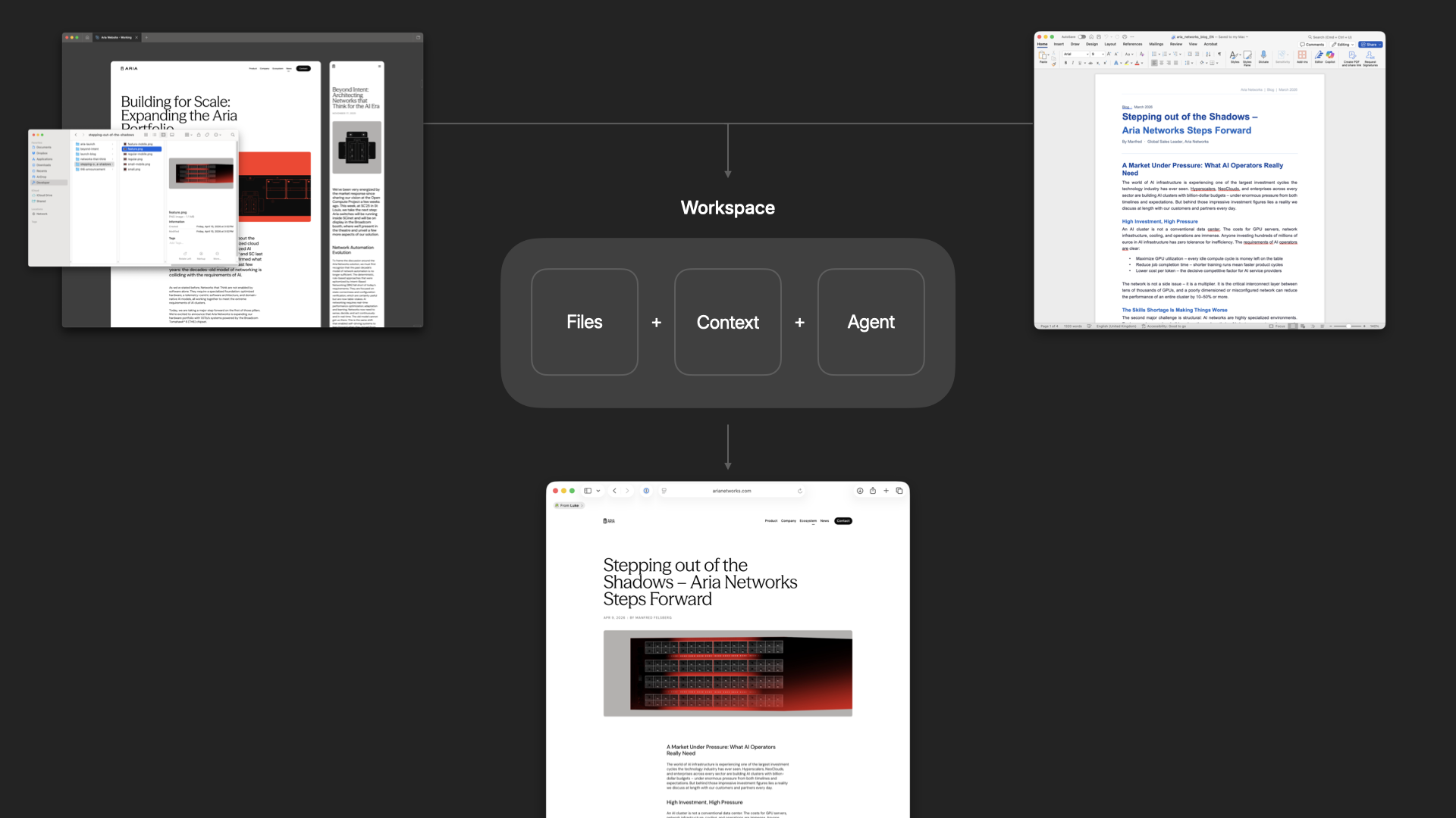
To help solve this, we've been building an app called Intent. The goal: make it easier to build software together. For any task, you spin up a workspace, which is a bundle of everything you need. Files (an isolated copy of the codebase, so you can change without messing up what others are doing), context (specs, scratchpad, data from external systems via MCP, etc), and agents (with tools and the ability to delegate and orchestrate work). Because these are all in one bundle, it becomes easier to put things down, pick them up, and hand them off.
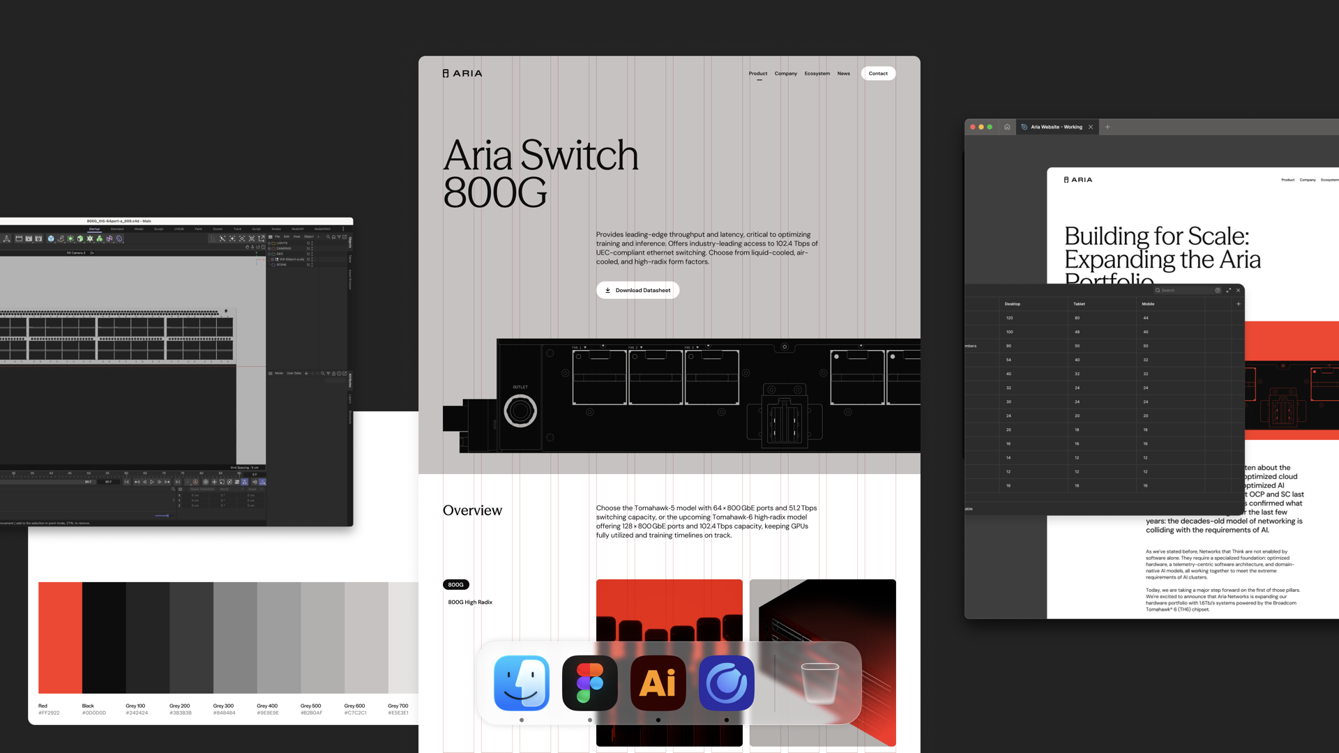
Here's why that matters in practice. A designer keeps working where they already work (like Figma or paper) and brings their expertise into the workspace: grid, typography. That all gets encoded. A developer gets to work in their tools: CSS frameworks, deployment, structure. Same surface, different expertise.
The same surface that makes it easy to collaborate with people on your team is the same one that makes it easy to collaborate with agents. And true collaboration means respecting everyone's taste. So any workspace that gets spun up will align with how the designer encoded the styles to work and how the developer encoded the code to work.
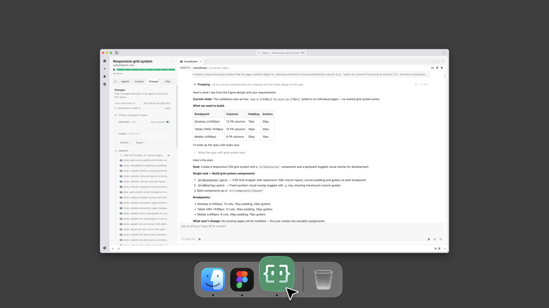
To illustrate as a designer, I've got a Figma file with a grid and layouts. I go into a workspace in Intent and say: "Agent, look at the Figma file. Create the grid. Here's what the breakpoints are." Now that's encoded in the workspace and anybody that creates a new page or drops in a new asset, it works within that system.
I can also set up how animations should work to give everything made in the workspace silky smooth transitions.
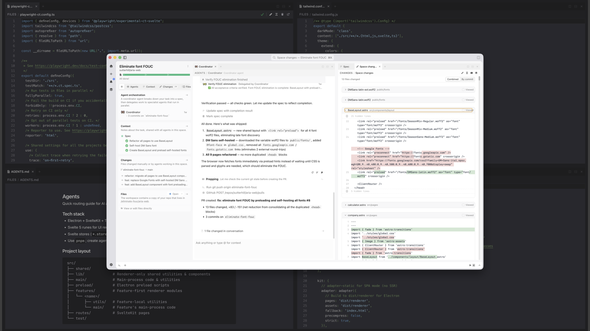
Same idea on the developer side. The dev can say: here's the agent's MD file, here's how we're testing the code, here's the tailwind config. The agent encodes all of that.
Taste gets baked into code files and markdown files in the repo. And because things are built on top of the same version control that developers use, it gets automatically included into every new workspace.
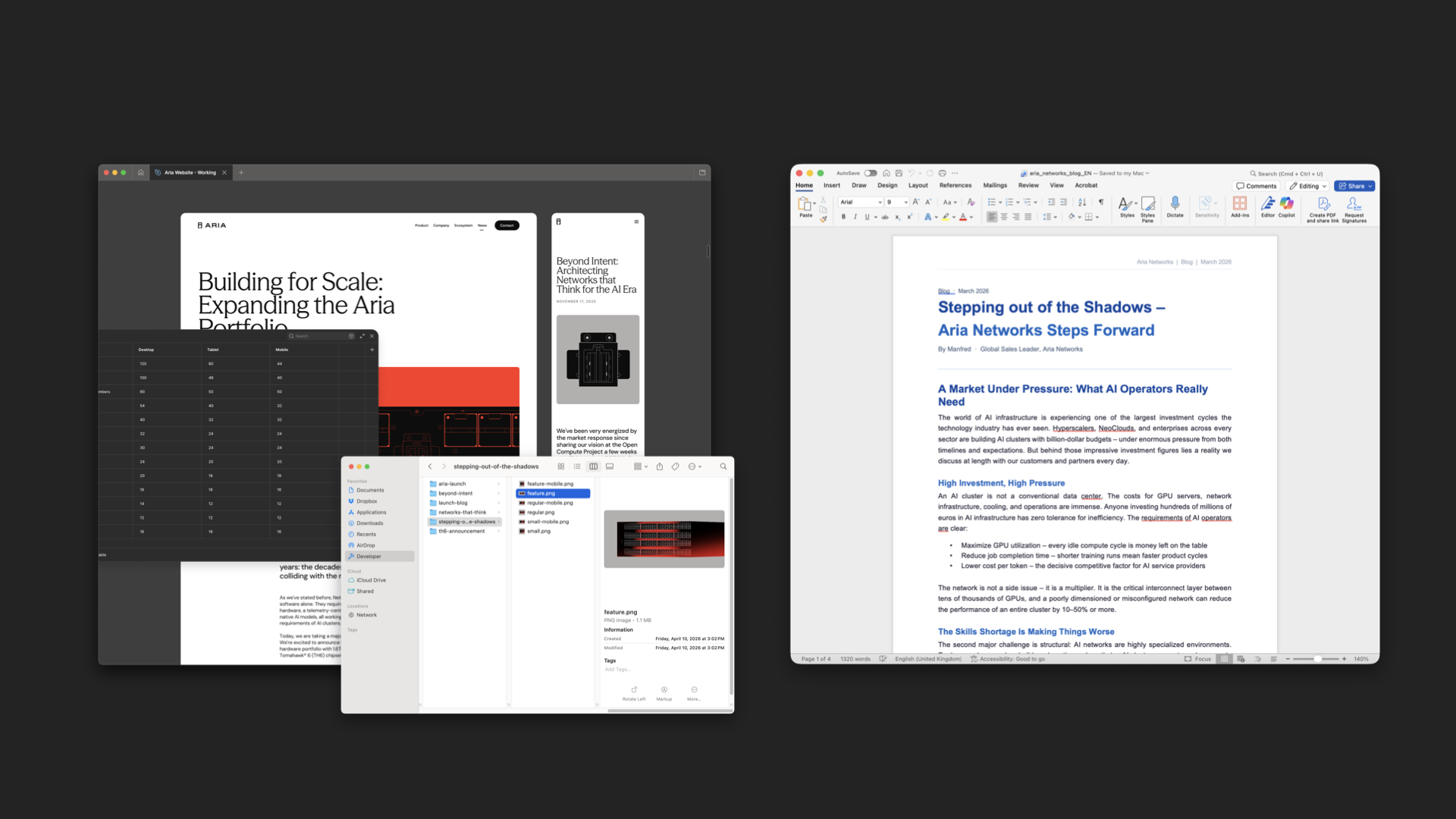
The great thing is that this same pattern works for anybody on the team. An illustrator can use their own tools to make assets. A content writer can write their copy in Word.
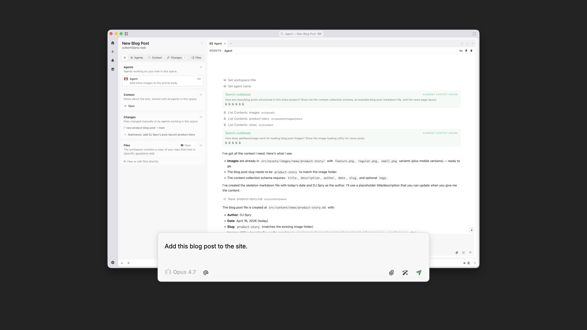
Then anybody on the team can spin up a workspace and say: we're making a blog post, here are the assets, here's the Word doc. Because that workspace already includes the designer and developer's tastes, what pops out the other end is a blog post that's fully aligned with the rest of the site.
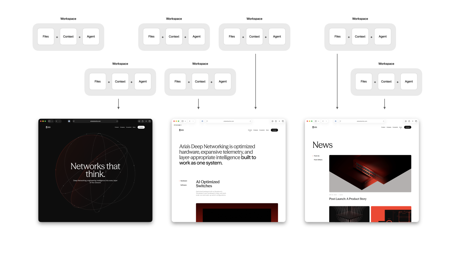
You can also run these workspaces in parallel so many people can be working on different parts of the experience simultaneously. And because every workspace is encoded in the same way, everything that gets added ends up unified by default.
This gives us massive parallelism and the ability to accommodate all kinds of last-minute requests. Which, even in an age of AI, still happen. Here's me busting out 10 last-minute 8pm asks in minutes using multiple workspaces without messing up the design or code integrity of the site.
AI tools are making individuals faster, but speed isn't the problem. Cohesion is. When taste is encoded into a shared workspace in Intent, designers keep designing, developers keep developing, and everything that comes out the other end holds together. No handoffs necessary.
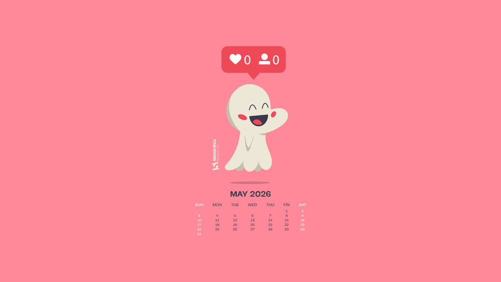
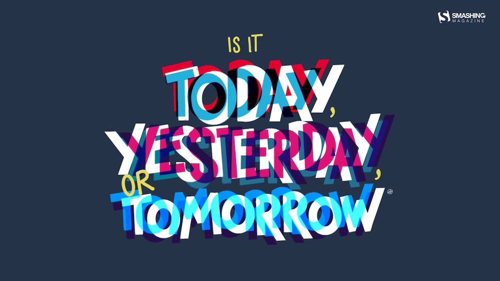
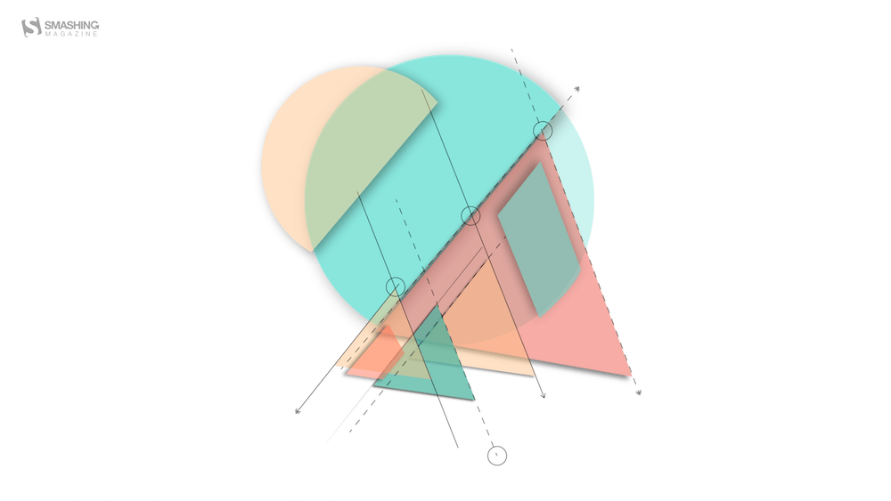
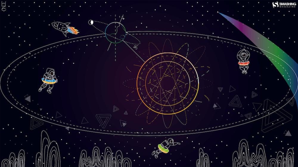
May has a way of sneaking in with longer days, softer light, and that first real hint of summer in the air. It’s the season of fresh ideas and just enough energy to start something new, or finally pick up something you’ve been putting off. And sometimes, all it takes to spark that little bit of inspiration is a fresh view… even if it’s just on your desktop.
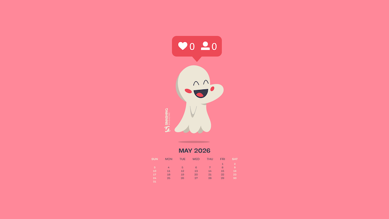
That’s where our monthly wallpapers series comes in. For the past 15 years, artists and designers from around the world have been contributing their designs to celebrate each new month. This May is no exception. Created with care and a unique personal touch, every wallpaper in this collection comes in a variety of screen resolutions and can be downloaded for free. A huge thank-you to everyone who got creative — this post wouldn’t be possible without your wonderful support!
If you too would like to get featured in one of our upcoming wallpapers posts, please don’t hesitate to join in. We can’t wait to see what you’ll come up with! Happy May!
You can click on every image to see a larger preview.
We respect and carefully consider the ideas and motivation behind each and every artist’s work. This is why we give all artists the full freedom to explore their creativity and express emotions and experience through their works. This is also why the themes of the wallpapers weren’t anyhow influenced by us but rather designed from scratch by the artists themselves.
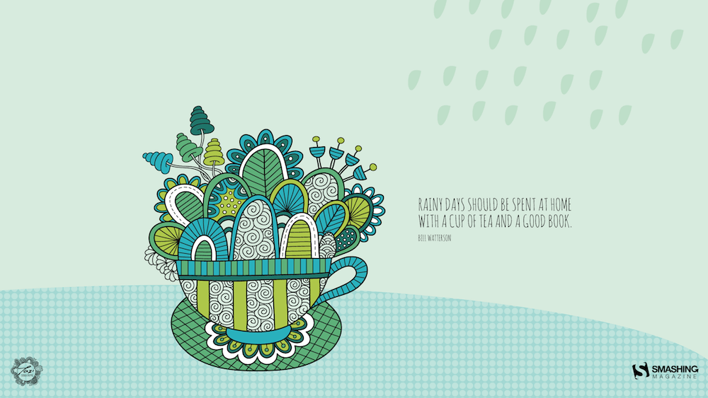
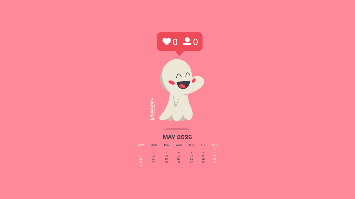
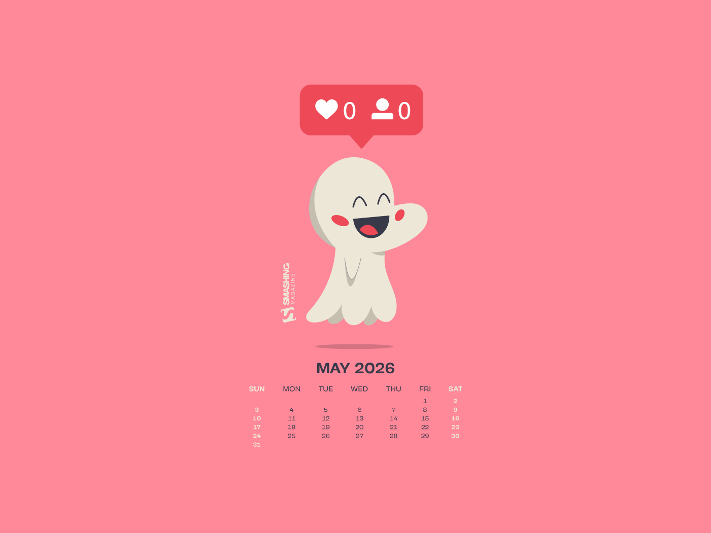
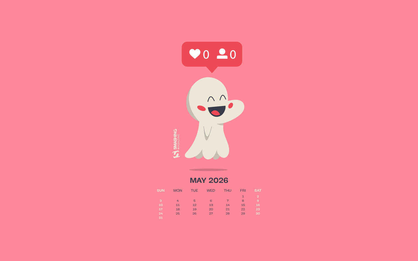
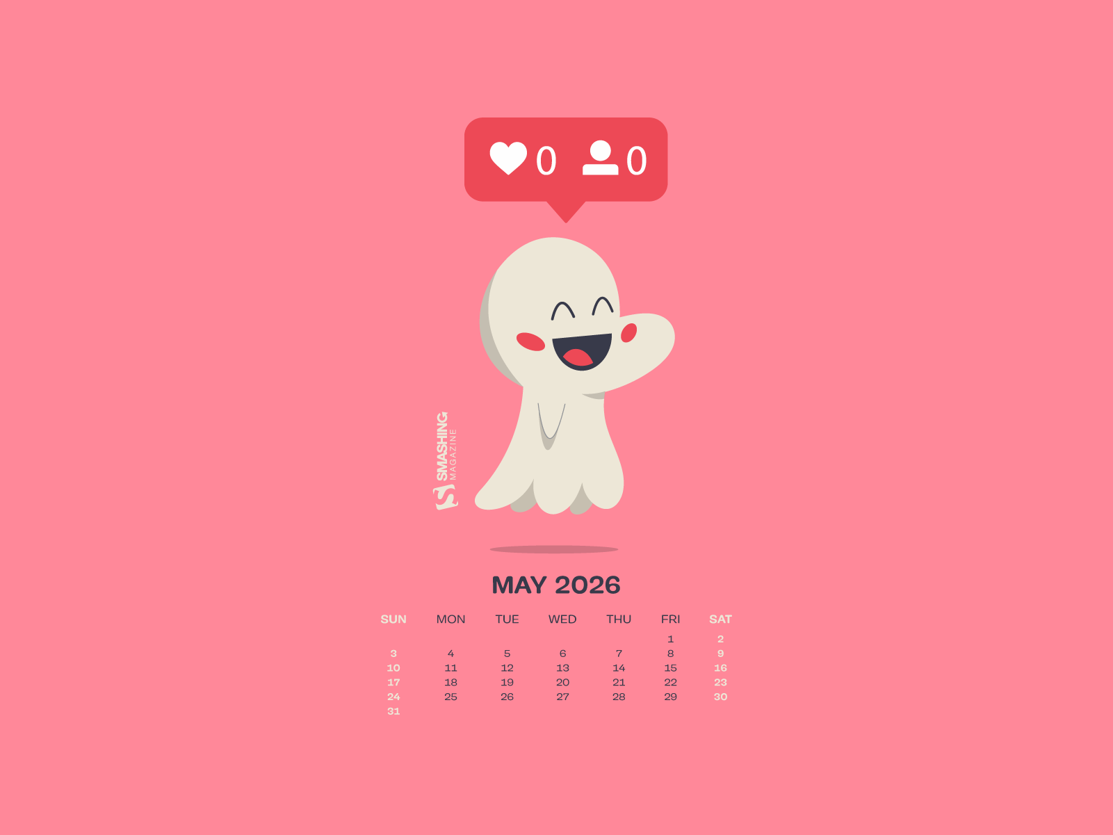
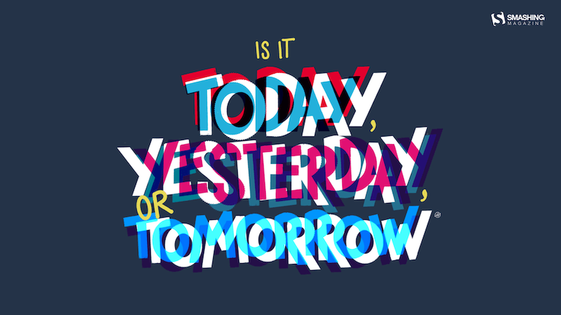
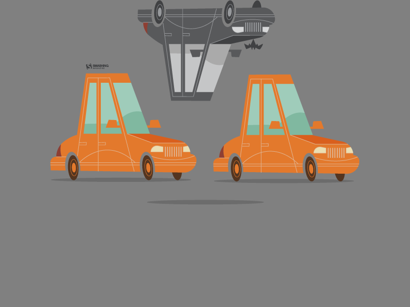
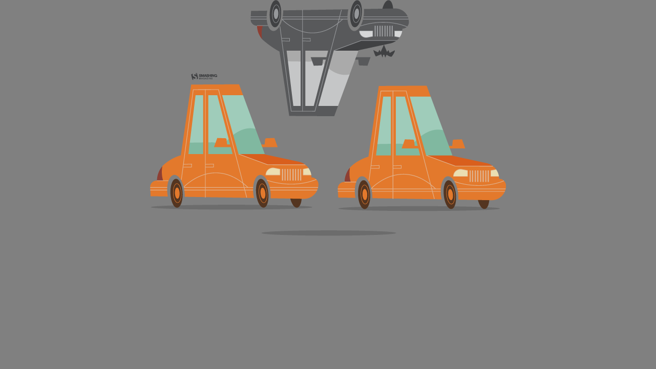
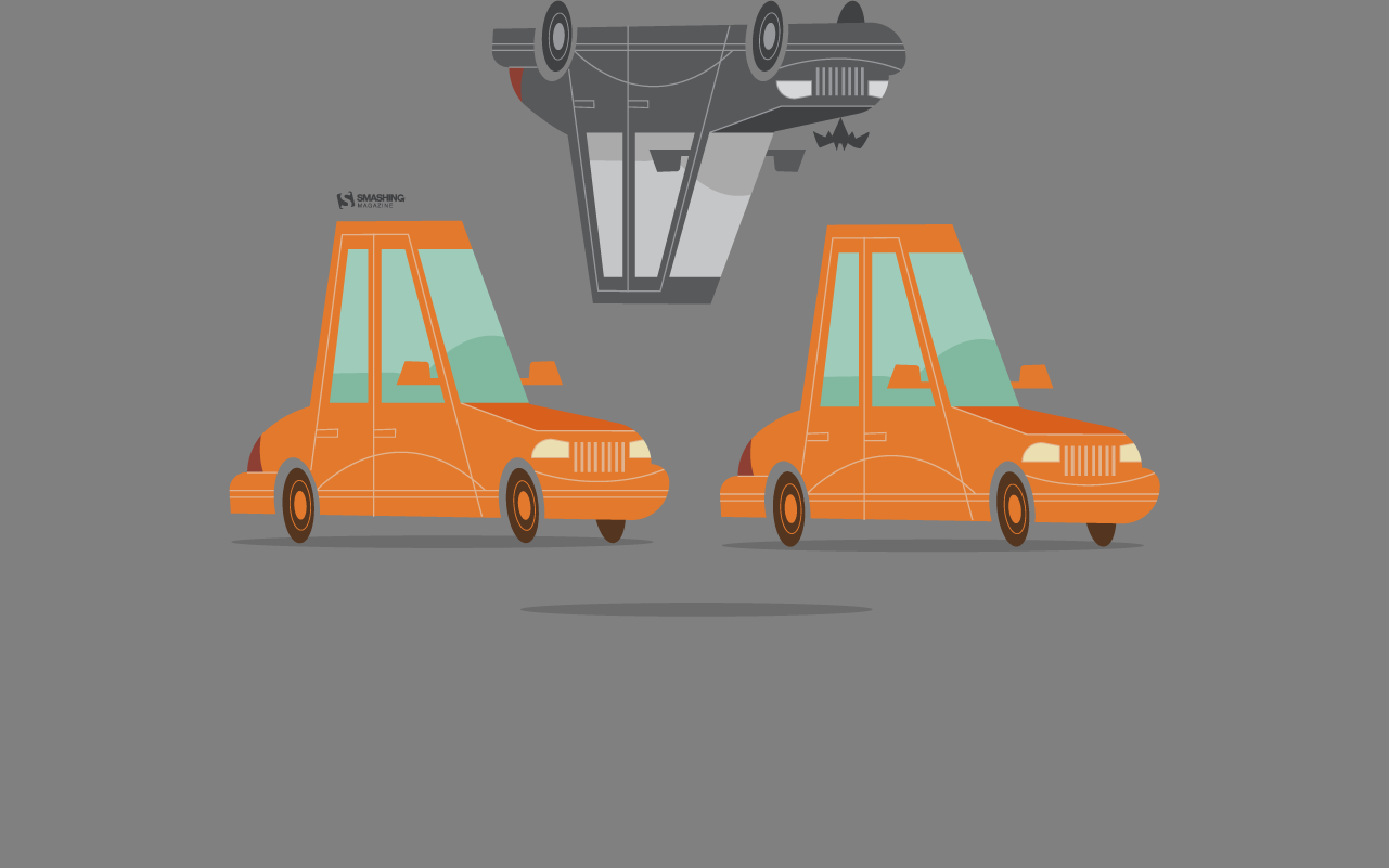
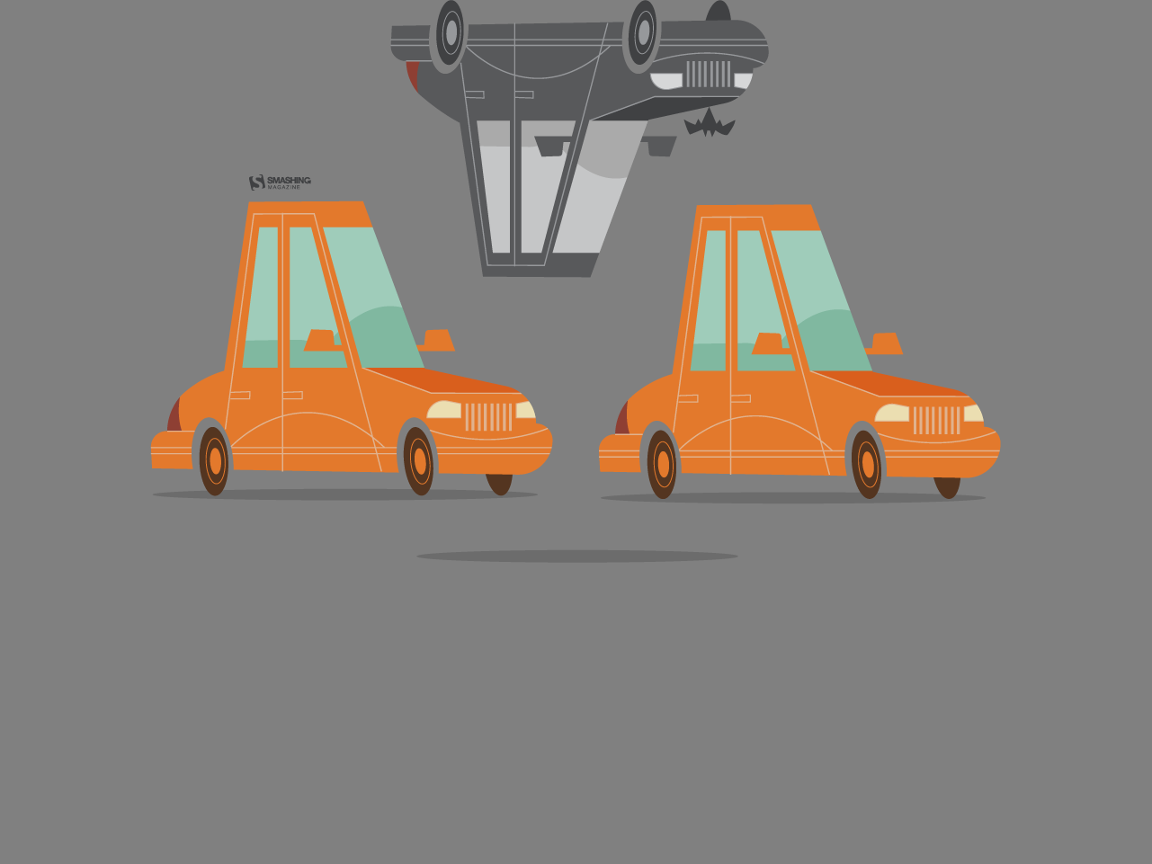
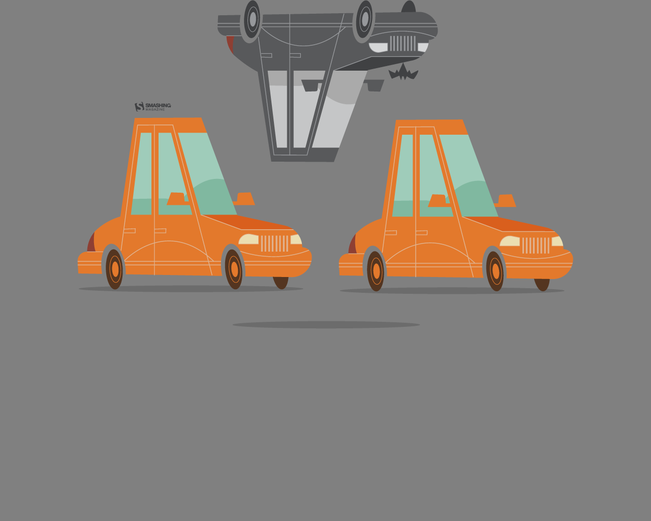
“A quiet ritual, a shared moment, a pause in the rush — tea invites you to slow down and discover warmth in the smallest details. Let each cup unfold its own little story.” — Designed by PopArt Studio from Novi Sad, Serbia.
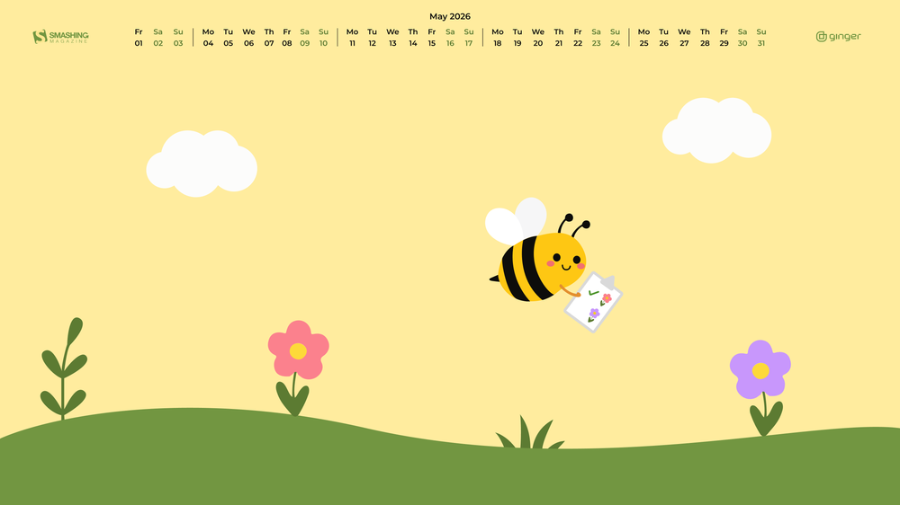
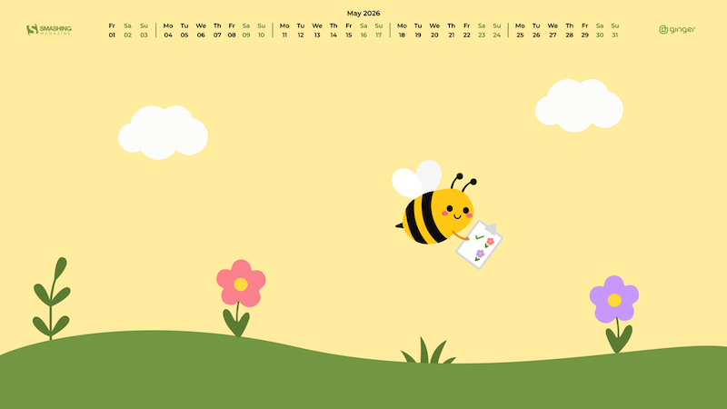
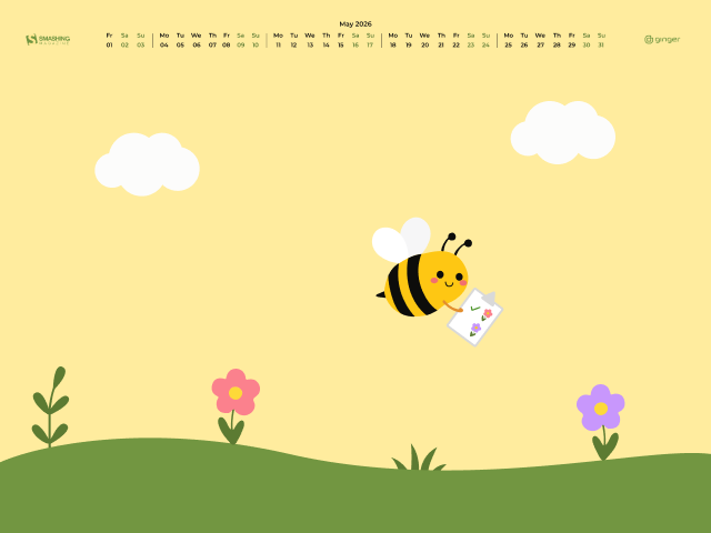
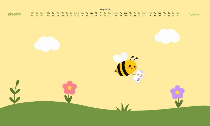
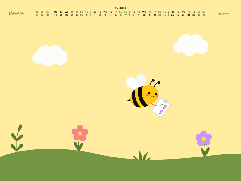
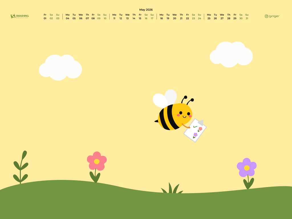
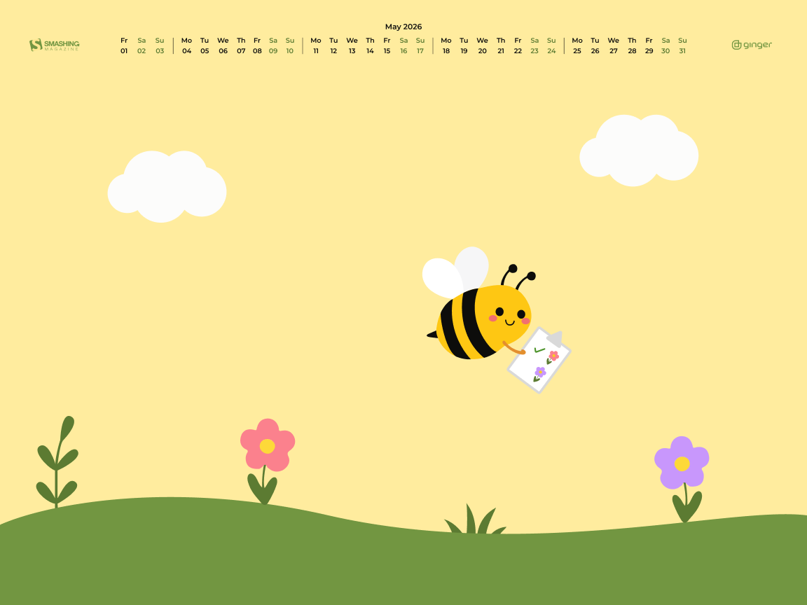
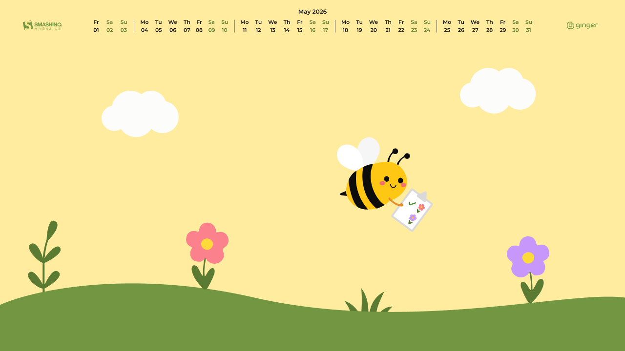
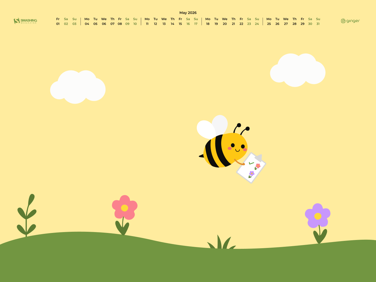
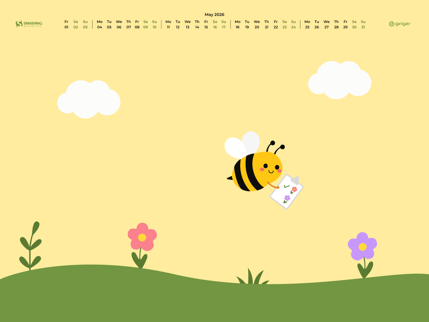
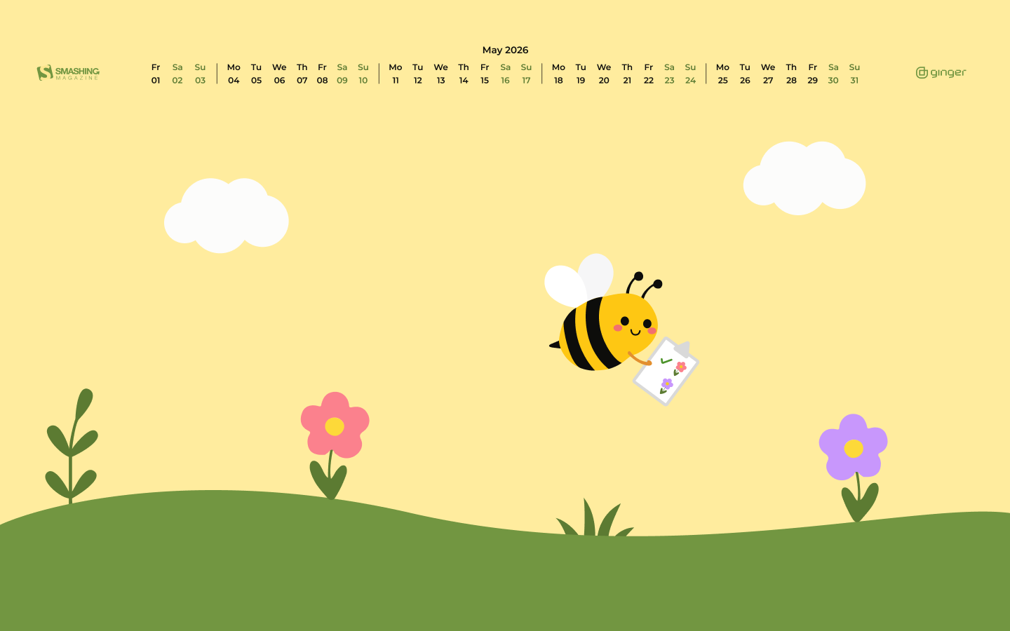
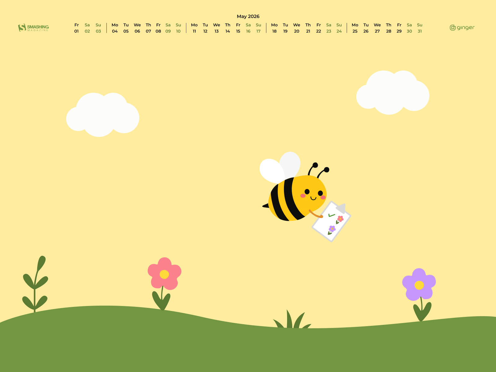
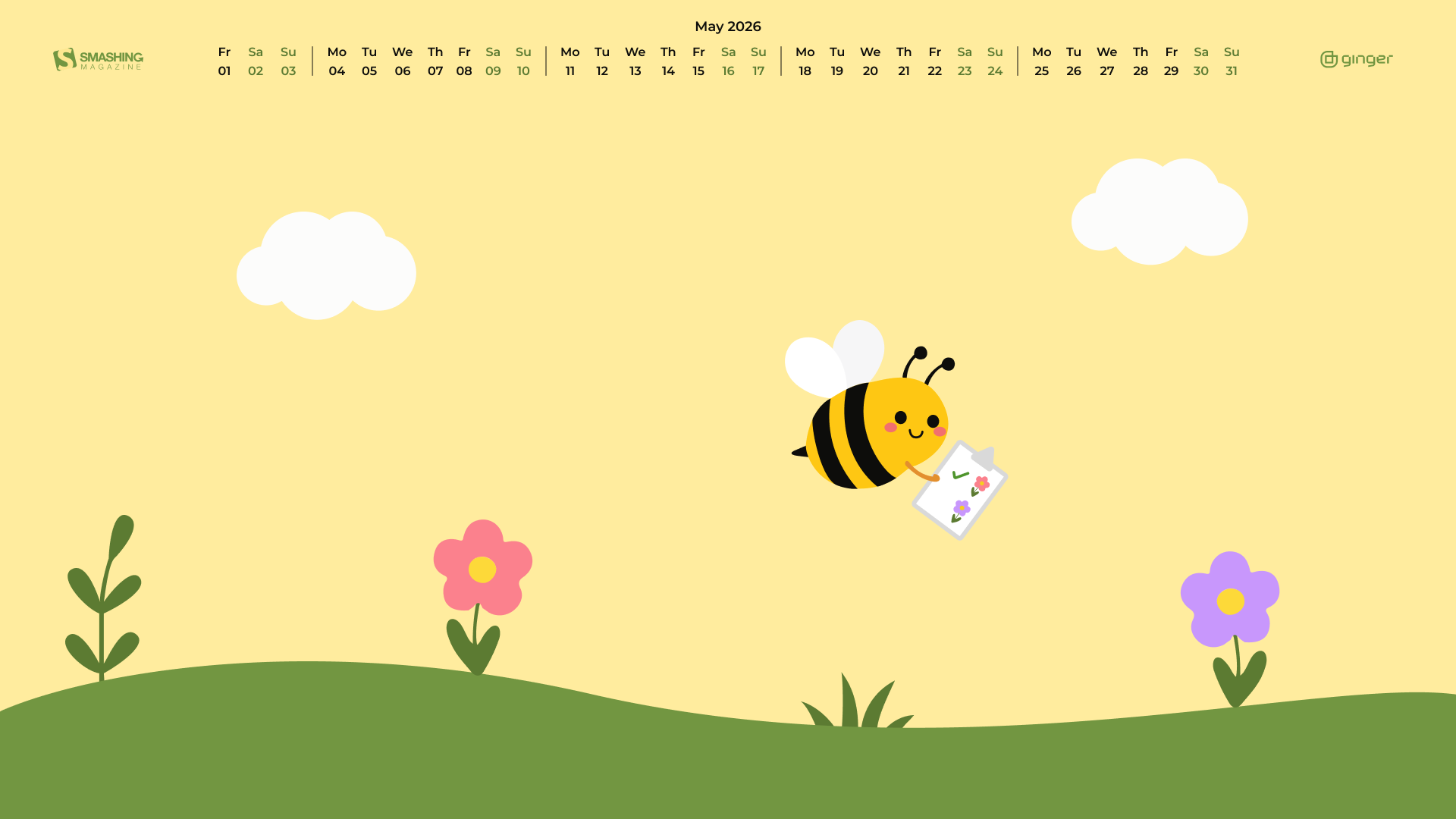
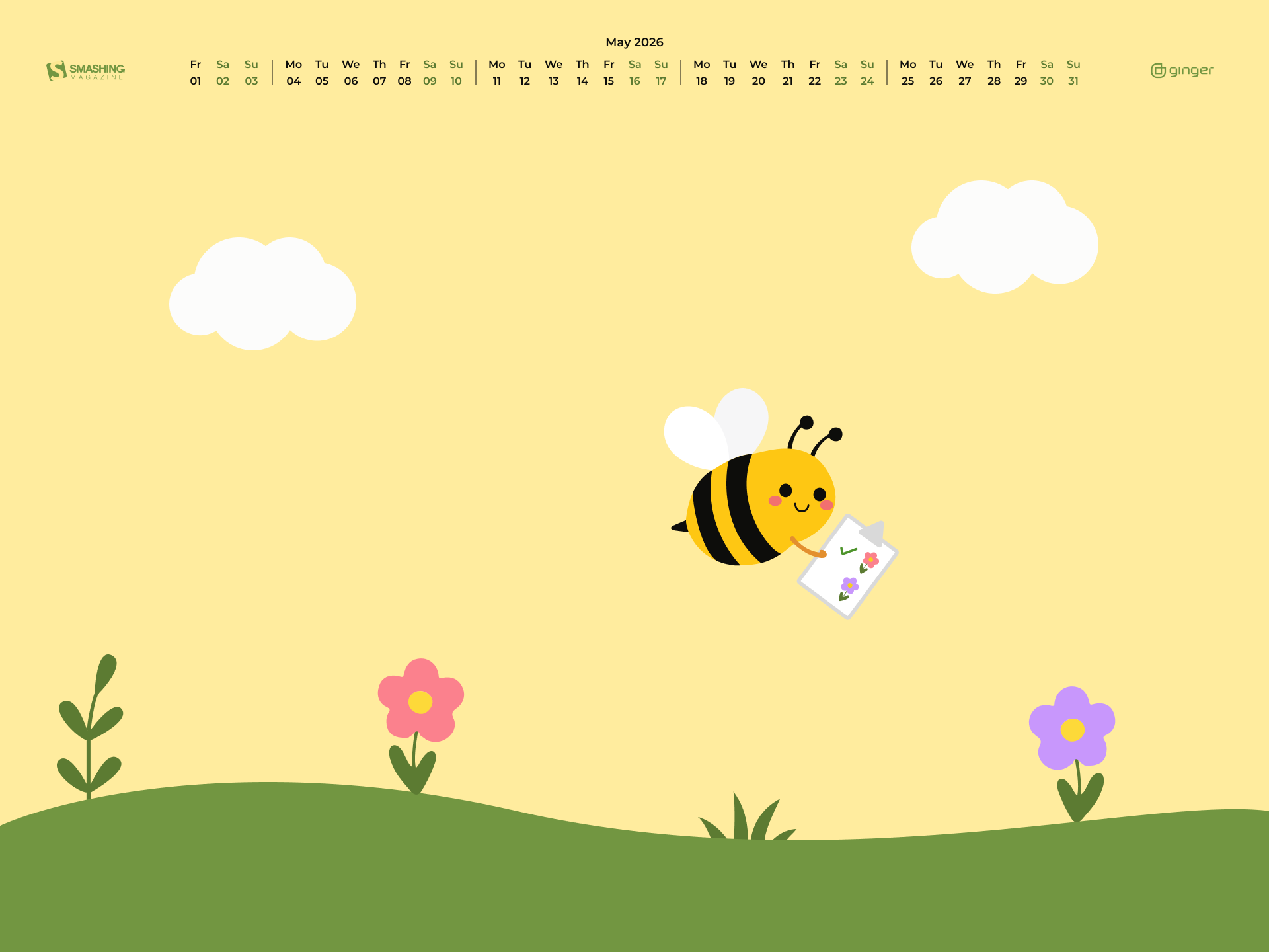
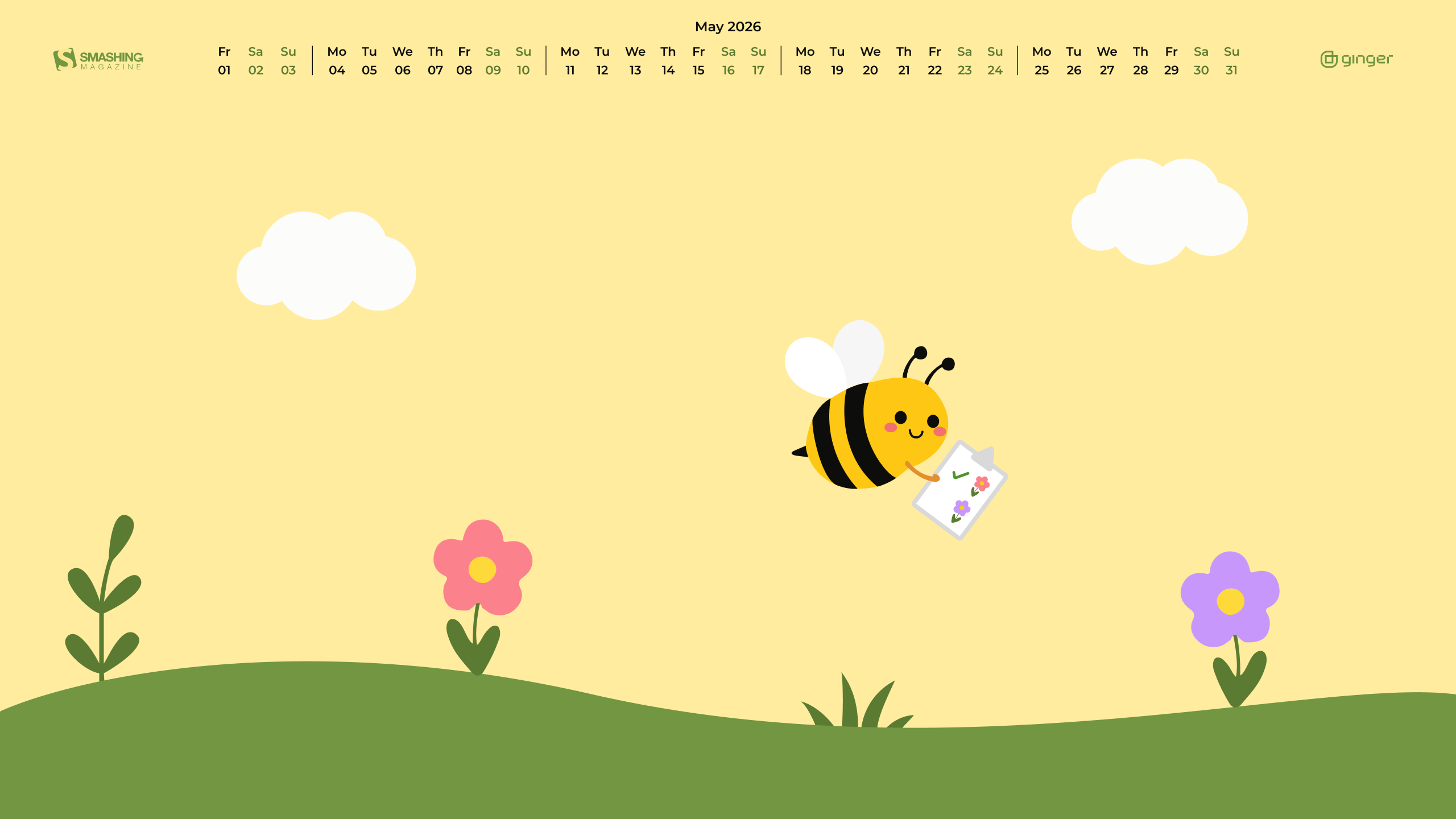
“A small bee with a big garden plan checks each flower on her list and looks for the next bloom to visit.” — Designed by Ginger IT Solutions from Serbia.
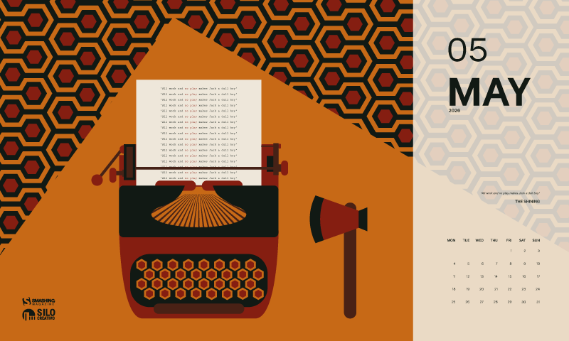
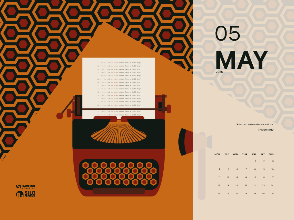
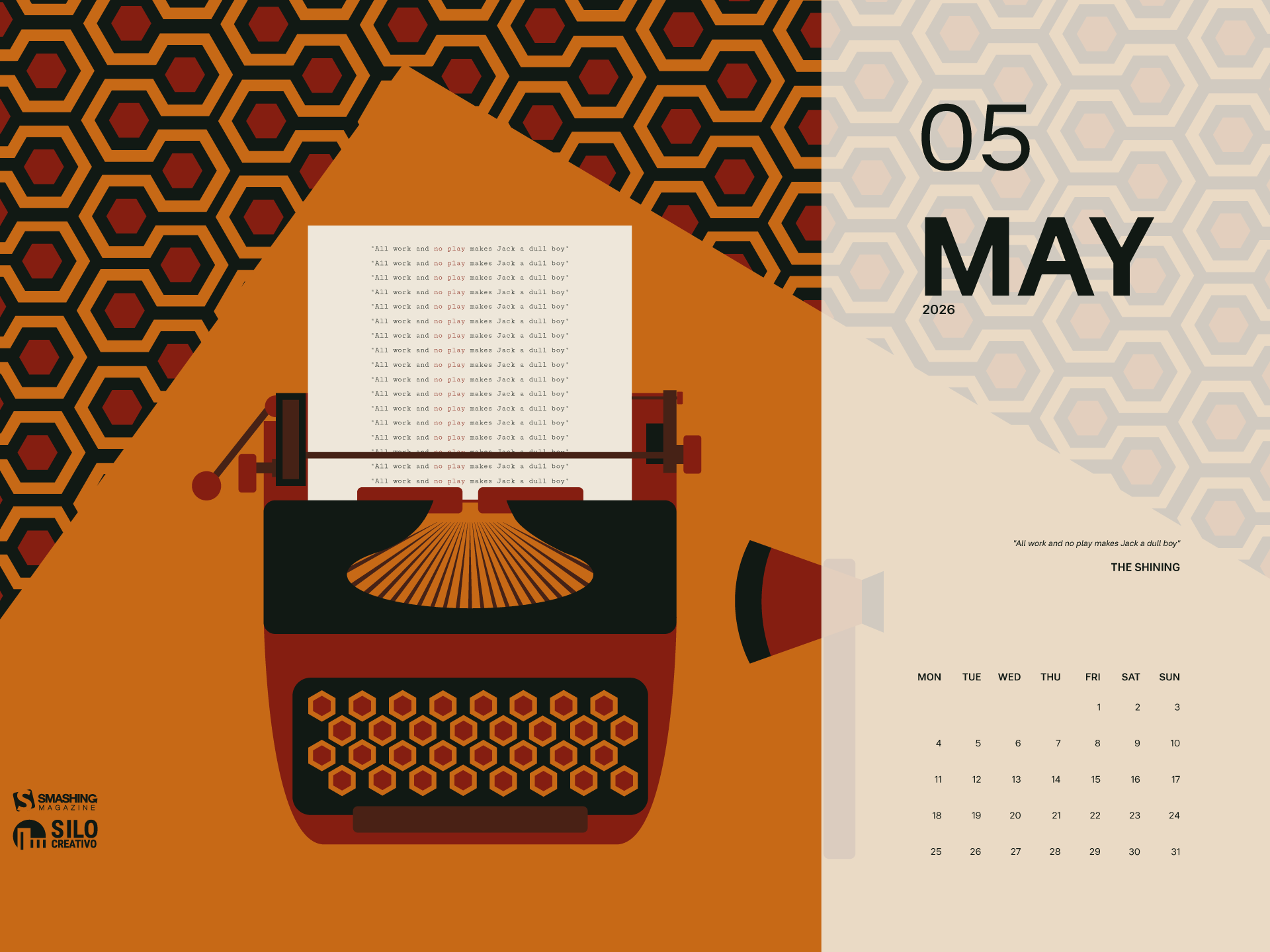
“Summer is getting closer, but we’re reminded of a more wintry and eerie landscape, like that of ‘The Shining.’ A truly great film, proving that you don’t need much, but it needs to be used well to create suspense and terror.” — Designed by Veronica Valenzuela from Spain.
“Buddha Purnima, falling on May 1st, is the most sacred Buddhist festival commemorating the birth, enlightenment, and passing of Gautama Buddha. It is observed on the full moon day of the Vaisakha month, symbolizing spiritual liberation and the triumph of peace. The day serves as a global reminder of his core teachings: non-violence, compassion, and the path to ending suffering.” — Designed by V D Photography from Surat, Gujarat, India.
“The longing for warmth, flowers in bloom, and new beginnings is finally over as we welcome the month of May. From celebrating nature on the days of turtles and birds to marking the days of our favorite wine and macarons, the historical celebrations of the International Workers’ Day, Cinco de Mayo, and Victory Day, to the unforgettable ‘May the Fourth be with you’, May is a time of celebration — so make every May day count!” — Designed by PopArt Studio from Serbia.
“This month is dedicated to flowers, to join us and brighten our days giving a little more color to our daily life.” — Designed by Verónica Valenzuela Jimenez from Spain.
“Springtime, especially May, is my favorite time of the year. And I like popsicles — so it’s obvious isn’t it?” — Designed by Steffen Weiß from Germany.
“We don’t usually count the breaths we take, but observing nature in May, we can’t count our breaths being taken away.” — Designed by Ana Masnikosa from Belgrade, Serbia.
“The ‘lily of the valley’ came earlier this year. In France, we celebrate the month of May with this plant.” — Designed by Philippe Brouard from France.
“April and May are usually when everything starts to bloom, especially the magnolia trees. I live in an area where there are many and when the wind blows, the petals make it look like snow is falling.” — Designed by Sarah Masucci from the United States.
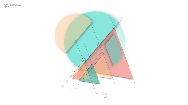
“‘As knowledge increases, wonder deepens.’ (Charles Morgan) So I tried to create an illustration based on this.” — Designed by Bisakha Datta from India.
“Lixia is the 7th solar term according to the traditional East Asian calendars, which divide a year into 24 solar terms. It signifies the beginning of summer in East Asian cultures. Usually begins around May 5 and ends around May 21.” — Designed by Hong, Zi-Cing from Taiwan.
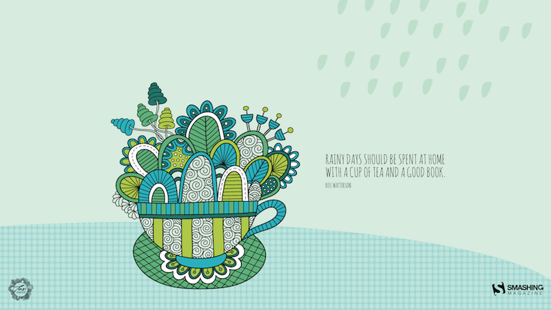
“Winter is nearly here in my part of the world and I think rainy days should be spent at home with a good book!” — Designed by Tazi Design from Australia.
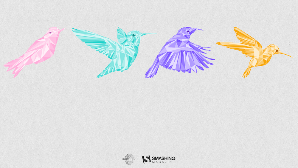
“Inspired by a little-known ‘holiday’ on May 4th known as ‘Bird Day’. It is the first holiday in the United States celebrating birds. Hurray for birds!” — Designed by Clarity Creative Group from Orlando, FL.
“I designed Magical Sunset as a friendly reminder to take a moment and enjoy life around you. Each sunset and sunrise brings a new day for greatness and a little magic.” — Designed by Carolyn Warcup from the United States.
“Edwin Way Teale once said that ‘[t]he world’s favorite season is the spring. All things seem possible in May.’ Now that the entire nature is clothed with grass and branches full of blossoms that will grow into fruit, we cannot help going out and enjoying every scent, every sound, every joyful movement of nature’s creatures. Make this May the best so far!” — Designed by PopArt Studio from Serbia.
Feeling inspired? We’ll publish the June wallpapers on May 31, so if you’d like to be part of the collection, please don’t hesitate to submit your design. We are already looking forward to it!
Mutuelle d’assurance engagée en faveur de l’inclusion, la Macif a progressivement structuré sa démarche d’accessibilité numérique pour répondre à la fois à ses obligations réglementaires, à ses engagements RSE (Responsabilité Sociétale des Entreprises) et aux besoins de ses sociétaires comme de ses collaborateurs. Depuis plus de trois ans, la Macif est accompagnée par Temesis pour ancrer durablement l’accessibilité numérique dans ses pratiques et ses processus métiers.
En bref
Début de la collaboration : 2019
Périmètre : site macif.fr, application mobile, parcours de souscription et de devis, sites satellites du groupe
Chiffres clés :
Une vingtaine d’audits d’accessibilité réalisés (sites, applications, tunnels de souscription)
Plus de 6 ans d’accompagnement continu avec un expert Temesis détaché plusieurs jours par semaine
Plus de 200 collaborateurs sensibilisés dont une cinquantaine dans un parcours spécifique à leur métier. Un effort de formation qui se poursuit chaque année.
Points forts de l’accompagnement :
Expertise technique reconnue
Accompagnement stratégique et opérationnel
Logique d’amélioration continue
Transmission de compétences
Contexte et enjeux
La Macif est historiquement engagée sur la question du handicap. Depuis 2005, elle déploie ainsi le programme Macif Égalis, qui vise à fournir à ses sociétaires en situation de handicap des offres et des services accessibles et adaptés à leurs besoins. La mutuelle n’aborde pas l’accessibilité numérique comme une contrainte de conformité réglementaire.
I want to discuss accessibility because it is the most important thing for making websites. Other A List Apart articles give you innovation and insight. This article will give you homework. These are just my personal views, but they’re pretty good.
I want to start off with a couple of statements, and you will agree:
Designers are good people. I have never heard a designer say, “I don’t care if somebody can’t read this text”, “Not my fault if somebody can’t use this device”, or “Who cares if this is confusing?”
Some designs exclude people. You have seen people unable to read the text on a website or app that somebody designed. You’ve seen people unable to use a physical device that somebody has designed. You’ve seen people utterly bamboozled while trying to use a service that somebody designed.
So what?
The first question is, “Is this life-or-death stuff?” The answer is, “Yes.” In my favorite essay, This Is All There Is, Aral Balkan makes the point that pretty much everything that we design can affect life events and death events. Aral gives the example of how even a straightforward bus timetable app can affect life and death events, if we design it badly:
somebody might miss a life event, such as their daughter’s fifth birthday party; or
somebody might miss a death event, such as the chance to say goodbye to a dying grandmother.
The next—and frustrating—question is, “Why do some designs still exclude people?” After all, we know that:
not everybody can see perfectly;
not everybody can hear perfectly;
not everybody thinks the same way; and
not everybody moves the same way.
I think the answer is that there’s too much to recall. Consider, if you will, the wide variety of topics that A List Apart articles cover. Designers are expected to remember all of that guidance, plus all of the accessibility guidance, plus so much more. It is too much.
Recognizing accessibility issues while designing
I’d like to point toward one possible solution, starting from Jakob Nielsen’s 10 Usability Heuristics for User Interface Design. These are from the mid-1990s, and—although there’s a good chance that you, gentle reader, are a lot younger than that—please bear with me.
Seeing as the problem is that there’s too much to recall, I want to look at heuristic № 6, “Recognition rather than Recall.” Jakob Nielsen said that for users, information required to use the design should be visible or easily retrievable when needed. I suggest we tweak that to make life easier for designers. Let’s say that the information required to produce the design should be visible or easily retrievable when needed. In other words, let’s make it easier to recognise accessibility issues while we’re designing.
Vishnu, an engineer and global citizen with low vision says, “I want to be on the same level as everyone else”, “If I can adjust my screen, I can read comfortably”, and, “Translating in my head is easier with simpler sentences.”
Trevor, a high school student with autism, says, “I like consistent, familiar places on the web”, “When I can learn the pattern, I can find my way”, and, “Reading is hard for me”.
Maria, a bilingual community health worker, says, “I love this. It’s all here … when I can find it”, “When a site is confusing, I just leave”—fair enough, Maria!—and, “When I hear and see it, health information makes more sense”.
Lea, an editor living with fatigue and pain, says, “No one gets that this really is a disability”, “Don’t make me work so hard”—please do not bombard this lady with drop-down lists—and, “Links at the top of the page make navigation easier for me”.
Carol, a grandmother with macular degeneration which affects her sight, says, “My grandkids are dragging me into the world of technology”, “I don’t understand what the screen is saying”, and, “Why can’t the text be just a little bit larger?”
I want to throw one more persona at you now, because, well, A List Apart readers are overachievers. One of my favorite authors, Cennydd Bowles—who literally wrote the book on Future Ethics—says to create Personas Non Grata. In other words, every time we design something, we have to think about what a bad guy could do with that thing, and whom that might affect.
To actually use these personas while designing, I like what Eric Meyer and Sara Wachter-Boettcher in Design for Real Life call the Designated Dissenter: for each project that you work on, one of your teams should be responsible for asking, “Will this work for Vishnu?”, “How’s Trevor going to get on with this?”, and so on.
Then, once you’ve used the personas to recognise the accessibility issues, you can look up the guidelines for whichever platforms you’re designing for:
I told you in the introduction of this article that I would give you homework. You thought I was joking. So, here’s your homework: I want you to grab the personas from the Know About Accessibility website, and use them throughout every design project to help you recognise accessibility issues while you work—and reclaim design for everyone.

 Connexion