❌

Vue normale

What are the principles of prototyping?
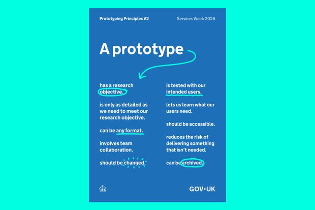
A poster titled 'A prototype' with the titles of the 9 principles described in this post. The background of the image is teal and the poster is GOV.UK blue with white text and teal accents to highlight significant words.

A prototype is a way to learn something before making a bigger commitment. When designing services, many of the things we need to test are intangible: policies, processes, conversations, operating models. A prototype can go beyond the screen - we can prototype with an email, text message, or an event.

The GOV.UK Service Manual outlines: ‘You must make prototypes of your service to explore, share and test different designs before you commit to building anything. You can quickly make and test multiple prototypes and discard the ones that do not test well. You should use the prototype that best meets your needs at the time.’

Digital prototyping tools have become more accessible. New AI-assisted tools may also help teams explore and visualise ideas more quickly. But while the tools have changed, the purpose and principles of prototyping have not. 

A prototype can be anything

As long as a person uses it, and we learn something. 

We need shared principles that help teams focus on finding out what they need to know in order to move forward. Prototyping is about learning rather than producing artefacts. 

At Services Week 2026, we hosted an interactive session on the ‘Principles of Prototyping’. Rather than presenting a finished set of principles, we shared a draft list of principles and invited people from across government to test, critique and improve it. Thank you to the 124 people who contributed. The 9 principles below are the result of that session.

9 Principles of prototyping

1. A prototype answers a question.

Before creating a prototype, think about the questions you need to answer to make a decision and move forward. To develop these questions, you could involve a designer, a user researcher, a product manager and other members of the team. 

2. A prototype is only as detailed as we need to answer our question.

If we know the research question we are trying to answer, we can create a prototype that helps us answer that question. The prototype does not necessarily need to be complex to answer a simple question. This is particularly true in the early stages of developing a service. 

3. A prototype can be any format.

A prototype does not always have to be digital. A prototype can be a blog post, or a word document that people use and give feedback on. 

4. A prototype is tested with people who will use the service.

A prototype is tested with the people who are going to use the future service; that’s how we learn. We can find ways to meet these people where they are.

At NHS Digital, Rhiannon Smith, Content Designer for NHS.UK worked on making content about skin symptoms more inclusive. Before the improvements, skin symptoms were mostly described in terms of how they appear on white skin. The team improved the content and tested it with the people who use the website to get their feedback. You can read more about this case study on the NHS Digital blog.  

5. A prototype is accessible.

A prototype should be accessible. If we use an event as a prototype for a service we are developing, the event should be held in a venue that is accessible for all, particularly for the users that will be accessing the service. If we use an email as a way of prototyping a bit of communication around a service, that email should be written in a way that everyone can understand. 

6. A prototype involves team collaboration.

Prototyping is not only the domain of interaction designers and service designers. It also involves user researchers, product managers and policy experts. A policy expert could prototype a piece of policy and then show it to the people who would be affected by that policy for feedback. Or a designer could create a prototype with input from lots of colleagues about what they need to find out. 

An example of this is the multidisciplinary team from Camden Council who formed to redesign debt support in Camden. The team included a service designer, design researcher, officers, money and debt advisors, and policy experts. You can read more about this case study on the Change by Design blog.

7. A prototype reduces the risk of delivering something that is not needed.

The intention of prototyping is to understand if something is needed, create a service that works for people, and to learn about risks early. If a prototype causes an unintended consequence, it’s useful to know that early in the process rather than finding out when something is fully live. It's also useful to understand people’s reactions to a prototype to understand if it meets their needs. The service may need to change to meet people's needs. 

8. A prototype should be changed.

As we learn from the prototyping process and get feedback from people, we should change and iterate the prototype. A prototype is not intended as a finished artefact. The change can be small, such as revising the wording to make something clearer. Or it can be big, for instance by providing a piece of information via email as well as text message so that people can understand it better. 

9. A prototype can be archived.

Sometimes a prototype leads to a change in a live service. Sometimes a prototype leads to a completely new service or policy being developed. Or we learn that the prototype does not achieve goals the team is trying to achieve. If this happens, it’s good to share the knowledge with people, write down why the prototype is not being taken forward, and don’t be afraid to archive it.
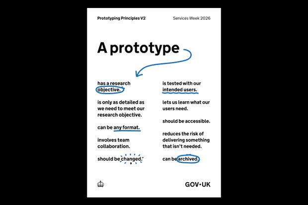

These principles can be downloaded as posters at the links below.  Use the principles with your team to plan prototypes, test assumptions and reduce delivery risk.

Prototyping Principles A3, White
Prototyping Principles A1, Blue

Announcing our rebrand: A clearer, more intuitive Matomo

As of today, April 30, 2026, we’re announcing the first step of our brand refresh. Another software company talking about a cosmetic redesign? Not quite. This update isn’t just about how Matomo looks. It’s about making the whole Matomo experience clearer, faster and more user-friendy.

Why we’re making this change

Over time, Matomo has grown significantly. New features, new use cases, and a growing global community have shaped what the platform is today.

As an open-source platform, feedback, contributions, and real-world usage play a direct role in how the product evolves. That creates a continuous loop between how Matomo is used and how it improves. Over time, we’ve gathered lots of great feedback on how users experience Matomo, what works well, and where things slows them down.

Some patterns became clear: For many users, navigation could be more intuitive, key insights could surface faster and onboarding could be smoother.

Our rebrand is the starting point for addressing these areas more systematically. Our overall goal is to reduce friction so you can get value from your data faster.

From feedback to product improvements

By turning all our user touchpoints into a modern, clear, and cohesive experience, we want to make it easier for users to understand, adopt, and get value from Matomo.

You’ll start to notice:

  • Updated navigation (top bar and main menu) for better readability
  • Improved main selectors (website, segment and dashboard) for easier use
  • A modernised overall layout, refreshed widgets shadows being an exemplary detail

Our product now even offers a dark-mode that users can easily select in their Matomo settings.

What’s changing, and when?

Starting today, you’ll see the first changes with the updated look and feel of our website. We’ll continue rolling out improvements across onboarding, education, usability, and the overall product experience. All of these improvements are guided by the same principle of putting our users first.

While the brand evolves, our values remain the same:

  • Full data ownership
  • Privacy-first analytics
  • Transparency and control
  • Flexibility for different teams and use cases
  • Accurate, reliable data

If anything, this rebrand sharpens these commitments.

Where we go from here

Rebrands often focus on how things look. This one is about how things work and how they feel to use.

We’d value your feedback as we continue the roll-out. You can reach us at marketing@matomo.org or via our social channels.

Not using Matomo yet? You can explore the new experience with a 21-day free trial.

The post Announcing our rebrand: A clearer, more intuitive Matomo appeared first on Analytics Platform - Matomo.

Good designers, bad websites: a proposal

Par : by
23 avril 2026 à 14:57

I want to discuss accessibility because it is the most important thing for making websites. Other A List Apart articles give you innovation and insight. This article will give you homework. These are just my personal views, but they’re pretty good.

I want to start off with a couple of statements, and you will agree:

  1. Designers are good people. I have never heard a designer say, “I don’t care if somebody can’t read this text”, “Not my fault if somebody can’t use this device”, or “Who cares if this is confusing?”
  2. Some designs exclude people. You have seen people unable to read the text on a website or app that somebody designed. You’ve seen people unable to use a physical device that somebody has designed. You’ve seen people utterly bamboozled while trying to use a service that somebody designed.

So what?

The first question is, “Is this life-or-death stuff?” The answer is, “Yes.” In my favorite essay, This Is All There Is, Aral Balkan makes the point that pretty much everything that we design can affect life events and death events. Aral gives the example of how even a straightforward bus timetable app can affect life and death events, if we design it badly:

  • somebody might miss a life event, such as their daughter’s fifth birthday party; or
  • somebody might miss a death event, such as the chance to say goodbye to a dying grandmother.

The next—and frustrating—question is, “Why do some designs still exclude people?” After all, we know that:

  • not everybody can see perfectly;
  • not everybody can hear perfectly;
  • not everybody thinks the same way; and
  • not everybody moves the same way.

I think the answer is that there’s too much to recall. Consider, if you will, the wide variety of topics that A List Apart articles cover. Designers are expected to remember all of that guidance, plus all of the accessibility guidance, plus so much more. It is too much.

Recognizing accessibility issues while designing

I’d like to point toward one possible solution, starting from Jakob Nielsen’s 10 Usability Heuristics for User Interface Design. These are from the mid-1990s, and—although there’s a good chance that you, gentle reader, are a lot younger than that—please bear with me. 

Seeing as the problem is that there’s too much to recall, I want to look at heuristic № 6, “Recognition rather than Recall.” Jakob Nielsen said that for users, information required to use the design should be visible or easily retrievable when needed. I suggest we tweak that to make life easier for designers. Let’s say that the information required to produce the design should be visible or easily retrievable when needed. In other words, let’s make it easier to recognise accessibility issues while we’re designing.

How are we going to do that? I really like the book A Web for Everyone—Designing Accessible User Experiences by Sarah Horton and Whitney Quesenbery. I really like this book not only because it includes a quote from me—actually two quotes, but I don’t like to boast—but because it includes personas that are perfect for helping us to recognise accessibility issues. That’s the good news. The even better news is that these personas are available now for free on the companion website to the book What Every Engineer Should Know About Digital Accessibility, again by Sarah Horton, with David Sloan this time.

Meet your users

I’m going to introduce you to these personas now:

I want to throw one more persona at you now, because, well, A List Apart readers are overachievers. One of my favorite authors, Cennydd Bowles—who literally wrote the book on Future Ethics—says to create Personas Non Grata. In other words, every time we design something, we have to think about what a bad guy could do with that thing, and whom that might affect.

To actually use these personas while designing, I like what Eric Meyer and Sara Wachter-Boettcher in Design for Real Life call the Designated Dissenter: for each project that you work on, one of your teams should be responsible for asking, “Will this work for Vishnu?”, “How’s Trevor going to get on with this?”, and so on. 

Then, once you’ve used the personas to recognise the accessibility issues, you can look up the guidelines for whichever platforms you’re designing for: 

Your mission, should you choose to accept it

I told you in the introduction of this article that I would give you homework. You thought I was joking. So, here’s your homework: I want you to grab the personas from the Know About Accessibility website, and use them throughout every design project to help you recognise accessibility issues while you work—and reclaim design for everyone.


NOTE: This article is based on “Recognise,” my five-minute presentation from Interaction Design Association (IxDA) Dublin’s Defuse (Design for Use) event in 2025.

❌