❌

Vue normale

Macif : l'accessibilité numérique comme prolongement naturel de l'engagement mutualiste

27 avril 2026 à 13:31

Mutuelle d’assurance engagée en faveur de l’inclusion, la Macif a progressivement structuré sa démarche d’accessibilité numérique pour répondre à la fois à ses obligations réglementaires, à ses engagements RSE (Responsabilité Sociétale des Entreprises) et aux besoins de ses sociétaires comme de ses collaborateurs. Depuis plus de trois ans, la Macif est accompagnée par Temesis pour ancrer durablement l’accessibilité numérique dans ses pratiques et ses processus métiers.

En bref

  • Début de la collaboration : 2019
  • Périmètre : site macif.fr, application mobile, parcours de souscription et de devis, sites satellites du groupe
  • Chiffres clés :
    • Une vingtaine d’audits d’accessibilité réalisés (sites, applications, tunnels de souscription)
    • Plus de 6 ans d’accompagnement continu avec un expert Temesis détaché plusieurs jours par semaine
    • Plus de 200 collaborateurs sensibilisés dont une cinquantaine dans un parcours spécifique à leur métier. Un effort de formation qui se poursuit chaque année.
  • Points forts de l’accompagnement :
    • Expertise technique reconnue
    • Accompagnement stratégique et opérationnel
    • Logique d’amélioration continue
    • Transmission de compétences

Contexte et enjeux

La Macif est historiquement engagée sur la question du handicap. Depuis 2005, elle déploie ainsi le programme Macif Égalis, qui vise à fournir à ses sociétaires en situation de handicap des offres et des services accessibles et adaptés à leurs besoins. La mutuelle n’aborde pas l’accessibilité numérique comme une contrainte de conformité réglementaire.

Good designers, bad websites: a proposal

Par : by
23 avril 2026 à 14:57

I want to discuss accessibility because it is the most important thing for making websites. Other A List Apart articles give you innovation and insight. This article will give you homework. These are just my personal views, but they’re pretty good.

I want to start off with a couple of statements, and you will agree:

  1. Designers are good people. I have never heard a designer say, “I don’t care if somebody can’t read this text”, “Not my fault if somebody can’t use this device”, or “Who cares if this is confusing?”
  2. Some designs exclude people. You have seen people unable to read the text on a website or app that somebody designed. You’ve seen people unable to use a physical device that somebody has designed. You’ve seen people utterly bamboozled while trying to use a service that somebody designed.

So what?

The first question is, “Is this life-or-death stuff?” The answer is, “Yes.” In my favorite essay, This Is All There Is, Aral Balkan makes the point that pretty much everything that we design can affect life events and death events. Aral gives the example of how even a straightforward bus timetable app can affect life and death events, if we design it badly:

  • somebody might miss a life event, such as their daughter’s fifth birthday party; or
  • somebody might miss a death event, such as the chance to say goodbye to a dying grandmother.

The next—and frustrating—question is, “Why do some designs still exclude people?” After all, we know that:

  • not everybody can see perfectly;
  • not everybody can hear perfectly;
  • not everybody thinks the same way; and
  • not everybody moves the same way.

I think the answer is that there’s too much to recall. Consider, if you will, the wide variety of topics that A List Apart articles cover. Designers are expected to remember all of that guidance, plus all of the accessibility guidance, plus so much more. It is too much.

Recognizing accessibility issues while designing

I’d like to point toward one possible solution, starting from Jakob Nielsen’s 10 Usability Heuristics for User Interface Design. These are from the mid-1990s, and—although there’s a good chance that you, gentle reader, are a lot younger than that—please bear with me. 

Seeing as the problem is that there’s too much to recall, I want to look at heuristic № 6, “Recognition rather than Recall.” Jakob Nielsen said that for users, information required to use the design should be visible or easily retrievable when needed. I suggest we tweak that to make life easier for designers. Let’s say that the information required to produce the design should be visible or easily retrievable when needed. In other words, let’s make it easier to recognise accessibility issues while we’re designing.

How are we going to do that? I really like the book A Web for Everyone—Designing Accessible User Experiences by Sarah Horton and Whitney Quesenbery. I really like this book not only because it includes a quote from me—actually two quotes, but I don’t like to boast—but because it includes personas that are perfect for helping us to recognise accessibility issues. That’s the good news. The even better news is that these personas are available now for free on the companion website to the book What Every Engineer Should Know About Digital Accessibility, again by Sarah Horton, with David Sloan this time.

Meet your users

I’m going to introduce you to these personas now:

I want to throw one more persona at you now, because, well, A List Apart readers are overachievers. One of my favorite authors, Cennydd Bowles—who literally wrote the book on Future Ethics—says to create Personas Non Grata. In other words, every time we design something, we have to think about what a bad guy could do with that thing, and whom that might affect.

To actually use these personas while designing, I like what Eric Meyer and Sara Wachter-Boettcher in Design for Real Life call the Designated Dissenter: for each project that you work on, one of your teams should be responsible for asking, “Will this work for Vishnu?”, “How’s Trevor going to get on with this?”, and so on. 

Then, once you’ve used the personas to recognise the accessibility issues, you can look up the guidelines for whichever platforms you’re designing for: 

Your mission, should you choose to accept it

I told you in the introduction of this article that I would give you homework. You thought I was joking. So, here’s your homework: I want you to grab the personas from the Know About Accessibility website, and use them throughout every design project to help you recognise accessibility issues while you work—and reclaim design for everyone.


NOTE: This article is based on “Recognise,” my five-minute presentation from Interaction Design Association (IxDA) Dublin’s Defuse (Design for Use) event in 2025.

I like The Web They Want

19 avril 2026 à 21:05

I like The Web They Want

Last Friday we organised the first The Web You Want event, a series of events where we look at the current state of the web and wonder out loud what we should do with it. We had five speakers who presented the web that they want, and I liked their visions very much. It makes me hopeful.
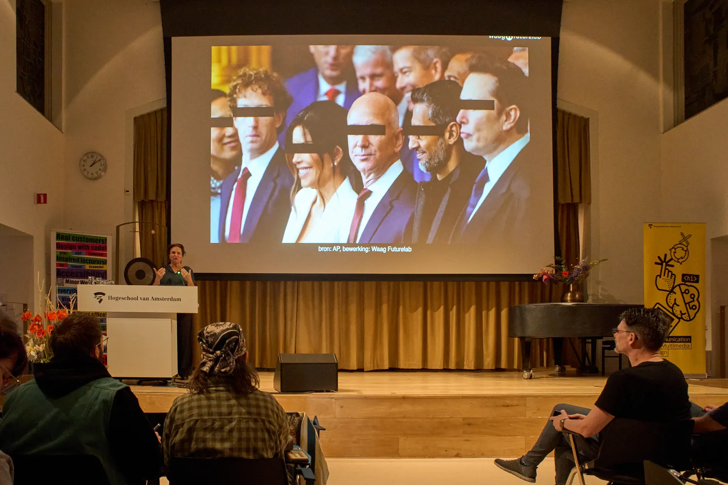
A group of billionares with black bars over their eyes shown on a big screen by someone behind a lectern

There is a bad web

Many speakers pointed out that large parts of the web are not so nice anymore. Hidde de Vries asked if he could use the C-word, because the root of the problem is, of course, Capitalism. A handful of evil corporations, who all sacked their ethical teams recently (if they ever had one), control most of the things that people do on the web. And giving so much power to such a small group of crazy billionaires, with such a distorted world view, is a big problem.

There is a better web

Many speakers also pointed at good places to start when looking for a better web. Tips were given about how to make the web a better place, by working on things like accessibility, and on things like sustainability, and how to make sure that ethics are never set aside. And of course alternatives to large so called social media were promoted: Marleen Stikker pointed at all the different more or less federated alternatives to social media, like the Fediverse and the Atmosphere. Sanne Peters pointed out that you don’t actually need the web all the time. Making bonzai, reading books by authors who have a different background, watching movies from countries you don’t know anything about, and talking to your neighbours were some of the gentle alternatives to the web she promoted.
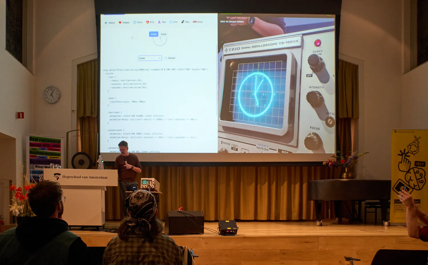
An osciloscope with a clock on it, shown on a big screen by someone behind a lectern

There’s also a fun web

Most speakers showed that the web is a fun place. Marleen showed us that the cool parties are on the Fediverse and on Atmosphere, you are missing the good stuff if you’re not there. Most other speakers talked about the option for hosting your own, independent website. Like this one. We showed some of the incredible things that our students have been making during our web design and developments courses, rubics cubes that have a secret transformer mode, an interactive octopus that gets very nervous when the water level gets too low, and some black holes that suck up all the stuff on your website. And of course Niels Leenheer gave a fantastic talk where he showed us the unbeleivable stuff he does with web technology, like making clocks, not just in the browser, but also on old osciloscopes and even with real lasers. Absolutely brilliant.
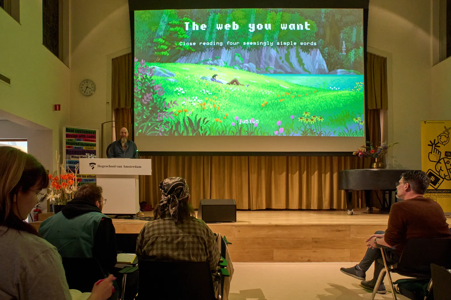
A pixelated, green landscape, shown on a big screen by someone behind a lectern

The web is something to think about.

So the web, it turns out, is much more than what silicon valley wants it to be. It is still a place where people meet other people, where likeminded groups find each other, where the world connects, and where people can do their own stuff, independently. And these independent, federated spaces thrive, and they grow. The web is also a very important medium. The fact that it is for everyone by design really means that it is for everyone. Do so responsibly, like Hidde mentioned. And try to get a deep, deep understanding of what the web that you want would be, like Justus Sturkenboom explained in his brilliant, brilliant talk about the philosophical meaning of the words the, web, you, and want. He almost found the deeper, hidden agenda that I had with this conference, I think. I will link to his talk when he publishes it, it is absolutely fantastic.

The web you want

The first event was well attended. I think there were a bit over 100 people. Many current students, quite some former students, and quite a few people from all kinds of places. One of the bigger compliments we received was from someone I didn’t know who found it refreshing that nobody really talked about “AI” during the event.

The next event is on the 10th of June and I really hope to see all of you there. Tickets are free, just let us know you will attend so we can make sure we have enough seats.

WCAG3 Contrast as of April 2026

10 avril 2026 à 23:47

For years I have seen people, teams, products, organizations, and projects promoting APCA contrast as the WCAG3 color contrast algorithm. In many of those cases, those same actors have suggested dismissing the contrast algorithm in WCAG2.

This kind of problematic advice happened so often that I started filing issues with tool makers to remove APCA, as with this May 2024 Chromium issue.

In January 2025 I saw a post promoting that advice, which would create legal risk for anyone following it. You can see my original 2025 response on Mastodon and the same post on Bluesky, where the creator of APCA also weighed in. Read those to ensure you aren’t just taking my word for it.

Current Situation

Here is the most current (as of this writing) contrast ratio algorithm in WCAG3 with the salient bit highlighted:

contrast ratio test Exploratory

meeting a sufficient level of contrast between two colors using the relationship of hue, saturation, and lightness values

Editor’s note

The contrast algorithm used in WCAG 3 is yet to be determined.

APCA was marked for removal in early 2023:

Exploratory content that does not gain WG support to proceed to the next stage within 6 months is automatically removed in the WCAG 3 development process. We still hope the promising contrast work will continue to mature for potential later inclusion.

As with other WCAG3 ideas that did not get working group support, the working group pulled it from the July 2023 WCAG3 working draft. APCA was only ever exploratory, and the W3C’s July 2023 update explained removal of exploratory items. The APCA creator’s response to Michael Cooper’s comment acknowledged that APCA versions in the draft were all early versions that were very obsolete (emphasis theirs).

I have no idea if APCA, whatever version, will come back to WCAG3.

What to Do?

The W3C logo with a frog-headed eyedropper over it. You can still use APCA (whatever version). If you do, limit your risk by taking one of these approaches:

  • Choose colors that also conform to WCAG2 contrast requirements; or
  • If you pick colors that fail WCAG2 contrast requirements, document it and have a ready response should you receive a drive-by lawsuit from a bad actor using an automated checker to find a contrast violation (assuming your attorney lets you do this).

I am still not a (bird) lawyer.

In the meantime, WCAG3 is years away from being done, perhaps 2030 at the soonest. Any contrast algorithm it picks won’t be final until at least then. But if you like whatever is proposed and want to use it before 2030, then probably refer to my two approaches above.

❌