❌

Vue lecture

De l'importance de la souveraineté logicielle

Un énième signal.

Le 13 juin dernier, la société Anthropic, connue pour sa domination du marché de l’intelligence artificielle générative avec les grands modèles de langage (LLM) de la série « Claude », s’est vue contrainte, sur ordre du gouvernement américain dont elle dépend, de couper l’accès à certains de ses services aux ressortissants étrangers.

Le pourquoi importe moins que le geste. Il est ici question de décider arbitrairement de qui a le droit d’utiliser quoi, et selon quels critères. De faire fi de la justice et de la morale.

  •  

∪ of Target Audiences (Accessibility, SEO, AEO/GEO)

Using SEO (search engine optimization) to justify accessibility was only ever a technique for bosses or clients or stakeholders who see accessibility as a cost center and are typically driven more by dashboards or money. Ideally, you want to get past that ASAP to drive better outcomes for humans, not SERPs (search engine results pages). I get it as a foot-in-the-door tactic — hopefully it goes no further.

But SEO also drove bad accessibility practices, such as alt text keyword stuffing, low-contrast text, verbose headings, link text built around keywords, gratuitous landing pages, and more. Karl does a good job of demonstrating how little SEO and accessibility are connected. As such, I’ve always been wary of companies pitching accessibility and SEO in their marketing.

Now I see companies pitching accessible & “AI-ready” or “agent friendly” work, often still including SEO. I’m calling foul.

Venn diagram with three circles. 1, Accessibility: The work needed to make things accessible to humans in assorted contexts. 2, SEO: The work needed to get your sites into search engines and maybe even ranked well. 3, AEO/GEO: The work to get your IP stolen by LLMs as they DDoS your site, so it can be later incorrectly regurgitated. Overlap with Accessibility and SEO: With bonus per­for­ma­tive use of the term “a11y.” Overlap of SEO and AEO/GEO: This is someone tricking you into speed-running having your IP stolen. There is no overlap of Accessibility and AEO/GEO nor all three.

We’ve already seen anti-user guidance from LLM companies asking for their notion of accessible sites. Never mind that these PhD-level genius LLM tools can’t handle a general site most kids navigate with ease. Let’s ignore the failure of that technology and instead start slapping misunderstood ARIA attributes on all our pages instead.

Sure, there’s overlap between SEO and LLM-thieving. SEO and accessibility even have slight overlap. But accessibility is about people. Twisting a human affordance to feed these corporate efforts to make humans redundant (among all the other harms) is a signal. Different people will read that signal in different ways. If it sells work and you still focus on humans first, cool.

But to me that signal says you aren’t serious about the work. That your TESCREAL patch is just waiting to get sewn on. I’m trying to be less absolutist, less black-and-white. But boy is it hard given what I see every time I peel back the veneer.

I made a thing (based on an old experiment) to better illustrate where I see the overlaps.

See the Pen Accessibility + SEO + AEO by Adrian Roselli (@aardrian) on CodePen.

  •  

Fermeture de dialog avec l'attribut closedby

Pour rappel <dialog> permet de créer des boîtes de dialogue (modales, popups, popins, elles ont tant de noms) en HTML sans plus avoir à tout gérer en CSS+JavaScript pour positionner un élément <div> en absolu.

Et on a aussi connu cela : une popin qui se ferme quand on appuie sur echap alors qu'on voulait forcer l'utilisateur à valider un formulaire, ou à l'inverse une modale qu'on ne peut fermer qu'avec un bouton alors qu'un clic en dehors serait tellement plus naturel. Jusqu'ici, la solution consistait à empiler du JavaScript pour gérer ça à la main.

Désormais, un simple attribut HTML suffit.

Mentionné par Una Kravets et Bramus Van Damme à la Google I/O 2026.

Comment ça marche ?

L'attribut closedby s'ajoute directement sur l'élément <dialog> et accepte trois valeurs :

  • any — le dialogue se ferme via la touche Échap, un geste natif (retour arrière sur mobile), ou un clic en dehors (correspond à ce qu'on appelle un light dismiss).
  • closerequest — fermeture via la touche Echap ou geste natif uniquement, pas de clic en dehors. C'est le comportement par défaut d'une modale ouverte avec showModal().
  • none — fermeture uniquement via code (bouton, soumission de formulaire…), aucune alternative native.

Exemples rapides :

<!-- On peut cliquer à côté pour fermer -->
<dialog closedby="any">
  <p>Aperçu rapide, fermable au moindre clic extérieur.</p>
  <button onclick="this.closest('dialog').close()">Fermer</button>
</dialog>
<!-- Aucune fermeture "accidentelle" possible -->
<dialog closedby="none">
  <p>Formulaire critique. On ne vous laisse pas esquiver comme ça.</p>
  <button onclick="this.closest('dialog').close()">Valider et fermer</button>
</dialog>

Et sans closedby ?

Si l'attribut est absent ou invalide, le navigateur applique un comportement automatique : - showModal() → se comporte comme closedby="closerequest" (Echap fonctionne). - show() ou attribut open → se comporte comme closedby="none" (rien ne ferme sans code).

Autrement dit, rien ne change pour vos éléments existants. Ouf la rétrocompatibilité.

Compatibilité navigateurs

À ce jour, le support atteint environ 70 % de couverture globale d'après Caniuse ce qui est encourageant mais insuffisant pour un usage en production sans y réfléchir.

Navigateur Support
Chrome / Edge ✅ depuis la version 134
Firefox ✅ depuis la version 141
Opera ✅ depuis la version 119
Safari (macOS & iOS) ❌ pas encore supporté

🐌 Safari reste en retrait... et tant que ce n'est pas supporté un fallback JavaScript pour le light dismiss peut faire l'affaire :

// Fallback pour les navigateurs sans closedby="any"
document.querySelectorAll('dialog[closedby="any"]').forEach((dialog) => {
  document.addEventListener('click', (e) => {
    if (dialog.open && !e.composedPath().includes(dialog)) {
      dialog.close();
    }
  });
});

Accessibilité

L'attribut closedby agit uniquement sur la fermeture, il ne modifie pas la sémantique de l'élément. Les bonnes pratiques habituelles restent donc :

  • closedby="any" : le clic en dehors ferme la boîte de dialogue, vérifiez que ce comportement est prévisible pour les utilisateurs de lecteurs d'écran. Un clic accidentel à côté d'un formulaire partiellement rempli peut surprendre. Réservez cette valeur aux interactions légères et non critiques (petites popups d'information ou de prévisualiation).
  • closedby="none" : si l'utilisateur ne peut pas fermer via la touche Échap ni en cliquant en dehors, il doit impérativement y avoir un bouton de fermeture, accessible au clavier et aux technologies d'assistance.
  • Gestion du focus : à l'ouverture, le focus doit aller dans la modale ; à la fermeture, il doit revenir sur l'élément déclencheur (qui a ouvert la modale, par exemple un bouton).
  • Libellé/titre : pensez à aria-labelledby (pointant vers le titre) et éventuellement aria-describedby pour les descriptions. L'élément <dialog> expose déjà le bon rôle ARIA, mais sans nom accessible les lecteurs d'écran annoncent une boîte de dialogue anonyme.

Publié par Alsacreations.com

  •  

headingoffset is Not the Document Outline Algorithm

Hi, just me heading off some bad advice I’m starting to see in developer venues.

Background

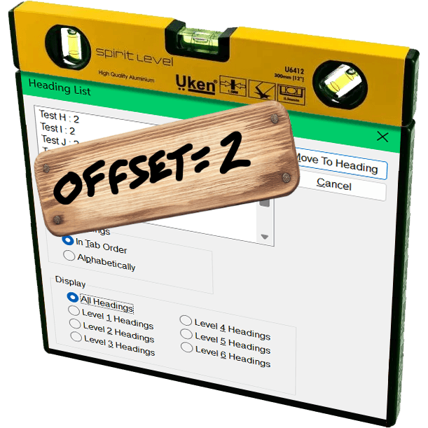
The JAWS heading list dialog with a yellow three-in-one surface level resting on top and a board nailed over it with hand-scrawled ‘offset=2’.

The proposed Document Outline Algorithm, where headings would automatically reset themselves to the appropriate level based on their position in the DOM structure, was never part of a final HTML specification. It was quickly proven to be unworkable; brief support in JAWS demonstrated that. You can read the tortured history (and a JAWS support demo) in my 2016 post There Is No Document Outline Algorithm.

In 2019 WHATWG worked to resurrect <hgroup>, partly in a novel effort to try to resurrect the Document Outline Algorithm. In the end, even that effort was futile. <hgroup> came back, but it came back as a grouping element only. The only impact it has on heading structures is that browser could, if they really wanted, ignore other headings in the same <hgroup>.

In 2020, Steve Faulkner wrote about the doc-subtitle role, from the Digital Publishing WAI-ARIA Module 1.0, as a way to handle subtitles until <hgroup> found its new footing. Sadly, a cadre of authors thought that role could be the basis for the Document Outline Algorithm.

Authors very much want to make the browser decide heading levels for them. Authors also very much continue to write content and HTML structures that make that impossible.

So I wasn’t surprised when Firefox’s recent announcement of headingoffset support coming to Firefox behind a flag resulted in many cheering the “return” (irony quotes) of the Document Outline Algorithm.

But it isn’t.

headingoffset

The headingoffset attribute lets authors offset heading levels for descendants of a given node.

So if you have, say a dialog that starts at <h2>, you could add headingoffset="2" and then let it pull in (server-side or via your preferred user-slowing front-end tooling) another page that uses <h1> as its first heading, you can be comfortable knowing that <h1> will be treated as <h3> in the accessibility tree.

This can be handy for content re-use without authors needing to make every heading a variable or burning down the DOM each time to forcibly re-write them.

But it’s still the author’s job to make an intentional and good decision. The browser will know nothing more about your content or structure than it did before. And it certainly doesn’t reduce WCAG risk.

Other useful nuggets:

  • headingoffset values must be valid non-negative integers.
  • headingoffset values must be between 0 and 8.
  • headingoffset values greater than 8 are specified to max at level 9, but existing bugs may impact that.
  • Other invalid headingoffset values should fall back to level 2, but again, bugs and implementation decisions wil impact that.
  • headingreset is a boolean attribute that tells browsers to ignore headingoffset for that node and its descendants.
  • Do not use headingoffset until you can confirm support for the computed heading level in your target audience browser.

Recap

  1. headingoffset is not the (nor any) Document Outline Algorithm, nor does it replicate it.
  2. headingoffset requires the author to make decisions based on content.
  3. Until JAWS and TalkBack fix existing bugs, probably don’t do / allow any heading levels higher than 6.
  4. Don’t do / allow any heading levels higher than 9.
  5. If you are hoping headingoffset will resolve your heading level problems in a hands-off way with imported or user-generated content, you may end up creating confusion and WCAG risk.
  6. Do not try to use headingoffset to try to recreate the Document Outline Algorithm.

Related

Not a ton of detail in this post, but at 500 words if you want more then here are some resources beyond what I linked:

  •  

Lancement du site a11yfrance.org

Suite au lancement de l’association a11y France en avril 2025, nous avons désormais un site web dédié : https://a11yfrance.org.

Qui sommes-nous ?

A11Y France, association de loi 1901, fédère les personnes professionnelles de l’accessibilité numérique et les personnes concernées pour un numérique véritablement accessible à toutes et tous.

L’association a été cofondée par Ideance, Temesis, Tanaguru, l’Association Valentin Haüy et la Fédération des Aveugles et Amblyopes de France. Elle compte actuellement plus de 40 membres actifs (liste à venir prochainement).

  •  

Centrer verticalement en CSS : épisode final

Le centrage vertical en CSS… C’est historiquement l’une des difficultés les plus célèbres du développement web, un sujet de plaisanterie classique qui fait sourire les développeurs back-end et désespérer les intégrateurs depuis l’époque de CSS2.

Pendant près de quinze ans, nous avons multiplié les détours techniques. Nous avons buté sur des vertical-align: middle capricieux réservés aux tableaux, ou des position: absolute combinés à des top: 50% et des transform: translateY(-50%) aussi magiques que fragiles.

Cette époque de savants calculs et de lignes de code superflues est désormais révolue depuis l'arrivée des modèles de positionnement Flexbox et Grid Layout.

Ceci dit, une petite révolution est passée quasi inaperçue, et pourtant elle simplifie tout : la propriété align-content fonctionne désormais dans le flux normal (Block layout). Plus besoin de déclarer un display: flex ou display: grid simplement pour aligner du contenu verticalement.

Le grand déblocage : align-content partout, pour tous

Jusqu’à récemment, align-content était une propriété exclusivement réservée aux modules Flexbox et Grid Layout. Elle permettait de distribuer l’espace entre les lignes ou d’aligner le contenu sur l’axe secondaire. Si vous tentiez de l’appliquer sur un simple bloc de texte (display: block), le navigateur l’ignorait superbement.

Grâce à une mise à jour majeure des spécifications CSS (CSS Box Alignment Module Level 3), align-content est désormais fonctionnel dans tous les modes d’affichage.

Un support universel et moderne

C’est une excellente nouvelle : ce comportement n’est pas une simple piste de réflexion, il est déjà pleinement supporté par tous les navigateurs modernes (Chrome, Firefox, Safari et Edge). Vous pouvez dès aujourd’hui l’utiliser en production pour simplifier considérablement vos intégrations.

Alors comment ça marche ?

Le principal avantage de cette évolution est l’économie de code et de structure HTML. Voyons cela à travers deux cas d’usage concrets.

1. Le centrage vertical parfait

Pour centrer un contenu verticalement dans un conteneur de hauteur fixe ou minimale, il suffit désormais de deux lignes de CSS sur le parent. Pas de Flexbox, pas de Grid, juste du bloc natif.

.hero-banner {
  display: block; /* Optionnel, c'est le comportement par défaut d'un div */
  min-height: 400px;

  /* La magie opère ici */
  align-content: center;
}

Ce qui change par rapport à Flexbox

Avec Flexbox, écrire align-items: center (ou align-content) nécessite impérativement un display: flex. Le problème, c’est que le passage en mode Flexbox modifie le comportement de tous les enfants directs (ils deviennent des flex items, se mettent en ligne par défaut, etc.). Avec align-content sur un bloc, les enfants restent des blocs normaux, conservent leurs marges et leur comportement natif dans le flux.

2. Aligner en bas de page

Vous souhaitez positionner un pied de carte ou un texte tout en bas d’un bloc sans avoir recours au positionnement absolu ? L’opération est tout aussi directe :

.card {
  min-height: 300px;
  align-content: end;
}

Vous pouvez bien sûr utiliser toutes les valeurs classiques de la propriété : start, end, center, space-between, space-around, space-evenly.

Tableau récapitulatif des valeurs courantes

Valeur Effet sur un bloc (display: block)
start / flex-start Aligne le contenu au début (haut) du conteneur.
center Centre le contenu verticalement.
end / flex-end Aligne le contenu à la fin (bas) du conteneur.
space-between Distribue l’espace résiduel entre les blocs enfants.

Et pour l'axe horizontal ? Le cas de justify-self

Si align-content règle magistralement la question de l'alignement vertical sur le parent, une autre propriété complémentaire pointe le bout de son nez pour l'axe horizontal : justify-self.

Appliquée cette fois directement sur un élément enfant au sein d'un bloc, elle a pour but de lui permettre de se positionner de manière autonome à gauche, à droite ou au centre de son parent (par exemple avec justify-self: center ou justify-self: end).

Pour le moment, le support actuel par les navigateurs reste encore trop partiel pour envisager une utilisation en production. Pour l'alignement horizontal d'un bloc individuel dans le flux normal, les bonnes vieilles marges automatiques (margin-inline: auto, etc.) ont donc encore de beaux jours devant elles.

Pourquoi ça change la vie ?

Au-delà du gain de temps, cette évolution CSS apporte une vraie rigueur sémantique et technique :

  • Lisibilité du code : Moins de conteneurs (div) superflus créés uniquement pour corriger des défauts d’alignement.
  • Performance cognitive : Le code est plus lisible. Quand on lit align-content: center, on comprend immédiatement l’intention, sans avoir à analyser si le display: flex associé ne risque pas de perturber le reste de la mise en page.
  • Respect du flux : On conserve la puissance et la prévisibilité du modèle de bloc traditionnel là où Flexbox ou Grid n’étaient finalement que des détours techniques pour un besoin simple.

Dix-quinze ans après les premiers débats enflammés sur les forums d’Alsacreations pour savoir s’il fallait utiliser les display: table-cell ou des hacks à base de lignes fantômes, le CSS moderne nous offre enfin l’outil ultime. Une seule propriété pour les gouverner toutes. Elle n’est pas belle, la vie d’intégrateur en 2026 ?

Publié par Alsacreations.com

  •  

Maybe Don’t Rely on Google’s “Modern Web Guidance”

Just in time for Google I/O, the Chrome for Developers site announced Modern Web Guidance (MWG):

Orange star between two curly braces, topped with a circle-line and a flat line at the bottom, appearing almost as an ASCII art lantern.

Modern Web Guidance is a set of evergreen and expert-vetted skills that guide your AI coding agents across many common use cases to build modern web experiences that are accessible, performant, and secure.

I appreciate this set of LLM skills lists accessibility first, something I feel strongly every MVP (or early preview as Google calls this) must:

Simply, if your MVP does not have accessibility factored in, it is not viable. If you claim accessibility is a core principle but your version 0 does not include it, then it is not a core principle.

Last year I made a straightforward and simple request to Google (that also respects the law in most jurisdictions where Google does business):

Please, if your team cannot explain how the thing satisfies all WCAG Success Criteria at Level AA, then don’t release the thing.

Unfortunately, MWG accessibility doesn’t satisfy. Partly because not every pattern has tailored guidance. For example, you may remember when Google ran at a toast pattern before abandoning it:

Again, the people designing the feature neither understood accessibility nor had consulted anyone who did while they designed it, instead relegating accessibility to the later stages of their design and assuming it could simply be remediated with a modest effort and without any serious redesign or rethink.

I hoped Google also remembered and applied that experience here, making a skill tailored to toasts to avoid another debacle. Nope.

Reopening because this guide needs accessibility guidance in some form as there’s no general toast guidance.

22 May comment reopening issue #393 “Create guide and evals for the persistent-toast-notifications use case,” originally marked complete 4 April 2026

But this is an early preview of what developers can do with MWG. It’s not going to cover every pattern. That would be absurd. So let’s look to a pattern Google decided to showcase at launch via this first example prompt on the page:

Create an accordion-style stats component that smoothly animates on open and close.

First prompt on MWG home page, under Build new user experiences heading.

I expected a pile of <details name> elements, maybe CSS block-size with a JavaScript fallback, probably a couple placeholder images for generic stats, possibly a well-formed table to accompany them, and of course all of it passing WCAG. This is what Antigravity produced with MWG:

See the Pen Google Modern Web Accordion by Adrian Roselli (@aardrian) on CodePen.

Antigravity with MWG went well beyond the prompt, providing a theme switcher, configuration settings, and plenty of calls to Google fonts. But it failed to do what I asked. The animation doesn’t work in Firefox. This despite the promise of baseline / Baseline support and fallbacks:

  • Progressive Enhancement & Nuanced Fallbacks: We distinguish between purely additive enhancements (like speculative preloading) which are safe to let older browsers silently ignore, and critical behaviors (like dialog controls or network beacons) where we write highly considered, low-overhead fallbacks.
  • […]
  • Baseline-Aware Integration: We leverage real-time compatibility data from the Baseline project so agents can dynamically adapt to current browser support and any browser support preferences.

This is already worrisome given we know that three years on, Baseline still doesn’t really address baseline support:

The relatively new Web Platform Baseline offering does not track browser support for accessibility features built into the web platform. If you need to understand whether browsers support accessibility features as your own base level set of requirements, for legal or other compliance reasons, then Web Platform Baseline does not represent a baseline.

Let’s ignore the non-DRY code, like duplicated HTML text in the script and stringing out the transition instead of using transition-property. Antigravity with MWG didn’t even create a WCAG-conformant example from its own prompt. I found errors within moments. MWG failed its core promises of creating accessible and performant code. Despite its own explicit guidance.

For the first two of these MWG already had guidance, and the a11y skill just wasn’t picked up. Overall activation aside, this highlights the importance of including contextual a11y information.

[…] [W]e should try to have one guide for each common interactive element summarizing and linking/embedding relevant bits of guidance (e.g. tabs, accordions, drawers, etc). The more scattered the use case guidance is, the less likely it is that agents will actually pick up all the pieces.

And there’s the rub. There’s no way to guarantee you’ll get what you ask for, that you won’t get something else, and that these guides — the entire promise of MWG — will be honored. MWG asks authors to trust MWG when using an LLM to code interfaces. But MWG knows its guidance may be ignored:

LLMs are non-deterministic. Even if we do everything right, there is no guarantee any guideline will be used for any given prompt. Even if the relevant guide is picked up, it may not be read fully. Case in point: As you say, MWG already had guidelines for many of these things!

Mastodon post from a domain expert consultant to Google for MWG, 21 May 2026

The underlying code generation technology can’t be trusted to follow the rules and the rules aren’t robust enough to blunt that reality.

Crude orange Vonnegut-style asterisk between two curly braces angled out a bit, topped with a rounded rectangle and a curved line at the bottom, appearing almost as an ASCII art toilet.

If your job requires you to burn tokens to satisfy some manager’s dashboard, then yes, grab the MWD skills files and integrate them into your LLM work. You’ll almost definitely get better output than if you do nothing at all. There are smart people working on this and many of the accessibility rules I saw were on-point.

But that output will be wrong in subtler and more nuanced ways across potentially fatter piles of code with more unrelated output and unwanted dependencies. It will require a more specialized set of skills to identify errors. And those errors will be different every time the code is generated.

So on the side, keep supporting any existing pattern library. If it’s built well, it’s copy-ready code that you can stuff into a project just as quickly as a chatbot could generate it. It’s deterministic, so you get the same code every time. Ideally it’s been vetted, so you don’t need to look for errors. It’s tailored to your context, meaning you don’t need to yank out random style switchers and typefaces (hoping you got all the dependencies).

If your job doesn’t require you to burn tokens, then probably ignore MWG and, by extensions, LLM for code. In case the environmental damage, intellectual property theft, wealth redistribution to the rich, encoded biases, and built-in support of fascism weren’t enough.

Update: 24 June 2026

The Silktide blog has this banger of a quote:

Across the board, [Google Antigravity using Modern Web Guidance] was a deprioritization of accessibility requirements in favor of visual presentation.

I don’t agree Antigravity nor MWG should use APG, which a regular visitor here may know, but the author is correct the APG disclosure pattern is mostly harmless.

But Silktide is right that the, once again, Google built the wrong thing for the wrong people and then proudly shoved it out into the world with no hint of self-awareness.

  •  

Google publie son guide officiel pour l'optimisation IA

Google a mis en ligne un guide officiel, assez compact, que beaucoup attendaient pour expliquer comment "optimiser son site" pour ses fonctionnalités d'IA (obtention de résumés automatiques, mode "IA" dans les résultats, etc.).

Bonne nouvelle pour le web : il n'y a rien de révolutionnaire, et cela ne devrait - pour le moment - aboutir à aucune technique fourbe qui impacterait les humains ou l'accessibilité numérique.

Le message principal est que les bonnes pratiques classiques restent valables.

Le but de cette actualité n'est pas de faire la promotion de l'usage de IA par Google mais bien de souligner l'espérance d'une absence d'impact supplémentaire sur la qualité du web actuel.

Les réponses générées par l'IA de Google s'appuient sur le même index de recherche qu'avant : si vous n'êtes pas indexé, vous n'existez pas pour l'IA non plus.

On attend toujours un contenu de qualité, une structure technique propre, une bonne expérience utilisateur. À ce sujet Google a également confirmé il y a quelques jours qu'il pénaliserait les sites modifiant le comportement du bouton retour du navigateur, notamment pour "faire rester" les humains sur un site dans un piège infini grâce aux méthodes history.pushState et history.replaceState.

Ce qui est intéressant, c'est la section mythbusting où Google démonte quelques idées qui circulent en ce moment... Les rumeurs et fausses astuces circulent encore plus vite qu'avant.

  • Les fichiers llms.txt : inutiles pour Google. Le fichier n'a aucun effet particulier sur le traitement de votre site.
  • Découper le contenu en petits morceaux : pas nécessaire, les systèmes comprennent des pages avec plusieurs sujets.
  • Réécrire ses textes pour l'IA : inutile également. Les systèmes comprennent le sens général, pas besoin de cibler chaque variante de requête imaginable.
  • Les données structurées : toujours utiles pour les résultats enrichis classiques, mais pas requises pour apparaître dans les réponses IA.

La seule vraie nuance apportée concerne le contenu "non générique" : avoir un vrai point de vue, une expérience personnelle, une analyse qui va au-delà du consensus. Dans un monde où produire du contenu banal est à la portée de n'importe quel outil ou LLM quelconque, ce qui a de la valeur c'est ce que vous seul pouvez apporter.

Publié par Alsacreations.com

  •  

Finally, the Handoff is Dead

The designer/developer handoff has been with us for years. And even though today's AI tools are dramatically increasing everyone's output, the walls between disciplines haven't changed. So now we're throwing more stuff over the wall, faster. We've been iterating on a different workflow, which Amelia Wattenberger and I demoed at Design Futures Assembly.

Most companies have years of cemented process. Changing how designers and developers work together means unwinding habits, tools, and politics that have been building for a long time. We're in a different situation because we're spinning up new companies regularly. Which means we can recreate the design/dev process each time. And as the technology evolves and we learn what works, we adapt and carry those lessons into the next one. Today we'll share our current approach.
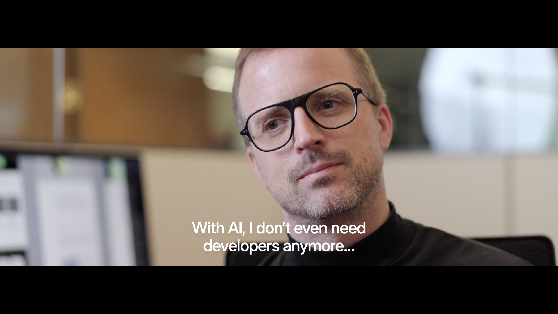
With AI, I Don't Even Need Developers

Where a lot of the discourse on AI is these days, and where a lot of AI tools are at, is individual empowerment. Designers saying: "I can finally ship code, I don't even need developers anymore." Developers saying the reverse.
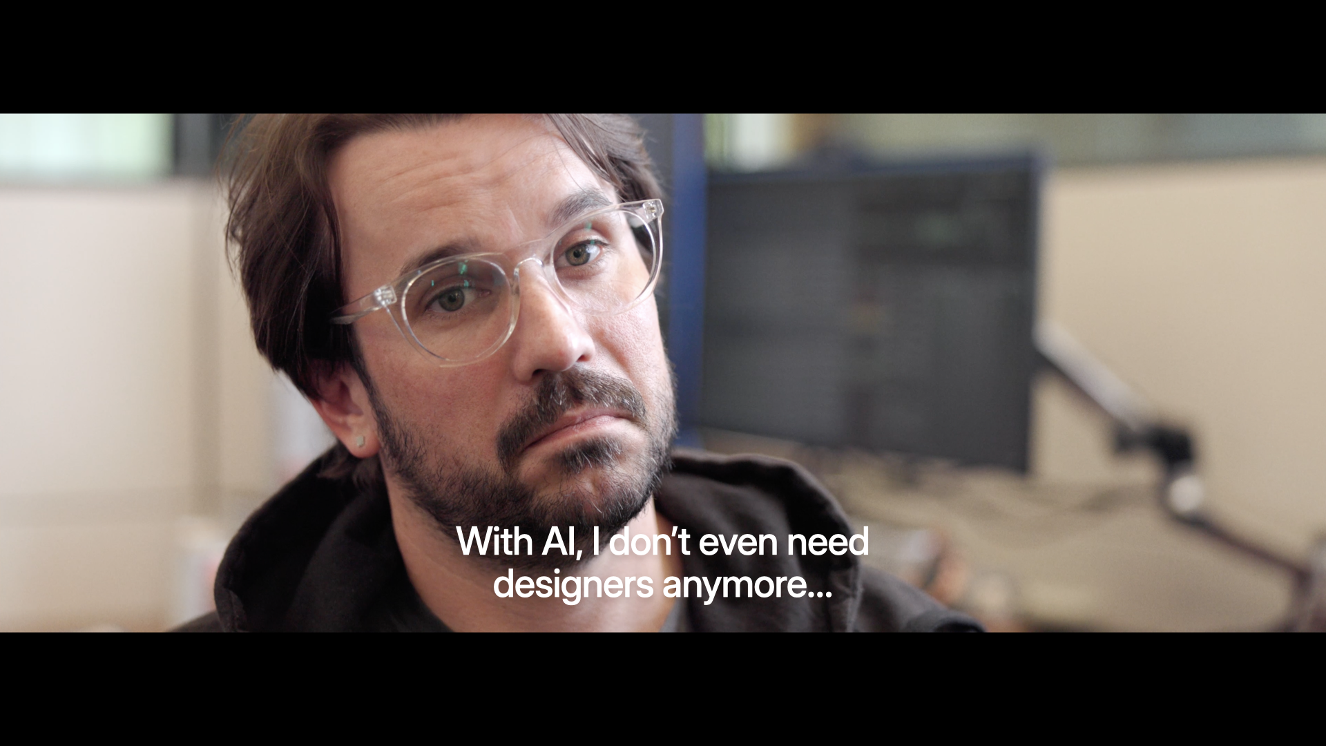
With AI, I Don't Even Need Designers

But very few people are actually asking the question: how do we use AI to work better together?
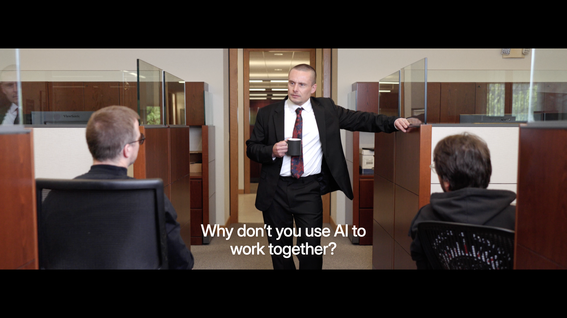
How Can We Use AI to Work Together?

Because pretty much everybody, in this room and beyond, is working with other people. And that's where the magic lies. Being able to pull multiple folks, their skills, and their experience together to create something better than you could do yourself.
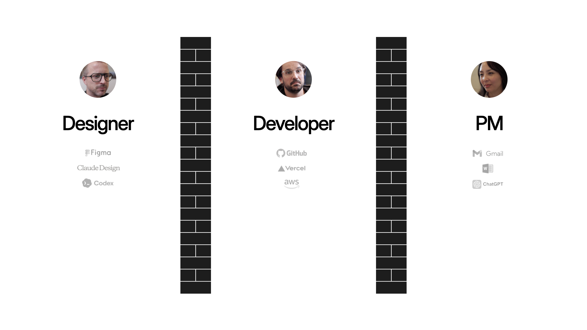
Throwing Things Over The Wall

Why doesn't this kind of collaboration happen already? As user experience, front-end development, and product management have matured as disciplines, we've fallen into a throw-it-over-the-wall modality. Partially because as these roles have matured, specific tools have been made for designers, like Figma. Likewise specific tools for developers, tools for PMs, et.c

And now we're adding a lot more tools, thanks to AI. So we're all able to produce more at a higher rate. Which means we're more throwing stuff over the wall faster. That's why you hear stories of developers just being overwhelmed with PRs as everyone starts "shipping" their ideas.
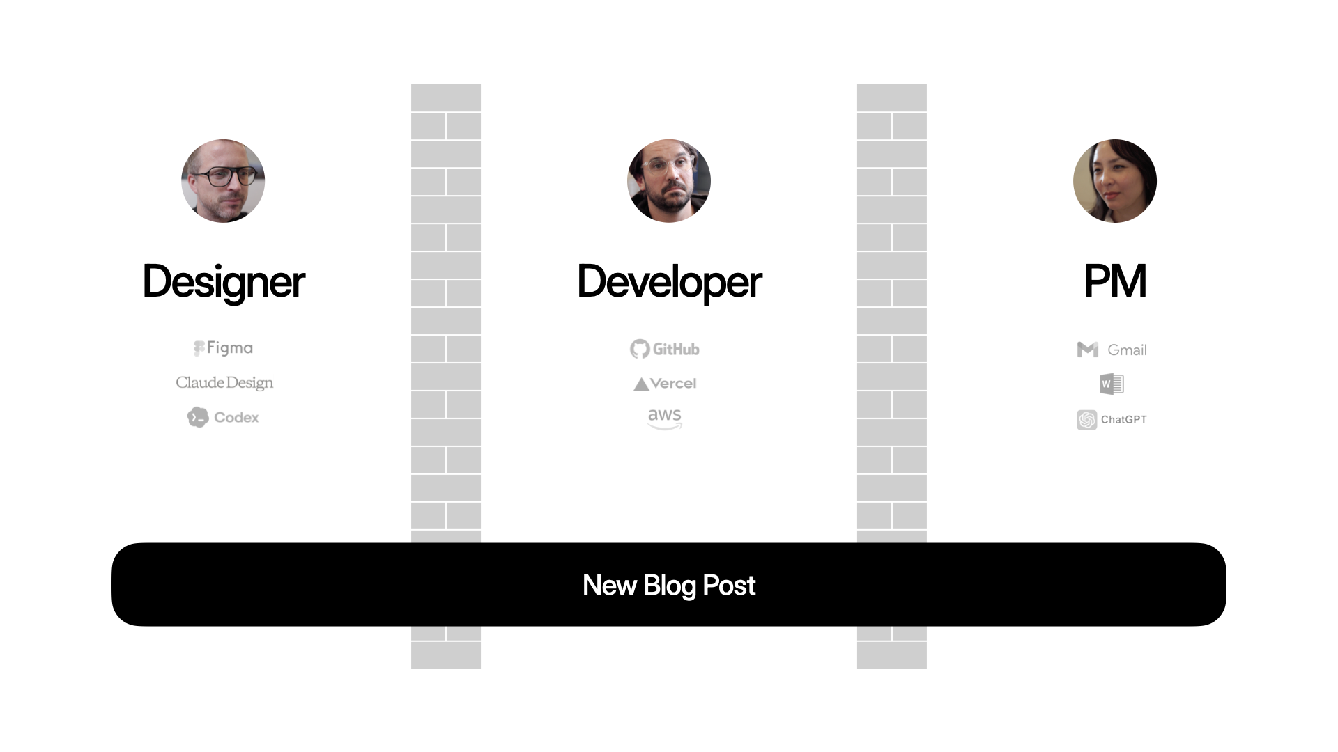
Even a Blog Post Requires Collaboration

That applies to big complex projects but also nearly everything we do. Like publishing a blog post on your Web site. Maybe these days, the PM writes the content in ChatGPT, the designer makes the assets in Nano Banana, the developer writes the code in Codex. Everyone's productive, but are they aligned?
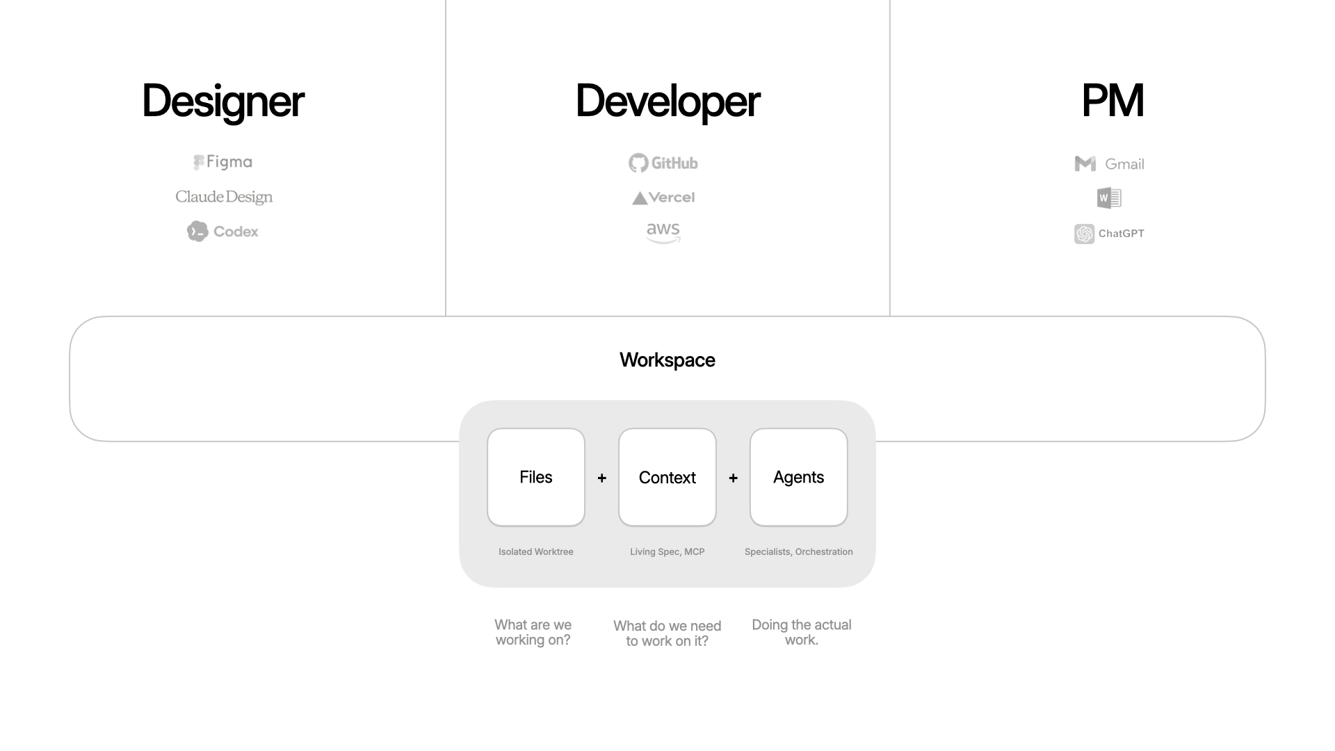
The Workspace Primitive in the Intent App

To help solve this, we've been building an app called Intent. The goal: make it easier to build software together. For any task, you spin up a workspace, which is a bundle of everything you need. Files (an isolated copy of the codebase, so you can change without messing up what others are doing), context (specs, scratchpad, data from external systems via MCP, etc), and agents (with tools and the ability to delegate and orchestrate work). Because these are all in one bundle, it becomes easier to put things down, pick them up, and hand them off.
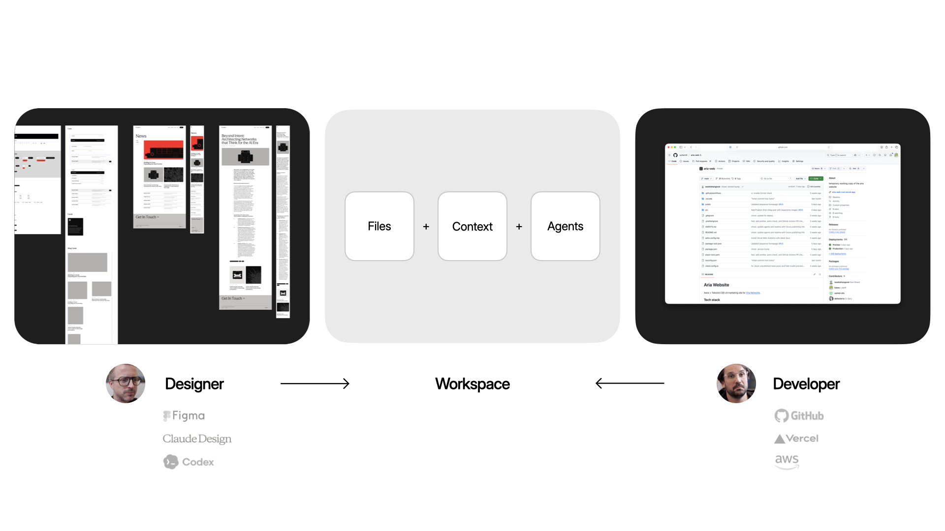
The Workspace Primitive in the Intent App

Here's why that matters in practice. A designer keeps working where they already work (like Figma or paper) and brings their expertise into the workspace: grid, typography. That all gets encoded. A developer gets to work in their tools: CSS frameworks, deployment, structure. Same surface, different expertise.
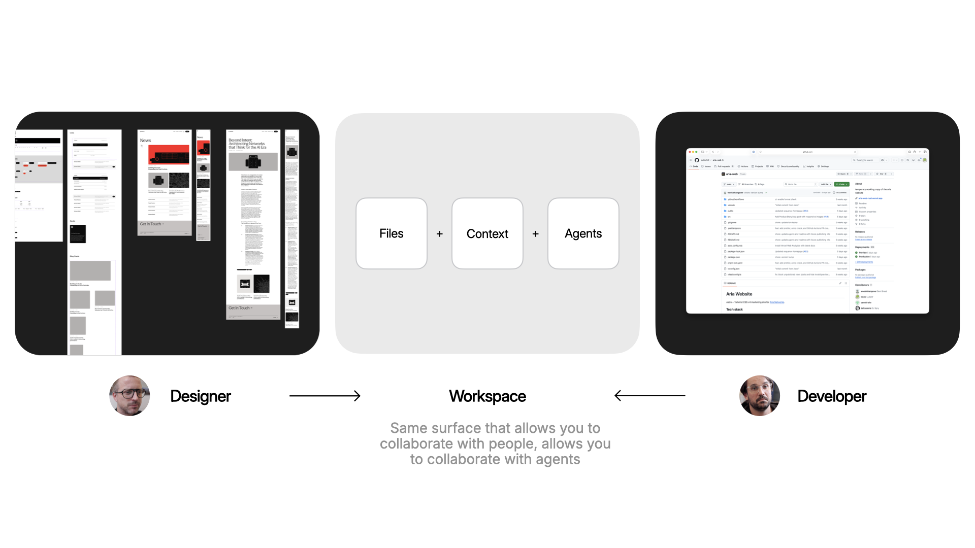
Encoding Design and Development outcomes into a Workspace in Intent

The same surface that makes it easy to collaborate with people on your team is the same one that makes it easy to collaborate with agents. And true collaboration means respecting everyone's taste. So any workspace that gets spun up will align with how the designer encoded the styles to work and how the developer encoded the code to work.
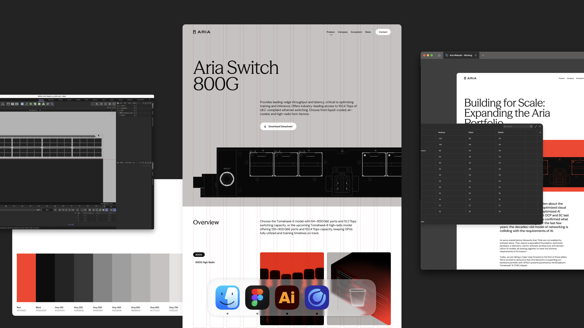
Figma File with layouts and styles for Aria Website

To illustrate as a designer, I've got a Figma file with a grid and layouts. I go into a workspace in Intent and say: "Agent, look at the Figma file. Create the grid. Here's what the breakpoints are." Now that's encoded in the workspace and anybody that creates a new page or drops in a new asset, it works within that system.
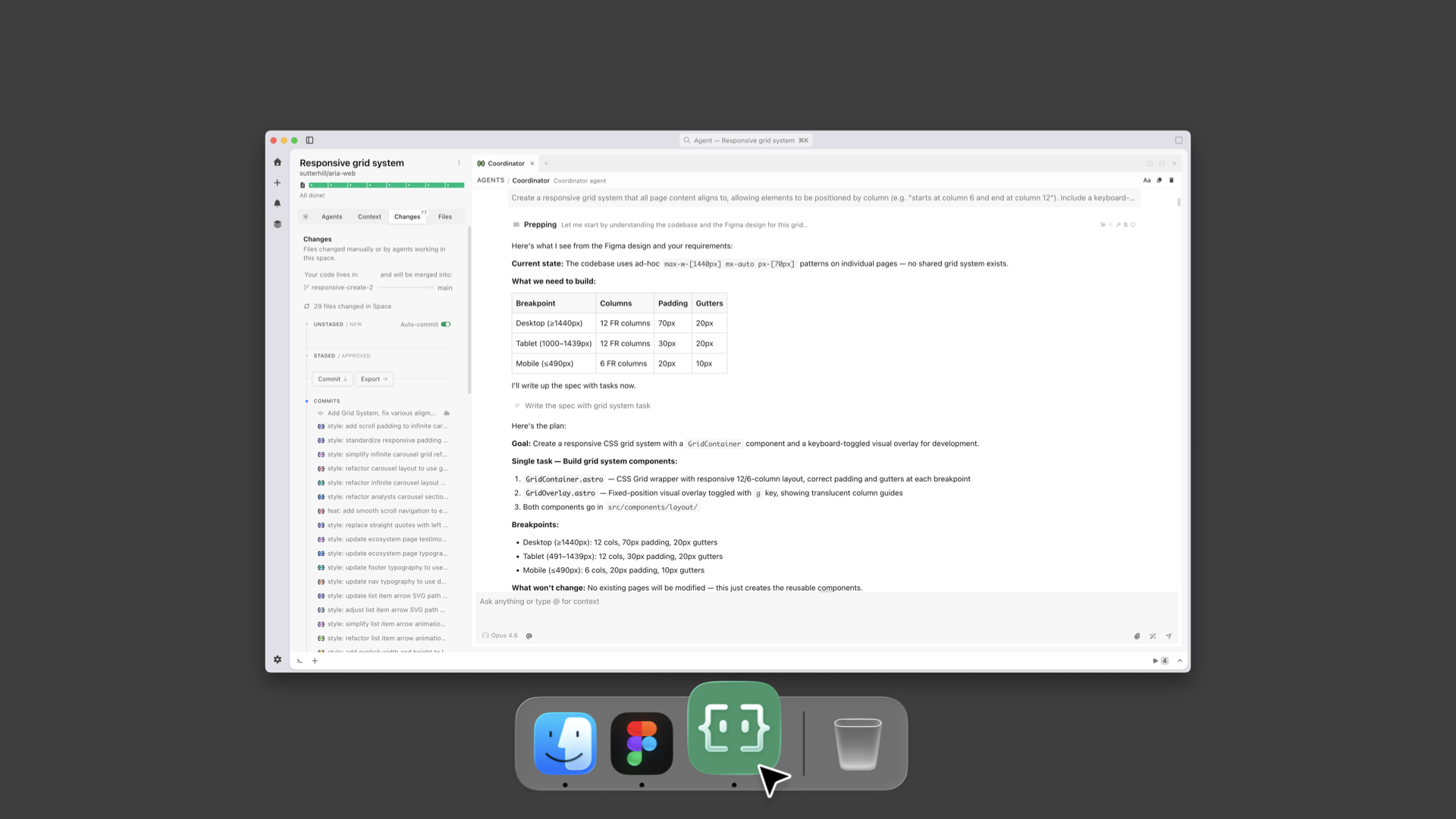
Encoding Design  grid and breakpoints into a Workspace in Intent

I can also set up how animations should work to give everything made in the workspace silky smooth transitions.
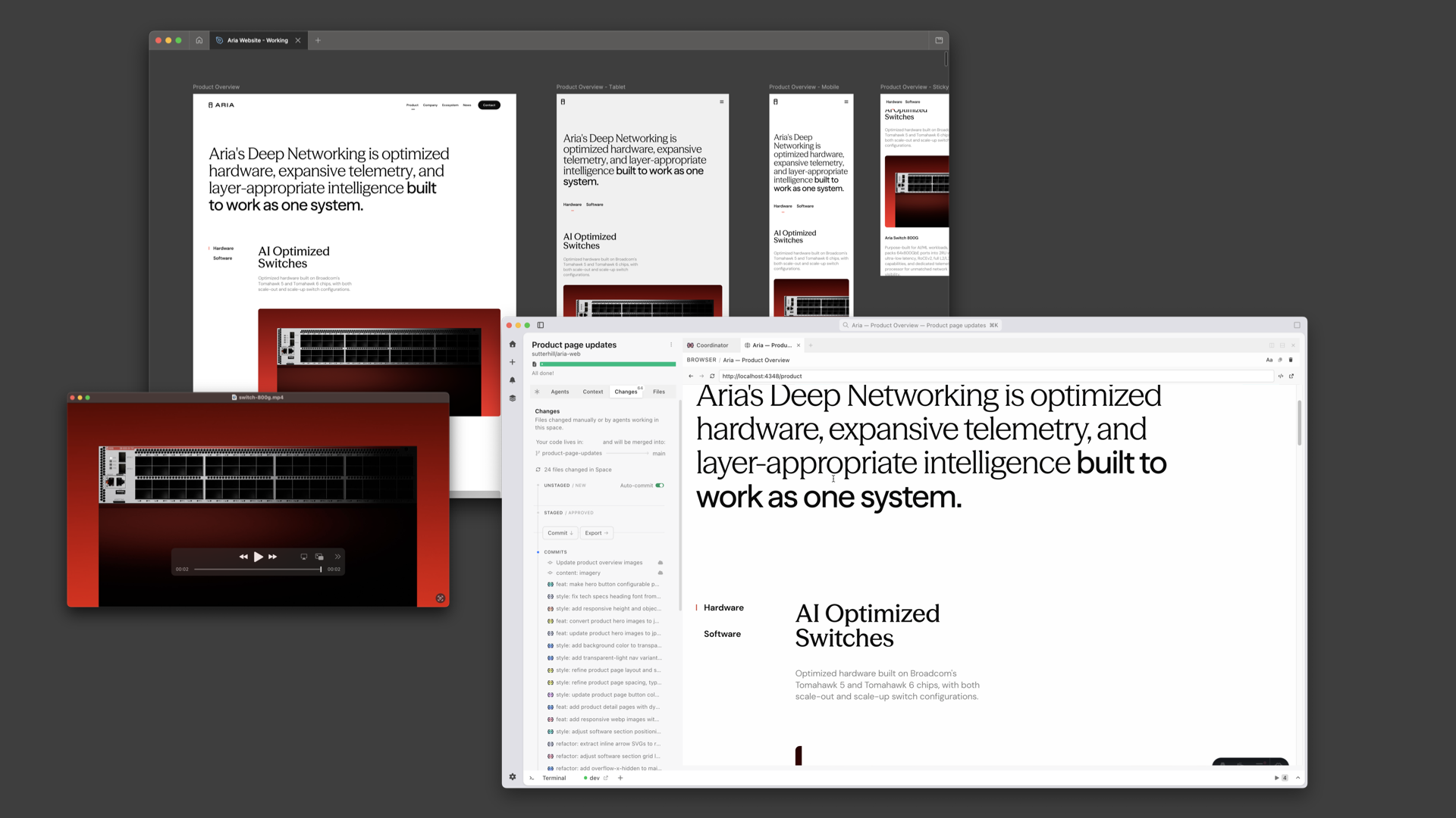
Encoding Design  grid layouts and responsive behaviors

Same idea on the developer side. The dev can say: here's the agent's MD file, here's how we're testing the code, here's the tailwind config. The agent encodes all of that.
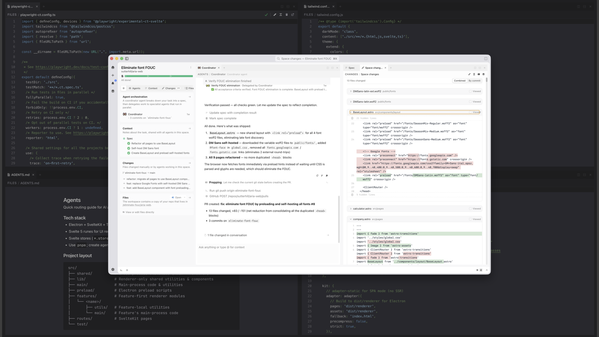
Encoding Development configurations into a Workspace in Intent

Taste gets baked into code files and markdown files in the repo. And because things are built on top of the same version control that developers use, it gets automatically included into every new workspace.
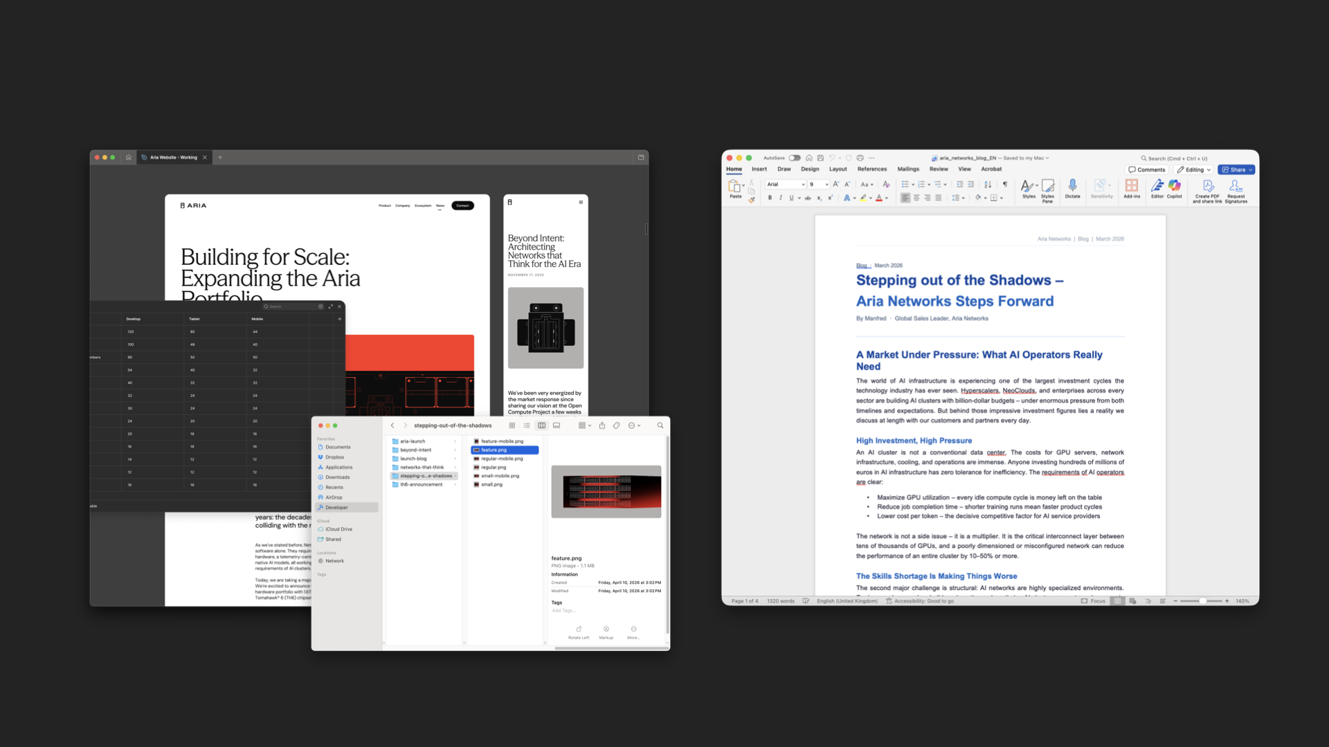
Assets from an illustrator and text from a write for an Aria blog post

The great thing is that this same pattern works for anybody on the team. An illustrator can use their own tools to make assets. A content writer can write their copy in Word.
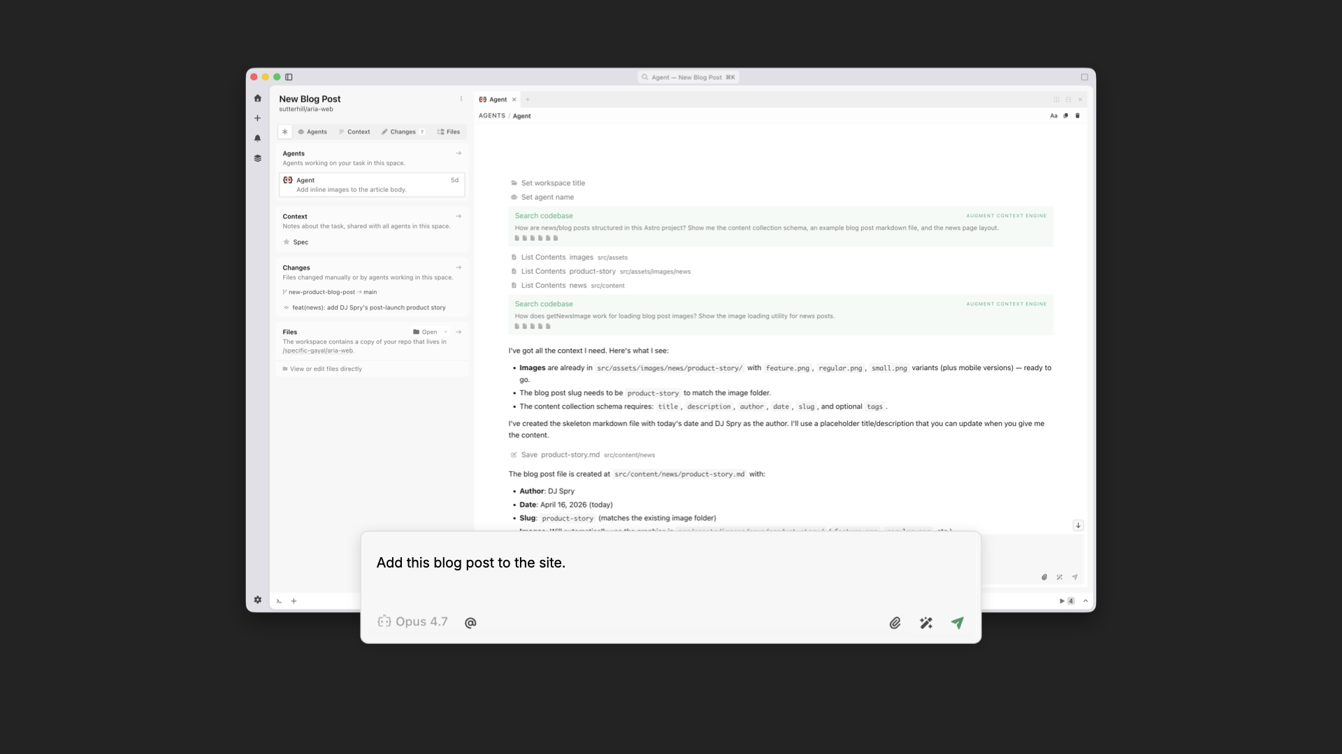
Turn this into an  Aria blog post command in Intent app

Then anybody on the team can spin up a workspace and say: we're making a blog post, here are the assets, here's the Word doc. Because that workspace already includes the designer and developer's tastes, what pops out the other end is a blog post that's fully aligned with the rest of the site.
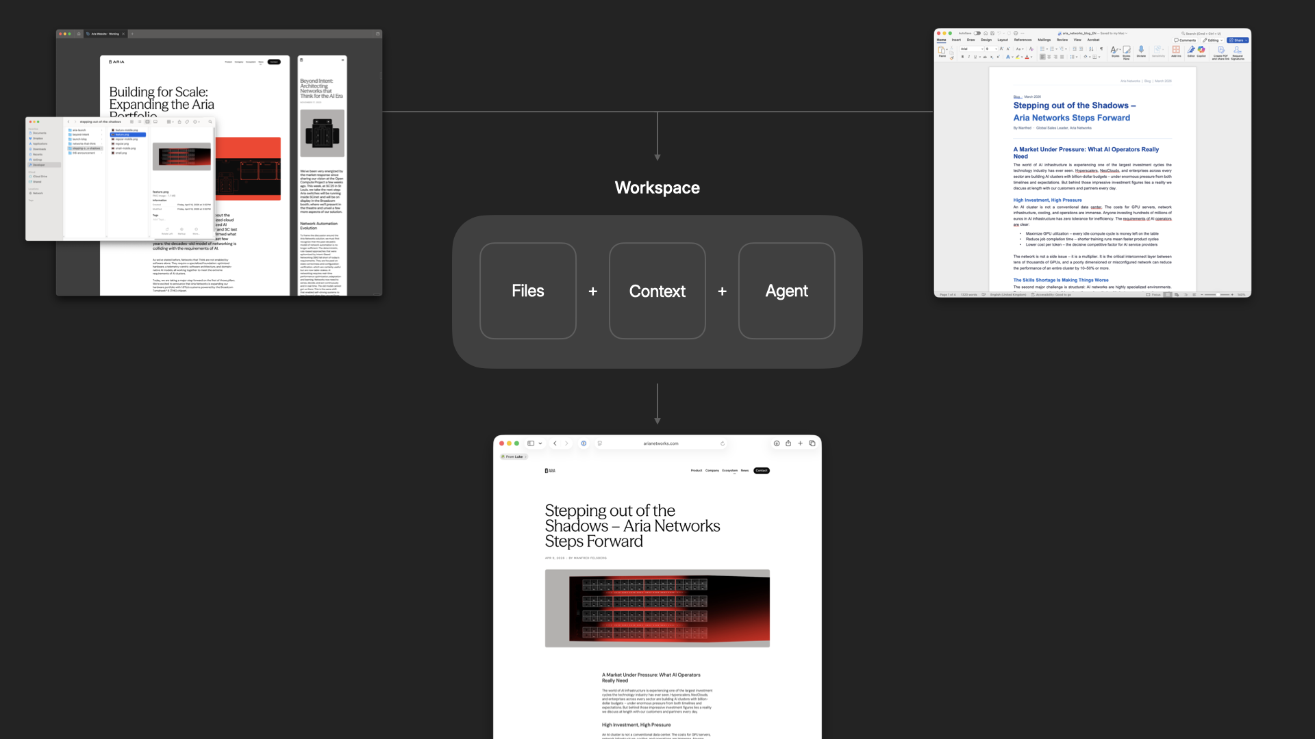
An Intent workspace turns assets into a unified design and development result

You can also run these workspaces in parallel so many people can be working on different parts of the experience simultaneously. And because every workspace is encoded in the same way, everything that gets added ends up unified by default.
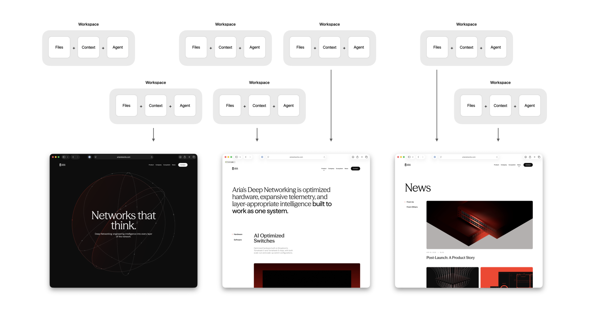
Running many workspace in parallel in Intent

This gives us massive parallelism and the ability to accommodate all kinds of last-minute requests. Which, even in an age of AI, still happen. Here's me busting out 10 last-minute 8pm asks in minutes using multiple workspaces without messing up the design or code integrity of the site.

AI tools are making individuals faster, but speed isn't the problem. Cohesion is. When taste is encoded into a shared workspace in Intent, designers keep designing, developers keep developing, and everything that comes out the other end holds together. No handoffs necessary.

  •  

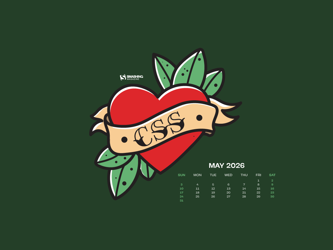
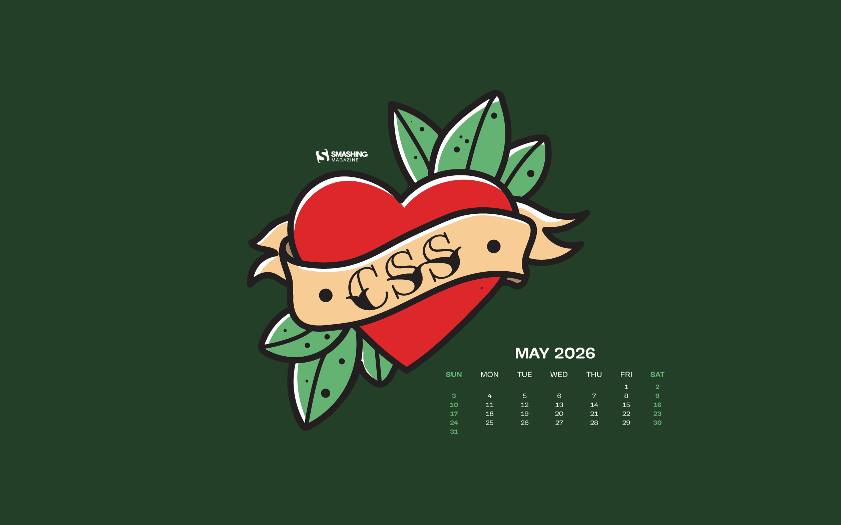
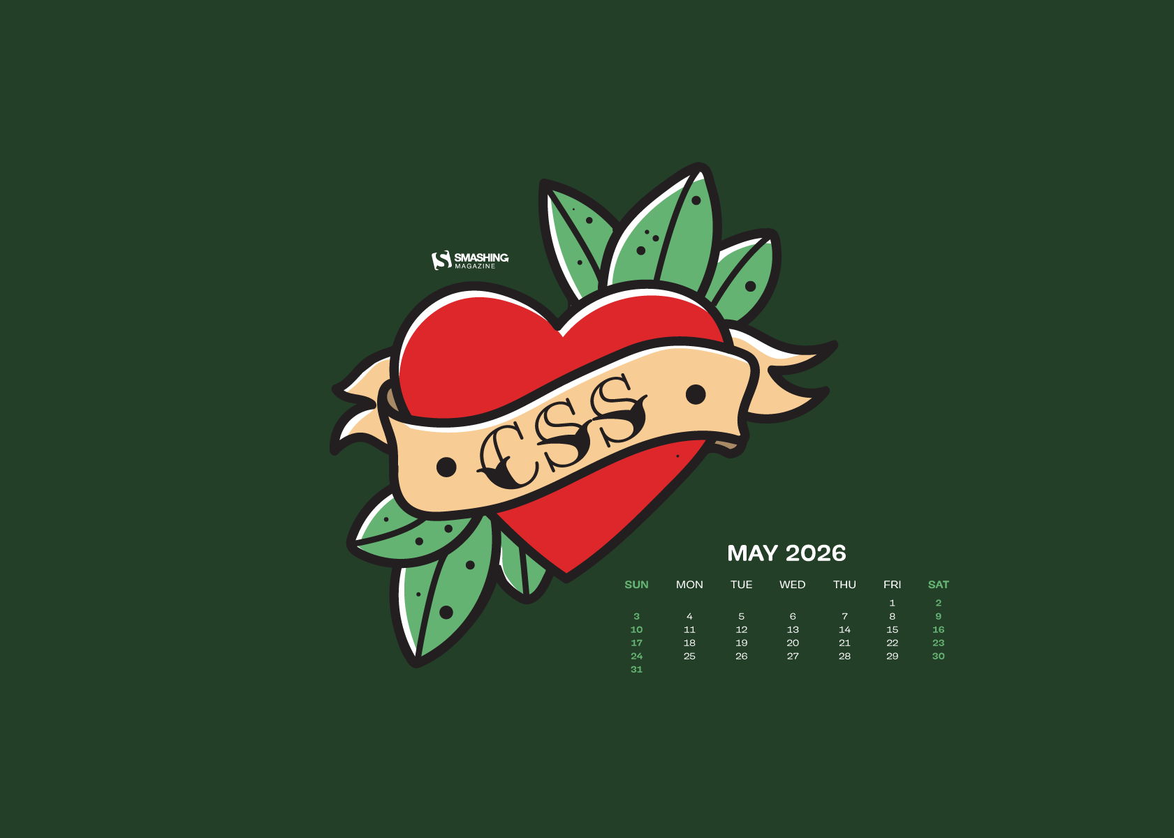
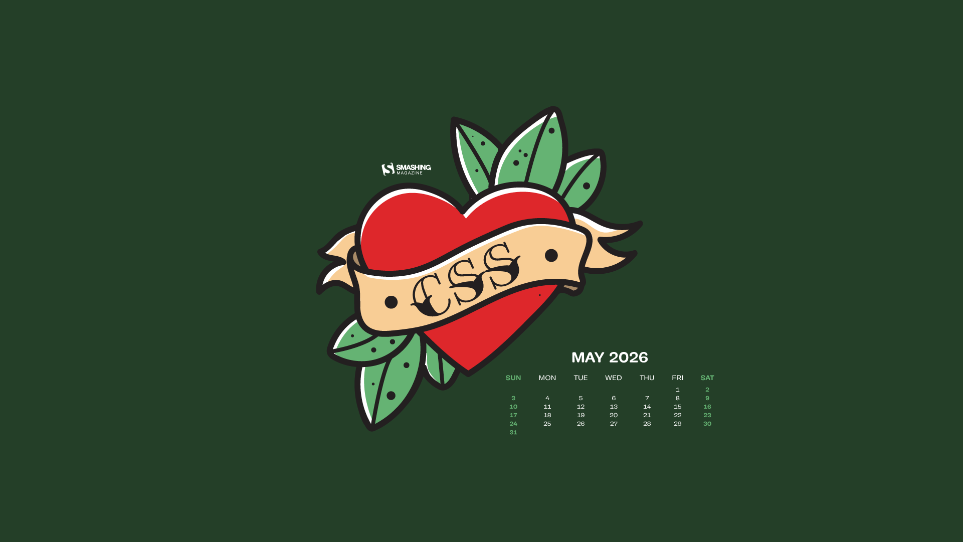
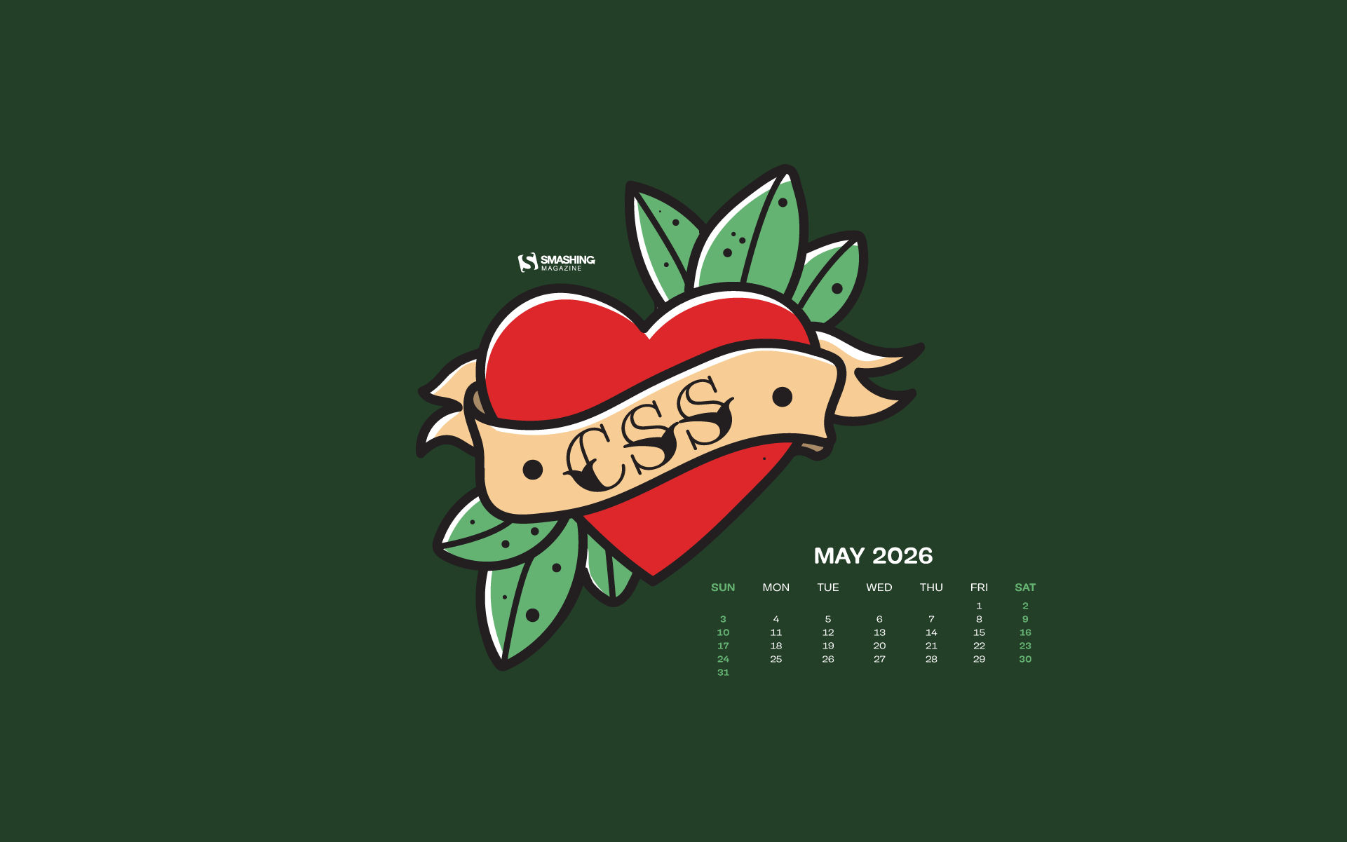
A Fresh View In May (2026 Wallpapers Edition)

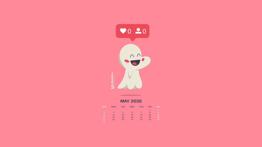
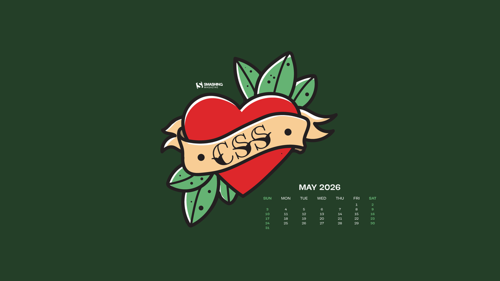
May has a way of sneaking in with longer days, softer light, and that first real hint of summer in the air. It’s the season of fresh ideas and just enough energy to start something new, or finally pick up something you’ve been putting off. And sometimes, all it takes to spark that little bit of inspiration is a fresh view… even if it’s just on your desktop.
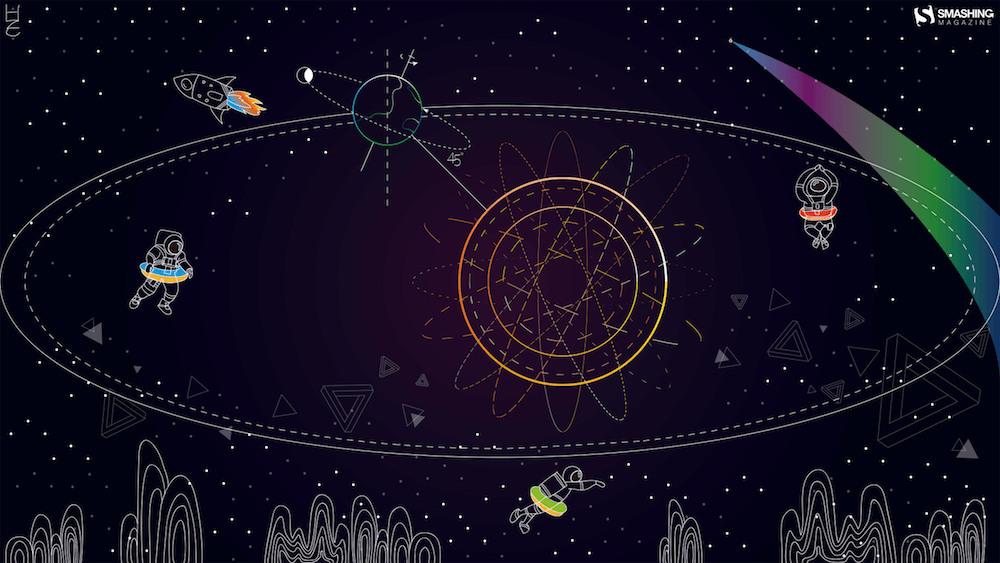
That’s where our monthly wallpapers series comes in. For the past 15 years, artists and designers from around the world have been contributing their designs to celebrate each new month. This May is no exception. Created with care and a unique personal touch, every wallpaper in this collection comes in a variety of screen resolutions and can be downloaded for free. A huge thank-you to everyone who got creative — this post wouldn’t be possible without your wonderful support!
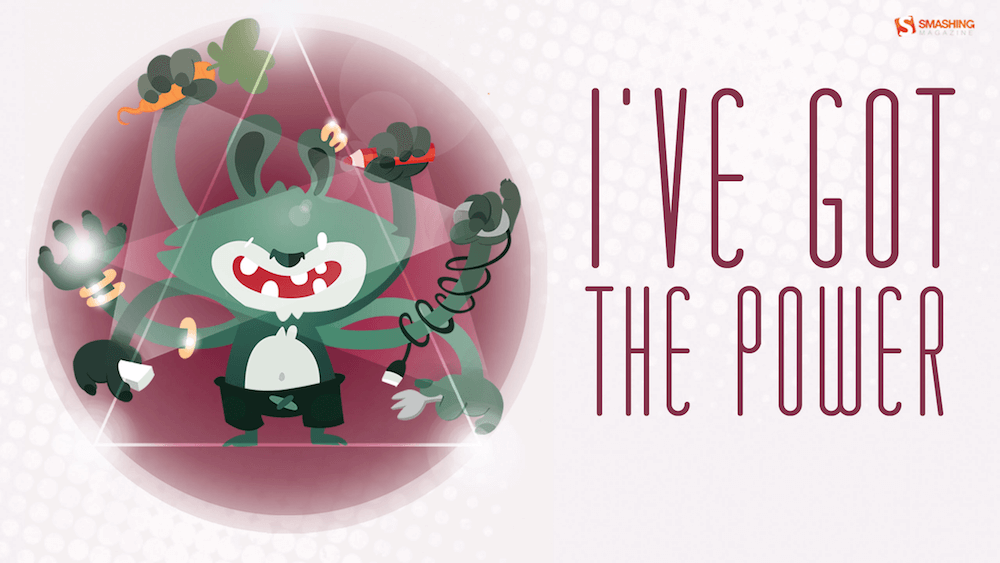
If you too would like to get featured in one of our upcoming wallpapers posts, please don’t hesitate to join in. We can’t wait to see what you’ll come up with! Happy May!

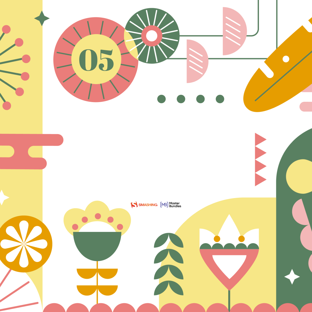
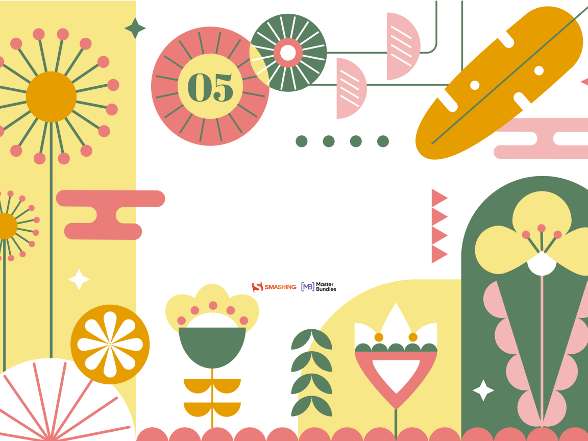
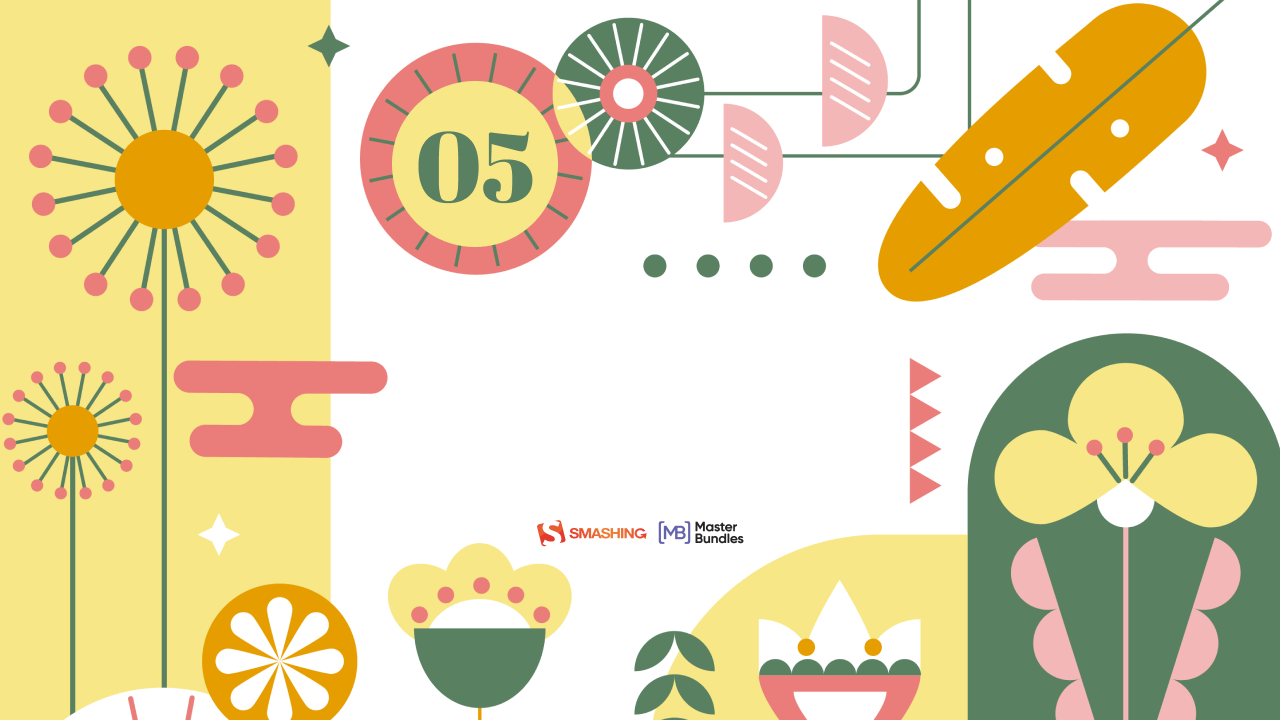
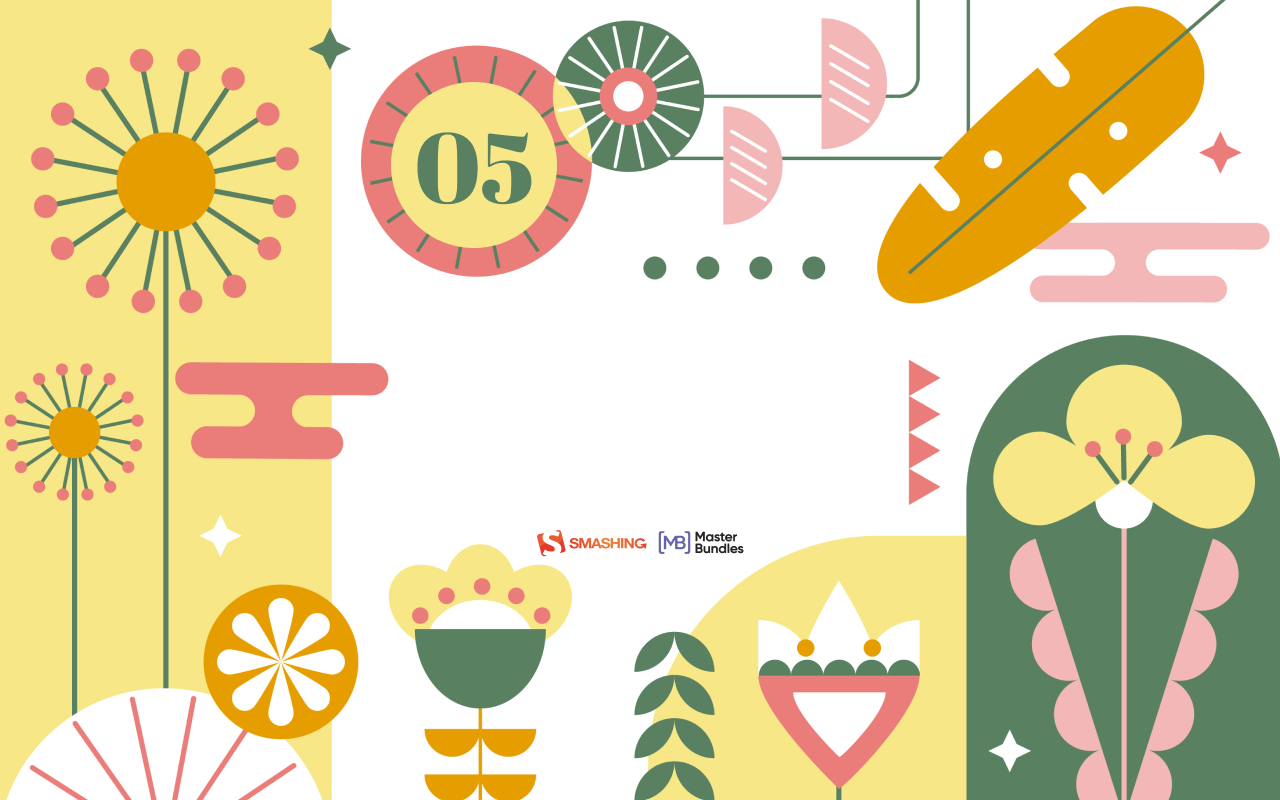
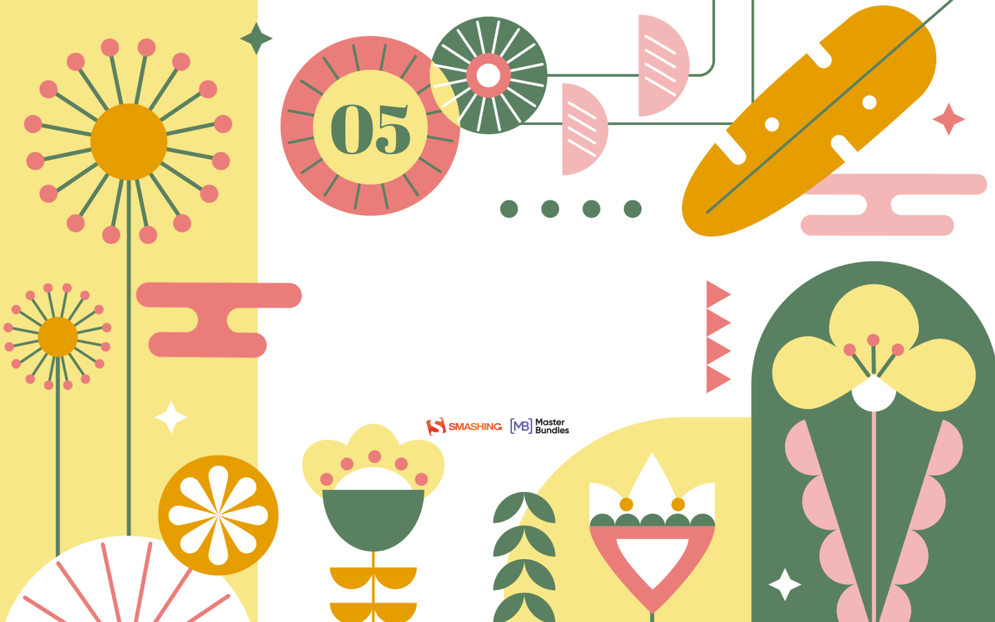
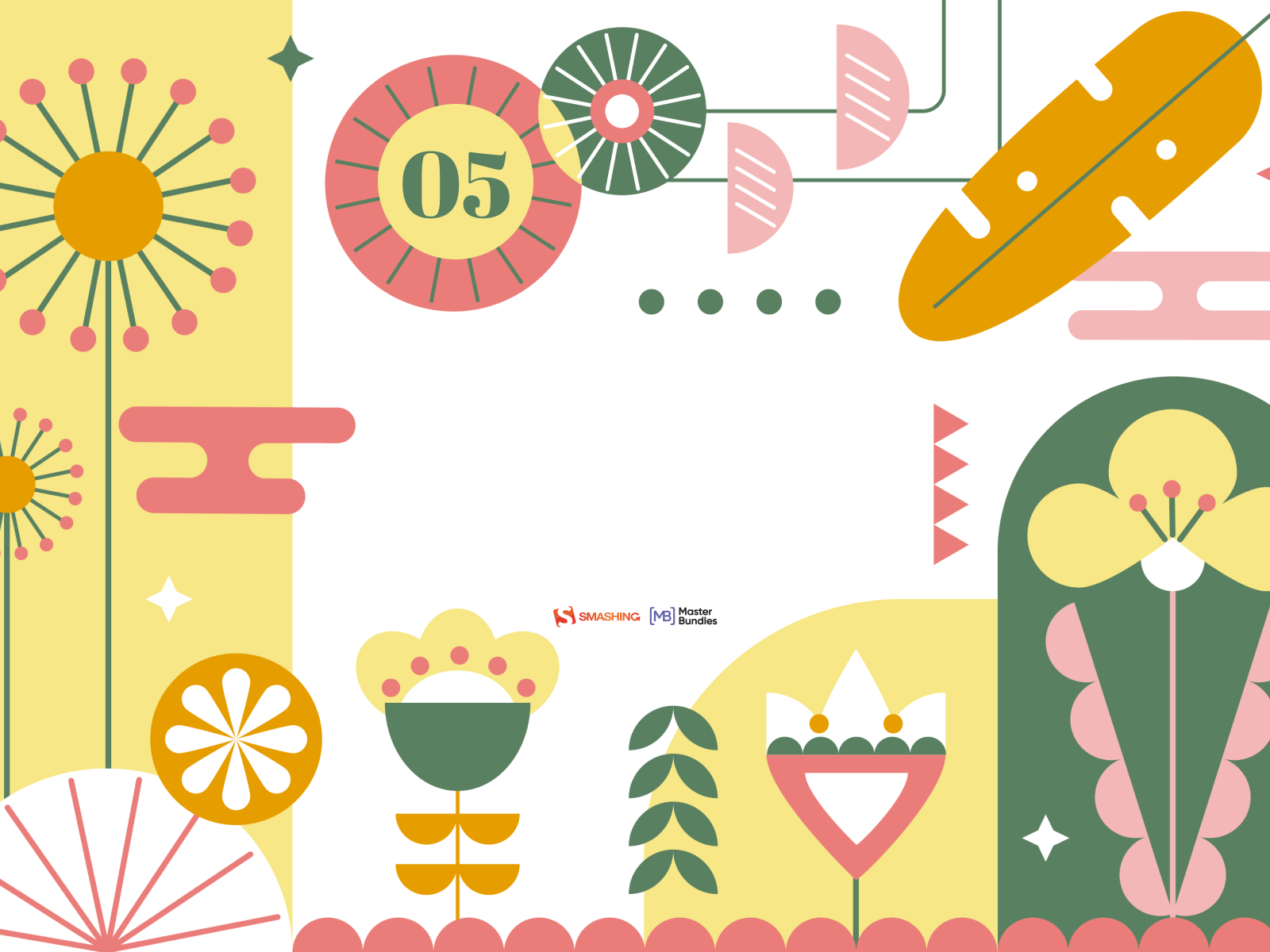
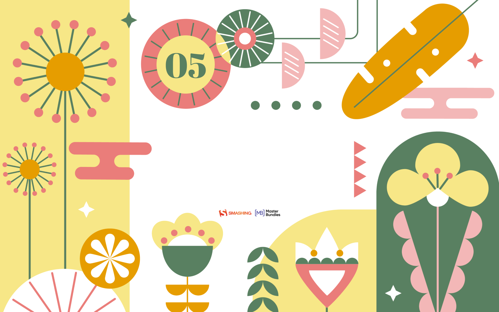
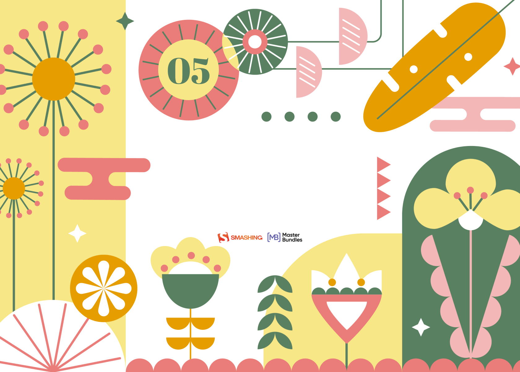
  • You can click on every image to see a larger preview.
  • We respect and carefully consider the ideas and motivation behind each and every artist’s work. This is why we give all artists the full freedom to explore their creativity and express emotions and experience through their works. This is also why the themes of the wallpapers weren’t anyhow influenced by us but rather designed from scratch by the artists themselves.
Happily Invisible Online

Designed by Ricardo Gimenes from Spain.

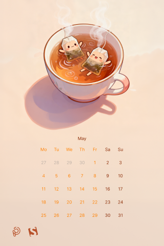
Where Every Sip Tells A Secret

“A quiet ritual, a shared moment, a pause in the rush — tea invites you to slow down and discover warmth in the smallest details. Let each cup unfold its own little story.” — Designed by PopArt Studio from Novi Sad, Serbia.

Just A Style Thing

Designed by Ricardo Gimenes from Spain.

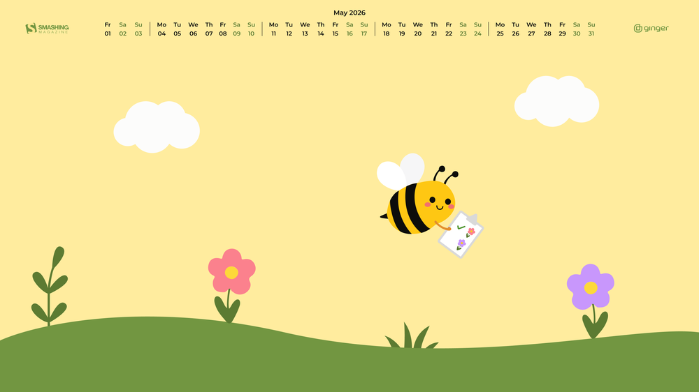
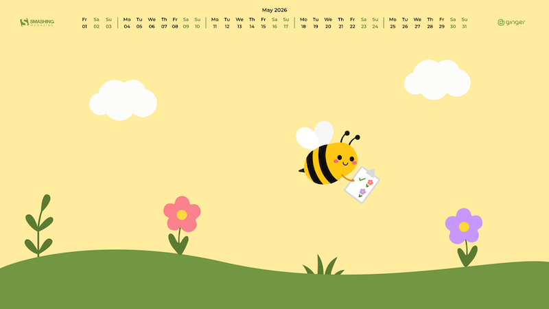
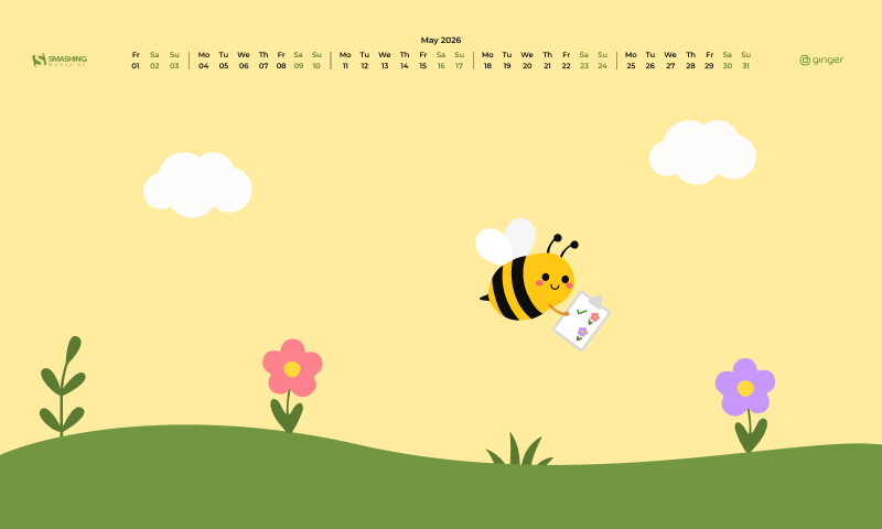
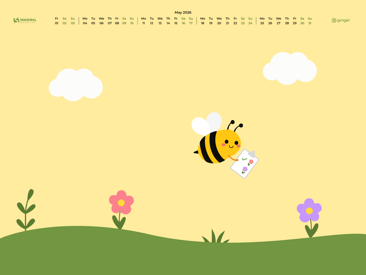
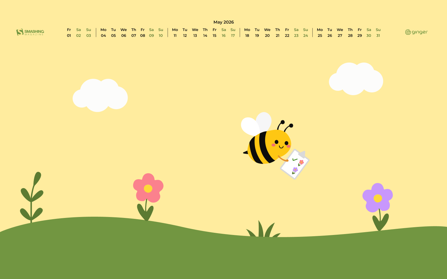
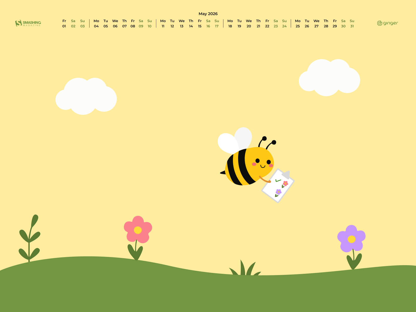
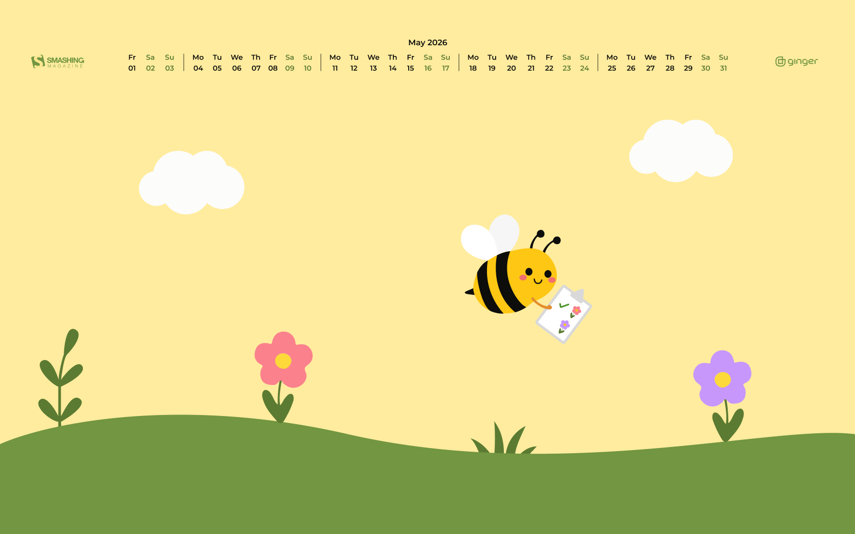
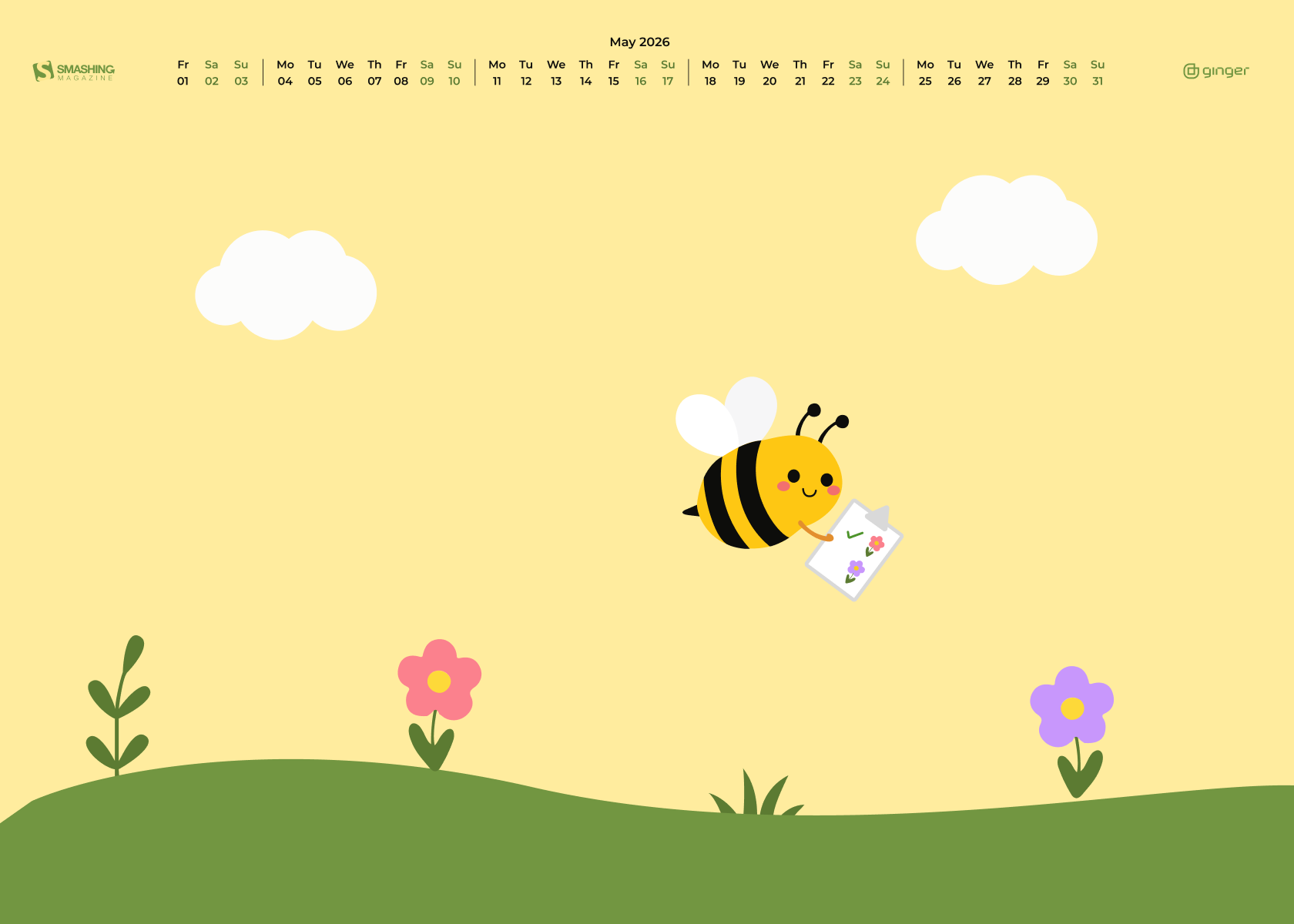
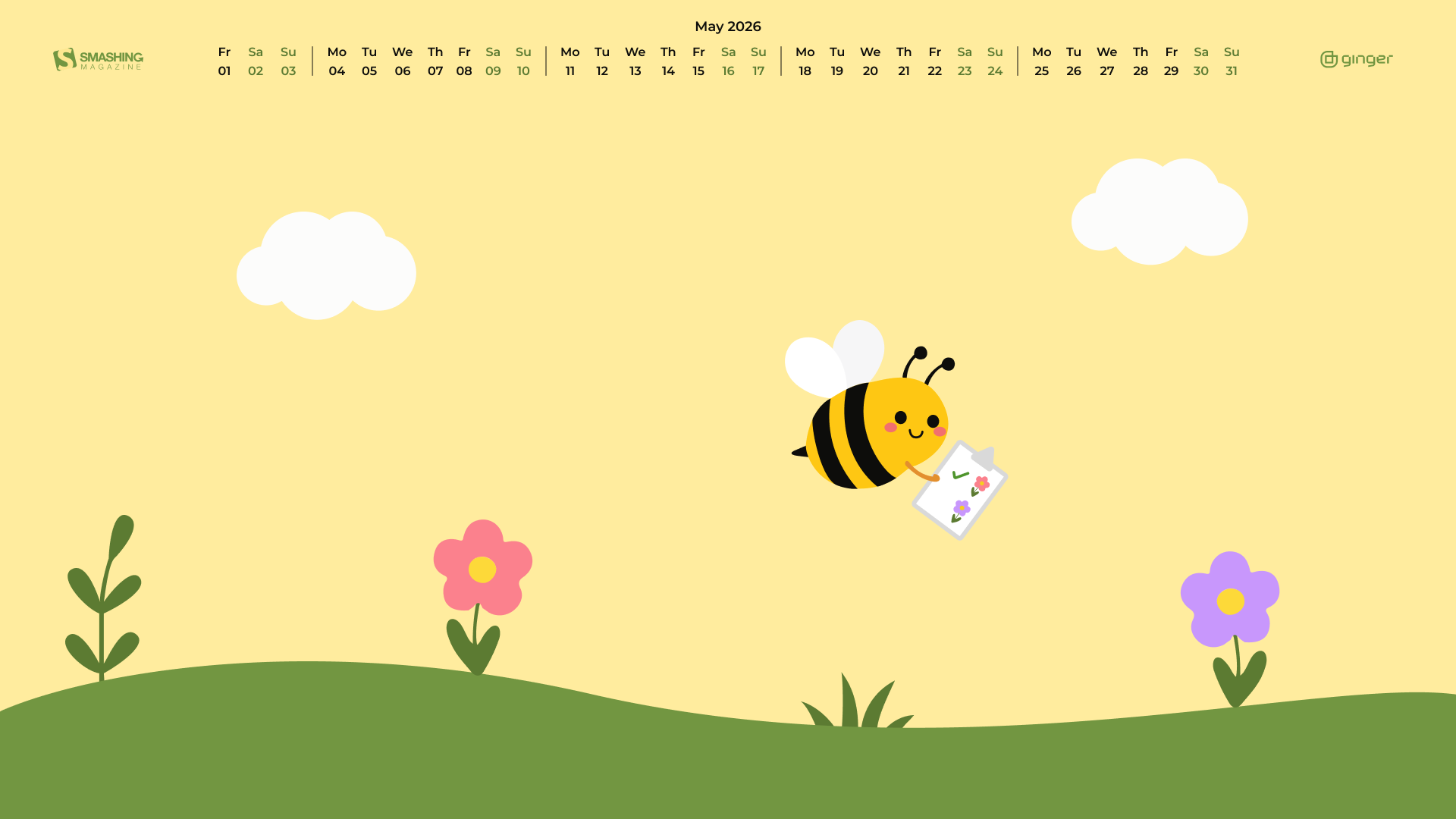
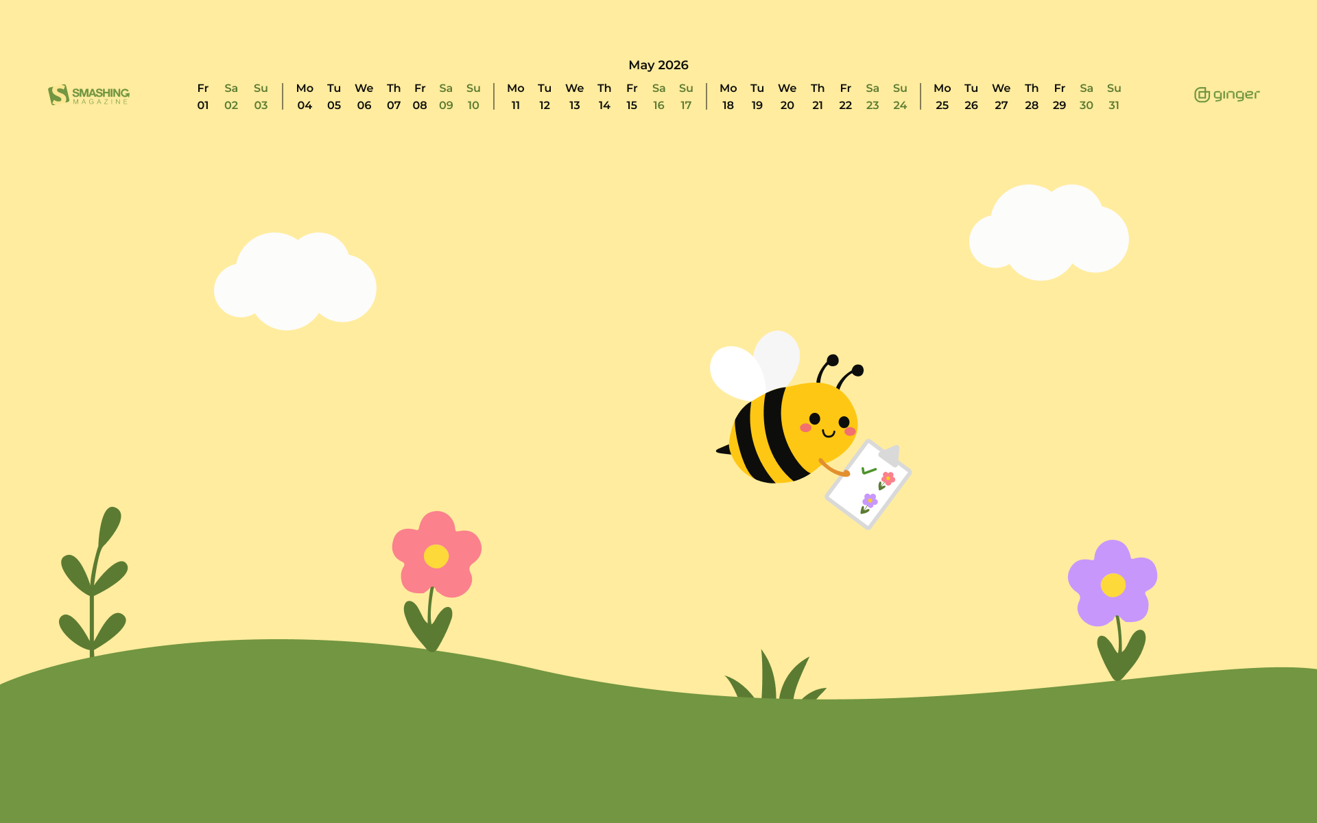
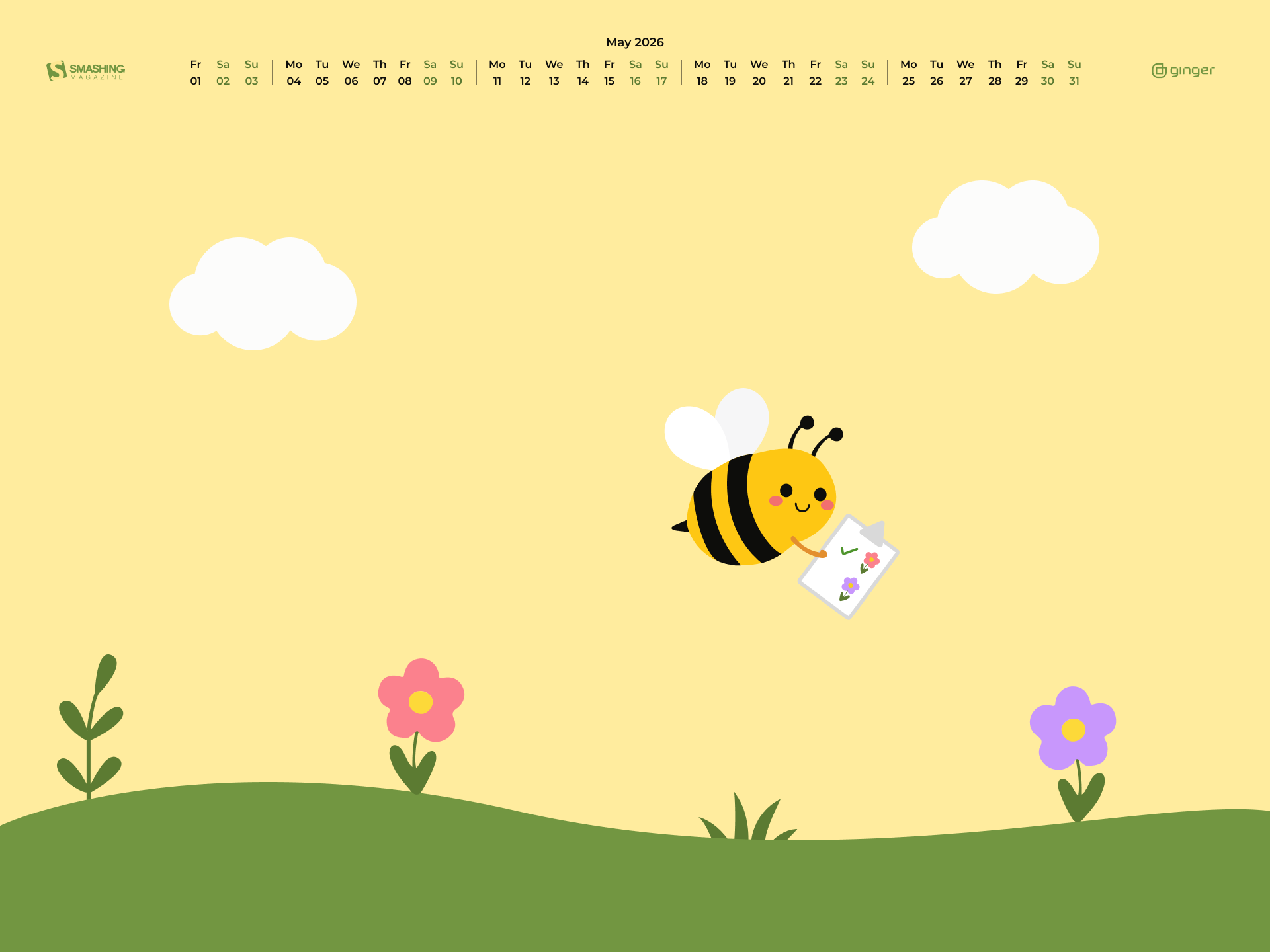
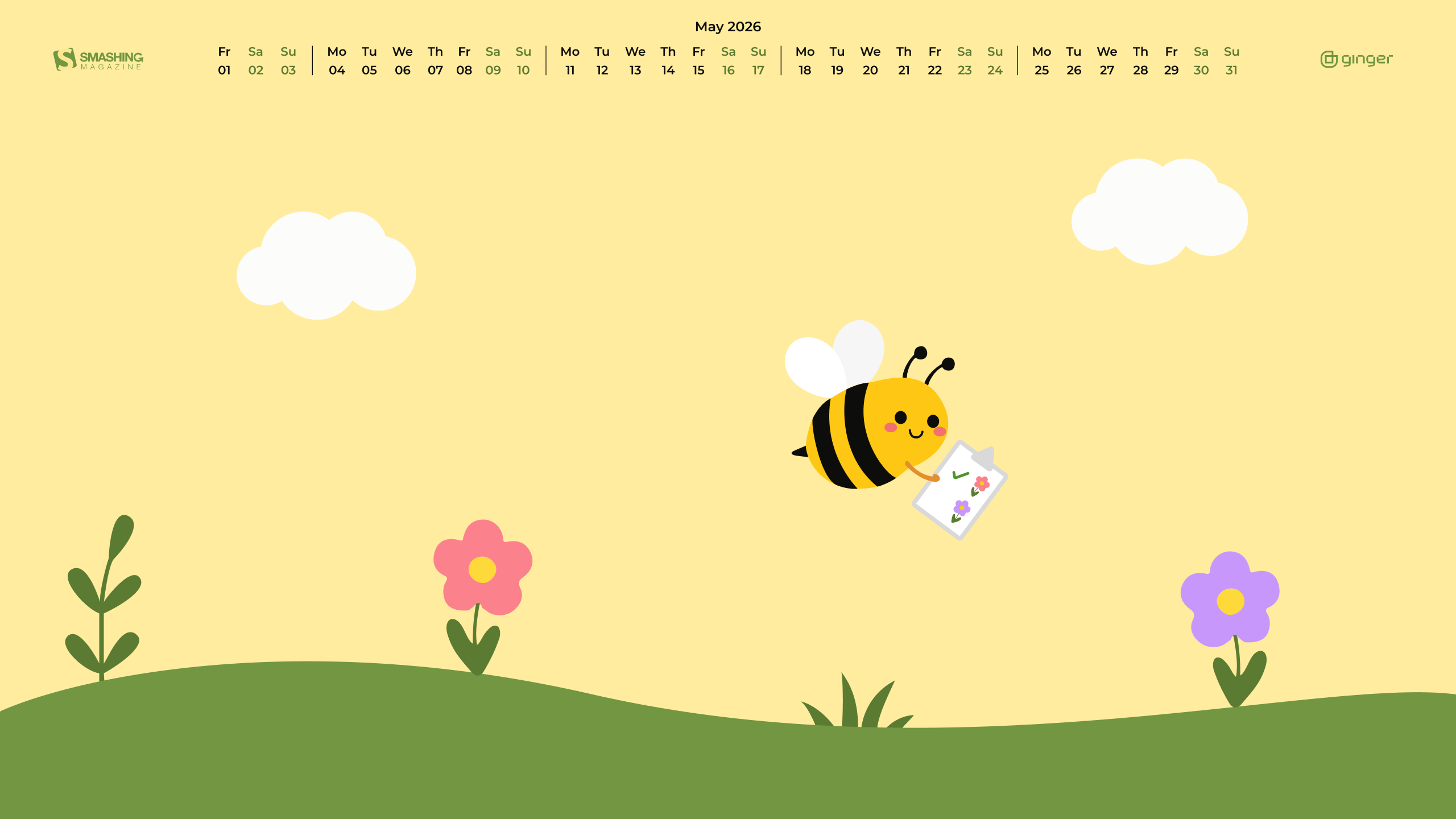
Next Bloom

“A small bee with a big garden plan checks each flower on her list and looks for the next bloom to visit.” — Designed by Ginger IT Solutions from Serbia.

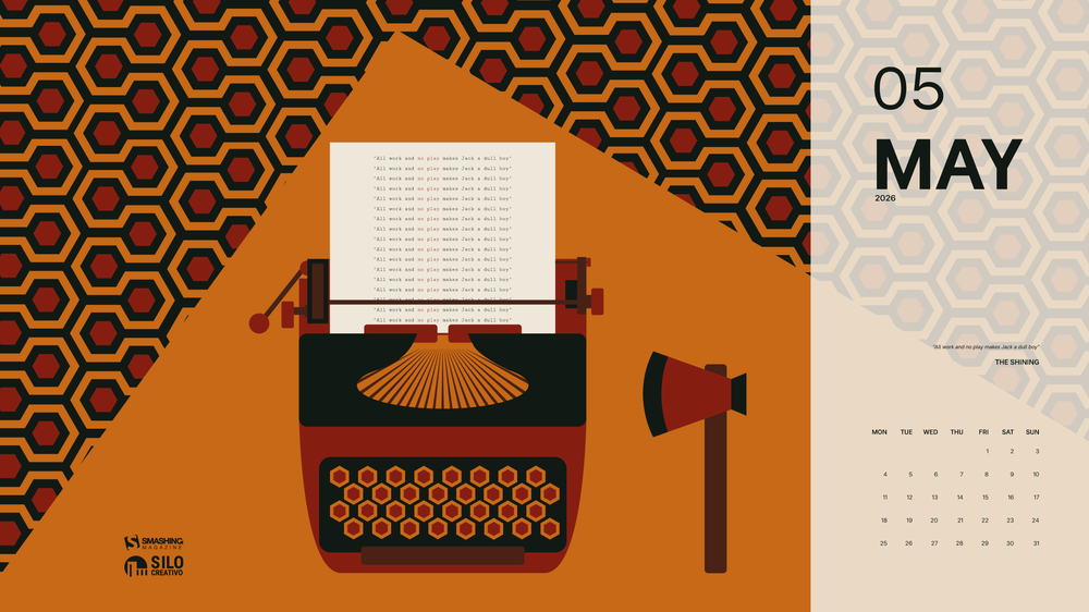
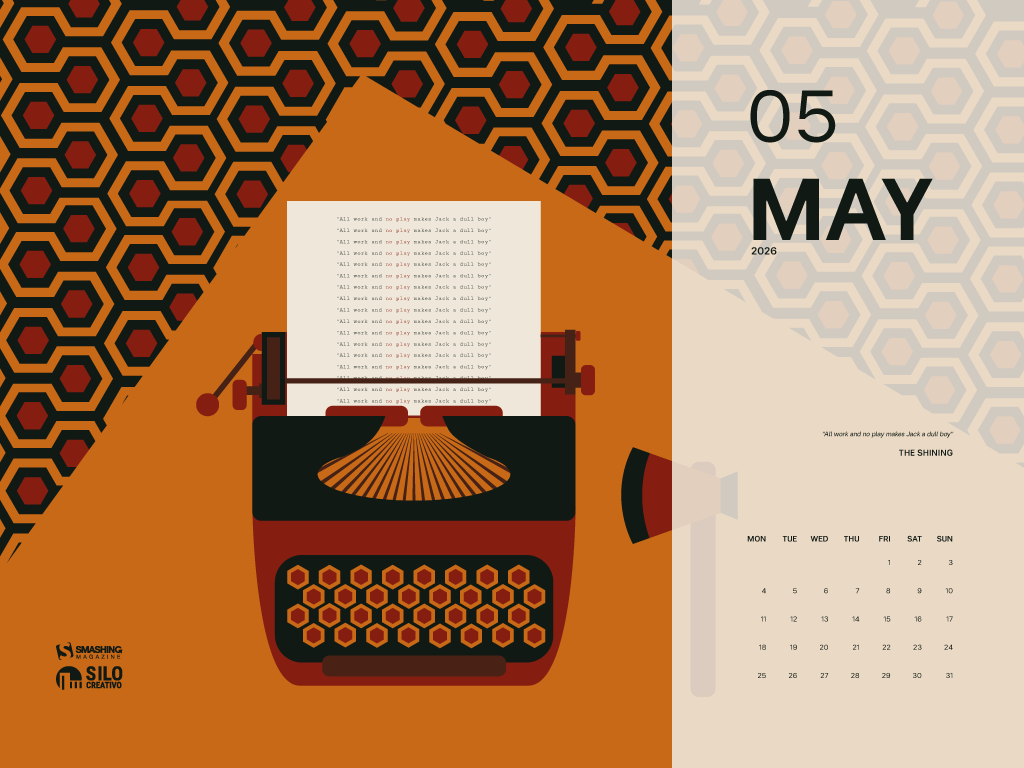
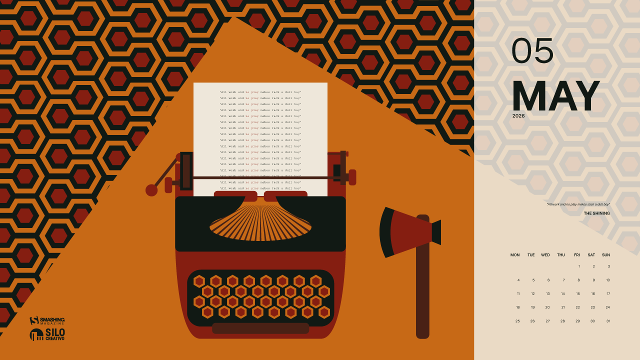
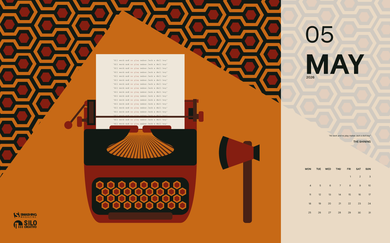
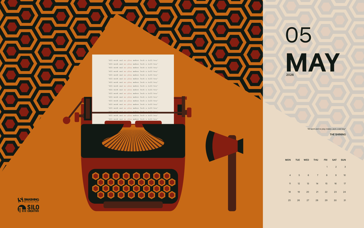
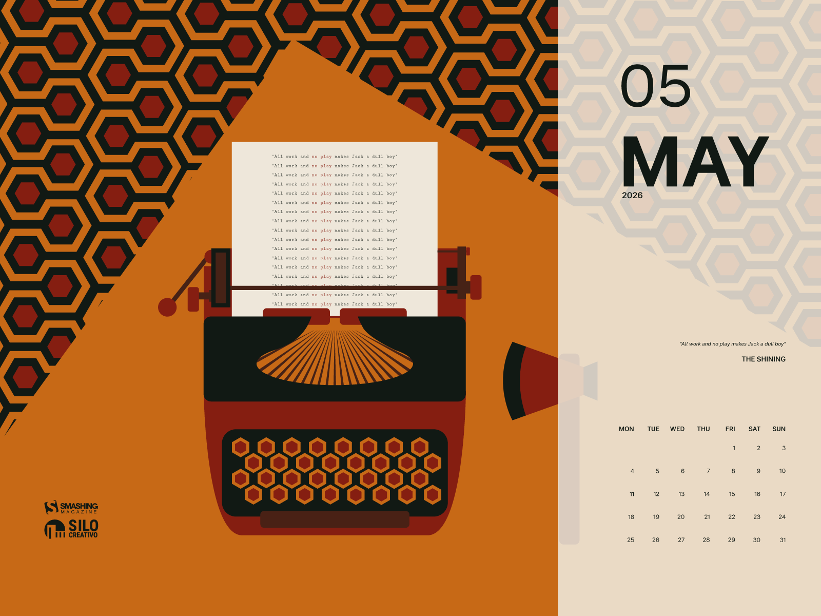
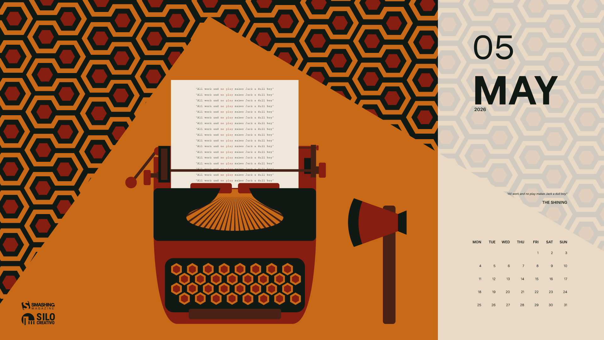
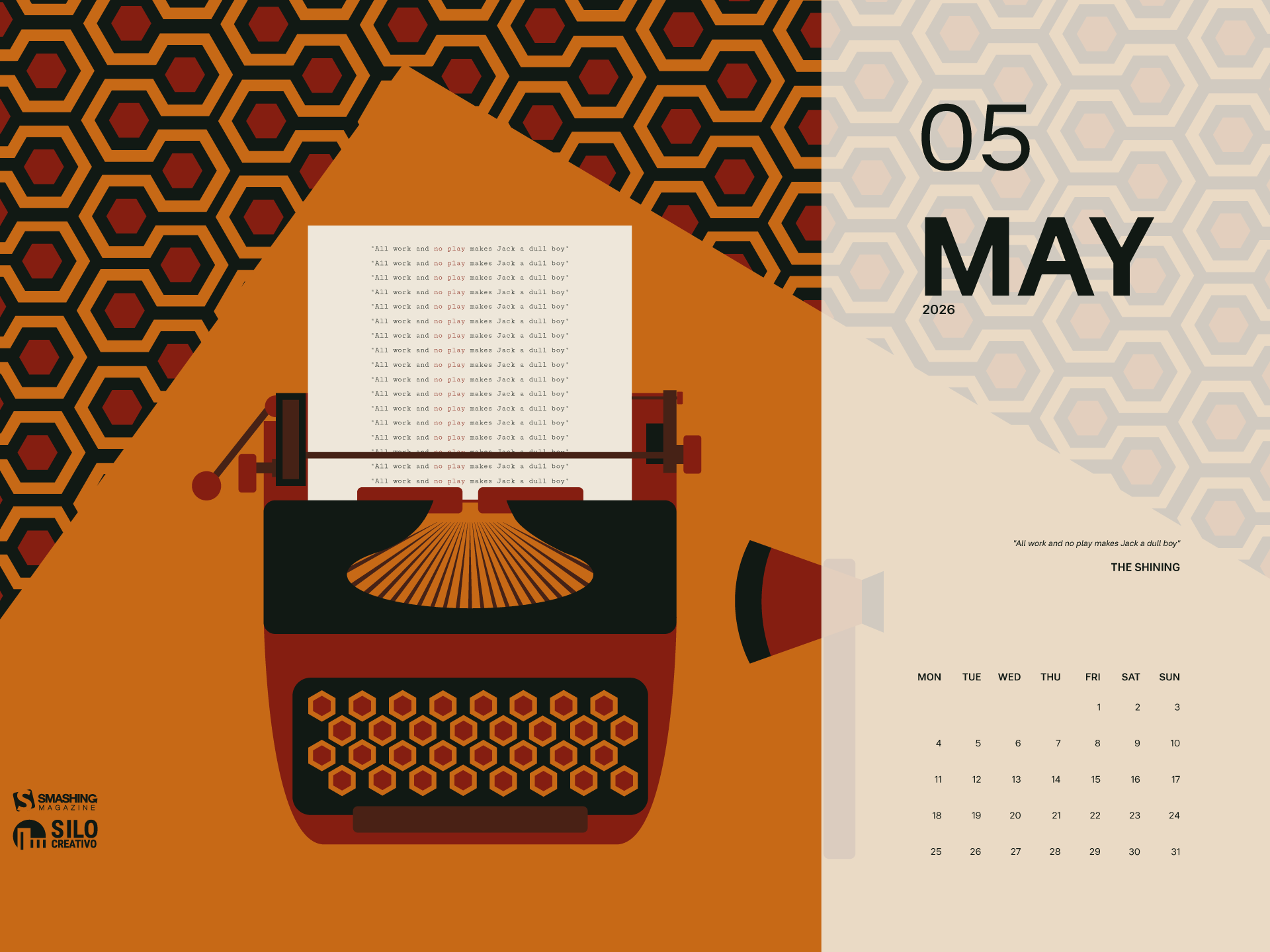
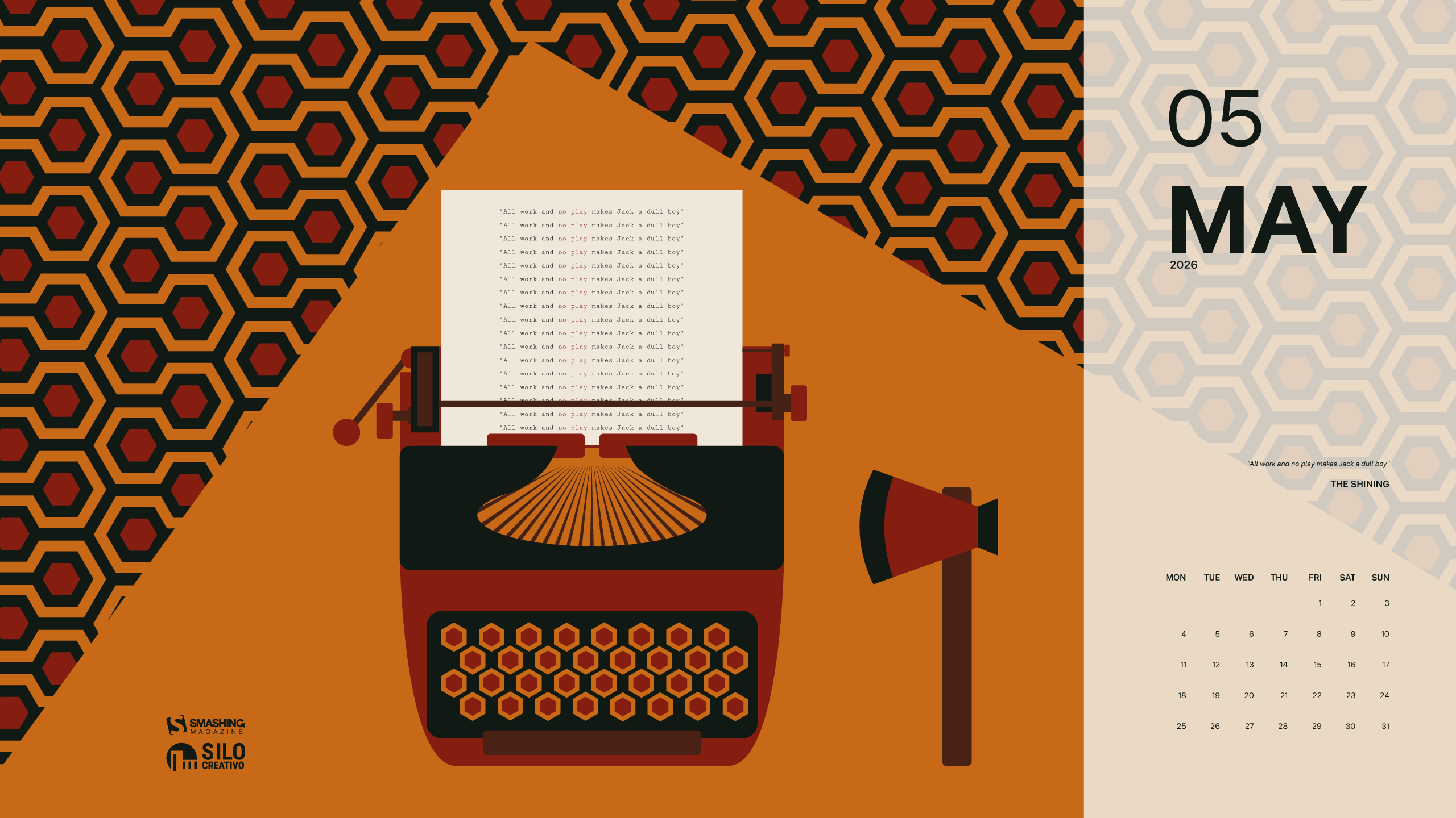
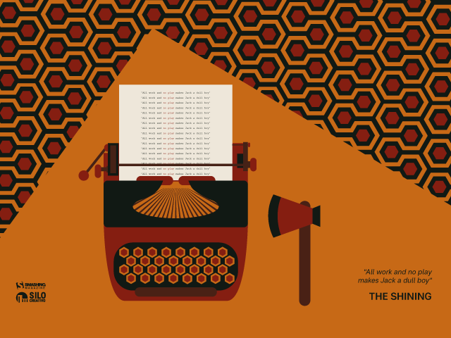
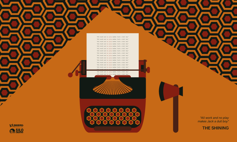
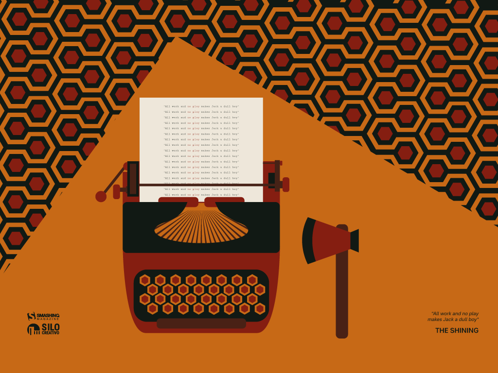
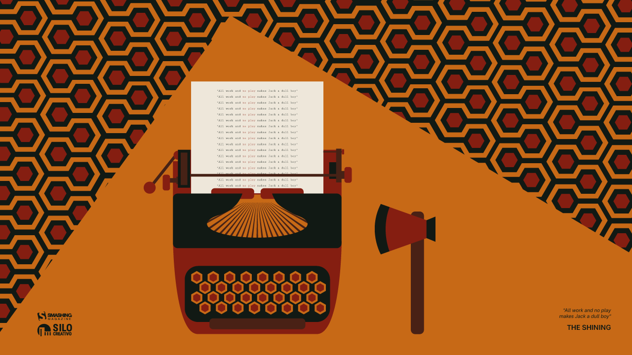
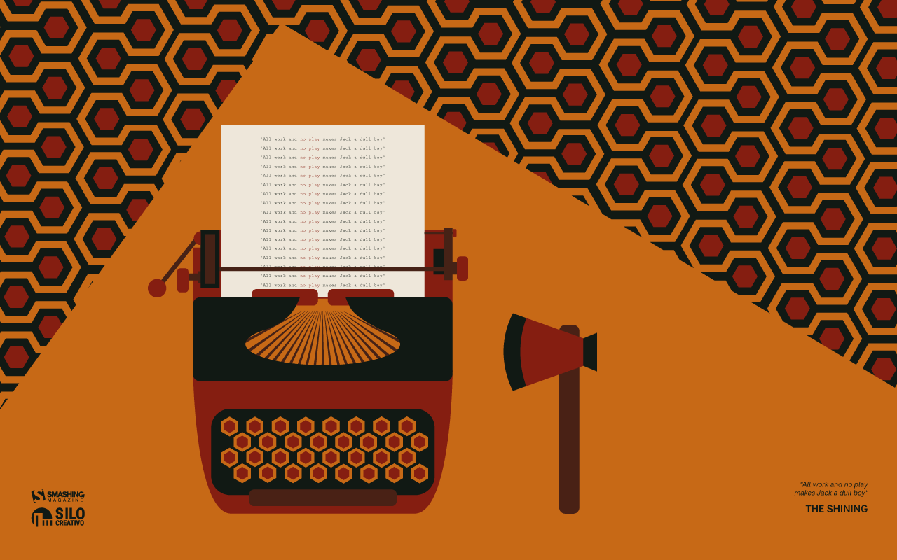
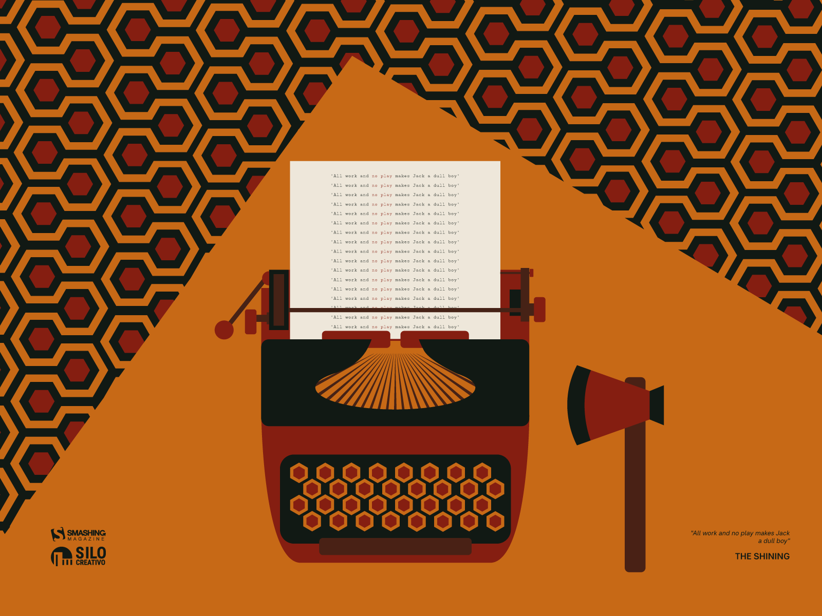
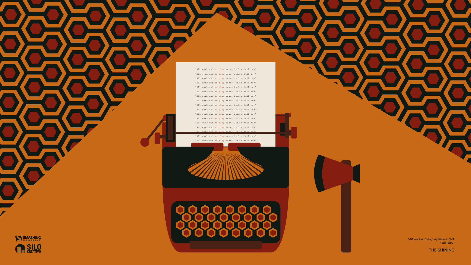
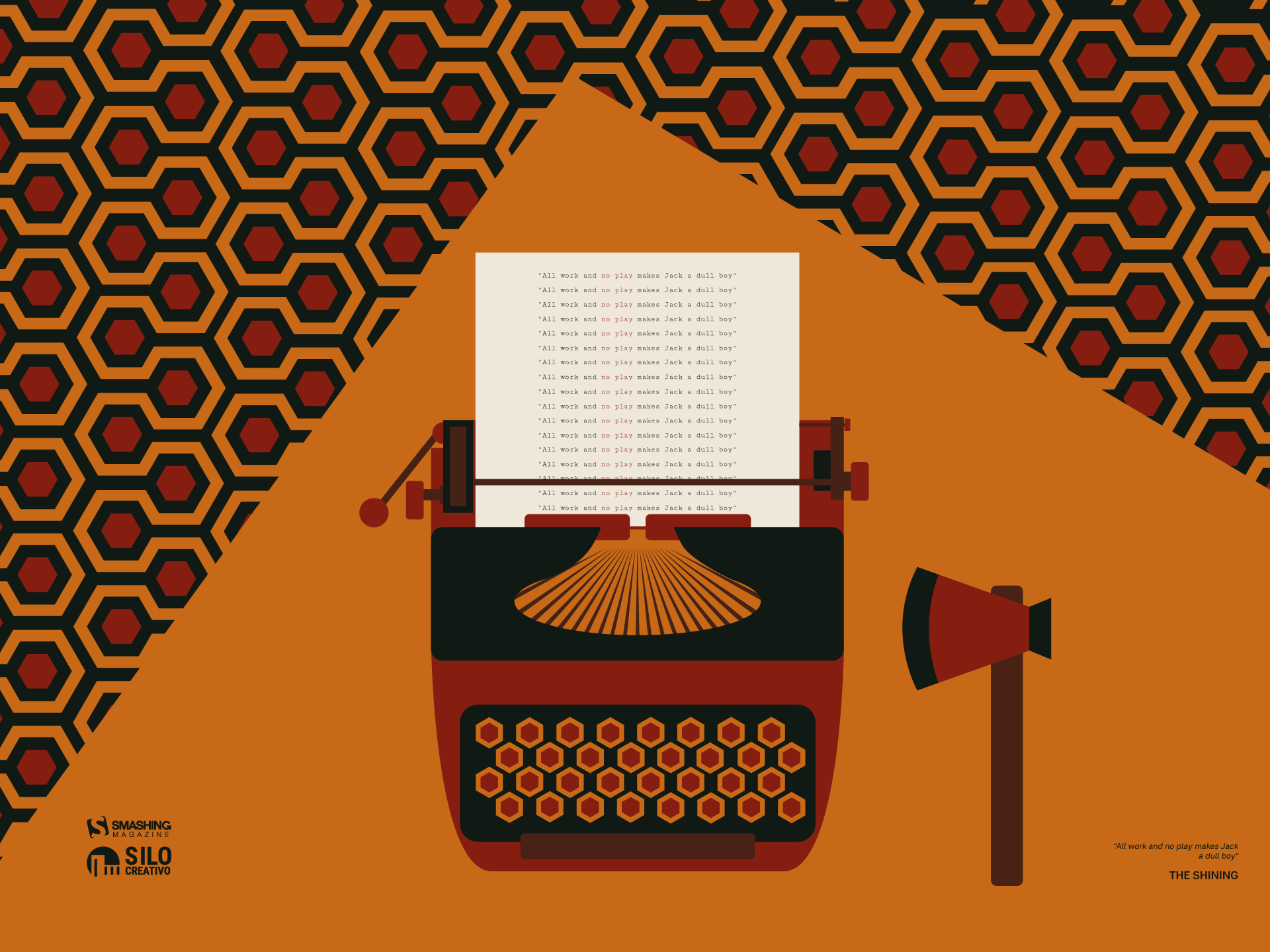
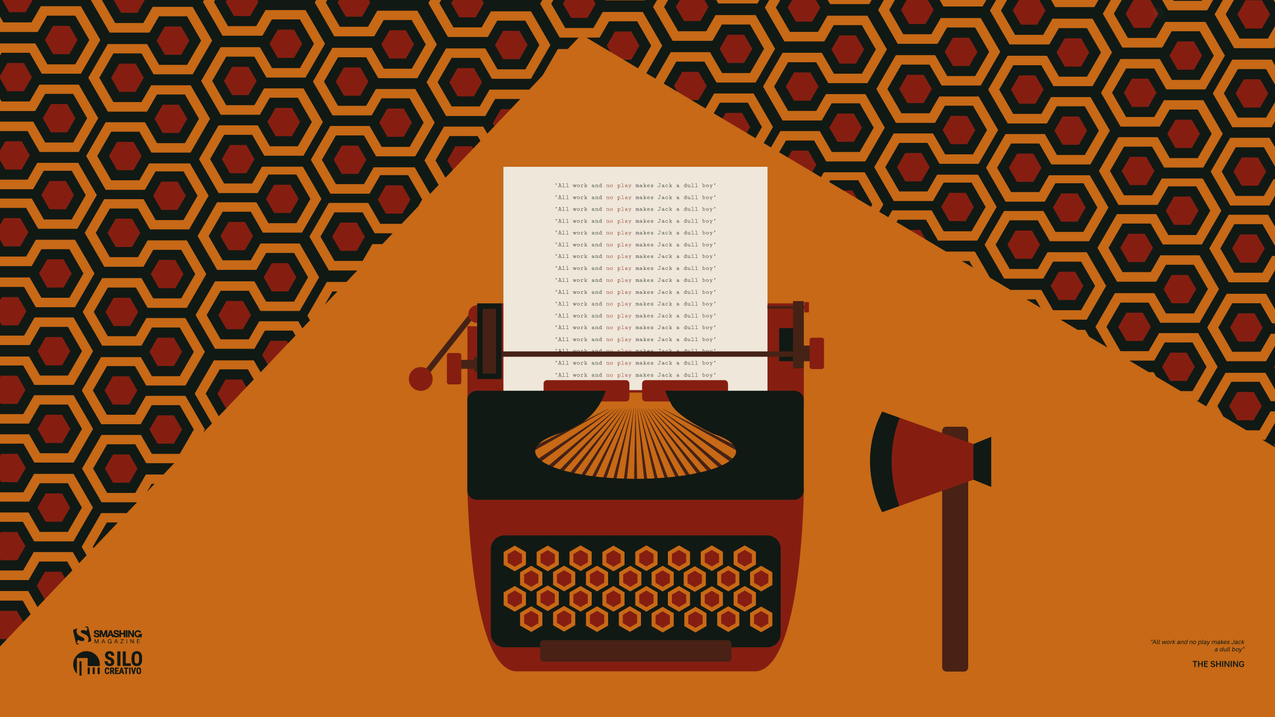
No Play Jack

“Summer is getting closer, but we’re reminded of a more wintry and eerie landscape, like that of ‘The Shining.’ A truly great film, proving that you don’t need much, but it needs to be used well to create suspense and terror.” — Designed by Veronica Valenzuela from Spain.

Buddha Purnima

“Buddha Purnima, falling on May 1st, is the most sacred Buddhist festival commemorating the birth, enlightenment, and passing of Gautama Buddha. It is observed on the full moon day of the Vaisakha month, symbolizing spiritual liberation and the triumph of peace. The day serves as a global reminder of his core teachings: non-violence, compassion, and the path to ending suffering.” — Designed by V D Photography from Surat, Gujarat, India.

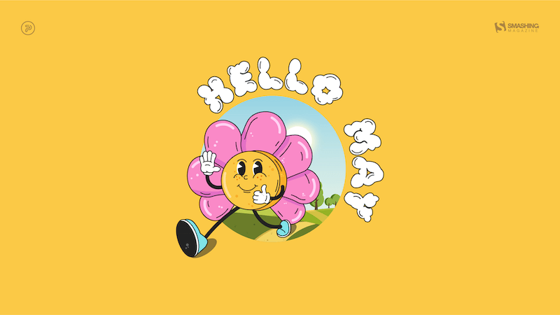
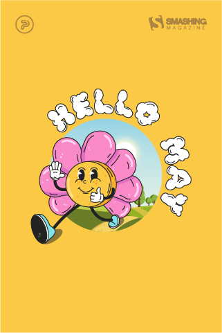
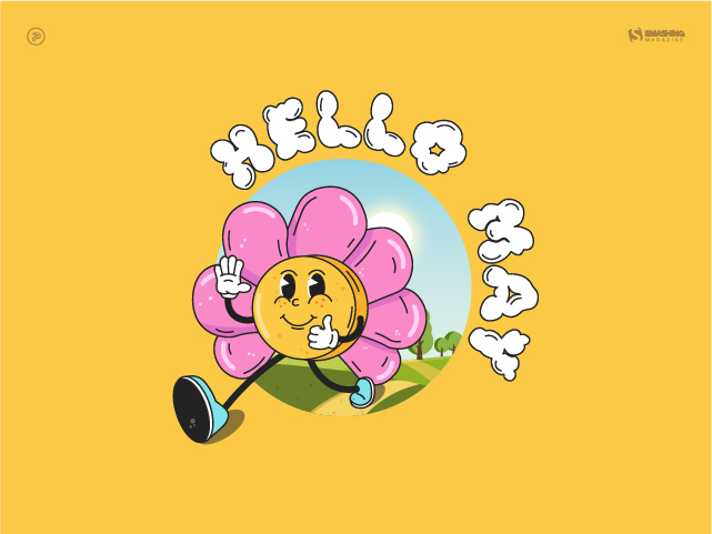
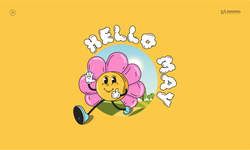
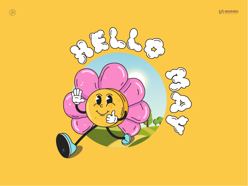
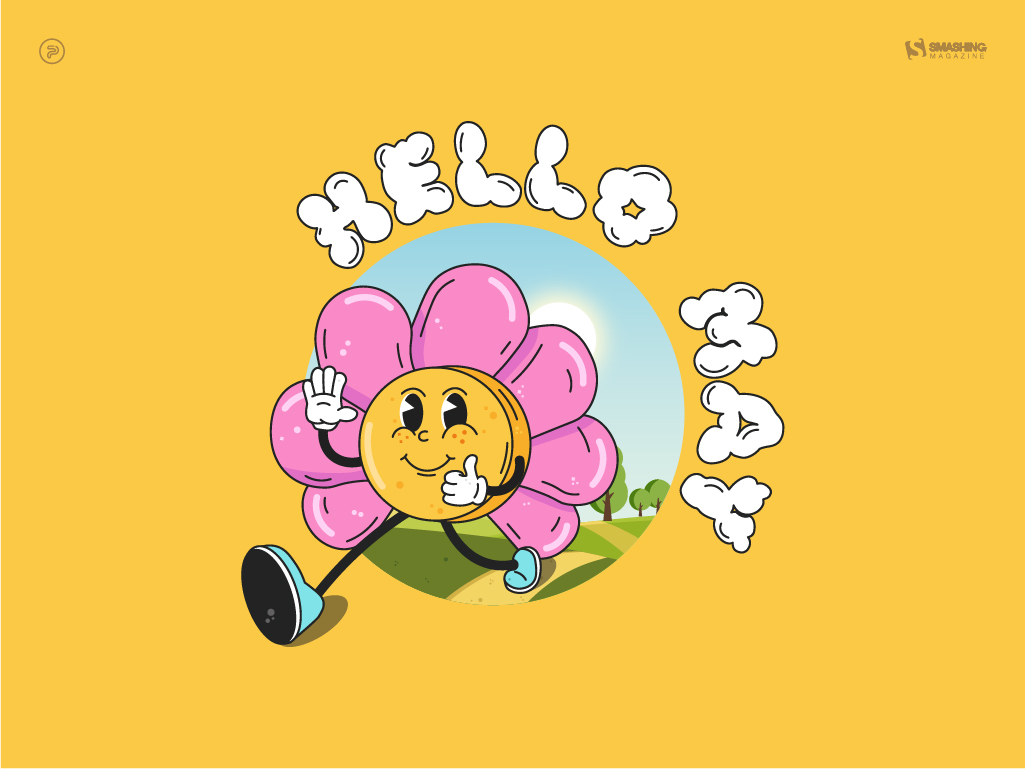
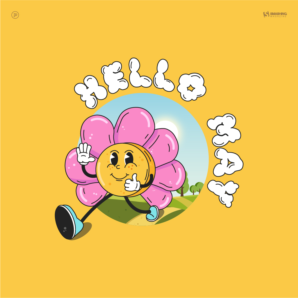
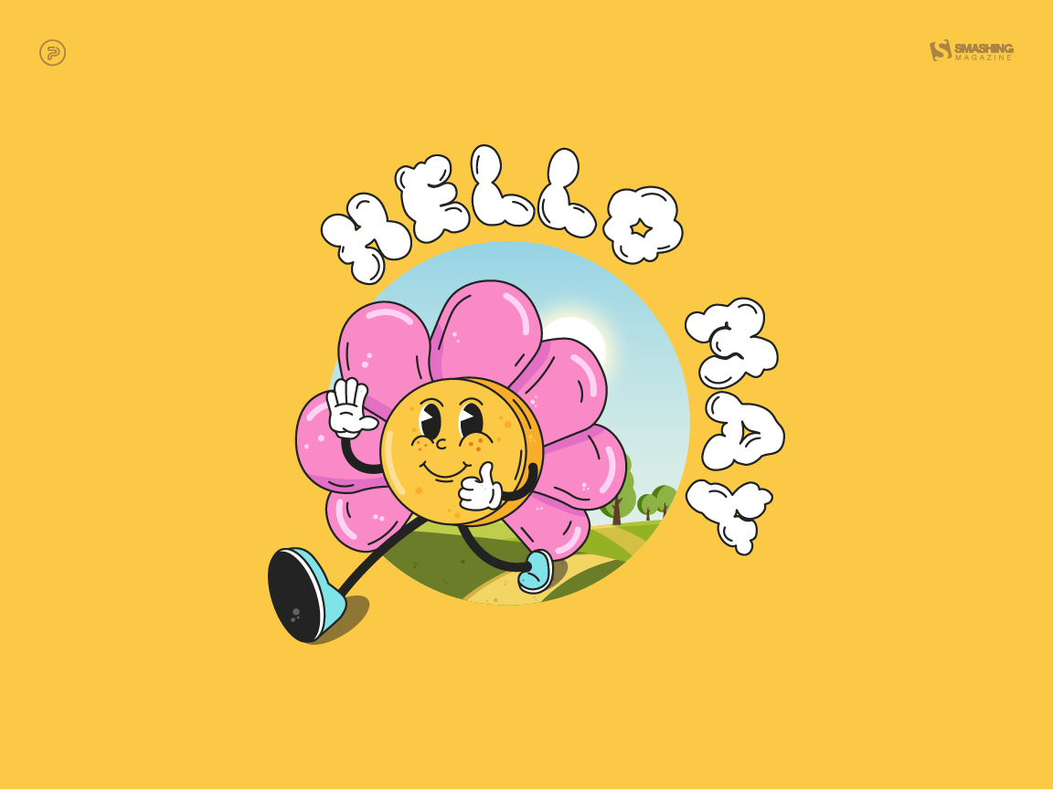
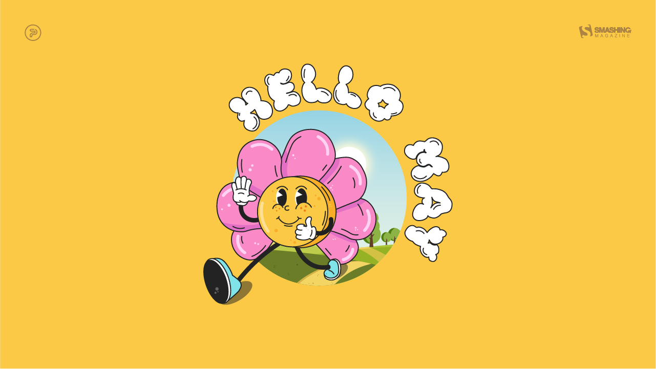
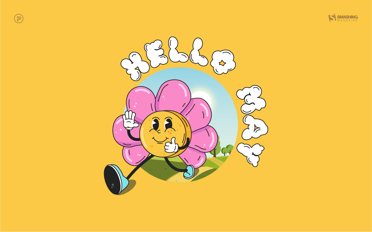
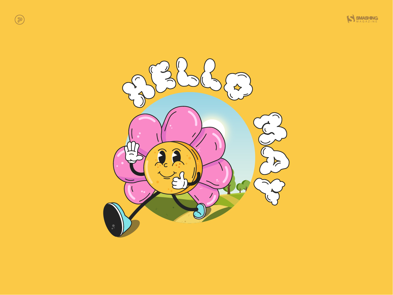
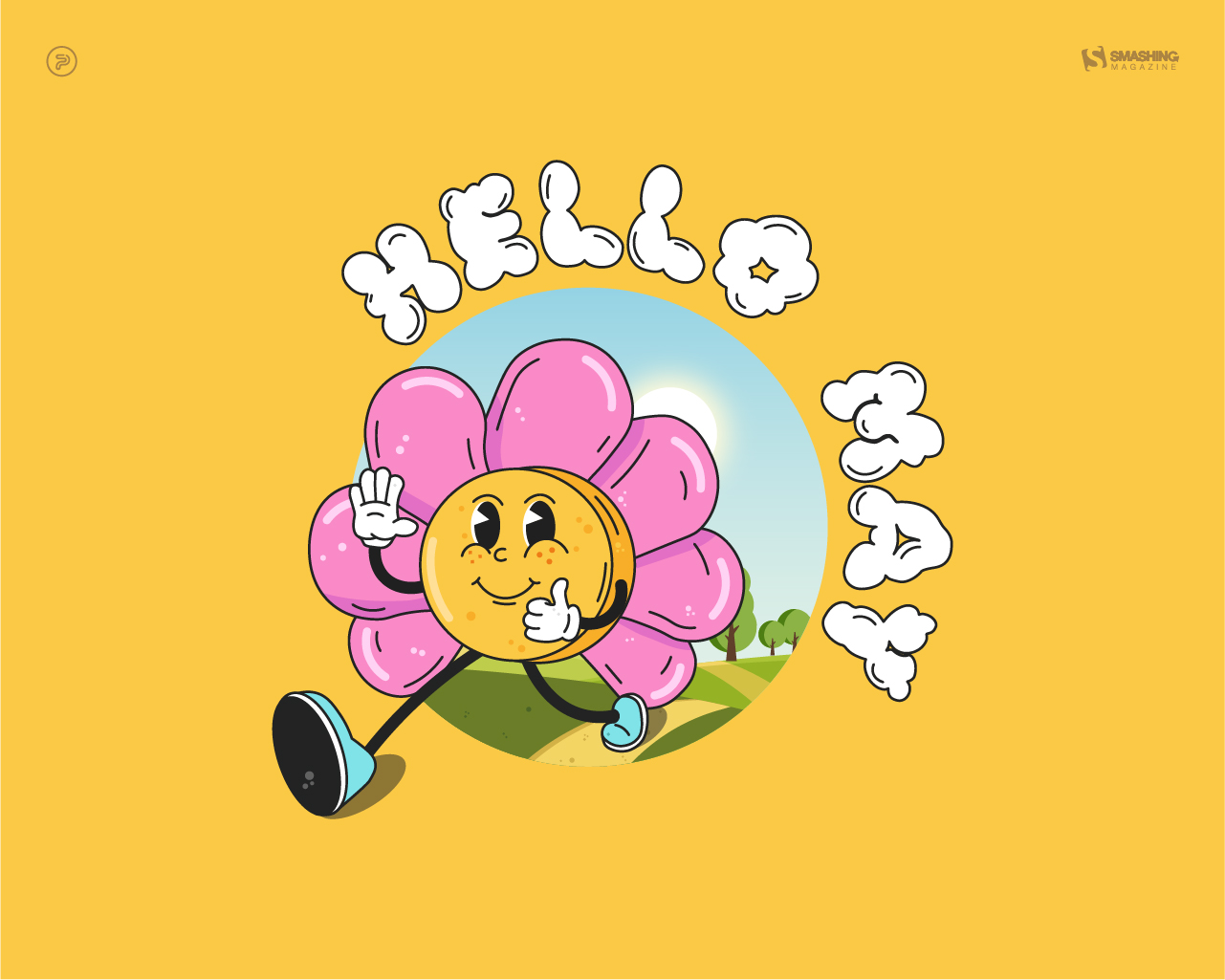
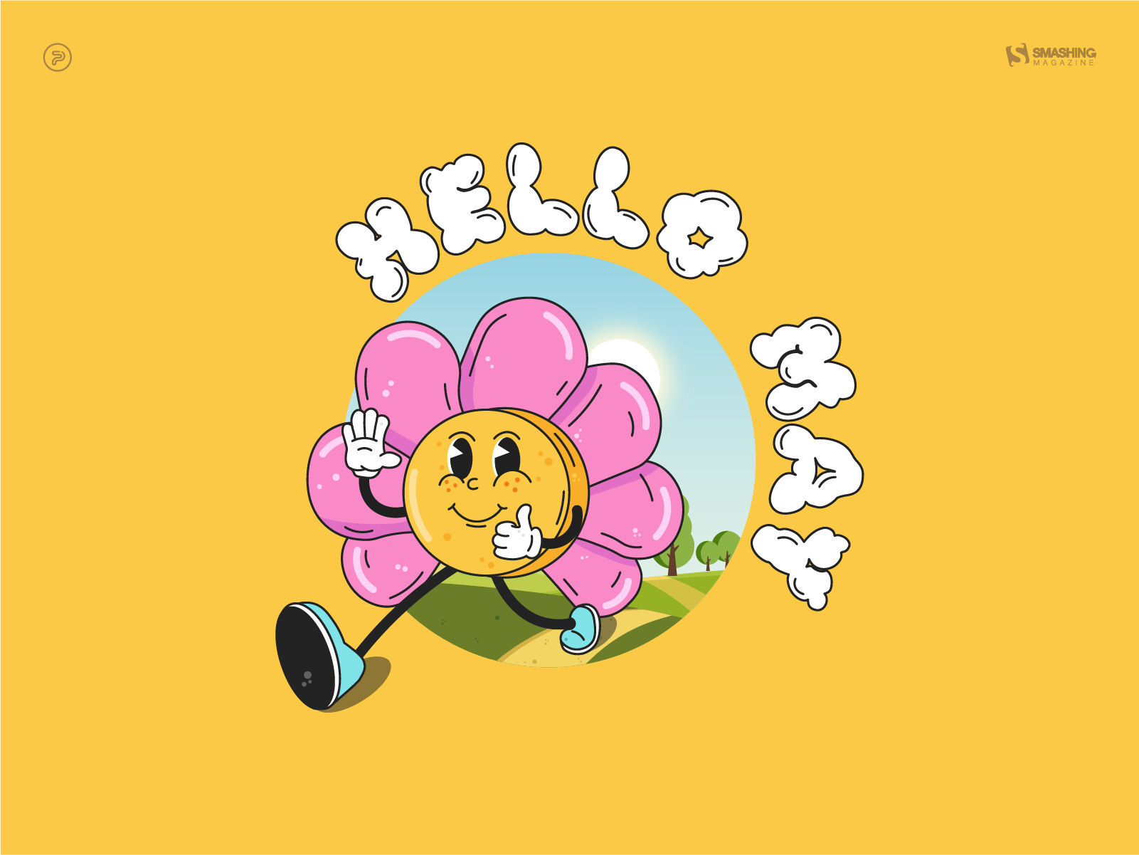
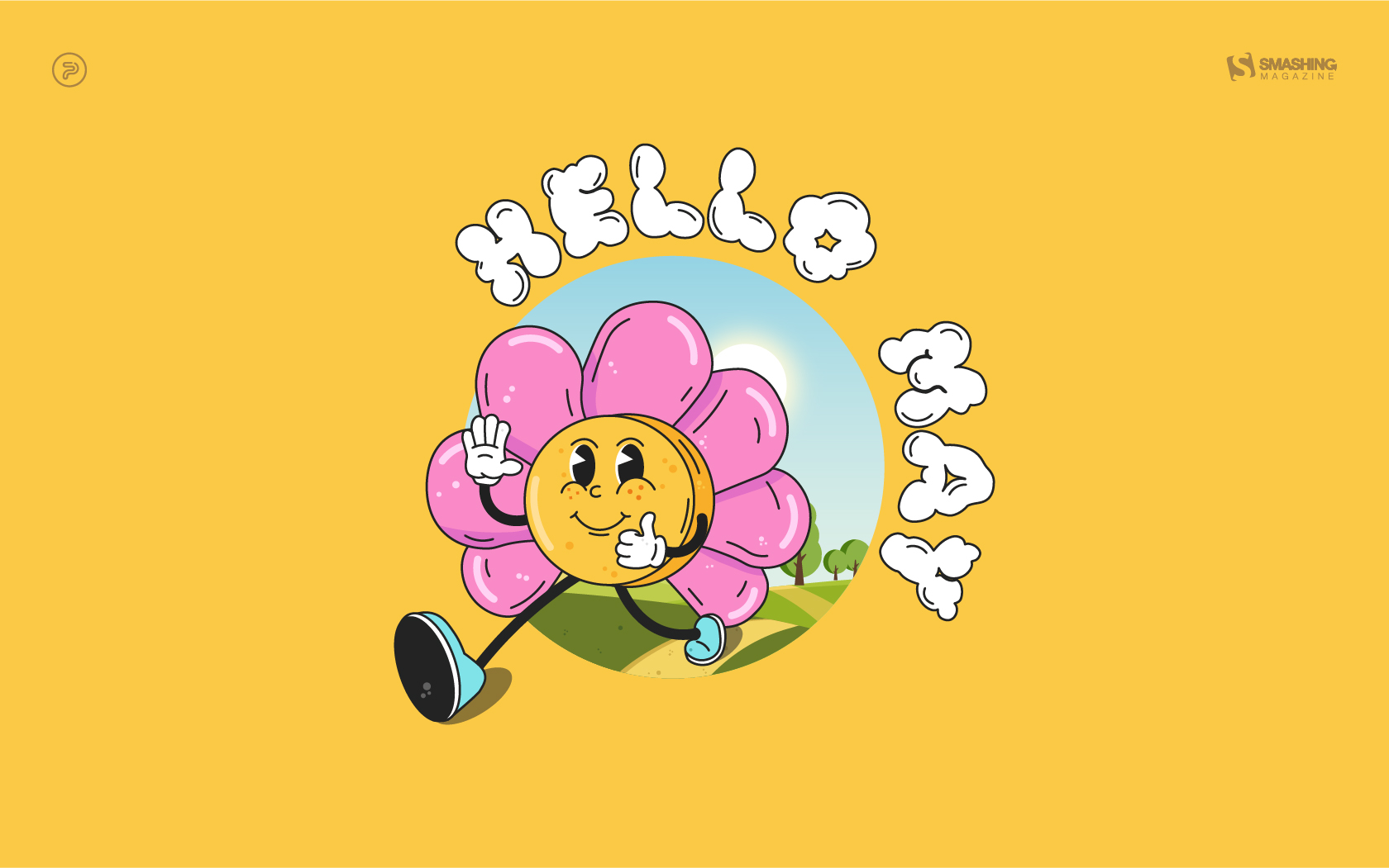
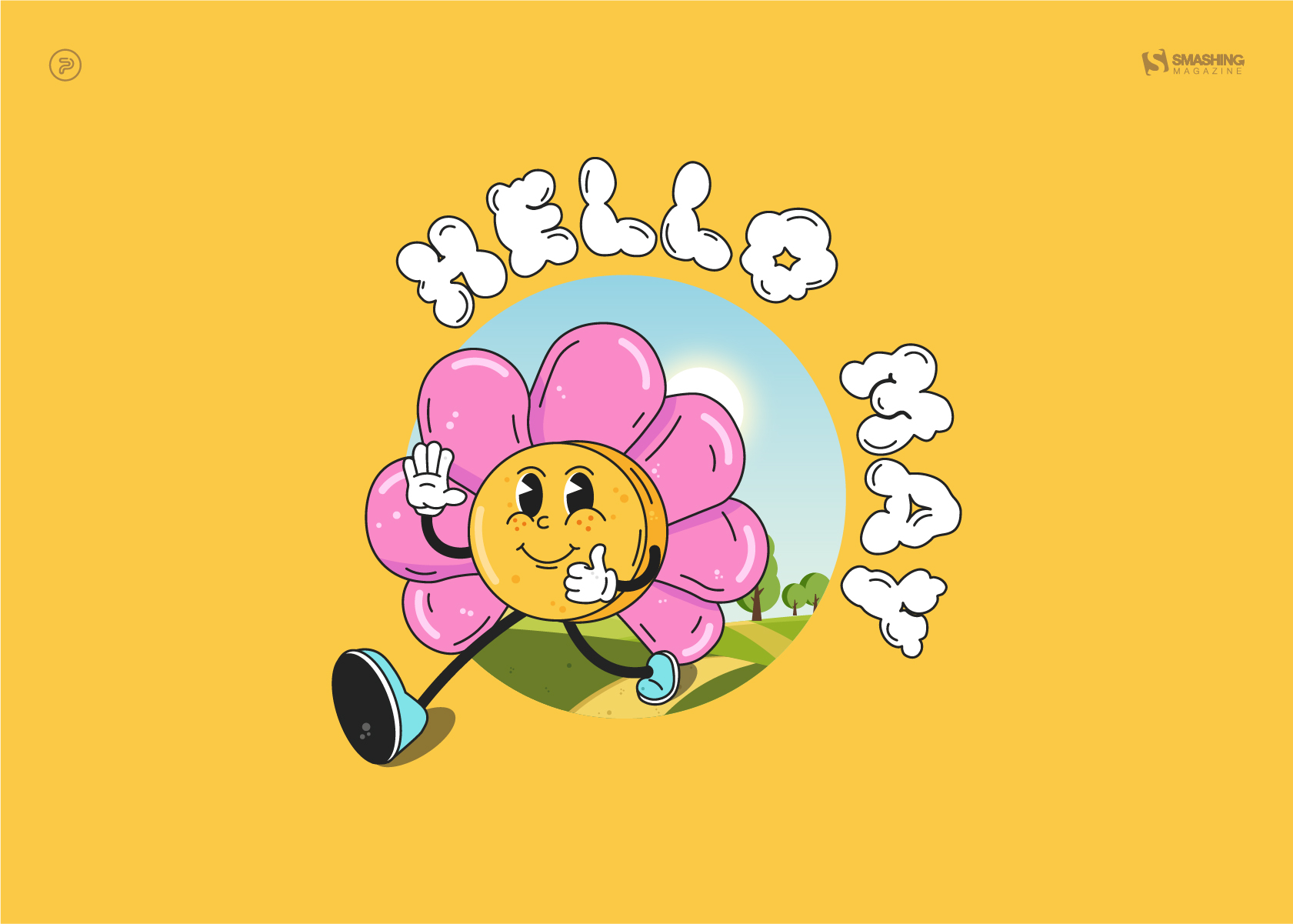
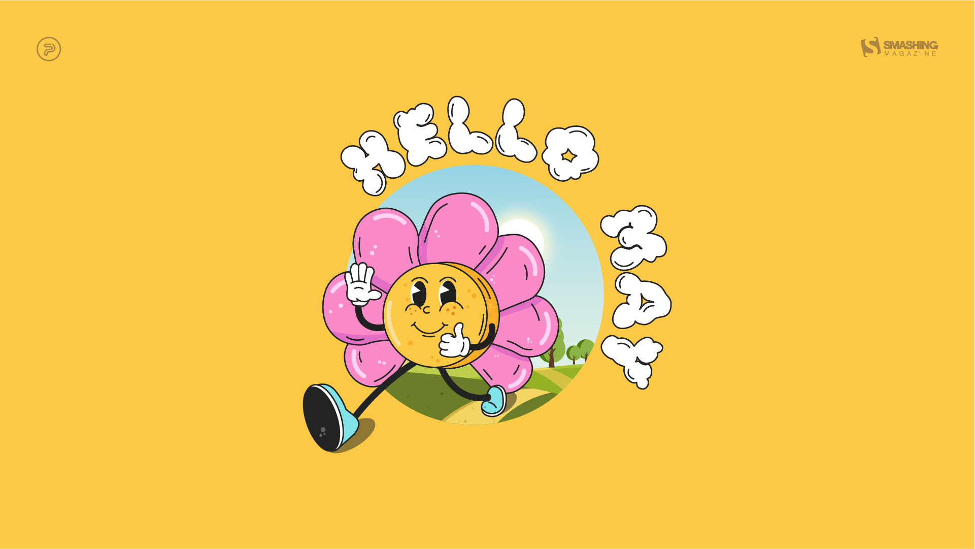
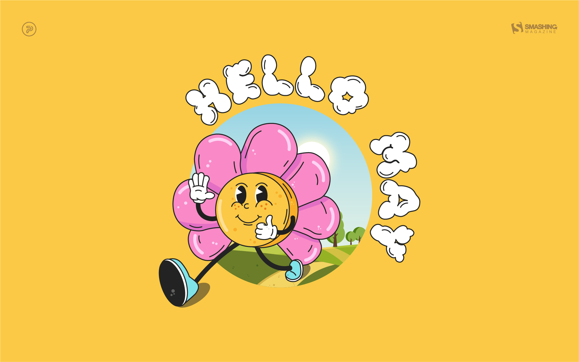
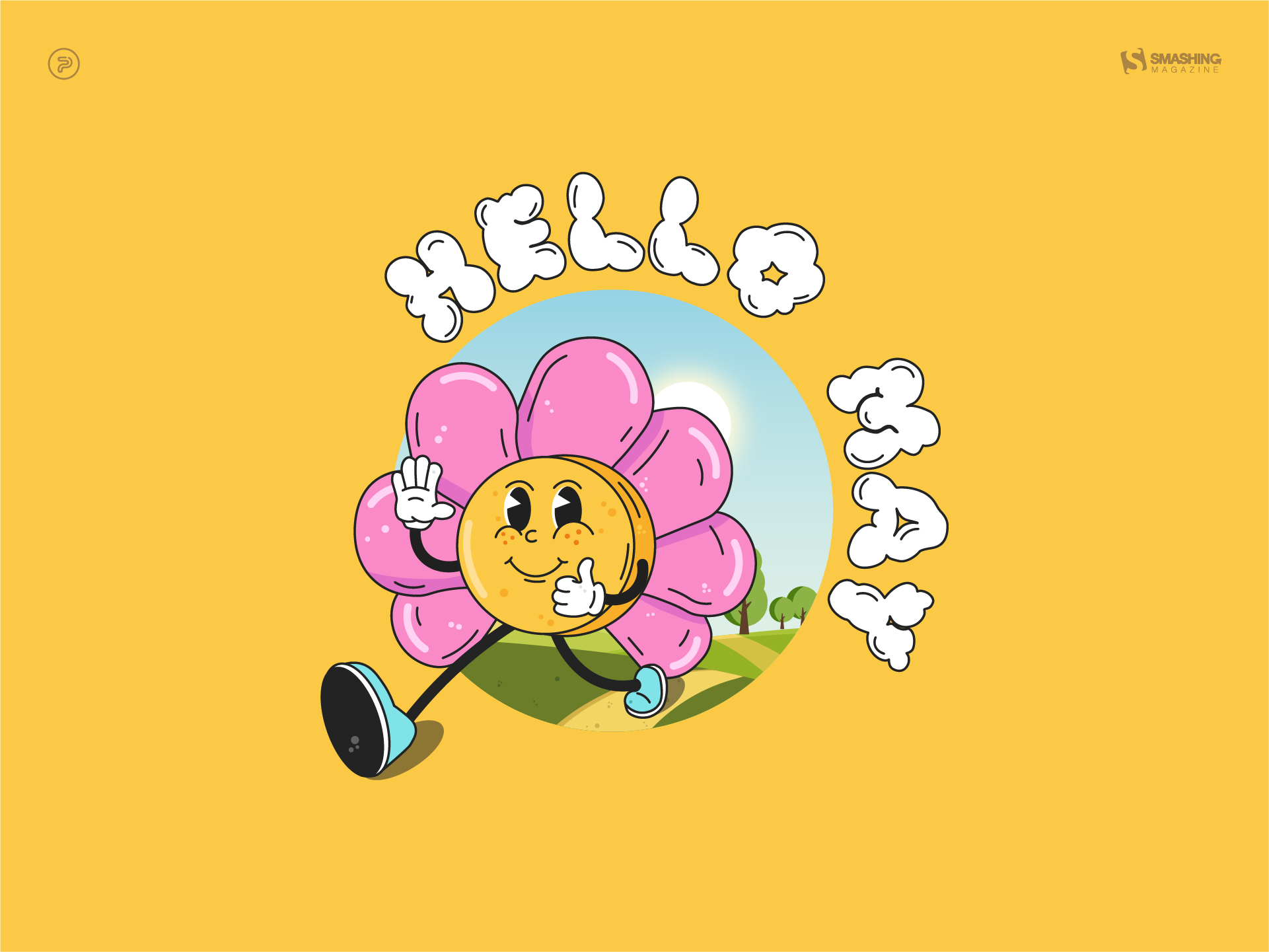
Hello May

“The longing for warmth, flowers in bloom, and new beginnings is finally over as we welcome the month of May. From celebrating nature on the days of turtles and birds to marking the days of our favorite wine and macarons, the historical celebrations of the International Workers’ Day, Cinco de Mayo, and Victory Day, to the unforgettable ‘May the Fourth be with you’, May is a time of celebration — so make every May day count!” — Designed by PopArt Studio from Serbia.

Add Color To Your Life!

“This month is dedicated to flowers, to join us and brighten our days giving a little more color to our daily life.” — Designed by Verónica Valenzuela Jimenez from Spain.

Ladies And Gentlemen

Designed by Ricardo Gimenes from Spain.

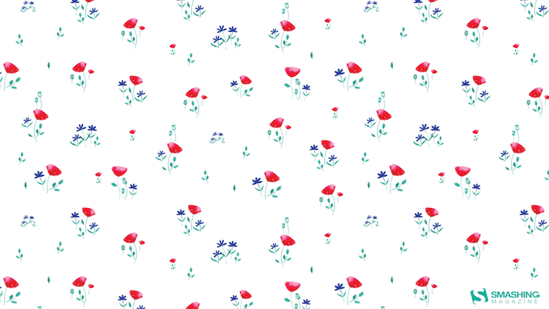
Poppies Paradise

Designed by Nathalie Ouederni from France.

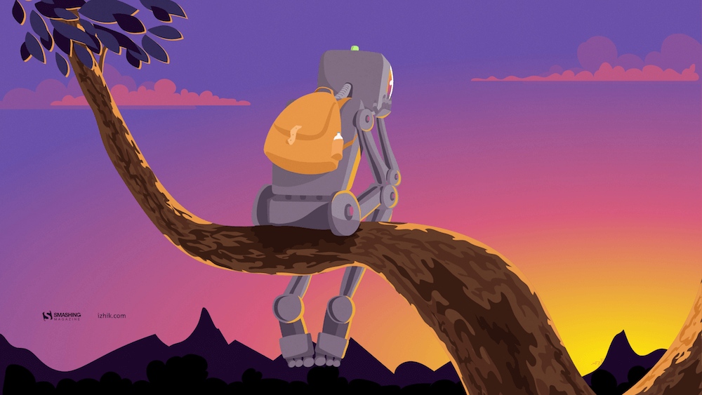
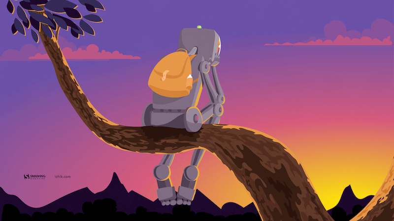
Understand Yourself

“Sunsets in May are the best way to understand who you are and where you are heading. Let’s think more!” — Designed by Igor Izhik from Canada.

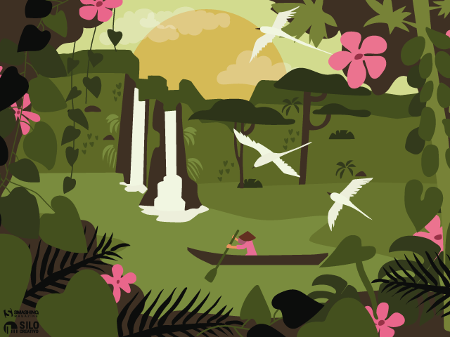
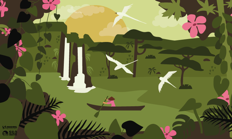
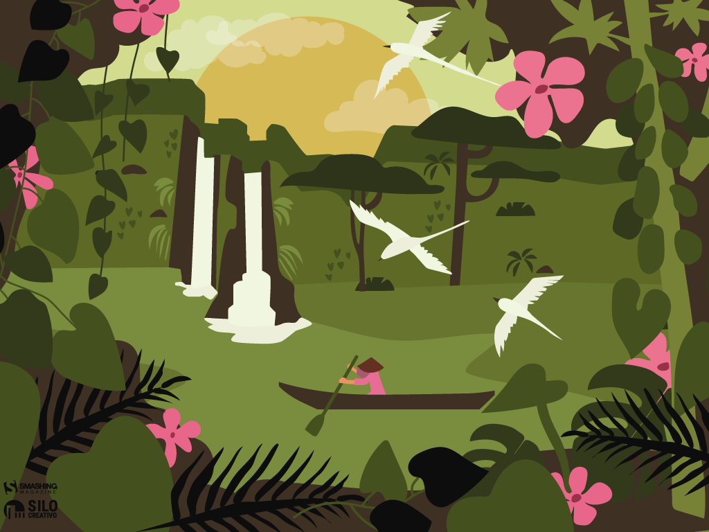
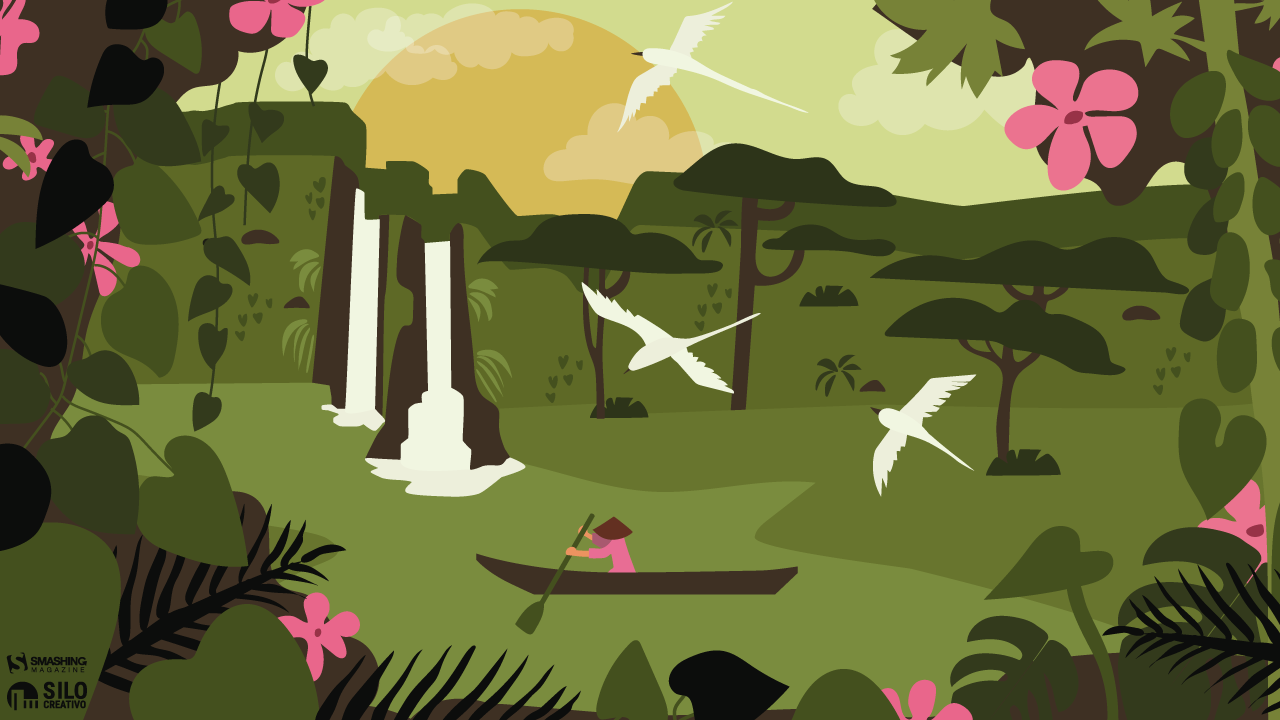
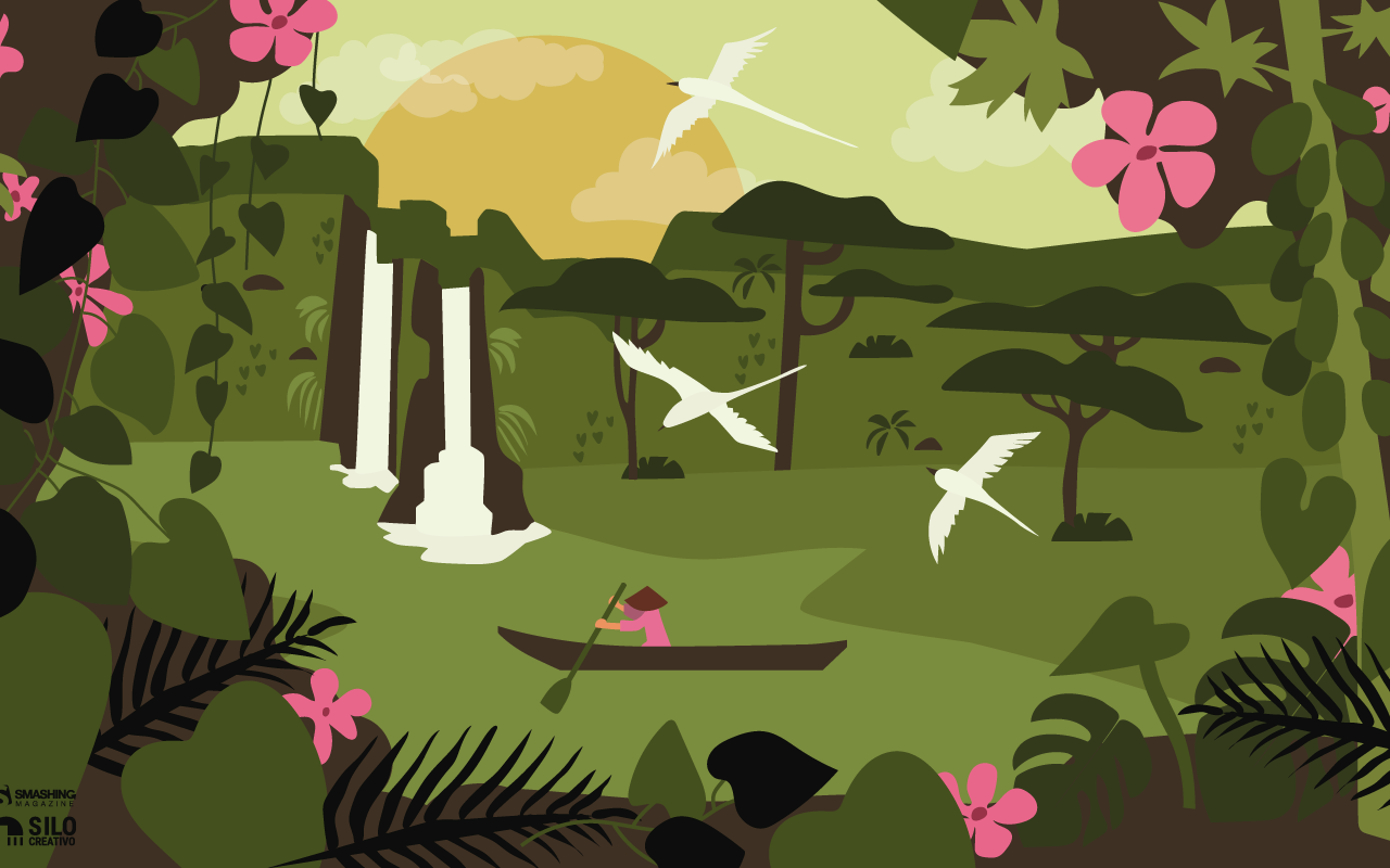
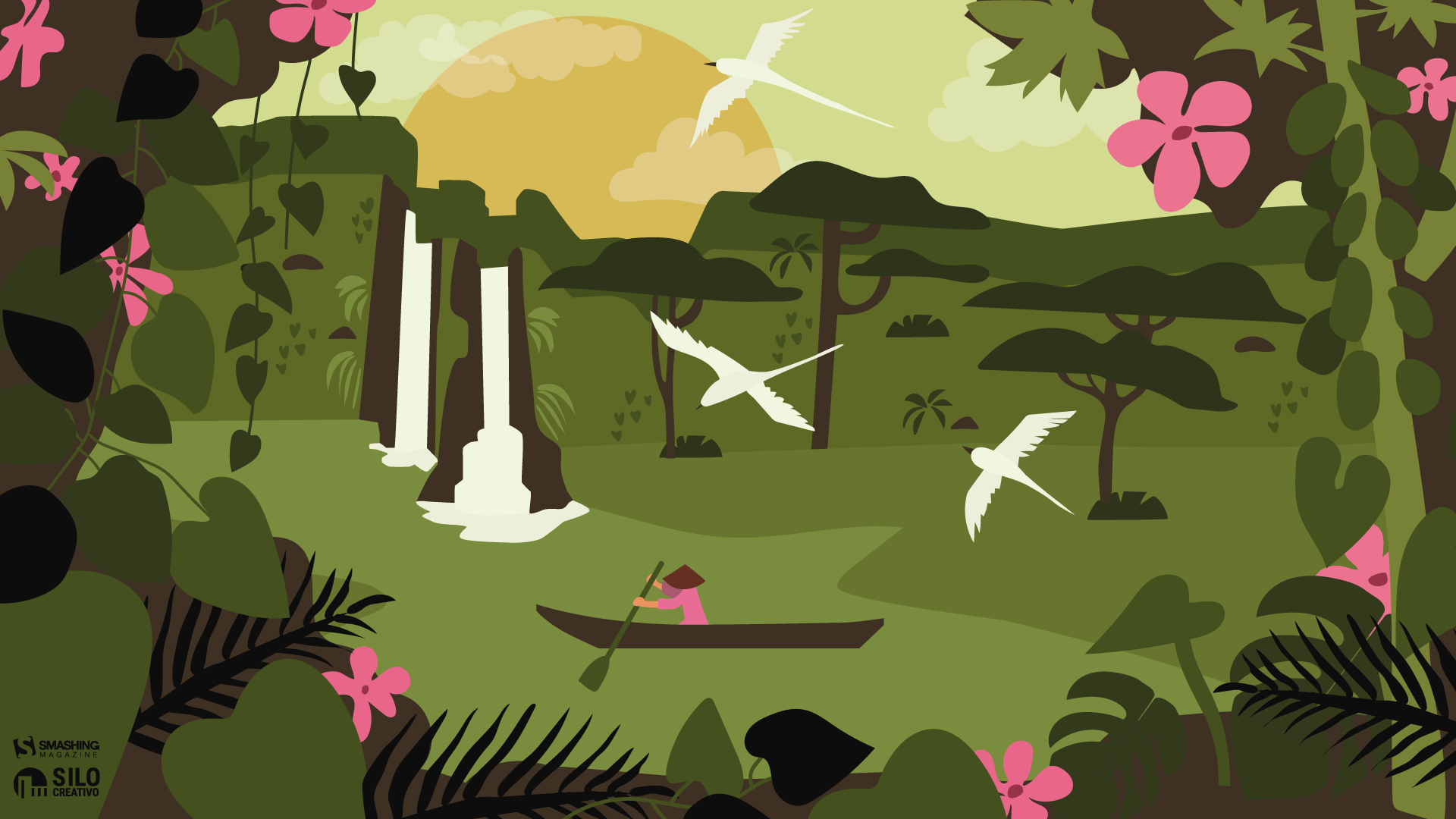
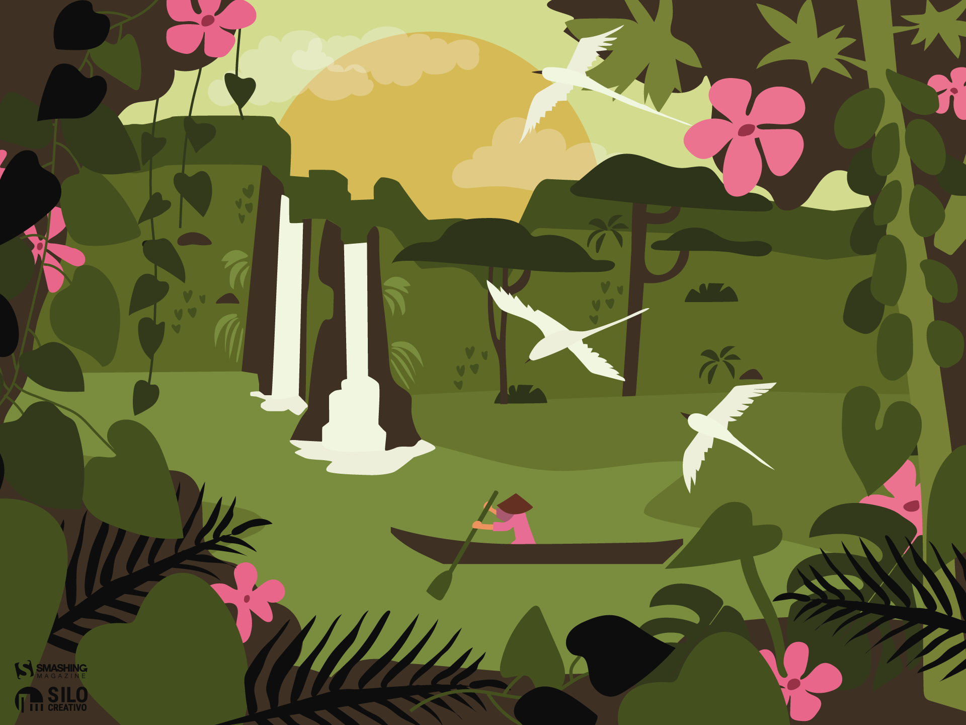
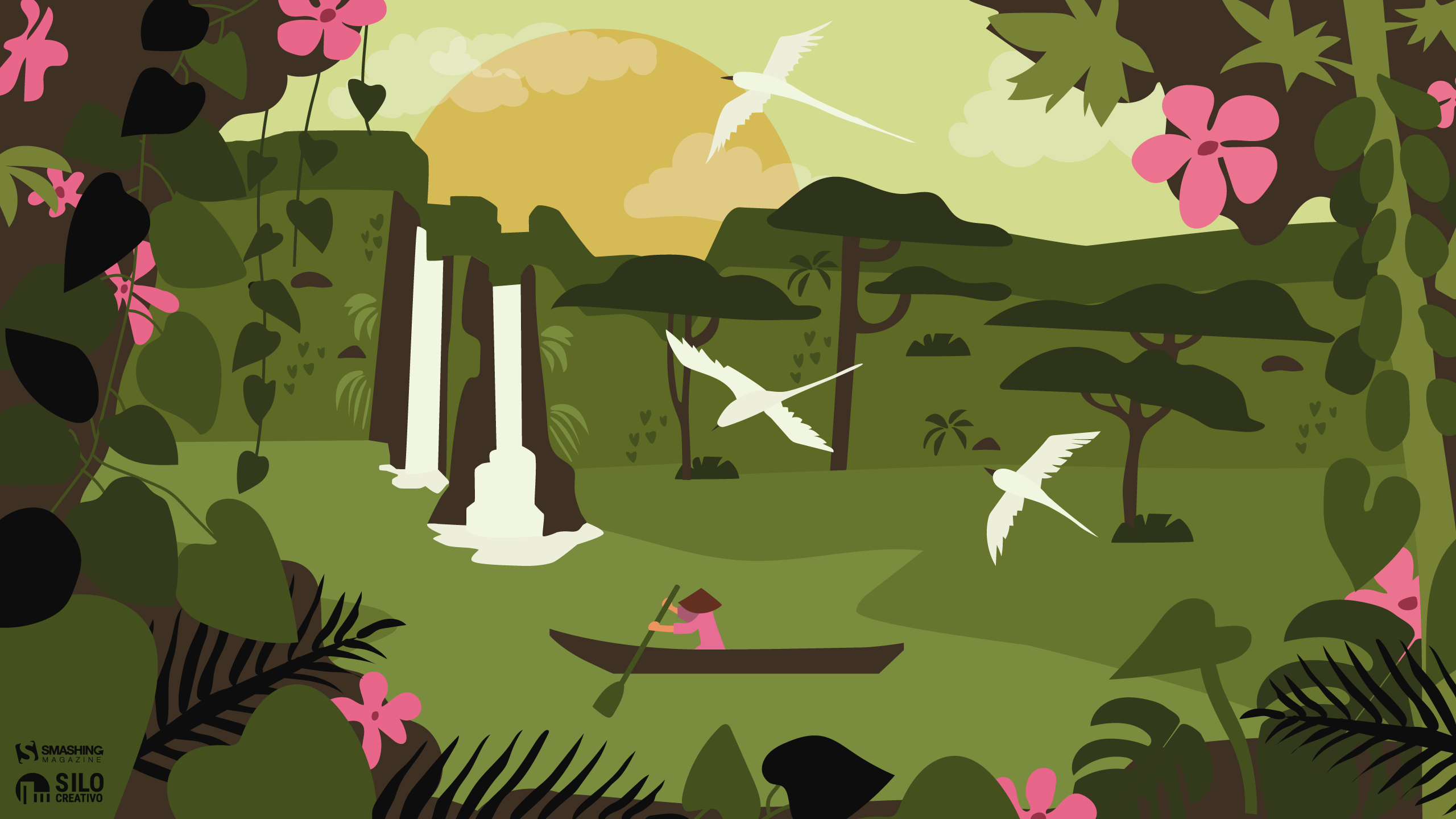
Navigating The Amazon

“We are in May, the spring month par excellence, and we celebrate it in the Amazon jungle.” — Designed by Veronica Valenzuela Jimenez from Spain.

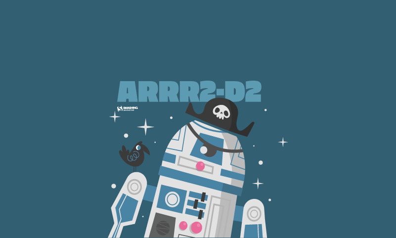
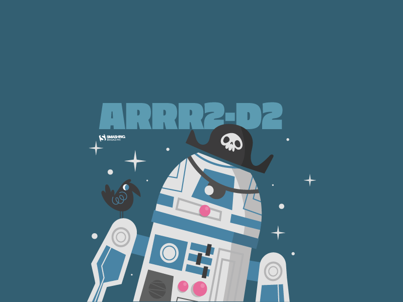
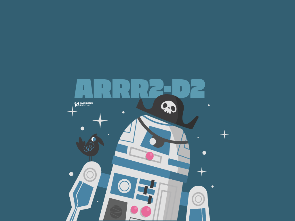
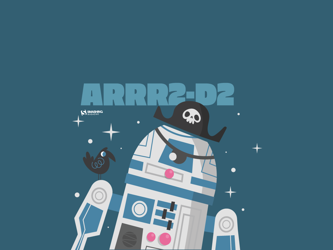
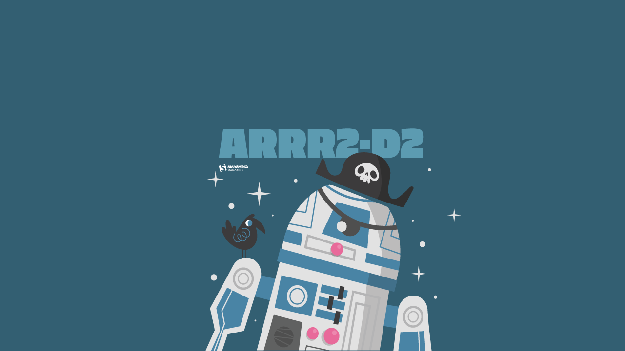
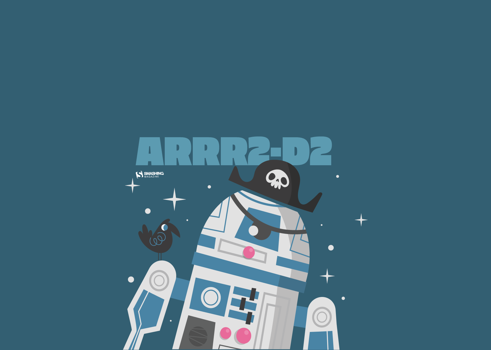
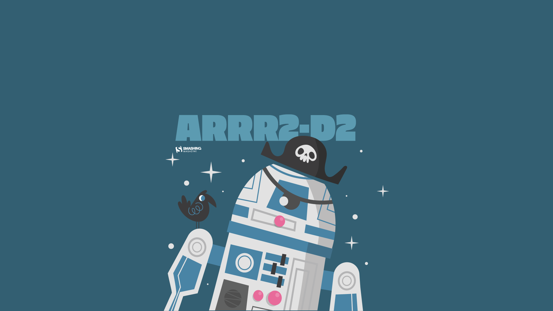
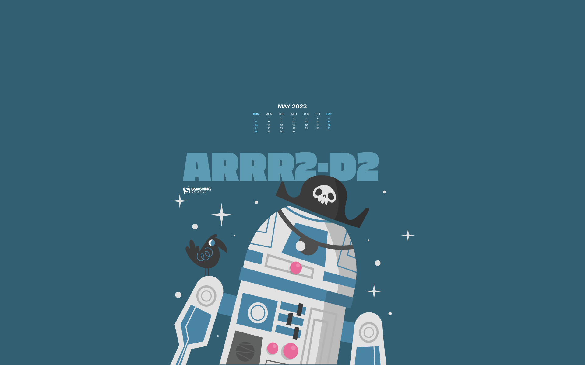
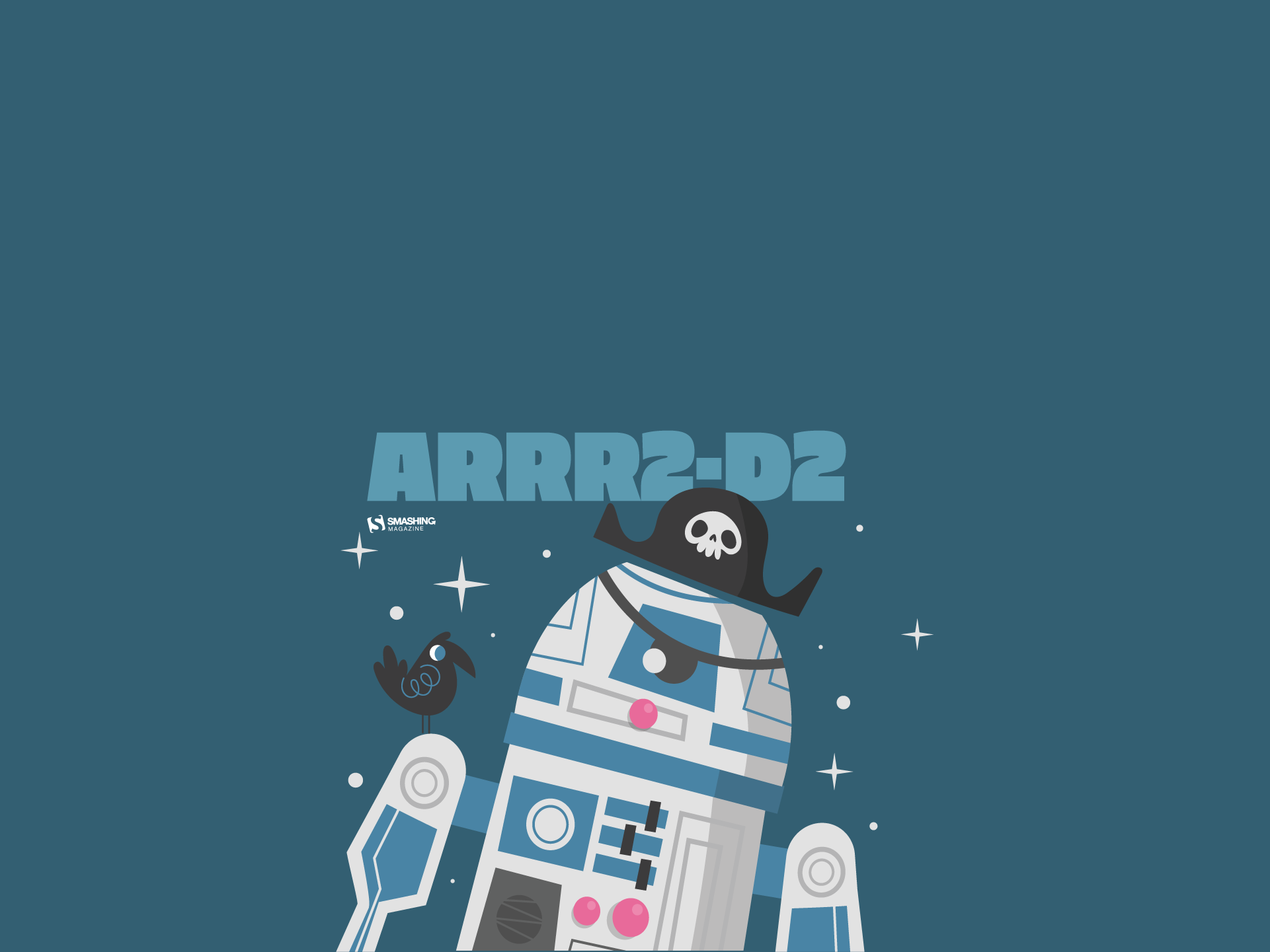
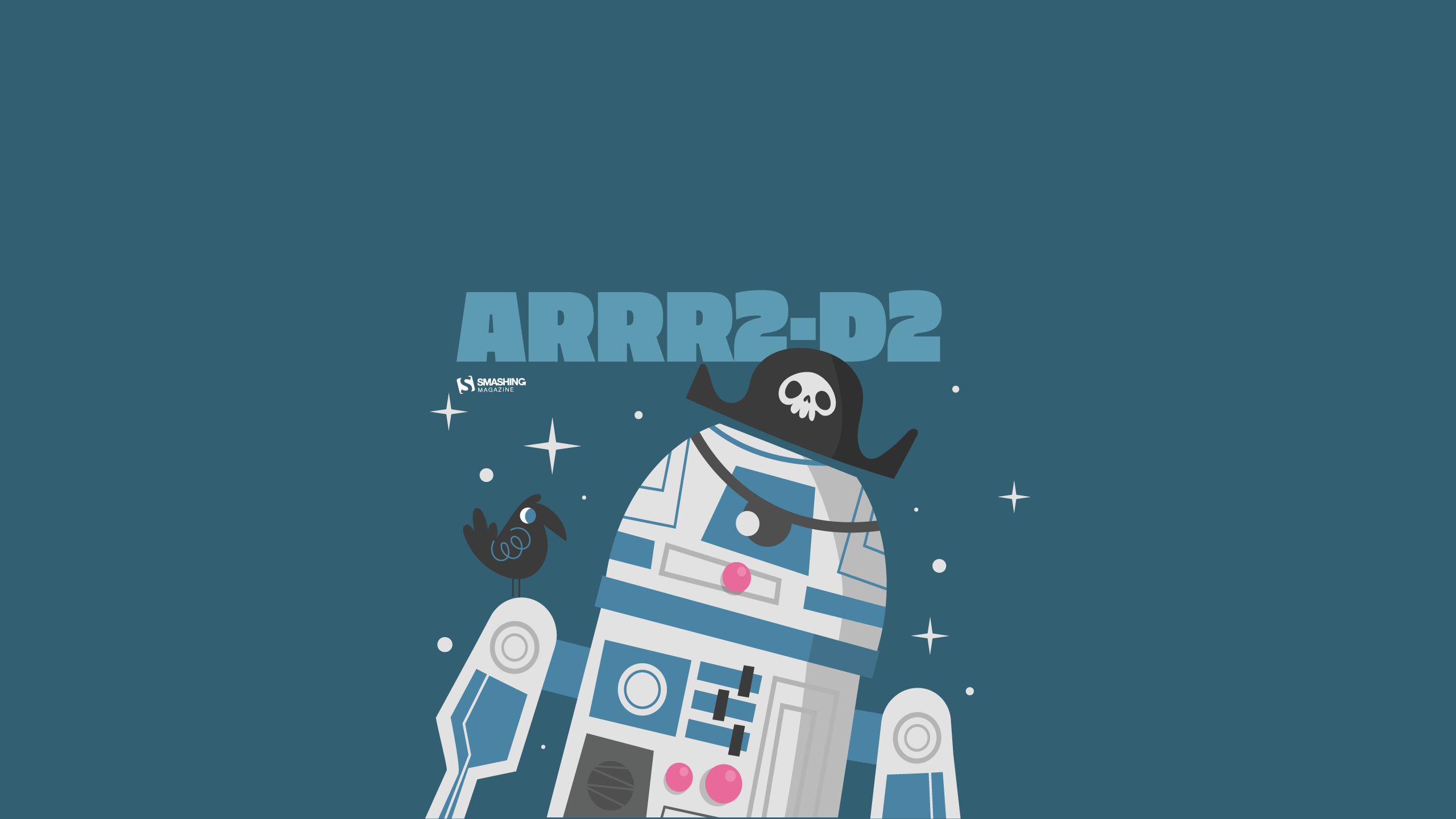
ARRR2-D2

Designed by Ricardo Gimenes from Spain.

Lake Deck

“I wanted to make a big painterly vista with some mountains and a deck and such.” — Designed by Mike Healy from Australia.

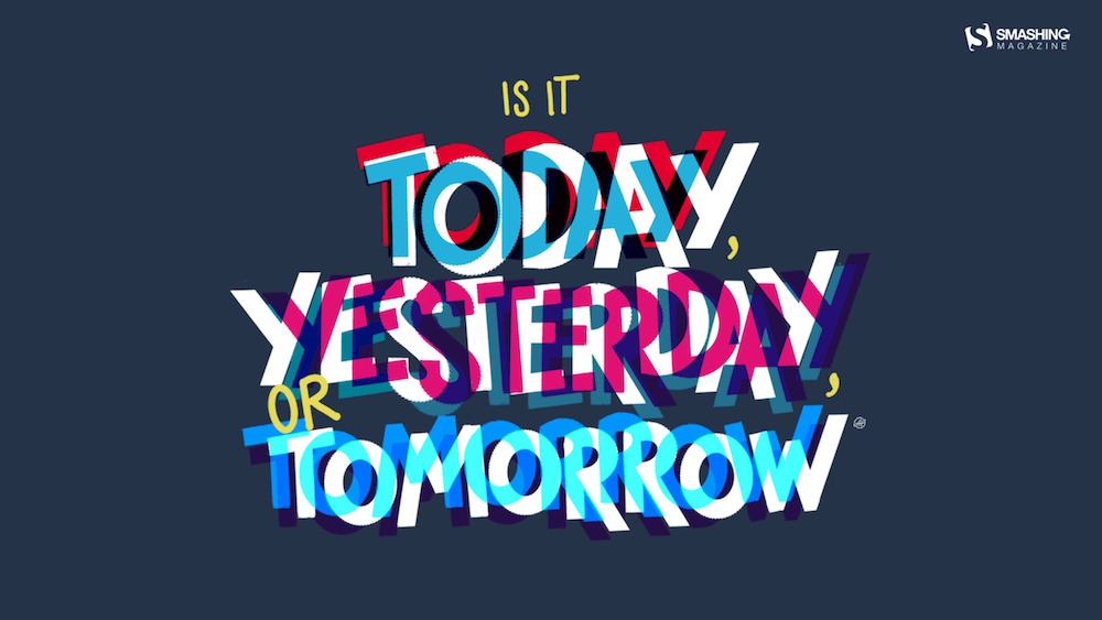
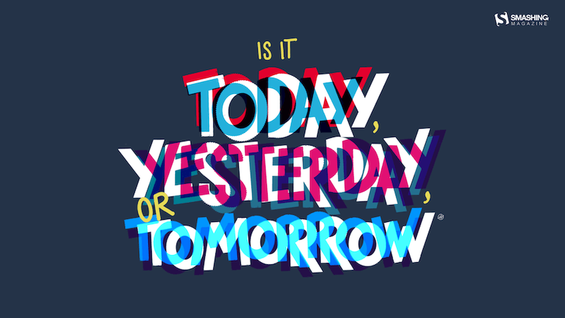
Today, Yesterday, Or Tomorrow

Designed by Alma Hoffmann from the United States.

The Monolith

Designed by Ricardo Gimenes from Spain.

Tentacles

Designed by Julie Lapointe from Canada.

Geo

Designed by Amanda Focht from the United States.

Make A Wish

Designed by Julia Versinina from Chicago, USA.

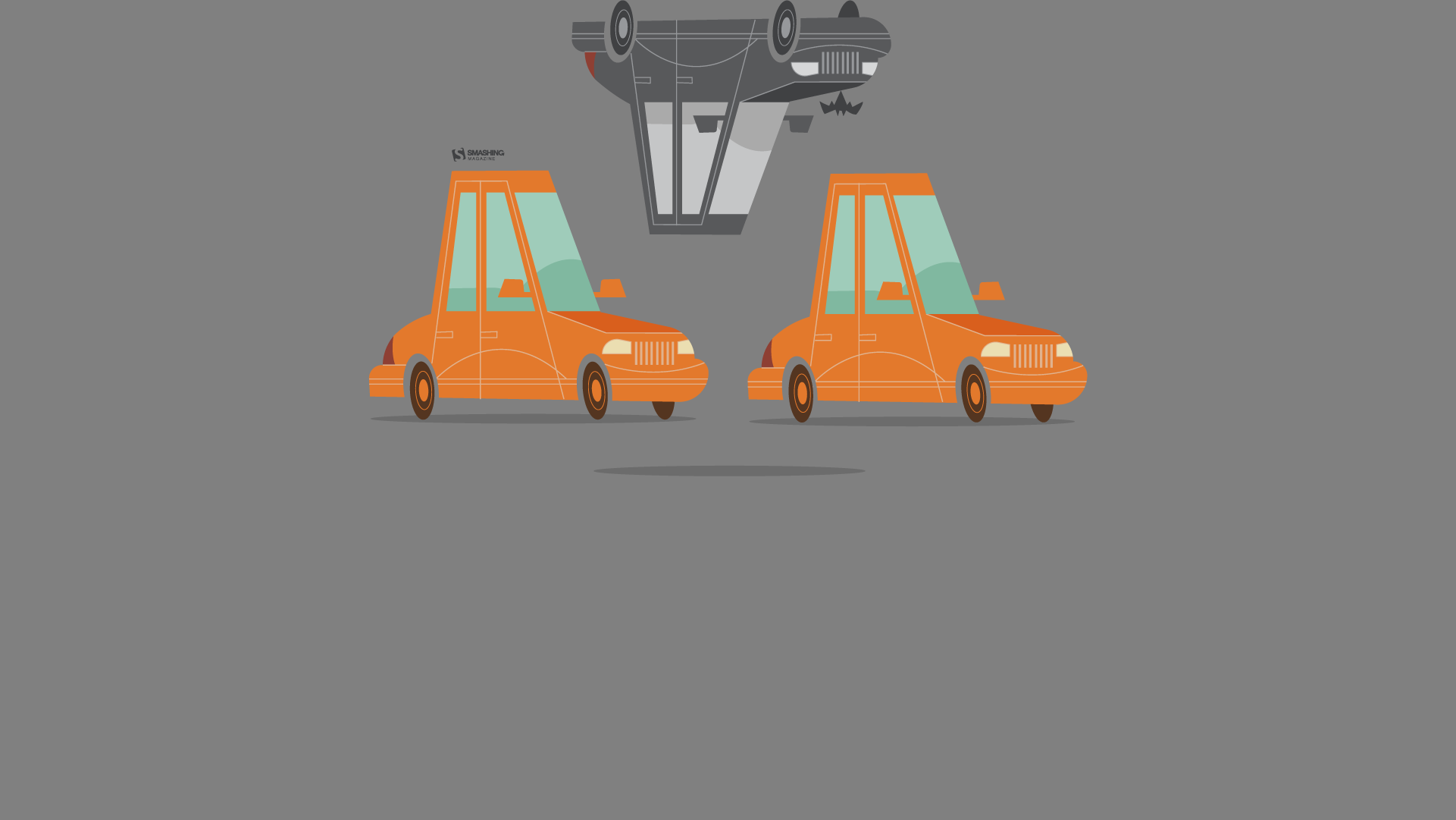
Bat Traffic

Designed by Ricardo Gimenes from Spain.

Blooming May

“In spring, especially in May, we all want bright colors and lightness, which were not there in winter.” — Designed by MasterBundles from Ukraine.

Enjoy May!

“Springtime, especially May, is my favorite time of the year. And I like popsicles — so it’s obvious isn’t it?” — Designed by Steffen Weiß from Germany.

Stone Dahlias

Designed by Rachel Hines from the United States.

Spring Gracefulness

“We don’t usually count the breaths we take, but observing nature in May, we can’t count our breaths being taken away.” — Designed by Ana Masnikosa from Belgrade, Serbia.

Sweet Lily Of The Valley

“The ‘lily of the valley’ came earlier this year. In France, we celebrate the month of May with this plant.” — Designed by Philippe Brouard from France.

April Showers Bring Magnolia Flowers

“April and May are usually when everything starts to bloom, especially the magnolia trees. I live in an area where there are many and when the wind blows, the petals make it look like snow is falling.” — Designed by Sarah Masucci from the United States.

Always Seek Knowledge

“‘As knowledge increases, wonder deepens.’ (Charles Morgan) So I tried to create an illustration based on this.” — Designed by Bisakha Datta from India.

May Your May Be Magnificent

“May should be as bright and colorful as this calendar! That’s why our designers chose these juicy colors.” — Designed by MasterBundles from Ukraine.

Celestial Longitude Of 45°

“Lixia is the 7th solar term according to the traditional East Asian calendars, which divide a year into 24 solar terms. It signifies the beginning of summer in East Asian cultures. Usually begins around May 5 and ends around May 21.” — Designed by Hong, Zi-Cing from Taiwan.

Power

Designed by Elise Vanoorbeek from Belgium.

Rainy Days

“Winter is nearly here in my part of the world and I think rainy days should be spent at home with a good book!” — Designed by Tazi Design from Australia.

Birds Of May

“Inspired by a little-known ‘holiday’ on May 4th known as ‘Bird Day’. It is the first holiday in the United States celebrating birds. Hurray for birds!” — Designed by Clarity Creative Group from Orlando, FL.

Magical Sunset

“I designed Magical Sunset as a friendly reminder to take a moment and enjoy life around you. Each sunset and sunrise brings a new day for greatness and a little magic.” — Designed by Carolyn Warcup from the United States.

All Is Possible In May

“Edwin Way Teale once said that ‘[t]he world’s favorite season is the spring. All things seem possible in May.’ Now that the entire nature is clothed with grass and branches full of blossoms that will grow into fruit, we cannot help going out and enjoying every scent, every sound, every joyful movement of nature’s creatures. Make this May the best so far!” — Designed by PopArt Studio from Serbia.

Get Featured Next Month

Feeling inspired? We’ll publish the June wallpapers on May 31, so if you’d like to be part of the collection, please don’t hesitate to submit your design. We are already looking forward to it!

  •  

Macif : l'accessibilité numérique comme prolongement naturel de l'engagement mutualiste

Mutuelle d’assurance engagée en faveur de l’inclusion, la Macif a progressivement structuré sa démarche d’accessibilité numérique pour répondre à la fois à ses obligations réglementaires, à ses engagements RSE (Responsabilité Sociétale des Entreprises) et aux besoins de ses sociétaires comme de ses collaborateurs. Depuis plus de trois ans, la Macif est accompagnée par Temesis pour ancrer durablement l’accessibilité numérique dans ses pratiques et ses processus métiers.

En bref

  • Début de la collaboration : 2019
  • Périmètre : site macif.fr, application mobile, parcours de souscription et de devis, sites satellites du groupe
  • Chiffres clés :
    • Une vingtaine d’audits d’accessibilité réalisés (sites, applications, tunnels de souscription)
    • Plus de 6 ans d’accompagnement continu avec un expert Temesis détaché plusieurs jours par semaine
    • Plus de 200 collaborateurs sensibilisés dont une cinquantaine dans un parcours spécifique à leur métier. Un effort de formation qui se poursuit chaque année.
  • Points forts de l’accompagnement :
    • Expertise technique reconnue
    • Accompagnement stratégique et opérationnel
    • Logique d’amélioration continue
    • Transmission de compétences

Contexte et enjeux

La Macif est historiquement engagée sur la question du handicap. Depuis 2005, elle déploie ainsi le programme Macif Égalis, qui vise à fournir à ses sociétaires en situation de handicap des offres et des services accessibles et adaptés à leurs besoins. La mutuelle n’aborde pas l’accessibilité numérique comme une contrainte de conformité réglementaire.

  •  

Good designers, bad websites: a proposal

I want to discuss accessibility because it is the most important thing for making websites. Other A List Apart articles give you innovation and insight. This article will give you homework. These are just my personal views, but they’re pretty good.

I want to start off with a couple of statements, and you will agree:

  1. Designers are good people. I have never heard a designer say, “I don’t care if somebody can’t read this text”, “Not my fault if somebody can’t use this device”, or “Who cares if this is confusing?”
  2. Some designs exclude people. You have seen people unable to read the text on a website or app that somebody designed. You’ve seen people unable to use a physical device that somebody has designed. You’ve seen people utterly bamboozled while trying to use a service that somebody designed.

So what?

The first question is, “Is this life-or-death stuff?” The answer is, “Yes.” In my favorite essay, This Is All There Is, Aral Balkan makes the point that pretty much everything that we design can affect life events and death events. Aral gives the example of how even a straightforward bus timetable app can affect life and death events, if we design it badly:

  • somebody might miss a life event, such as their daughter’s fifth birthday party; or
  • somebody might miss a death event, such as the chance to say goodbye to a dying grandmother.

The next—and frustrating—question is, “Why do some designs still exclude people?” After all, we know that:

  • not everybody can see perfectly;
  • not everybody can hear perfectly;
  • not everybody thinks the same way; and
  • not everybody moves the same way.

I think the answer is that there’s too much to recall. Consider, if you will, the wide variety of topics that A List Apart articles cover. Designers are expected to remember all of that guidance, plus all of the accessibility guidance, plus so much more. It is too much.

Recognizing accessibility issues while designing

I’d like to point toward one possible solution, starting from Jakob Nielsen’s 10 Usability Heuristics for User Interface Design. These are from the mid-1990s, and—although there’s a good chance that you, gentle reader, are a lot younger than that—please bear with me. 

Seeing as the problem is that there’s too much to recall, I want to look at heuristic № 6, “Recognition rather than Recall.” Jakob Nielsen said that for users, information required to use the design should be visible or easily retrievable when needed. I suggest we tweak that to make life easier for designers. Let’s say that the information required to produce the design should be visible or easily retrievable when needed. In other words, let’s make it easier to recognise accessibility issues while we’re designing.

How are we going to do that? I really like the book A Web for Everyone—Designing Accessible User Experiences by Sarah Horton and Whitney Quesenbery. I really like this book not only because it includes a quote from me—actually two quotes, but I don’t like to boast—but because it includes personas that are perfect for helping us to recognise accessibility issues. That’s the good news. The even better news is that these personas are available now for free on the companion website to the book What Every Engineer Should Know About Digital Accessibility, again by Sarah Horton, with David Sloan this time.

Meet your users

I’m going to introduce you to these personas now:

I want to throw one more persona at you now, because, well, A List Apart readers are overachievers. One of my favorite authors, Cennydd Bowles—who literally wrote the book on Future Ethics—says to create Personas Non Grata. In other words, every time we design something, we have to think about what a bad guy could do with that thing, and whom that might affect.

To actually use these personas while designing, I like what Eric Meyer and Sara Wachter-Boettcher in Design for Real Life call the Designated Dissenter: for each project that you work on, one of your teams should be responsible for asking, “Will this work for Vishnu?”, “How’s Trevor going to get on with this?”, and so on. 

Then, once you’ve used the personas to recognise the accessibility issues, you can look up the guidelines for whichever platforms you’re designing for: 

Your mission, should you choose to accept it

I told you in the introduction of this article that I would give you homework. You thought I was joking. So, here’s your homework: I want you to grab the personas from the Know About Accessibility website, and use them throughout every design project to help you recognise accessibility issues while you work—and reclaim design for everyone.


NOTE: This article is based on “Recognise,” my five-minute presentation from Interaction Design Association (IxDA) Dublin’s Defuse (Design for Use) event in 2025.

  •  

I like The Web They Want

I like The Web They Want

Last Friday we organised the first The Web You Want event, a series of events where we look at the current state of the web and wonder out loud what we should do with it. We had five speakers who presented the web that they want, and I liked their visions very much. It makes me hopeful.

A group of billionares with black bars over their eyes shown on a big screen by someone behind a lectern

There is a bad web

Many speakers pointed out that large parts of the web are not so nice anymore. Hidde de Vries asked if he could use the C-word, because the root of the problem is, of course, Capitalism. A handful of evil corporations, who all sacked their ethical teams recently (if they ever had one), control most of the things that people do on the web. And giving so much power to such a small group of crazy billionaires, with such a distorted world view, is a big problem.

There is a better web

Many speakers also pointed at good places to start when looking for a better web. Tips were given about how to make the web a better place, by working on things like accessibility, and on things like sustainability, and how to make sure that ethics are never set aside. And of course alternatives to large so called social media were promoted: Marleen Stikker pointed at all the different more or less federated alternatives to social media, like the Fediverse and the Atmosphere. Sanne Peters pointed out that you don’t actually need the web all the time. Making bonzai, reading books by authors who have a different background, watching movies from countries you don’t know anything about, and talking to your neighbours were some of the gentle alternatives to the web she promoted.

An osciloscope with a clock on it, shown on a big screen by someone behind a lectern

There’s also a fun web

Most speakers showed that the web is a fun place. Marleen showed us that the cool parties are on the Fediverse and on Atmosphere, you are missing the good stuff if you’re not there. Most other speakers talked about the option for hosting your own, independent website. Like this one. We showed some of the incredible things that our students have been making during our web design and developments courses, rubics cubes that have a secret transformer mode, an interactive octopus that gets very nervous when the water level gets too low, and some black holes that suck up all the stuff on your website. And of course Niels Leenheer gave a fantastic talk where he showed us the unbeleivable stuff he does with web technology, like making clocks, not just in the browser, but also on old osciloscopes and even with real lasers. Absolutely brilliant.

A pixelated, green landscape, shown on a big screen by someone behind a lectern

The web is something to think about.

So the web, it turns out, is much more than what silicon valley wants it to be. It is still a place where people meet other people, where likeminded groups find each other, where the world connects, and where people can do their own stuff, independently. And these independent, federated spaces thrive, and they grow. The web is also a very important medium. The fact that it is for everyone by design really means that it is for everyone. Do so responsibly, like Hidde mentioned. And try to get a deep, deep understanding of what the web that you want would be, like Justus Sturkenboom explained in his brilliant, brilliant talk about the philosophical meaning of the words the, web, you, and want. He almost found the deeper, hidden agenda that I had with this conference, I think. I will link to his talk when he publishes it, it is absolutely fantastic.

The web you want

The first event was well attended. I think there were a bit over 100 people. Many current students, quite some former students, and quite a few people from all kinds of places. One of the bigger compliments we received was from someone I didn’t know who found it refreshing that nobody really talked about “AI” during the event.

The next event is on the 10th of June and I really hope to see all of you there. Tickets are free, just let us know you will attend so we can make sure we have enough seats.

  •  

WCAG3 Contrast as of April 2026

For years I have seen people, teams, products, organizations, and projects promoting APCA contrast as the WCAG3 color contrast algorithm. In many of those cases, those same actors have suggested dismissing the contrast algorithm in WCAG2.

This kind of problematic advice happened so often that I started filing issues with tool makers to remove APCA, as with this May 2024 Chromium issue.

In January 2025 I saw a post promoting that advice, which would create legal risk for anyone following it. You can see my original 2025 response on Mastodon and the same post on Bluesky, where the creator of APCA also weighed in. Read those to ensure you aren’t just taking my word for it.

Current Situation

Here is the most current (as of this writing) contrast ratio algorithm in WCAG3 with the salient bit highlighted:

contrast ratio test Exploratory

meeting a sufficient level of contrast between two colors using the relationship of hue, saturation, and lightness values

Editor’s note

The contrast algorithm used in WCAG 3 is yet to be determined.

APCA was marked for removal in early 2023:

Exploratory content that does not gain WG support to proceed to the next stage within 6 months is automatically removed in the WCAG 3 development process. We still hope the promising contrast work will continue to mature for potential later inclusion.

As with other WCAG3 ideas that did not get working group support, the working group pulled it from the July 2023 WCAG3 working draft. APCA was only ever exploratory, and the W3C’s July 2023 update explained removal of exploratory items. The APCA creator’s response to Michael Cooper’s comment acknowledged that APCA versions in the draft were all early versions that were very obsolete (emphasis theirs).

I have no idea if APCA, whatever version, will come back to WCAG3.

What to Do?

The W3C logo with a frog-headed eyedropper over it. You can still use APCA (whatever version). If you do, limit your risk by taking one of these approaches:

  • Choose colors that also conform to WCAG2 contrast requirements; or
  • If you pick colors that fail WCAG2 contrast requirements, document it and have a ready response should you receive a drive-by lawsuit from a bad actor using an automated checker to find a contrast violation (assuming your attorney lets you do this).

I am still not a (bird) lawyer.

In the meantime, WCAG3 is years away from being done, perhaps 2030 at the soonest. Any contrast algorithm it picks won’t be final until at least then. But if you like whatever is proposed and want to use it before 2030, then probably refer to my two approaches above.

  •  

L’impact de l’IA agentique sur les ressources humaines

L’IA va-t-elle supprimer des emplois, transformer les métiers ou simplement servir de prétexte commode à des licenciements ? Je vous propose dans cet article de démêler le vrai du faux dans la bataille de chiffres qui oppose études alarmistes et données rassurantes, pour en tirer des enseignements concrets à l’usage des professionnels RH. Car derrière … Lire la suite L’impact de l’IA agentique sur les ressources humaines →

L’article L’impact de l’IA agentique sur les ressources humaines est apparu en premier sur FredCavazza.net.

  •  

Web agentique : la révolution qui ne vous attendra pas
2023 a été l’année de naissance des chabots, 2024, celle de leur consécration. De même, 2025 a été l’année de naissance des agents intelligents, et 2026 sera également l’année de leur consécration, car elle va aller de paire avec l’avènement de la super-intelligence. Cette montée en puissance se traduira par des changements majeurs dans notre … Lire la suite Web agentique : la révolution qui ne vous attendra pas →
L’article Web agentique : la révolution qui ne vous attendra pas est apparu en premier sur FredCavazza.net.

  •  

Bilan de mes prédictions 2025

L’année 2025 se termine en fanfare avec des innovations toujours plus spectaculaires, des investissements toujours plus élevés et des projections de croissance / C.A. toujours plus enthousiastes. Je publierai la semaine prochaine mes prévisions pour 2026, mais pour l’heure, il est grand temps de faire le bilan de mes prévisions de l’année dernière, et il … Lire la suite Bilan de mes prédictions 2025 →

L’article Bilan de mes prédictions 2025 est apparu en premier sur FredCavazza.net.

  •  
❌