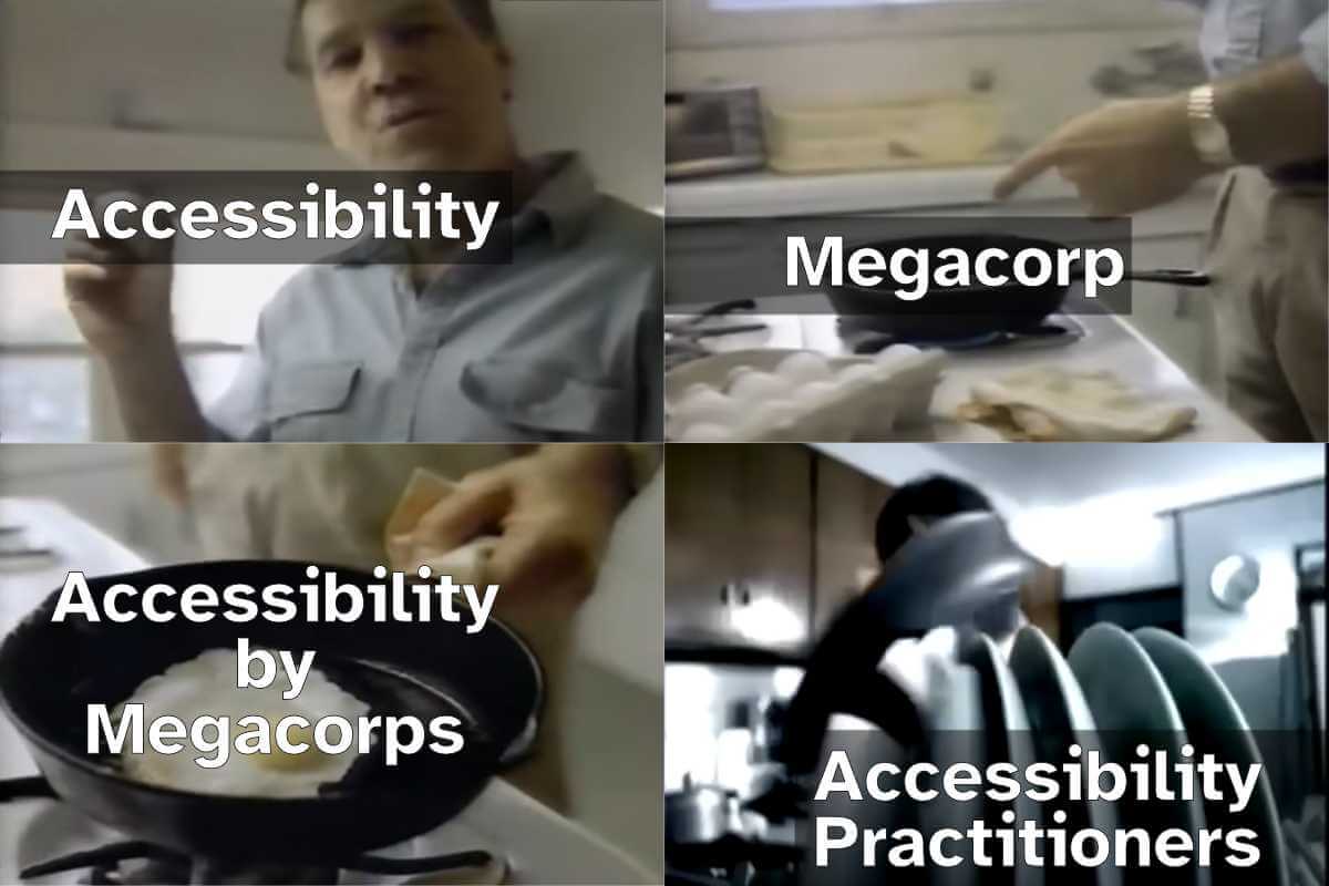
I want to discuss accessibility because it is the most important thing for making websites. Other A List Apart articles give you innovation and insight. This article will give you homework. These are just my personal views, but they’re pretty good.
I want to start off with a couple of statements, and you will agree:
Designers are good people. I have never heard a designer say, “I don’t care if somebody can’t read this text”, “Not my fault if somebody can’t use this device”, or “Who cares if this is confusing?”
Some designs exclude people. You have seen people unable to read the text on a website or app that somebody designed. You’ve seen people unable to use a physical device that somebody has designed. You’ve seen people utterly bamboozled while trying to use a service that somebody designed.
So what?
The first question is, “Is this life-or-death stuff?” The answer is, “Yes.” In my favorite essay, This Is All There Is, Aral Balkan makes the point that pretty much everything that we design can affect life events and death events. Aral gives the example of how even a straightforward bus timetable app can affect life and death events, if we design it badly:
somebody might miss a life event, such as their daughter’s fifth birthday party; or
somebody might miss a death event, such as the chance to say goodbye to a dying grandmother.
The next—and frustrating—question is, “Why do some designs still exclude people?” After all, we know that:
not everybody can see perfectly;
not everybody can hear perfectly;
not everybody thinks the same way; and
not everybody moves the same way.
I think the answer is that there’s too much to recall. Consider, if you will, the wide variety of topics that A List Apart articles cover. Designers are expected to remember all of that guidance, plus all of the accessibility guidance, plus so much more. It is too much.
Recognizing accessibility issues while designing
I’d like to point toward one possible solution, starting from Jakob Nielsen’s 10 Usability Heuristics for User Interface Design. These are from the mid-1990s, and—although there’s a good chance that you, gentle reader, are a lot younger than that—please bear with me.
Seeing as the problem is that there’s too much to recall, I want to look at heuristic № 6, “Recognition rather than Recall.” Jakob Nielsen said that for users, information required to use the design should be visible or easily retrievable when needed. I suggest we tweak that to make life easier for designers. Let’s say that the information required to produce the design should be visible or easily retrievable when needed. In other words, let’s make it easier to recognise accessibility issues while we’re designing.
Vishnu, an engineer and global citizen with low vision says, “I want to be on the same level as everyone else”, “If I can adjust my screen, I can read comfortably”, and, “Translating in my head is easier with simpler sentences.”
Trevor, a high school student with autism, says, “I like consistent, familiar places on the web”, “When I can learn the pattern, I can find my way”, and, “Reading is hard for me”.
Maria, a bilingual community health worker, says, “I love this. It’s all here … when I can find it”, “When a site is confusing, I just leave”—fair enough, Maria!—and, “When I hear and see it, health information makes more sense”.
Lea, an editor living with fatigue and pain, says, “No one gets that this really is a disability”, “Don’t make me work so hard”—please do not bombard this lady with drop-down lists—and, “Links at the top of the page make navigation easier for me”.
Carol, a grandmother with macular degeneration which affects her sight, says, “My grandkids are dragging me into the world of technology”, “I don’t understand what the screen is saying”, and, “Why can’t the text be just a little bit larger?”
I want to throw one more persona at you now, because, well, A List Apart readers are overachievers. One of my favorite authors, Cennydd Bowles—who literally wrote the book on Future Ethics—says to create Personas Non Grata. In other words, every time we design something, we have to think about what a bad guy could do with that thing, and whom that might affect.
To actually use these personas while designing, I like what Eric Meyer and Sara Wachter-Boettcher in Design for Real Life call the Designated Dissenter: for each project that you work on, one of your teams should be responsible for asking, “Will this work for Vishnu?”, “How’s Trevor going to get on with this?”, and so on.
Then, once you’ve used the personas to recognise the accessibility issues, you can look up the guidelines for whichever platforms you’re designing for:
I told you in the introduction of this article that I would give you homework. You thought I was joking. So, here’s your homework: I want you to grab the personas from the Know About Accessibility website, and use them throughout every design project to help you recognise accessibility issues while you work—and reclaim design for everyone.
For years I have seen people, teams, products, organizations, and projects promoting APCA contrast as the WCAG3 color contrast algorithm. In many of those cases, those same actors have suggested dismissing the contrast algorithm in WCAG2.
This kind of problematic advice happened so often that I started filing issues with tool makers to remove APCA, as with this May 2024 Chromium issue.
In January 2025 I saw a post promoting that advice, which would create legal risk for anyone following it. You can see my original 2025 response on Mastodon and the same post on Bluesky, where the creator of APCA also weighed in. Read those to ensure you aren’t just taking my word for it.
Current Situation
Here is the most current (as of this writing) contrast ratio algorithm in WCAG3 with the salient bit highlighted:
contrast ratio test Exploratory
meeting a sufficient level of contrast between two colors using the relationship of hue, saturation, and lightness values
Editor’s note
The contrast algorithm used in WCAG 3 is yet to be determined.
APCA was marked for removal in early 2023:
Exploratory content that does not gain WG support to proceed to the next stage within 6 months is automatically removed in the WCAG 3 development process. We still hope the promising contrast work will continue to mature for potential later inclusion.
As with other WCAG3 ideas that did not get working group support, the working group pulled it from the July 2023 WCAG3 working draft. APCA was only ever exploratory, and the W3C’s July 2023 update explained removal of exploratory items. The APCA creator’s response to Michael Cooper’s comment acknowledged that APCA versions in the draft were all early versions that were very obsolete (emphasis theirs).
I have no idea if APCA, whatever version, will come back to WCAG3.
What to Do?
You can still use APCA (whatever version). If you do, limit your risk by taking one of these approaches:
Choose colors that also conform to WCAG2 contrast requirements; or
If you pick colors that fail WCAG2 contrast requirements, document it and have a ready response should you receive a drive-by lawsuit from a bad actor using an automated checker to find a contrast violation (assuming your attorney lets you do this).
I am still not a (bird) lawyer.
In the meantime, WCAG3 is years away from being done, perhaps 2030 at the soonest. Any contrast algorithm it picks won’t be final until at least then. But if you like whatever is proposed and want to use it before 2030, then probably refer to my two approaches above.
Hey, Alphabet or Google or Chrome or whomever in that illegal monopoly continues to release things to the web platform that are full of accessibility barriers, I have what I think is a straightforward request.
My Request
Please, if your team cannot explain how the thing satisfies all WCAG Success Criteria at Level AA, then don’t release the thing.
If the thing is a new feature for the web platform (HTML, CSS, ARIA, SVG, etc.), then don’t even propose the thing until you have its WCAG conformance sorted.
Then understand WCAG is the bare minimum, is only table stakes, and does not in itself guarantee the thing is accessible. Which means be prepared for the thing to still contain barriers that must be addressed before it goes any further. Which means you’ll field some questions.
Blowback
I’ll run with two examples lead by Google in the web platform standards world, one older and one recent.
In late 2024, doing an end-run around the HTML spec and the concept of separation of concerns, Google drove carousels in the CSS Working Group. Then accessibility experts got wind of it and weighed in (more than just the once), only to get no traction.
Both of these book-end five years of a consistent experience for me (15 years based on posts linked below). Accessibility experts and disabled users (and the wonderful overlap of both groups) are not consulted at the start. Not in the scoping, not in the research, and not even in traditional shift-left-but-not-left-enough design phase.
Instead, we stumble across these things. We raise alarms or concerns or questions and are seen as buzzkills. Fun police. Hindrance to progress. We flag barriers and are ignored or dismissed or even harassed. And when the project inevitably catches fire, despite claims accessibility is baked in or the assertion it’s only a beta, we are told we didn’t weigh in early enough. We didn’t donate enough time. We didn’t participate in whatever opaque process in our copious free time.
Of course, ableism makes it easy to forget that accessibility experts and disabled users are already under a constant DDoS attack for our attention, never mind dealing with a US federal government that wants us to go away. I know I said I’m good at being a party-pooper, but I don’t want to be. It’s draining. And frankly, Google, it’s your fault (though not yours alone).
Google launched Designcember to promote its work on container queries and other technologies, but failed to support its own developers to ensure the site is accessible. Which I called out. And for which my free labor was requested to QA its fixes, but I did turn it into a teachable moment.
Google Chrome’s developer outreach site, Web.dev, shared how to build an accessible <tool-tip> custom element. If you followed its advice you were guaranteed a SC 1.4.13 WCAG violation. Never mind translation issues, misunderstanding of how <abbr> is exposed, a conflation of accessible name and description, and an enforced inability to select text. 2½ years on, other than moving my bug report to a new tracker, neither Google overall nor the author has made any effort to fix it.
Google has updated Material Design to “Expressive” and, in a repeat of its tendency for confirmation bias with Material UI efforts, seems to again engage in lackluster research.
Using Open-UI as a vehicle for “spitballing,” Google suggests using menus for navigation, for which I am thankfully able to jump in and throw warnings, including references to material that Google should have uncovered in the barest due diligence. I grump about this on the socials.
Google releases its AI Edge Gallery native app for Android, which allows users to generate image descriptions, transcripts, and more, but does so without any support for TalkBack. As Devin Prater points out, Google knew about this 3½ months ago and did nothing.
Wrap-up
Do you work for the company that formerly claimed it wouldn’t do evil? It sucks if you take this as a personal attack. It’s not. Your employer is simply doing a terrible job of supporting you in your efforts to support disabled users. If you want to be angry or frustrated, be angry or frustrated at the multi-billion dollar company that keeps throwing up barriers instead of spending a negligible amount of money to get experts and users involved.
It’s a paycheck that puts food on the table. I get that. Take its money and do what you can.
If you work for not-Google, like, say, Apple or Microsoft or Meta or Adobe or whatever, don’t be smug. If I had the energy I could take all of your employers to task for similar, egregious violations of user trust.
I did this rant in only one thousand and seven words!
Eric Bailey made a point about conference-driven development, essentially rushing broken or half-baked features out the door so the megacorp would have something to reveal on stage.
I think he was right. On 21 May, CSS carousels featured at Google I/O. The comparison example was Elementor, which ignores the more compelling question (to me) of why Elementor needed 165kb of JavaScript for a carousel. It also ignores the very real risk of WCAG violations and the larger question of why Elementor would make such profound claims when only one browser supports the feature.
Also consider the follow-on comment from the Google presenter, that the CSSWG is already looking ahead to exploring things like bringing your own custom elements for buttons and markers and native cyclical scrolling. The CSSWG may be the vehicle where Google continues to exert its dominance over web standards, separation of concerns and accessibility be damned.
Update: 6 June 2025
David Bushell highlights something with which I agree and which I don’t think gets enough attention — ::pseudo-elements?.
He points out it’s a clear violation of separation of concerns (which should sound familiar) and reminds of localization risks (something I would think a Working Group would consider). Google’s rush to market has left many obvious gaps, and I rather hope Google stops doing that seemingly every quarter / conference cycle.
In The Need for Accessibility Excellence, Devin Prater points out Gemini’s accessibility failures on Android (versus iOS), significant gaps in TalkBack, frustrations with Google Play Books, hassles with Gmail on Android, barriers in gaming on Android, and the seeming abandonment of Accessibility Tags in Google Play.
This isn’t about pointing fingers or assigning blame. It’s about recognizing a pattern of inconsistency and demanding a higher standard. How can we expect small companies or indie developers to make their apps accessible, when we can’t get Google to listen to us and take us seriously?
And that’s the thrust of it. When developers continue to justify their decisions because Google did it, that lowers the experience for everyone.
I posted something on Mastodon that uses Unicode math symbols to produce fake bold and fake italic text. I used YayText.com to generate it, but I am not linking it because you I don’t want you to use it.
NVDA 2024.4.2 / Firefox 135. Doesn’t announce the fake bold nor fake italic.JAWS 2025 / Chrome 133. Announces each fake bold and fake italic letter individually, including its case and style.
Those two videos account for ~78% of primary screen reader use. You could stop there and you’d have a good sense of the divergent experience and how it doesn’t match up with the visible text as you might expect.
This is not new information. I was raising this as a concern back in 2018 when Twitter was not yet a Nazi bar.
I know it’s easy to want to blame screen readers. That reflex, however, is a mistake. Instead, as an author you have some responsibility here.
VoiceOver / macOS 15.3.1 / Safari 18.3. Doesn’t announce the fake bold nor fake italic.Narrator / Windows 11 24H2 / Edge 133. Doesn’t announce the fake bold nor fake italic.
I’m using default settings. Some users will have different settings, but understand screen reader users have the same range of skill & experience with their kit as everyone else has with their own kit.
Try with your built-in screen reader. You have one built into whatever system you are using to read this post (unless you printed it to dead tree pulp, like a boss). If you are unfamiliar with the commands, such as starting it or navigating, I have some screen reader documentation and resources.
VoiceOver / iPadOS 18.3.1 / Safari. Doesn’t announce the fake bold nor fake italic.TalkBack 15.2 / Chrome 133. Announces the fake bold and fake italic as if it is regular text. TalkBack started doing this in 2021.
I’ve shared six screen reader experiences.
The takeaway should be do not use sites like YayText to make fake bold or italic text (whether on Bluesky, LinkedIn, that Nazi bar, that other Nazi bar, or the yet other Nazi bar, etc.).
If you’re a tester, you may see the speech logs show the characters. These are lies because that doesn’t mean they are announced.
For comparison, this is what it would look like if it was marked up using HTML (and yes, some Masto instances support this) instead of math symbols:
Please do not eat the shrimp scampi in the fridge. It is tasty but will kill you.
Actually, you don’t have to imagine. I recorded the behavior in 2021. It’s not much different today and the examples above will help you guess even if you don’t read that post or try it yourself.
Update: 9 March 2025
This post landed on Hacker News, with the standard mix of comments from people who read the post, mis-read the post, didn’t read the post, think they know “the fix,” know better, and generally debated the nature of their debates.
I've already written about the
<details> and <summary> elements, but there is more to tell, and there have been some changes since I last wrote at length about them in 2018.
<details> and <summary>
HTML’s <details> and <summary> elements can be used to create native disclosure widgets - an expand/collapse widget where more information or interactive controls related to a topic (identified via the subtree content of the <summary>, or text preceding the disclosure widget) can be found. These native disclosure widgets function without JavaScript, unless you need to support legacy browsers. Yes, IE11 is no longer supported, but that doesn’t mean it’s been erased from existence. Do what’s necessary for your users.
HTML classifies both elements as “interactive elements”. The <details> element serves as the containing element for the widget, though it is not expected to be directly interacted with by users. Nor is <details> generally expected to be exposed to assistive technologies. The open attribute of the <details> element is used to modify the expanded or collapsed state of the widget. When present it represents the widget being in the expanded state, and when absent the collapsed state. While the attribute is used on the <details> element, the state is programmatically communicated by its required <summary> element.
The <summary> element, the only child content of the <details> that will be persistently visible regardless of the widget’s state, acts as the disclosure widget trigger. It serves as its “legend” or “caption” as a means to represent the further contents of the <details> element. Interacting with the element will toggle the open attribute of its parent <details>. Generally, the <summary> element will expose an “expanded” or “collapsed” state, correlating to the open attribute existing or not on the parent <details>, and thus programmatically conveying whether the associated content is shown or hidden.
The <summary> element is ‘supposed to be’ exposed to assistive technologies as having a “button” role. However, its role may also be announced as “summary”, or even as a “disclosure triangle” because that’s a choice someone made on purpose… and even sometimes (unfortunately) no role at all. How it is exposed is contingent on the platform/browser and screen reader pairing. More on this later.
The following is an example of a <details> and <summary>.
Learn how the <summary> element is exposed to AT:
Depending on the screen reader and browser pairing you may be using, the <summary> element would have been exposed in one of the following ways:
"Disclosure Triangle" with Narrator, VoiceOver and TalkBack when paired with Edge/Chrome.
"Button" with NVDA when paired with Firefox, Edge or Chrome.
"Summary" with VoiceOver when paired with Firefox or Safari.
Bugged behavior or no role announced with TalkBack with Firefox or iOS VO with Safari, respectively.
You don't need to have a <div> as a sibling element to the <summary>. I just like to add it for styling purposes. <div>s are fine if used appropriately, after all.
A summary, whether you want it or not
Browsers will automatically add a <summary> element as the first child element of a <details> if it was not explicitly added. The subtree for this overlooked <summary> would contain the localized fallback text of “details” (which would be the <summary> element’s accessible name). The following disclosure widget demonstrates this error correction:
Additionally, a <summary> is supposed to be the first child element of a <details>. However, if you were to do something like the following:
<details>
I'm putting content here even though the summary
is supposed to be the first element.
<summary>
I'm out of place, but I won't stay that way
</summary></details>
Browsers will render the <summary> as the first element anyway, mitigating one’s inability to follow very simple markup instructions.
Styling a disclosure widget
The <details> and <summary> elements are fairly flexible with their styling. You can even remove the UA styling for the default triangle icon.
Then, for example, a new icon to visually indicate state could be added via pseudo-elements, or adding in your own image, or whatever. You do you. Just remember that the <summary> already (mostly) indicates the expand/collapse state. So if you use an inline graphic (image, SVG, font-icon, whatever), it should be treated as decorative. More on this later.
Impact of removing the default disclosure triangle
It’s worth noting that with Firefox in particular, it exposes the default disclosure widget triangle marker as part of the <summary>’s accessible name. This can lead to some ‘interesting’ (ridiculous) announcements such as “black pointing small triangle” being part of the element’s accessible name. And here’s the Firefox bug I filed for this silliness.
If removing this marker so you can insert your own custom chevron or other visual expanded/collapsed state marker, it will actually make the state of the widget unclear with Firefox and VoiceOver, since the announcement of the default triangle direction is the only way state is communicated in that pairing.
Cool.
However, Firefox and VoiceOver alone is not the only pairing that is impacted by the removal of the default triangle marker. VoiceOver, JAWS and NVDA all have an issue with consistently announcing the toggled state of the disclosure widget if this marker is removed.
Something to keep in mind as you determine just how important it is to restyle an element whose semantics are, at least presently, semi-reliant on their default styling.
Special find-in-page behavior
Previously, when a <details> element lacked the open attribute, all of its descendant elements, except for the <summary> element, would be completely hidden to all users. That has changed. Now, if a user performs a find-in-page (e.g., Ctrl or Command + F keys) when using a Chromium browser, then the content of these disclosure widgets can become discoverable.
Give it a try. Search for the word “heyo” if you’re using Chrome or Edge. The following <details> and <summary> will automatically open:
Search for "heyo" instead of toggling me!
Heyo! You found me (maybe... 'it depends™').
A common criticism of disclosure widgets is that they make the discoverability of information difficult, and this find-in-page reveal helps mitigate that criticism. It would be nice to see this get implemented in Firefox and Safari as well.
Consider this find-in-page feature before thinking you might use a <details> and <summary> as the foundation for other command-centric (navigation or menus) or dialog (especially modal) components. You probably don't want a disclosure widget of menu items, or a custom modal dialog to randomly open when performing an in-page-search.
Granted, you can get around this by making sure the non-<summary> contents of the customized <details> are set to display: none or visibility: hidden. I mean, with enough time and effort, one can suppress enough of the native functionality and implicit ARIA semantics of the <details> and <summary> elements, and mold them into some other component entirely. But, generally the amount of effort this entails can be equal to or greater than just creating a more traditional JS-based control, or using other HTML features like the <dialog> element.
Oddities and further accessibility information
It may be of little surprise to you that the <details> and <summary> elements do have accessibility quirks, especially since I already talked about some of them. But being aware of these can help you avoid possible accessibility issues. Some of these quirks are a result of misuse/bending of the element’s purpose, while some are surfaced due to valid use of the elements.
Consistent role announcements? Just be aware…
As mentioned, the implicit ARIA semantics for the <summary> element (e.g., the role that is exposed) is a bit varied. One might think to “fix” this by specifying a role=button on the <summary> element. Doing so would forcibly expose it as a button on all platforms.
However, if one were to do that, macOS Safari would treat the element as a standard button and the expanded/collapsed state would be dropped. This would also impact any instance that had a heading nested within the <summary> element. The role=button of the <summary> element would cause the nested heading semantics to be dropped with macOS Safari. Adding the role would at least make iOS VO announce a role for the <summary> element, but would still do nothing to mitigate the lack of iOS announcing state.
If your goal is to create an absolutely consistent disclosure widget behavior across browsers, i.e., ensuring that all <summary>s are exposed as expand/collapse buttons, then you’d be better off creating your own using JavaScript and the necessary ARIA attributes. You’d lose out on the find-in-page functionality that the native disclosure widget provides… but depending on the type of disclosure widget you’re creating, you may actually want that. You can check out my GitHub repo for an ARIA disclosure widget I created, or check out the examples on the demo page. Or, go look at the ARIA Authoring Practices disclosure widget examples. Or, the tons of other show/hide buttons that people have made over the years.
In the future the `hidden` attribute will hopefully (likely?) have wider support for the until-found value. This would allow authors to effectively create native <details> and <summary> behavior with ARIA and JS-powered disclosure widgets, if they so chose.
Giving detail to <details>
As mentioned, the <details> element isn’t really meant to be exposed or interacted with directly. But hey, maybe you have different ideas?
Well, if you decided to name a <details> element, you’d generally find that a details or group role would be exposed (note one of those is a valid ARIA role, and the other is merely the element’s tag name being conveyed as its role). Naming the <details> would result in no other noticeable impact to the <summary> element’s exposure to the tested screen readers. With TalkBack and Edge/Chrome, the name, let alone the existence of the details/group role was not announced. That’s not a big deal though… especially since naming the <details> element is something you probably shouldn’t be doing anyway.
The great thing about browsers is that they will correct for many author errors to help ensure that a web page will render, regardless of invalid HTML markup. The not so great thing about browsers is that they will correct for many author errors to help ensure that a web page will still render, regardless of invalid HTML markup.
A <summary> element is only valid as a child of a <details> element. Additionally, only a single <summary> is valid within a <details> element. However, if a web developer were to do the following (and they have):
<details><summary>I'm valid</summary><summary>I'm not... why the hell am I here?</summary>
...
</details><!-- or --><div><summary>Sumdivery?</summary></div>
Browsers would parse the above, silently groan (yes, browsers judge you) about how often people mess up the fundamental programming language of the web, and then mitigate for this lack of knowledge and figure out the best way to render the invalid content. For instance:
The following demonstrates the output of the invalid markup in the previous code snippet.
I'm validI'm not... why the hell am I here?
...
Sumdivery?
Browsers correct for the double <summary> elements within the <details> by only using the first <summary> for its intended purpose, and then including the second element as a part of the collapsible content of the widget.
Both this secondary <summary>, and the one placed outside the context of a <details> are visually rendered as static text and may still be rendered with a list marker, making it appear as a single item within a list.
Oh. But, I said “visually rendered” there. That was important.
In Chromium browsers the errant <summary> is exposed as a generic element. Which makes sense since it is not an interactive element.
Firefox and Safari, however, do not presently modify the exposed role of the element. So, while the <summary> is no longer keyboard accessible, AT will still expose it as if it was an interactive element. This HTML AAM PR and the browser bugs linked within will hopefully rectify this relatively soon.
<summary> can have nested interactive elements and headings
So if you’ve heard anything about accessibility quirks with <details> and <summary> elements, this is probably the topic that gets brought up the most. The HTML specification indicates the allowed content model for the <summary> element allows for phrasing content with optionally intermixed heading content.
Phrasing content includes various interactive elements such as <input>, <textarea>, <button>, <a href>, etc., and heading content - as the name would suggest - includes <h1> to <h6> elements, as well as <hgroup>.
While HTML allows such elements within a <summary>, there is an open issue about whether or not it should. Since I’ve responded to that issue with a wall of text, I don’t think I need to re-get into it here. But the gist is that, as mentioned, <summary> element mappings are messy and part of the reason why nested headings and interactive elements are not consistently exposed. Safari, Firefox and Chromium browsers all treat nested interactive elements a bit differently - as outside their use in <summary> elements, it’s invalid HTML to nest them. And because <button> elements - or elements like <summary> that are supposed to map to role=button are supposed to treat child elements as presentational, this is why headings or other elements with semantics important to accessibility are not consistently exposed.
It’s honestly a very messy issue with pros and cons all over the place concerning what could be done. We’ll just have to see how that all pans out and in the meantime, people should just realize that just because something is allowed in HTML, that doesn’t mean it’s going to be a good idea for all users. As another example, allowing <a href> elements to wrap all sorts of things. I’m not going to even get started on how awful that can be…
Creating an ARIA disclosure widget
OK, so you’ve decided that you want to roll your own disclosure widget because you’re now fully up to speed on how <details> and <summary> are weirdos with some issues they need to work out.
To create your own custom disclosure widget, you would essentially need a <button> element, an element to serve as your content “container” and then a few ARIA attributes to communicate the expanded and collapsed state.
For instance, a very basic widget could be made with the following markup:
<buttontype=buttonaria-expanded=true|false>
My trigger's name
</button><divclass="dw-panel"><!-- content goes here! --></div>
A minimal script to toggle the content would be as follows:
Being a custom widget, styling is also as intricate or bare bones as you require. Per the above markup and scripted behavior, and without introducing anymore complexity than necessary, the following style selectors can be used and expanded upon.
button[aria-expanded]{/* style as you see fit */}button[aria-expanded=false]~.dw-panel{display:none;}
An important note about rolling your own disclosure widget!
Depending on the situations your disclosure widget might be used in, you should strongly consider creating such components with a progressive enhancement mindset.
For instance, if you are going to use disclosure widgets on a web page that a user could parse via a browser's reader mode, then you should ensure that your <button> and especially its aria-expanded state are provided by your JavaScript.
The reason for this is because in a browser's reader mode, all your styling and JavaScript is dropped, but your markup generally remains. So if you have a hard coded <button aria-expanded=false>, then that can still be presented in the reader mode version of your web page.
What is especially important here is also to avoid hard coding the hidden attribute for your custom disclosure widgets. It too will be respected in reader mode, so if used on your disclosure widget content panels, then that content will not render in reader mode.
The <details> and <summary> elements continue to function in a browser's reader mode.
Also, notice the lack of aria-hidden=true on the containing element for the content that shows/hides. display: none already hides the content from assistive technologies, which would mean using aria-hidden=true on the .dw-panel would not only be useless, but introduce a potential for inaccessible content were the CSS of the page to be blocked somehow, as then the content would be visible, but not readable to assistive technologies.
Other disclosure widget options
To more clearly expose the boundaries of a disclosure widget to users of assistive technologies, the content container can be provided additional ARIA attributes which AT may use to convey ‘start’ and ‘end’ boundaries of the content.
For instance,
<buttontype=buttonaria-expanded=...id="dwtrigger">
Example name
</button><divclass=dw-panelrole="choose your role"aria-labelledby="dwtrigger"><!-- content goes here! --></div>
A role attribute can be used to expose the content container as a particular type of document structure or landmark element.
The type of role you choose will be contingent on the importance and type of content the disclosure widget represents. For instance, you might use a group, region, article, or even a note role. For simplicity’s sake, let’s use the region role for this example. The region role representing a generic landmark element, so the assumption here is that this exposed content is important to call out and allow someone to quickly navigate back to, via screen reader landmark navigation commands, as necessary.
The region can be named by use of aria-labelledby, where the value of the attribute would be the id of the <button> element.
A user expanding this disclosure widget and then entering the expanded contents could then be met with a “start of example name, region”. And when they are leaving, they might hear something along the lines of “end of example name, region”.
OK, I think I’m done for now
So, this probably came across as me being down on <details> and <summary> which is unfortunate because I actually rather like the elements and outside of some current bugs - content model aside - they’re just so convenient to use.
For instance, here’s a very basic example of using them to create form group sections that can expand/collapse.
With that said, I don’t have a neat little bow I can tie this whole thing up in. <details> and <summary> elements are complicated. Saying don’t use them isn’t really practical and there’s a lot of good things about them. But they do have bugs. I filed some. It’d be great if other people would file some too!
It really just all comes down to what sort of experience you want to provide to people, and how OK you might be knowing that the native elements are going to be exposed differently, have different gaps but also different features to them. Or, you can roll your own disclosure widgets and provide a consistent experience that you are fully in charge of… but it may not be as feature rich as what the browsers could provide, and your disclosure widgets need to degrade gracefully if viewed in a browser’s reading mode.
The decision of what you do is up to you. At least now, hopefully you have enough information to help you make it.

 Connexion

 You can still use APCA (whatever version). If you do, limit your risk by taking one of these approaches: