❌

Vue lecture

Test et avis de Shadow House Mascarade
Shadow House Mascarade jeu

Test et avis de Shadow House Mascarade d’EmperorS4 chez Blue Orange

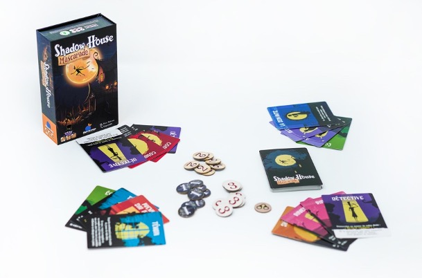
Shadow House Mascarade est un jeu d’EmperorS4, illustré par l’auteur. De 3 à 8 joueurs/joueuses à partir de 8 ans pour des parties de 15 minutes. Édité par EmperorS4 et localisé par Blue Orange. Disponible depuis octobre 2024.

Synopsis

Vous êtes invités dans un manoir pour un dîner entre aristocrates. Tout ne se passe pas comme prévu car le Vicomte Shadow a été tué. Le majordome a bouclé toutes les issues. Saurez-vous démasquer le coupable à temps ? Ce dernier parviendra-t-il à ne pas se faire attraper ?
Test et avis de Shadow House Mascarade

Comment jouer à Shadow House Mascarade
Test et avis de Shadow House Mascarade

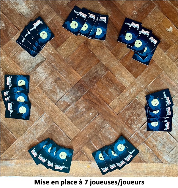
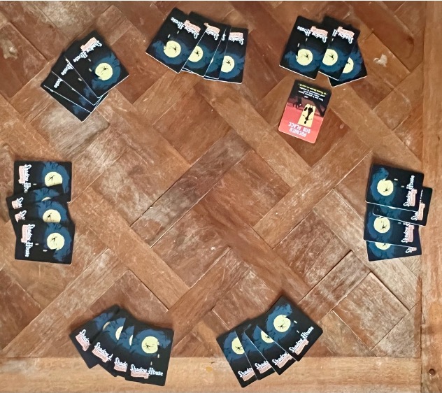
Celui ou celle qui a reçu la carte Premier sur place ouvre le bal et la pose face visible devant lui.

Test et avis de Shadow House Mascarade

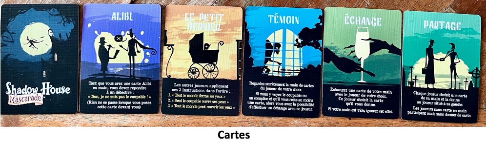
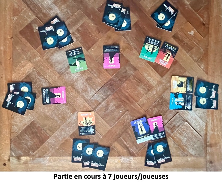
Dans le sens horaire, les autres joueurs/joueuses vont chacun leur tour placer une carte de leur main, face visible, devant eux, en lisant l’effet indiqué. Il est ensuite appliqué.
Test et avis de Shadow House Mascarade

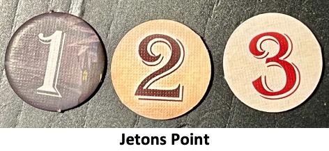
La manche prend fin lorsqu’un joueur pose sa carte Détective devant lui tout en identifiant le coupable. Il gagne ainsi 2 points.

Test et avis de Shadow House Mascarade

Tous les joueurs/joueuses n’ayant pas de carte Coupable ni de carte Complice gagnent 1 point.
Test et avis de Shadow House Mascarade

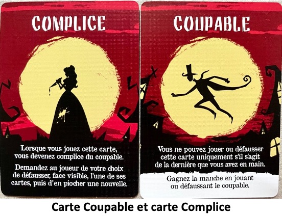
Cela ne fonctionne pas s’il a une carte Complice posée devant lui.

La manche peut prendre fin également si l’un/e de vous joue la carte Toby et révèle le Coupable. Il gagne ainsi 3 points s’il n’a pas de carte Complice devant lui. Les autres gagnent 1 point à l’exception Coupable et des Complices.

Test et avis de Shadow House Mascarade

Si la dernière carte que vous jouez est la carte Coupable, vous gagnez la manche. Vous récupérez 2 points ainsi que vos Complices.
Test et avis de Shadow House Mascarade

La manche prend aussitôt fin quand un joueur Coupable reçoit un jeton Menottes. Il révèle alors sa carte. Lui et ses complices perdent la manche. Les autres joueurs gagnent un point chacun.

Test et avis de Shadow House Mascarade

Vous voilà prêts pour jouer une nouvelle manche.

Fin de partie

Dès que l’un de vous possède au moins 5 points la partie prend fin. Celui/celle qui possède le plus de points remporte la partie.

Si égalité, la victoire est partagée.
Test et avis de Shadow House Mascarade

Mon avis sur Shadow House Mascarade

Shadow House Mascarade est un jeu d’ambiance, de cartes, à identité secrète et à rôle changeant, de déductions, de bluff, avec une forte interaction. Votre objectif : trouver le meurtrier du Vicomte Shadow. La mise en place est rapide, adaptée en fonction du nombre de joueurs/joueuses. La transmission des règles du jeu se fait en 5 minutes.

Le jeu est très accessible, les tours de jeu sont rapides : à votre tour, jouez l’une de vos cartes en main (vous démarrez la partie avec 4 cartes en main). Appliquez ensuite l’effet de la carte jouée. Rebondissements et retournement de situation en perspective. Les cartes peuvent circuler et plutôt deux fois qu’une :-). Parviendrez-vous à ne pas perdre le fil, à garder une bonne lecture du jeu ?

Même si vous perdez une manche, rien n’est joué. Rattrapez-vous et tentez de marquer 5 points avant les autres joueurs (cf. article complet). Si vous le souhaitez, vous pouvez jouer une seule manche, la variante Enquête Flash, sans utiliser les jetons Point.

Le jeu fonctionne bien à 4 joueurs/joueuses, je lui trouve moins d’intérêt a 3. Plus vous serez nombreux plus le jeu gagnera en saveur ludique :-). Il n’y aura plus seulement qu’un seul Coupable car ce dernier sera accompagné de Complices. Ils perdront ou gagneront ensemble. J’apprécie particulièrement cette mécanique de rôles qui peuvent évoluer au cours de la partie. Il faut rester attentif à ce qui se passe autour de la table, car une carte jouée par un adversaire peut complètement modifier votre situation. Vous devrez donc essayer de mémoriser les informations disponibles tout en évitant de donner trop d’indices sur votre propre rôle. À plusieurs, les interactions deviennent encore plus intéressantes. Avec les Complices, il ne suffit plus uniquement de penser à sa propre victoire : certains joueurs/joueuses devront également veiller à la réussite de leur camp. Cela apporte une petite dimension de coopération temporaire.

Il y a 16 types de cartes différents, de quoi proposer des parties différentes et de renouveler les effets et les situations rencontrées autour de la table. C’est d’ailleurs un jeu qui peut sans problème se voir agrémenté d’une petite extension en mode booster.

N’hésitez pas à y mettre un peu de role play pour ajouter une dose de rire supplémentaire.

Alors, qui a tué le Vicomte Shadow ?

Bon jeu à Vous !!!

Article de Benjamin Guimbert
Test et avis de Shadow House Mascarade
Shadow House Mascarade jeu
Test et avis de Shadow House Mascarade
90
  •  

Hexplorando nous fait reconstruire la planète tuile par tuile sur Nintendo Switch

Hexplorando Switch

Il y a des annonces qui passent inaperçues dans le vacarme de la pré-gamescom, et c’est souvent là que se cachent les jeux les plus attachants. Maximum Entertainment a levé le voile le 18 août dernier sur Hexplorando, un jeu de construction et de réflexion signé du studio indépendant Hexplora Interactive, qui propose ni plus […]

L’article Hexplorando nous fait reconstruire la planète tuile par tuile sur Nintendo Switch est apparu en premier sur Switch-Actu.

  •  

Pokémon Pokopia : Fonds-Bulleux, on replonge dans notre Poké-Vie – TEST

5 mois après la sortie du phénomène Pokémon Pokopia, la 1ère vague de son pass d'extension a vu le jour, promettant de nouvelles fonctionnalités sur le thème de la plongée sous-marine, ainsi qu'une toute nouvelle ville à explorer, Fonds-Bulleux. Un prétexte parfait pour relancer ce cozy game et de se plonger une nouvelle fois dans […]

L’article Pokémon Pokopia : Fonds-Bulleux, on replonge dans notre Poké-Vie – TEST est apparu en premier sur Switch-Actu.

  •  

6 Accessible Website Examples to Inspire Your Design

Accessible web design opens up a universe of possibilities where every user, regardless of their abilities, can easily navigate, interact, and appreciate your website. 

But why stop here? 

Achieving web accessibility isn’t merely a requirement by law; it’s a critical step towards improving user experience and amplifying your site’s engagement.

Creating an accessible website involves several aspects – optimal colour contrast, appropriate text size, and the use of semantic HTML, among other things. Although it may seem overwhelming at first, knowing where to begin is a challenge that we can tackle together.

In this post, we’ll go over the main areas to concentrate on when constructing an accessible website and discuss six exceptional examples of accessible websites, each illustrating best practices and serving as a source of inspiration.

First, the basics: the four principles of accessibility (POUR)

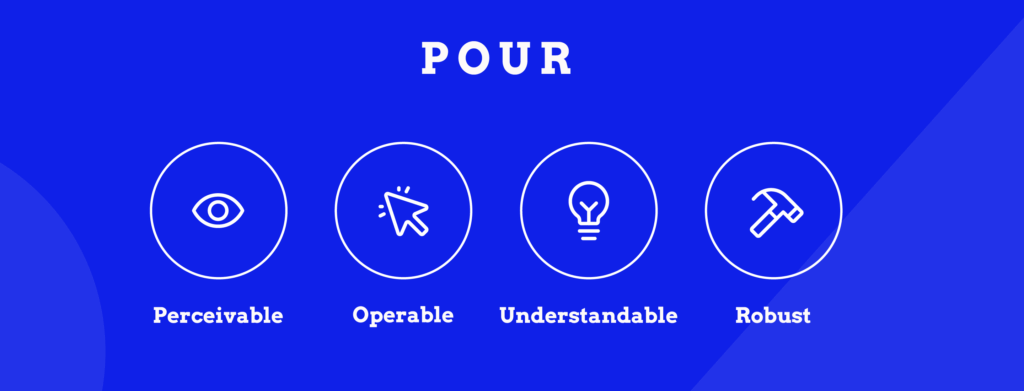
Illustration listing the four principles of accessibility explained below

Every accessible website is built on four core principles defined by WCAG. These form the foundation of web accessibility:

  1. Perceivable: Information must be presentable to users in ways they can perceive. If someone can’t see images, they need alt text. If they can’t hear audio, they need captions. Content can’t be invisible to all of someone’s senses.
  2. Operable: Users must be able to operate the interface. This means providing keyboard access, giving people enough time to complete tasks, not causing seizures with flashing content, and helping users navigate and find content easily.
  3. Understandable: Information and operation of the user interface must be understandable. Use clear language, make your site behave predictably, and help users avoid and correct mistakes.
  4. Robust: Content must work reliably with current and future technologies, including assistive technologies like screen readers, voice recognition software, and alternative input devices.

These four principles – Perceivable, Operable, Understandable, Robust (POUR) – guide every WCAG success criterion. When websites meet these principles, they work for everyone.

What makes a website accessible?

Since accessibility is centred around people, your first job would be to consider the wide range of potential impairments – from vision and hearing impairments to cognitive and physical disabilities. The goal is to create an inclusive experience for every user, regardless of their abilities.

When you test your website for accessibility, we recommend starting with the Web Content Accessibility Guidelines, or WCAG. Published by the World Wide Web Consortium (W3C), the WCAG provides a comprehensive set of recommendations for enhancing web content accessibility. 

The guideline identifies three conformance levels: 

  • A – Very basic accessibility compliance.
  • AA – The global standard everyone should adhere to.
  • AAA – The strictest requirements that aren’t necessary. 

Usually, legal accessibility requirements stipulate at least AA compliance; however, striving for AAA accessibility where possible can elevate the user experience considerably.

The WCAG guidelines cover a wide array of accessibility aspects, from visual design to navigability and coding semantics to input modalities. If you want to read more about them, go to the W3C website. 

For the site owners, web designers, and developers who are already interested in learning more about any of these specific topics or just web accessibility in general, our team at The A11y Collective has created a range of online courses for that very purpose.

Essential accessibility features at a glance

Here’s a quick reference guide to the main features that make websites accessible:

FeatureWhat it doesWho it helps
Alt text for imagesProvides descriptive text for imagesPeople using screen readers, those with slow connections
Readable textUses clear fonts, appropriate size, and spacingPeople with dyslexia, low vision, or reading difficulties
Keyboard navigationAllows full site use without a mousePeople with motor disabilities, screen reader users, and power users
Colour contrastEnsures text stands out from backgrounds (4.5:1 minimum)People with low vision, colour blindness, or viewing in bright light
Captions/subtitlesProvides text versions of audio/video contentPeople who are deaf or hard of hearing, non-native speakers
Consistent designKeeps layouts and navigation predictablePeople with cognitive disabilities, all users learning the site
Semantic HTML & ARIAUses meaningful code for assistive technologiesScreen reader users, keyboard navigators

Below, we’ll explore each of these features in detail with practical examples and implementation tips.

Alt text for images

This descriptive text helps relay the content of the images to users who may depend on screen readers to browse the internet. When crafting alternative text, focus on conveying the essential details contained in the image.

Keep in mind that the aim isn’t to provide an artistic critique of the image but rather to communicate necessary information to visitors who might not be able to visually perceive it. 

Let’s do this together.

 A boy sitting on green grass waiting for a dog.

Photo by: Matheus Bertelli

Which alt description do you think is better? 

  • A horizontal photograph of a small black-haired boy with a white shirt and short jeans, smiling with anticipation, kneeling in a patch of grass waiting for a little furry dog of unknown breed to meet him at his location. 
  • A boy sitting on green grass waiting for a dog.

If you said the second one, you’re on the right track. This simple, informative description allows visually impaired users an equivalent content experience to their sighted peers.

Readable and legible text

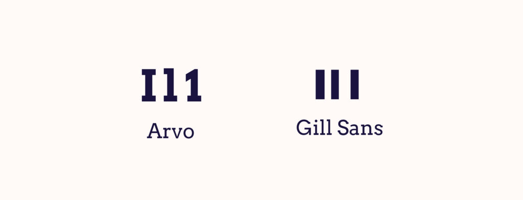
Websites, particularly ones dense with content, are more accessible and user-friendly when the text is concise. Fonts, text size, and line spacing are pivotal to the legibility of your content. Avoid fonts that may be challenging for some users to read, for example, ones with “imposter letter shapes”.

Example of a font with imposter letter shapes comparing the text "I L 1" to an accessible one. The inaccessible font, Gill Sans, shows the same stripe shape three times. The accessible font, Arvo, shows a distinctive difference between the three letters.
  • Use relative units like “em” or “rem” when specifying text sizes, typically keeping body text around 1em or larger. 
  • Appropriate line spacing can make blocks of text easier to read and less daunting.
  • Tooltips, which usually appear when users hover over or focus on a particular item, should have a background and text colour with high contrast. These design elements should never block essential information or controls and must be legible.

Keyboard-friendly navigation

In the pursuit of outstanding web accessibility, it’s essential that a website be fully functional via a keyboard. This allows users who are unable to use a mouse due to physical disabilities to browse your website without hindrance. 

Key navigation controls such as “Tab” to move forward and “Shift” + “Tab” to move backwards should be fully functional, enabling users to access all actionable elements like links, buttons, and forms.

Colour contrast

Adequate colour contrast between text and the backdrop aids visually impaired users, particularly those who are colourblind. High contrast levels between the background and text can greatly augment the visibility and overall accessibility of your website.

To ensure compliance with these, there are several tools, such as the WebAIM Contrast Checker and the Stark plugin for Figma, Sketch, and Adobe. These tools calculate the contrast ratio and indicate whether your chosen colour combination meets the required standards. 

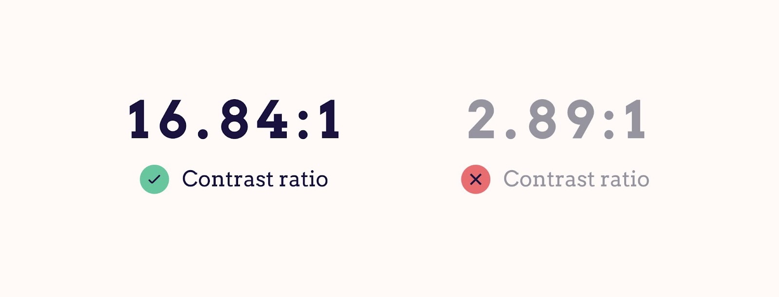
For instance, a colour combination such as black text on a white background gives a high contrast ratio, while light grey text on a white background would not meet accessibility standards.

Two examples of text with contrast differences shown. The first text has 16.84:1 contrast, compared to the background and is accessible. The second text has 2.89:1 contrast, compared to the background. This is inaccessible.

Captions/subtitles for videos

Besides being beneficial for those with impaired hearing, they also assist non-native speakers in understanding video content and cater to those eager to learn a new language. Similarly, users in a noisy environment or who prefer silenced videos can significantly benefit from this feature.

Consistency in design and navigation

Predictable and intuitive navigation accompanied by a consistent layout provides an exceptional user experience. This involves maintaining a familiar design across the site, using easily recognisable web design patterns such as commonly located search bars, and ensuring a proper hierarchical structure of headings is in place.

Semantic HTML and ARIA landmarks

Using semantic HTML – meaningful HTML elements that describe their function – enables viewers and screen reader users to better interpret different areas of your web pages. The use of heading tags, such as <h1>, <h2>, <h3>, etc., assists visitors and assistive technologies in skimming through different sections of a webpage.

Integrating Accessible Rich Internet Applications (ARIA) landmarks can markedly advance your website’s accessibility. These landmarks, through specially designed code, assist screen readers in providing additional context to users, thereby fostering better understanding and navigation. 

A prime example is using ARIA landmarks to label a search section on a website. By doing so, assistive technologies can quickly recognize this feature and guide users to it.For readers eager to delve deeper into ARIA’s details and practical implementation, consider signing up for The A11y Collective’s insightful course, “ARIA explained”.

Understanding the importance of website accessibility

Just as ramps and elevators facilitate physical mobility, web accessibility practices ensure digital inclusivity, making online content usable by all. Accessible web design benefits everyone – it encompasses a wide variety of needs and improves the user experience by considering the diverse range of site visitors. 

Web accessibility is particularly essential for users with disabilities who are part of one of the three main types of disability groups: permanent, temporary, and conditional/situational.

  • Permanent disabilities may include enduring visual, auditory, or physical impairments. 
  • Temporary disabilities could be short-term conditions like a broken arm affecting your ability to use a mouse or a scratched cornea impacting your sight. 
  • Situational or conditional disabilities refer to external factors that could affect how someone interacts with a website, like trying to view a screen in bright sunlight or attempting to browse while holding a baby.

Our goal is to make the digital space as welcoming as possible, no matter the circumstances of any individual.

Take, for example, a site incorporating simple, clear navigation menus: this small design choice eases the experience of all users, particularly those with cognitive impairments who may find complex navigation structures overwhelming.

It’s worth noting that good design is far more than just aesthetic appeal and fancy graphics. It’s about creating a platform that’s intuitive, enjoyable, and inclusive for everyone. 

How accessibility affects SEO and rankings

Search Engine Optimisation, more commonly known as SEO, relates to practices aimed at enhancing a website’s visibility on search engine result pages. Although accessibility is not a direct ranking factor for search engines, such as Google, it can significantly impact user experience signals that are central to SEO.

An inaccessible website may lead to higher bounce rates as users may quickly leave if they find it difficult to navigate or interact with the site. So logically, accessible websites tend to encourage more user engagement, signalling to search engines the value of the site to visitors. 

This sentiment is echoed by Google Search Advocate John Mueller, who stated:

Accessibility is something that is important for a website because, if you drive your users away with a website that they can’t use, then they’re not going to recommend it to other people.

Accessibility compliance and legal aspects

There are certain legal frameworks, such as the Americans with Disabilities Act (ADA), the European Accessibility Act (EAA), and the Accessibility to products and services directive, which require certain websites to comply with accessibility standards. This is to avoid legal complications and to ensure individuals with disabilities can access online information and services.

Despite these legal frameworks, the case for accessibility extends beyond mere compliance. Of course, the risk of legal repercussions may push certain organisations to prioritise accessibility, but the real prize is the ethical duty of providing equal access to all users. It’s about businesses recognising and validating the diversity of their audience and ensuring their digital platforms mirror these beliefs.

6 stellar examples of accessible websites

Theory is good, but it’s even better to see all of these tips in action. That’s why we’ve collected some of the best examples of websites that follow accessibility guidelines: 

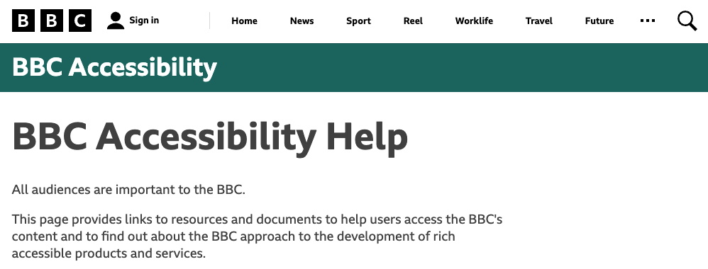
BBC

Screenshot of the accessibility page of the BBC.

BBC main website accessibility page

Emerging as a leader in the field of the digital inclusivity matrix, the British Broadcasting Corporation (BBC) exhibits a passionate dedication to making its digital services accessible to one and all. 

Their specific accessibility page provides a plethora of links to resources and documents to help users access the BBC’s content. This page is indeed a testament to accessibility in action.

The BBC also makes sure that all of their websites work well with assistive technologies to guarantee the best possible browsing journey for their audience. 

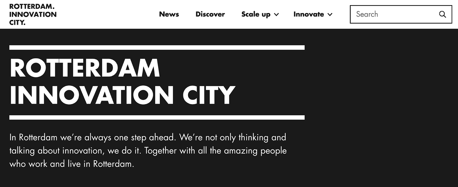
Rotterdam Innovation City

Screenshot of the homepage of Rotterdam Innovation City.

Rotterdam Innovation City website

Rotterdam Innovation City‘s seamlessly designed and keyboard-navigable website is a testament to its commitment to accessibility. 

Indeed, their masterful use of semantic HTML provides meaning to the web page content, ensuring users and screen readers alike can nimbly navigate through different website elements.

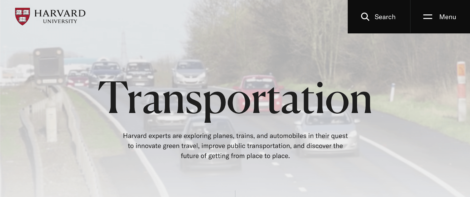
Harvard University

Screenshot of the homepage of Harvard University

As a reflector of its academic excellence, Harvard University ensures a hurdle-free digital experience. The University provides an array of reading tools, incorporates multilingual video subtitles, and has carefully botched its colour scheming to accommodate the needs of colourblind individuals.

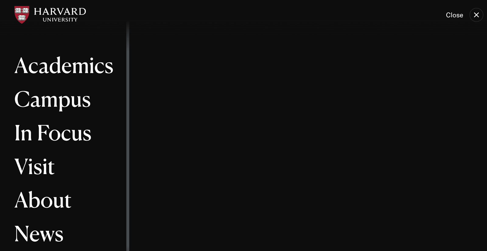
Their menu also reflects the simplistic but effective design of their website with a large and easy-to-read font and clear interface. 

Screenshot of the menu of Harvard University.

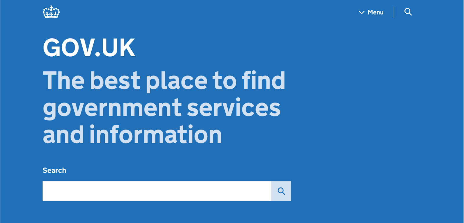
GOV.UK

Screenshot of the homepage of gov.uk

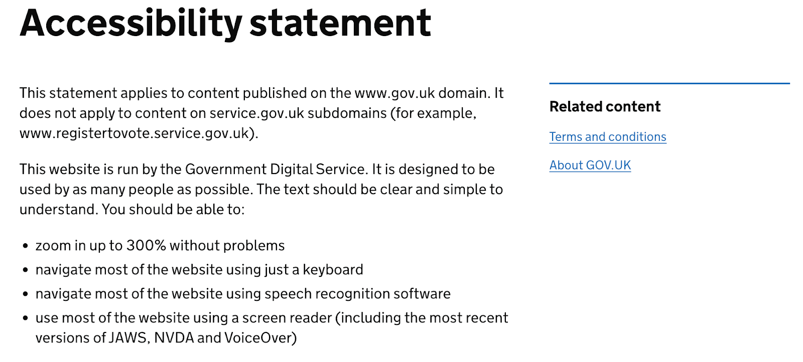
GOV.UK expertly demonstrates its commitment to digital inclusivity and accessibility. The array of accessibility features on its webpage, from clear content displayed with high contrast, consistent navigation, and support for assistive technologies through ARIA landmark roles to full keyboard navigation functionality, is impressive.

In their Accessibility statement, they also directly list all the features included in the website. 

Screenshot of the Accessibility statement of gov.uk

Additionally, they offer people the option to request any content in a different format best suited for them, such as plain text, braille, BSL, large print, or audio CD. 

Barclays

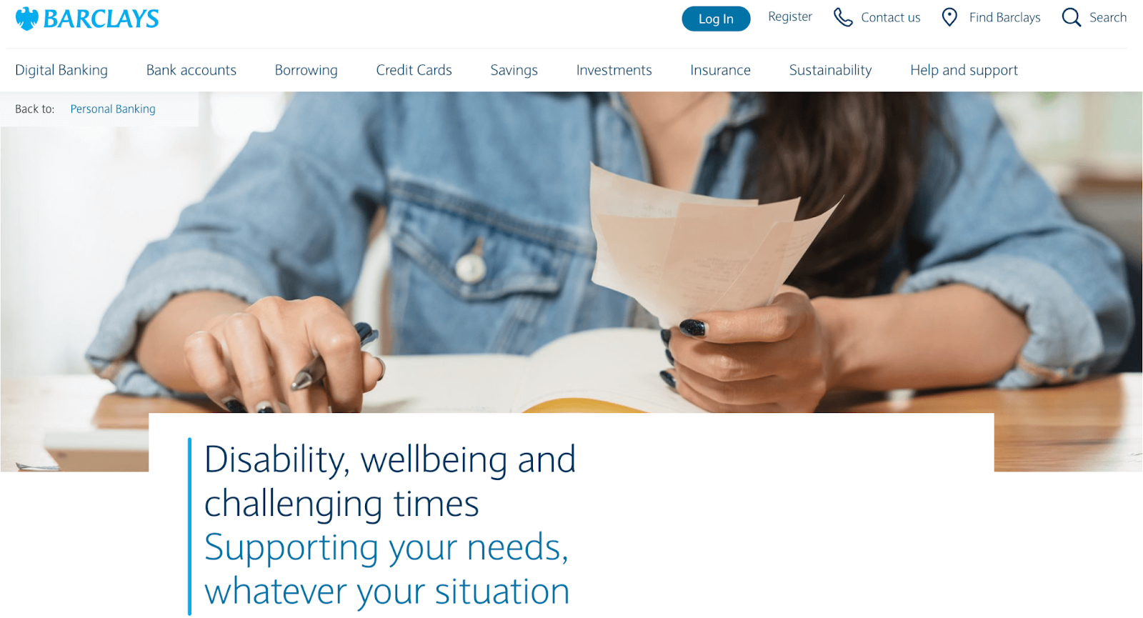
Screenshot of the homepage of Barclays

The digital version of Barclays mirrors its corporate commitment to advocating for accessible banking. With provisions for intuitive navigation, sensitive colour schemes, compatibility with screen readers, and a host of other features, the Barclays website makes banking accessible to all. 

Apple

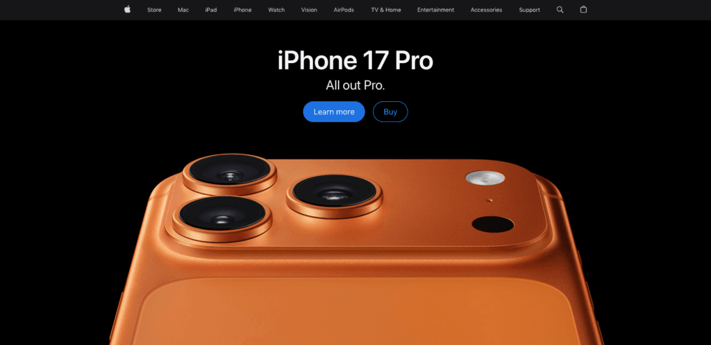
Apple homepage

Apple has long been recognised as a leader in accessibility, and their website reflects this commitment. Apple.com demonstrates that accessible design doesn’t mean compromising on visual appeal – their clean, high-contrast design works beautifully with screen readers, keyboard navigation, and voice control.

Their product pages provide comprehensive keyboard navigation throughout complex product configurators, detailed alt text for product images, and video content with captions and audio descriptions. The shopping experience works just as smoothly whether you’re using a mouse, keyboard, screen reader, or voice commands

With these examples serving as a benchmark, start making strides to enrich your own website’s accessibility and usability today! Embed these best practices into your web projects to create a streamlined user experience that truly caters to everyone.

What an accessibility statement looks like

You might have noticed that many accessible websites include an accessibility statement. This is a public commitment that shows users you care about accessibility and provides a way for them to report issues. Here’s what a good accessibility statement typically includes:

EXAMPLE ACCESSIBILITY STATEMENT TEMPLATE

Our Commitment to Accessibility

[Organisation Name] is committed to ensuring digital accessibility for people with disabilities. We are continually improving the user experience for everyone and applying the relevant accessibility standards.

Conformance Status

The Web Content Accessibility Guidelines (WCAG) define requirements for designers and developers to improve accessibility for people with disabilities. We aim to conform to WCAG 2.1 Level AA standards.

**[Website Name] is [fully/partially/not] conformant with WCAG 2.1 Level AA. [Fully conformant means: the content fully conforms to the accessibility standard without any exceptions. Partially conformant means: some parts of the content do not fully conform.] **

Measures to Support Accessibility

[Organisation Name] takes the following measures to ensure accessibility:

• Include accessibility as part of our mission statement • Integrate accessibility into our procurement practices
• Provide ongoing accessibility training for our staff • Test with people who use assistive technologies

Feedback and Contact Information

We welcome your feedback on the accessibility of [Website Name]. Please let us know if you encounter accessibility barriers:

• Email: [accessibility@organisation.com] • Phone: [contact number]

We aim to respond to accessibility feedback within [X business days].

Technical Specifications

Accessibility of [Website Name] relies on the following technologies:

  • HTML 
  • CSS
  • JavaScript 
  • ARIA

Date: [Last reviewed: DD/MM/YYYY]

That’s it! Your accessibility statement doesn’t need to be fancy or full of jargon – it just needs to be honest, clear, and show that you’re committed to making your website work for everyone. You can see real examples on sites like the BBC and GOV.UK.

Take the next steps toward creating accessible websites

Creating an accessible website involves more than just ticking compliance boxes. It’s about welcoming your users into the heart of your online presence and enhancing their experience. 

While there are various automated tools that check your website’s accessibility, keep in mind that they provide some insights, but their scope and depth can be somewhat limited. They simply cannot comprehend user experience as humans do. 

In particular, be cautious of quick-fix solutions such as accessibility overlays. Despite their tempting promise of making your website accessible with a single click, these overlays often fail to resolve numerous website accessibility issues and have been widely criticised by users with disabilities.

Instead of relying on these patchy solutions, it’s wiser to build a comprehensive understanding of what an accessible website looks like and how to create one. Don’t worry. Building that understanding is not as daunting as it sounds. Remember, The A11y Collective is here for your support. Our bespoke online courses are here to guide you on this journey towards accessibility. “Web accessibility, the basics” is a particularly beneficial course that provides you with the best foundation in this area.

The journey to web accessibility is an ongoing process, not a one-off task. As standards evolve, so should your understanding, and continuous learning is an integral part of the journey toward better accessibility and inclusion.

So, don’t wait – take the next step in enhancing your website’s accessibility and enroll in one of The A11y Collective’s courses today!

Design websites that meet accessibility laws.

Understand how design decisions impact real-world users and teach you to create websites that are inclusive for everyone.

The post 6 Accessible Website Examples to Inspire Your Design appeared first on The A11Y Collective.

  •  

∪ of Target Audiences (Accessibility, SEO, AEO/GEO)

Using SEO (search engine optimization) to justify accessibility was only ever a technique for bosses or clients or stakeholders who see accessibility as a cost center and are typically driven more by dashboards or money. Ideally, you want to get past that ASAP to drive better outcomes for humans, not SERPs (search engine results pages). I get it as a foot-in-the-door tactic — hopefully it goes no further.

But SEO also drove bad accessibility practices, such as alt text keyword stuffing, low-contrast text, verbose headings, link text built around keywords, gratuitous landing pages, and more. Karl does a good job of demonstrating how little SEO and accessibility are connected. As such, I’ve always been wary of companies pitching accessibility and SEO in their marketing.

Now I see companies pitching accessible & “AI-ready” or “agent friendly” work, often still including SEO. I’m calling foul.

Venn diagram with three circles. 1, Accessibility: The work needed to make things accessible to humans in assorted contexts. 2, SEO: The work needed to get your sites into search engines and maybe even ranked well. 3, AEO/GEO: The work to get your IP stolen by LLMs as they DDoS your site, so it can be later incorrectly regurgitated. Overlap with Accessibility and SEO: With bonus per­for­ma­tive use of the term “a11y.” Overlap of SEO and AEO/GEO: This is someone tricking you into speed-running having your IP stolen. There is no overlap of Accessibility and AEO/GEO nor all three.

We’ve already seen anti-user guidance from LLM companies asking for their notion of accessible sites. Never mind that these PhD-level genius LLM tools can’t handle a general site most kids navigate with ease. Let’s ignore the failure of that technology and instead start slapping misunderstood ARIA attributes on all our pages instead.

Sure, there’s overlap between SEO and LLM-thieving. SEO and accessibility even have slight overlap. But accessibility is about people. Twisting a human affordance to feed these corporate efforts to make humans redundant (among all the other harms) is a signal. Different people will read that signal in different ways. If it sells work and you still focus on humans first, cool.

But to me that signal says you aren’t serious about the work. That your TESCREAL patch is just waiting to get sewn on. I’m trying to be less absolutist, less black-and-white. But boy is it hard given what I see every time I peel back the veneer.

I made a thing (based on an old experiment) to better illustrate where I see the overlaps.

See the Pen Accessibility + SEO + AEO by Adrian Roselli (@aardrian) on CodePen.

  •  

headingoffset is Not the Document Outline Algorithm

Hi, just me heading off some bad advice I’m starting to see in developer venues.

Background

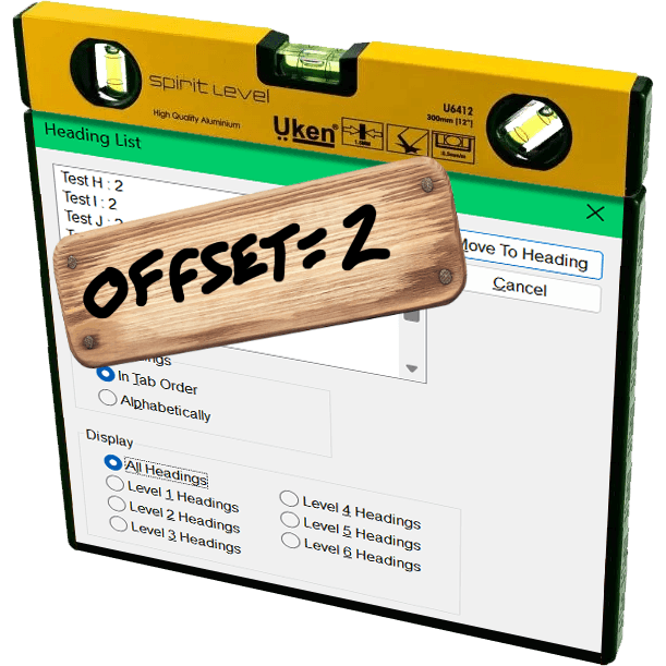
The JAWS heading list dialog with a yellow three-in-one surface level resting on top and a board nailed over it with hand-scrawled ‘offset=2’.

The proposed Document Outline Algorithm, where headings would automatically reset themselves to the appropriate level based on their position in the DOM structure, was never part of a final HTML specification. It was quickly proven to be unworkable; brief support in JAWS demonstrated that. You can read the tortured history (and a JAWS support demo) in my 2016 post There Is No Document Outline Algorithm.

In 2019 WHATWG worked to resurrect <hgroup>, partly in a novel effort to try to resurrect the Document Outline Algorithm. In the end, even that effort was futile. <hgroup> came back, but it came back as a grouping element only. The only impact it has on heading structures is that browser could, if they really wanted, ignore other headings in the same <hgroup>.

In 2020, Steve Faulkner wrote about the doc-subtitle role, from the Digital Publishing WAI-ARIA Module 1.0, as a way to handle subtitles until <hgroup> found its new footing. Sadly, a cadre of authors thought that role could be the basis for the Document Outline Algorithm.

Authors very much want to make the browser decide heading levels for them. Authors also very much continue to write content and HTML structures that make that impossible.

So I wasn’t surprised when Firefox’s recent announcement of headingoffset support coming to Firefox behind a flag resulted in many cheering the “return” (irony quotes) of the Document Outline Algorithm.

But it isn’t.

headingoffset

The headingoffset attribute lets authors offset heading levels for descendants of a given node.

So if you have, say a dialog that starts at <h2>, you could add headingoffset="2" and then let it pull in (server-side or via your preferred user-slowing front-end tooling) another page that uses <h1> as its first heading, you can be comfortable knowing that <h1> will be treated as <h3> in the accessibility tree.

This can be handy for content re-use without authors needing to make every heading a variable or burning down the DOM each time to forcibly re-write them.

But it’s still the author’s job to make an intentional and good decision. The browser will know nothing more about your content or structure than it did before. And it certainly doesn’t reduce WCAG risk.

Other useful nuggets:

  • headingoffset values must be valid non-negative integers.
  • headingoffset values must be between 0 and 8.
  • headingoffset values greater than 8 are specified to max at level 9, but existing bugs may impact that.
  • Other invalid headingoffset values should fall back to level 2, but again, bugs and implementation decisions wil impact that.
  • headingreset is a boolean attribute that tells browsers to ignore headingoffset for that node and its descendants.
  • Do not use headingoffset until you can confirm support for the computed heading level in your target audience browser.

Recap

  1. headingoffset is not the (nor any) Document Outline Algorithm, nor does it replicate it.
  2. headingoffset requires the author to make decisions based on content.
  3. Until JAWS and TalkBack fix existing bugs, probably don’t do / allow any heading levels higher than 6.
  4. Don’t do / allow any heading levels higher than 9.
  5. If you are hoping headingoffset will resolve your heading level problems in a hands-off way with imported or user-generated content, you may end up creating confusion and WCAG risk.
  6. Do not try to use headingoffset to try to recreate the Document Outline Algorithm.

Related

Not a ton of detail in this post, but at 500 words if you want more then here are some resources beyond what I linked:

  •  

Announcing our rebrand: A clearer, more intuitive Matomo

As of today, April 30, 2026, we’re announcing the first step of our brand refresh. Another software company talking about a cosmetic redesign? Not quite. This update isn’t just about how Matomo looks. It’s about making the whole Matomo experience clearer, faster and more user-friendy.

Why we’re making this change

Over time, Matomo has grown significantly. New features, new use cases, and a growing global community have shaped what the platform is today.

As an open-source platform, feedback, contributions, and real-world usage play a direct role in how the product evolves. That creates a continuous loop between how Matomo is used and how it improves. Over time, we’ve gathered lots of great feedback on how users experience Matomo, what works well, and where things slows them down.

Some patterns became clear: For many users, navigation could be more intuitive, key insights could surface faster and onboarding could be smoother.

Our rebrand is the starting point for addressing these areas more systematically. Our overall goal is to reduce friction so you can get value from your data faster.

From feedback to product improvements

By turning all our user touchpoints into a modern, clear, and cohesive experience, we want to make it easier for users to understand, adopt, and get value from Matomo.

You’ll start to notice:

  • Updated navigation (top bar and main menu) for better readability
  • Improved main selectors (website, segment and dashboard) for easier use
  • A modernised overall layout, refreshed widgets shadows being an exemplary detail

Our product now even offers a dark-mode that users can easily select in their Matomo settings.

What’s changing, and when?

Starting today, you’ll see the first changes with the updated look and feel of our website. We’ll continue rolling out improvements across onboarding, education, usability, and the overall product experience. All of these improvements are guided by the same principle of putting our users first.

While the brand evolves, our values remain the same:

  • Full data ownership
  • Privacy-first analytics
  • Transparency and control
  • Flexibility for different teams and use cases
  • Accurate, reliable data

If anything, this rebrand sharpens these commitments.

Where we go from here

Rebrands often focus on how things look. This one is about how things work and how they feel to use.

We’d value your feedback as we continue the roll-out. You can reach us at marketing@matomo.org or via our social channels.

Not using Matomo yet? You can explore the new experience with a 21-day free trial.

The post Announcing our rebrand: A clearer, more intuitive Matomo appeared first on Analytics Platform - Matomo.

  •  

Tails OS : un système d’exploitation pensé pour l’anonymat

Imaginez une clé USB qui se prend pour James Bond : dès qu’elle quitte la pièce, pouf, plus aucune trace. C’est à peu près la promesse de Tails (The Amnesic Incognito Live System), un système d’exploitation « bootable » qui tourne depuis une clé ou un DVD, s’appuie sur le réseau Tor et oublie tout en se fermant. La version la plus récente (6.14.2, sortie le 15 avril 2025) arrive même avec des correctifs de sécurité de dernière minute — pas le genre à traîner, donc.

« C’est encore une distro Linux, non ?» – Oui… mais pas vraiment !

Ce qui rend Tails unique

  • Amnésie totale : aucun fichier n’atterrit sur le disque dur de la machine hôte. À chaque redémarrage, vous repartez sur un système vierge.
  • Tor à gogo : tout passe dans les oignons (Tor), même les applis capricieuses. Si un logiciel tente de se connecter en dehors de Tor, il se fait rembarrer fissa.
  • Persistance optionnelle : besoin de garder vos clefs GPG ou vos brouillons LibreOffice ? Activez la « Persistent Storage » chiffrée et choisissez ce qui survit aux reboots.
  • Cycle de sorties éclair : une mise à jour toutes les six semaines, histoire de colmater les failles avant qu’elles ne deviennent des légendes urbaines.
  • Fusion avec le Tor Project (2024) : l’OS est officiellement passé sous l’aile de la fondation Tor — pratique quand votre raison d’être, c’est justement Tor !

Wow ! Pas étonnant que les distributions « classiques » aient l’air un peu plan-plan à côté.

Les points forts qui claquent

Ça fait plaisir…Pourquoi c’est cool
Anonymat par défautTor partout, blocage du réseau clair, ponts Tor si besoin
PortabilitéUne clé USB de 8 Go + un PC de ces dix dernières années et roule ma poule
Coffre‑fort intégréPersistance chiffrée au choix, chiffrement complet
Suite « prête à conspirer »Tor Browser, Thunderbird+OpenPGP, OnionShare, KeePassXC… déjà configurés
Open source + auditsTout le code est public ; les chercheurs en sécu adorent fouiller

Oui, et tout ça gratuitement.

…et les petites galères à prévoir

  • Lent comme un dimanche pluvieux : Tor ajoute de la latence. Oubliez le binge‑watching en 4K.
  • Compat’ matos capricieuse : cartes Wi‑Fi exotiques ou Mac T2 peuvent faire la tête.
  • Pas un OS « au quotidien » : chaque reboot reset. Si vous travaillez sur des projets lourds (montage vidéo, dev quotidien), vous allez râler.
  • Applis limitées : tout nouveau logiciel nécessite la Persistance + un redémarrage, sinon il s’évapore.
  • Apprendre les bonnes pratiques : Tails est sûr, mais pas magique ; utiliser l’« Unsafe Browser » sans précaution, c’est comme mettre un gyrophare sur votre tête – visible !

À qui ça parle ?

  • Journalistes & lanceurs d’alerte qui doivent échanger discrètement.
  • Militants & ONG sous régime hostile.
  • Victimes de violence domestique cherchant un havre numérique.
  • Geeks soucieux de leur vie privée (coucou !).
  • …et, soyons clairs, pas aux gamers invétérés ni aux fans de Photoshop XXL.

Vous cochez une case ?

Envie de tester ? Petit guide express

  1. Téléchargez l’image ISO/USB depuis le site officiel (vérifiez la signature PGP, sinon gare au poisson d’avril).
  2. Gravez ou flashez la bête : Balena Etcher ou l’« Tails Installer » maison, simple comme bonjour.
  3. Désactivez le Secure Boot si votre BIOS grogne.
  4. Démarrez depuis la clé (F12, Esc, ou la touche cabalistique de votre PC).
  5. Configurez la Persistance si besoin : sélectionnez uniquement ce dont vous avez réellement besoin, histoire de ne pas tout garder « juste au cas où ».
  6. Première connexion : Tor détecte l’état du réseau et vous guide. Bloqué ? Essayez les bridges — ça passe crème dans la plupart des cafés.

On en cause ?

Au final, Tails, c’est un peu le coup‑de‑pouce ultime quand on veut un ordinateur jetable mais puissant. Pas fait pour tout le monde, mais un joker précieux dans un monde où nos données ressemblent trop souvent à de la petite monnaie qu’on abandonne sur le comptoir.

Alors, vous vous lancez ? Vous voyez d’autres usages que j’aurais oubliés ? Partagez vos idées — et, promis, on reste discrets 😉

  •  

Dépendance numérique : comment la France en est arrivé là, et surtout… comment en sortir ?

2025, La France découvre (enfin) sa dépendance numérique Ça y est. Depuis l’augmentation des droits de douanes Trumpistes, la France découvre ses dépendances numériques. Même le chef de l’état défend la souveraineté numérique de la France. Bravo, applaudissement ! Presque 15 ans après la création déjà tardive d’un secrétariat au numérique (qui aura muté en […]
  •  

Don’t Use Fake Bold or Italic in Social Media

I posted something on Mastodon that uses Unicode math symbols to produce fake bold and fake italic text. I used YayText.com to generate it, but I am not linking it because you I don’t want you to use it.

I embedded the post, but you can go to it directly if you prefer.

Then I recorded the screen reader output.

NVDA 2024.4.2 / Firefox 135. Doesn’t announce the fake bold nor fake italic.
JAWS 2025 / Chrome 133. Announces each fake bold and fake italic letter individually, including its case and style.

Those two videos account for ~78% of primary screen reader use. You could stop there and you’d have a good sense of the divergent experience and how it doesn’t match up with the visible text as you might expect.

This is not new information. I was raising this as a concern back in 2018 when Twitter was not yet a Nazi bar.

I know it’s easy to want to blame screen readers. That reflex, however, is a mistake. Instead, as an author you have some responsibility here.

VoiceOver / macOS 15.3.1 / Safari 18.3. Doesn’t announce the fake bold nor fake italic.
Narrator / Windows 11 24H2 / Edge 133. Doesn’t announce the fake bold nor fake italic.

I’m using default settings. Some users will have different settings, but understand screen reader users have the same range of skill & experience with their kit as everyone else has with their own kit.

Try with your built-in screen reader. You have one built into whatever system you are using to read this post (unless you printed it to dead tree pulp, like a boss). If you are unfamiliar with the commands, such as starting it or navigating, I have some screen reader documentation and resources.

VoiceOver / iPadOS 18.3.1 / Safari. Doesn’t announce the fake bold nor fake italic.
TalkBack 15.2 / Chrome 133. Announces the fake bold and fake italic as if it is regular text. TalkBack started doing this in 2021.

I’ve shared six screen reader experiences.

The takeaway should be do not use sites like YayText to make fake bold or italic text (whether on Bluesky, LinkedIn, that Nazi bar, that other Nazi bar, or the yet other Nazi bar, etc.).

If you’re a tester, you may see the speech logs show the characters. These are lies because that doesn’t mean they are announced.

For comparison, this is what it would look like if it was marked up using HTML (and yes, some Masto instances support this) instead of math symbols:

Please do not eat the shrimp scampi in the fridge. It is tasty but will kill you.

All screen readers announce all those words, even if they don’t all expose the bold or italic styling by default.

Now…

Imagine your local government sends this:

Imagine the impact on screen reader users.

Actually, you don’t have to imagine. I recorded the behavior in 2021. It’s not much different today and the examples above will help you guess even if you don’t read that post or try it yourself.

Update: 9 March 2025

This post landed on Hacker News, with the standard mix of comments from people who read the post, mis-read the post, didn’t read the post, think they know “the fix,” know better, and generally debated the nature of their debates.

  •  
❌